In our large screen visualization project, we often use a variety of charts. Compared with the traditional table display and boring text description, the chart display makes the user look more intuitive and the data display more clear at a glance. Based on svg drawing technology and front-end technology stack vue, this paper briefly expounds some ideas of drawing progress bar by taking the ring progress bar commonly used in work as an example, hoping to share with you
Explanation of ideas: there are various types of techniques for drawing rings, such as canvas drawing, div simulation, ecarts plug-in, etc. here, take svg Technology as an example. When it comes to drawing a circle, we can use the circle tag in svg. Of course, we can also use the path tag. One ring is used as the background and the other ring is used as the progress ring. There is a question here. Since they are all circles, how can we draw the corresponding radians according to the actual values? Here you need to use a high-level css attribute. For the specific usage of stroke dashoffset, you can check the relevant api documents. In most business scenarios, the circular progress bar is always bizarre. For example, some circular progress bars seem to have scales, paragraph by paragraph, which requires another high-level css attribute, stroke dasharray. Using stroke dash offset and stroke dash array, combined with knowledge points such as gradient and rotation in svg, we can draw various progress bars, as shown in the following figure:
Based on the above ideas, first of all, let's encapsulate a progress bar component. The code is as follows
<template>
  <div class="progress">
    <svg
      xmlns="http://www.w3.org/2000/svg"
      width="100%"
      height="100%"
      viewBox="0 0 400 400"
    >
      <!-- Bottom background ring -->
      <circle
        cx="200"
        cy="200"
        :r="radius"
        :stroke="bgRingColor"
        :stroke-width="strokeWidth"
        fill="none"
      />
      <!-- Progress Bar Ring -->
      <circle
        class="progress-bar"
        ref="progressbar"
        cx="200"
        cy="200"
        :r="radius"
        :stroke="ringColor"
        :stroke-width="strokeWidth"
        fill="none"
        :stroke-linecap="strokeLinecap"
        transform="rotate(-90, 200, 200)"
        :stroke-dasharray="strokeDasharray"
        :stroke-dashoffset="strokeDashoffset"
      />
    </svg>
    <!-- Intermediate description text -->
    <div class="progress-desc">
      <slot></slot>
    </div>
  </div>
</template>
<script>
export default {
  name: "Progress",
  props: {
    rate: {
      type: Number,
      default: 0,
    },
    bgRingColor: {
      type: String,
      default: "#ebeef5",
    },
    ringColor: {
      type: String,
      default: "#67C23A",
    },
    strokeLinecap: {
      type: String,
      default: "round",
    },
    strokeWidth: {
      type: Number,
      default: 20,
    },
  },
  computed: {
    radius() {
      return 200 - this.strokeWidth / 2;
    },
    strokeDasharray() {
      return 2 * Math.PI * this.radius;
    },
    strokeDashoffset() {
      let val = 0;
      let rate = this.rate;
      if (rate > 1) {
        rate = 1;
      } else if (rate < 0) {
        rate = 0;
      }
      if (this.strokeLinecap === "round") {
        val = 2 * Math.PI * this.radius * (1 - rate) + this.strokeWidth;
      } else {
        val = 2 * Math.PI * this.radius * (1 - rate);
      }
      return val;
    },
  },
};
</script>
<style scoped>
.progress {
  position: relative;
  width: 100%;
  height: 100%;
}
.progress-desc {
  position: absolute;
  left: 50%;
  top: 50%;
  transform: translate(-50%, -50%);
  font-family: "Microsoft YaHei";
  font-size: 20px;
  text-align: center;
}
.progress-bar {
  transition: stroke-dashoffset 1s ease;
}
</style>
Here, we have encapsulated the basic properties of the progress bar and some parameters that must be passed. Then we can use this progress bar component in the corresponding components. By configuring different styles, we can complete a variety of small cases
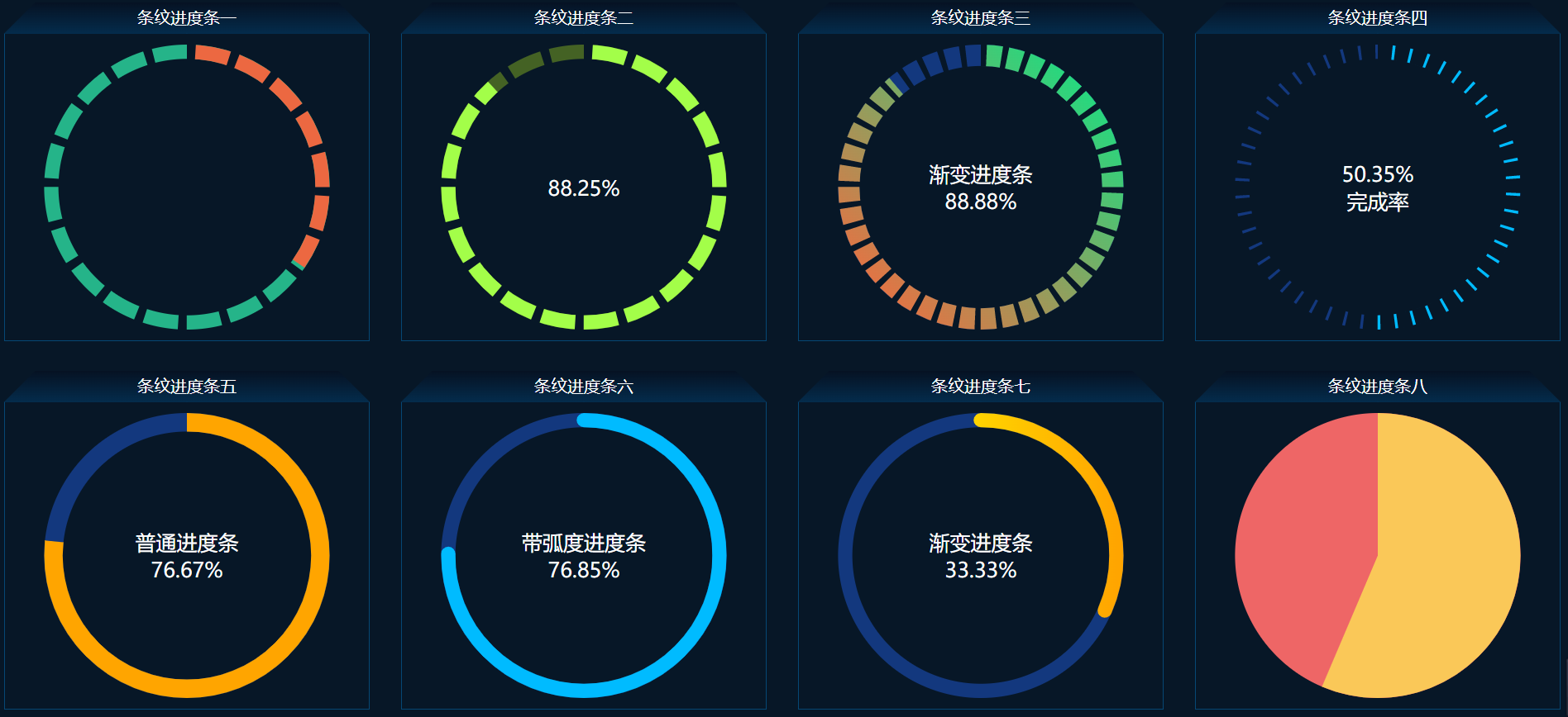
<template>
  <div class="progress">
    <div class="svg-module">
      <div class="module-title">Stripe progress bar I</div>
      <div class="module-content">
        <svg-line
          :rate="0.3456"
          bg-ring-color="#25b489"
          ring-color="#ec6841"
          :stroke-width="20"
          stroke-linecap="butt"
          :part="20"
          :part-gap="12"
        >
        </svg-line>
      </div>
    </div>
    <div class="svg-module">
      <div class="module-title">Stripe progress bar II</div>
      <div class="module-content">
        <svg-line
          :rate="0.8825"
          bg-ring-color="#446224"
          ring-color="#a3fe49"
          :stroke-width="20"
          stroke-linecap="butt"
          :part="20"
          :part-gap="12"
        >
          <span>
            <span>{{ `${(0.8825 * 100).toFixed(2)}%` }}</span>
          </span>
        </svg-line>
      </div>
    </div>

    <div class="svg-module">
      <div class="module-title">Stripe progress bar III</div>
      <div class="module-content">
        <svg-line
          :rate="0.8888"
          bg-ring-color="#13387e"
          ring-color="#1cbd9c"
          :stroke-width="30"
          stroke-linecap="butt"
          :part="40"
          :part-gap="8"
          :show-gradient="true"
          :gradient="myGradient"
        >
          <span>
            <span>Gradient progress bar</span><br />
            <span>{{ `${(0.8888 * 100).toFixed(2)}%` }}</span>
          </span>
        </svg-line>
      </div>
    </div>

    <div class="svg-module">
      <div class="module-title">Stripe progress bar IV</div>
      <div class="module-content">
        <svg-line
          :rate="0.5035"
          bg-ring-color="#13387e"
          ring-color="#00bbff"
          stroke-linecap="butt"
          :stroke-width="20"
          :part="50"
          :part-gap="20"
        >
          <span>
            <span>{{ `${(0.5035 * 100).toFixed(2)}%` }}</span>
            <br />
            <span>Completion rate</span>
          </span>
        </svg-line>
      </div>
    </div>

    <div class="svg-module">
      <div class="module-title">Stripe progress bar 5</div>
      <div class="module-content">
        <svg-line
          :rate="0.7667"
          bg-ring-color="#13387e"
          ring-color="orange"
          :stroke-width="26"
          stroke-linecap="butt"
          :part="1"
          :part-gap="0"
        >
          <span>
            <span>General progress bar</span><br />
            <span>{{ `${(0.7667 * 100).toFixed(2)}%` }}</span>
          </span>
        </svg-line>
      </div>
    </div>

    <div class="svg-module">
      <div class="module-title">Stripe progress bar 6</div>
      <div class="module-content">
        <svg-line
          :rate="0.7685"
          bg-ring-color="#13387e"
          ring-color="#00bbff"
          :stroke-width="20"
          :part="1"
          :part-gap="0"
        >
          <span>
            <span>Progress bar with radian</span><br />
            <span>{{ `${(0.7685 * 100).toFixed(2)}%` }}</span>
          </span>
        </svg-line>
      </div>
    </div>

    <div class="svg-module">
      <div class="module-title">Stripe progress bar 7</div>
      <div class="module-content">
        <svg-line
          :rate="0.3333"
          bg-ring-color="#13387e"
          ring-color="#00bbff"
          :stroke-width="20"
          :part="1"
          :part-gap="0"
          :show-gradient="true"
        >
          <span>
            <span>Gradient progress bar</span><br />
            <span>{{ `${(0.3333 * 100).toFixed(2)}%` }}</span>
          </span>
        </svg-line>
      </div>
    </div>

    <div class="svg-module">
      <div class="module-title">Stripe progress bar 8</div>
      <div class="module-content">
        <svg-line
          :rate="0.5632"
          bg-ring-color="#ee6666"
          ring-color="#fac858"
          :stroke-width="200"
          stroke-linecap="butt"
          :part="1"
          :part-gap="0"
        >
        </svg-line>
      </div>
    </div>
  </div>
</template>
<script>
import SvgLine from "./svgline.vue";
export default {
  name: "SVGLineIndex",
  components: {
    SvgLine,
  },
  data() {
    return {
      myGradient: {
        // The id must be unique in the same page
        id: "svg-linear-gradient001",
        x1: "100%",
        y1: "100%",
        x2: "0%",
        y2: "0%",
        colorStops: [
          {
            offset: "0%",
            color: "#0ae787",
          },
          {
            offset: "100%",
            color: "#fe653c",
          },
        ],
      },
    };
  },
};
</script>
<style scoped>
.progress {
  display: flex;
  flex-wrap: wrap;
  justify-content: space-around;
  align-content: space-around;
  width: 100%;
  height: 100%;
  background-color: #071727;
  overflow: hidden;
}
.svg-module {
  width: 23%;
  height: 46%;
}
.module-content {
  width: 100%;
  height: calc(100% - 30px);
  padding: 10px;
  border: 1px solid #064774;
  color: #fff;
  box-sizing: border-box;
}
.module-title {
  position: relative;
  z-index: 1;
  width: 100%;
  height: 30px;
  line-height: 30px;
  font-size: 16px;
  text-align: center;
  color: #fff;
}
.module-title::before,
.module-title::after {
  content: "";
  position: absolute;
  z-index: -1;
  top: 0;
  width: 50%;
  height: 100%;
  background-image: linear-gradient(to bottom, #061223, #042c4c);
}
.module-title::before {
  left: 0;
  transform: skew(-45deg);
  transform-origin: left bottom;
}
.module-title::after {
  right: 0;
  transform: skew(45deg);
  transform-origin: right bottom;
}
</style>