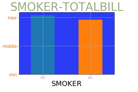
Check the average of smoking and non-smoking bills
plt.subplot(facecolor=np.random.random(size=3))
tips.groupby('smoker')["total_bill"].mean().plot(kind="bar")
plt.grid()
plt.ytick([0,10,20],["min","middle","max"],fontsize=15,color=np.random.random(size=3))
plt.xlabel('SMOKER',fontsize=25)
plt.xticks([0,1],["yes","no"],rotation=0,color=np.random.random(size=3))
plt.title("SMOKER_TOTALBILL",fontsize=40,color=np.random.random(size=3))
plt.show()
Legend
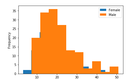
tips.query('sex == "Female"')["total_bill"].plot(kind='hist', label="Female")
tips.query('sex == "Male"')["total_bill"].plot(kind="hist", label="Male")
plt.legend()
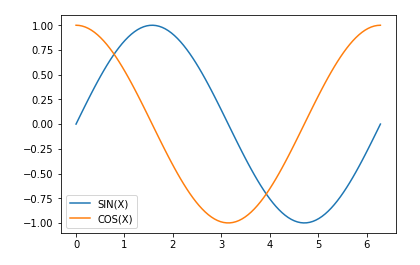
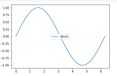
# In all drawing functions, you can use lable to label the legend of the corresponding image
plt.plot(x, np.sin(x), label="SIN(X)")
plt.plot(x, np.cos(x), label="COS(X)")
plt.legend()
# Two drawing boards in one cell
tips.query('sex == "Female"')["total_bill"].plot(kind='hist', label="Female")
tips.query('sex == "Male"')["total_bill"].plot(kind="hist", label="Male")
plt.legend()
plt.show()


tips.query('smoker == "Yes"')["total_bill"].plot(kind='hist', label="Smoker-Yes")
tips.query('smoker == "No"')["total_bill"].plot(kind="hist", label="Smoker-No")
plt.legend()
plt.show
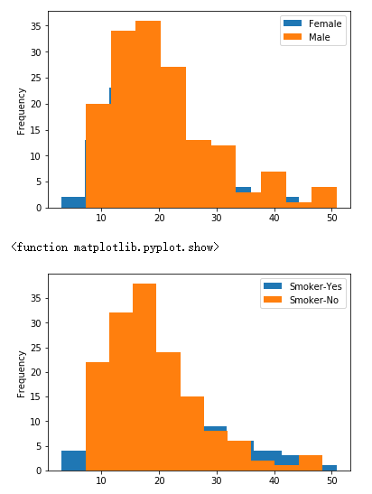
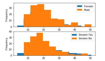
# Two canvases in one drawing board
ax1 = plt.subplot(2,1,1)
tips.query('sex == "Female"')["total_bill"].plot(kind='hist', label="Female")
tips.query('sex == "Male"')["total_bill"].plot(kind="hist", label="Male")
# plt.legend()
# plt.show()

ax2 = plt.subplot(2,1,2)
tips.query('smoker == "Yes"')["total_bill"].plot(kind='hist', label="Smoker-Yes")
tips.query('smoker == "No"')["total_bill"].plot(kind="hist", label="Smoker-No")
# plt.legend()

ax1.legend()
ax2.legend()
plt.show()
legend method
There are two methods of parameter transfer:
Add the label parameter to the plot function, and then call the legend() method to display
Pass in the list of strings directly in the legend method
loc parameter
The loc parameter is used to set the location of the legend label, usually in the legend function
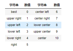
matplotlib has predefined several positions of numerical representation
Example:
plt.plot(x, np.sin(x))
plt.legend(["Sin(x)"], loc=10)
plt.show()
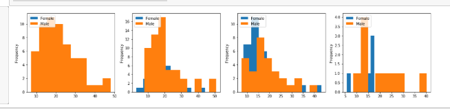
# Check the distribution of daily (men's and women's) consumption bills
# Draw 4 sub canvases by day
# Each sub canvas, divided into men and women to draw
loc = 1
plt.figure(figsize=(20,4))
for day in tips.day.unique():

    ax = plt.subplot(1,4,loc)
    loc += 1
    query_condition = 'day == \"{}\"'.format(day)
    day_data = tips.query(query_condition)

    day_data.query('sex == "Female"')["total_bill"].plot(kind="hist", label="Female")
    day_data.query('sex == "Male"')["total_bill"].plot(kind="hist", label="Male")
    plt.legend(loc="upper left")
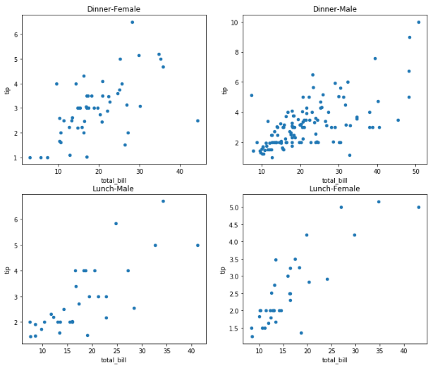
plt.figure(figsize=(12,10))
loc = 1

# for i in range(4):
#     ax = plt.subplot(2,2,loc)
#     loc += 1

# The first level of cycle, to classify time
for time in tips.time.unique():
    time_df = tips.query('time == \"{}\"'.format(time))
    for sex in time_df.sex.unique():
        sex_df = time_df.query('sex == \"{}\"'.format(sex))
        # Set the position of the word canvas
        ax = plt.subplot(tips.time.unique().size, time_df.sex.unique().size,loc)
        loc += 1
        sex_df.plot(kind='scatter', x="total_bill", y="tip", ax=ax)
        plt.title("{}-{}".format(time, sex))
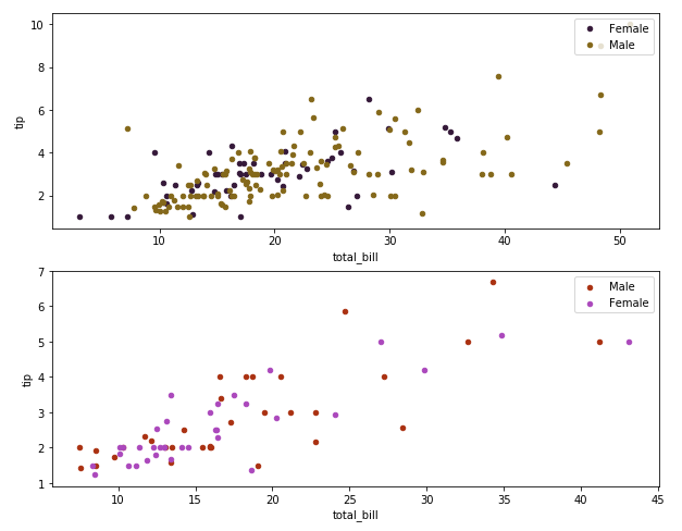
loc = 1
plt.figure(figsize=(10,8))
for time in tips.time.unique():
    time_df = tips.query('time == \"{}\"'.format(time))
    ax = plt.subplot(tips.time.unique().size,1,loc)
    loc += 1
    for sex in time_df.sex.unique():
        sex_df = time_df.query('sex == \"{}\"'.format(sex))
        sex_df.plot(kind='scatter', x="total_bill", y="tip", ax=ax, label=sex, c=np.random.random(size=3))
    plt.legend(loc="upper right")
The loc parameter can be a tuple of 2 elements, representing the coordinates of the lower left corner of the legend
The legend can also exceed the limit loc = (-0.1,0.9)
[0,0] left lower
[0,1] left top
[1,0] right down
[1,1] right upper
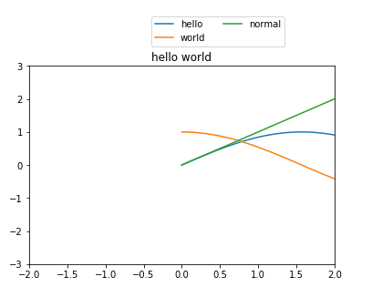
plt.title("hello world")
plt.axis([-2,2,-3,3])

plt.plot(x, np.sin(x), x, np.cos(x), x, x)
plt.legend(["hello","world","normal"],loc=[0.4,1.1], ncol=2)
ncol parameter
There are several columns in ncol control legend. To set ncol in legend, you need to set loc
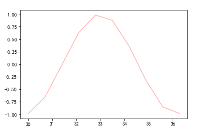
linestyle,color,marker
Change line style
Set font
mpl.rcParams['font.sans-serif'] = ['SimHei']
Set Chinese minus sign display problem
mpl.rcParams['axes.unicode_minus']=False
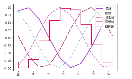
style_dict = {
    "Solid line":"-",
    "Dotted line":":",
    "Dot marking":"-.",
    "Ladder line":"steps",
    "Broken line":"--"
}

pad = 1.5
for k, v in style_dict.items():
    pad += 1
    plt.plot(x, np.sin(x+pad), color=np.random.random(size=3), linewidth=2, linestyle=v, label=k)

plt.legend(loc="upper right")
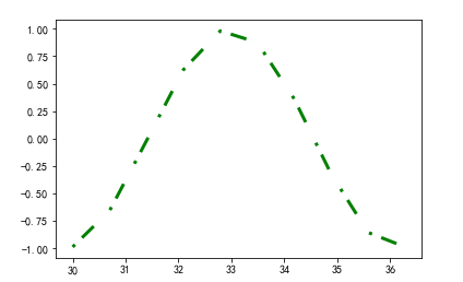
dashes=[1,3,5,7] use even integers to represent custom dashes
plt.plot(x, np.sin(x), dashes=[1,3,5,7], lw =3, color='green')
Point shape
facecolor can only set point type with area
plt.plot(x, np.sin(x), marker="3", markersize=20, linestyle="None",
         markerfacecolor="green", markeredgecolor="red", markeredgewidth=3)
plt.plot(x, np.sin(x), color="red", alpha=0.3)
Save pictures
Function of savefig using figure object
filename
A string containing a file path or a Python file type object. The image format is inferred from the file extension. For example,. pdf infers pdf,. png infers png ("png", "pdf", "svg", "ps", "eps"...)
dpi
Image resolution (dots per inch), default is 100
facecolor
Background color of the image, default is "w" (white)
To save an image using a palette object
figure = plt.figure(facecolor="red")
plt.subplot(facecolor="red")
plt.plot(x, np.sin(x), marker="*", markersize=40, markerfacecolor="yellow", ls="None", markeredgecolor="red")

plt.axis('off')
Saving palette color needs to be solved in the savefig function
figure.savefig('stars.png', facecolor="red",dpi=100)

