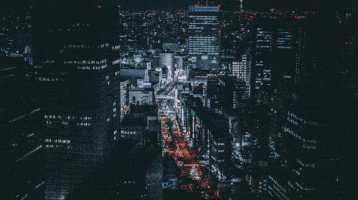
What is the fault effect?
Its original meaning is "temporary interference", which is often used to refer to "image interference" in visual art. This is one of the most common effects in horror films and online films.
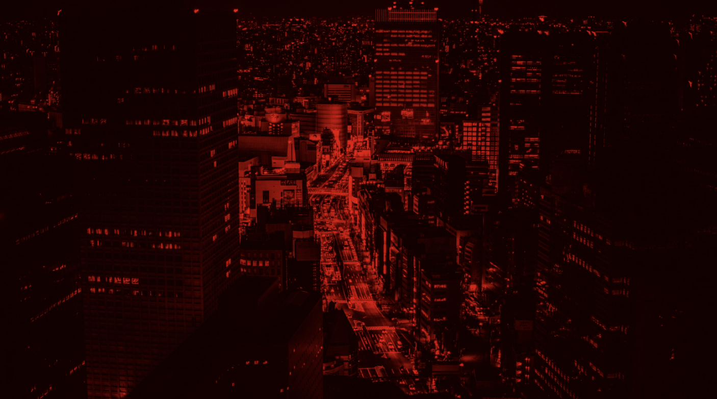
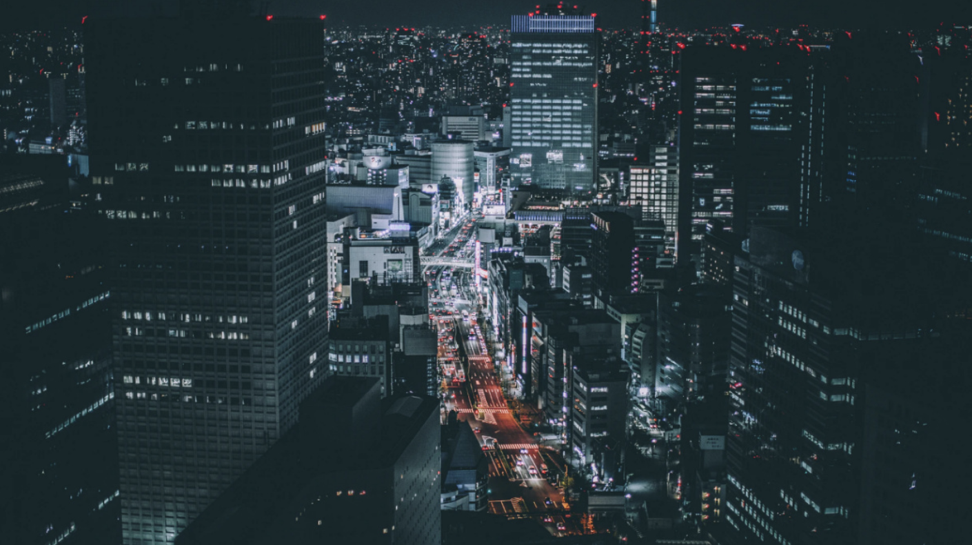
What is RGB displacement?
Color difference, RGB offset, RGB split, etc. there are various methods to describe it, but in essence, it means that the three primary colors of light, namely red, green and blue, should overlap without any dislocation.
This is used in conjunction with mutation effects. In some cases, the word mutation is used to include color change, so implementing it in this case will produce more mutation effects.
Actual operation
HTML:
<div class="glitch" style="background-image: url(...);">
</div>
In the inline style of the element, specify the image you want to mutate as the background image
We use background image to avoid writing the image URL multiple times when dividing the image into RGB. Although we can specify the background image in CSS, we use inline style to make it easier to change the image in HTML.
CSS:
.glitch {
  background: #000 no-repeat center;
  background-size: 0; // `. glitch ` do not display the background image on yourself
  height: 100vh;
  overflow: hidden;
  position: relative;
}
This is our CSS code. The key is background size: 0; This means The glitch element itself does not display an image.
Of course, the original CSS can also be used, but we will use Sass to make it easier to write random images for animation.
Image segmentation into RBG
html:
<div class="glitch" style="background-image: url(...);">
  <div class="channel r"></div>
</div>
Now let's try displaying only the red channel.
.glitch {
  ...
  .channel {
    background: inherit; // Inherits the background of the container element
    background-size: cover;
    bottom: 0;
    left: 0;
    position: absolute;
    right: 0;
    top: 0;
  }

  // Separate from ". channel" above for later execution.
  .channel {
    &::before {
      bottom: 0;
      content: "";
      display: block;
      left: 0;
      mix-blend-mode: multiply; // Multiply the images by R/G/B to create their own channels
      position: absolute;
      right: 0;
      top: 0;
    }
  }

  .r {
    &::before {
      background: #f00;
    }
  }
}
Now you should be able to see the red channel.
<div class="glitch" style="background-image: url(...);">
  <div class="channel r"></div>
  <div class="channel g"></div>
  <div class="channel b"></div>
</div>
Similarly, add green and blue channels.
.glitch {
  ...

  .channel {
    ...
  }

  .channel {
    mix-blend-mode: screen; // Each channel can be combined with the original image by overlapping on the screen

    &::before {
      ...
    }
  }

  .r {
    ...
  }

  .g {
    &::before {
      background: #0f0;
    }
  }

  .b {
    &::before {
      background: #00f;
    }
  }
Each RGB channel is created and superimposed on the screen to display the original image.
Then you can translate the channel () to get the RGB displacement effect.
  .r {
    transform: translate(4px, 2px);
    ...
  }

  .g {
    transform: translate(-3px, -1px);
    ...
  }
RGB displacement animation
@function rand($min, $max) {
  @return random() * ($max - $min) + $min;
}
We will create a random function so that we can easily set the maximum and minimum values.
$animation-duration: 3s; // How many seconds does the animation cycle
$glitch-duration: 20%; // The length of the mutation (RGB displacement) itself, as a percentage of the above seconds
$glitch-frequency: 10; // Motion frequency
$glitch-interval: $glitch-duration / $glitch-frequency;

@mixin rgb-shift($name) {
  @keyframes rgb-shift-#{$name} {
    @for $i from 0 to $glitch-frequency {
      #{$i * $glitch-interval} {
        transform: translate(
          #{rand(-2, 2) * 1%}, / / how far it moves left or right (± 2% of the width).
          #{rand(-0.5, 0.5) * 1%} / / degree of up and down movement (± 0.5% of height).
        );
      }
    }

    #{$glitch-duration}, 100% {
      transform: none;
    }
  }

  animation: rgb-shift-#{$name} $animation-duration steps(1, jump-end) infinite alternate both;
}
Create a mixer for each RGB channel and create and animate @ keyframes at the same time.
@use 'sass:math';

@function rand($min, $max) {
  @return math.random() * ($max - $min) + $min;
}

$glitch-interval: math.div($glitch-duration, $glitch-frequency);
The latest version of Sass recommends using the above mathematical functions, but some of them are not supported by CodePen, so we will use a slightly traditional method throughout the process.
The point is that the animation timing function should use the step (n, < jumpterm >) function to make the motion more abrupt, because it will be stiff rather than smooth.
Another thing is that the animation direction is set to alternate. You can do without it by adjusting $animation duration $glitch duration $glitch frequency, but if you set it to alternate, the repeated animation will be half of the above figure, even if it has the same glitch length and static state. As shown in the figure above, the alternating time of faults and pauses of the same length is halved. As shown in the figure above, the mutation and rest of the same length need to repeat half of the animation, so half of the CSS code needs to be written.
   .r {
    transform: translate(4px, 2px);
    @include rgb-shift(r);
    ...
  }

  .g {
    transform: translate(-3px, -1px);
    @include rgb-shift(g);
    ...
  }

  .b {
    @include rgb-shift(b);
    ...
  }
A mixer is included in each channel to play RGB displacement animation.
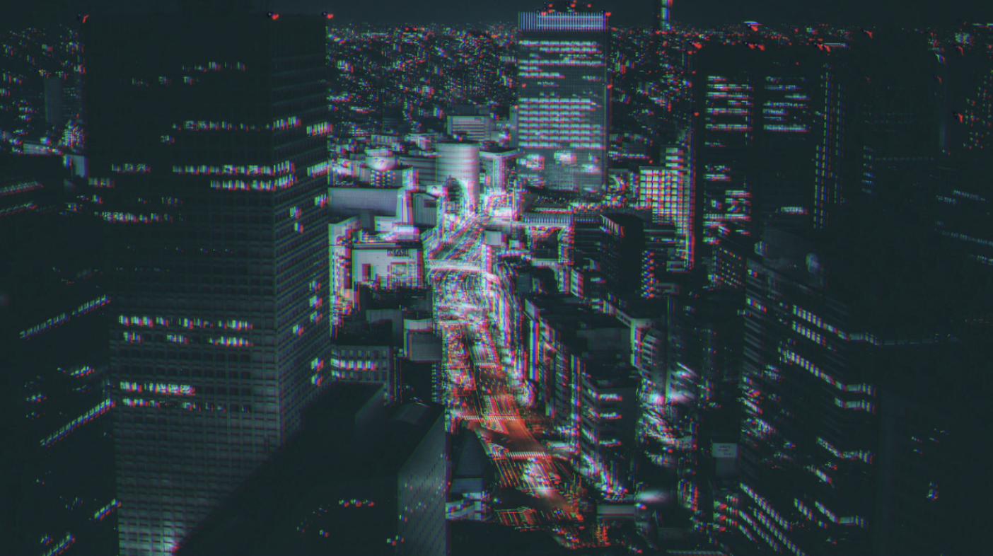
fault
How to achieve glitching is to overlap the same picture, cut off a part, and then transfer.
.glitch {
  ...
  &::before,
  &::after,
  .channel {
    background: inherit;
    background-size: cover;
    bottom: 0;
    left: 0;
    position: absolute;
    right: 0;
    top: 0;
  }

  &::before {
    content: "";
  }

  &::after {
    content: "";
  }
  ...
}
Use a pseudo element to layer the same image (for example, a div).
.glitch {
  ...

  &::before {
    clip-path: polygon(
      0 20%,
      100% 20%,
      100% 30%,
      0 30%
    );
    transform: translate(5%, 0.5%);
    content: "";
  }

  &::after {
    clip-path: polygon(
      0 60%,
      100% 60%,
      100% 65%,
      0 65%
    );
    transform: translate(-5%, -0.5%);
    content: "";
  }
  ...
}
Let's try to display the fault in a static state. Clip path () is used to crop the image.
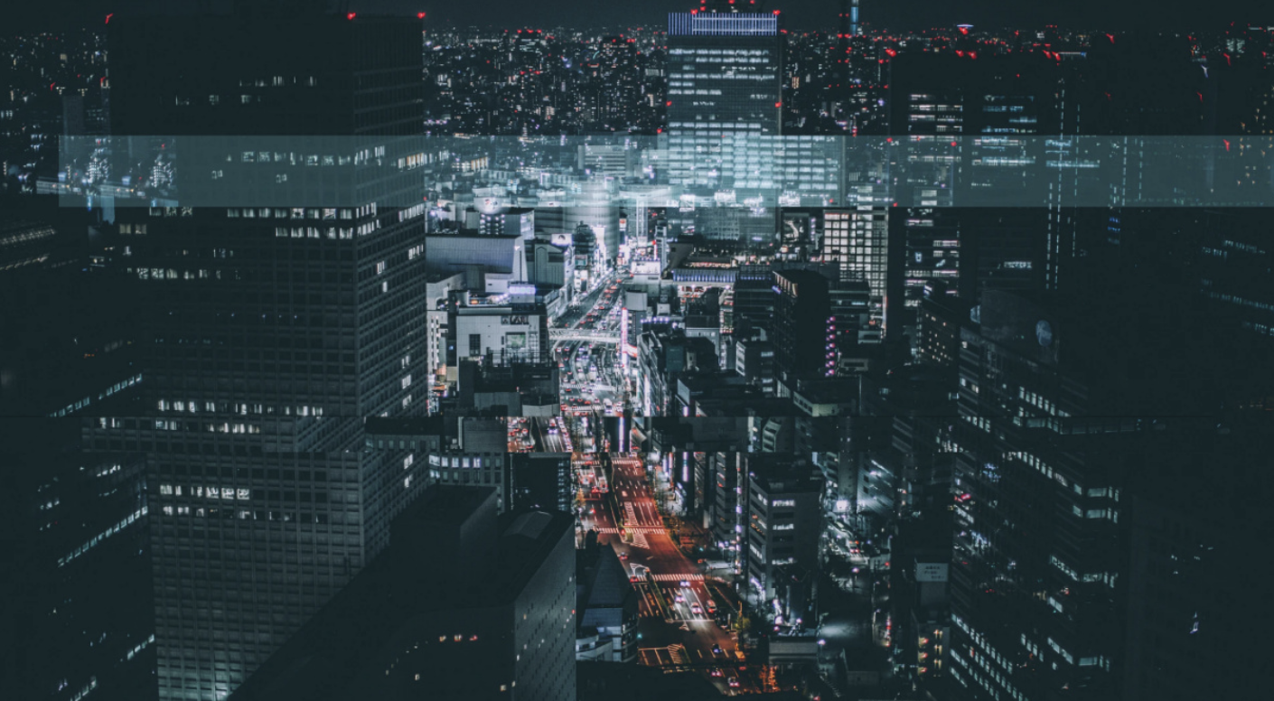
The previous is under the RGB layer, and the RGB layer has mix blend mode: sreen;, So only that part of the image is bright. I think it's very abrupt.
The back is ugly, but there is a small part of the image slightly wrong at the bottom of the middle.
These are just two pictures, but if you often move them and resize them, plus RGB displacement, there will be quite a lot of faults. Of course, you can add more by using div, etc.
Fault animation
@mixin glitch($name) {
  @keyframes glitch-#{$name} {
    @for $i from 0 to $glitch-frequency {
      $left: 0%;
      $right: 100%;
      $top: rand(0, 90) * 1%;
      $bottom: $top + rand(1, 10) * 1%;

      #{$i * $glitch-interval} {
        clip-path: polygon(
          $left $top,
          $right $top,
          $right $bottom,
          $left $bottom
        );
        transform: translate(
          #{rand(-8, 8) * 1%},
          #{rand(-0.5, 0.5) * 1%}
        );
      }
    }

    #{$glitch-duration}, 100% {
      clip-path: none;
      transform: none;
    }
  }

  animation: glitch-#{$name} $animation-duration linear infinite alternate both;
}
As with RGB displacement, a clutter is created.
.glitch {
  ...

  &::before {
    @include glitch(before);
    clip-path: polygon(
      0 20%,
      100% 20%,
      100% 30%,
      0 30%
    );
    transform: translate(5%, 0.5%);
    content: "";
  }

  &::after {
    @include glitch(after);
    clip-path: polygon(
      0 60%,
      100% 60%,
      100% 65%,
      0 65%
    );
    transform: translate(-5%, -0.5%);
    content: "";
  }
  ...
}
All you have to do is include it in the pseudo element, and then you're done.
summary
If you make the animation in an infinite cycle as in the demonstration, it may make the audience uncomfortable, so you may have to consider the dose. However, you can use CSS to apply mutation and RGB displacement effects, which means you can easily use it as a mouse over effect.
source code
<div class="glitch" style="background-image: url(https://images.hdqwalls.com/wallpapers/rolls-royce-black-badge-ghost-2021-4k-cd.jpg);">
  <div class="channel r"></div>
  <div class="channel g"></div>
  <div class="channel b"></div>
</div>
@function rand($min, $max) {
  @return random() * ($max - $min) + $min;
}

$animation-duration: 3s;
$glitch-duration: 20%;
$glitch-frequency: 10;
$glitch-interval: $glitch-duration / $glitch-frequency;

@mixin rgb-shift($name) {
  @keyframes rgb-shift-#{$name} {
    @for $i from 0 to $glitch-frequency {
      #{$i * $glitch-interval} {
        transform: translate(
          #{rand(-2, 2) * 1%},
          #{rand(-0.5, 0.5) * 1%}
        );
      }
    }

    #{$glitch-duration}, 100% {
      transform: none;
    }
  }

  animation: rgb-shift-#{$name} $animation-duration steps(1, jump-end) infinite alternate both;
}

@mixin glitch($name) {
  @keyframes glitch-#{$name} {
    @for $i from 0 to $glitch-frequency {
      $left: 0%;
      $right: 100%;
      $top: rand(0, 90) * 1%;
      $bottom: $top + rand(1, 10) * 1%;

      #{$i * $glitch-interval} {
        clip-path: polygon(
          $left $top,
          $right $top,
          $right $bottom,
          $left $bottom
        );
        transform: translate(
          #{rand(-8, 8) * 1%},
          #{rand(-0.5, 0.5) * 1%}
        );
      }
    }

    #{$glitch-duration}, 100% {
      clip-path: none;
      transform: none;
    }
  }

  animation: glitch-#{$name} $animation-duration linear infinite alternate both;
}

body {
  margin: 0;
}

.glitch {
  background: #000 no-repeat center;
  background-size: 0;
  height: 100vh;
  position: relative;
  overflow: hidden;

  &::before,
  &::after,
  .channel {
    background: inherit;
    background-size: cover;
    bottom: 0;
    left: 0;
    position: absolute;
    right: 0;
    top: 0;
  }

  &::before {
    @include glitch(before);
    content: "";
  }

  &::after {
    @include glitch(after);
    content: "";
  }

  .channel {
    mix-blend-mode: screen;

    &::before {
      bottom: 0;
      content: "";
      display: block;
      mix-blend-mode: multiply;
      position: absolute;
      left: 0;
      right: 0;
      top: 0;
    }
  }

  .r {
    @include rgb-shift(r);

    &::before {
      background: #f00;
    }
  }

  .g {
    @include rgb-shift(g);

    &::before {
      background: #0f0;
    }
  }

  .b {
    @include rgb-shift(b);

    &::before {
      background: #00f;
    }
  }
}