preface:
Three buttons have been added in version 1.22 of fluent, including TextButton, OutlinedButton and elevated Button. Although the previous Button has not been abandoned, it is recommended to use the new Button.
Official website api entry: ButtonStyle
catalog:
More button entries (buttons with icons or just one icon)
Usage: they all use the same way
2. Long press event onLongPress?
backgroundColor?? Background color?
overlayColor?? Highlight color, the color when the button is focused, hovered, or pressed
shape? Shape - fillet radians can be set
More button entry (button with icon or just an icon)
Usage: they all use the same way
1,TextButton:
TextButton(
     child: Text("love you"),
     onPressed: () {},
);
effect:

2,OutlinedButton:
OutlinedButton(
     child: Text("love you"),
     onPressed: () {},
);
effect:

3,ElevatedButton
ElevatedButton(
     child: Text("love you"),
     onPressed: () {},
);
effect:

Attribute API:
1. Click event onPressed
ElevatedButton(
     child: Text("love you"),
     onPressed: () {
         print('I was clicked');
    },
);
2. Long press event onLongPress
ElevatedButton(
     child: Text("love you"),
     onLongPress?: () {
         print('I was long pressed');
    },
);
3. Properties:
- textStyle / / font
- backgroundColor / / background color
- / / groundcolor / / font
- overlayColor / / highlight color: the color when the button is focused, hovered, or pressed
- shadowColor / / shadow color
- elevation / / shadow value
- padding // padding
- minimumSize / / minimum size
- side / / border
- Shape / / shape
- mouseCursor / / when the cursor of the mouse pointer enters or hovers over [InkWell] of this button
- visualDensity / / compactness of button layout
- tapTargetSize / / the area in response to touch
- Duration of animation changes for animation duration / / [shape] and [elevation].
- enableFeedback / / whether the detected gesture should provide sound and / or tactile feedback. For example, on Android, clicking will produce a click sound. After feedback is enabled, long pressing will produce a short vibration. Generally, the default value of the component is true.
textStyle font
ElevatedButton(
          child: Text("love you"),
          style: ButtonStyle(
            textStyle: MaterialStateProperty.all(TextStyle(fontSize: 16)),                //typeface
          ),
          onPressed: () {
            print('I was clicked');
          },
        )
backgroundColor background color
ElevatedButton(
          child: Text("love you"),
          style: ButtonStyle(
            backgroundColor: MaterialStateProperty.all(Color(0xffEDFCF5)),                //background color
          ),
          onPressed: () {
            print('I was clicked');
          },
        )
foregroundColor font color
ElevatedButton(
          child: Text("love you"),
          style: ButtonStyle(
            foregroundColor: MaterialStateProperty.all(Color(0xff31C27C)),                //Font color
          ),
          onPressed: () {
            print('I was clicked');
          },
        )
Overlay color is a high bright color, and the color when the button is focused, hovered, or pressed
ElevatedButton(
          child: Text("love you"),
          style: ButtonStyle(
            overlayColor: MaterialStateProperty.all(Color(0xff31C27C)),                //Font color
          ),
          onPressed: () {
            print('I was clicked');
          },
        )
side border
ElevatedButton(
          child: Text("love you"),
          style: ButtonStyle(
            side: MaterialStateProperty.all(BorderSide(width: 1,color: Color(0xffffffff))),//frame
          ),
          onPressed: () {
            print('I was clicked');
          },
        )
shadowColor shadow color
ElevatedButton(
          child: Text("love you"),
          style: ButtonStyle(
            shadowColor: MaterialStateProperty.all(Colors.red),
          ),
          onPressed: () {
            print('I was clicked');
          },
        )
elevation shadow value
ElevatedButton(
          child: Text("love you"),
          style: ButtonStyle(
            elevation: MaterialStateProperty.all(10),                                     //Shadow value
          ),
          onPressed: () {
            print('I was clicked');
          },
        )
Shape shape - fillet radian can be set
(1) Prism. If you do not set the border, you can achieve the effect of fillet radian. Setting the border is prism
ElevatedButton(
          child: Text("Audit completed"),
          style: ButtonStyle(
            side: MaterialStateProperty.all(BorderSide(width: 1,color: Color(0xffCAD0DB))),//frame
            shape: MaterialStateProperty.all(BeveledRectangleBorder(borderRadius: BorderRadius.circular(8))),//Fillet radian
          ),
          onPressed: () {
            print('I was clicked');
          },
        )

ElevatedButton(
      child: Text("Study Report"),
      style: ButtonStyle(
        backgroundColor: MaterialStateProperty.all(Color(0xffFFF8E5)),                //background color
        foregroundColor: MaterialStateProperty.all(Color(0xffB85F23)),                //Font color
        overlayColor: MaterialStateProperty.all(Color(0xffFFF8E5)),                   //? High bright color
        shadowColor: MaterialStateProperty.all( Color(0xffffffff)),                  //Shadow color
        elevation: MaterialStateProperty.all(0),                                     //Shadow value
        textStyle: MaterialStateProperty.all(TextStyle(fontSize: 12)),                //typeface
        side: MaterialStateProperty.all(BorderSide(width: 1,color: Color(0xffffffff))),//frame
        shape: MaterialStateProperty.all(BeveledRectangleBorder(borderRadius: BorderRadius.circular(8))),//Fillet radian
      ),
      onPressed: () {},
    );
(2) Round

ElevatedButton(
          child: Text("Examine"),
          style: ButtonStyle(
            backgroundColor: MaterialStateProperty.all(Color(0xffffffff)),                //background color
            foregroundColor: MaterialStateProperty.all(Color(0xff5E6573)),                //Font color
            overlayColor: MaterialStateProperty.all(Color(0xffffffff)),                   //? High bright color
            shadowColor: MaterialStateProperty.all( Color(0xffffffff)),                  //Shadow color
            elevation: MaterialStateProperty.all(0),                                     //Shadow value
            textStyle: MaterialStateProperty.all(TextStyle(fontSize: 12)),                //typeface
            side: MaterialStateProperty.all(BorderSide(width: 1,color: Color(0xffCAD0DB))),//frame
            shape: MaterialStateProperty.all(
                CircleBorder(
                    side: BorderSide(
                      //Set interface effect
                      color: Colors.green,
                      width: 280.0,
                      style: BorderStyle.none,
                    )
                )
            ),//Fillet radian

          ),
          onPressed: () {},
        )
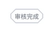
(3) Fillet radian (this is directly)

ElevatedButton(
          child: Text("Audit completed"),
          style: ButtonStyle(
            backgroundColor: MaterialStateProperty.all(Color(0xffffffff)),                //background color
            foregroundColor: MaterialStateProperty.all(Color(0xff5E6573)),                //Font color
            overlayColor: MaterialStateProperty.all(Color(0xffffffff)),                   //? High bright color
            shadowColor: MaterialStateProperty.all( Color(0xffffffff)),                  //Shadow color
            elevation: MaterialStateProperty.all(0),                                     //Shadow value
            textStyle: MaterialStateProperty.all(TextStyle(fontSize: 12)),                //typeface
            side: MaterialStateProperty.all(BorderSide(width: 1,color: Color(0xffCAD0DB))),//frame


            shape: MaterialStateProperty.all(
                StadiumBorder(
                    side: BorderSide(
                      //Set interface effect
                      style: BorderStyle.solid,
                      color: Color(0xffFF7F24),
                    )
                )
            ),//Fillet radian


          ),