Applet flex layout quick start
- Implementation of flex layout for applet
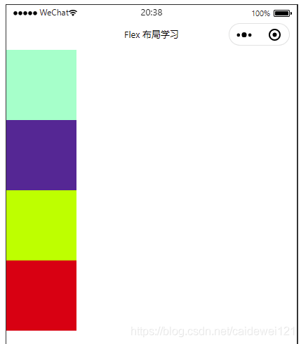
- 1, view default layout
- 2, Use flex to set horizontal elastic layout
- 3, Set vertical elastic layout with flex
- 4, Other parent properties
- 5, Child properties of flex layout
- 5, Summary
Implementation of flex layout for applet
- If you want a space to implement flex layout, you must set the flex style for its parent control
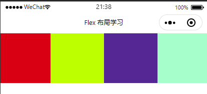
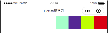
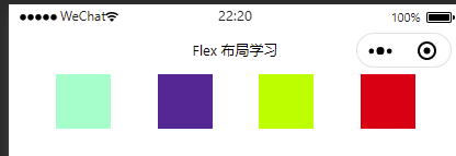
1, view default layout
index.wxml
<view class="container">
  <view class="s1">view>
  <view class="s2">view>
  <view class="s3">view>
  <view class="s4">view>
view>
index.wxss
.container {
  /* display: flex; */
  /* justify-content: space-evenly; */
  /* align-items: center; */
}
.s1 {

.s1 {
  width: 100px;
  height: 100px;
  background-color: aquamarine;
}
.s2 {
  width: 100px;
  height: 100px;
  background-color: rebeccapurple;
}
.s3 {
  width: 100px;
  height: 100px;
  background-color: greenyellow;
}
.s4 {
  width: 100px;
  height: 100px;
  background-color: red;
}


}
Realization effect
1.1 flex layout principle
Flex is the abbreviation of flexible Box, which means "elastic layout". It is used to provide maximum flexibility for box model. Any container can be specified as flex layout
- When we set the flex layout for the parent box, the float, clear and vertical align attributes of the child elements will be invalidated
- Telescopic layout = elastic layout = telescopic box layout = elastic box layout = flex layout
Elements with Flex layout become Flex container s, or containers for short. All its child elements automatically become container members and Flex items
Total: By adding the flex attribute to the parent container, you can control the position and arrangement of the child boxes
1.2 common attributes of flex parent
- Flex direction: sets the direction of the spindle
- Justify content: sets the arrangement of child elements on the spindle
- Flex Wrap: sets whether child elements wrap
- Align content: sets the arrangement mode (multiple lines) of child elements on the side axis
- Align items: sets the arrangement of child elements on the side axis (single line)
- Flex flow: composite attribute, which is equivalent to setting both flex direction and flex wrap
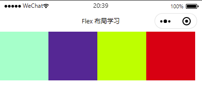
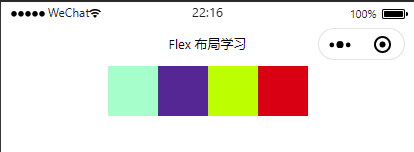
2, Use flex to set horizontal elastic layout
Set the above parent container property display property to flex layout
index.wxss
.container {
  display: flex;
}
index.wxml remains unchanged
2.1 direction axis of flex layout
- The Flex layout has two directional axes: the horizontal main axis and the vertical cross axis
- The Flex layout defaults to the horizontal spindle
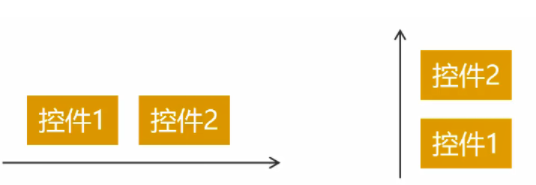
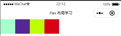
2.1.1 horizontal spindle layout row (horizontal right)
Set the value of flex direction in the parent container
- flex-direction: row; (default)
- flex-direction: row-reverse; (spindle reverse)
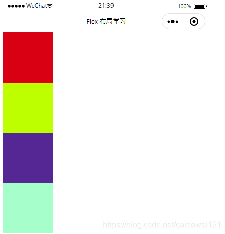
2.1.2 vertical side axis layout column (horizontal down)
- flex-direction: column; (vertical)
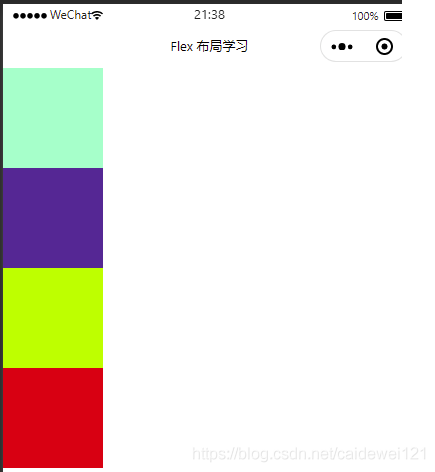
- flex-direction: column-reverse; (vertical reverse)
2.2 justify content attribute in Flex
Here, change the size of the box and set the spindle to row. If you want to try a variety of effects, you can modify the spindle direction by yourself
.container {
  display: flex;
  flex-direction: row; // Set default layout

}

.s1 {
  width: 50px;
  height: 50px;
  background-color: aquamarine;
}
.s2 {
  width: 50px;
  height: 50px;
  background-color: rebeccapurple;
}
.s3 {
  width: 50px;
  height: 50px;
  background-color: greenyellow;
}
.s4 {
  width: 50px;
  height: 50px;
  background-color: red;
}
2.2.1 flex start left center layout
Set the attribute of justify content of the parent container to flex start, because the applet defaults to flex start
Flex start and initial have similar effects
.container {
  display: flex;
  flex-direction: row;
  justify-content: flex-start;
}
2.2.2 flex end right center layout
.container {
  display: flex;
  flex-direction: row;
  justify-content: flex-end;
}
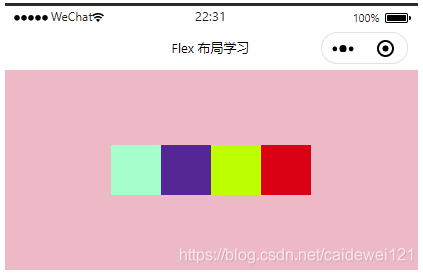
2.2.3 center horizontal center layout
.container {
  display: flex;
  flex-direction: row;
  justify-content: center;
}
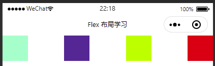
2.2.4 layout at both ends of space between
.container {
  display: flex;
  flex-direction: row;
  justify-content: space-between;
}
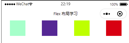
2.2.5 space around layout
.container {
  display: flex;
  flex-direction: row;
  justify-content: space-around;
}
2.2.6 space evenly layout
.container {
  display: flex;
  flex-direction: row;
  justify-content: space-evenly;
}
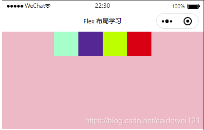
3, Set vertical elastic layout with flex
First, we need to modify the style of the parent container:
wxss:
.container {
  display: flex;
  flex-direction: row;
  justify-content: center;
  height: 200px;
  background-color: pink;
}
design sketch
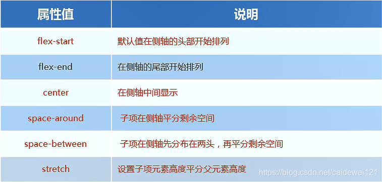
3.1 align-items
Applicable to single line, the attribute values are as follows:
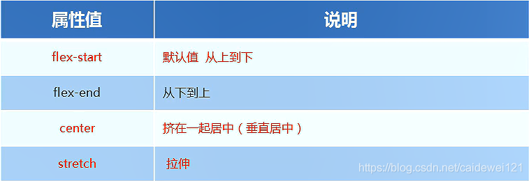
3.1.1 use align items to set flex start
This is also the default
wxss:
.container {
  display: flex;
  flex-direction: row;
  justify-content: center;
  height: 200px;
  background-color: pink;
  align-items: flex-start;
}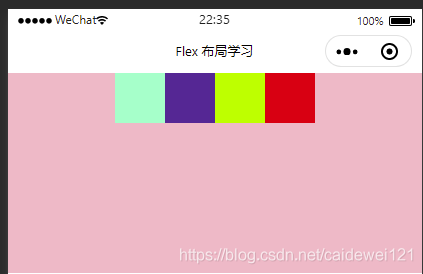
3.1.2 use align items to set center (common!!!)
Set the box horizontally and vertically centered (just content and align items are both set to center)
wxss:
.container {
  display: flex;
  flex-direction: row;
  justify-content: center;
  height: 200px;
  background-color: pink;
  align-items: center;
}
design sketch:
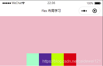
3.1.3 use align items to set the low end alignment of flex end
wxss:
.container {
  display: flex;
  flex-direction: row;
  justify-content: center;
  height: 200px;
  background-color: pink;
  align-items: flex-end;
}
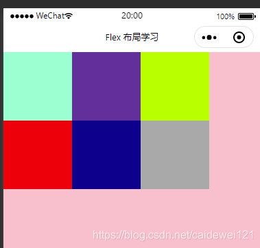
3.2 align content sets the arrangement method (multiple lines) of child elements on the side axis
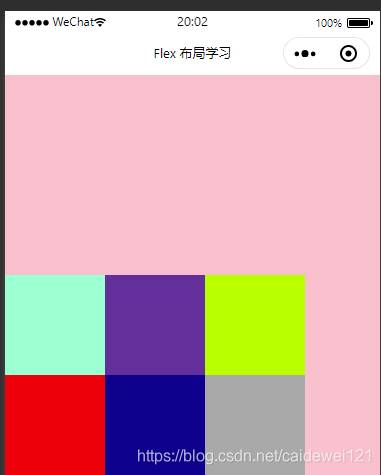
Let's draw six grids first, which is only suitable for multiple lines index.wxml
<view class="container">
	<view class="s1">view>
	<view class="s2">view>
	<view class="s3">view>
	<view class="s4">view>
  <view class="s5">view>
	<view class="s6">view>
view>
index.wxss
.container {
  display: flex;
  background-color: pink;
  width: auto;
  height: 400px;
  flex-wrap: wrap;
}

.s1 {
  width: 200rpx;
  height: 200rpx;
  background-color: aquamarine;
}

.s2 {
  width: 200rpx;
  height: 200rpx;
  background-color: rebeccapurple;
}

/**
Other boxes are omitted. The style is the same and the color is different
*/
effect
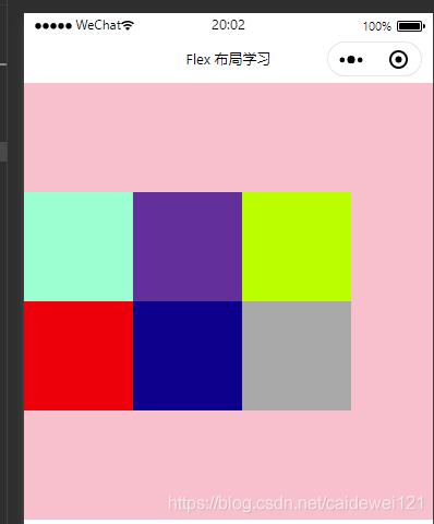
3.2.1 flex start attribute
When we set the parent container align content to flex start, the effect is as follows
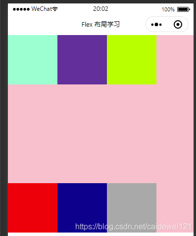
3.2.2 flex end effect
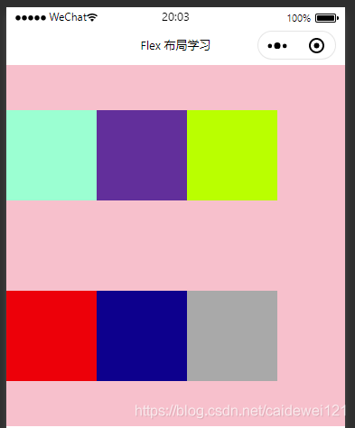
3.2.3 center
3.2.4 space-between
3.2.5 space-around
3.3 differences between align items and align content
- Align items is applicable to single line cases, with only top, bottom, center and stretch
- Align content is applicable to the case of line feed (multiple lines) (invalid in the case of single line). Attribute values such as upper alignment, lower alignment, centering, stretching and evenly allocating the remaining space can be set.
- The summary is to find align items in a single line and align content in multiple lines
4, Other parent properties
4.1 flex growth usage
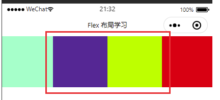
We found that there is a little gap in the above layout, so we can use flex growth to fill this gap. For example, we set the flex growth attribute in the purple frame, so as to support the redundant part.
wxss
.s2 {
  width: 100px;
  height: 100px;
  flex-grow: 1;
  background-color: rebeccapurple;
}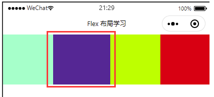
We can also set the flex growth attribute in other boxes, so that the box will divide the space equally
4.1 flex wrap sets whether child elements wrap
- flex-wrap: nowrap; Default no line breaks
- flex-wrap: wrap; It will be arranged in another row By default, the flex layout does not wrap lines by default. If not, the width of the box element will be reduced.
5, Child properties of flex layout
5.1 align-self
Controls how children are arranged on the side axis
You can run a single project with different alignment from other projects, and you can override the align items attribute. The default is auto, which means that it inherits the align items attribute of the parent class. If there is no parent element, it is equivalent to strtch
Like this, we set the parent attribute to align items: Flex start, and set align self: Flex end for each grid on the 4th; The following effects will appear
5, Summary
- Event binding is divided into bubbling event and blocking event. bind is bubbling event by default and catch is blocking event. Business logic should be analyzed clearly
- Wxss style global style (template) and local style (wxss)
- WXSS layout, display flex
- Horizontal layout: justify content has five attributes, which are
- Flex start in the upper left corner
- Flex end in the upper right corner
- Flex center centering
- Both ends of space around are left blank and evenly distributed
- If there are multiple squares on both sides of the head end of space between, they will be next to both ends
- Uniform distribution of space evenlt spindle
- Vertical layout: align items also has five attributes, which are
- Flex start upper left
- Flex end bottom left
- Center left center
- Stretch stretch
- baseline alignment
- flex layout, modifying axis parameters
- row from left to right
- Row reverse right to left
- column left, top to bottom
- Column reverse left, bottom to top
- Horizontal layout: justify content has five attributes, which are