Today, a circular progress bar with progress is implemented by customizing the View. The final effect is shown in the following figure: 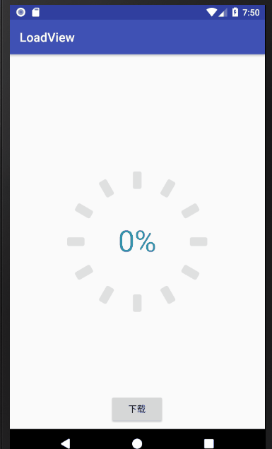
Now let's talk about the design idea: first of all, this progress bar can customize the number of small rounded rectangles, the size of small rounded rectangles, the angle of small rounded rectangles, the color of unfinished progress, the color, text size, text color and circle radius when the progress is completed, so you need to customize these parameters; then how to draw this round progress? We need to draw a small rounded rectangle first, and then rotate the canvas to draw a rectangle. As shown in the figure, there are 12 small rounded rectangles, each rotating 360 / 12 = 30 degrees, drawing a small rounded rectangle, a total of 12. Then draw the progress value in the middle, and draw the progress value in the middle. It mainly needs to calculate the position of the text, which will be introduced later. Next, the implementation process is explained in detail through the code. The code is as follows:
import android.content.Context;
import android.content.res.TypedArray;
import android.graphics.Canvas;
import android.graphics.Paint;
import android.graphics.RectF;
import android.graphics.Typeface;
import android.support.annotation.FloatRange;
import android.support.annotation.Nullable;
import android.text.TextPaint;
import android.util.AttributeSet;
import android.util.Log;
import android.view.View;
/**
* Created by Liu xinon April 27, 2018
*/
public class LoadView extends View {
//Color value already load ed
private int mHasLoadColor;
//No color value for load
private int mNormalLoadColor;
//The width of a small rectangle
private int mRectangleWidth;
//Height of small rectangle
private int mRectangleHeight;
//Number of small rectangles
private int mRectangleNum;
//Small rectangle circle angle
private int mRectangleRadius;
//Inner radius size
//Inside radius refers to the size of the block not included
private int mInnerRadius;
//Outer radius
private int mOuterRadius;
//Text size
private int mTextSize;
//Paint brush
private Paint mPaint;
//A brush for writing
private TextPaint mTextPaint;
//Small rectangle
private RectF mRectF;
private Context mContext;
//Percentage string
private String mPercentStr;
//Percentage
private float mPercent;
public LoadView(Context context) {
this(context, null);
}
public LoadView(Context context, @Nullable AttributeSet attrs) {
this(context, attrs, 0);
}
public LoadView(Context context, @Nullable AttributeSet attrs, int defStyleAttr) {
super(context, attrs, defStyleAttr);
init(context, attrs, defStyleAttr);
}
private void init(Context context, AttributeSet attrs, int deStyleAttr) {
mContext = context;
TypedArray typedArray = mContext.obtainStyledAttributes(attrs, R.styleable.LoadView, deStyleAttr, 0);
//Here are the default values for some custom parameters
mHasLoadColor = mContext.getResources().getColor(R.color.color_3398ab);
mNormalLoadColor = mContext.getResources().getColor(R.color.color_e0e0e0);
mRectangleWidth = dipToPixels(mContext, 14);
mRectangleHeight = dipToPixels(mContext, 28);
mRectangleNum = 12;
mInnerRadius = dipToPixels(mContext, 85);
mTextSize = dipToPixels(mContext, 48);
mRectangleRadius = dipToPixels(mContext, 3);
mPercentStr = "0%";
mPercent = 0f;
if (typedArray != null) {
//Read these parameter settings from xml
mHasLoadColor = typedArray.getColor(R.styleable.LoadView_HasLoadColor, mHasLoadColor);
mNormalLoadColor = typedArray.getColor(R.styleable.LoadView_NormalLoadColor, mNormalLoadColor);
mRectangleWidth = typedArray.getDimensionPixelSize(R.styleable.LoadView_RectangleWidth, mRectangleWidth);
mRectangleHeight = typedArray.getDimensionPixelSize(R.styleable.LoadView_RectangleHeight, mRectangleHeight);
mRectangleNum = typedArray.getInteger(R.styleable.LoadView_RectangleNum, mRectangleNum);
mInnerRadius = typedArray.getDimensionPixelSize(R.styleable.LoadView_InnerRadius, mInnerRadius);
mTextSize = typedArray.getDimensionPixelSize(R.styleable.LoadView_TextSize, mTextSize);
mRectangleRadius = typedArray.getDimensionPixelSize(R.styleable.LoadView_RectangleRadius, mRectangleRadius);
typedArray.recycle();
}
//The outer radius is equal to the user set inner radius plus the height of the small rectangle
mOuterRadius = mInnerRadius + mRectangleHeight;
//Here is the RetcF needed to draw the first circular rectangle. It is determined by the coordinates of the upper left corner and the lower right corner,
// Here, the coordinates of the upper left corner (mOuterRadius - mRectangleWidth / 2f,0),
//The coordinates of the lower right corner (mOuterRadius + mRectangleWidth / 2f, mRectangleHeight);
mRectF = new RectF(mOuterRadius - mRectangleWidth / 2f, 0, mOuterRadius + mRectangleWidth / 2f, mRectangleHeight);
mPaint = new Paint();
mPaint.setColor(mNormalLoadColor);
mPaint.setAntiAlias(true);
mPaint.setStyle(Paint.Style.FILL);
mTextPaint = new TextPaint();
//You can also set the font of the text here. I have removed it
/*try {
Typeface typeface = Typeface.createFromFile("fonts/MyriadPro-Bold.otf");
mTextPaint.setTypeface(typeface);
} catch (Exception e) {
e.printStackTrace();
}*/
mTextPaint.setTextSize(mTextSize);
mTextPaint.setColor(mHasLoadColor);
}
private int dipToPixels(Context context, float dip) {
final float SCALE = context.getResources().getDisplayMetrics().density;
float valueDips = dip;
int valuePixels = (int)(valueDips * SCALE + 0.5f);
return valuePixels;
}
/**
*For external calls
* Please call in the main thread to set the progress from 0 to 1
* @param percent
*/
public void setPercent(@FloatRange(from=0.0, to=1.0) float percent){
this.mPercent=percent;
this.mPercentStr=Math.round(percent*100)+"%";
invalidate();
}
@Override
protected void onMeasure(int widthMeasureSpec, int heightMeasureSpec) {
//Forced width height, invalid setting width height in xml file
//Set the size according to the radius and small rectangle size
int defaultSize = 2 * (mInnerRadius + mRectangleHeight);
setMeasuredDimension(defaultSize, defaultSize);
}
@Override
protected void onDraw(Canvas canvas) {
int hasDownCount = 0;//How many loaded rectangles do you need to draw to convert the downloaded percentage
hasDownCount = Math.round(mPercent * mRectangleNum);//Only round
//Save the state of the canvas before rotating
canvas.save();
//Required angle for each rotation
float degress = 360.0f / mRectangleNum;
for (int i = 0; i < mRectangleNum; i++) {
if (hasDownCount > i) {
//Loaded colors
mPaint.setColor(mHasLoadColor);
} else {
//Color without load
mPaint.setColor(mNormalLoadColor);
}
//round rectangle
canvas.drawRoundRect(mRectF, mRectangleRadius, mRectangleRadius, mPaint);
//Rotate the canvas at the center. Here, imagine you draw on the paper with a pen in reality. When you draw one, you will rotate the paper, and you will know
canvas.rotate(degress, mOuterRadius, mOuterRadius);
}
//Go back to the previous canvas state
canvas.restore();
//Text width
float textWidth = mTextPaint.measureText(mPercentStr);
//Pay attention to the calculation of height
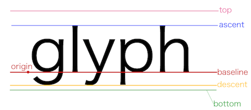
//drawText is based on the BaseLine of the text
//So the steps to calculate the height: half of the descent ascent minus descent; the result
// It's the offset of Baseline from the center dot, and the radius is the height
//Not yet? Look at the picture below
Paint.FontMetrics fontMetrics = mTextPaint.getFontMetrics();
float diffBaseLine = (-(fontMetrics.ascent + fontMetrics.descent)) / 2;
//By default, x is the position of the left side of the string on the screen. If paint.setTextAlign(Paint.Align.CENTER) is set, that is the center of the character, y is the position of the baseline on the screen
canvas.drawText(mPercentStr, mOuterRadius - textWidth / 2, mOuterRadius + diffBaseLine, mTextPaint);
}
}
Code uploaded, link address LoadView