Catalogue of series articles
Three articles introduction CSS (I)
Three articles introduction CSS (II)
Three articles introduction CSS (III)
I css inheritance
1. Style inheritance
In the last article, we have learned about css. We know that css is actually a tool for finding corresponding tags and modifying the contents of tags.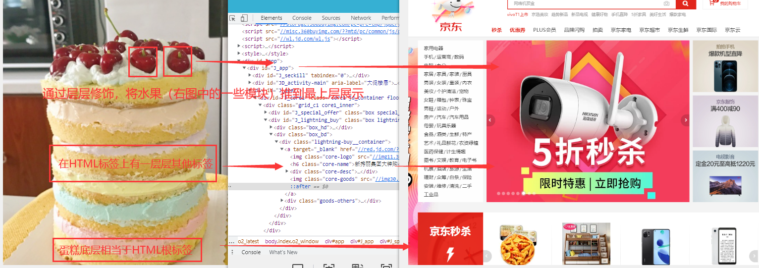
We have learned about tags. How to find the tags you want to modify step by step has been learned in the selector of the last article.
When we modify each label, we will find that most of the time, the modification of a label (a layer of cake) is the same in its child label (the upper layer). If you keep repeating these tasks, you will be very stunned. Therefore, adhering to the idea that lazy people change the world, we can understand what inheritance in css is for.
To save trouble
Just as a son can inherit his father's inheritance, in CSS, the styles on the ancestor elements will also be inherited by his descendant elements,
Using inheritance, we can set some basic styles to ancestor elements, so that all descendant elements will automatically inherit these styles, so we don't have to set them again.
example:
Next, we only modify the background color of div without operating on the p tag. In the effect, the p tag inside div also has a yellow background
<div style="background-color: yellow;">
		<p>
			I am p Text in label
			<span>I am span Text in</span>
		</p>
</div>
			<span>I am p Extraelement span</span>
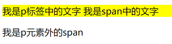
However, not all styles will be inherited by child elements. For example, background related styles will not be inherited, border related styles and location related styles
Officially, inheritance is a rule that allows styles to be applied not only to specific html tag elements, but also to their descendants.
2. Weight of selector
In the previous study, it can be noted that a label can be selected in many ways. When different selectors are used to select the same element and set the same style, there will be conflict. The final style defined by the selector is determined by the priority (weight) of the selector, and the one with higher priority will be displayed first.
Priority rules:
| selector | priority |
|---|---|
| inline style | 1000 |
| id selector | 100 |
| Class and pseudo class | 10 |
| element selector | 1 |
| General distribution* | 0 |
| Inherited styles | No priority |
It should be noted that when multiple selectors are included in the selector, the priorities of multiple selectors need to be added and then compared,
However, the priority calculation of the selector will not exceed its maximum order of magnitude. If the priority of the selector is the same, the later style will be used.
In other words, even if a tag is selected through 11 id selectors, the modification inline to the tag cannot be modified
The priority of the union selector is calculated separately
div , p , #p1 , .hello{}
You can add one at the end of the style! important, then this style will get the highest priority,
It will take precedence over all styles and even over inline styles, but try to avoid them in development! important
3.RGB color and pixel
The colors of the web pages we see are colorful. In reality, painters can mix different colors to call out the desired colors, while in css, we can color the labels we want to dye through RGB function( RBG is a color system).
rgb() function: Syntax: RGB(red,green,blue)
In the rgb function, we need to pass in three parameters between 0-255, which represent the brightness of red, green and blue lights. Through the mixing of different brightness of these three lights, we can get what kind of color we need
| parameter | describe |
|---|---|
| red | Red in the three primary colors, required, a number between 0 - 255 (and inclusive) |
| green | Green in the three primary colors, required, a number between 0-255 (and included) |
| blue | Blue in the three primary colors, required, a number between 0-255 (and included) |
example:
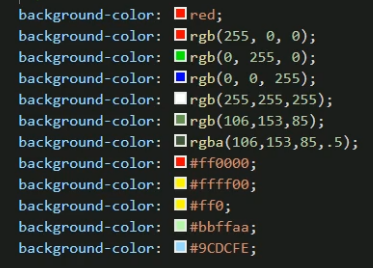
background-color: rgb(161,0,0);
background-color: rgb(100%,50%,50%);
background-color: #084098;
In the example, you can see that in addition to writing numbers directly, the rgb function also supports passing in percentages.
The third method is another css method to represent color: Hex color
Assignment by 6-bit hexadecimal: each bit is a value between 0-f. (hexadecimal: 0, 1, 2, 3, 4, 5, 6, 7, 8, 9, a, b, c, d, e, F, where a ~ f represents 10 ~ 15. These are called hexadecimal digits
color : #ff0000; 	// red
color : #00ff00; 	// green
color : #0000ff; 	// blue
color : #ffff00; 	// yellow
color : #000000; 	// black
color : #ffffff; 	// white
In addition, you can also assign values through color names: red, blue and yellow
color : red; //red
In addition, css has many ways to adjust the color, but at present, it is enough for us to master the rgb function
pixel
Pixel is a supplementary knowledge point, which can be skipped directly
Physical pixels:
 When we buy a computer, we will see that the computer supports 1920*1080 The resolution here is the concept of physical pixels. Whether it's a cell phone,television
 The screen is also a computer screen. There are small light-emitting devices on the screen. If your computer screen is 1920*1080 The resolution is, then
 There are 1920 light-emitting devices in the horizontal direction and 1080 light-emitting devices in the vertical direction, which are invisible to your naked eye.
 If you drop water on the screen, you will find that the color in the water drop is red, green and blue stripes(See the figure below),When a picture is displayed on the screen, each
 All light-emitting devices emit light(This is nonsense),Through the color mixing of light-emitting devices in different positions, a color picture is displayed. So we
 When talking about the resolution of mobile phones and smart TVs, they are just talking about their screens.
Logical pixels:
We often say, "the resolution of this picture is 1920*1080 In this case, what does the resolution of the picture mean?
Suppose you have a camera and one day you want to take a close-up of your wife's face. Your camera's internal camera is equipped with 1920 photosensitive devices in the horizontal direction,
If 1080 photosensitive devices are installed in the vertical direction, a total of 1920 times 1080 equals 2073600 photosensitive devices. When you close up your wife's face,
Each photosensitive device captures a point on the face, so 2073600 points are taken, that is, the picture of your wife's face is taken from this 2073600
 It consists of two points. The more than 2 million points are stored in the camera in the form of binary data streams of 0 and 1, and a binary data stream records the image
 Pixel information, translated into vernacular, is "the resolution of this beautiful photo is 1920*1080,There are 2073600 pixels ". The pixel information recorded here is logic
 Edit pixels. So when we talk about logical pixels, we are all talking about the logical pixel information contained in a picture and a video.
II Layout of web pages
1. Document flow
normal flow document flow
In the style inheritance part, we mentioned that the effect of label display can be regarded as a cake, and the effect is superimposed layer by layer. We can set styles for each layer through css, and users will only see the top layer of the display effect.
The lowest of these layers is called document flow (you can compare it to a cake tray)
Document flow is the basis of web pages. The elements we create are arranged in the document flow by default
For us, elements, that is, tags, mainly have two states:
- In document flow
- Not in document stream (out of document stream)
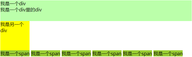
Characteristics of elements in document flow
	Block element
		1.Block elements will occupy one line in the document flow, and block elements will be arranged from top to bottom.
		2.The default width of a block element in the document stream is 100 times that of the parent element%
		3.The height of the block element in the document stream is extended by the content by default
	Inline element
		1.Inline elements only occupy their own size in the document flow and are arranged from left to right by default,
			If one line is not enough to hold all inline elements, change to the next line,
			Continue from left to right.
		2.In the document flow, the width and height of inline elements are expanded by content by default
		be careful: body It is also a layer element. When it is not specified, eg: div Default width and body identical
example:
<body>
		<div style="background-color: #bfa;">
			I am a div
			<div style="height: 50px;">I am a div Inside div</div>
		</div>
		<div style="width: 100px; height: 100px; background-color: #ff0; "> I'm another div < / div >

		<span style="background-color: yellowgreen;">I am a span</span>
		<span style="background-color: yellowgreen;">I am a span</span>
		<span style="background-color: yellowgreen;">I am a span</span>
		<span style="background-color: yellowgreen;">I am a span</span>
		<span style="background-color: yellowgreen;">I am a span</span>
		<span style="background-color: yellowgreen;">I am a span</span>
	</body>
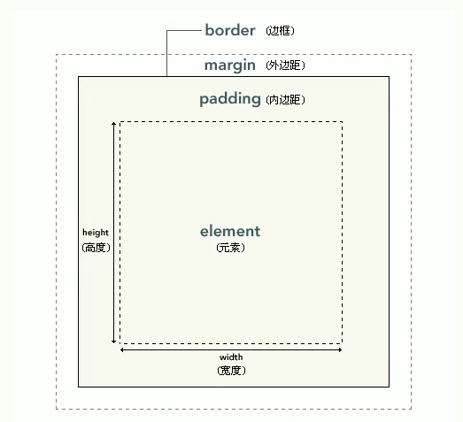
2. Box model
After a preliminary understanding of the concept of document flow, we will find that it is difficult to achieve beautiful pages like jd.com and Taobao just by stacking tags, and the next concept is the key to realizing beautiful pages and the cornerstone of css layout - "box model"
css sets all the elements in the page as a rectangular box in order to put the module in the specified position. As the name suggests, it is like a complete box in the real world, including four parts: margin, border, padding and actual content
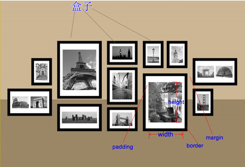
As shown in the picture above, the plane box model is actually more like a photo frame in reality. The distance between each photo frame and the surrounding photo frame is the outer margin
The content area is where the label element is located, and all child elements and text contents in the element are arranged in the content area
The size of the content area is set by the width and height attributes
- Width sets the width of the content area
- Height sets the height of the content area
.box{
	width: 300px;
	height: 300px;
}
It should be noted that width and height are only the size of the content area of the box, not the whole size of the box. The size of the visible box of the box is determined by the content area, inner margin and border
3. Box frame
Border attribute. The border belongs to the edge of the box, the part in the border belongs to the inside of the box, and the part out of the border is the outside of the box (including the outer margin)
The size of the border affects the size of the entire box
To set a border for an element, you must specify three styles
border-width:border width
border-color:Border color
border-style:The style of the border
Border width set border width:
Using border width, you can specify the width of four borders respectively
If four values are specified in border width,
Then the four values will be set to the upper right, lower left respectively, and set in a clockwise direction
If you specify three values, the three values are set to the top, left, right and bottom respectively
If you specify two values, the two values are set to the top, bottom, left and right respectively
If you specify a value, all four sides are the value
border-width:10px 20px 30px 40px ;
border-width:10px 20px 30px ;
border-width: 10px 20px ;
In addition to border width, CSS also provides four border XXX width
The value of xxx may be top right bottom left
Specifically used to set the width of the specified edge
border-left-width:100px ;
Border color sets the color of the border
Like width, color also provides styles in four directions, and colors can be specified separately
border-xxx-color
border-color: red;
border-color: red yellow orange blue;
border-color: red yellow orange;*/
border-color: red yellow;
Border style sets the border style
Optional values:
- none, default, no border
- Solid solid line
- Dotted dotted border
- dashed dotted line
- Double double line
Style can also specify the border style of the four sides respectively. The rule is consistent with the width,
At the same time, it also provides four styles of border XXX style to set four edges respectively
border-style: double;
border-style: solid dotted dashed double;
4. Abbreviation attribute
It can be seen that there are three attributes of the border of a box that need to be modified. If one is realistic in development, it will waste time, so css also provides the abbreviated attribute of the border: the abbreviated attribute of border sets all the border attributes in a declaration.
You can set the following properties in order:
- border-width
- border-style
- border-color
That is to say, using a border, you can set three border attributes of a box:
border:5px solid red;//A solid red border with a width of 5px, separated by spaces between attributes
If only one border of the box is set, the border attribute can be realized through (border border border)
- border-top
- border-right
- border-bottom
- border-left
border-top: 10px solid orange;
5. Inner and outer margins
Inner margin (padding)
The distance between the content area and the border is the inner margin. Like the border, the inner margin also has four directions
padding-top
padding-right
padding-bottom
padding-left
The inner margin will affect the size of the visible box of the box, and the background of the content element will extend to the inner margin,
The size of a box is determined by the content area, inner margin and border. When calculating the size of a box, these three areas need to be calculated together
Width of visible box = border-left-width + padding-left + width +padding-right + border-right-width
Height of visible width = border-top-width +padding-top + height + padding-bottom + border-bottom-width
/*Set the upper and inner margins*/
padding-top: 100px;
/*Set right inner margin*/
padding-right: 100px;
padding also has the attribute of abbreviation. You can specify the inner margins in four directions at the same time. The rules are the same as border width
padding: 100px;
padding: 100px 200px;
padding: 100px 200px 300px;
padding: 100px 200px 300px 400px;
Outer margin
- The outer margin does not affect the size of the box, but it affects the position of the box
- The outer margin can also be set to a negative value, and the corresponding element will move in the opposite direction
- The abbreviated attribute margin can also be used for the outer margin. The outer margin in four directions can be set at the same time. The rules are the same as padding
- The outer margin also has four directions:
margin-top  		Upper and outer margin, set a positive value, and the element itself will move downward
margin-right		The right outer margin, set by default, has no effect
margin-bottom  	Lower outer margin, set a positive value, and the element below the element itself will move downward
margin-left 		Left outer margin, set a positive value, and the element will move to the right
Since the elements in the page are placed on the left and on the top, note that when we set the upper and left outer margins, the position of the box itself will change,
If you set the right and lower outer margins, it will change the position of other boxes
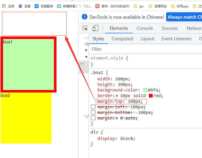
As in the example below, when the upper margin is set for box1, box1 itself will move downward, and box2 will move with the exclusive row of block elements:
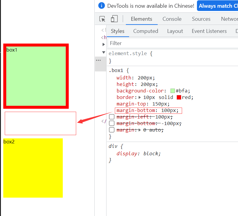
When we set the lower outer border, box1 itself will not move down, but box2 will move down:
auto: auto Fill
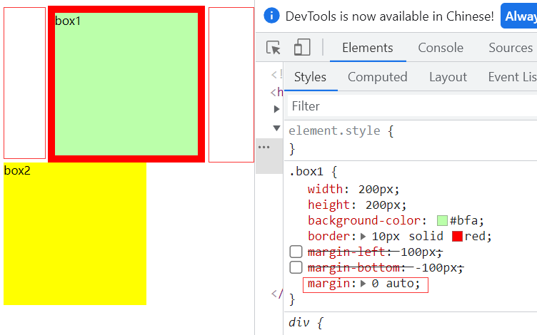
Margin can also be set to auto. Auto is generally only set to the margin in the horizontal direction. If you only specify that the margin of the left outer margin or the right outer margin is auto, the outer margin will be set to the maximum value. If the outer margin in the vertical direction is set to auto, the outer margin will be 0 by default
If left and right are set to auto at the same time, the outer margins on both sides will be set to the same value, which can make the element automatically center in the parent element. Therefore, we often set the left and right outer margins to auto to make the child element horizontally center in the parent element
6. Horizontal layout, vertical layout
After learning all the attributes of the box, we can know which parts are composed of the position of an element label;
Horizontal layout
There are seven attributes in the horizontal direction:
- margin-left
- border-left
- padding-left
- width
- padding-right
- border-right
- margin-right
Then the horizontal layout of an element in its parent element should meet the following equation
margin-left+border-left+padding-left+width+padding-right+border-right+margin-right=Parent element content area width
The above equation must be satisfied for any element. If the equation is not satisfied, it is called transition constraint, and the browser will automatically adjust it
Three of the seven values can be set to auto
width (auto by default), margin left, margin right
- If there is no auto in the seven values, the browser will automatically adjust the value of margin right to satisfy the equation
- If you set a width and an outer margin to auto, the width will be adjusted to the maximum, and the outer margin trying to be auto will automatically be 0
- If all three values are auto, the outer margin is 0
- If both outer edges are auto and the width is fixed, the outer margin is set to the same value
- Overflow condition margin is negative
Vertical layout
The vertical direction also has many attributes, but it is different from the horizontal direction,
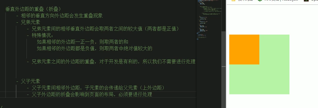
In a web page, the outer margins of adjacent vertical directions will overlap. The so-called outer margin overlap means that the adjacent outer margins between sibling elements will take the maximum value rather than the sum. If the vertical outer margins of parent and child elements are adjacent, the outer margins of child elements will be set to the parent elements, focusing on the adjacent elements
By default, the height of the parent element is spread by the content (content area elements including child elements)
The child elements are arranged in the content area of the parent element. If the size of the child element exceeds the parent element, the child element will overflow from the parent element. Use the overflow attribute to set how the parent element handles the overflow child elements
Optional values:
visible default: the child element overflows from the parent element and is displayed outside the parent element
hidden overflow content will be cropped and will not be displayed
Scroll generates two scroll bars, through which you can view the complete content
auto generates scroll bars as needed
	.box3{
		width: 200px;
		height: 100px;
		background-color: yellow;
		overflow-y: scroll;//Set overflow handling method
		padding-top: 100px;
	}
	.box4{
		width: 100px;
		height: 300px;
		background-color: yellowgreen;
	}
	<body>
		<div class="box3">
			<div class="box4"></div>
		</div>
	</body>
The effect is as follows:
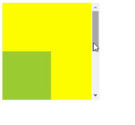
overflow-x and overflow-y handle the horizontal and vertical directions in the same way as overflow.
In addition, we can also use box sizing to set the calculation method of box size (the function of setting width and height)
Box sizing optional values:
Content box is the default value. Width and height are used to set the size of the content area
The width and height of the border box is used to set the visible box size of the whole box, that is, the set width and height refer to the total size of the content area + inner margin + border
box-sizing:border-box;
7. Box model of elements in the row, margin folding
Element in box
- Inline elements do not support setting width and height
- Padding can be set for inline elements, but the vertical padding will not affect the layout of the page
- Border can be set for in-line elements, and the vertical border will not affect the layout of the page
- Margin can be set for inline elements, and the vertical margin will not affect the layout
In line element setting padding does not fold in the horizontal direction, and the adjacent outer margins in the horizontal direction do not overlap, but sum
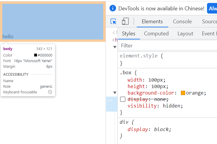
There are a lot less places to set in-line elements and reference block elements. Sometimes we need to set the format of in-line elements. At this time, we can use display and visibility to achieve the desired effect
display Used to set the type of element display
	Optional value:
		inline Set element as inline element block Set element to block element
		inline-block Set element as inline block element
				In line block, you can set the width and height without monopolizing one line
		table Set element as a table
		none The element is not displayed in the page
visibility Used to set the display state of elements
	Optional value:
		visible By default, the element is displayed normally in the page
		hidden The element is hidden from the page,But it still occupies the position of the page
If you don't understand the inline block, just treat the inline block element as a word
Use example:
a{
	background-color: #bfa;
	display: none;
	width: 500px;
	height: 500px;
}
.box{
	width: 100px;
	height: 100px;
	background-color: orange;
	visibility:hidden ;
}
<body>
	<div class="box"></div>
	<a href="#"> I'm a big hyperlink</a>
	<span>hello</span>
</body>
8. Remove the style and center the text
In order to have a better display effect when there is no style in the page, the browser has set some default margin and padding for many elements, which we don't need to use under normal circumstances. Therefore, we often need to remove the default margin and padding in the browser before writing styles.
*{
		margin: 0;
		padding: 0;
	}
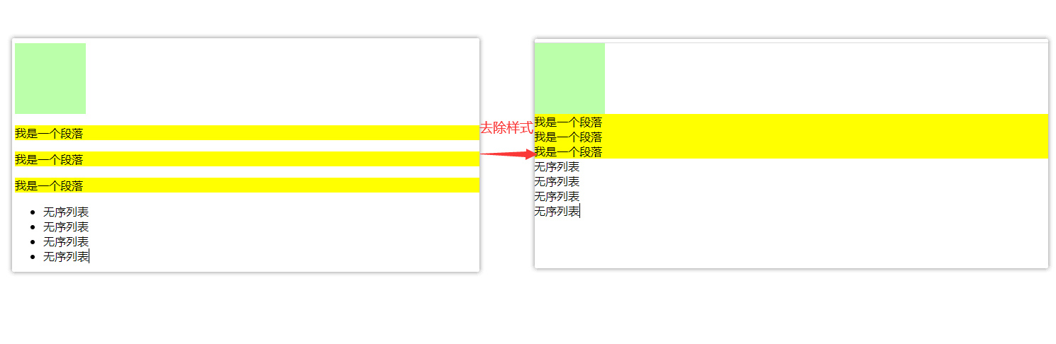
Text centered
To center a text vertically in the parent element, you only need to set the line height of the parent element to the same value as the height of the parent element
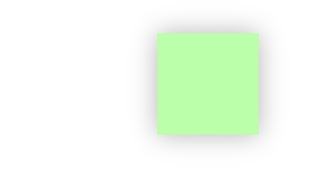
9. Shadow, contour, fillet
Shadows and outlines will not affect the page layout, but will appear above and below the original elements
Box shadow is used to set the shadow effect of elements. The shadow will not affect the page layout
- The first value horizontal offset sets the horizontal position of the shadow. A positive value moves to the right and a negative value moves to the left
- The second value, the vertical offset, sets the horizontal position of the shadow. A positive value moves downward and a negative value moves upward
- The third value is the blur radius of the shadow
- The fourth value is the color of the shadow
As like as two peas, outline is used to set up the outline of an element. The usage is exactly the same as that of border. The difference between the outline and the border does not affect the size of the visible frame.
example:
    <style type="text/css">
        .box{
            width: 200px;
            height: 200px;
            background-color: #bfa;
            box-shadow: 0px 0px 50px rgba(0, 0, 0, .3);//As we learned earlier in rgba, the fourth parameter represents transparency
        }

    </style>
</head>
<body>
    <div class="box"></div>
</body>
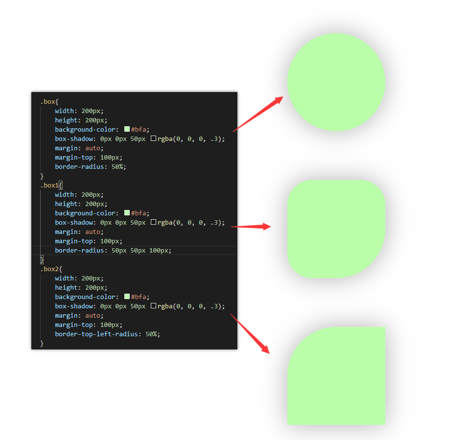
Border Radius Fillet sets the radius size of the circle. Border radius can specify the fillets of four corners respectively
- Four values top left, top right, bottom right, bottom left
- Three values: top left, top right / bottom left, bottom right
- Two values: upper left / lower right, upper right / lower left
You can also specify the fillet you want to set
- border-top-left-radius:
- border-top-right-radius:
- border-bottom-left-radius :
- border-bottom-right-radius :
When setting, you can also set the fillet to ellipse and separate the X/Y radius with /
border-radius: 20px /40px;
III location
1. Floating
In the example diagram of rounded corners above, we can see that the width of the three div s can not occupy a full row, but they are still arranged vertically. This is because the block elements mentioned earlier have the characteristic of exclusive row. If we have the need to arrange them in a row, we need to use floating
Use float to float elements away from the document flow
Optional values:
*none, the default value. The elements are arranged in the document flow by default
Left, the element will immediately leave the document flow and float to the left of the page
*Right, the element will immediately leave the document flow and float to the right of the page
*
*After setting the float for an element (the float attribute is a value other than none),
*The element will immediately leave the document flow. After the element leaves the document flow, the element below it will immediately move upward
*After the element floats, it will float to the top left or right of the page as much as possible,
*Until you encounter the border of the parent element or other floating elements
*If the floating element is a block element without floating, the floating element will not exceed the block element
*The floating elements will not exceed the sibling elements above him, up to one side