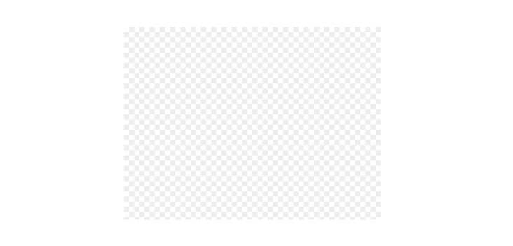
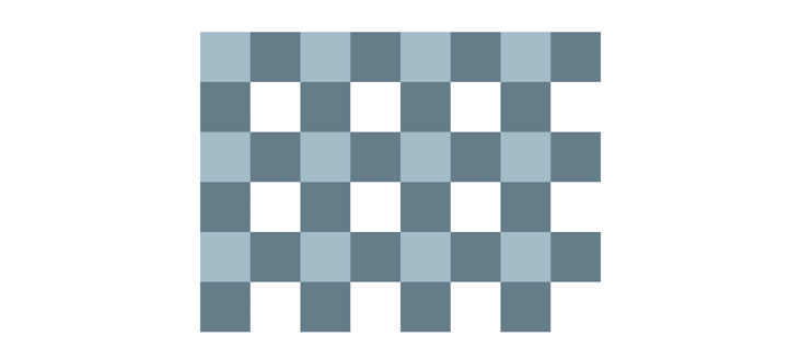
Students who often use photoshop are familiar with the background of such a transparent square. Some are called "chessboard" effect, as follows
This paper introduces three tips for drawing transparent squares with CSS
1, Linear gradient
Linear gradient can be said to be the first application to realize this effect. Of course, the implementation is also the most ingenious and complex. The principle is to draw two right triangles and then splice them, as follows
The smallest splicing unit is actually such a figure, a gradient in the 45deg direction
For the convenience of observation, the colors and dimensions of all the demonstrations below have been specially treated, the same below
.bg{
  background-image: linear-gradient(45deg, #eee 25%, transparent 25%, transparent 75%, #eee 75%)
}
Tiled, that's it

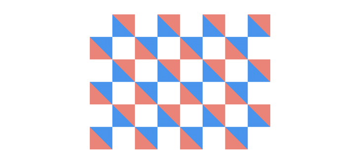
Then draw another copy of the same, staggered splicing
The following is a dynamic diagram to fully represent the implementation process

Here is the complete code
.bg{
    width: 400px;
    height: 300px;
    background-image: linear-gradient(45deg, #eee 25%, transparent 25%, transparent 75%, #eee 75%), linear-gradient(45deg, #eee 25%, transparent 25%, transparent 75%, #eee 75%);
    background-size: 16px 16px;
    background-position: 0 0, 8px 8px;
}
2, Repeating linear gradient
Repeating linear gradient can also achieve the "chessboard" effect, which is easier to understand, but requires a little extra skill
First draw a horizontal stripe pattern
.bg{
  background-image: repeating-linear-gradient(#eee 0 8px, transparent 0 16px)
}
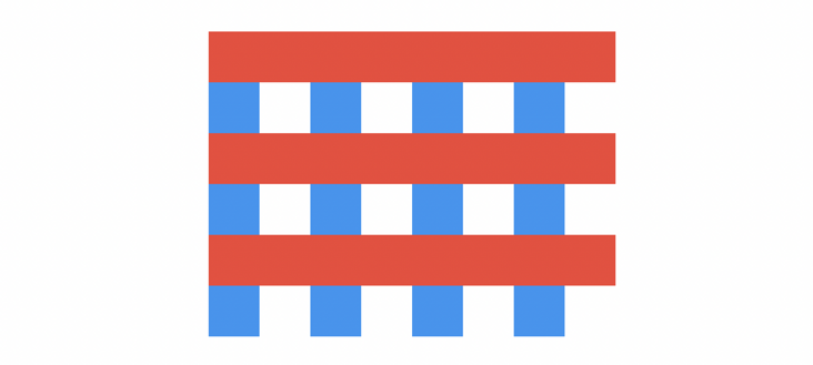
Then draw a vertical stripe
.bg{
  background-image: repeating-linear-gradient(#eee 0 8px, transparent 0 16px), repeating-linear-gradient(90deg, #eee 0 8px, transparent 0 16px)
}
If it's gray, it looks like this

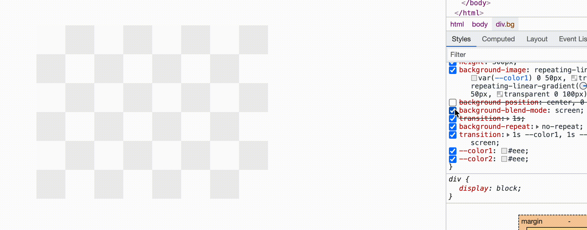
The interlaced stripes overlap. In this case, we can consider adding the background mixing mode (for the mixing mode, please refer to the article by Mr. Zhang Xinxu: Deep understanding of CSS mix blend mode filter screen blending mode ), the "screen" used here can filter out the black part. If it is a light gray, the remaining color is almost "white". As shown below, the "chessboard" effect comes out
.bg{
  background-blend-mode: screen;
}
The following is a dynamic diagram to fully represent the implementation process

Here is the complete code
.bg{
    width: 400px;
    height: 300px;
    background-image: repeating-linear-gradient(#eee 0 8px, transparent 0 16px), repeating-linear-gradient(90deg, #eee 0 8px, transparent 0 16px);
      background-blend-mode: screen;
}
Moreover, this method can achieve the effect of arbitrary inclination, such as

However, the mixed mode has many limitations. At present, there is no problem in this light gray. It may not be possible to change a color, such as this
This needs to be used according to the actual situation
3, Conc gradient
Conc gradient gradient can be regarded as the official solution (there is this chessboard case on MDN), but the compatibility is slightly poor
The following is a dynamic diagram to fully represent the implementation process

Here is the complete code
.bg{
    width: 400px;
    height: 300px;
    background-image: conic-gradient(#eee 0 25%, transparent 0 50%, #eee 0 75%, transparent 0);
      background-size: 16px 16px;
}
In fact, it can also be optimized with repeating conic gradient (the principle is the same, so it belongs to the same method). The latter two colors are repeated from the first two, so it can be realized with only two colors
.bg{
    width: 400px;
    height: 300px;
    background-image: repeating-conic-gradient(#eee 0 25%, transparent 0 50%);
      background-size: 16px 16px;
}
This should be regarded as the most streamlined of pure CSS schemes
4, You may not actually use these
Although CSS gradient can skillfully realize these patterns, it may not be done in normal work. Just cut the picture directly, for example, draw such an SVG directly in Fig

Then just use this picture directly
.bg{
    width: 400px;
    height: 300px;
    background-image: url('xxx.svg');
      background-size: 16px 16px;
}
This "chessboard" effect is completed in less than 10 seconds. It is simple and fast without compatibility problems.
Are CSS gradients chicken ribs?
Of course not! CSS gradient drawing is dynamic. You can dynamically adjust the color, size, or shape. These are not what static images can achieve. For example, I'm afraid you need to save multiple images, but for gradient, just change a color value
.bg{
    width: 400px;
    height: 300px;
    background-image: repeating-conic-gradient(var(--color) 0 25%, transparent 0 50%);
      background-size: 16px 16px;
}
.bg1{
  --color1: gray;
}
.bg2{
  --color1: yellow;
}
.bg1{
  --color1: blue;
}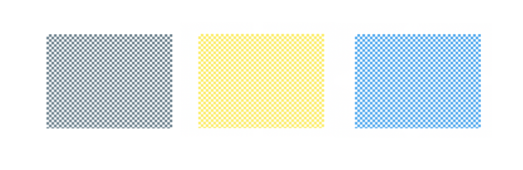
More importantly, learning to master gradients is very helpful to improve your CSS level. However, according to the actual situation, if you don't need to change some styles dynamically, SVG pictures are also a good method, but don't stop thinking 🤔.