Time series data analysis
Reference Zhihu article: time series data analysis 101, author: Li Jianyang
In addition, it also adds the evaluation method summary of classification and clustering + python implementation.
1 prepare and process time series data
1.1 preparing data sets
- Looking for ready-made data in open source data warehouse
- Construct time features from non display data to create time series data
1.2 finding the timeline
- Construct a time column with the time of the event record
- The time column is constructed by another time related element. For example, the driving distance in a data set is positively correlated with time. At this time, the time column can be constructed by distance.
- Take the order of physical trajectories as the time column. For example, some data in medical, weather and other fields are in the form of pictures. At this time, the time column can be extracted from the image.
1.3 possible problems
-
In which process is the time value generated and when
-
If we are dealing with historical data, we do not have a document description to clean the records, nor can we find someone to deal with the data flow to confirm the generation method of timestamp. At this time, we need to make some empirical investigation and inference, such as:
1) By comparing the data of different category characteristics (such as different users), we can understand whether some time pattern s are common
2) Use aggregate data analysis to understand time characteristics, such as whether the timestamp is a local time zone or a standard time zone, whether the time reflects user behavior or some external restrictions (network communication)
- What is a meaningful time scale? When we get a set of time series data, we should think about how to choose the time resolution, which has a great impact on the subsequent feature construction and the effectiveness of the model
1.4 cleaning data
1.4. 1. Missing value handling
The most common processing methods include filling and deleting, and filling is selected in most cases.
- Forward filling method
import pandas as pd
import numpy as np
import matplotlib.pyplot as plt
%matplotlib inline
pd.set_option('max_row',1000)
# Import US annual unemployment rate data
unemploy = pd.read_csv('data\\unemployment.csv')
unemploy.head()
# Build a column of randomly missing values
unemploy['missing'] = unemploy['rate']
# Randomly select 10% rows and manually fill in the missing values
mis_index = unemploy.sample(frac=0.1,random_state=999).index
unemploy.loc[mis_index,'missing']=None
# forward fill
unemploy['f_fill'] = unemploy['missing']
unemploy['f_fill'].ffill(inplace=True)
- Moving average method
unemploy['moveavg']=np.where(unemploy['missing'].isnull(),
                            unemploy['missing'].shift(1).rolling(3,min_periods=1).mean(),
                            unemploy['missing'])
- Interpolation method
# Linear interpolation, polynomial interpolation and cubic spline interpolation
unemploy['inter_lin']=unemploy['missing'].interpolate(method='linear')
unemploy['inter_poly']=unemploy['missing'].interpolate(method='polynomial', order=3)
unemploy['inter_poly']=unemploy['missing'].interpolate(method='spline', order=3)
1.4. 2 change data set time and frequency
The time axes from different data sources often cannot correspond one by one. At this time, the method of changing time and frequency is used for data cleaning. Since the frequency of actual measurement data cannot be changed, what we can do is to change the frequency of data collection, that is, down sampling and up sampling.
Down sampling
Downsampling refers to reducing the frequency of data collection, that is, the way to extract subsets from the original data.
Usage scenario:
-
The original resolution of the data is unreasonable: for example, there is a data recording the outdoor temperature, and the time frequency is once per second. We all know that the temperature will not change significantly at the second level, and the measurement error of the second level temperature data will even be greater than the fluctuation of the data itself. Therefore, this data set has a lot of redundancy. In this case, it may be more reasonable to take data every n elements.
-
Pay attention to the information of a specific season: if we are worried about seasonal fluctuations in some data, we can only select a season (or month) for analysis, for example, only select the data in January of each year for analysis.
-
Data matching: for example, you have two time series data sets, one with lower frequency (annual data) and one with higher frequency (monthly data). In order to match the two data sets for the next analysis, you can combine the high-frequency data, such as calculating the annual mean or median, so as to obtain the data set with the same time axis.
Up sampling
To some extent, up sampling is a way to obtain higher frequency data out of thin air. Using up sampling only allows us to obtain more data labels without adding additional information.
Usage scenario:
-
Irregular time series: used to deal with the problem of irregular time axis in multi table Association.
For example, there are two data, one records the time and quantity of donation, and the other records the time and code of public activities. At this time, we need to combine the data of the two tables, label each donation, and record the latest public activity before each donation. This operation is called rolling join.
-
Data matching: similar to the down sampling scenario, for example, we have a monthly unemployment rate data, which needs to be converted into daily data in order to match with other data. If we assume that new jobs generally start on the first day of each month, we can deduce that the daily unemployment rate of this month is equal to the unemployment rate of that month.
Through the above cases, we find that even in a very clean data set, because it is necessary to compare data with different scales from different dimensions, it is often necessary to use up sampling and down sampling methods.
1.4. 3 smooth data
In order to tell a more understandable story, smoothing is often performed before data analysis. Data smoothing is usually to eliminate some extreme values or measurement errors. Even if some extreme values themselves are true, but do not reflect the potential data pattern, we will smooth them out.
-
(weighted) moving average method
The simplest smoothing technique can give the same weight to data points, or give higher weight to data points that are closer to each other.
-
Simple exponential smoothing method
The difference from the former is that the attenuation method is different. As the name suggests, the weight of the nearest data point to the earliest data point decreases exponentially
Exponential smoothed value at time t:
S t = α ∗ x t + ( 1 − α ) ∗ S t − 1 S_t=\alpha*x_t+(1-\alpha)*S_{t-1} St= α ∗xt+(1− α) * ST − 1, smoothing coefficient α The larger the size, the greater the impact of the nearest neighbor's data
-
Holt Exponential Smoothing Method
By introducing an additional coefficient, the deficiency that exponential smoothing can not be applied to data with trend characteristics is solved, but it still can not solve the smoothing problem of data with seasonal changes.
-
Holt winters exponential smoothing method (three parameters: α Horizontal smoothing coefficient, β Trend smoothing coefficient, γ Seasonal smoothing coefficient)
A new coefficient is introduced again to solve the problem that Holt Exponential Smoothing cannot solve the problem of seasonal variation data. In short, it is realized by introducing trend coefficient and seasonal coefficient on the basis of exponential smoothing with only one smoothing coefficient. This technology is widely used in time series prediction (such as future sales data prediction).
python implementation: https://blog.csdn.net/u010665216/article/details/78051192?locationNum=11&fps=1
# Simple exponential smoothing
air['smooth_0.5']= air.Passengers.ewm(alpha =0.5).mean()
air['smooth_0.9']= air.Passengers.ewm(alpha =0.9).mean()
2 exploratory analysis (EDA)
Conventional methods: histogram observation of frequency distribution (series.hist()), scatter chart observation of correlation between different columns, broken line chart observation of trend change, etc
2.1 special methods for time series
For the time series data that completes data cleaning, the first question we want to ask is whether it reflects a stable system. The evaluation of stationarity is important because it lets us know to what extent historical data can be used to predict future data. After confirming the stationarity, we should then explore whether there are some internal dynamic relationships (such as seasonal changes) in the time series, also known as autocorrelation, which can explain how close the correlation between future data and historical data is. Finally, we need to ensure that the correlation we find is a real causal relationship rather than a false correlation.
2.1. 1 understand stationarity
Many statistical models of time series depend on the premise that the time series is stable. Generally speaking, a stable time series means that the time series has stable statistical values over a period of time, such as mean and variance. Because we have our own intuition about whether a data is stable, we should be careful not to rely too much on intuition and be deceived by intuition in the process of practice.
Therefore, we introduce some statistical hypothesis tests to test the stationarity of a time series data.
-
ADF Test
ADF Test is a kind of unit root test. Unit root is a feature that makes time series non-stationary. Technically, in the following formula, if alpha=1, we say that there is a unit root.
Y t = α Y t − 1 + β X e + ϵ Y_t=\alpha Y_{t-1}+\beta X_e+\epsilon Yt= α Yt−1+ β Xe+ ϵ, among Y t , Y t − 1 Y_t,Y_{t-1} Yt, Yt − 1 represents the time series values at time t and t-1, X e X_e Xe , represents an exogenous variable, ϵ \epsilon ϵ Represents the error term.
Intuitively, we can understand that the trend of the whole time series may be reversed only when alpha < 1. ADF test is the hypothesis test of alpha value. Its original hypothesis is alpha =1, that is, if the original hypothesis is true, the time series is non-stationary.
from statsmodels.tsa.stattools import adfuller

# Use ADF Test
result = adfuller(series, autolag='AIC')
print(f'ADF Statistic: {result[0]}')
print(f'n_lags: {result[1]}')
print(f'p-value: {result[1]}')
# ADF Statistic: 3.1451856893067363
# n_lags: 1.0
# p-value: 1.0
A p value of 1 means that the original hypothesis is not rejected, that is, there is a unit root and the time series is non-stationary.
deficiencies:
- It is not very effective to distinguish between near unit roots and unit roots
- When there are few data points, the problem of false positive is easy to occur
- Most tests do not detect all factors leading to non-stationary. For example, some tests only test whether one of the mean or variance is stable, and some tests only test the overall distribution. Therefore, when using any hypothesis test, we must first fully understand the characteristics of the data and the limiting factors of the test.
-
KPSS Test
The difference between KPSS and ADF is that the original assumption of KPSS is about stationary process, while the original assumption of ADF is about unit root.
result1 = adfuller(series2, autolag='AIC')
print(f'ADF Statistic: {result1[0]}')
print(f'p-value: {result1[1]}')
# ADF Statistic: -9.588680806555054
# p-value: 2.0639843020333296e-16
The p value is far less than 0.05, which means that the original assumption is rejected, that is, the time series is stable.
The importance of time series stationarity lies in:
- A large number of statistical models are based on the assumption of stationarity
- For a model applied to non-stationary time series, its accuracy and model index will change with the change of time series itself, resulting in the instability of the model itself.
- For a non-stationary time series, it can be made stationary by some simple transformations. log transform and square root transform are two common methods, which are suitable for non equal variance scenarios. In addition, the trend of time series can be eliminated by difference.
2.2 looking for autocorrelation
Autocorrelation is an important concept of time series, which means that the value of one time in the time series has a certain correlation with the value of another time. For example, if there is a daily updated temperature data, you may find that there is a certain correlation between the temperatures on May 15 and August 15 every year. If May 15 is hotter that year, the corresponding August 15 is hotter. Of course, there is another possibility that the correlation is close to 0. Knowing the temperature on May 15 will not give you any information about the temperature on August 15.
-
The autocorrelation function
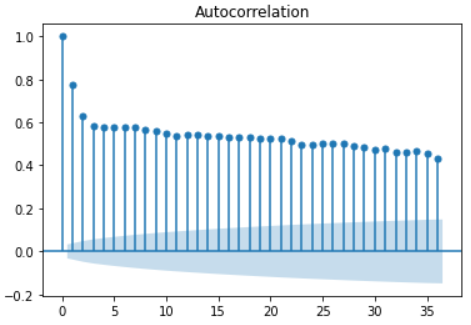
The autocorrelation (acf) function describes the correlation between a set of time series and a set of time series with an interval of n times in front of it.
Important nature:
- The acf value of periodic sequence has the same periodicity as the original sequence
- For the sum of several periodic sequences, the acf is calculated, and the acf of each periodic sequence is calculated respectively, and then added, the result is the same
- The acf value of all time series is 1 when the interval lag=0, that is, the time series has a complete positive correlation with itself
- A complete white noise sequence whose acf at any interval is approximately 0
- For any time series, the acf value is not significant at 5% confidence, and the critical value of the confidence interval is 0 ± 1.96 T − d ±\frac{1.96}{T-d} ±T−d1.96, where t is the sample size and D is the time interval. It can be concluded from the formula that the confidence interval is also increasing with the increase of time interval D, that is, the farther the distance is, the less credible the correlation is.
-
The partial autocorrelation function
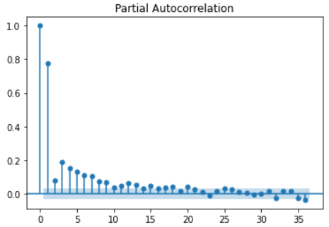
Partial autocorrelation (pacf) function describes the partial correlation between a group of time series and a group of time series with an interval of n times in front of it.
Partial correlation can be understood essentially as removing the interference between samples, that is, the correlation effect at an earlier time.
Important nature:
- For periodic time series, pacf will quickly approach 0, rather than showing periodicity like acf, so there is not much redundant information in pacf. This is very helpful for us to judge how long time series to collect in order to obtain enough information.
- The critical value of confidence interval of pacf is the same as that of acf
For example, the pacf for calculating time interval 3 removes the influence of samples with time interval less than 3, and only calculates the correlation between time series with time interval 3, because the influence of samples with time interval 1 and 2 has been calculated in the previous pacf function.
from statsmodels.graphics.tsaplots import plot_acf, plot_pacf
# Draw acf function
plot_acf(series)
plt.show()
# Draw pacf function
plot_pacf(series)
plt.show()
3 time series analysis method based on statistics
3.1 autoregressive model (AR)
The basis of autoregressive model is that the future can be predicted by history, that is, the data of time t can be expressed as a function of the previous time.
Basic formula: y t = b 0 + b 1 ∗ y t − 1 + e t y_t=b_0+b_1*y_{t-1}+e_t yt=b0+b1∗yt−1+et
This simplest model is called AR(1), where 1 in parentheses means that the time interval is 1, that is, the data value at the current time is calculated only considering the value of the previous time. It can be seen from the formula that it is very similar to the conventional linear regression. b 0 , b 1 b_0,b_1 b0 and b1 represent intercept term and regression coefficient respectively, e t e_t et ^ represents the error term at time t, where the error term is 0 and has a fixed variance.
It is extended to the nearest neighbor time value of p, which is called AR §, and its formula is:
y t = ϕ 0 + ϕ 1 ∗ y t − 1 + ϕ 2 ∗ y t − 2 + . . . + ϕ p ∗ y t − p + e t y_t=\phi_0+\phi_1*y_{t-1}+\phi_2*y_{t-2}+...+\phi_p*y_{t-p}+e_t yt=ϕ0+ϕ1∗yt−1+ϕ2∗yt−2+...+ϕp∗yt−p+et, ϕ \phi ϕ Represents a series of regression coefficients.
**Note: * * before using AR model, two assumptions need to be tested: correlation and stability.
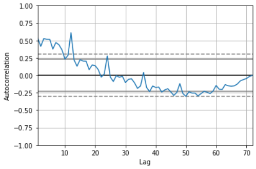
- Correlation test: Pandas provides autocorrelation_ The plot method is used to test the overall autocorrelation - lag using pandas_ The plot method checks the correlation of a single time interval
pd.plotting.autocorrelation_plot(sales_data['sales'])
# It can be seen from the autocorrelation diagram that when lag < = 12, the acf value is outside the critical point, showing a very strong correlation.
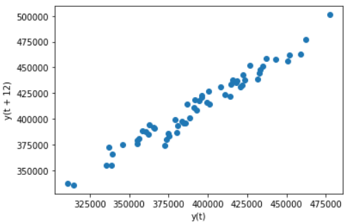
# Draw a scatter diagram with lag=12 as the strongest correlation in the above figure, and observe the correlation
pd.plotting.lag_plot(sales_data['sales'],lag=12)
-
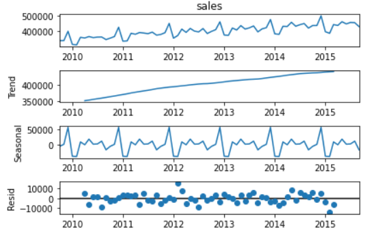
Check stationarity: use seasonal in stats models_ Decompose method decomposes trend items and seasonal items. ADF Test and KPSS Test
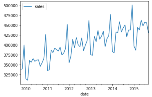
# There are obvious trend items (monotonic increase in Figure 2) and seasonal items (periodic change in Figure 3) in the data set
decomposed = seasonal_decompose(sales_data['sales'], model='additive')
x = decomposed.plot()
3.2 moving average model (MA)
The basis of moving average model (MA) is that the value of each time point is a function of the error items of historical data points, in which these error items are independent of each other.
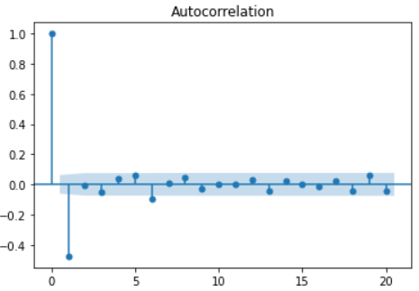
The formula of MA model is very similar to that of AR model, except that the historical value in the formula is replaced by the error item e of historical data. Because the error item e is independent of each other, in MA model, the value at time t is only related to the latest q values, and there is no autocorrelation with earlier data. If ACF diagram is drawn for Ma sequence, its autocorrelation relationship is suddenly truncated. The ACF map of AR sequence often decreases slowly.
Formula: y t = e t + θ 1 ∗ e t − 1 + θ 2 ∗ e t − 2 + . . . + θ p ∗ e t − p + μ y_t=e_t+\theta_1*e_{t-1}+\theta_2*e_{t-2}+...+\theta_p*e_{t-p}+\mu yt=et+θ1∗et−1+θ2∗et−2+...+θp∗et−p+μ
3.3 differential integrated moving average autoregressive model (ARIMA)
ARMA model formula: y t = e t + θ 1 ∗ e t − 1 + θ 2 ∗ e t − 2 + . . . + θ p ∗ e t − p + μ y_t=e_t+\theta_1*e_{t-1}+\theta_2*e_{t-2}+...+\theta_p*e_{t-p}+\mu yt=et+θ1∗et−1+θ2∗et−2+...+θp∗et−p+μ
ARMA model is a simple combination of AR and MA, including historical numerical items and error items. Because AR model requires the stationarity of time series, ARMA model also has this limitation, so we extend it to ARIMA model, and the concept of difference is a method to obtain time series. The most commonly used difference method is to calculate the difference between the current term and the previous term to obtain a new set of time series. Due to the powerful function of ARIMA, it is widely used in the field of statistics, especially for small sample data sets that are difficult to be applied in machine learning and deep learning. At the same time, we should also be vigilant against over fitting.
| function | AR§ | MA(q) | ARMA or ARIMA |
|---|---|---|---|
| ACF curve | Slow descent | Sudden drop after interval = q | No obvious cut-off point |
| PACF curve | Sudden drop after interval = p | Slow descent | No obvious cut-off point |
In the actual analysis process, we can also use ARIMA model, because AR, Ma and ARMA are its special cases.
Arima has three parameters p, D and Q, which are written as ARIMA (p,d,q), where p represents AR §, autoregressive order, D represents Integrated (d), differential order, Q represents MA(q), and moving average order. We should ensure that these three parameters are as small as possible to avoid over fitting. A criterion for available parameters is not to let D exceed 2, P and Q exceed 5, and P and Q try to ensure that one is the dominant term of the model and the other is relatively small.
Special examples:
- ARIMA(0, 0, 0) is a white noise model
- ARIMA(0, 1, 0) is a random walking model
- ARIMA(0, 1, 1) is an exponential smoothing model, while ARIMA(0, 2, 2) is a Holt linear trend model
3.3. 1. Box Jenkins method
The multi-step iterative process is divided into the following steps:
- Combine the visualization of data set and domain knowledge to select a set of appropriate models
- Fitting model
- Fine tune the parameters according to the model performance to solve the poor performance of the model
There is not much extension here, so the automatic fitting method can be used in application.
3.3. 2 automatic fitting method
- Data cleaning (missing value processing, time and frequency adjustment, data smoothing)
- Exploratory analysis (check stationarity, autocorrelation)
- Divide training set and test set
- Model fitting
# Step 2, check the stability
adf_test = ADFTest()
adf_test.should_diff(sales_data) #The results show that it is unstable, suggesting that we need to introduce the difference item
# (0.01, False)
# Step 3, divide the training set and the test set
train = sales_data[:60]
test = sales_data[60:]
# step4, fitting model
arima_model = auto_arima(train, start_p=0, d=1,start_q=0, max_p=5,max_d=5,max_q=5,
                         start_P=0, D=1, start_Q=0, max_P=5, max_D=5, max_Q=5, m=12, seasonal=True,trace=True,n_fits=50)
Performing stepwise search to minimize aic
 ARIMA(0,1,0)(0,1,0)[12]             : AIC=981.377, Time=0.02 sec
 ARIMA(1,1,0)(1,1,0)[12]             : AIC=982.734, Time=0.11 sec
 ARIMA(0,1,1)(0,1,1)[12]             : AIC=982.307, Time=0.14 sec
 ARIMA(0,1,0)(1,1,0)[12]             : AIC=983.595, Time=0.13 sec
 ARIMA(0,1,0)(0,1,1)[12]             : AIC=1005.088, Time=0.06 sec
 ARIMA(0,1,0)(1,1,1)[12]             : AIC=1007.898, Time=0.31 sec
 ARIMA(1,1,0)(0,1,0)[12]             : AIC=981.328, Time=0.02 sec
 ARIMA(1,1,0)(0,1,1)[12]             : AIC=982.703, Time=0.13 sec
 ARIMA(1,1,0)(1,1,1)[12]             : AIC=984.307, Time=0.68 sec
 ARIMA(2,1,0)(0,1,0)[12]             : AIC=987.645, Time=0.04 sec
 ARIMA(1,1,1)(0,1,0)[12]             : AIC=982.083, Time=0.19 sec
 ARIMA(0,1,1)(0,1,0)[12]             : AIC=980.880, Time=0.06 sec
 ARIMA(0,1,1)(1,1,0)[12]             : AIC=982.336, Time=0.10 sec
 ARIMA(0,1,1)(1,1,1)[12]             : AIC=983.925, Time=0.46 sec
 ARIMA(0,1,2)(0,1,0)[12]             : AIC=982.207, Time=0.08 sec
 ARIMA(1,1,2)(0,1,0)[12]             : AIC=983.139, Time=0.17 sec
 ARIMA(0,1,1)(0,1,0)[12] intercept   : AIC=982.868, Time=0.08 sec

Best model:  ARIMA(0,1,1)(0,1,0)[12]
Total fit time: 2.802 seconds

# View model results
arima_model.summary()
# step5, predict the time series and compare with the real value
pred = pd.DataFrame(arima_model.predict(n_periods=12),columns=['predicted'],index=test.index)
plt.plot(train)
plt.plot(test,label='true')
plt.plot(pred,label='predict')
plt.legend()
3.4 Vector Autoregression model
What we discussed above are univariate problems, and the real world is often more complex. At this time, we will expand the AR model from univariate to multivariable. The characteristic of multivariable model is that there are several groups of parallel time series, and these times affect each other.
Consider a scenario of three groups of parallel time series data. Under the second-order condition, the formula is as follows:
y = ϕ 0 + ϕ 1 ∗ y t − 1 + ϕ 2 ∗ y t − 2 y=\phi_0+\phi_1*y_{t-1}+\phi_2*y_{t-2} y= ϕ 0+ ϕ 1∗yt−1+ ϕ 2 * YT − 2, y and ϕ 0 \phi_0 ϕ 0 is a vector of 3 * 1, ϕ 1 , ϕ 2 \phi_1,\phi_2 ϕ 1, ϕ 2 is a matrix of 3 * 3
It can also be seen from the formula that the variables of VAR model increase rapidly with the increase of order. Therefore, this method should be tried only when the interaction relationship between different time series is expected. VaR is useful in some scenarios:
- Test whether a variable affects other variables
- A large number of variables need to be predicted, and analysts do not have much domain knowledge
- Determine to what extent a prediction is caused by potential causality
import matplotlib.pyplot as plt
import pandas as pd
import numpy as np
from statsmodels.tsa.stattools import adfuller
from statsmodels.tsa.api import VAR
from statsmodels.tsa.stattools import grangercausalitytests
from statsmodels.tsa.vector_ar.vecm import coint_johansen
from statsmodels.stats.stattools import durbin_watson
%matplotlib inline
# Step 1: import data, which is an economic data with eight indicators
df = pd.read_csv('data/Raotbl6.csv', parse_dates=['date'], index_col='date')
df.head()
# Draw eight time series images
fig, axes = plt.subplots(nrows=4, ncols=2,figsize=(10,6))
for i, ax in enumerate(axes.flatten()):
    data = df[df.columns[i]]
    ax.plot(data, color='red', linewidth=1)
    ax.set_title(df.columns[i])
plt.tight_layout()

# Step 2: Granger's Causality Test to test the interaction between different sequences
maxlag=12
test='ssr_chi2test'
variables=df.columns
def grangers_causation_matrix(data, variables, test='ssr_chi2test', verbose=False):
    df = pd.DataFrame(np.zeros((len(variables), len(variables))), columns=variables, index=variables)
    for c in df.columns:
        for r in df.index:
            test_result = grangercausalitytests(data[[r, c]], maxlag=maxlag, verbose=False)
            p_values = [round(test_result[i+1][0][test][1],4) for i in range(maxlag)]
            min_p_value = np.min(p_values)
            df.loc[r, c] = min_p_value
    df.columns = [var + '_x' for var in variables]
    df.index = [var + '_y' for var in variables]
    return df

grangers_causation_matrix(df, variables = df.columns)

# step3: ADF test to check whether a single variable is stable
def adfuller_test(series, signif=0.05, name='', verbose=False):
    r = adfuller(series, autolag='AIC')
    output = {'test_statistic':round(r[0], 4), 'pvalue':round(r[1], 4), 'n_lags':round(r[2], 4), 'n_obs':r[3]}
    p_value = output['pvalue']
    def adjust(val, length= 6): return str(val).ljust(length)

    # Print Summary
    print(f'    Augmented Dickey-Fuller Test on "{name}"', "\n   ", '-'*47)
    print(f' Null Hypothesis: Data has unit root. Non-Stationary.')
    print(f' Significance Level    = {signif}')
    print(f' Test Statistic        = {output["test_statistic"]}')
    print(f' No. Lags Chosen       = {output["n_lags"]}')

    for key,val in r[4].items():
        print(f' Critical value {adjust(key)} = {round(val, 3)}')

    if p_value <= signif:
        print(f" => P-Value = {p_value}. Rejecting Null Hypothesis.")
        print(f" => Series is Stationary.")
    else:
        print(f" => P-Value = {p_value}. Weak evidence to reject the Null Hypothesis.")
        print(f" => Series is Non-Stationary.")
for name, column in df.iteritems():
    adfuller_test(column, name=column.name)
    print('\n')

# step4: Cointegration test, testing multivariate stationarity
def cointegration_test(df, alpha=0.05):
    out = coint_johansen(df,-1,5)
    d = {'0.90':0, '0.95':1, '0.99':2}
    traces = out.lr1
    cvts = out.cvt[:, d[str(1-alpha)]]
    def adjust(val, length= 6): return str(val).ljust(length)

    # Summary
    print('Name   ::  Test Stat > C(95%)    =>   Signif  \n', '--'*20)
    for col, trace, cvt in zip(df.columns, traces, cvts):
        print(adjust(col), ':: ', adjust(round(trace,2), 9), ">", adjust(cvt, 8), ' =>  ' , trace > cvt)

cointegration_test(df)

# step7: select the model order and train it. According to the AIC value, when lag=4, it reaches the local optimum
model = VAR(df_differenced)
for i in [1,2,3,4,5,6,7,8,9]:
    result = model.fit(i)
    print('Lag Order =', i)
    print('AIC : ', result.aic, '\n')

# Select lag=4 to fit the model
model_fitted = model.fit(4)
model_fitted.summary()
# step8: durbin watson test to test whether there is correlation in the residual term. The purpose of this step is to ensure that the model has explained all variances and patterns in the data
out = durbin_watson(model_fitted.resid)
for col, val in zip(df.columns, out):
    print(adjust(col), ':', round(val, 2))  # The closer the test value is to 2, the better the model

# Step 9: the model has been used enough. The next step is prediction
lag_order = model_fitted.k_ar
forecast_input = df_differenced.values[-lag_order:]
fc = model_fitted.forecast(y=forecast_input, steps=nobs)
df_forecast = pd.DataFrame(fc, index=df.index[-nobs:], columns=df.columns + '_2d')
df_forecast

# step10: restore the difference value to the original data
def invert_transformation(df_train, df_forecast):
    df_fc = df_forecast.copy()
    columns = df_train.columns
    for col in columns:
        # Write a sequence with length of 6 and write the calculation process of difference with paper and pen, which can help understand the reduction process of the following two lines
        df_fc[str(col)+'_1d'] = (df_train[col].iloc[-1]-df_train[col].iloc[-2]) + df_fc[str(col)+'_2d'].cumsum()
        df_fc[str(col)+'_forecast'] = df_train[col].iloc[-1] + df_fc[str(col)+'_1d'].cumsum()
    return df_fc
df_results = invert_transformation(df_train, df_forecast)
df_results.loc[:, ['rgnp_forecast', 'pgnp_forecast', 'ulc_forecast', 'gdfco_forecast',
                   'gdf_forecast', 'gdfim_forecast', 'gdfcf_forecast', 'gdfce_forecast']]
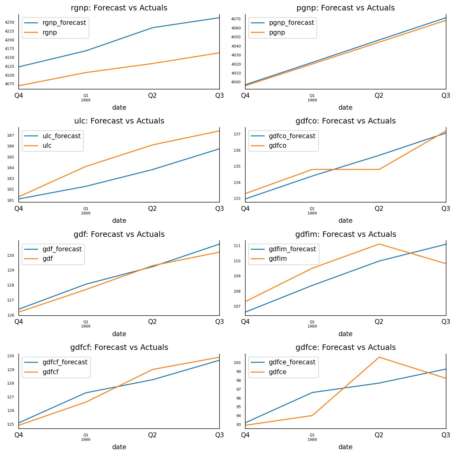
fig, axes = plt.subplots(nrows=int(len(df.columns)/2), ncols=2, dpi=150, figsize=(10,10))
for i, (col,ax) in enumerate(zip(df.columns, axes.flatten())):
    df_results[col+'_forecast'].plot(legend=True, ax=ax).autoscale(axis='x',tight=True)
    df_test[col][-nobs:].plot(legend=True, ax=ax);
    ax.set_title(col + ": Forecast vs Actuals")
    ax.xaxis.set_ticks_position('none')
    ax.yaxis.set_ticks_position('none')
    ax.spines["top"].set_alpha(0)
    ax.tick_params(labelsize=6)

plt.tight_layout()
4 machine learning under time series data
4.1 feature selection
In the previous chapters, the analysis methods used used all the data points in the time series, but we will not use all the data points in the machine learning part to be introduced next. Feature generation is to find a quantitative way to extract the most important information from time series and generate some numerical and category labels. In essence, feature generation is to compress the original data and generate a group of smaller data with sufficient representation. For example, using the mean value and the number of time points to represent the original time series data is the simplest example.
Some common features:
- Mean and variance
- Maximum and minimum
- The difference between the first value and the last value
- Number of local maxima and local minima
- Periodicity and autocorrelation
4.1. 1 automatic feature generation and selection
from tsfresh.examples.robot_execution_failures import download_robot_execution_failures,load_robot_execution_failures
from tsfresh import extract_features,select_features
import pandas as pd

timeseries, y = load_robot_execution_failures() # Load data
timeseries.columns #The dataset contains 8 columns, where id indicates the category ID, time is the timeline, and the other 6 columns are the time series values of different dimensions
# Index(['id', 'time', 'F_x', 'F_y', 'F_z', 'T_x', 'T_y', 'T_z'], dtype='object')

# Automatically extract all features
X_extracted = extract_features(timeseries,column_id = "id",column_sort = "time")
X_extracted

# Selective generation feature
fc_parameters = {
    "length": None,
    "large_standard_deviation": [{"r": 0.05}, {"r": 0.1}]
}
extract_features(timeseries, column_id = "id",column_sort = "time",default_fc_parameters=fc_parameters)

# Automatic feature selection
X_extracted_cols = X_extracted.isnull().sum().where(lambda x : x==0).dropna().index  # Since not all generated variables are meaningful, delete the features containing NA, which is also the requirement of the feature selection function
X_selected = select_features(X_extracted[X_extracted_cols], y)
# The fresh algorithm automatically selects 665 features from 2203 features
print('count of raw feature: {}'.format(len(X_extracted_cols)))
print('count of auto-selected feature: {}'.format(len(X_selected.columns)))
# count of raw feature: 2203
# count of auto-selected feature: 665
This process in the official document shows the idea of using fresh algorithm for feature selection. In short, it determines whether to select this feature by comparing the significant differences of features under different time series categories.
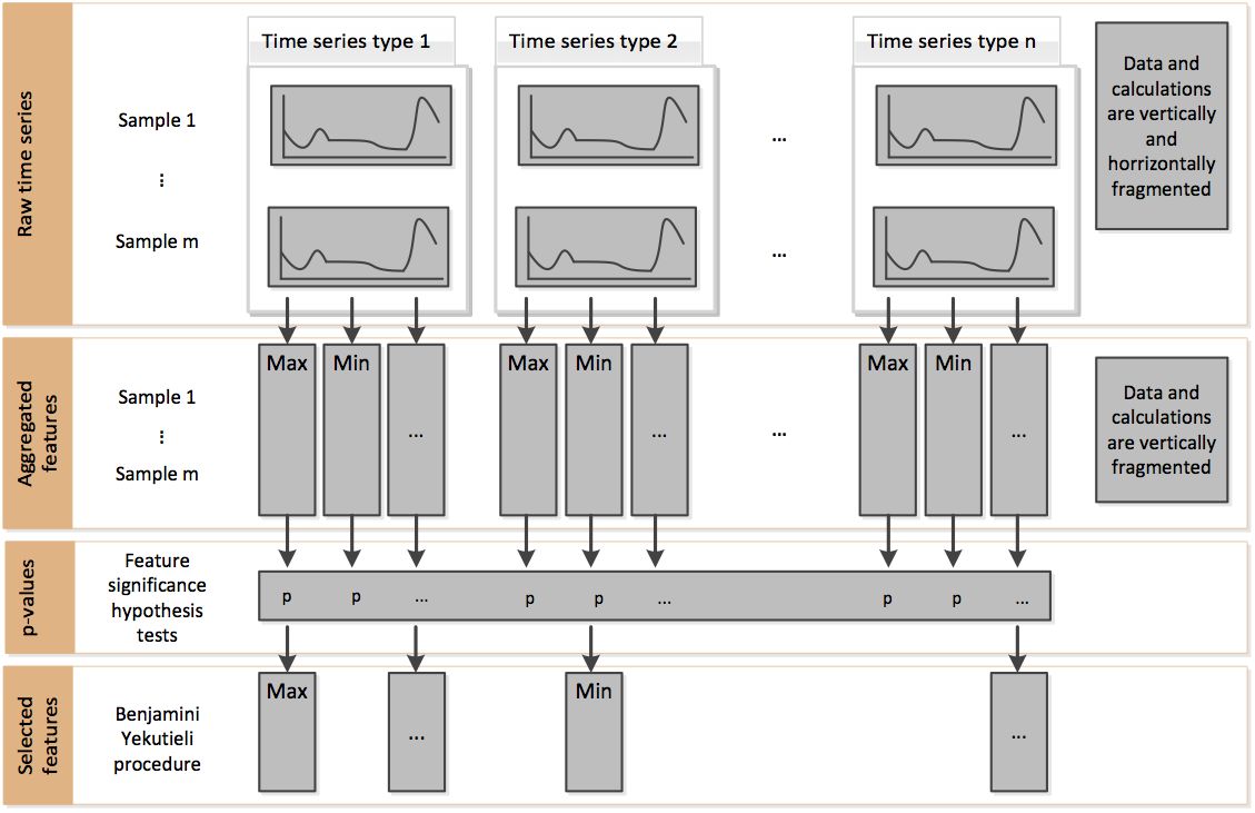
In addition, there are other methods for feature selection, such as recursive feature extraction (RFE). However, this method is not built in the tsfresh package and can be combined with the RFE method in sklearn.
4.2 classification
Taking the original EEG time series data as an example, this paper demonstrates how to use machine learning model for time series classification.
The EEG data set has five categories:
- EEG recording of healthy human brain with eyes open and closed
- EEG records of two non epilepsy related areas in patients with epilepsy during seizure free period
- Intracranial recording of EEG during seizures
import matplotlib.pyplot as plt
from tsfresh import extract_features
import pandas as pd
import numpy as np
from sklearn.model_selection import train_test_split
from sklearn.ensemble import RandomForestClassifier
import xgboost as xgb
eeg = pd.read_csv('data\eeg.csv')
eeg.head()

# 1. Observe the time series characteristics of different categories to prepare for the following structural characteristics
plt.subplot(3, 1, 1)
plt.plot(eeg[eeg.id==0]['times'], eeg[eeg.id==0]['measurements'])
plt.legend(eeg.loc[0,'classes'])
plt.subplot(3, 1, 2)
plt.plot(eeg[eeg.id==300]['times'],eeg[eeg.id==300]['measurements'])
plt.legend(eeg.loc[300*4097,'classes'])
plt.subplot(3, 1, 3)
plt.plot(eeg[eeg.id==450]['times'],eeg[eeg.id==450]['measurements'])
plt.legend(eeg.loc[450*4097,'classes'])
plt.tight_layout()
# It is found from the chart that the data of Z and G are less tortuous than that of S. In addition, each class has quite different value range, and the distribution of data points seems to be different.

# 2. Extract features, and manually select 6 features according to observation visualization
fc_parameters = {
    "skewness": None,
    "ratio_beyond_r_sigma": [{"r": 1}],
    "maximum":None,
    "minimum":None,
    "mean_abs_change":None,
    "longest_strike_above_mean":None
}
data = extract_features(eeg, column_id = "id",column_sort = "times",column_value="measurements",chunksize=20, default_fc_parameters=fc_parameters)
# chunksize is set to a small value to prevent the computer from running out of memory
data.index.names=['id']
data.reset_index()
data = data.merge(eeg[['id','classes']].drop_duplicates(), on='id',how='inner')

# 3. Two classical ensemble learning methods, random forest and xgboost, are used
# Training machine learning model
X_train, X_test, y_train, y_test = train_test_split(data.drop(['id', 'classes'], axis=1), data["classes"])
rf_clf = RandomForestClassifier()
rf_clf.fit(X_train, y_train)
rf_clf.score(X_test, y_test)

# Use XGBOOST model
xgb_clf = xgb.XGBClassifier()
xgb_clf.fit(X_train, y_train)
xgb_clf.score(X_test, y_test)
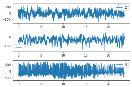
Evaluation index:
- Confusion matrix (recall, precision)
- ROC/AUC, calculate AUC value
# Confusion matrix
y_true = [0, 1, 2, 2, 2]
y_pred = [0, 0, 2, 2, 1]
target_names = ['class 0', 'class 1', 'class 2']
print(metrics.classification_report(y_true, y_pred))

# ROC/AUC, calculate AUC
y_true = np.array([0, 0, 1, 1])
y_scores = np.array([0.1, 0.4, 0.35, 0.8])
metrics.roc_auc_score(y_true, y_scores)
Confusion matrix visualization: http://scikit-learn.org/dev/auto_examples/model_selection/plot_confusion_matrix.html#sphx-glr-auto-examples-model-selection-plot-confusion-matrix-py
ROC curve visualization: https://blog.csdn.net/lz_peter/article/details/78054914
4.3 clustering
The important step of clustering problem is to determine the distance, that is, how to measure the similarity.
Two ideas:
-
Calculate distance based on feature
It is not much different from the traditional clustering method of machine learning. It uses the original time series to construct features, and then clusters them with features.
-
Calculate distance based on original time series
One of the most commonly used algorithms is called dynamic time warping (DTW), which is very suitable for time series data with important shape features. DTW as like as two peas, the two vectors are equal length. That is to say, the length of the two sets of time series is exactly the same, and in many cases, the time series are not equal length, DTW can play a role.
- Two application scenarios:
- Sound pattern recognition: suppose we want to track the sound to identify the speech content. Because different people speak at different speeds, this is a typical example of unequal time series, but the sound pattern of each word is the same. This problem can be well solved by using DTW.
- Stock market: when we make stock forecast, the stock market may not coincide completely in the short term due to huge volatility, but it is easy to capture the same model in the long term
A picture can help us understand the essence of DTW algorithm. The core of DTW is to capture the pattern or shape features of time series, and it does not require one-to-one correspondence of time axes.
- Two application scenarios:
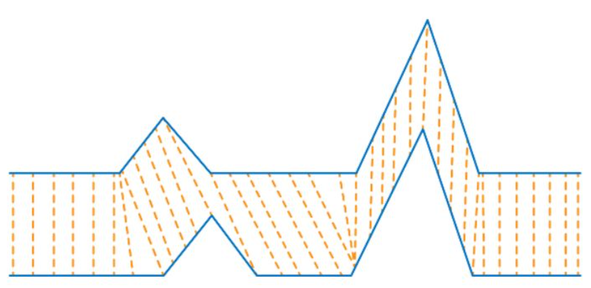
Basic rules of DTW method:
- Every point in one time series can match a point in another time series
- The starting point of one time series always matches the starting point of another time series (not necessarily one-to-one)
- The end point of one time series always matches the end point of another time series (not necessarily one-to-one)
- The matching lines of the two time series will not cross
- DTW distance (typical dynamic programming algorithm)
from math import sqrt
import numpy as np

def distDTW(ts1,ts2)
    DTW = {}
    for i in range(len(ts1)):
        DTW[(i, -1)] = np.inf
    for i in range(len(ts2)):
        DTW[(-1, i)] = np.inf
    DTW[(-1, -1)] = 0

    for i in range(len(ts1)):
        for j in range(len(ts2)):
            dist = (ts1[i] - ts2[j]) ** 2
            DTW[(i, j)] = dist + min(DTW[(i - 1, j)], DTW[(i, j - 1)], DTW[(i - 1, j - 1)])
    return sqrt(DTW[len(ts1) - 1, len(ts2) - 1])
In addition, there are several other distance algorithms applied to time series:
-
Fr é chet distance
Frecher distance can be understood as dog rope distance, that is, the shortest dog rope distance required for people and dogs to walk a section of the road.
-
Longest common subsequence
The longest common subsequence is mainly used for non numerical time series, such as two English words. The length of the longest common sequence can also be used to judge the distance.
clustering
import matplotlib.pyplot as plt
import pandas as pd
import numpy as np
from sklearn import preprocessing
from sklearn.cluster import AgglomerativeClustering
from sklearn.metrics.cluster import homogeneity_score
from scipy.spatial.distance import euclidean
from fastdtw import fastdtw
from tqdm import tqdm
### 1. Calculate distance based on feature
# Normalized data
data_cluster = data.drop(['id', 'classes'], axis=1)
data_values = preprocessing.scale(data_cluster.values)
# Hierarchical clustering is carried out by using the first kind of clustering idea
clustering = AgglomerativeClustering(n_clusters = 5,linkage = 'ward')
clustering.fit(data_values)
# Output model evaluation index
homogeneity_score(clustering.labels_, data.classes)
# Output: 0.43
# The constructed features are used for hierarchical clustering, and the homogeneity evaluation is 0.43

### 2. Calculate distance based on original time series
rowlist= np.array(range(0,50))
for a in [np.array(range(100,150)),np.array(range(200,250)),np.array(range(300,350)),np.array(range(400,450))]:
    rowlist=np.append(rowlist,a)
# Using the second kind of clustering idea, first calculate the DTW distance. This step has a large amount of calculation. First save the results, and as a simplification, only select part of the data into the model
pairwise_dis = pd.DataFrame(np.zeros((250, 250)))
for index_r, r in tqdm(enumerate(rowlist)):
    for index_c, c in enumerate(rowlist):
        arr1 = eeg[eeg.id==r]['measurements'].values[:500]
        arr2 = eeg[eeg.id==c]['measurements'].values[:500]
        distance, _ = fastdtw(arr1, arr2, dist=euclidean)
        pairwise_dis.iloc[index_r,index_c]=distance
pairwise_dis.to_csv('data/pairwise_dis.csv',index=False)
pairwise_distance = pd.read_csv('data/pairwise_dis.csv')
# Hierarchical clustering is carried out by using the second kind of clustering idea
dtw_clustering = AgglomerativeClustering(linkage = 'average',n_clusters = 5, affinity = 'precomputed')
_=dtw_clustering.fit_predict(pairwise_distance)
# Output model evaluation index
homogeneity_score(dtw_clustering.labels_, data[data.index.isin(rowlist)]['classes'])
Evaluation indicators:
-
The sum of the nearest cluster centers
-
Adjusted Rand index
The value range is [- 1, 1]. Negative numbers represent bad results. The closer to 1, the better, which means that the clustering results are more consistent with the real situation.
-
Mutual information and adjusted mutual information
When the two cluster sets are the same (i.e. completely matched), the return value of AMI is 1; the average expected AMI of random partition (independent label) is about 0, which may also be negative.
-
Homogenization score
The larger the value range [0, 1] means that the clustering results are more consistent with the real situation.
-
Integrity score
The value range is [0, 1]. The larger the value, the more consistent the clustering results are with the real situation.
-
V-measure score
The value range is [0, 1]. The larger the value, the more consistent the clustering results are with the real situation.
-
Contour coefficient
The average intra cluster distance and the average nearest cluster distance of each sample are used to calculate. The highest value is 1 and the worst value is - 1. Values near 0 represent overlapping clusters, and negative values usually indicate that the samples have been assigned to the wrong cluster.
-
Ratio of intra cluster dispersion to inter cluster dispersion
raw_data = np.loadtxt( './cluster.txt') # Import data file
X = raw_data[:, : -1] # Segment the data to be clustered
y_true = raw_data[:, -1]
# Training clustering model
n_clusters = 3# Set the number of clusters
model_kmeans = KMeans(n_clusters=n_clusters, random_state= 0) # Establish clustering model object
model_kmeans.fit(X) # Training clustering model
y_pre = model_kmeans.predict(X) # Predictive clustering model
# Model effect index evaluation
n_samples, n_features = X.shape # Total sample size
inertias = model_kmeans.inertia_ # The sum of the nearest cluster centers
adjusted_rand_s = metrics.adjusted_rand_score(y_true, y_pre) # Adjusted Rand index
mutual_info_s = metrics.mutual_info_score(y_true, y_pre) # Mutual information
adjusted_mutual_info_s = metrics.adjusted_mutual_info_score(y_true, y_pre) # Adjusted mutual information
homogeneity_s = metrics.homogeneity_score(y_true, y_pre) # Homogenization score
completeness_s = metrics.completeness_score(y_true, y_pre) # Integrity score
v_measure_s = metrics.v_measure_score(y_true, y_pre) # V-measure score
silhouette_s = metrics.silhouette_score(X, y_pre, metric= 'euclidean') # Average contour coefficient
calinski_harabaz_s = metrics.calinski_harabaz_score(X, y_pre) # Calinski and Harabaz score
print( 'Total sample size: %d t Total feature number: %d'% (n_samples, n_features)) # Print out sample size and feature number
print( 70* '-') # Print separator lines
print( 'inetARItMItAMIthomotcomptv_mtsilhtc&h') # Printout indicator title
print( '%dt%.2ft%.2ft%.2ft%.2ft%.2ft%.2ft%.2ft%d'% (
inertias, adjusted_rand_s, mutual_info_s, adjusted_mutual_info_s, homogeneity_s, completeness_s,
v_measure_s,
silhouette_s, calinski_harabaz_s)) # Print out index value
print( 70* '-') # Print separator lines
print( 'Abbreviation t Full name') # Printout abbreviations and full name titles
print( 'ine t The sum of the nearest cluster centers')
print( 'ARI t Adjusted Rand index')
print( 'MI t Mutual information')
print( 'AMI t Adjusted mutual information')
print( 'homo t Homogenization score')
print( 'comp t Integrity score')
print( 'v_m t V-measure score')
print( 'silh t Average contour coefficient')
print( 'c&h t Calinski and Harabaz score')