preface
ElementUI is a desktop component library based on Vue 2.0 for developers, designers and product managers.
It is a UI framework based on Vue, which develops many related components based on Vue to facilitate us to quickly develop pages.
1, Download of ElementUI
ElementUI can be downloaded on the official website:
Official website address: https://element.eleme.cn/#/zh-CN

When writing page code, we can directly refer to the component guide on the official website of elementui. When using VSCode, we need to import three packages, one is the index of elementui CSS style package, one is index js script package, and Vue's js package. I will give you these three packages in the next forum. The following is the process of guiding the package.
Note: the package must be guided in order!
①<link rel="stylesheet" href="../element-ui-2.13.0/lib/theme-chalk/index.css">
②<script src="../js/vue-v2.6.10.js"></script>
③<script src="../element-ui-2.13.0/lib/index.js"></script
2, Use of ElementUI
2.1 Layout
| parameter | explain | type | Optional value | Default value |
|---|---|---|---|---|
| gutter | Grid spacing | number | ------- | 0 |
| type | The default layout is flex, which is valid in modern browsers | string | ------- | --- |
| justify | Horizontal arrangement under flex layout | string | start/end/center... | start |
| align | Vertical arrangement under flex layout | string | top/middle/bottom | top |
| tag | Custom element labels | string | * | div |
| parameter | explain | type | Optional value | Default value |
| span | Number of columns occupied by the grid | number | ------- | 24 |
| offset | Number of spacing cells to the left of the grid | number | ------- | 0 |
| push | The number of cells the grid moves to the right | number | ------- | 0 |
| pull | The number of cells the grid moves to the left | number | ------- | 0 |
| xs | < 768px responsive grid number or grid attribute object | number/object | ------- | ------- |
Referring to the responsive design of Bootstrap, five response dimensions are preset: xs mobile phone, sm flat panel, md desktop display, lg large desktop display and xl Large desktop display.
2.2 Container layout
Common labels:
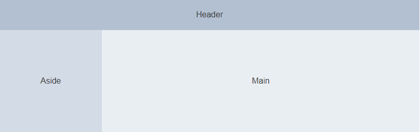
< El container >: outer container. When the child element contains < El header > or < El footer >, all child elements will be arranged vertically up and down, otherwise they will be arranged horizontally left and right.
< El header >: top bar container.
< El aside >: sidebar container.
< El main >: main area container.
< El footer >: bottom bar container.
The above components adopt flex layout. Please determine whether the target browser is compatible before use. In addition, the child element of < El container > can only be the last four, and the parent element of the last four can only be < El container >
The following are common attributes of container, header, left side of aside and bottom of footer:
| parameter | explain | type | Optional value | Default value |
| direction | Arrangement direction of child elements | string | horizontal / vertical | vertical when there is , El header , or , El footer , in the child element; horizontal otherwise |
| parameter | explain | type | Optional value | Default value |
| height | Top rail height | string | -------- | 60p |
| parameter | explain | type | Optional value | Default value |
| width | Sidebar width | string | -------- | 300px |
| parameter | explain | type | Optional value | Default value |
| height | Bottom rail height | string | -------- | 60px |
2.3 buttons
Here are some common buttons:
<el-row>
<el-button>Default button</el-button>
<el-button type="primary" disabled>Main button</el-button>
<el-button type="success" size="mini">Success button</el-button>
<el-button type="info">Information button</el-button>
<el-button type="warning">Warning button</el-button>
<el-button type="danger">Danger button</el-button>
</el-row>
<el-row>
<el-button plain>Plain button</el-button>
<el-button type="primary" plain>Main button</el-button>
<el-button type="success" plain>Success button</el-button>
<el-button type="info" plain>Information button</el-button>
<el-button type="warning" plain>Warning button</el-button>
<el-button type="danger" plain>Danger button</el-button>
</el-row>
<el-row>
<el-button round>Fillet button</el-button>
<el-button type="primary" round>Main button</el-button>
<el-button type="success" round>Success button</el-button>
<el-button type="info" round>Information button</el-button>
<el-button type="warning" round>Warning button</el-button>
<el-button type="danger" round>Danger button</el-button>
</el-row>
Common button properties
| parameter | explain | type | Optional value | Default value |
| size | size | string | medium / small / mini | -------- |
| type | type | string | primary / success / warning / danger / info / text | -------- |
| plain | Is it a simple button | boolean | ------- | false |
| round | Fillet button | boolean | ------- | false |
| circle | Round button | boolean | ------- | false |
| loading | Loading status | boolean | ------- | false |
| disabled | Disable status | boolean | ------- | false |
| icon | Icon class name | string | ------- | ------- |
| autofocus | Default aggregation | boolean | ------- | false |
| native-type | Native type attribute | string | button / submit / reset | button |
2.4 navigation menu
The following is the navigation menu I copied and the background system home page written by the container. You can use it directly
<!DOCTYPE html>
<html lang="en">
<head>
    <meta charset="UTF-8">
    <meta http-equiv="X-UA-Compatible" content="IE=edge">
    <meta name="viewport" content="width=device-width, initial-scale=1.0">
    <title>Student management system</title>
    <link rel="stylesheet" href="../element-ui-2.13.0/lib/theme-chalk/index.css">
    <script src="../js/vue-v2.6.10.js"></script>
    <script src="../element-ui-2.13.0/lib/index.js"></script>
    <style>
        .el-header, .el-footer {
          background-color: rgb(105,139,105);
          color: #333;
          text-align: center;
          line-height: 60px;
        }

        .el-aside {
          background-color: rgb(84,92,100);
          color: #333;
          text-align: center;
          line-height: 200px;
          height: 640px;
        }

        .el-main {
          background-color: #E9EEF3;
          color: #333;
          text-align: center;
          line-height: 160px;
        }

        body > .el-container {
          margin-bottom: 40px;
        }

        .el-container:nth-child(5) .el-aside,
        .el-container:nth-child(6) .el-aside {
          line-height: 260px;
        }

        .el-container:nth-child(7) .el-aside {
          line-height: 320px;
        }
      </style>
</head>
<body>
    <div id="app">
        <el-container>
            <el-header height="100px">
                <h1>Student management system</h1>
            </el-header>
            <el-container>
              <el-aside width="200px">
                <el-col :span="24">
                    <el-menu
                      default-active="2"
                      class="el-menu-vertical-demo"
                      @open="handleOpen"
                      @close="handleClose"
                      background-color="#545c64"
                      text-color="#fff"
                      active-text-color="#ffd04b">
                      <el-submenu index="1">
                        <template slot="title">
                          <i class="el-icon-location"></i>
                          <span>management function</span>
                        </template>
                        <el-menu-item-group>
                          <el-menu-item index="1-1">Student management</el-menu-item>
                          <el-menu-item index="1-2">Option 2</el-menu-item>
                        </el-menu-item-group>
                          <el-menu-item index="1-3">Option 3</el-menu-item>
                        </el-menu-item-group>

                      </el-submenu>
                      <el-menu-item index="2">
                        <i class="el-icon-menu"></i>
                        <span slot="title">Navigation II</span>
                      </el-menu-item>
                      <el-menu-item index="4">
                        <i class="el-icon-setting"></i>
                        <span slot="title">Navigation IV</span>
                      </el-menu-item>
                    </el-menu>
                  </el-col>
                </el-row>
              </el-aside>
              <el-main height="400px">

              </el-main>
            </el-container>
          </el-container>
    </div>
</body>
<script>
    new Vue({
        el:"#app",
        data:{

        },
        methods:{
            handleOpen(key, keyPath) {
        console.log(key, keyPath);
        },
           handleClose(key, keyPath) {
        console.log(key, keyPath);
      }
        }
    })
</script>
</html>
Page effect

Common properties
| parameter | explain | type | Optional value | Default value |
| mode | pattern | string | horizontal / vertical | vertical |
| collapse | Whether to collapse the menu horizontally (only available when mode is vertical) | boolean | ------- | false |
| background-color | Background color of menu (only hex format is supported) | string | ------- | #ffffff |
| text-color | Text color of the menu (only hex format is supported) | string | ------- | #303133 |
| active-text-color | Text color of the currently active menu (only hex format is supported) | string | ------- | #409EFF |
| defalut-active | index of the currently active menu | string | ------- | -------- |
| default-openeds | The index array of the currently open sub menu | Array | ------- | -------- |
| unique-opened | Keep only one submenu expanded | boolean | ------- | false |
| menu-trigger | Trigger mode of submenu opening (only valid when mode is horizontal) | string | hover / click | hover |
| router | Whether to use Vue router mode. If this mode is enabled, index will be used as the path for route jump when navigation is activated | boolean | ------- | false |
| collapse-transition | Turn on collapse animation | boolean | ------- | true |
Method
| Method name | explain | parameter |
| open | Expand the specified sub menu | Index: the index of the sub menu to be opened |
| close | Collapse the specified sub menu | Index: the index of the sub menu to be stowed |
Events
| Event name | explain | Callback Arguments | |
| select | Menu activation callback | Index: select the index of the menu item, indexpath: select the index path of the menu item | |
| open | Callback for sub menu expansion |
| |
| close | Sub menu retracted callback | Index: index of the stowed sub menu, indexPath: index path of the stowed sub menu |