Custom components
Component(Object object) | wechat open document (qq.com)
Extract some duplicate code
Commodity classification (taobao.com)
Create custom components
Similar to a page, a custom component consists of four files: json, wxml, wxss, and JS
You can quickly create the component structure in the wechat developer tool

Declare component, import component
tabs.json
{
	"component": true
}
demo01.json
{
  "usingComponents": {
    "Tabs": "/components/Tabs/Tabs"
  }
}
Simple edit component
Tabs.wxml
<!--components/Tabs/Tabs.wxml-->
<view class="tabs">
  <view class="tabs_title">
    <view class="title_item active">home page</view>
    <view class="title_item">original</view>
    <view class="title_item">classification</view>
    <view class="title_item">about</view>
  </view>
  <view class="tabs_content">

  </view>
</view>
Tabs.wxss
/* components/Tabs/Tabs.wxss */
.tabs {}

.tabs_title {
  display: flex;
  padding: 10rpx 0;
}

.title_item {
  flex: 1;
  display: flex;
  justify-content: center;
  align-items: center;
}

/* Style when selected */
.active {
  color: #b81d24;
  border-bottom: 5rpx solid currentColor;
}

.tabs_content {}
The above data is written in the wxml of the component. Next, we will implement js dynamic data
Fill in initial data
Tabs.js
// components/Tabs/Tabs.js
Component({
  /**
   * List of properties for the component
   */
  properties: {
  },

  /**
   * Initial data of components
   */
  data: {
    tabs: [
      {
        id: 0,
        name: "home page",
        isActive: true
      },
      {
        id: 1,
        name: "original",
        isActive: false
      }
      ,
      {
        id: 2,
        name: "classification",
        isActive: false
      }
      ,
      {
        id: 3,
        name: "about",
        isActive: false
      }
    ]
  },

  /**
   * Component method list
   */
  methods: {
  }
})
Tab.wxml
<view class="tabs">

  <view class="tabs_title">
    <!-- List rendering -->
    <!-- class Ternary expression in, according to item of isActive Property to determine whether it is selected. If it is selected, the class name is added to display the style -->
    <view wx:for="{{tabs}}" wx:key="id" class="title_item {{item.isActive?'active':''}}">
      {{item.name}}
    </view>
  </view>

  <view class="tabs_content"></view>

</view>
Bind click event
Tab.wxml
<view class="tabs_title">
  <!-- List rendering -->
  <!-- class Ternary expression in, according to item of isActive Property to determine whether it is selected. If it is selected, the class name is added to display the style -->
  <!-- data-index Custom attribute used to pass the current index value -->
  <view wx:for="{{tabs}}" wx:key="id" class="title_item {{item.isActive?'active':''}}" bindtap="handleItemTap"
    data-index="{{index}}">
    {{item.name}}
  </view>
</view>
Note that the methods for customizing components are written in methods
Tabs.js
methods: {
    handleItemTap(e) {
      // View the location of the index
      console.log(e);

      // 1. Get the clicked index
      // ES6 constant const, read-only and immutable
      // ES6 deconstruction assignment: const {index} = e.currenttarget dataset;
      const index = e.currentTarget.dataset.index;

      // 2. Get the original array
      // ES6 variable let, block level scope
      // ES6 deconstruction assignment: let {tabs} = this data;
      let tabs = this.data.tabs;

      // 3. Circular array: set isActive: true for the current index entry, and false for the rest
      // ES6 arrow function
      tabs.forEach((v, i) => {
        i === index ? v.isActive = true : v.isActive = false
      });

      // Modify data
      this.setData({
        tabs
      })
    }
}
All the above data are written in the component. Next, let's pass the data from the parent to the child
Pass data from parent to child
demo01.wxml
<!--
  Parent component demo01,Subcomponents Tabs
  The parent component passes data through label properties
  Subcomponents in properties Medium receiving
-->
<Tabs abc="Data to be transferred"></Tabs>
Tabs.js
properties: {
  // Attribute name
  abc: {
    // Type of data received
    type: String,
    // Default value
    value: ""
  }
},
Tabs.wxml
<!-- amount to data Data in, using{{}}Render -->
<view>{{abc}}</view>
Next, modify the case code
-
Put the data to be transferred in the data of the parent component, that is, it was originally written in tabs The data in JS data is placed in Demo01 JS in data
data: { tabs: [ { id: 0, name: "home page", isActive: true }, { id: 1, name: "original", isActive: false } , { id: 2, name: "classification", isActive: false } , { id: 3, name: "about", isActive: false } ] }, -
The parent component passes data through label properties
demo01.wxml
<Tabs tabs="{{tabs}}"></Tabs> -
The sub components are received in properties, and the final effect is the same as before
Tabs.js
properties: {
  tabs: {
    type: Array,
    value: []
  }
},
Tabs You can modify the parent data component in the app tab window instead of the child data component in the JS window
// this. If no data is found in data, look in properties
let tabs = this.data.tabs;
// Put tabs into data
this.setData({
  tabs
})
Therefore, the processing data needs to be placed in the parent component, and the required index value is passed from the child component to the parent component (the child passes data to the parent)
Transfer data from child to parent
Tabs.js
methods: {
  handleItemTap(e) {
    // 1. Get the clicked index
    const index = e.currentTarget.dataset.index;
    // 2. Trigger custom events in the parent component and transfer data
    this.triggerEvent("itemChange", { index }); //Trigger event ("custom event name", data to be passed)
  }
}
demo01.wxml
<!--
  Subcomponents Tabs -> Parent component demo01
  Add a custom event to the label of the subcomponent
  Write parent component js Event method
-->
<Tabs tabs="{{tabs}}" binditemChange="handleItemChange"></Tabs>
demo01.js
// Custom event method
handleItemChange(e) {
  console.log(e);
  // Receive transmitted data
  const index = e.detail.index;
  // The following codes are the same
  let tabs = this.data.tabs;
  tabs.forEach((v, i) => {
    i === index ? v.isActive = true : v.isActive = false
  });
  this.setData({
    tabs
  })
},
You can view it in the AppData window
slot tag
Slot placeholder (slot). The parent component calls the child component to pass some labels to replace the position of the slot
Tabs.wxml
  <view class="tabs_content">
    <slot></slot>
  </view>
demo01.wxml
<Tabs tabs="{{tabs}}" binditemChange="handleItemChange">
  <block wx:if="{{tabs[0].isActive}}">Content 1</block>
  <block wx:elif="{{tabs[1].isActive}}">Content 2</block>
  <block wx:elif="{{tabs[2].isActive}}">Content 3</block>
  <block wx:else>Content 4</block>
</Tabs>
life cycle
application
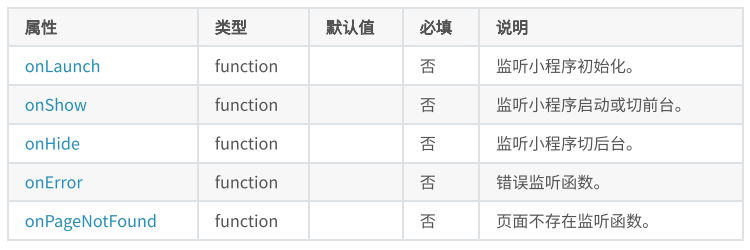
// app.js
App({
  // Triggered when the application starts for the first time, which can be used to obtain the user's personal information at the beginning
  onLaunch() {
    console.log("onLaunch");
  },

  // Triggered during application display, which can be used to reset page data and page effect
  onShow() {
    console.log("onShow");
    // Can be called multiple times
  },

  // Triggered when hidden is applied, which can be used to pause or clear the timer
  onHide() {
    console.log("onHide");
  },

  // Triggered when the application code reports an error, which can be used to collect error information and send it to the background
  onError(error) {
    console.log("onError");
    console.log(error);
  },

  // Triggered when the application cannot find the entry page for the first time. It can be used for jump
  onPageNotFound() {
    console.log("onPageNotFound");
    wx.navigateTo({
      url: '/pages/demo01/demo01',
    })
  }

})
page
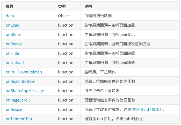
// pages/demo02/demo02.js
Page({

  /**
   * Initial data of the page
   */
  data: {

  },

  /**
   * Life cycle function -- listening for page loading
   * Send asynchronous request initialization page data
   */
  onLoad: function (options) {
    console.log("onLoad");
  },

  /**
   * Life cycle function -- monitor page display
   */
  onShow: function () {
    console.log("onShow");
  },

  /**
   * Life cycle function -- monitor the completion of the first rendering of the page
   */
  onReady: function () {
    console.log("onReady");
  },

  /**
   * Life cycle function -- listening for page hiding
   */
  onHide: function () {
    console.log("onHide");
  },

  /**
   * Life cycle function -- listen for page unloading
   */
  onUnload: function () {
    console.log("onUnload");
  },

  /**
   * Page related event handler -- listen to user drop-down actions
   * Initialize page
   */
  onPullDownRefresh: function () {
    console.log("onPullDownRefresh");
  },

  /**
   * Handler for bottom pull event on page
   * Touch bottom to load more data
   */
  onReachBottom: function () {
    console.log("onReachBottom");
  },

  /**
   * Users click the upper right corner to share
   */
  onShareAppMessage: function () {
    console.log("onShareAppMessage");
  },

  /**
   * Page scrolling
   */
  onPageScroll() {
    console.log("onPageScroll");
  },

  /**
   * Page size change
   */
  onResize() {
    console.log("onResize");
  },

  /**
   * It is currently a tab page. It will be triggered when you click the tab of the current page
   */
  onTabItemTap() {
    console.log("onTabItemTap");
  }
})
},
/**
- Handler for bottom pull event on page
- Touch bottom to load more data
*/
onReachBottom: function () {
console.log("onReachBottom");
},
/**
- Users click the upper right corner to share
*/
onShareAppMessage: function () {
console.log("onShareAppMessage");
},
/**
- Page scrolling
*/
onPageScroll() {
console.log("onPageScroll");
},
/**
- Page size change
*/
onResize() {
console.log("onResize");
},
/**
- It is currently a tab page. It will be triggered when you click the tab of the current page
*/
onTabItemTap() {
console.log("onTabItemTap");
}
})