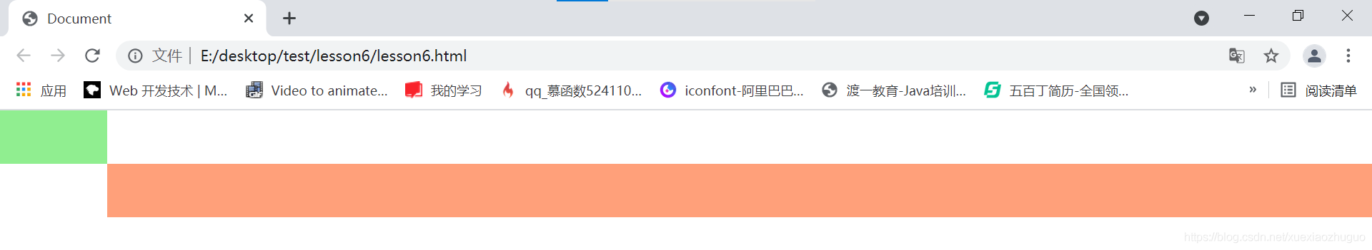
Two column layout
Renderings (right and left):
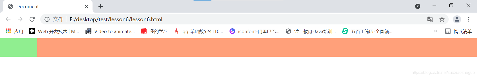
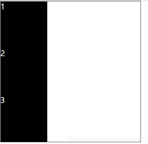
Write first on the right and then on the left; You can write left and then right. The first born element must be set to absolute positioning, and the next element can come up in a row. If the second born element is set to absolute positioning, even if it is separated from the original position for positioning, it will not be able to get to the first line, because the first element is a block level element, which monopolizes one line
    <!-- Two column layout -->
    <!-- It must be two div;One fixed, one adaptive -->
    <!-- Thinking, how to make two div And to a row: absolute positioning, positioning away from the original position -->
    <div class="right"></div>
    <div class="left"></div>
    <!-- Two column layout -->
/* Two column layout */
/* 1.On the right is adaptive, only height and width are set */
/* 2.Set the absolute positioning to let the following elements come up; */
/* 3.After coming up, because the set width is 100%; Therefore, the following elements will be masked. Set margin left to let the elements on the left out */
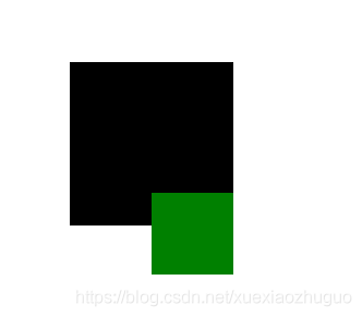
.right{
height:50px;
width:100%;
background-color: lightsalmon;
position:absolute;
left:0px;
margin-left:100px;
}
/* Usually fixed on the left,
1.Set the width and height */
.left{
height:50px;
width:100px;
background-color: lightgreen;
}
/* Two column layout */
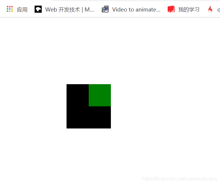
Two classic bugs: margin collapse
    <!-- Two classics bug: margin Collapse -->
    <div class="wrapper">
        <div class="content"></div>
    </div>
    <!-- Two classics bug: margin Collapse -->
/* Two classic bug s: margin collapse */
.wrapper{
    /* Let the wrapper, the parent of content, run with him, 150px to the left of the page; 150px from the upper edge; */
    margin-left:150px;
    margin-top:150px;


    background-color: #000;

    width:100px;
    height:100px;
}

.content{
    /* Make content 50px away from the left line of his parent; */
    margin-left:50px;

    background-color: green;

    width:50px;
    height:50px;
}
/* Two classic bug s: margin collapse */
content it is OK to set the margin left to the left of his parent, but setting the margin top, that is, when setting the margin to the upper edge of the parent, there is no response, which is still the above figure; He doesn't go down relative to his father's shed at all;
.content{
    margin-top:50px;
}
It will not move until the margin top is greater than the margin top at the top of the page, but at this time, it moves together with its parent, which is equivalent to a whole;
That is, the vertical margin of parent-child nested elements is combined, and they take the largest value
Namely

.content{
    margin-top:200px;
}
As a result, there is no problem in locating the elements of his parent relative to the browser ceiling, but his children should also move down relative to the ceiling of his parent, but he doesn't go down, just as his parent doesn't have a ceiling It's like the shed collapsed, so it's called margin collapse
terms of settlement:
This bug can't be solved perfectly, just find a way to make up for it
- What can't be done: if the parent's shed collapses, manually add a border to his parent
Unprofessional and inappropriate; According to the drawing, poor 1px is not enough, but it can solve this problem;
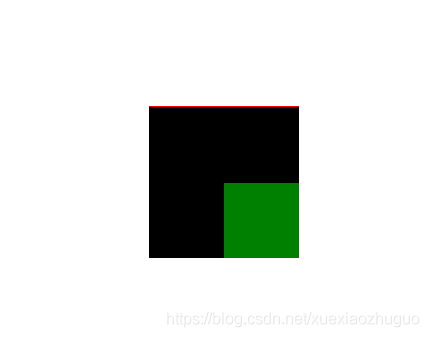
.wrapper{
    border-top:1px solid red;
}
.content{
    margin-top:50px;
}
- BFC - > block format context
As like as two peas, css takes every element of html as a box, and further believes that every box has its own set of rendering rules. This rendering rule is that you finish writing the code, and it can draw out the code according to the code you write. There is a set of identical grammar rules in every box, which is the normal rule of all boxes in html. Then we can change the rendering rules of some boxes or a box by some specific means;
That is, after the bfc is set, the special party box will follow another set of syntax rules;
Solution: change the rendering rules of his parent so that his parent becomes a bfc element. After his parent becomes a bfc, the margin collapse generated by his parent and children is solved
How to trigger the bfc of a box
- position:absolute;
- display:inline-block;
- float:left/right
- overflow:hidden
Trigger with overflow
Add overflow:hidden overflow part to parent

.wrapper{
    overflow:hiddden;
}
.content{
    margin-top:80px;
}
Trigger with display: inline block
Change to block level row element
.wrapper{
    display:inline-block;
}
.content{
    margin-top:80px;
}
Using 1 2 3 4 can solve this problem, but at the same time, it raises new problems: for specific needs, which one has no impact and which one is used
Merge of two classic bugs: margin
    <!-- Two classics bug:margin merge -->
    <span class="box1">123</span>
    <span class="box2">234</span>
    <!-- Two classics bug:margin merge -->
/* Merge of two classic bugs: margin */
.box1{
    background-color: red;
}
.box2{
    background-color: green;
}
/* Merge of two classic bugs: margin */
1. Set the right margin of box1
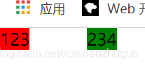
.box1{
    margin-right:50px;
}
2. Set the left margin of box2
.box2{
    margin-left:50px;
}
The left and right margin s set by the two box es are added. This is a normal phenomenon, that is, the areas cannot be shared
margin merge
The vertical margin of the two brothers is merged and shared
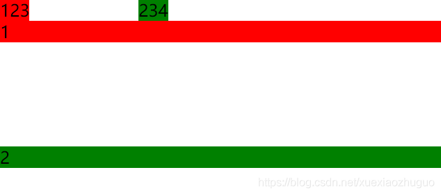
    <!-- Elements of two sibling structures -->
    <div class="demo1">1</div>
    <div class="demo2">2</div>
.demo1{
    background-color: red;
    margin-bottom:100px;
}
.demo2{
    background-color: green;
    margin-top:100px;
}
terms of settlement
bfc can still be used to solve - > to solve a bug in demo1 and demo2, you must put them in the bfc environment and add a parent to them, which is blessed with bfc syntax

    <div class="wrapper">
        <div class="demo1">1</div>
    </div>
    <div class="wrapper">
        <div class="demo2">2</div>
    </div>
.wrapper{
    overflow:hidden;
}
.demo1{
    background-color: red;
    margin-bottom:100px;
}
.demo2{
    background-color: green;
    margin-top:100px;
}
Margin collapse only adds Css. When the margin merge is solved, a parent must be added to the html to change the html structure When programming, html, that is, the structure is the most important. The structure can not be added or changed arbitrarily; That is, we can't add a useless structure just because we modify a bug
This margin combination is not solved. You can add one directly, which can be solved by mathematical calculation
That is, if margin bottom: 100px; margin-top:100px; Therefore, if the interval should be 200px, it should be directly changed to margin bottom: 200px; Or margin top: 200px; that will do
float model
Three models: box model, position model and float model
<!-- float -->
<!-- Three models:Box model,Layer model,Floating model -->
<!-- float:left/right -->
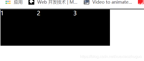
<div class="wrapper">
<div class="content">1</div>
<div class="content">2</div>
<div class="content">3</div>
</div>
<!-- float -->
/* float  */
.wrapper{
    width:300px;
    height:300px;
    border:1px solid #000;
}
.content{
    color:#fff;
    background-color: black;
    width:100px;
    height:100px;
}
/* float  */
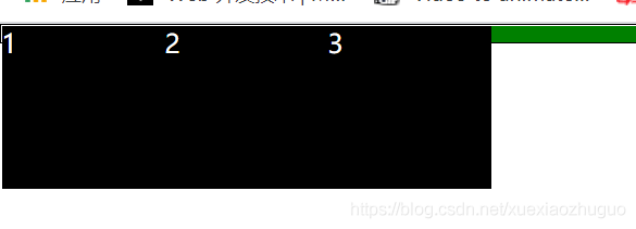
After adding floating left
It's in line. It's one line. Line up from left to right

.content{
    float:left;
}
Add floating right
Row from right to left

.content{
    float:right;
}
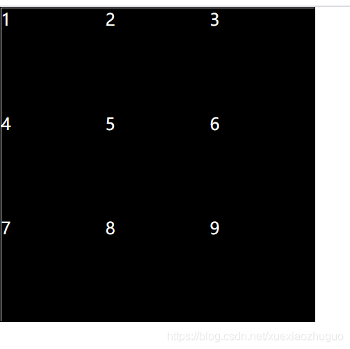
Increase the number of internal child elements to 9 left
    <div class="wrapper">
        <div class="content">1</div>
        <div class="content">2</div>
        <div class="content">3</div>
        <div class="content">4</div>
        <div class="content">5</div>
        <div class="content">6</div>
        <div class="content">7</div>
        <div class="content">8</div>
        <div class="content">9</div>
    </div>
.content{
    float:left
}
float can make elements stand in line, and margin can be added in the process of standing in line
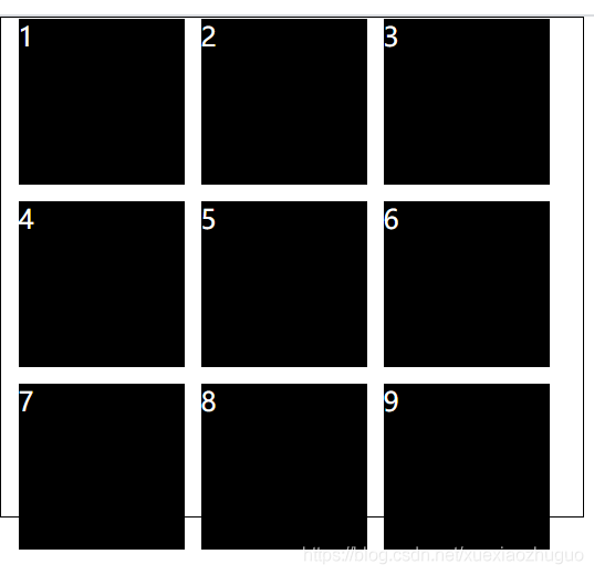
/* Widen the outer container a little; Because the floating rule is: if the remaining space is enough, take one, and if not enough, go to the next line; The boundary of the station is the boundary of the parent */
.wrapper{
    width:350px
}
.content{
    margin-left:10px;
    margin-bottom:10px;
}
These styles on Taobao can be made by float ing

Floating elements produce floating streams,
All elements that produce a floating flow,
Block level elements are invisible, which is naturally the effect of layering
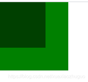
Produced 1 Elements of BFC and 2 Elements with text class attributes (with inline) and 3 Floating elements can be seen in text
1. The float is set in box to generate a floating flow, so the block level elements cannot be seen, and the demo goes up
)]
    <div class="box"></div>
    <div class="demo"></div>
.box{
    width:100px;
    height:100px;
    background-color: #000;;

    float:left;
    opacity: 0.5;
}
.demo{
    width:150px;
    height:150px;
    background-color: green;
}
2. The elements of the text class attribute and the text can see the elements that generate the floating flow
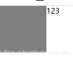
    <div class="box"></div>
    123
3. The elements that trigger the bfc can also see the elements that generate the floating flow
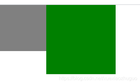
    <div class="box"></div>
    <div class="demo"></div>
.demo{
    float:left;
}
After the child has set float, its parent div cannot contain it, because the block level element cannot see the element generating the floating flow
Without float, normally:

    <div class="wrapper">
        <div class="content">1</div>
        <div class="content">2</div>
        <div class="content">3</div>
    </div>
.wrapper{
    /* Do not widen the height, that is, the width is adaptive, and the height is supported by the content */
    border:1px solid #000;
}
.content{
    color:#fff;
    background-color: black;
    width:100px;
    height:100px;
}
After adding float
His parent cannot be wrapped. His parent is a block element, so naturally, floating elements cannot be seen
.content{[
    float:left;
]}
How do you wrap a parent around a floating child?
1. Add a height; But not once and for all, the height is uncertain

.wrapper{
    height:100px;
}
2. The culprit is the floating stream. As long as the floating stream is cleared, there is no problem, and his parent will be normal
    <div class="wrapper">
        <div class="content">1</div>
        <!-- 1 Generated floating flow,Logically, it has an impact on subsequent elements
        1 Generated floating flow:------------------------------ -->
        <div class="content">2</div>
        <!-- 2 Generated floating flow:------------------------------ -->
        <div class="content">3</div>
        <!-- 3 Generated floating flow:------------------------------ -->
        <!-- If you add one at the end p element,Then this p The element is affected by the third floating flow,His place of birth should be on the first line -->
        <p style="border-top:10px solid green"></p>
    </div>
If the third generated floating flow is removed, no one will affect p it
Add a syntax clear on p; Clear has only one function: clear the floating flow around
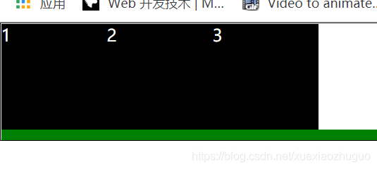
p{
    clear:both;
}
When the border thickness of p is set to 0px, our package problem is solved, that is, as long as p is logically there, it can clear the floating stream without pixels