Catalog
I. FloatingActionButton
II. Snackbar
III. CoordinatorLayout
IV. CardView
I. FloatingActionButton
1, effect
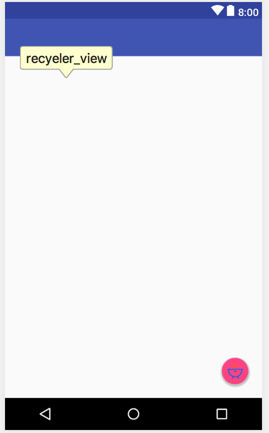
For example, the button in the lower right corner:
2, use
    <android.support.design.widget.FloatingActionButton
        android:id="@+id/fab"
        android:layout_width="wrap_content"
        android:layout_height="wrap_content"
        android:layout_gravity="right|bottom"
        android:layout_margin="20dp"
        android:src="@mipmap/icon_eat"
        android:elevation="10dp"/>
Here, the android:elevation = "10dp" attribute is used to specify a height value for FloatingActionButton. The larger the height value is, the larger the projection range is, and the weaker the projection effect is.
II. Snackbar
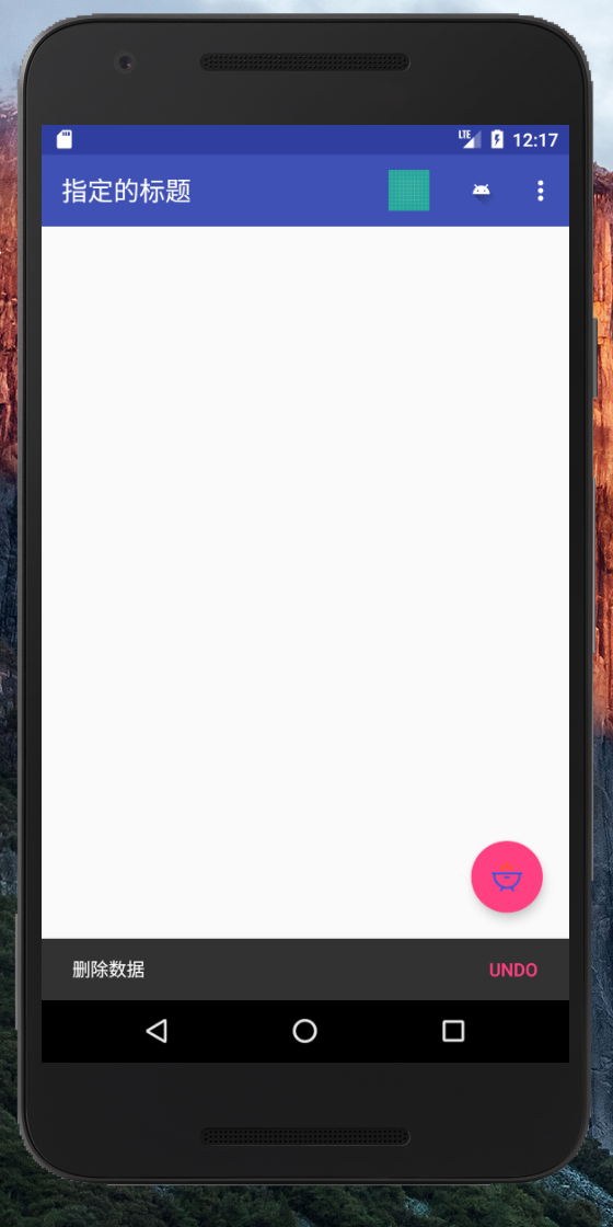
1, effect
2, explain
The use of the snake bar is similar to Toast, except for the addition of a button click event.
3, use
fab.setOnClickListener(new View.OnClickListener() {
            @Override
            public void onClick(View view) {
                Snackbar.make(view,"Delete data",Snackbar.LENGTH_SHORT)
                        .setAction("Undo", new View.OnClickListener() {
                            @Override
                            public void onClick(View view) {
                                Toast.makeText(MainActivity.this,"withdraw",Toast.LENGTH_SHORT).show();
                            }
                        })
                        .show();
            }
        });
Call the set Action() method to set an action for interaction.
III. CoordinatorLayout
1, explain
CoordinatorLayout is an enhanced Frame Layout, which can listen to various events of all child controls, and then help us to make corresponding.
####2. Use
<?xml version="1.0" encoding="utf-8"?>
<android.support.design.widget.CoordinatorLayout xmlns:android="http://schemas.android.com/apk/res/android"
    xmlns:app="http://schemas.android.com/apk/res-auto"
    xmlns:tools="http://schemas.android.com/tools"
    android:layout_width="match_parent"
    android:layout_height="match_parent"
    tools:context="video.live.com.materialdesigndemo.MainActivity">

    <!--
    android:layout_height="?attr/actionBarSize"   Height is the system default height
     app:popupTheme="@style/ThemeOverlay.AppCompat.Light"   Make the pop-up light and have a visual difference from the theme color
    -->

    <android.support.v7.widget.Toolbar
        android:id="@+id/toolbar"
        android:layout_width="match_parent"
        android:layout_height="?attr/actionBarSize"
        android:background="?attr/colorPrimary"
        android:theme="@style/Base.ThemeOverlay.AppCompat.Dark.ActionBar"
        app:popupTheme="@style/ThemeOverlay.AppCompat.Light" />

    <android.support.design.widget.FloatingActionButton
        android:id="@+id/fab"
        android:layout_width="wrap_content"
        android:layout_height="wrap_content"
        android:layout_gravity="right|bottom"
        android:layout_margin="20dp"
        android:src="@mipmap/icon_eat"
        android:elevation="10dp"/>

</android.support.design.widget.CoordinatorLayout>
IV. CardView
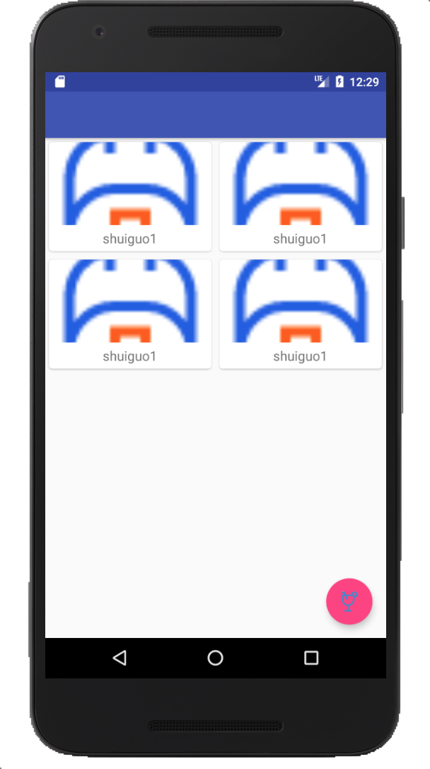
1, effect
2, use
Add dependency: implementation 'com.android.support:cardview-v7:24.2.1'
<?xml version="1.0" encoding="utf-8"?>
<android.support.v7.widget.CardView xmlns:android="http://schemas.android.com/apk/res/android"
    android:layout_width="match_parent"
    android:layout_height="wrap_content"
    xmlns:app="http://schemas.android.com/apk/res-auto"
    android:layout_margin="5dp"
    app:cardCornerRadius="4dp">

    <LinearLayout
        android:layout_width="match_parent"
        android:layout_height="wrap_content"
        android:orientation="vertical">
        <ImageView
            android:id="@+id/fruit_image"
            android:layout_width="match_parent"
            android:layout_height="100dp"
            android:scaleType="centerCrop" />
        <TextView
            android:id="@+id/fruit_name"
            android:layout_width="wrap_content"
            android:layout_height="wrap_content"
            android:layout_gravity="center_horizontal"
            android:layout_margin="5dp"
            android:textSize="16sp"/>
    </LinearLayout>

</android.support.v7.widget.CardView>
3, explain
CardView is a kind of view container with rounded corners and shadow. We can use app: cardcorneraradius attribute to specify the radian of card rounded corners. We can specify the height of card shadow by adapting app: elevation. The larger the height value is, the wider the projection range is, and the effect is weak.
DEMO will be provided later in the last chapter. Interested students hope to continue to pay attention. Thank you