abstract
- This chapter is to learn and summarize the knowledge of Toggle in UGUI.
- In order to better explain their views, this article attempts to analyze some common functions of Toggle from the perspective of "self-made imitation"
Toggle Essentials
- For a Toggle, its biggest feature is that it has two states: on / off, corresponding to true/false of Boolean value.
- Therefore, a basic Toggle must switch between true/false values in each interaction, and the value can be known by the outside world, so that the outside world can carry out specific behavior according to the switching conditions.
- Similarly, when the component performs event processing, the switch state should also be substituted as a parameter.
Toggle of UGUI
Unity preset Toggle composition analysis
analysis
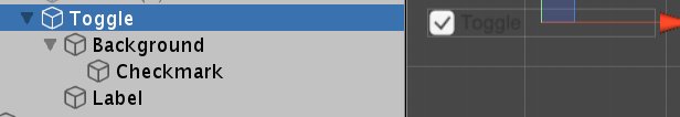
- The above is an expanded view of the Toggle object in the scene. It can be seen that it is composed of three-level structure.
- It should be noted that Toggle itself is a non rendered object or empty object with only Toggle components attached.
- Background itself is used as a background picture, and its function is to switch the performance of interaction
- Label is a text component, which is responsible for displaying text information, which has nothing to do with Toggle's own function
- Checkmark is an important object that shows the characteristics of toggle. It will be activated when toggle is on and hidden when toggle is off. It is an important part to show the toggle switch state
summary
- It can be seen that Toggle, the preset UI of UGUI, consists of three parts: basic background, switch state display diagram and text box. The key part is the Image that is displayed and hidden with the switch state.
Inspector window parameters
analysis
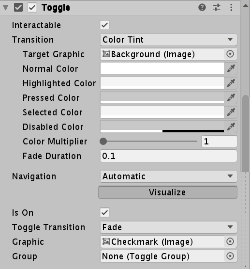
- As shown in the figure, we can divide the component parameters into upper and lower parts with Is On as the boundary. The upper part is completely consistent with the content of the Button component, while the lower part is unique to the Toggle component.
- We can see the Target Graphic parameter in the upper part, which refers to Background. Graphic is a graphic rendering interface of Unity. It can obtain any component that can be rendered and render according to certain rules. Therefore, the Background object is a tool used by Toggle to reflect the basic interactive visual effect of the Button.
- Looking at the next part, the important parameter Is On indicates its switching state. In the game interface, it shows whether the Checkmark is in the active display state. You can see that the Graphic below refers to Checkmark, which means that the object is used as a rendering object to represent Is On. Similarly, we can drag the Label in, so that the text is displayed when it Is On and hidden when it is off.
- Group is an important parameter representing "radio box group". It can set multiple Toggle components as a group. In a group, there is and only one component can be in the on state. Another component is involved here, so it will not be repeated here.
summary
- From the parameter list, we can see that Toggle can be regarded as a special Button. Its basic function is the same as that of the Button and extends on the basis of the Button - there is an on-off state. The event is always Boolean.
Toggle common member analysis
- onValueChanged: provides the registration and removal methods of event listening, which can be processed in the form of code during switch state transition.
- ASON: Toggle switch status can be dynamically obtained and modified
- Group: group can be dynamically obtained or assigned
Homemade Toggle
For example, when the picture is on, only the basic details are displayed at any time.
Realize the interaction of Button part
- According to the analysis, button interaction is divided into five basic states: defocus, focus, click, select and disable, which are represented by five colors respectively. It is implemented through five interfaces: ipointexexit, ipointenterenter, ipointerdown, ipointerup and ipointerclick.
- Because selection is involved, considering that clicking other buttons in the Button of UGUI will deselect the selected Button, a static member can be used to refer to the currently selected object.
- Disable is controlled by a Boolean value.
Implement Toggle specific interactions
- toggle is special in ASON, group and event handling functions with Boolean parameters. Only isOn and events are implemented here
- ASON only needs to use Boolean members and flip their values in the click event, that is, the IPointerClick method. Set the display of the picture according to the value.
- Event handling can declare the delegate with parameters and call in the click event.
Source code
public class CToggle : MonoBehaviour, IPointerEnterHandler, IPointerUpHandler, IPointerExitHandler, IPointerDownHandler, IPointerClickHandler
{
        #region Inspector Setting
        [SerializeField] private bool interactivable;
        [SerializeField] private Image targetImage;
        [SerializeField] private Text targetText;
        [SerializeField] private Color normalColor;
        [SerializeField] private Color highlightColor;
        [SerializeField] private Color pressedColor;
        [SerializeField] private Color selectColor;
        [SerializeField] private Color disableColor;

        [SerializeField] private bool IsOn;
        [SerializeField] private Image toggleGrapics;
        #endregion

        #region callBack Methods

        private void Awake()
        {
            if (interactivable)
            {
                if (targetImage != null)
                    targetImage.color = normalColor;
                if (targetText != null)
                    targetText.color = normalColor;
            }
            else
            {
                if (targetImage != null)
                    targetImage.color = disableColor;
                if (targetText != null)
                    targetText.color = disableColor;
            }

            if (isOn)
                toggleGrapics.gameObject.SetActive(true);
            else
                toggleGrapics.gameObject.SetActive(false);

        }

        //focusing
        public void OnPointerEnter(PointerEventData eventData)
        {
            if (!Interactivable) return;
            //When focused, the color changes to a high bright color
            if (targetImage != null)
                targetImage.color = highlightColor;
            if (targetText != null)
                targetText.color = highlightColor;
        }

        //Defocus
        public void OnPointerExit(PointerEventData eventData)
        {
            if (!Interactivable) return;
            if (targetImage != null)
                targetImage.color = normalColor;
            if (targetText != null)
                targetText.color = normalColor;
        }

        //Click
        public void OnPointerDown(PointerEventData eventData)
        {
            if (!Interactivable) return;
            if (targetImage != null)
                targetImage.color = pressedColor;
            if (targetText != null)
                targetText.color = pressedColor;
        }
        //release
        public void OnPointerUp(PointerEventData eventData)
        {
            if (!Interactivable) return;

            if (targetImage != null)
                targetImage.color = selectColor;
            if (targetText != null)
                targetText.color = selectColor;
        }
        //click
        public void OnPointerClick(PointerEventData eventData)
        {
            isOn = !isOn;
            if (isOn)
                toggleGrapics.gameObject.SetActive(true);
            else
                toggleGrapics.gameObject.SetActive(false);

            onValueChanged?.Invoke(isOn);
        }
        #endregion

        #region code read-in references
        //Click delegate
        public Action<bool> onValueChanged;
        //Can I interact
        public bool Interactivable { set => interactivable = value; get => interactivable; }
        //Control rendered objects
        public Image TargetImage { set => targetImage = value; get => targetImage; }
        public Text TargetText { set => targetText = value; get => targetText; }

        //Color of normal state
        public Color NormalColor { set => normalColor = value; get => normalColor; }
        //Color of focus state
        public Color HighlightColor { set => highlightColor = value; get => highlightColor; }
        //Color of click status
        public Color PressedColor { set => pressedColor = value; get => pressedColor; }
        //Color of the selected state
        public Color SelectColor { set => selectColor = value; get => selectColor; }
        //Color of disabled state
        public Color DisableColor { set => disableColor = value; get => disableColor; }

        public bool isOn { get => IsOn; set => IsOn = value; }
        public Image grapics { get => toggleGrapics; set => toggleGrapics = value; }
        #endregion


}