

Introduction to Compose
Jetpack Compose is a new library released at the 2019 Google I/O conference until release version 1.0 is released in July 2021 0 It features less Kotlin
Code, more convenient to complete UI development on Android platform.
Why composite
Jetpack Compose is Android's modern toolkit for building native UI. It simplifies and accelerates UI development on Android. Quickly bring your app to life with less code, powerful tools, and intuitive Kotlin APIs.
It can be seen from the description on the official website that using Compose can simplify the development of UI on Android, significantly reduce the time of creating pages, and have more 'modernization'.
With the update and iteration of mobile phone hardware, it is possible to build pages with high complexity on mobile phone to meet the needs of business. It is based on traditional XML
There are more and more controls corresponding to the construction method, and maintaining the state synchronization between controls becomes more and more difficult to maintain. It needs to spend a lot of energy to maintain the unity of the state of each control.
Based on this, Android has launched Compose. The UI declared by Compose is immutable, cannot be referenced by the outside world, and cannot hold the State. The @ Composable declaration runs as a "pure function" when the State
When the function changes, it can refresh the UI again, which can better implement the characteristics of declarative UI.
What is a declarative UI
The traditional interface is written through imperative programming. For example, on Android, different types of views are built through xml, and then the method of the view is called directly to change when the state needs to be changed.
 // Find the corresponding TextView by findViewById
var tv: TextView = findViewById(R.id.tv)
// Directly call the method to change the color of TextView
tv.setColor(red)
The declarative UI only needs to describe the current UI state and does not need to control the switching of different UI states separately. When it needs to be changed, only the corresponding state needs to be changed, and the rest of the work is left to the framework.
      // When the name status value is changed, the UI status will be automatically updated
      Text(
            "hello ${name}",
            modifier = Modifier.background(color = Color.Blue)
        )
Basic Usage
class MainActivity : ComponentActivity() {
    override fun onCreate(savedInstanceState: Bundle?) {
        super.onCreate(savedInstanceState)
        setContent {
            MyApplicationTheme {
                // A surface container using the 'background' color from the theme
                Surface(color = MaterialTheme.colors.background) {
                    Greeting("Android")
                }
            }
        }
    }
}

@Composable
fun Greeting(name: String) {
    Text(text = "Hello $name!")
}

@Preview(showBackground = true)
@Composable
fun DefaultPreview() {
    MyApplicationTheme {
        Greeting("Android")
    }
}- @Composable: as you can see, there are annotations for @Composable as long as the controls involved in Compose are built, and can only be invoked in the same way that @Composable is annotated.
- @Preview: add the @ preview annotation before the method to see the relevant layout without running the program. There are three options in the upper right corner of Android Studio. If Split and Design are selected
You can see the corresponding display effect.
- setContent: the function of setContent is the same as the setContentView function used in the development Activity, and @ Composable is passed in through content
Tag to build the UI.
After running, you can see the Text of Hello Android on the mobile phone. In addition to using Text to express the display of Text, Compose also has a variety of corresponding properties to change the display effect of controls and rich controls to build a complex interface.
Base control
Text
Text is similar to TextView of Android View. Similarly, like TextView, it has many properties that can be set:
- Text: String: sets the text content
- Modifier: modifier of modifier: Text
- Color: Color: the setting of text color can be predefined by using Compose, such as color Blue or directly enter the color value Color(0xFF000000)
- fontSize:TextUnit: sets the font size, such as 20 sp
- fontFamily: FontFamily?: Set font
- fontWeight: FontWeight?: Font weight
- lineHeight: TextUnit: set row height
- letterSpacing:TextUnit: set character spacing
- textDecoration : TextDecoration?: Set strikeouts and underscores
- MAXLINE: int: maximum number of lines displayed
- fontStyle : FontStyle?: Set the font type, such as FontStyle Italic
- textAlign:TextAlign?: Display styles, such as textalign Left
- Ontextlayout: (textlayoutresult) - > unit: text calculation completion callback
- overflow: TextOverflow: text overflow style
Example
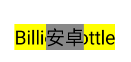
          Text(
                text = "Hello BillionBottle",
                modifier = Modifier.padding(5.dp),
                color = Color.Blue,
                textAlign = TextAlign.Start,
                textDecoration = TextDecoration.LineThrough,
                fontStyle = FontStyle.Italic,
                maxLines = 1
            )
effect:
Button
Button is mainly used to respond to user click events. It mainly has the following properties:
- Onclick: () - > unit: callback will be performed when the button is clicked
- Modifier: modifier: modifier of Button
- Enabled: Boolean: sets the validity of the button. The default value is true
- shape: Shape: adjust the appearance of the button. The default is materialtheme shapes. small
- border: BorderStroke?: Set the outer border of the button, such as cutcorner shape (30); RoundedCornerShape(50) fillet shape
- elevation: ButtonElevation?: Sets the height of the button in the Z-axis direction
- contentPadding: PaddingValues: the distance between the content and the boundary
- colors: ButtonColors: sets the color of the button, including the background of enable/disable and the color of content
- Content: @ composable() - > unit: to set the content for the Button, you need to pass in the @ Compose method
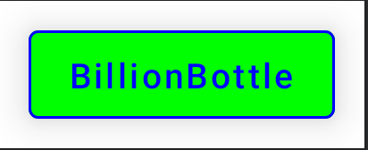
Example
  Button(
  onClick = {},
  modifier = Modifier.padding(12.dp),
  colors = ButtonDefaults.buttonColors(
      backgroundColor = Color.Green,
      contentColor = Color.Blue
  ),
  elevation = ButtonDefaults.elevation(
      defaultElevation = 12.dp,
      pressedElevation = 12.dp
  ),
  border = BorderStroke(width = 1.dp, color = Color.Blue)
) {
  Text(text = "BillionBottle")
}
effect:
Image
Image corresponds to the ImageView of Android View and can be used to display pictures. It mainly has the following properties:
- bitmap: ImageBitmap: you can directly pass in the ImageBitmap to build. If you want to display drawable
For the pictures under the folder, you can use VaR imagebitmap = imagebitmap imageResource(id = R.drawable.xxx) - contentDescription: String?: accessibility services can read and identify
- Modifier: modifier of modifier: Image
- Alignment: alignment
- Contentscale: the display mode of the picture
- Alpha: float: sets the transparency. The default is 1.0f
- Colorfilter: colorfilter: you can set the color filter
Example
   // Use the picture resources under drawable to display pictures
Image(
    painter = painterResource(R.drawable.xxx),
    contentDescription = "",
)
Surface
When we want to add a background color to a custom component, we need to use Surface, which mainly has the following properties:
- modifier: Modifier: you can set modifiers for the Surface
- shape: Shape: sets the shape. The default is rectangle shape
- color: Color: sets the background color
- contentColor: Color: sets the color for Text text in the Surface. When Text does not specify a color, the color is used
- border: Border?: Set outer border
- elevation: Dp: sets the height of the Surface in the Z-axis direction
- Content: @ composable() - > unit: to set the content layout for the Surface, you need to pass in the @ Compose method
Example
    Surface(modifier = Modifier.padding(4.dp), color = Color.Gray) {
        Column {
            Text(modifier = Modifier.align(Alignment.CenterHorizontally), text = "custom")
            Image(
                modifier = Modifier.size(150.dp),
                painter = ColorPainter(color = Color.Green),
                contentDescription = "image color"
            )
        }
    }
effect: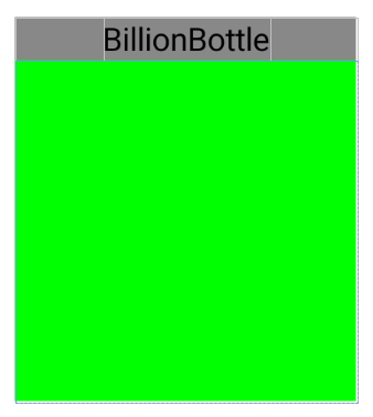
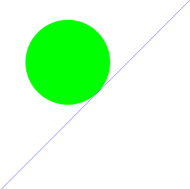
Canvas
Canvas is a component that performs drawing in a specified area on the screen. Note that you need to add modifiers to specify the size when using. You can use modifier size
To set a fixed size, you can also use modifier fillMaxSize,ColumnScope.weight sets the relative parent component size. If the parent component is not sized, Canvas
You must set a fixed size.
Canvas is similar to the original custom View, but more convenient. You can draw the desired effect through the drawing method defined by DrawScope. You can use drawArc and drawCircle
, drawLine, drawPoints and other methods to draw graphics (for details, please refer to the methods under DrawScope):
Canvas(modifier = Modifier.fillMaxSize()) {
    val canvasWidth = size.width
    val canvasHeight = size.height
    // Draw a blue line from the lower left corner to the upper right corner
    drawLine(
        start = Offset(x = canvasWidth, y = 0f),
        end = Offset(x = 0f, y = canvasHeight),
        color = Color.Blue
    )

    // Draw a circle with a radius of 200, 1200, position 120
    drawCircle(color = Color.Green, center = Offset(200f, 1200f), radius = 120f)
}
effect:
Layout control
Compose provides some available layout components to enable us to better layout UI elements:
Column
The LinearLayout control of Android must be very familiar to Android learners, and the Column is very similar to the vertical arrangement of LinearLayout. Observe how it is declared
@Composable
inline fun Column(
    modifier: Modifier = Modifier,
    verticalArrangement: Arrangement.Vertical = Arrangement.Top,
    horizontalAlignment: Alignment.Horizontal = Alignment.Start,
    content: @Composable ColumnScope.() -> Unit
) {
    val measurePolicy = columnMeasurePolicy(verticalArrangement, horizontalAlignment)
    Layout(
        content = { ColumnScopeInstance.content() },
        measurePolicy = measurePolicy,
        modifier = modifier
    )
}
Column has two properties that control the layout of children:
Vertical arrangement controls the vertical arrangement of child elements. The default is arrangement Top, arranged as close to the top of the spindle as possible. It also has several other values to represent different layout methods:
- Arrangement.BOTTOM: arranged vertically and as close to the bottom as possible
- Arrangement.CENTER: vertically centered
- Arrangement.SpaceBetween: evenly distributed child elements
- Arrangement. Spaceevery: make the child elements equally spaced, but there is no spacing at the head and tail of the element
- Arrangement.SpaceAround: make the child elements equally spaced, and the spacing between the beginning and end of the child elements is half the size in the middle
horizontalAlignment controls the horizontal arrangement of child elements. The default is alignment Generally, start starts from the left. Alignment
The following defines many arrangement methods. There are three main types applicable to columns:
- Alignment.Start: align left
- Alignment.End: align right
- Alignment.CenterHorizontally: horizontally centered
How do you put the child controls of Column? In fact, it also has an attribute content, which is a function that sends out sub interface elements, which contains the required sub elements.
For example, the following example uses horizontal right alignment and vertical bottom alignment:
@Composable
fun columnColumn() {
       Column(
            // The modifier will be described below. It is mainly used to expand the functions of the control, such as adding margins, width, etc
            modifier = Modifier.height(100.dp).padding(5.dp),
            verticalArrangement = Arrangement.Bottom,
            horizontalAlignment = Alignment.End
        ) {
            Text("Android")
            Text("BillionBottle")
        }
}
effect:

Row
Unlike Column, Row is laid out in a horizontal direction, which is very similar to LinearLayout setting the layout mode of horizontal arrangement
There are also two properties to represent the arrangement in the horizontal and vertical directions. Its properties and usage are also very similar to Column.
@Composable
inline fun Row(
    modifier: Modifier = Modifier,
    horizontalArrangement: Arrangement.Horizontal = Arrangement.Start,
    verticalAlignment: Alignment.Vertical = Alignment.Top,
    content: @Composable RowScope.() -> Unit
) {
    val measurePolicy = rowMeasurePolicy(horizontalArrangement, verticalAlignment)
    Layout(
        content = { RowScopeInstance.content() },
        measurePolicy = measurePolicy,
        modifier = modifier
    )
}
By observing its declaration method, it can be clearly seen that the horizontal and vertical directions are controlled in the same way. The Arrangement is mainly aimed at its main axis direction (vertical for Column and Row)
Alignment is the arrangement in the other direction. I won't go into detail. Let's see how to use it through an example:
@Composable
fun rowShow() {
    // A 200 dp wide, vertically centered, horizontally aligned layout was created
    Row(
        modifier = Modifier.width(200.dp),
        verticalAlignment = Alignment.CenterVertically,
        horizontalArrangement = Arrangement.Start
    ) {
        Text("Android")
        Text("BillionBottle")
    }
}
effect:

Box
Using Box, you can overlay one element on top of another, similar to a FrameLayout layout. To view Box declarations and related properties:
@Composable
inline fun Box(
    modifier: Modifier = Modifier,
    contentAlignment: Alignment = Alignment.TopStart,
    propagateMinConstraints: Boolean = false,
    content: @Composable BoxScope.() -> Unit
) {
    val measurePolicy = rememberBoxMeasurePolicy(contentAlignment, propagateMinConstraints)
    Layout(
        content = { BoxScopeInstance.content() },
        measurePolicy = measurePolicy,
        modifier = modifier
    )
}
modifier and content are the same as before, and contentAlignment is the control Box
There are many ways to align child elements. For example, you can set the top or bottom center. For details, see the Alignment static attribute below
// 2D Alignments.
Notes related content.
Let's see how to use it:
@Composable
fun boxLayout() {
    Box(
        contentAlignment = Alignment.BottomCenter,
        modifier = Modifier
            .width(100.dp)
            .height(50.dp)
            .padding(bottom = 10.dp),
    ) {

        Text("BillionBottle", modifier = Modifier.background(Color.Yellow))
        Text(
            "Android",
            modifier = Modifier.background(color = Color.Gray)
        )
    }
}
effect:
Modifier
Compose basically provides modifiers for each component to expand the functions of the component, including the width and height of the component, barrier free information, user input and advanced interaction of user click and scroll. Modifier is mainly used by modifier
This class is created. Its calling method is chain calling. Each call will return to itself. Common attributes include background, height, offset, size and clickable
For details, please refer to Official document Modifier
It should be noted that different effects may be displayed on the interface through different call sequences:
   Column(
        modifier = Modifier
            .width(100.dp)
            .height(100.dp)
    ) {
        Text("BillionBottle")
        Icon(
            Icons.Filled.Favorite,
            contentDescription = "Favorite",
            // 1
            modifier = Modifier
                .background(Color.Green)
                .size(ButtonDefaults.IconSize)
                .padding(2.dp)
        )
    }
Through the preview interface build & refresh, you can see that if the modifier is used Size and The two calls of padding exchange positions, and the size of the Icon will be greatly different.
Through the superposition and combination of various controls, we can construct the interface we want. Moreover, for the problem that too much nesting in the original Android View may have performance impact, Compose
It can effectively deal with nested layouts, which is an excellent tool for designing complex interfaces.
Give me an example
The following is a custom control that displays different userprofiles by passing in name, image and content:
// @DrawableRes indicates that the incoming image must be a resource file under drawable
@Composable
fun userProfile(name:String,content:String,desc:String = "",@DrawableRes image:Int) {
        // Add margins
        Row(modifier = Modifier.padding(all = 8.dp)) {
            Image(
                painter = painterResource(image),
                contentDescription = desc,
                modifier = Modifier
                    .size(40.dp)
                    // Crop the picture into a circle
                    .clip(CircleShape)
            )

            // Add Image and Column spacing
            Spacer(modifier = Modifier.width(8.dp))

            Column {
                Text(text = name)
                Spacer(modifier = Modifier.height(4.dp))
                Text(text = content)
            }
        }
}
The effect displayed after passing in the corresponding parameter:
4. Status management
The so-called state can be understood as the change of a value, which can be a Boolean value change or an array change, or the state of button text and color from the interface, and Compose is declarative
UI is mainly reorganized according to the change of state. At this time, it is necessary to add state and manage related states.
There is an observable object mutablestate < T > in the compose runtime, which can be created through mutableStateOf:
interface MutableState<T> : State<T> {
    override var value: T
}

// The three declarations are the same
val state = remember { mutableStateOf("") }
var value by remember { mutableStateOf("") }
val (value, setValue) = remember { mutableStateOf("") }
remember is to store the state in Composition. When reorganization occurs, the original object will be automatically discarded and the value after changing the state will be used instead. As long as the value of MutableState
Making a change will cause the composable method using this state to be reorganized. Not much, let's see how state is used:
//module
data class Info(var content:String)
@Composable
fun Greeting(name: String) {
    var info by remember { mutableStateOf(Info("")) }
    MyApplicationTheme {
        // A surface container using the 'background' color from the theme
        Surface(color = MaterialTheme.colors.background) {
            Column(modifier = Modifier.padding(16.dp)) {

                if (info.content.isNotEmpty()){
                    Text(text = info.content)
                }
                OutlinedTextField(
                    value = info.content,
                    onValueChange = {
                        info = Info(it)
                    },
                    label = { Text("title") }
                )
            }
        }
    }
}
The function is very simple, that is, in the OutlinedTextField
If the content entered by the keyboard is not empty, it can be displayed on the top in real time. It is mainly changed through VAR info by remember {mutablestateof (info ("")}
When the reference of this variable changes, Compose will refresh the components using this variable, and the corresponding component state will also change. Therefore, when using Compose, we only need to update the data.
However, remember can only save the state during reorganization. Once other conditions, such as screen rotation, change the Configuration, remember
There is nothing you can do. At this time, you need to use rememberSaveable. As long as the data is of Bundle type, remebersaveable can automatically save it. Usage:
- As long as it is of type parse, it is the same as remember:
@Parcelize
data class Info(val content: String): Parcelable

var value by rememberSaveable { mutableStateOf(Info("")) }- MapSaver:
data class Info(val content: String)

val infoSaver = run {
    val nameKey = "content"
    mapSaver(
        save = { mapOf(nameKey to it.content) },
        restore = { Info(it[nameKey] as String) }
    )
}
@Composable
fun CityScreen() {
    var infoState = rememberSaveable(stateSaver = citySaver) {
        mutableStateOf(Info(""))
    }
    Column(modifier = Modifier.padding(16.dp)) {

        if (infoState.value.content.isNotEmpty())
            Text(text = infoState.value.content)

        OutlinedTextField(
            value = infoState.value.content,
            onValueChange = {
                 infoState.value = Info("$it")
            },
            label = { Text("title") }
        )
    }
}
- ListSaver
data class City(val name: String, val country: String)

val CitySaver = listSaver<City, Any>(
    // The values saved in the array correspond to the attributes in the City in order
    save = { listOf(it.name, it.country) },
    restore = { City(it[0] as String, it[1] as String) }
)

@Composable
fun CityScreen() {
    var selectedCity = rememberSaveable(stateSaver = CitySaver) {
        mutableStateOf(City("", ""))
    }
}
Of course, compose also supports other types of states:
- LiveData
- Flow
- RxJava2
Before using other State types, you must convert them to State < T > type, so that compose can recognize that this is a State value. You need to refresh the ui according to this value. For example, when using LiveData, you need to
The Composable method is converted to state type before using it. You can use livedata < T > observeAsState().
Summary
This article only briefly introduces the basic content of Android Compose. More rich content and details can be viewed on the official website. With the continuous update of the version, new functions will be added, waiting for everyone to explore!