KMeans divides the characteristic matrix X of a set of N samples into K clusters without intersection.
Centroid: the mean value of all data in the cluster
Process: 1 K samples are randomly selected as the initial centroid to start the iteration
2. Each sample point is assigned to the nearest cluster center to generate K clusters
3. For each cluster, calculate the latest centroid of the average value of all sample points assigned to the cluster
4. When the position of the centroid does not change, the iteration stops and the clustering is completed.
Euclidean distance: d(x, ) =
) = 
Manhattan distance: d(x,) = 
Cosine distance: cos =
= 
sklearn.cluster.KMeans
Important parameters: n_clusters: tell the model to be divided into 8 categories by default
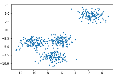
from sklearn.datasets import make_blobs
import matplotlib.pyplot as plt
# Create your own dataset
x,y = make_blobs(n_samples=500,n_features=2,centers=4,random_state=1)
fig,ax1 = plt.subplots(1)  # Generate several subgraphs, fig canvas, ax1 object
ax1.scatter(x[:,0],x[:,1],marker='o',s=8)
plt.show()
color = ['red','pink','orange','gray']
fig,ax1 = plt.subplots(1)
for i in range(4):
    ax1.scatter(x[y==i,0],x[y==i,1],marker='o',s=8,c=color[i])
plt.show() 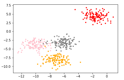
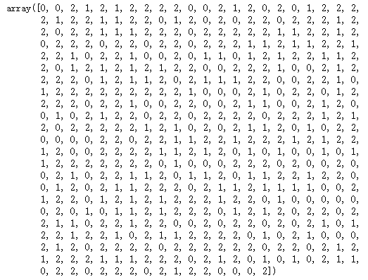
from sklearn.cluster import KMeans
n_clusters = 3
cluster = KMeans(n_clusters=n_clusters,random_state=0).fit(x)   # Clustering has been completed to find the centroid
y_pred = cluster.labels_    # labels_ View the clustered categories and the corresponding classes in each sample
y_pred
#You can also call the interface predict, which is the same as the result of fit
#predict is equivalent to having a centroid. Cluster the points according to this centroid
#Why use predict? When the amount of data is very large, you can slice the data to find the centroid in fit, and then predict clusters all the data to save time, but the effect is certainly not as good as reducing the amount of data. When the data is very large, the effect is almost the same
# cluster = KMeans(n_clusters=n_clusters,random_state=0).fit(x[:200])
# y = cluster_smallsub.predict(x)
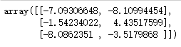
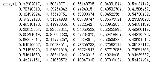
centroid = cluster.cluster_centers_    # cluster_centers_  View centroid
centroid
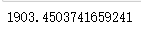
cluster.inertia_ # View total square sum of distances
#Draw the clustered image
color = ["red","green","orange","gray"]
fig,ax1 = plt.subplots(1)
for i in range(n_clusters):
    ax1.scatter(x[y_pred==i,0],x[y_pred==i,1],marker='o',s=8,c=color[i])
ax1.scatter(centroid[:,0],centroid[:,1],marker="x",s=15,c="black")
plt.show() 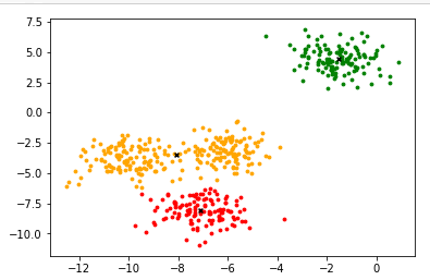
#Guess the number of clusters
n_clusters = 4
cluster4 = KMeans(n_clusters,random_state=0).fit(x)
inertia_ = cluster4.inertia_
inertia_
n_clusters = 5
cluster5 = KMeans(n_clusters,random_state=0).fit(x)
inertia_ = cluster5.inertia_
inertia_
#The smaller the intertia, the better, but the intertia is affected by n_cluster influence, cannot be adjusted n_cluster to reduce intertia
#Therefore, intertia is not an effective evaluation index
#Model evaluation index of clustering algorithm
The effect of clustering is measured by measuring the differences inside and outside the cluster.
When the real label is known: mutual information score (generally not encountered in reality)
When the real label is unknown:
Contour coefficient: two indexes a and b are used to evaluate the density in the cluster
a: similarity between the sample and other samples in its own cluster (average distance between all other points in the sample cluster)
b: similarity between the sample and samples in other clusters (average distance between the sample and all points in the next nearest cluster)
Single sample contour coefficient s = (- 1,1) the closer to 1, the better
metrics.silhouette_score returns the mean of all sample contour coefficients in a dataset
metrics.silhouette_ sample returns the contour coefficient of each sample in the dataset
Kalinski harabasz index: calinski harabasz index; advantages: fast calculation
s(k) = 

Number of k clusters, Inter group discrete matrix (covariance matrix between different clusters)
Trace of tr matrix (sum of diagonal elements) Intra cluster discrete matrix (covariance matrix of data in a cluster)
The higher the degree of dispersion between data, the greater the trace of covariance, so the higher the calinski harabasz index, the better
Contour coefficient
from sklearn.metrics import silhouette_score
from sklearn.metrics import silhouette_samples
silhouette_score(x,y_pred)
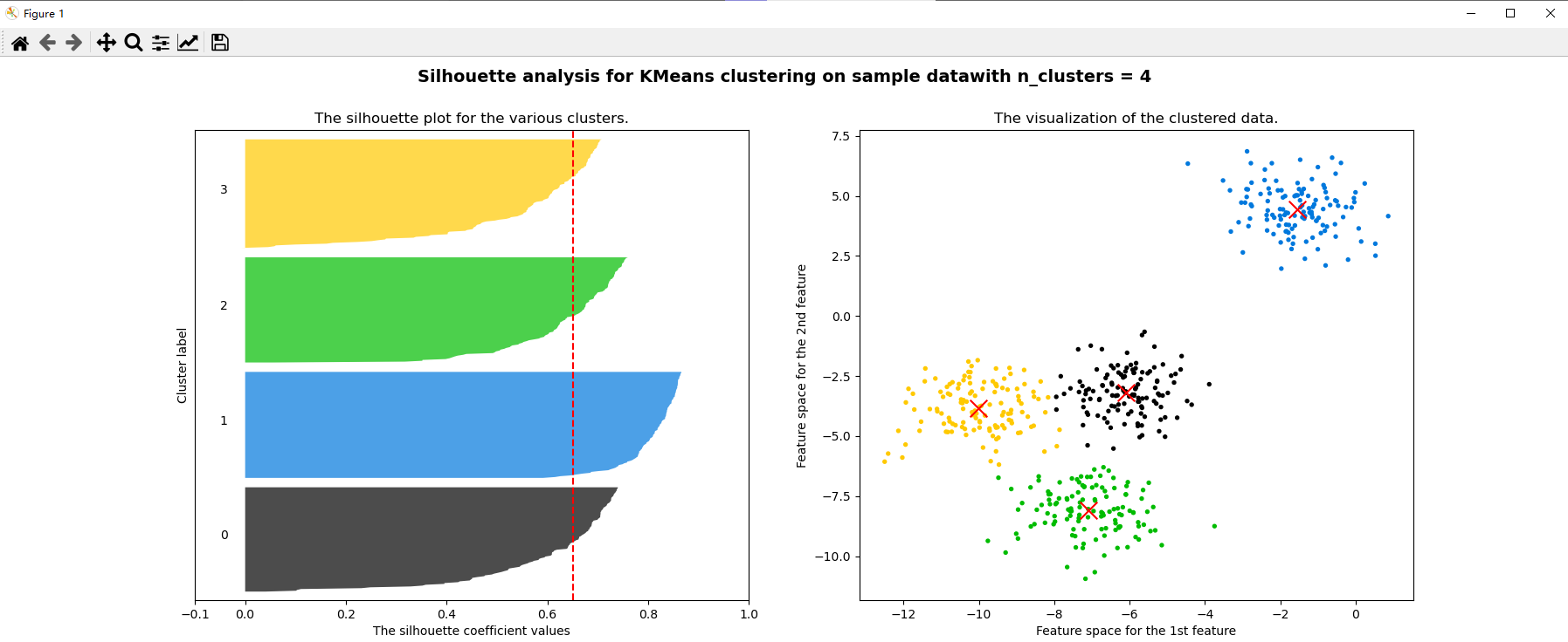
silhouette_score(x,cluster4.labels_) # The effect of 4 clusters is better than 3 clusters
silhouette_score(x,cluster5.labels_) # 5 clusters
silhouette_samples(x,y_pred)
Kalinsky halabas index
from sklearn.metrics import calinski_harabasz_score
calinski_harabasz_score(x,y_pred)
calinski_harabasz_score(x,cluster4.labels_)
calinski_harabasz_score(x,cluster5.labels_)

Time taken to compare two coefficients
from time import time
t0 = time()
calinski_harabasz_score(x,cluster4.labels_)
time()-t0
t0 = time()
silhouette_score(x,cluster4.labels_)
time()-t0
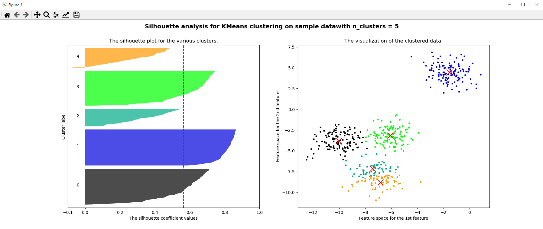
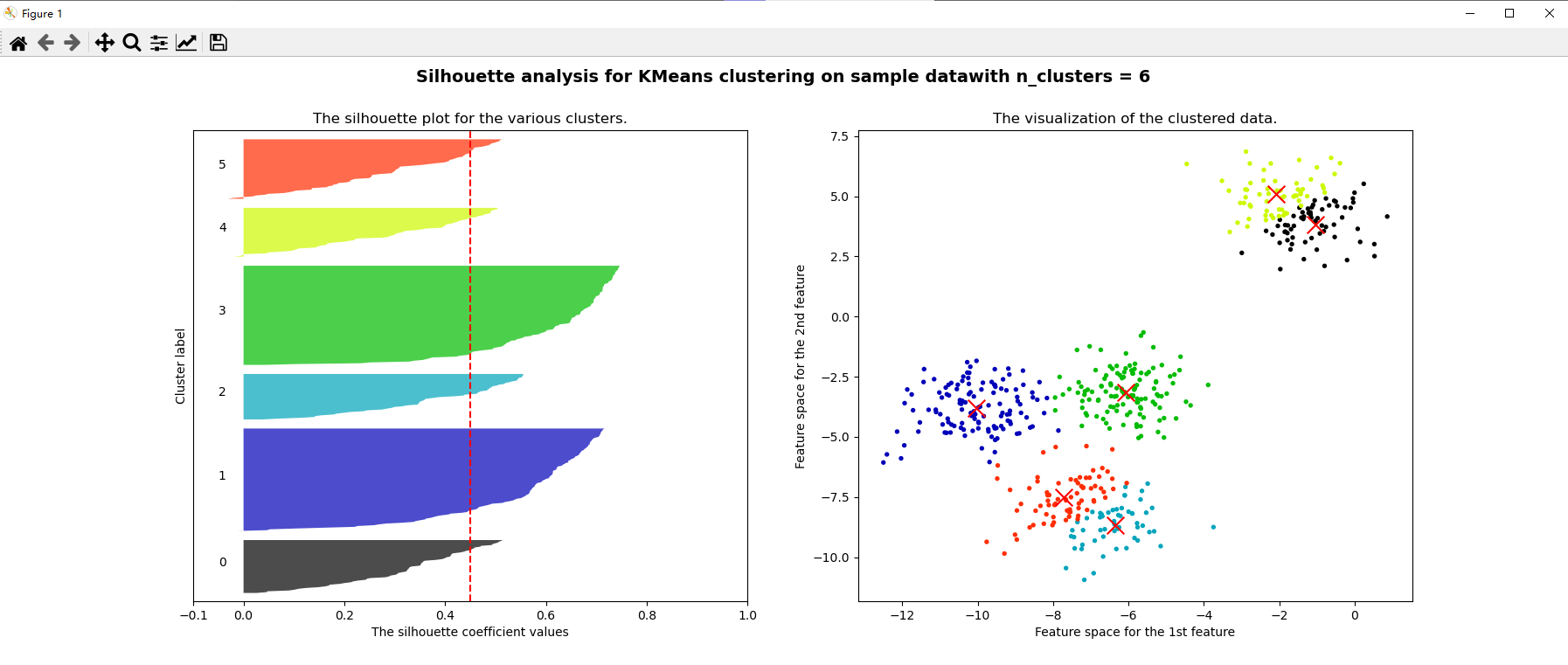
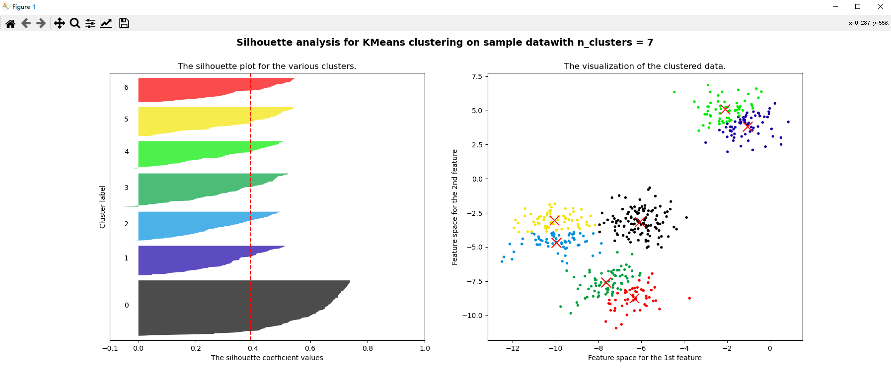
Case: select n based on contour coefficient_ clusters
from sklearn.cluster import KMeans
from sklearn.metrics import silhouette_score,silhouette_samples
import matplotlib.pyplot as plt
import matplotlib.cm as cm
import numpy as np
from sklearn.datasets import make_blobs
# Create your own dataset
x,y = make_blobs(n_samples=500,n_features=2,centers=4,random_state=1)
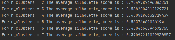
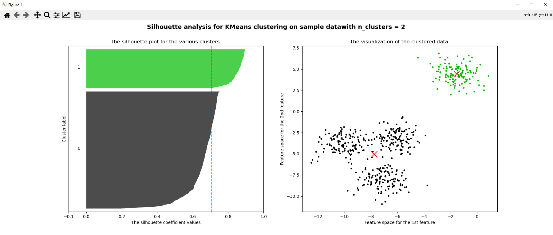
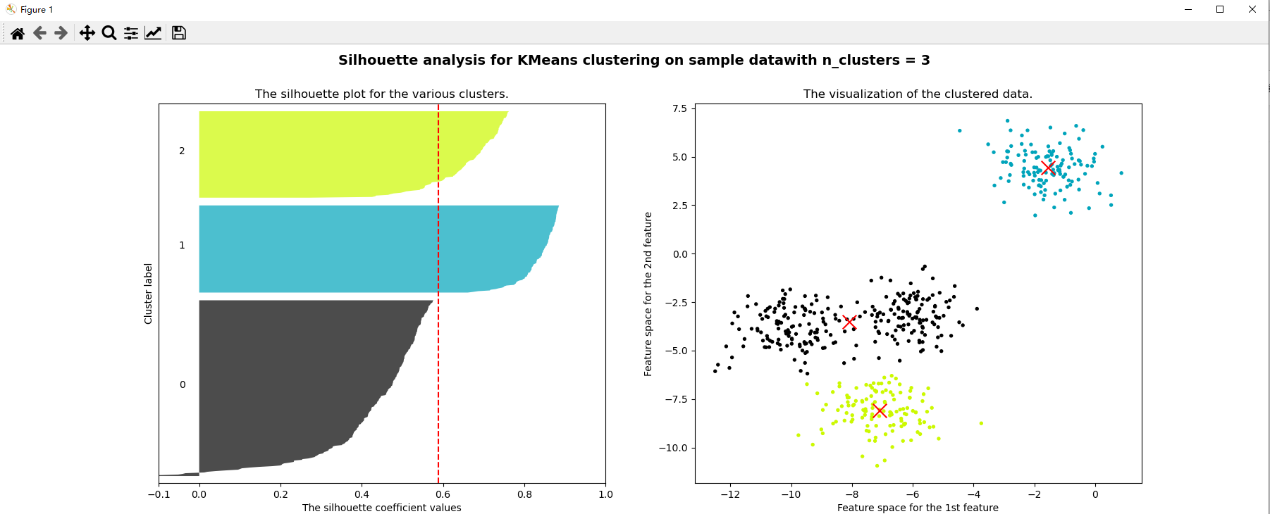
for n_clusters in [2,3,4,5,6,7]:
# Know the contour coefficient of each clustered class, and want a comparison of the contour coefficient between each class
# Know the distribution of the image after clustering
fig, (ax1, ax2) = plt.subplots(1, 2)
fig.set_size_inches(18, 7)
# The first graph is the contour coefficient graph, which is a horizontal bar graph composed of the contour coefficients of each cluster
# The abscissa of the horizontal bar graph is the value of the contour coefficient, and the ordinate is the value of each sample
# Set abscissa
# Contour coefficient [- 1,1], too long abscissa is not conducive to visualization, so set the value of x-axis between [- 0.1,1]
ax1.set_xlim([-0.1, 1])
# Set the ordinate. The minimum value is 0 and the maximum value is x.shape[0]
# Each cluster is arranged together, and there are gaps between different clusters
# Add a distance (n_clusters + 1) * 10 to x.shape[0] as a gap
ax1.set_ylim([0, x.shape[0] + (n_clusters + 1) * 10])
# Start modeling
clusterer = KMeans(n_clusters=n_clusters, random_state=10).fit(x)
cluster_labels = clusterer.labels_
# silhouette_score generates contour mean
# When calling the contour coefficient, the parameters to be input are the characteristic matrix x and the clustered label cluster_labels
silhouette_avg = silhouette_score(x, cluster_labels)
print("For n_clusters =", n_clusters, "The average silhouette_score is :", silhouette_avg)
# Call silhouette_samples returns the contour coefficient of each sample, which is the abscissa
sample_silhouette_values = silhouette_samples(x, cluster_labels)
# Sets the initial value on the y-axis (a certain distance from the x-axis)
y_lower = 10
for i in range(n_clusters):
# Extract the contour coefficient of the ith cluster from the contour coefficient results of each sample and sort them (make the samples of each cluster together)
ith_cluster_silhouette_values = sample_silhouette_values[cluster_labels == i]
# . sort() will directly change the order of the original data
# . sort() sorts the data from small to large along the upper half of the y axis
ith_cluster_silhouette_values.sort()
# See how many samples are in the cluster
size_cluster_i = ith_cluster_silhouette_values.shape[0]
y_upper = y_lower + size_cluster_i
# Functions in the colormap library that use decimals to call colors
# In nipy_spectral([enter any decimal to represent a color])
# Make sure that the decimals generated in each cycle are different to ensure that all clusters will have different colors
color = cm.nipy_spectral(float(i) / n_clusters)
# Start filling the contents of sub Figure 1
# fill_between is a function that unifies the color of the histogram in a range
# fill_ The range of betweenx is on the ordinate, fill_ The range of betweeny is on the abscissa
# fill_ Betweenx (lower ordinate limit, upper ordinate limit, value on x axis, histogram color)
ax1.fill_betweenx(np.arange(y_lower, y_upper), ith_cluster_silhouette_values, facecolor=color, alpha=0.7)
# Write the cluster number for the contour coefficient of each cluster so that the number is displayed in the middle of each bar graph on the coordinate axis
# Text (to display the abscissa of the number position, the ordinate of the number position and the content of the number)
ax1.text(-0.05, y_lower + 0.5 * size_cluster_i, str(i))
# Calculate the new initial value on the y-axis for the next cluster. After each iteration, add 10 to the upper limit of Y
y_lower = y_upper + 10
# Title Figure 1
ax1.set_title("The silhouette plot for the various clusters.")
ax1.set_xlabel("The silhouette coefficient values")
ax1.set_ylabel("Cluster label")
# Put the mean value of contour coefficient on the whole data set into our graph in the form of dotted line
ax1.axvline(x=silhouette_avg, color="red", linestyle="--")
# Make the y-axis not display the scale
ax1.set_yticks([])
# Let the scale on the x-axis display as the list we specify
ax1.set_xticks([-0.1, 0, 0.2, 0.4, 0.6, 0.8, 1])
# Create a second diagram, point diagram
# Get colors. Since there is no cycle, you need to generate multiple decimals at a time to get multiple colors
colors = cm.nipy_spectral(cluster_labels.astype(float) / n_clusters) # Four classes and four labels become floating point numbers
ax2.scatter(x[:, 0], x[:, 1], marker="o", s=8, c=colors)
# Put the center of mass in the image
centers = clusterer.cluster_centers_
ax2.scatter(centers[:, 0], centers[:, 1], marker="x", c="red", alpha=1, s=200)
ax2.set_title("The visualization of the clustered data.")
ax2.set_xlabel("Feature space for the 1st feature")
ax2.set_ylabel("Feature space for the 2nd feature")
# Set the title for the entire diagram
plt.suptitle(("Silhouette analysis for KMeans clustering on sample data""with n_clusters = %d" % n_clusters)
, fontsize=14, fontweight='bold') # fontsize font size, fontweight bold font
plt.show()