Today is the first day of work after the festival. I wake up in the morning and open my eyes, huh? Ah...? What...? Where's this? Who am I? What class do you work in?
The goose, however, was woken up by eight alarm clocks specially set up last night. The difficulty of getting up in the morning in winter must be appreciated by all of you. You came to the office early with 10,000 unwilling to get up. It's still a familiar environment or a familiar taste.
Also, familiar task requirements (vi).
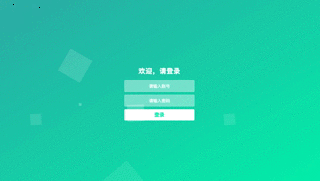
Today's first task is to write a login page, the boss gave me a Reference (chao) Examination (xi) Case You can see it by clicking on the link. Well, this login page is really concise and generous, especially its bubble background. The first reaction is that it should be a dynamic picture. Opening the review element, we found that it was written in code, which aroused the curiosity of the baby. So we tried to write a login page with bubble background. The effect is as follows:
emm... why is the uploaded gif dynamic graph always so small to fill in the screenshot?
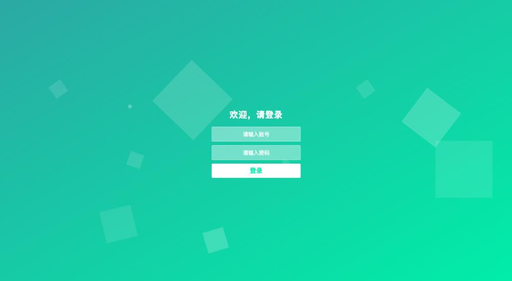
(You can brainpower these background bubbles upward.)
It takes only a few simple codes to achieve this effect.
First, we define 10 li list tags. I use the vue framework:
<ul class="bg-bubbles">
    <li v-for="i in 10" :key="i"></li>
</ul>
The style is written in less:
.bg-bubbles {
    position: absolute;
    // Fill the bubble background with the whole screen.
    top: 0;
    left: 0;
    width: 100%;
    height: 100%;
    // If the element content exceeds the given width and height, the overflow attribute can determine whether the scrollbar behavior is displayed or not.
    overflow: hidden;
    li {
      position: absolute;
      // Bottom is set to create the effect of bubbles emerging from the bottom of the page.
      bottom: -160px;
      // Default bubble size;
      width: 40px;
      height: 40px;
      background-color: rgba(255, 255, 255, 0.15);
      list-style: none;
      // Use custom animation to make bubbles appear, rise and roll.
      animation: square 15s infinite;
      transition-timing-function: linear;
      // Different positions, sizes, transparency and velocities of each bubble are set to make it appear hierarchical.
      &:nth-child(1) {
        left: 10%;
      }
      &:nth-child(2) {
        left: 20%;
        width: 90px;
        height: 90px;
        animation-delay: 2s;
        animation-duration: 7s;
      }
      &:nth-child(3) {
        left: 25%;
        animation-delay: 4s;
      }
      &:nth-child(4) {
        left: 40%;
        width: 60px;
        height: 60px;
        animation-duration: 8s;
        background-color: rgba(255, 255, 255, 0.3);
      }
      &:nth-child(5) {
        left: 70%;
      }
      &:nth-child(6) {
        left: 80%;
        width: 120px;
        height: 120px;
        animation-delay: 3s;
        background-color: rgba(255, 255, 255, 0.2);
      }
      &:nth-child(7) {
        left: 32%;
        width: 160px;
        height: 160px;
        animation-delay: 2s;
      }
      &:nth-child(8) {
        left: 55%;
        width: 20px;
        height: 20px;
        animation-delay: 4s;
        animation-duration: 15s;
      }
      &:nth-child(9) {
        left: 25%;
        width: 10px;
        height: 10px;
        animation-delay: 2s;
        animation-duration: 12s;
        background-color: rgba(255, 255, 255, 0.3);
      }
      &:nth-child(10) {
        left: 85%;
        width: 160px;
        height: 160px;
        animation-delay: 5s;
      }
    }
    // Custom square animation;
    @keyframes square {
      0% {
        opacity: 0.5;
        transform: translateY(0px) rotate(45deg);
      }
      25% {
        opacity: 0.75;
        transform: translateY(-400px) rotate(90deg)
      }
      50% {
        opacity: 1;
        transform: translateY(-600px) rotate(135deg);
      }
      100% {
        opacity: 0;
        transform: translateY(-1000px) rotate(180deg);
      }
    }
  }
In addition, the background color of the outermost parent container here is:
background: linear-gradient(to bottom right, #50A3A2, #53E3A6);
So far, a bubble background map is completed. Looking back, it's not difficult, but it also makes people feel the charm and power of css animation more and more.
If you like this article, you might as well point out a favorite or concern, which will be my greater motivation.
There is a long way to go, and we hope to share our encouragement with you.