A complete quantitative trading strategy is one that takes into account all aspects of the transaction, but who knows if it can make money?
But a quantitative transaction can be done automatically by building confidence in the measurement system and keeping it running as it has always been.
The author mainly talks about the quantitative transaction of pure technology, some basic conditions are not handled and quantified, and I have not involved it for the time being.
Quantitative Transactions
A complete quantitative trading strategy, which I feel should include the following two parts:
- Transaction strategy
- fund management
Transaction strategy
A complete trading strategy should include when to buy and when to sell.
The market is roughly divided into two technical genres on how to buy and sell.
- Trend Following
- Value Regression
Trend Following
This genre believes that the stock market is continuing, so the opportunity for buying and selling points is to catch on.
Indicator: MACD, moving average.
Comment: Open for half a year, open for half a year.
Value Regression
This genre holds that stocks have intrinsic value. Although they bounce back and forth in disorder, they fluctuate around their intrinsic value from start to finish, so the opportunity to buy and sell stocks is to seize the oversold and oversold points to buy and sell them.
Indicator: RSI.
Comment: Less is more.
Whether the trend follows or the value returns, in fact, the core issue of buying and selling is not solved, that is, when to buy and sell. Although each genre has its own solution, its solution throws out a new problem to solve the problem we need to solve.
However, there are some technical indicators to help us observe trends and oversold.
Technical Indicators
Here we will focus on the common technical indicators, such as MACD, Average Line, RSI. There are also some interesting graphical indicators to judge buying and selling by judging the shape of the graph, which can both follow trends and return values.
Here are their calculation formulas and descriptions.
MACD
MACD, known as identical moving average, is developed from the biexponential moving average, which is derived from the fast exponential moving average (EMA12) minus the slow exponential moving average (EMA26), and then from the 9-day weighted moving average DEA of the fast-line DIF-DIF, the MACD column is obtained.- From Baidu Encyclopedia
The DIF of this indicator's fast line is the difference between the two exponential averages, so when the trend goes up, it will be positive, and when the curvature of the rise is large, it will rapidly increase, and its DEA is naturally below it, while the trend is the opposite.So this indicator can reflect the trend of history, and some of the filtered trends are not obvious, but if there is no obvious trend is cross-dead cross-tangle, the judgment of the situation is not obvious.
Moving Average
Moving Average, referred to as MA, MA is a method of statistical analysis, which averages securities prices (indices) in a certain period of time and connects the average values at different times to form a MA to observe the trend of changes in securities prices.- From Baidu Encyclopedia
Mobile Average should be the most widely used technical indicator because almost all trading software draws a mobile average, which reflects historical trends, moving up and vice versa.
RSI
N-day RSI =N-day closing increase average/(N-day closing increase average + N-day closing decrease average)*100 - - From Baidu Encyclopedia
RSI is interesting, if all the N-day rise is 100, all the fall is 0, so 100 means the market is too optimistic, 0 means the market is too pessimistic, which is naturally useful in times of shocks, but if the trend is going up all the way, then it is not too optimistic, but the market is like that, at this time should not be reversedTo operation.
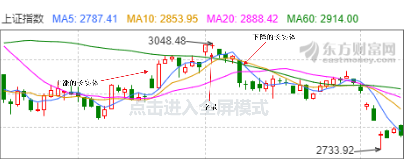
Candlestick Charts
That is, we are familiar with the K-line chart, which shows the trading situation of a time period through opening price, maximum price and minimum price. Candle chart has many meaningful graphics. Here are mainly some graphics that I think make sense, long entity, crosses
A long entity means that the highest and lowest prices for a single k-line are very different, and then the closing and opening prices are very close to the highest and lowest prices, respectively.This is because the buyer or seller is very strong.It can be used to guess the following trend and to follow it.
A cross is a very small difference between the opening price and the closing price, almost coinciding, followed by a partial shadow.The reason for this is that the buyer and seller repeatedly tangle, but who can not do who can be used to speculate the reversal of the situation, can be used as a value regression.
The recent Shanghai Stock Index is interesting. They have everything.
All technical indicators have their inherent meaning, which is known by observing their calculation formula, and all technical indicators have the same problem: lag, or simply reflect the historical trend, but this is reasonable and the future is not yet.If any of these metrics can predict the future, it's too interesting.
In summary, whether trading is done subjectively or through technical indicators, the ultimate judgment is the decision-maker's experience, which may or may not be quantifiable.It's best to quantify. It's OK not to quantify. It's not enough to make money. It's just the difference between manual and automatic.
visualization
Say nothing, let's see how these metrics are traded.
Use the Shanghai Index here
import matplotlib.pyplot as plt
import matplotlib as mpl
import pandas as pd
import talib
import tushare as ts
# pip install https://github.com/matplotlib/mpl_finance/archive/master.zip
from mpl_finance import candlestick_ohlc
from matplotlib.pylab import date2num

# Use ggplot style to look better
mpl.style.use("ggplot")
# Obtain Shanghai Index Data
data = ts.get_k_data("000001", index=True, start="2019-01-01")
# Convert the date value to the datetime type and set it to index
data.date = pd.to_datetime(data.date)
data.index = data.date

# Calculate MACD Indicator Data
data["macd"], data["sigal"], data["hist"] = talib.MACD(data.close)

# Calculate moving average
data["ma10"] = talib.MA(data.close, timeperiod=10)
data["ma30"] = talib.MA(data.close, timeperiod=30)

# Compute RSI
data["rsi"] = talib.RSI(data.close)

# Calculate MACD Indicator Data
data["macd"], data["sigal"], data["hist"] = talib.MACD(data.close)

# Calculate moving average
data["ma10"] = talib.MA(data.close, timeperiod=10)
data["ma30"] = talib.MA(data.close, timeperiod=30)

# Compute RSI
data["rsi"] = talib.RSI(data.close)

# Draw the first graph
fig = plt.figure()
fig.set_size_inches((16, 20))

ax_canddle = fig.add_axes((0, 0.7, 1, 0.3))
ax_macd = fig.add_axes((0, 0.45, 1, 0.2))
ax_rsi = fig.add_axes((0, 0.23, 1, 0.2))
ax_vol = fig.add_axes((0, 0, 1, 0.2))

data_list = []
for date, row in data[["open", "high", "low", "close"]].iterrows():
    t = date2num(date)
    open, high, low, close = row[:]
    datas = (t, open, high, low, close)
    data_list.append(datas)

# Draw a candle chart
candlestick_ohlc(ax_canddle, data_list, colorup='r', colordown='green', alpha=0.7, width=0.8)
# Set x-axis to time type
ax_canddle.xaxis_date()
ax_canddle.plot(data.index, data.ma10, label="MA10")
ax_canddle.plot(data.index, data.ma30, label="MA30")
ax_canddle.legend()

# Draw MACD
ax_macd.plot(data.index, data["macd"], label="macd")
ax_macd.plot(data.index, data["sigal"], label="sigal")
ax_macd.bar(data.index, data["hist"] * 2, label="hist")
ax_macd.legend()

# Draw RSI
# Over 85% is set to overbuy and over 25% to oversell
ax_rsi.plot(data.index, [80] * len(data.index), label="overbuy")
ax_rsi.plot(data.index, [25] * len(data.index), label="oversell")
ax_rsi.plot(data.index, data.rsi, label="rsi")
ax_rsi.set_ylabel("%")
ax_rsi.legend()

# Divide volume by 100w
ax_vol.bar(data.index, data.volume / 1000000)
# Set to Millions Bit Units
ax_vol.set_ylabel("millon")
ax_vol.set_xlabel("date")
fig.savefig("index.png")

# Mark Moving Average Buy and Sell Points
for date, point in data[["ma_point"]].itertuples():
    if math.isnan(point):
        continue
    if point > 0:
        ax_canddle.annotate("",
                    xy=(date, data.loc[date].close),
                    xytext=(date, data.loc[date].close - 10),
                    arrowprops=dict(facecolor="r",
                                    alpha=0.3,
                                    headlength=10,
                                    width=10))
    elif point < 0:
        ax_canddle.annotate("",
                    xy=(date, data.loc[date].close),
                    xytext=(date, data.loc[date].close + 10),
                    arrowprops=dict(facecolor="g",
                                    alpha=0.3,
                                    headlength=10,
                                    width=10))
If you cannot install it with pip install ta-lib, you can install it with the.whl package that downloads the response at the address http://www.lfd.uci.edu/~gohlke/pythonlibs/#ta-lib
The results are as follows:
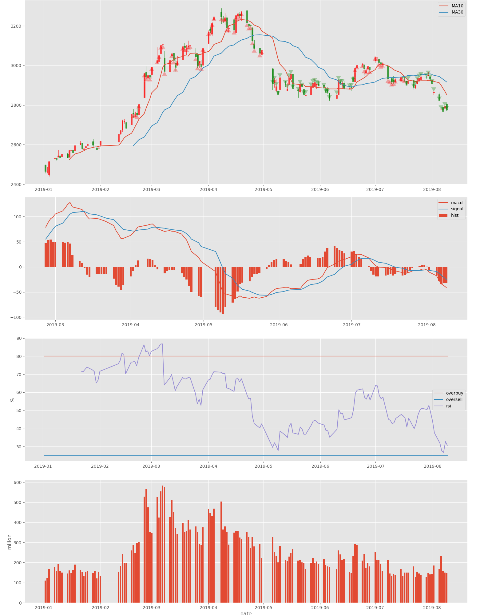
If you simply pass through the indicator's gold fork, there will be unusually many buy-and-sell points, so this is just the point where the moving average is marked.
Through a simple observation, we find that RSI has not oversold in this period of time and there is no buying point.
summary
Without an omnipotent indicator, the key is the person who uses the indicator.