In the previous article Vite + Vue3 initial experience - vite In my blog, I feel the improvement of runtime efficiency brought by Vite. In this issue, I will feel the new change brought by Vue3 - separation of concerns.
Todo List design
In this experience of Vue3, I want to be a functional module that can experience (part of) the new features of Vue3.
After thinking about it, it should be more appropriate to use a Todo List.
Let's plan its function list.
- Enter Todo and press enter to add a new Todo Item.
- Display all todo items as a list.
- Todo items can be marked as completed. After marking, todo items will be grayed out and sorted at the bottom.
- Todo items can be deleted and will not be displayed in the list after deletion.
- Todo items can be placed on the top and highlighted to increase priority.
OK, next, let's build the basic page first.
Build basic UI interface
Configure UI Library
Currently, there are several UI frameworks supporting Vue3:
Ant Design and elementui are the old UI libraries from Vue2. I decided to use the light style ant design when I experienced Vue3.
Install Ant Design Vue that supports Vue3 first.
yarn add ant-design-vue@next
Then, configure on-demand loading. In this way, only the used components will be packaged, which can effectively reduce the volume of the production package.
// vite.config.ts
import { defineConfig } from 'vite'
import vue from '@vitejs/plugin-vue'
import Components from 'unplugin-vue-components/vite'
import { AntDesignVueResolver } from 'unplugin-vue-components/resolvers'

// https://vitejs.dev/config/
export default defineConfig({
  plugins: [
    vue(),
    Components({
      resolvers: [
        AntDesignVueResolver(),
      ],
    }),
  ]
});
Finally, in main Import style files into ts.
// main.ts
import 'ant-design-vue/dist/antd.css';
Basic layout
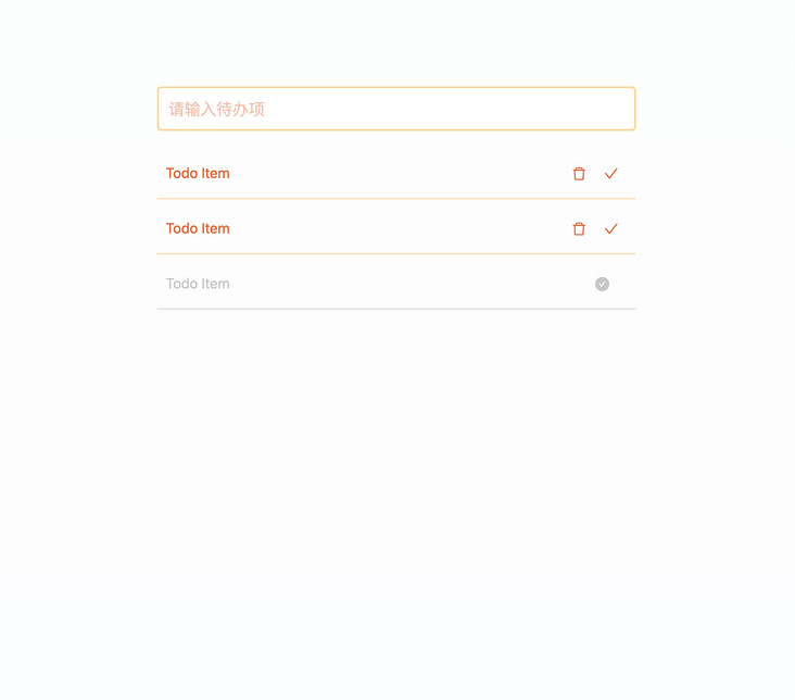
Now, our layout needs an input box and a list. Let's draw these two elements on the page first.
Before that, in app Vue introduces our TodoList component.
// TodoList.vue
<script setup lang="ts">
import { DeleteOutlined, CheckOutlined, CheckCircleFilled } from '@ant-design/icons-vue';
import { Input } from "ant-design-vue";


</script>

<template>
  <section class="todo-list-container">
    <section class="todo-wrapper">
      <Input class="todo-input" placeholder="Please enter a to-do item" />
      <section class="todo-list">
        <section class="todo-item">
          <span>Todo Item</span>
          <div class="operator-list">
            <DeleteOutlined />
            <CheckOutlined />
          </div>
        </section>
        <section class="todo-item">
          <span>Todo Item</span>
          <div class="operator-list">
            <DeleteOutlined />
            <CheckOutlined />
          </div>
        </section>
        <section class="todo-item todo-checked">
          <span>Todo Item</span>
          <div class="operator-list">
            <CheckCircleFilled />
          </div>
        </section>
      </section>
    </section>
  </section>
</template>

<style scoped lang="less">
.todo-list-container {
  display: flex;
  justify-content: center;
  width: 100vw;
  height: 100vh;
  box-sizing: border-box;
  padding-top: 100px;
  background: linear-gradient(rgba(93, 190, 129, .02), rgba(125, 185, 222, .02));
  .todo-wrapper {
    width: 60vw;
    .todo-input {
      width: 100%;
      height: 50px;
      font-size: 18px;
      color: #F05E1C;
      border: 2px solid rgba(255, 177, 27, 0.5);
      border-radius: 5px;
    }
    .todo-input::placeholder {
      color: #F05E1C;
      opacity: .4;
    }
    .ant-input:hover, .ant-input:focus {
      border-color: #FFB11B;
      box-shadow: 0 0 0 2px rgb(255 177 27 / 20%);
    }
    .todo-list {
      margin-top: 20px;
      .todo-item {
        box-sizing: border-box;
        padding: 15px 10px;
        cursor: pointer;
        border-bottom: 2px solid rgba(255, 177, 27, 0.3);
        color: #F05E1C;
        margin-bottom: 5px;
        font-size: 16px;
        transition: all .5s;
        display: flex;
        justify-content: space-between;
        align-items: center;
        padding-right: 10px;
        .operator-list {
          display: flex;
          justify-content: flex-start;
          align-items: center;
          :first-child {
            margin-right: 10px;
          }
        }
      }
      .todo-checked {
        color: rgba(199, 199, 199, 1);
        border-bottom-color: rgba(199, 199, 199, .4);
        transition: all .5s;
      }

      .todo-item:hover {
        box-shadow: 0 0 5px 8px rgb(255 177 27 / 20%);
        border-bottom: 2px solid transparent;
      }
      .todo-checked:hover {
        box-shadow: none;
        border-bottom-color: rgba(199, 199, 199, .4);
      }
    }
  }
}
</style>
This time I chose a set of yellow and orange colors. Let's see the effect of the interface.
Processing business logic
Processing input
Now, let's deal with our input logic. When the Enter key is pressed, collect the input results, add them to the Todo array, and empty the input box.
Here, we need to use two-way binding to define a reference variable and bind it to the input box.
<script setup lang="ts">
import { ref } from "vue";

// Create a reference variable to bind Todo List data
const todoList = ref<{
  title: string,
  is_completed: boolean
}[]>([]);

// Create a reference variable to bind the input box
const todoText = ref('');
const onTodoInputEnter = () => {
  // Add todo item to todoList
  todoList.value.unshift({
    title: todoText.value,
    is_completed: false
  });
  // After adding to todoList, clear the value of todoText
  todoText.value = '';
}
</script>
<template>
   //...
  <!-- v-model:value Grammar is vue3 The new feature of represents the bidirectional binding within the component, which is a value key yes value -->
  <Input v-model:value="todoText" @keyup.enter="onTodoInputEnter" class="todo-input" placeholder="Please enter a to-do item" />
</template>
Now open the local development interface, enter a value, then press enter, and the value of the input box will be cleared - add this item to the todoList array!
Render list
After processing the input, you now need to render the list.
Here we still use the classical v-for syntax, and we need to add some state judgment.
<section class="todo-list">
  <section v-for="item in todoList" class="todo-item" :class="{'todo-completed': item.is_completed}">
    <span>{{item.title}}</span>
    <div class="operator-list">
      <CheckCircleFilled v-show="item.is_completed" />
      <DeleteOutlined v-show="!item.is_completed" />
      <CheckOutlined v-show="!item.is_completed" />
    </div>
  </section>
</section>
I believe all the grammar I have used vue2 is clear, so I won't introduce it too much.
It is said that vscode + volar supports vue3 + ts very well, and the code prompt and error prompt are very perfect. In the development process, it is simply twice the result with half the effort.
Handling delete and completion logic
Finally, let's deal with the logic of deletion and completion.
<script setup lang="ts">
// Create a reference variable to bind Todo List data
const todoList = ref<{
  title: string,
  is_completed: boolean
}[]>([]);
// The logic of deletion and completion are placed in the same place as todoList, so the focus on logic is more focused
const onDeleteItem = (index: number) => {
  todoList.value.splice(index, 1);
}
const onCompleteItem = (index: number) => {
  todoList.value[index].is_completed = true;
  // Reorder to put the completed items back
  todoList.value = todoList.value.sort(item => item.is_completed ? 0 : -1);
}
</script>
<template>
   //...
  <DeleteOutlined v-show="!item.is_completed" @click="onDeleteItem(index)" />
  <CheckOutlined v-show="!item.is_completed" @click="onCompleteItem(index)" />
</template>
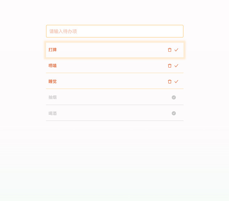
Finally, let's take a look at the effect of our interface. (as shown below)
Add top logic
We need to add a field is to the array element first_ Top, which is used to judge whether the node is at the top.
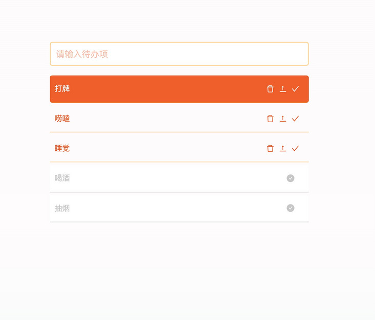
Then, add the logic processing and style display of the top function. (below)
<script setup lang="ts">
// Create a reference variable to bind Todo List data
const todoList = ref<{
  title: string,
  is_completed: boolean,
  is_top: boolean
}[]>([]);
const onTopItem = (index: number) => {
  todoList.value[index].is_top = true;
  // Reorder to move the completed items forward
  const todoItem = todoList.value.splice(index, 1);
  todoList.value.unshift(todoItem[0]);
}
</script>
<template>
   //...
  <section class="todo-list">
    <section v-for="(item, index) in todoList"
      class="todo-item"
      :class="{'todo-completed': item.is_completed, 'todo-top': item.is_top}">
      <span>{{item.title}}</span>
      <div class="operator-list">
        <CheckCircleFilled v-show="item.is_completed" />
        <DeleteOutlined v-show="!item.is_completed" @click="onDeleteItem(index)" />
        <ToTopOutlined v-show="!item.is_completed" @click="onTopItem(index)" />
        <CheckOutlined v-show="!item.is_completed" @click="onCompleteItem(index)" />
      </div>
    </section>
  </section>
</template>
Then, let's take a look at our interface effect! (as shown below)
In this way, our Todo List is completed!
Now let's take a look at our code, which mainly has two logical concerns:
- todoList related logic is responsible for the rendering of the list and the related operations of the list (delete, top, finish).
- todoText related logic is responsible for processing the input of the input box.
If I want to modify the processing logic related to the list, I only need to pay attention to and adjust the code related to todoList; If I want to adjust the logic related to input, I just need to focus on and adjust the logic related to todoText.
If these two pieces of logic become more and more complex with the development of business, I can choose to split them into smaller pieces of business logic for maintenance, or split these logic into a single file for maintenance and management, so as to have better control over subsequent maintenance and upgrading.
Dealing with front and back end interaction logic
All our previous logics were processed locally. Now let's access the logic of the server and persist all our data and changes. At the same time, let's also take a look at how to deal with scenarios with front-end and back-end interaction logic in Vue3.
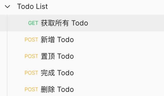
Suppose we have the following sets of interfaces (as shown in the figure below)
Then, based on the back-end interaction logic of these groups of interfaces, let's use the classic axios.
Use yarn add axios to add dependencies.
Here, we first create a new service in the src directory to initialize the service we use for network requests. (below)
// src/service/index.ts
import axios from "axios";

const service = axios.create({
  // Set the baseURL, which is the back-end service I deployed
  baseURL: "https://hacker.jt-gmall.com"
});

export default service;
User identity information
The Todo List we designed is an online web page. We hope every user will come in and see their own Todo List.
Let's take a look at the interface design in the background. It uses keys to group todo items, so we need to generate a unique user key for each user when entering the page.
Let's design a function to get the key first.
uuid is used here to generate a unique user key.
// service/auth.ts
import { v4 as uuid } from "uuid";

const getUserKey = () => {
  if (localStorage.getItem('user_key')) return localStorage.getItem('user_key');

  const userKey = uuid();
  localStorage.setItem('user_key', userKey);
  return userKey;
}

export {
  getUserKey
}
Get Todo List
Then we go back to our todolist Vue file, we first write a logic to obtain the remote Todo list. (below)
// TodoList.vue
import service from "@/service";
import { getUserKey } from '@/service/auth';

// Create a reference variable to bind Todo List data
const todoList = ref<{
  title: string,
  is_completed: boolean,
  is_top: boolean
}[]>([]);
// Initialize todo list
const getTodoList = async () => {
  const reply = await service.get('/todo/get-todo-list', { params: { key: getUserKey() } });
  todoList.value = reply.data.data;
}
getTodoList();
After adding the network request here, the page will not change, because the user currently has no data.
Next, let's complete the remaining logic.
Note: alias alias function is used here, which needs to be in vite config. Ts and tsconfig JSON.
import path from 'path';

// vite.config.ts
export default defineConfig({
  resolve: {
    alias: {
      "@": path.resolve(__dirname, "src"),
    }
  },
  // ...
})
// tsconfig.json
{
"compilerOptions": {
// ...
"baseUrl": "./",
"paths": {
"@/*": ["./src/*"]
}
}
}Add, top, finish, delete Todo
Since users enter Todo List to view their own data, and the data can only be operated by themselves.
Therefore, in order to have a better user experience, after all our operation logic is completed, the echo data still uses the original logic.
Of course, when adding data, we still need to retrieve the list data, because we need to use the id of each item when operating the data.
To sum up, our reconstructed four functions are as long as this.
// The logic of deleting, completing and topping are all placed in the same place as todoList, which makes the focus on logic more focused
const onDeleteItem = async (index: number) => {
  const id = todoList.value[index].id;
  await service.post('/todo/delete', { id });

  todoList.value.splice(index, 1);
}

const onCompleteItem = async (index: number) => {
  const id = todoList.value[index].id;
  await service.post('/todo/complete', { id });

  todoList.value[index].is_completed = true;
  // Reorder to put the completed items back
  const todoItem = todoList.value.splice(index, 1);
  todoList.value.push(todoItem[0]);
}

const onTopItem = async (index: number) => {
  const id = todoList.value[index].id;
  await service.post('/todo/top', { id });

  todoList.value[index].is_top = true;
  // Reorder to move the completed items forward
  const todoItem = todoList.value.splice(index, 1);
  todoList.value.unshift(todoItem[0]);
}

// The logic of adding todo items is put in one place
// Create a reference variable to bind the input box
const todoText = ref('');
const addTodoItem = () => {
  // Add a TodoItem and request to add an interface
  const todoItem = {
    key: getUserKey(),
    title: todoText.value
  }
  return service.post('/todo/add', todoItem);
}
const onTodoInputEnter = async () => {
  if (todoText.value === '') return;

  await addTodoItem();
  await getTodoList();

  // After adding successfully, clear the value of todoText
  todoText.value = '';
}
After the logic modification is completed, let's go back to the page to check the effect! After we do some operations, refresh the page and have a look. (as shown below)
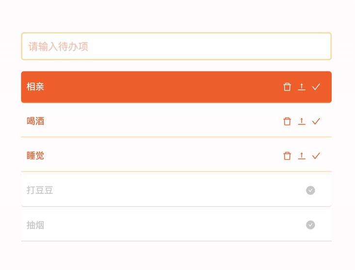
After refreshing the page, our data can still be displayed, indicating that the data has been successfully persistent on the server!
Summary
This time, we use Vue3 to complete a simple Todo List system.
It can be seen that Vue3's support for ts has become more friendly, and my experience with the new Vue single file syntax and composite API is a little close to React + JSX—— I mean, it's a better experience for developers.
Let's take a look at the logic part we implemented with the composite API (as shown in the figure below).
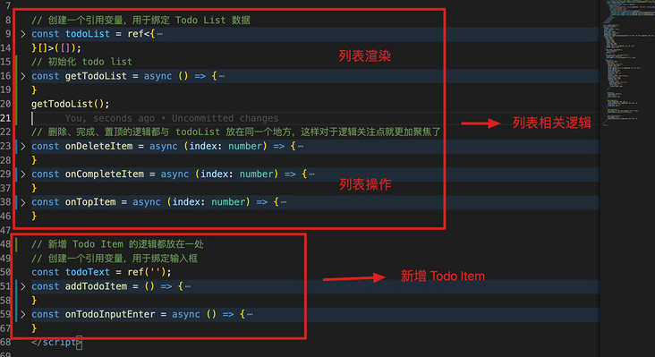
As can be seen from the above figure, our logic concerns are divided into two parts: list related logic (rendering and operation) and new Todo Item.
This clear division of responsibilities enables us to maintain the functions of a certain part, and the related contents are enclosed in a relatively small scope, which can make people focus more on the functions that need to be adjusted.
If I were to give a score for Vue3 and Vue2's (Development) experience now, I would give 8 and 6 points respectively.
Well, that's all for our vue3 experience. Vue3 gives me a very good experience!
Finally, attach the of this experience Demo address.
One last thing
If you've seen here, I hope you'd better give me a compliment before you leave~
Your praise is the greatest encouragement to the author, and can also let more people see this article!
If you think this article is helpful to you, please help in github Light up star and encourage it!