catalogue
Slot, I want to drill into your arms
1, Component slot
The biggest feature of components is reusability, and good use of slots can greatly improve the reusability of components
1.1. Single slot
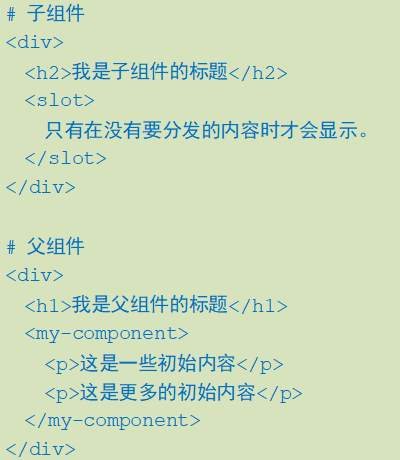
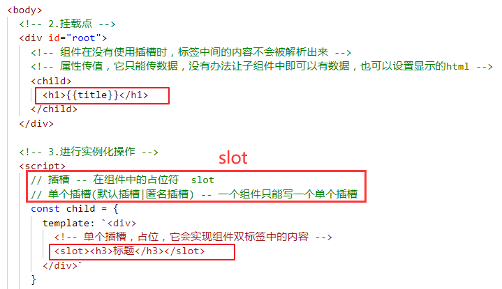
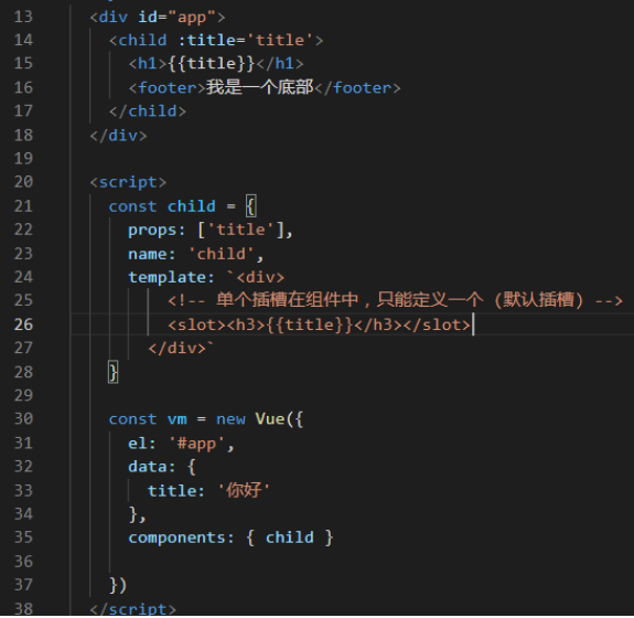
When the child component template has only one slot without attributes, the entire content fragment passed in by the parent component will be inserted into the DOM position where the slot is located and the slot label itself will be replaced.
2.2 named slot
Sometimes we need multiple slots to complete the corresponding data custom display.
A < slot > exit without {name will have the implied name "default".
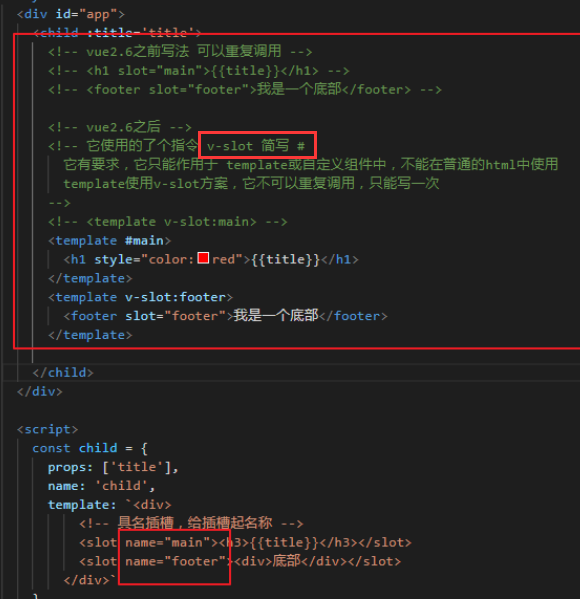
Updated since {2.6.0. Obsolete usage slot s
# Subcomponents
<div class="container">
  <header>
<slot name="header"></slot>
  </header>
  <main>
    <slot></slot>
  </main>
</div>

# Parent component
<app-layout>
    // Old writing
    <h1 slot="header">Here may be a page title</h1>
// neographism
// V-slots can only be added on < template >
// Abbreviation: V-slot: header = = #header
	<template v-slot:header>
    	<h1>Here may be a page title</h1>
 	</template>

  <p>A paragraph of the main content.</p>
</app-layout>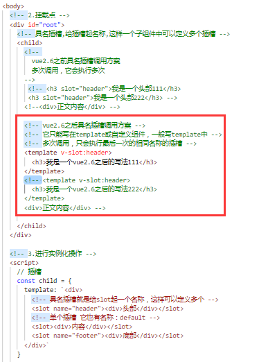
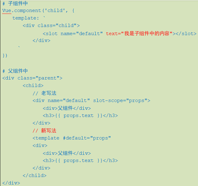
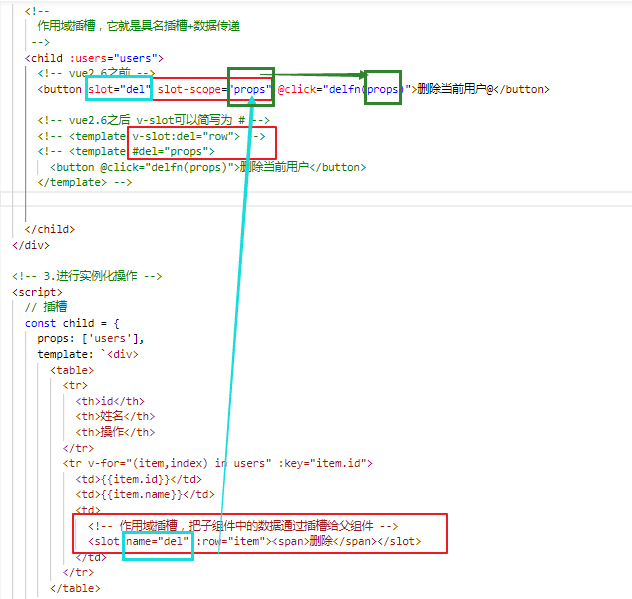
2.3. Scope slot
A scope slot is a special type of slot used as a reusable template (that can be passed data) to replace rendered elements. In the subcomponent, just pass the data to the slot, just as you pass the} prop to the component
<div id="app">
    <child :users='users'>
      <!--
        vue2.6 before
       -->
      <!-- <h6 slot="action" slot-scope="row" @click="pdel(row)">Delete it</h6> -->
      <!--
         vue2.6 after
        -->
      <!-- <template v-slot:action="row">
        <h3 @click="pdel(row)">delete</h3>
      </template> -->
      <template #action="row">
        <h3 @click="pdel(row)">delete</h3>
      </template>
    </child>
  </div>

  <script type="text/template" id="userhtml">
    <div>
      <table width="600" border="1">
        <tr>
          <th>ID</th>
          <th>full name</th>
          <th>operation</th>
        </tr>
        <tr v-for="(item,index) in users" :key="item.id">
          <td>{{item.id}}</td>
          <td>{{item.name}}</td>
          <td>
            <!-- adopt slot Data transmission, this slot Is a scope slot -->
            <slot name="action" :info="item">
              <button @click="del(index)">delete</button>
            </slot>
          </td>
        </tr>
      </table>
    </div>
  </script>
  <script>
    const child = {
      props: ['users'],
      name: 'child',
      template: '#userhtml',
      methods: {
        del(index) {
          console.log(index)
        }
      }
    }

    const vm = new Vue({
      el: '#app',
      data() {
        return {
          users: [
            { id: 1, name: 'Zhang San' },
            { id: 2, name: 'Li Si' },
            { id: 3, name: 'Wang Wu' },
          ]
        }
      },
      components: { child },
      methods: {
        pdel(row) {
          console.log(row.info)
        }
      }

    })
  </script>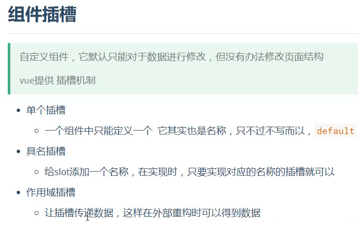
Slot, I want to drill into your arms
Slot, I believe every Vue has used it, but how to better understand the slot and how to customize the slot, today's Xiaobian will bring you more vivid instructions.
Default slot
After graduating from college, I just went to work. I was a poor man. I wanted to rent a house every month, so Xiaobian decided to buy a one bedroom, pieced together to borrow a pile of debt, and finally got enough down payment to buy a small blank house. We can think of this one bedroom blank room as a component. The house type, area and floor are fixed, but how to decorate and what furniture to put in the room is up to you. The interior of the room can be understood as a slot, allowing users to customize the content.
1. The developer finally delivered the one bedroom development
<template>
  <!--This is a one bedroom-->
  <div class="one-bedroom">
    <!--Add a default slot, and users can define the content of this one bedroom externally-->
    <slot></slot>
  </div>
</template>
2. Xiaobian is going to start decoration
<template>
  <!--One bedroom here-->
  <one-bedroom>
    <!--Put the furniture in the room, and the interior of the component is the space of the default slot provided above-->
    <span>Put a small bed first. There is no girlfriend anyway</span>
    <span>Put another computer desk and work overtime at home bug</span>
  </one-bedroom>
</template>
<script>
import OneBedroom from '../components/one-bedroom'
export default {
  components: {
    OneBedroom
  }
}
</script>
Named slot
After a few years as like as two peas, the little girl has a girlfriend and is going to get married. One bedroom room is definitely not working. The mother-in-law disagrees with her. She can't afford to buy a big house, but she can buy a two bedroom house (because she is a two bedroom house), so she has a master bedroom and a second bedroom. So we need to distinguish. Think of the house as a component, then the component has two slots and needs to be distinguished by name.
1. The developer has finally completed the development and delivery of the house
<template>
  <div class="two-bedroom">
    <!--This is the master bedroom-->
    <div class="master-bedroom">
      <!---The master bedroom uses the default slot-->
      <slot></slot>
    </div>
    <!--This is the second bedroom-->
    <div class="secondary-bedroom">
      <!--Named slot for secondary use-->
      <slot name="secondard"></slot>
    </div>
  </div>
</template>
2. Xiaobian is going to sell blood and save money for decoration
<template>
  <two-bedroom>
    <!--The master bedroom uses the default slot-->
    <div>
      <span>Put a big bed and get married. Hey, hey, hey</span>
      <span>Put a wardrobe. My wife has too many clothes</span>
      <span>Forget it, let's put a computer desk and write bug</span>
    </div>
    <!--Second bedroom, through v-slot:secondard You can specify which named slot to use, v-slot:secondard It can also be abbreviated as #secondard-->
    <template v-slot:secondard>
      <div>
        <span>Parents should live in a hard bed. Soft beds are bad for the waist</span>
        <span>Put a wardrobe</span>
      </div>
    </template>
  </two-bedroom>
</template>
<script>
import TwoBedroom from '../components/slot/two-bedroom'
export default {
  components: {
    TwoBedroom
  }
}
</script>
Scope slot
When decorating, the decorator asked me whether the washing machine should be placed in the bathroom or balcony. Generally, the developer will reserve a place for the washing machine. This position can be understood as the parameter passed by the slot. This is the scope slot.
1. Look at the parameters transmitted from the toilet slot
<template>
  <div class="two-bedroom">
    <!--Other contents are omitted-->
    <div class="toilet">
      <!--adopt v-bind Parameters can be passed out, Tell me the washing machine can be put in the bathroom outside-->
      <slot name="toilet" v-bind="{ washer: true }"></slot>
    </div>
  </div>
</template>
2. Put the washing machine in the bathroom
<template>
  <two-bedroom>
    <!--Other omissions-->
    <!--Toilet slot, through v-slot="scope"You can get the internal pass of the component v-bind Transmitted value-->
    <template v-slot:toilet="scope">
      <!--Judge whether the washing machine can be put in-->
      <span v-if="scope.washer">Put the washing machine here</span>
    </template>
  </two-bedroom>
</template>
Slot defaults
Xiaobian's colleagues didn't want to wait for a future house, so they bought a second-hand house. The owners in front of the second-hand house have been decorated and can check in directly. Of course, you can also redecorate. Here are the second-hand houses bought by colleagues.
1. This is a decorated second-hand house
<template>
  <div class="second-hand-house">
    <div class="master-bedroom">
      <!--The slot can be specified with a default value. If the slot content is not modified when the component is called externally, the default slot is used-->
      <slot>
        <span>Here's a water bed. It's fun enough</span>
        <span>And a wardrobe. It's a little old</span>
      </slot>
    </div>
    <!--This is the second bedroom-->
    <div class="secondary-bedroom">
      <!--Named slot for secondary use-->
      <slot name="secondard">
        <span>Here is a crib</span>
      </slot>
    </div>
  </div>
</template>
2. My colleague decided to decorate the master bedroom first and use it for marriage later
<second-hand-house>
  <!--The master bedroom uses the default slot, and only the master bedroom is decorated-->
  <div>
    <span>Put a big bed and get married. Hey, hey, hey</span>
    <span>Put a wardrobe. My wife has too many clothes</span>
    <span>Forget it, let's put a computer desk and write bug</span>
  </div>
</second-hand-house>
For reference only:
For example, the headers of many pages here are the same, so here we can use the reusability of slots to simplify the code:
<template>
  <div>
    <div class="header">
      <img src="../assets/image/LOGO.png">
    </div>
      <!--Named slot-->
      <slot name="content"></slot>
    </div>
  </div>
</template>

<script>
export default {}
</script>
Use:
<template>
  <div id="dwBodyUser">
    <public-header>
      <el-tabs
        v-model="activeName"
        @tab-click="handleClick"
        slot="content"
      >
        <el-tab-pane
          label="All matters"
          name="first"
          :model="formData"
          ref="formDatas"
        >
          <!-- All event components -->
          <all-matters></all-matters>
        </el-tab-pane>
        <el-tab-pane
          label="Scene sharing"
          name="second"
          :model="formData"
          ref="formDatas"
        >
          <!-- Scene sharing component -->
          <scene-sharing></scene-sharing>
        </el-tab-pane>
      </el-tabs>
    </public-header>
  </div>
</template>

<script>
import publicHeader from '@/components/publicHeader/index.vue'
import allMatters from './component/allMattersTab.vue'
import screnSharing from './component/sceneSharingTab.vue'

export default {
  components: {
    publicHeader,  // Common head assembly
    allMatters,    // All event components
    sceneSharing,  // Scene sharing component
  }
}
</script>
There is another example of a public Table:
<!--author : Little gray wolf
    function : Table component
    time : 2022/01-->
<template>
  <div>
    <el-table :data="tableList" style="width: 100%" :header-cell-style="{background: '#EFEFEF'}">
      <el-table-column type="selection" width="55" v-if="showCheckBox"></el-table-column>
      <el-table-column label="Serial number" width="120" v-if="showNumber">
        <template slot-scope="scope">{{ scope.$index + 1 }}</template>
      </el-table-column>
      <el-table-column v-for="item in headerList" :prop="item.props" :label="item.label" : min-width="item.minWidth"></el-table-column>
      <el-table-column fixed="right" label="operation" width="300">
        <template slot-scope="scope">
          <el-popconfirm title="Are you sure?">
            <el-button slot="reference" style="color:#ED3740">{{ content }}</el-button>
          </el-popconfirm>
        </template>
        <!-- Event operation slot -->
        <slot name="matterOperation"></slot>
        <!-- Scene operation slot -->
        <slot name="sceneOperation"></slot>
      </el-table-column>
    </el-table>
  </div>
</template>

<script>
export default {
  props: {
    tableList: {
      type: Array
    },
    headerList: {
      type: Array
    },
    showCheckBox: {   // Show multiple check boxes
      type: Boolean,
      default: false
    },
    showNumber: {    // Display serial number
      type: Boolean,
      default: true
    },
    content: {
      type: String,
      default: "delete"
    },
  }
}
</script>

<style lang="scss" scoped>
  .cell button {
    border: none;
    padding-left: 0
  }
</style>
use:
<template>
  <div>
    <public-table
      :tableList="tableList"
      :showNumber="formData.showNumber"
      :headerList="headerList"
    >
      <!-- Scene operation slot -->
      <template #sceneOperation>
        <el-tooltip content="seize a seat">
          <el-button
            size="small"
            icon="el-icon-edit-outline"
          ></el-button>
        </el-tooltip>
      </template>
    </public-table>
  </div>
</template>

<script>
import publicTable from '@/components/publicTable/index'

export default {
  components: {
    publicTable,  // Common table component
  }
}
</script>