Preface
Component development refers to the idea of encapsulating reusable UI structures on a page as components to facilitate project development and maintenance.
Components are reuse of UI structures.
vue is a front-end framework that supports component development.
The Vue specifies that the component's suffix name is. Vue. Apps previously touched. A Vue file is essentially a component of a vue.
When components are encapsulated, they are independent of each other and have no parent-child relationship. When using components, parent-child relationships and brotherly relationships are formed based on the nested relationships between each other.
Each. The vue components are composed of three parts:
- Template -> Template structure for components (must have)
- script ->JavaScript behavior of components (optional)
- style ->Style of the component (optional)
template
The vue specifies that the template structure for each component needs to be defined in the <template>node.
The template is a container tag provided by vue and only serves as a wrapper. It will not be rendered as a true DOM element
Only unique root nodes can be included in a template
script
The vue specifies that developers can encapsulate JavaScript business logic for components in < script > nodes.
<script>
  //In the future, component-related data, methods, and so on, will need to be defined in the object exported by export default
  export default {}
</script>
vue regulation:. The data in a vue component must be a function and cannot point directly to a data object.
Therefore, when defining a data data data node in a component, the following approach is incorrect and can lead to problems where multiple component instances share the same data:
data: {
  count: 0
}
style
vue specification: within component
Let style support less syntax: add the lang="less" attribute to the < style > tag to write a component's style using less syntax.
Three steps to using components
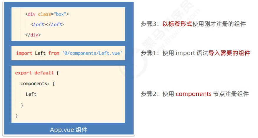
Registered through components are private subcomponents
Component F is registered under the components node of component A.
Component F can only be used in Component A. Cannot be used in component C.
Register Global Components
In the main of the vue project. JS entry file, via Vue.component() method, which allows you to register global components.
import Count from '@/components/Count.vue'

//Parameter 1: String format, representing the component's "registered name"
//Parameter 2: The component that needs to be globally registered
Vue.component('MyCount',Count)
- Example, in main.js:
import Vue from 'vue'
import App from './App.vue'

// Import the component that needs to be globally registered
import Count from '@/components/Count.vue'
Vue.component('MyCount', Count)

Vue.config.productionTip = false

new Vue({
  // In render function, which one is rendered. vue component, then this component is called "root component"
  render: h => h(App)
}).$mount('#app')
props of components
Props are custom properties of components. When encapsulating common components, using props appropriately can greatly improve the reusability of components!
Its grammatical format is as follows:
<script>
export default {
  // props are "custom properties" that allow users to specify initial values for the current component through custom properties
  // The name of the custom attribute is defined by the encapsulator (as long as the name is legal)
  // Data in props, which can be used directly in the template structure
  // Note: props are read-only, do not modify the value of props directly, otherwise the terminal will error!
  // props: ['init'],
  props: {
    // Custom Attribute A: {/* Configuration Options*/},
    // Custom Property B: {/* Configuration Options*/},
    // Custom Property C: {/* Configuration Options*/},
    init: {
      // The default value takes effect if the init property is not passed when the Count component is used externally
      default: 0,
      // The value type for setting init must be a Number number
      type: Number,
      // Required Check
      required: true
    }
  },

  data() {
    return {
      // Transfer init values from props to count
      count: this.init
    }
  },
  methods: {
    show() {
      console.log(this)
    }
  }
}
</script>
The consumer of the component then gives a numeric value when using the component:
//Bind the init property value of MyCount through v-binf
<MyCount :init="9"></MyCount>
props are read-only
The vue specifies that custom attributes encapsulated in components are read-only and programmers cannot directly modify the value of props. Otherwise, a direct error will be reported.
To modify the value of props, you can save the value of props to the data, because the data in the data is readable and writable!
props:['init'],
data() {
  return {
    count:this.init //Put this. Value of init is dumped to count
  }
}
Default default value of props
When declaring a custom property, you can define the default value of the property by default. The sample code is as follows:
export default {
  props: {
    init: {
      //Defining default values of attributes with default attributes
      default:0
    }
  }
}
Type value type of props
When declaring a custom property, you can define the value type of the property through type. The sample code is as follows:
export default {
  props: {
    init: {
      //Defining default values of attributes with default attributes
      default:0
      //Define the value type of the property with the type attribute.
      //If the value passed does not match this type, an error will be reported at the end
      type: Number
    }
  }
}
Required required for props
When declaring custom attributes, you can force the user to pass the value of the attribute by setting the attribute as required with the required option. Example:
export default {
  props: {
    init: {
      //Value type is Number number
      type: Number
      //Required Check
      required: true
    }
  }
}
Style conflict between components
By default, it is written in. Styles in vue components work globally, so it is easy to cause style conflicts between multiple components.
The root causes of style conflicts between components are:
(1) In a single-page application, the DOM structure of all components is based on a unique index. Rendered from an HTML page
(2) Styles in each component affect the entire index. DOM elements in HTML pages
Resolving Component Style Conflicts
Assign unique custom attributes to each component. When writing a component style, use the property selector to control the scope of the style. The sample code is as follows:
<template>
  <div class="right-container" data-v-001>
    <h3 data-v-001>Right assembly</h3>
  </div>
</template>

//Prevent style conflicts between components by using bracketed property selectors
<style lang="less">
.right-container[data-v-001] {
  padding: 0 20px 20px;
}
</style>
Or use the scoped s property of the style node:
To improve development efficiency and experience, vue provides scoped s for style nodes to prevent style conflicts between components:
<template>
  <div class="left-container">
    <h3>Left assembly</h3>
  </div>
</template>

<style lang="less" scoped>
.left-container {
  padding: 0 20px 20px;
}
h3 {
  color: red;
}
}
</style>
/deep/style penetration
If a scoped attribute is added to the style node of the current component, the style of the current component is not valid for its subcomponents. If you want some styles to work on subcomponents, you can use the / deep / depth selector.
<style lang="less" scoped>
h5 {
  color: pink;    /*Without/deep/the resulting selector format is h5[data-v-3c83f0b7]  */
}
// If there is a need to modify the default style of third-party components when using third-party component libraries, /deep/
/deep/ h5 {
  color: pink;    /*When adding/deep/the resulting selector format is [data-v-3c83f0b7] h5  */
}
</style>