Article directory
1. Basic example
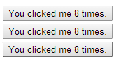
<div id="app-1">
			<button-counter></button-counter>
			<button-counter></button-counter>
			<button-counter></button-counter>
		</div>
	//Global definition component
	Vue.component('button-counter',{
			//Data required for each component
			data:function(){
				return {
					count:0
				}
			},
			template:'<button v-on:click="count++">You clicked me {{ count }} times.</button>'
		})

	new Vue({
			el:"#app-1"
		})
The component is a reusable Vue instance with a name: in this case < button counter >. We can use this component as a custom element in a root instance of Vue created by new Vue
Design sketch:
Note that when you click the button, each component maintains its count independently. Because every time you use a component, a new instance of it is created.
1.1 data must be a function
The data option of a component must be a function, so each instance can maintain an independent copy of the returned object:
Note: the data function must return the local object, if it is not a local object. Each < button counter > references an object, which causes clicking any button to add 1 to the count of all buttons
Examples are as follows:
<div id="app-1">
			<button-counter></button-counter>
			<button-counter></button-counter>
			<button-counter></button-counter>
		</div>


	var obj={ count:0 }
	//Global definition component
	Vue.component('button-counter',{
			//Data required for each component
			data:function(){
				return obj
			},
			template:'<button v-on:click="count++">You clicked me {{ count }} times.</button>'
		})

	new Vue({
			el:"#app-1"
		})
2. Passing data to subcomponents through props
When we need to create a blog component, if you can't pass data (content, title, author) to the blog component, the component is static and can't be used at all. So Vue provides props for passing data to components
Examples are as follows:
<div id="app-3">
	<! -- custom blog component -- >
	<! -- once a prop is registered, you can pass in data as a custom attribute like this: - >
	<blog-post title="My journey with Vue"></blog-post>
	<blog-post title="Blogging with Vue"></blog-post>
	<blog-post title="Why Vue is so fun"></blog-post>
</div>
	Vue.component('blog-post',{
			//Custom attribute
			props:['title'],
			template:'<h1>{{ title }}</h1>'
		})
By default, a component can have any number of props, and any value can be passed to any props.
Effect: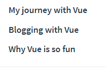
Deformation of the above example:
<div id="app-4">
	<blog-post v-for="item in items" :key="item.id" :title="item.title">

	</blog-post>
</div>
	Vue.component('blog-post',{
			props:['title'],
			template:'<h1>{{ title }}</h1>'
		})

	new Vue({
			el:"#app-4",
			data:{
				items:[
					{id:1,title:"My journey with Vue"},
					{id:2,title:"Blogging with Vue"},
					{id:3,title:"Why Vue is so fun"}
				]
			}
		})
3. Single element
When building a component, your template will eventually contain more than one title:
<h3>{{ title }}</h3>
At the very least, you will include the body of this post:
<h3>{{ title }}</h3>
<div v-html="content"></div>
However, if you try to write like this in the template, Vue will display an error and explain that every component must have a single root element. You can fix this problem by wrapping the contents of the template in a parent element, for example:
	<template id="mytemplate">
		<div>
			<h3>{{ title }}</h3>
			<div v-html="content">	</div>
		</div>
	</template>

	Vue.component('blog-post',{
			props:['title','content'],
			template:"#mytemplate"
		})
< template > is to facilitate the definition of more complex templates. Writing strings in component is not easy to read and write. Find templates by ID
It seems that when the components become more and more complex, our blog post needs not only the title and content, but also the release date, comments and so on. Defining a prop for each relevant information can be cumbersome:
<blog-post
  v-for="post in posts"
  v-bind:key="post.id"
  v-bind:title="post.title"
  v-bind:content="post.content"
  v-bind:publishedAt="post.publishedAt"
  v-bind:comments="post.comments"
></blog-post>
So it's time to refactor the < blog post > component to accept a separate post prop:
Remember that a component can have any number of props by default, and any value can be passed to any props. Include transitive objects
		<div id="app-5">
			<blog-post
				v-for="item in items"
				v-bind:key="item.id"
				v-bind:post="item.post" >

			</blog-post>
		</div>
		<!--Custom component template-->
		<template id="mytemplate">
			<div>
				<h3>{{ post.title }}</h3>

				<div v-html="post.content">	</div>

			</div>
		</template>

		Vue.component('blog-post',{
			props:['post'],
			template:"#mytemplate"
		})


		new Vue({
			el:"#app-5",
			data:{
				items:[
					{
						id:1,
						post:{title:"My journey with Vue",content:"This is xxxxMy journey with Vue"}
					},
					{
						id:2,
						post:{title:"Blogging with Vue",content:"This is xxxxBlogging with Vue"}
					},
					{
						id:3,
						post:{title:"Why Vue is so fun",content:"This is xxxxWhy Vue is so fun"}
					}
				]
			}
		})
4. Listen to subcomponent events
When we develop the < blog post > component, some of its functions may require us to communicate with the parent component. For example, we may introduce an auxiliary function to enlarge the font size of blog posts, while keeping the default font size of other parts of the page.
In its parent component, we can add a postFontSize data property to support this function:
new Vue({
  el: '#app-6',
  data: {
    posts: [/* ... */],
    postFontSize: 1
  }
})
It can be used to control the font size of all posts in the template:
<div id="blog-posts-events-demo">
  <div :style="{ fontSize: postFontSize + 'em' }">
    <blog-post
      v-for="post in posts"
      v-bind:key="post.id"
      v-bind:post="post"
    ></blog-post>
  </div>
</div>
Now let's add a button before the body of each blog post to enlarge the font size:
Vue.component('blog-post', {
  props: ['post'],
  template: `
    <div class="blog-post">
      <h3>{{ post.title }}</h3>
      <button>
        Enlarge text
      </button>
      <div v-html="post.content"></div>
    </div>
  `
})
The problem is that this button doesn't do anything:
<button>
  Enlarge text
</button>
When we click this button, we need to tell the parent component to enlarge the text of all the posts. Fortunately, the Vue instance provides a system of custom events to solve this problem. The parent component can listen to any event of the child component instance through v-on just as it handles the native DOM event:
<blog-post
  ...
  v-on:enlarge-text="postFontSize += size"
></blog-post>
At the same time, the sub component can trigger an event by calling the built-in $emit method and passing in the event name:
<button v-on:click="$emit('enlarge-text',0.1)">
  Enlarge text
</button>
$emit: triggers an event on the current instance. Additional parameters are passed to the listener callback.
If you don't know $exit, please check the official API document https://cn.vuejs.org/v2/api/ ා VM exit
With this v-on: enlarge text = "postFontSize + = 0.1" listener, the parent component receives the event and updates the value of postFontSize.
Full code above:
<div id="app-5" v-bind:style="{	fontSize:postFontSize+'em'}" >

			<blog-post
				v-for="item in items"
				:key="item.id"
				:post="item.post"
				v-on:enlarge-text="enlargeText">
				<!--v-on:enlarge-text="postFontSize+=$event"-->
			</blog-post>
		</div>
		<!--Custom component template-->
		<template id="mytemplate">
			<div class="blog-post">
				<h3>{{ post.title }}</h3>

				<div v-html="post.content">	</div>

				<button v-on:click="$emit('enlarge-text',0.1)">Enlarge font</button>
			</div>
		</template>
	Vue.component('blog-post',{
			props:['post'],
			template:"#mytemplate"
		})

	new Vue({
			el:"#app-5",
			data:{
				items:[
					{
						id:1,
						post:{title:"My journey with Vue",content:"This is xxxxMy journey with Vue"}
					},
					{
						id:2,
						post:{title:"Blogging with Vue",content:"This is xxxxBlogging with Vue"}
					},
					{
						id:3,
						post:{title:"Why Vue is so fun",content:"This is xxxxWhy Vue is so fun"}
					}
				],
				postFontSize:1

			},
			methods:{
				enlargeText:function(size){
					this.postFontSize+=size
				}
			}
		})
Do not understand to open to write, help understand!
4.1 using v-model on components
Custom events can also be used to create custom input components that support v-model. Remember:
<input v-model="searchText">
Equivalent to:
<input
  v-bind:value="searchText"
  v-on:input="searchText = $event.target.value"
>
When used on components, the v-model will look like this:
<div id="app-7">
	<custom-input-one v-model="searchText"></custom-input-two>
	<p>Text box content:{{searchText}}</p>
</div>
For it to work, the < input > in this component must:
- Bind its value attribute to a prop named value
- When its input event is triggered, the new value is thrown through the custom input event
<template id="myinputOne">
	<input v-bind:value="value" v-on:input="$emit('input',$event.target.value)"  />

</template>
	Vue.component("custom-input-one",{
			props:['value'],
			template:'#myinputOne'
		})

		new Vue({
			el:"#app-7",
			data:{
				searchText:""
			}
		})
It says that v-model equals v-bind:value="searchText" v-on:input="searchText = $event.target.value"
So you can write like this
<div id="app-6">
	<custom-input-two v-bind:value="searchText" v-on:input="inputEvent"></custom-input-two>
	<p>Text box content:{{searchText}}</p>
</div>
<template id="myinputTwo">
	<input v-bind:value="value" v-on:input="$emit('input',$event.target.value)" />
</template>

Vue.component('custom-input-two',{
			props:['value'],
			template:'#myinputTwo'
		})

new Vue({
			el:"#app-6",
			data:{
				searchText:""
			},
			methods:{
				inputEvent:function(value){
					this.searchText=value
				}
			}
		})
5. Distribute content through slots
Like HTML elements, we often need to pass content to subcomponents like this:
<div id="app-8">
	<alert-box>Something bad happend</alert-box>
</div>
<template id="errorTemplate">
	<div>
		<strong>Error!</strong>
	</div>
</template>


	Vue.component("alert-box",{
			template:'#errorTemplate'
		})

		new Vue({
			el:"#app-8"
		})
Result:
The text in < alert box > is not rendered because we did not pass the text to the subcomponent
Fortunately, Vue's custom elements make this very simple:
<template id="errorTemplate">
	<div>
		<strong>Error!</strong>
		<slot></slot>
	</div>
</template>

Vue.component("alert-box",{
			template:'#errorTemplate'
		})
Result: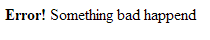
6. Dynamic components
Sometimes, it is very useful to dynamically switch between different components, for example, in a multi tag interface: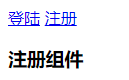
Click login to switch the login component; click registration to switch the registration component
<div id="app-9">
			<a href="#" v-on:click.prevent="flag=true">Land</a>
			<a href="#" v-on:click.prevent="flag=false">register</a>
			<custom-login v-if="flag"></custom-login>
			<custom-register v-else></custom-register>
		</div>
Vue.component("custom-login",{

			template:'<h3>Landing module</h3>'
		})

		Vue.component("custom-register",{

			template:'<h3>Registration component</h3>'
		})

		new Vue({
			el:"#app-9",
			data:{
				flag:true
			}
		})
But there are limitations in the above writing method. If there are three or more needs to switch the above writing method, it is not very convenient
Therefore, Vue provides the < component > element plus a special is attribute to implement:
<div id="app-10">
			<a href="#" v-on:click.prevent="flag='custom-login'">Land</a>
			<a href="#" v-on:click.prevent="flag='custom-register'">register</a>
			<component v-bind:is="flag"></component>
		</div>
Vue.component("custom-login",{

			template:'<h3>Landing module</h3>'
		})

		Vue.component("custom-register",{

			template:'<h3>Registration component</h3>'
		})

		new Vue({
			el:"#app-10",
			data:{
				flag:true
			}
		})
7. Precautions when parsing DOM template
Some HTML elements, such as < UL >, < ol >, < Table > and < Select >, have strict restrictions on which elements can appear inside. Some elements, such as < li >, < tr > and < option >, can only appear inside some other specific elements.
<div id="app-11">
			<table>
				<custom-lable></custom-lable>

			</table>
		</div>
Vue.component('custom-lable',{
			template:"<h3>Custom components</h3>"
		})

		new Vue({
			el:"#app-11"
		})
Rendered HTML: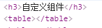
It can be found that the < H3 > that should have appeared inside the < Table > ran out. That's not going to work
Fortunately, this special is attribute gives us a flexible way:
<div id="app-11">
			<table>
				<tr is="custom-lable"></tr>
			</table>
		</div>
	Vue.component('custom-lable',{
			template:"<h3>Custom components</h3>"
		})

	new Vue({
			el:"#app-11"
		})
Effect: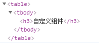
Note that this restriction does not exist if we use templates from the following sources:
- String (example: template: '...')
- Single file component (. vue)
- <script type="text/x-template">
An example string is as follows:
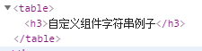
<div id="app-11">
	<custom-lable-two></custom-lable-two>
</div>
		Vue.component('custom-lable-one',{
			template:"<h3>Custom component string example</h3>"
		})

		Vue.component('custom-lable-two',{
			template:'<table><custom-lable-one></custom-lable-one></table>'
		})
		new Vue({
			el:"#app-11"
		})
Effect:
Single file component (. vue) requires the use of Vue cli scaffold, which has not been learned yet. Do not demonstrate
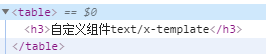
Examples of < script type = "text / x-template" > are as follows:
	<div id="app-11">
			<custom-lable-three></custom-lable-three>
		</div>
	<script type="text/x-template" id="custom-lable-template">
		<table><custom-lable-one></custom-lable-one></table>
	</script>

	Vue.component('custom-lable-one',{
			template:"<h3>Custom components text/x-template</h3>"
		})

	Vue.component('custom-lable-three',{
			template:"#custom-lable-template"
		})
	new Vue({
			el:"#app-11"
		})
Effect: