Note: this example is based on Vue cli scaffold construction
First, install the echorts dependency
npm install echarts -S
Note: after installing NodeJS, npm is used to install the package, and the foreign address is used. Timeout errors often occur. At this time, you can speed up the installation by modifying it to the domestic Taobao image.
//Taobao image
npm install -g cnpm --registry=https://registry.npm.taobao.org
In main Global import in JS
//Introducing echarts
import echarts from 'echarts'
//vue global injection ecarts
Vue.prototype.$echarts = echarts;
example. In Vue
html part
<template>
  <div id="container">
    <!--Chart container-->
    <div id="newCharts"></div>
  </div>
</template>
css part
<style lang="scss" scoped>
  #container {
    width: 100%;
    height: 100vh;
    padding-top: 100px;
    #newCharts{
      margin: 0 auto;
      width: 800px;
      height: 800px;
    }
  }
</style>
js part
Note: if you want to have a clearer understanding of many attributes in the setOption configuration item of the line chart below, including many attributes that are not written, you can click the link below for details.
In the chart drawn by ecarts, the setOption configuration item manual
<script>
  export default {
    name: "example",
    data() {
      return {
			formatter:'¥{value}',
		}
    },
    mounted() {
      this.showCharts();
    },
    methods: {
      // Show line chart
      showCharts(){
        // Initialize the ecarts instance based on the prepared dom
        let myChart = this.$echarts.init(document.getElementById('newCharts'));//You can also use $refs Get the dom instance by newcharts.
        // Draw a chart
        myChart.setOption({
          title: { text: 'stay vue Used in echarts Draw a chart' },//Title of Icon
          // X axis
          xAxis: [{
            type: 'category',//Coordinate axis type, category axis, applicable to discrete category data. When this type is selected, the category data can be automatically retrieved from series Data or dataset Source, or via xaxis Data set category data
            //Coordinate axis scale related settings
            axisTick: {
              alignWithLabel: true,//When true, the scale can be aligned with the label content at the bottom
            },
            data: ['Monday','Tuesday','Wednesday','Thursday','Friday','Saturday','Sunday'],//Scale data of X axis
            name: "time",//Axis name
            nameLocation: "start",//Axis name display location
            //Text style for axis names
            nameTextStyle: {
              align: "center",//Text horizontal alignment, automatic by default
              verticalAlign: "top",//Text vertical alignment, automatic by default
              lineHeight: 28,//Row height
              fontSize: 10,//font size
              color: "rgba(0, 0, 0, 1)"//Font color
            },
            //Settings related to axis scale labels
            axisLabel: {
              interval: 'auto'//The display interval of the scale label of the coordinate axis, which is valid in the category axis. It can be set to 0 to force the display of all labels. If it is set to 1, it means "display one label every other", if it is set to 2, it means "display one label every two labels", and so on.
            }
          }],
          // Y axis
          yAxis: {
            type: 'value',//Coordinate axis type, 'value' value axis, applicable to continuous data
            //Settings related to axis scale labels
            axisLabel: {
              formatter: this.formatter//The content formatter of scale label supports two forms: String template and callback function. In short, you can format the contents of the label yourself.
            },
          },
          //The simple understanding of drawing grid in rectangular coordinate system refers to this broken line diagram.
          grid: {
            left: 50//The distance from the grid component to the left side of the container
          },
          // data
          series: [
            {
              data: [155,45,87,123,89,116,173],//Data to be displayed in line chart
              type: 'line'//What type of data is displayed. Line is a line chart
            }
          ]
        })
      }
    }
  }
</script>
Note: ecarts initialization here should be in the hook function mounted(), which is the VM newly created in el$ el is replaced and mounted after the instance is up.
When our example is written, as soon as it runs, ah, many people will start to scold me. What the hell, how to report mistakes, broken line chart?
Don't worry. I haven't finished yet. Just listen to me carefully.
When we run the project and open the browser, we will find that an error is reported on the console, as shown in the following figure:
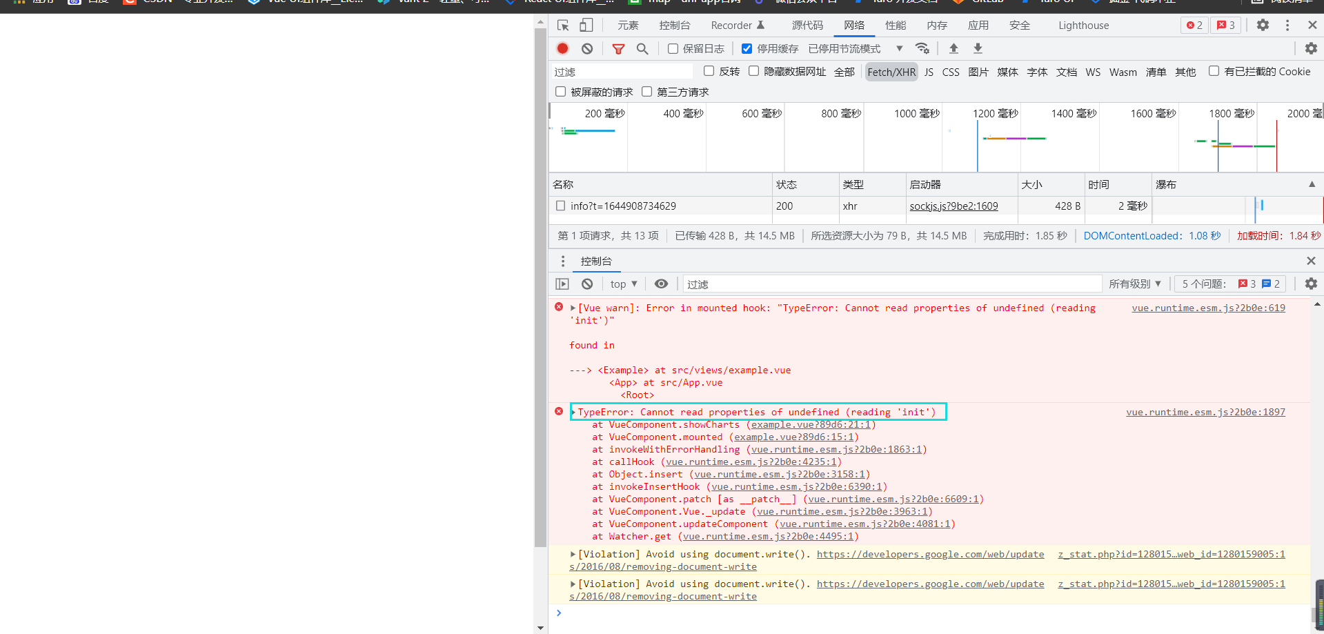
terms of settlement:
//Introducing echarts
import * as echarts from 'echarts'//After import, add an * as before ecarts
//vue global injection ecarts
Vue.prototype.$echarts = echarts;
After the modification, it runs, and the results are as follows:
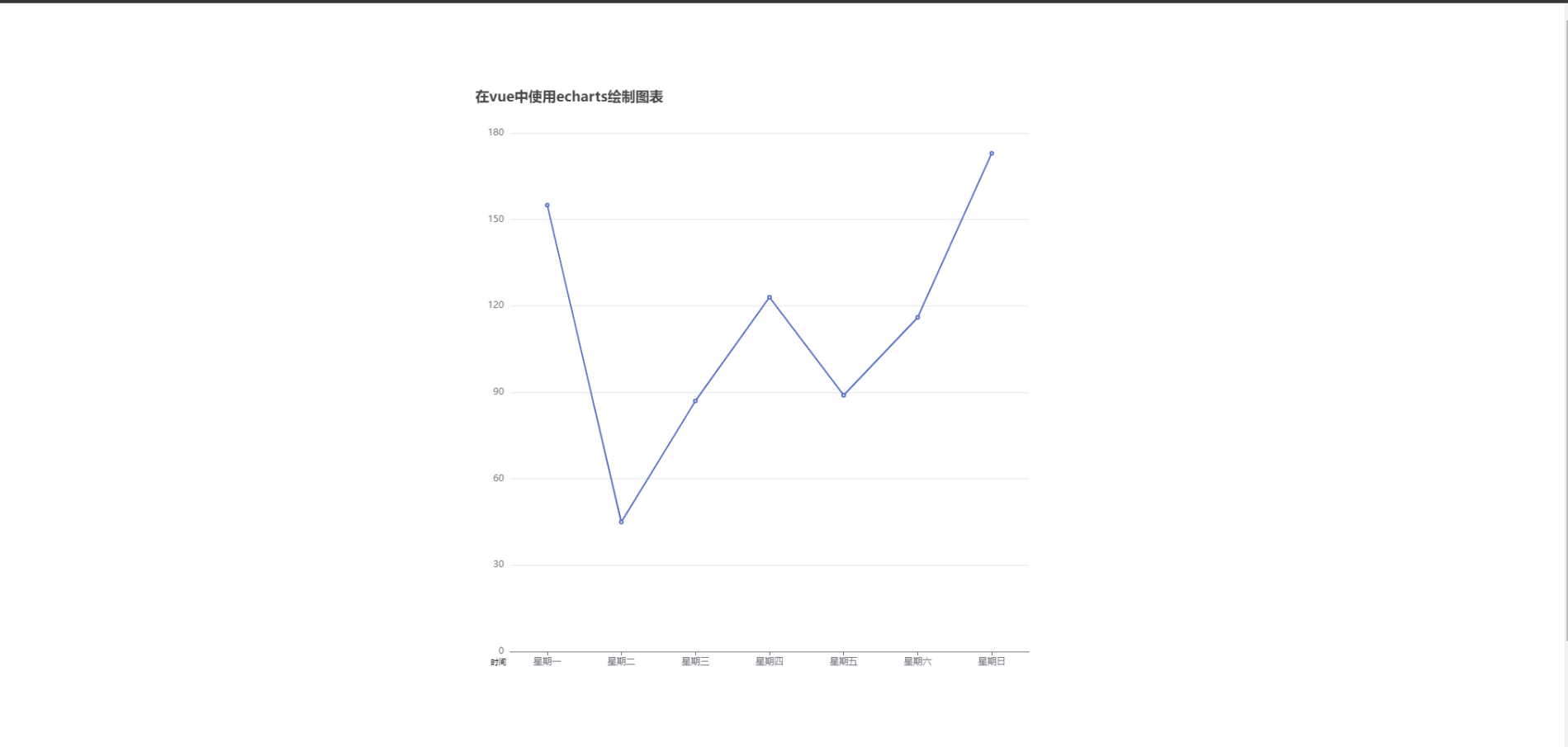
In this way, a simple example of line chart will come out, but I need to remind you here that the global introduction above will package all the ecarts charts, resulting in excessive volume, so I think it's better to introduce them on demand.
On demand import
In main JS
//Introduction of ECharts main module
let echarts = require('echarts/lib/echarts');
//Introduce components such as echart line chart as required
require('echarts/lib/chart/line');
//vue global injection ecarts
Vue.prototype.$echarts = echarts;
The reason why we use require instead of import here is that require can be directly imported from node_modules, and import must write all the paths.
If you think my writing is good, you can praise and support it. If you think it is helpful to you, you can collect it.
For more details, please refer to the official document Introduction Manual →