Deep component
Custom event
The event name rule is the same as the component prop, that is, camelCase in JS and kebab case in HTML.
this.$emit('myEvent')<my-component @my-event="doSomething"></my-component>
Custom events are defined on the emits option of the component. If a native event (such as click) is defined in the emits option, the component custom event replaces the native event listener. Similar to props, when defining an event with the emits option, you can use object syntax to add validation to the event. When adding event validation, the event should be assigned a function that receives the parameters passed to the $emit call and returns a Boolean value indicating whether the event is valid.
app.component('custom-form', {
  emits: {
    // No validation
    click: null,

    // Validate submit event
    submit: ({ email, password }) => {
      if (email && password) {
        return true
      } else {
        console.warn('Invalid submit event payload!')
        return false
      }
    }
  },
  methods: {
    submitForm(email, password) {
      this.$emit('submit', { email, password })
    }
  }
})
This piece of code has not carefully understood the running scenario.
Custom components can use v-model to realize two-way binding. The v-model on the default component uses modelValue (such as title) as prop and update:modelValue (such as update:title) as event (without this event, data can only flow from the parent to child components. This event response makes prop modified and the status of child components reflected in the parent attribute value). We have explained this earlier.
Because modelValue is used when v-model bidirectional binding is used, multiple v-model bindings can be bound to different modelvalues on a single component instance, such as
<user-name
  v-model:first-name="firstName"
  v-model:last-name="lastName"
></user-name>
app.component('user-name', {
  props: {
    firstName: String,
    lastName: String
  },
  emits: ['update:firstName', 'update:lastName'],
  template: `
    <input
      type="text"
      :value="firstName"
      @input="$emit('update:firstName', $event.target.value)">

    <input
      type="text"
      :value="lastName"
      @input="$emit('update:lastName', $event.target.value)">
  `
})
When we learned about form input binding earlier, we saw that v-model can use the built-in modifier. trim/.number/.lazy, and Vue allows us to customize the v-model modifier. The following procedure shows how the custom modifier capitalize implements the initial size.
<my-component v-model.capitalize="myText"></my-component>
The modifier added to the v-model will be notified to the component through the component prop of modelModifiers (the default value of modelModifiers is null, which is returned by the default factory function, see the previous article). That is, the external v-model is bound with the. capitalize modifier and captured by the modelModifiers prop in the component (in addition to the binding itself corresponding to a prop, the modifier also corresponds to a prop. The former is named modelValue and the latter is named modelModifiers).
app.component('my-component', {
  props: {
    modelValue: String,
    modelModifiers: {
      default: () => ({})
    }
  },
  emits: ['update:modelValue'],
  template: `
    <input type="text"
      :value="modelValue"
      @input="$emit('update:modelValue', $event.target.value)">
  `,
  created() {
    console.log(this.modelModifiers) // { capitalize: true }
  }
})
We see that the modifier has been captured. We hope that this modifier will work as a starting point. In the above code, the internal input event will directly trigger the update:modelValue event of the component, so as to directly modify the value of the variable myText bound by the v-model. We need to insert an uppercase filtering action in the middle: add the method emitValue to the component and put it in the component The input event callback is bound to the method emitValue. In the emitValue method, filter first (judge whether to filter according to whether there is a modifier named capitalize in the prop modelModifiers), and then raise the update:modelValue event of the component. Of course, the created() hook does not need to be deleted.
  methods: {
    emitValue(e) {
      let value = e.target.value
      if (this.modelModifiers.capitalize) {
        value = value.charAt(0).toUpperCase() + value.slice(1)
      }
      this.$emit('update:modelValue', value)
    }
  },
  template: `<input
    type="text"
    :value="modelValue"
    @input="emitValue">`
For v-model bindings with parameters (prop is not the default modelValue, but named, because more than one prop can be named, see multiple v-model bindings earlier in this article), the generated prop name will be the parameter name + ' Modifiers', e.g
<my-component v-model:description.capitalize="myText"></my-component>
When v-model is bound, the parameter is description. Therefore, props must have a description, and then the modifier capitalize must also correspond to a prop. At this time, props must have descriptionModifiers, and the modifier related to description will be captured by this prop
app.component('my-component', {
  props: ['description', 'descriptionModifiers'],  // These two prop s
  emits: ['update:description'],
  template: `
    <input type="text"
      :value="description"
      @input="$emit('update:description', $event.target.value)">
  `,
  created() {
    console.log(this.descriptionModifiers) // {capitalize: true} last 1 prop capture modifier
  }
})
slot
Slot content
We have previously used < slot >, which is a placeholder for component definition. The innerHTML of the component user (which can contain various HTML or even other Vue components) will be filled into this placeholder. If the component does not have a < slot > placeholder, the innerHTML of the component user will be discarded.
Render scope
    <div id="app">
        <todo-button action="delete">
            Do the first {{ n }} Job, execute after completion {{ action }}
        </todo-button>
    </div>
    <script>
        const app = Vue.createApp({
            data() {
                return {
                    n: 1
                }
            }
        })
        app.component('todo-button', {
            template: `
                <button class="btn-primary">
                    <slot></slot>
                </button>
            `
        })
        app.mount('#app')
    </script>
In the above code, a warning will appear because the action in {{action}} is inaccessible because of the slot (the content "do the first...) The scope of < todo button > cannot be accessed. The scope of the slot is the scope of the user of the component. In other words, all contents in the parent template are compiled in the parent scope; all contents in the child template are compiled in the child scope. The slot content is provided by the component user, so its scope is in the user (parent) scope.
Alternate content
The standby content is the default content when the user does not provide content. It can be directly embedded in the middle of < slot > < / slot > during component definition, that is, < slot > standby content < / slot >
<button type="submit">
  <slot>Submit</slot>
</button>
<submit-button></submit-button>
The button text rendered by the above code is "submit". The button text rendered by the following code is "save"
<submit-button>
  preservation
</submit-button>
Named slot
If you do not name a slot, use the default slot (named default). There can only be one slot. Naming a slot is unlimited. Naming a slot is to use a special attribute: name for the < slot > element
<div class="container">
  <header>
    <slot name="header"></slot>
  </header>
  <main>
    <slot></slot>
  </main>
  <footer>
    <slot name="footer"></slot>
  </footer>
</div>
The user of the component needs to use the v-slot instruction on a < template > element to indicate which slot position to replace the content in < template >
<base-layout>
  <template v-slot:header>
    <h1>Here is the title</h1>
  </template>

  <template v-slot:default>
    <p>Section I main contents</p>
    <p>Main contents of another section</p>
  </template>

  <template v-slot:footer>
    <p>The footer is some contact information</p>
  </template>
</base-layout>
The v-slot instruction can only be used for < template > elements or exclusive default slots (see below).
Scope slot and slot prop
As we know, the data of child components cannot be accessed in the parent slot content, but sometimes we do want the slot content to access the data of child components. In order to achieve this, we can add an attribute to the < slot > element, that is, slot prop. Using slot prop can achieve the effect that child component variables are used by the parent slot content. The constant value of slot prop See the application scenario. When components are used to render an item array, we want to customize the rendering method of each item, that is, the component customization Party retains certain flexibility for the component user. The following example is purely for demonstration
    <div id="app">
        <todo-list :title="title">
            <template v-slot:default="slotProps">
                <span>++ {{ slotProps.index }} ++ </span>
                <span>{{ slotProps.item }}</span>
            </template>
        </todo-list>
    </div>
    <script>
        const app = Vue.createApp({
            data() {
                return {
                    title: 'Zhang San's off work life'
                }
            }
        })
        app.component('todo-list', {
            props: ['title'],
            data() {
                return {
                    items: ['go off work', 'wash hands', 'having dinner', 'take a walk', 'sleep']
                }
            },
            template: `
                <h2>{{ title }}</h2>
                <ul>
                    <li v-for="(item, index) in items">
                        <slot :item="item" :index="index"></slot>
                    </li>
                </ul>
            `
        })
        app.mount('#app')
    </script>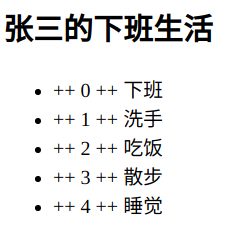
The todo list component has a component prop title. For the component prop, the data is from the user of the component to the inside of the component. The todo list component has a slot, which is unnamed (i.e. default slot). For the slot, the content is from the user of the component to the inside of the component. Although the slot of the component todo list is in the v-for loop, it is a (default) in morphology . slot prop binds the variables in the component to slot prop. The component user can receive all slot props of the slot with an object (v-slot: slot name = "object name", v-slot with value), so that the final data from the component to the component user.
Abbreviation syntax for exclusive default slots
In the above example, only the default slot receives content. In this case, the label of the component can be used as the template of the slot, that is, the template is omitted.
        <todo-list :title="title" v-slot:default="slotProps">
            <span>++ {{ slotProps.index }} ++ </span>
            <span>{{ slotProps.item }}</span>
        </todo-list>
The above method can be further simplified because the slot is not specified as the default slot. Therefore, the parameter default of v-slot can be omitted
        <todo-list :title="title" v-slot="slotProps">
            <span>++ {{ slotProps.index }} ++ </span>
            <span>{{ slotProps.item }}</span>
        </todo-list>
Exclusive default slots are special. If there are multiple slots, you should always use the complete < template > syntax for each slot. We add a date data attribute and a slot named other to the component, which are placed in the footer. The other slot is named date slot prop, and the bound value is date data attribute, so that the component user can customize the rendering method of the footer.
            data() {
                return {
                    items: ['go off work', 'wash hands', 'having dinner', 'take a walk', 'sleep'],
                    date: '2021-11-11'
                }
            },
            template: `
                <h2>{{ title }}</h2>
                <ul>
                    <li v-for="(item, index) in items">
                        <slot :item="item" :index="index"></slot>
                    </li>
                </ul>
                <slot :date="date" name="other"></slot>
            `
<todo-list :title="title">
<template v-slot:default="slotProps">
<span>++ {{ slotProps.index }} ++ </span>
<span>{{ slotProps.item }}</span>
</template>
<template v-slot:other="otherSlotProps">
<hr>
<p>{{ otherSlotProps.date }}</p>
</template>
</todo-list>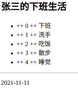
At this time, because the component has two slots, we need to use the standard < template > syntax. The v-slot instruction parameter indicates which slot it is, and the value receives the prop value of each slot.
Deconstruct slot prop
The internal working principle of the scope slot is to include the slot contents in a single parameter function:
function (slotProps) {
  // ... slot contents
}
Therefore, slotProps can be replaced with any Javascript expression that can be used as a function parameter. Using ES2015 + deconstruction syntax can simplify the use of slot prop and make the template clearer.
            <template v-slot:default="{ index: i, item: todo }">
                <span>++ {{ i }} ++ </span>
                <span>{{ todo }}</span>
            </template>
            <template v-slot:other="{ date: date }">
                <hr>
                <p>{{ date }}</p>
            </template>
Dynamic slot name
Vue instruction parameters can be dynamic parameter names, which is also applicable to v-slot instructions. v-slot instructions can define dynamic slot names by using dynamic parameter names
<base-layout>
  <template v-slot:[dynamicSlotName]>
    ...
  </template>
</base-layout>
Abbreviation for named slot
v-on and v-bind instructions have abbreviations, and v-slot instructions also have abbreviations, i.e v-slot: replace the slot name with # slot name
            <template #default="{ index: i, item: todo }">
                .....
            </template>
            <template #other="{ date: date }">
                .....
            </template>
Using the abbreviation syntax, even if there is only one default slot, the slot name must be indicated with #default = "..." and cannot be written with # = "..."