Custom components
- Creation and reference of components
-
Creation of components
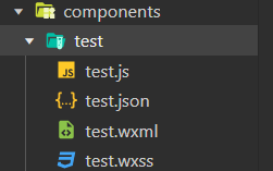
① In the root directory of the project, right-click to create the components - > test folder
② Right click the new components - > test folder and click "new Component"
③ After entering the name of the component, press enter to automatically generate 4 files corresponding to the component, with suffixes respectively js,. json,. wxml and wxss
-
Reference component
The reference methods of components are divided into "local reference" and "global reference"Local reference: the component can only be used in the currently referenced page
// At the bottom of the page json file, import components
{
	"usingComponents":{
		"my-test1":"/components/test1/test1"
	}
}
//At the bottom of the page In the wxml file, use components <my-test1></my-test1>
Global reference: components can be used in each applet page
On app The way components are referenced in the JSON global configuration file is called "global reference""usingComponents": { "my-test2": "/components/test2/test2", }//At the bottom of the page In the wxml file, use components <my-test2></my-test2>
-
Differences between components and pages
On the surface, components and pages are made of js,. json,. wxml and wxss consists of these four files. However, components and pages are different JS and JSON files are obviously different:
Assembly json file needs to declare "component": true attribute
Assembly The Component() function is called in the js file.
The event handler function of the component needs to be defined in the methods node
- style
1. Component style isolation
By default, the style of a custom component is only effective for the current component and will not affect the UI structure outside the component.
The style of component A does not affect the style of component C
The style of component A does not affect the style of the applet page
The style of the applet page does not affect the style of components A and C
2. Precautions for component style isolation
app. The global style in wxss is not valid for components
Only class selectors have the effect of style isolation, and id selectors, attribute selectors and label selectors are not affected by style isolation
3. Modify the style isolation option of the component
By default, the style isolation feature of custom components can prevent styles inside and outside components from interfering with each other. However, sometimes we want to control the style inside the component from the outside. At this time, we can modify the style isolation option of the component through styleIsolation. The usage is as follows:
// At the end of the assembly js file, add the following configuration
Component({
  options: {
    styleIsolation: 'isolated'
  },
})
//Or at the end of the assembly The following configuration is added to the json file
{
	"styleIsolation":"isolated"
}
Optional value for styleIsolation

- Data, methods, and properties
1.data
In applet components, the private data used for component template rendering needs to be defined in the data node. Examples are as follows:
Component({
	data{
		count:0
	}
})
2.methods method
In the applet component, event handling functions and custom methods need to be defined in the methods node. The example code is as follows
Component({
	methods:{ // Method list of components
		addCount(){
			this.setData({count:this.data.count+1})
			this._showCount() // Calling custom methods directly through this
		},
		_showCount(){
			wx.showToast({
				title: 'count Value is'+ this.data.count,
				icon:'none'
			})
		}
	}
})
3.properties property
In the applet component, properties are the external properties of the component, which are used to receive the data passed from the outside to the component
Component({
	properties:{
		max:{   //The method of completely defining the attribute, specifying the default value of the attribute
			type:Number,
			value:10
		}
		max:Number //Simplify how attributes are defined
	}
})
<my-test1 max="10"></my-test1>
4. Difference between data and properties
In the components of the applet, the properties property and data are used in the same way. They are both readable and writable, except:
Data tends to store private data of components
properties tend to store data passed from outside to components
5. Use setData to modify the value of properties
Since there is no difference between data and properties in essence, the value of the properties property can also be used for page rendering, or use setData to reassign the properties in the properties. The example code is as follows
// At the end of the assembly Use the value of the properties attribute in the wxml file
<view> max The value of the property is: {{max}} </view>
Component({
	properities:{max: Number}, // Define properties
	methods:{
		addCount(){
			this.setData({max:this.properties.max+1})// Use setData to modify the value of a property
		}
	}
})
- Data listener
1. What is a data listener
The data listener is used to listen to and respond to any changes in attributes and data fields, so as to perform specific operations. Its function is similar to the watch listener in vue. In the applet component, the basic syntax format of the data listener is as follows
Component({
	observers:{
		'field A, field B':function(field A New value for, field B New value for){

		}
	}
})
2. Basic usage of data listener
The UI structure of the component is as follows:
<!--components/test2/test2.wxml-->
<view>{{n1}} + {{n2}} = {{sum}}</view>

<button bindtap="addN1">n1+1</button>
<button bindtap="addN2">n2+1</button>
 /**
   * Initial data of components
   */
  data: {
    n1: 0,
    n2: 0,
    sum: 0
  },

  /**
   * Component method list
   */
  methods: {
    addN1() {
      this.setData({
        n1: this.data.n1 + 1
      })
    },
    addN2() {
      this.setData({
        n2: this.data.n2 + 1
      })
    }
  },
  observers: {
    'n1, n2': function (newN1, newN2) {
      this.setData({
        sum: newN1 + newN2
      })
    }
  }
3. Change of listening object attribute
The data listener supports monitoring the changes of single or multiple attributes in the object. The example syntax is as follows:
Components({
	observers:{
		'object.attribute A, object.attribute B': function(attribute A New value, property B New value for){
		//There are three conditions that trigger the listener:
		// Assign A value to attribute A: use setData to set this data. Object Triggered when attribute A
		// Assign a value directly to the object: use setData to set this data. Triggered on object
	}

	}
})
- Data listener - Case
1. Initial data definition
2. Render UI structure/** * Initial data of components */ data: { rgb: { r: 0, g: 0, b: 0 }, fullColor: '0, 0, 0' },<view style="background-color: rgb({{fullColor}});" class="colorBox">Color value:{{fullColor}}</view> <button size="mini" type="default" bindtap="changeR">R</button> <button size="mini" type="primary" bindtap="changeG">G</button> <button size="mini" type="warn" bindtap="changeB">B</button>.colorBox { line-height: 200rpx; font-size: 24rpx; color: white; text-shadow: 0rpx 0rpx 2rpx black; text-align: center; }
3. Define the event handling function of button
methods: {
    changeR() {
      this.setData({
        'rgb.r': this.data.rgb.r + 5 > 255 ? 255 : this.data.rgb.r + 5
      })
    },
    changeG() {
      this.setData({
        'rgb.g': this.data.rgb.g + 5 > 255 ? 255 : this.data.rgb.g + 5
      })
    },
    changeB() {
      this.setData({
        'rgb.b': this.data.rgb.b + 5 > 255 ? 255 : this.data.rgb.b + 5
      })
    },
 }
4. Listen for the change of the specified attribute in the object
  observers: {
    'rgb.r, rgb.g, rgb.b': function (r, g, b) {
     this.setData({
     fullColor: `${r}, ${g}, ${b}`
    })
 },
5. Listen for changes of all attributes in the object
If there are too many attributes to be monitored in an object, for convenience, you can use the wildcard * * to monitor the changes of all attributes in the object. The example code is as follows:
  observers: {
    'rgb.**': function (obj) {
      this.setData({
        fullColor: `${obj.r}, ${obj.g}, ${obj.b}`
      })
    }
  },
- Pure data field
1. Concept
Pure data fields refer to those data fields that are not used for interface rendering.
Application scenario: for example, in some cases, the fields in some data are neither displayed on the interface nor passed to other components, but only used inside the current component. The data field with this feature is suitable to be set as a pure data field.
Benefit: pure data fields help improve the performance of page updates
2. Usage rules
In the options node of the Component constructor, specify pureDataPattern as a regular expression, and the field name that conforms to this regular expression will become a pure data field. The example code is as follows:
  options: {
    pureDataPattern: /^_/
  },
  data:{
	a: true,// General data field
	_b: true,// Pure data field
  }
- Component lifecycle
1. Full life cycle of components
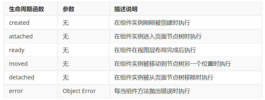
2. The main life cycle functions of components in applet components, there are three most important life cycle functions, namely created, attached and detached. Their respective characteristics are as follows:
① When the component instance is just created, the created lifecycle function will be triggered
setData cannot be called at this time
Usually, in this life cycle function, it should only be used to add some custom attribute fields to this of the component
② After the component is fully initialized and enters the page node tree, the attached lifecycle function will be triggered
At this point, this Data has been initialized
This life cycle is very useful. Most initialization work can be carried out at this time (for example, sending a request to obtain initial data)
③ After the component leaves the page node tree, the detached lifecycle function will be triggered
When you exit a page, the detached lifecycle function of each custom component in the page is triggered
At this time, it is suitable to do some cleaning work
3.lifetimes node
In applet components, lifecycle functions can be defined directly in the first level parameters of the Component constructor, and can be declared in the lifetimes field (this is the recommended method, with the highest priority). The example code is as follows:
  // Old definition
  created() {
    console.log('created')
  },
  attached() {
   console.log('attached')
  },
  // Recommended usage
  lifetimes: {
    created() {
      console.log('created ~~~~~')
    },
    attached() {
      console.log('attached ~~~~~')
    },
  },
- The lifecycle of the page on which the component is located
1. What is the life cycle of the page where the component is located
Sometimes, the behavior of a custom component depends on the change of the page state. At this time, the life cycle of the page where the component is located needs to be used. For example, whenever the show lifecycle function of the page is triggered, we hope to regenerate a random RGB color value. In the user-defined component, the life cycle functions of the page where the component is located are as follows:
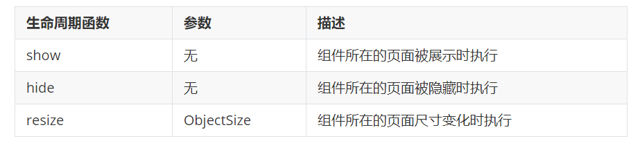
2.pageLifetimes nodepageLifetimes: { show() { console.log('show') this._randomColor() }, hide() { console.log('hide') }, resize() { console.log('resize') } }
3. Generate random RGB values
methods: {
    _randomColor() {
      this.setData({
        _rgb: {
          r: Math.floor(Math.random() * 256),
          g: Math.floor(Math.random() * 256),
          b: Math.floor(Math.random() * 256)
        }
      })
    }
}
pageLifetimes:{
	//Called immediately when the page where the component is located is displayed_ randomColor generates random color values
	show:function(){
		this._randomColor()
	}
}
- slot
1. What is a slot
In the wxml structure of a custom component, you can provide a < slot > node (slot) to host the wxml structure provided by the component user.
2. Single slot
In the applet, by default, only one < slot > is allowed in each custom component for space occupation. This limit on the number is called a single slot
<view class="wrapper">
	<view>This is the internal node of the component</view>
	<slot></slot>
</view>

<componene-tag-name>
<view>Here is insert into component slot Content in </view>
</component-tag-name>
3. Enable multiple slots
In the custom component of the applet, if you need to use multiple slots, you can use the js file, enable it as follows. The example code is as follows:
Components({
	options:{
		multipleSlots:true // Enable multiple slot support in the options at the time of component definition
	},
})
4. Define multiple slots
<view>
  <slot name="before"></slot>
  <view>Here is the internal structure of the component</view>
  <slot name="after"></slot>
</view>
- Communication between parent and child components
1. Three ways of communication between parent and child components
① Property binding
It is used to set data from the parent component to the specified attribute of the child component. Only JSON compatible data can be set
② Event binding
It is used to transfer data from child component to parent component, and any data can be transferred
③ Get component instance
The parent component can also use this Selectcomponent() gets the sub component instance object
This allows direct access to any data and methods of the subcomponents
2. Attribute binding
Property binding is used to pass values from parent to child. It can only pass ordinary types of data, and cannot pass methods to child components. The example code of the parent component is as follows:
// data node of parent component
data:{
	count: 0
}
//wxml structure of parent component
<my-test3 count="{{count}}"></my-test3>
<view>~~~</view>
<view> In the parent component, count The value of is:{{count}}</view>
The subcomponent declares the corresponding properties in the properties node and uses them. The example code is as follows:
//Properties node of subcomponent
properties:{
	count: Number
}
// wxml structure of subcomponents
<text> In the substructure, count The value is:{{count}}</text>
3. Event binding
Event binding is used to pass values from child to parent, and can pass any type of data. The steps are as follows:
① In the js of the parent component, define a function, which will be passed to the child component in the form of custom events
// Define the syncCount method in the parent component, which will be passed to the child component for calling.
syncCount(){
	console.log('syncCount')
}
② In the wxml of the parent component, pass the function reference defined in step 1 to the child component in the form of custom events
<!--use bind: Custom event name (recommended: clear structure)-->
<my-test3 count="{{count}}" bind:sync="syncCount"></my-test3>
<!--Or in bind Write the name of the custom event directly after it-->
<my-test3 count="{{count}}" bindsync="syncCount"></my-test3>
③ In the js of the sub component, call this Trigger event ('custom event name ', {/ * parameter object * /}) to send data to the parent component
// wxml structure of subcomponents
<text>In the sub assembly, count The value of is:{{count}}</text>
<button type="primary" bindtap="addCount">+1</button>
// js code of sub component
  methods: {
    addCount() {
      this.setData({
        count: this.properties.count + 1
      })
      // Trigger a custom event to synchronize the value to the parent component
      this.triggerEvent('sync', { value: this.properties.count })
    }
  }
④ In the js of the parent component, obtain the data passed from the child component through e.detail
syncCount(e){
	this.setData({
		count:e.detail.value
	})
}
4. Get component instance
You can call this in the parent component Select component ("id or class selector") to obtain the instance object of the sub component, so as to directly access any data and methods of the sub component. When calling, you need to pass in a selector, such as this selectComponent(".my-component")
<my-test3 count="{{count}}" bind:sync="syncCount" class="customA" id="cA"></my-test3>
<button bindtap="getChild">Gets an instance of a subcomponent</button>
getChild(){ // tap event handler for button
	const child=this.selectComponent('.customA')
	child.setData({count:child.properties.count+1})
	child.addCount()
}
- behaviors
1. What are behaviors
behaviors are features in applets that are used to realize code sharing between components, similar to Vue "mixins" in JS
2. How behaviors work
Each behavior can contain a set of properties, data, lifecycle functions, and methods. When a component references it, its properties, data, and methods are merged into the component. Each component can reference multiple behaviors, and behaviors can also reference other behaviors
3. Create behavior
Call the Behavior(Object object) method to create a shared behavior instance object for all components:
// Call the behavior() method to share the behavior instance object
// And use module Export shares the behavior instance object
module.exports=Behavior({
	properties:{};
	data:{username:'zs'},
	methods:{},
})
4. Import and use behavior. In the component, use the require() method to import the required behavior. After mounting, you can access the data or methods in the behavior. The example code is as follows:
// Use require () to import the behavior module that needs to be defined
const myBehavior = require('../../behaviors/my-behavior')
Component({
//Mount the imported behavior instance object into the behavior array node to take effect.
  behaviors: [myBehavior],
})