It's also a video from the dark horse tutorial
introduction
Create applet
Open website https://mp.weixin.qq.com/ Register.
Obtain AppID;
Open developer tools:
-
The agent mode is recommended to be changed to not applicable to any agent. After checking, it is directly connected to the network.
-
Select a new project, fill in the project name, directory and AppID, and select the back-end service not applicable to cloud service.
-
After clicking compile, you can view the operation effect on the left; You can also click preview and scan the code with mobile wechat
For developer documentation, click developer documentation in help; General settings in settings;
structure
pages: the page where all applets are stored
utils: a module that stores the nature of tools
app.js: entry file of applet project
app.json: the global configuration file of the applet project
app.wxss: global style of applet project
project.config.json: configuration file of the project
sitemap.json: used to configure whether the applet and its page can be indexed by wechat
It is recommended that each page be placed in a separate folder
js file: the script file of the page, which stores the data and event handling functions of the page
json file: the configuration file of the current page, and the appearance and performance of the configuration window
wxml file: the template structure file of the page
wxss file: the style sheet file of the current page
JSON configuration file
App. In the project root directory json
All page paths, window appearance, interface performance, bottom tab, etc. of the applet.
Pages: the path of all pages.
window: globally define the background color, text, etc. of all pages.
Style: the style used. v2 is one of the newer versions
sitemapLocation: indicates the sitemap JSON location.
**Project. In the project root directory config. json **
Applet development tool personalization
setting: configuration related to compilation (consistent with local settings in details)
projectname: project name (not equal to the applet name. The applet name can be viewed in details)
appid: the account ID of the applet
**Sitemap. In the project root directory json **
Configure whether the applet page allows wechat index
action: allow, allow index; disallow, the index is not allowed (warning: modify the checkSitMap in setting to false and it will not pop up again)
json in each page folder
The window appearance settings in this page override the global configuration (app.json in the project root directory).
The configuration content is the same as that of app. In the root directory of the project JSON window.
New applet page
app. Just add the storage path of the page in the pages in JSON, and the tool will automatically create the corresponding page.
Modify applet project home page
Adjust app The order of page paths in the pages array in JSON can be. By default, the first page is rendered as the first page.
wxml
Similar to html, the difference is
- Different label names
- html(div,span,img,a)
- wxml(view, text, image, navigator)
- Different attribute nodes
- < a href = "#" > connect</a>
- <navigator url="/page/home/home"></navigator>
- Similar to the template syntax in vue
- Data binding
- List rendering
- conditional rendering
wxss
Similar to css, the difference is
- Add rpx dimension unit
- css requires manual pixel unit conversion
- wxss supports rpx at the lower level and will automatically convert on different screen sizes
- Global and local styles are provided
- Such as app Wxss and wxss in the page
- wxss only supports some css selectors
- . class and #id
- element
- Union selector, descendant selector
- Pseudo class selectors such as:: after and:: before
js logical interaction
- app.js
- Applet entry, call app() function to start the whole applet
- js of page
- The entry file of the page. Create and run the interface by calling the Page() function
- Ordinary js
- Common function module files are used to encapsulate common functions and attributes
Host environment
concept
Host environment refers to the dependent environment necessary for program operation. For example, android and iOS are two different hosting environments.
Mobile wechat is the host environment of small programs, which completes functions based on wechat.
The applet hosting environment includes:
- communication model
- operating mechanism
- assembly
- API
communication model
Communication subject
- Render layer: wxml templates and wxss styles work on the render layer
- Logical layer: js script works in the logical layer
The communication model is divided into two parts:
- Communication between rendering layer and logic layer: forwarded by wechat client
- Communication between logical layer and third-party server: forwarded by wechat client
operating mechanism
Applet startup process
- Download the code package of the applet to the local
- Parse app JSON global configuration file
- Execute app JS applet entry file, call App() to create an applet instance
- Rendering applet home page
- Start complete
Page rendering pass
- Load the json configuration file that parses the page
- Load the wxml template and wxss style of the page
- Execute the js file of the page and call page() to create the page instance
- Rendering complete
assembly
Components are provided by the host environment and are divided into nine categories
-
View container
- View: view area component, similar to div, to achieve page layout effect
- Scroll view: scrollable view area; Achieve the effect of scrolling the list
- Swiper and swiper item: the carousel chart container component and the carousel chart item component
-
Basic content
- Text: text component, similar to span
- Rich text: rich text
-
Form component
-
Navigation components
-
Media component
-
map component
-
Canvas canvas component
-
Openness
-
Accessibility
view
There seems to be a problem with the horizontal layout and the use of container for the class name
<view class="container1">
	<view>A</view>
    <view>b</view>
    <view>c</view>
</view>
.container1 view{
    width:50px;
    height:50px;
    text-align:center;
    line-height:50px;
}
.container1 view:nth-child(1){
    background-color:lightgreen;
}
.container1 view:nth-child(2){
    background-color:lightskyblue;
}
.container1 view:nth-child(3){
    background-color:lightcoral;
}
.container1{
    display: flex;
    justify-content: space-around;
}
scroll-view
Achieve vertical scrolling effect, and use scroll-x for horizontal scrolling
<scroll-view class="container1" scroll-y>
	<view>A</view>
    <view>b</view>
    <view>c</view>
</scroll-view>
.container1 view{
    width:100px;
    height:100px;
    text-align:center;
    line-height:100px;
}
.container1 view:nth-child(1){
    background-color:lightgreen;
}
.container1 view:nth-child(2){
    background-color:lightskyblue;
}
.container1 view:nth-child(3){
    background-color:lightcoral;
}
.container1{
	border: 1px solid red;
    height:120px;
    width:100px;
}
Swiper and swiper item
<swiper class="swiper-container" indicator-dots>
    <swiper-item>
        <view class="item">A</view>
    </swiper-item>
    <swiper-item>
        <view class="item">b</view>
    </swiper-item>
    <swiper-item>
        <view class="item">c</view>
    </swiper-item>
</swiper>
.swiper-container{
    height: 150px;
}
.item{
    height: 100%;
    line-height: 150px;
    text-align: center;
}

swiper-item:nth-child(1) .item{
    background-color: lightgreen;
}
swiper-item:nth-child(2) .item{
    background-color: lightskyblue;
}
swiper-item:nth-child(3) .item{
    background-color: lightcoral;
}
Common properties of components:
- Indicator dots: false by default. Whether to display panel indicator dots
- Indicator color: default rgba(0,0,0,.3), indicating the point color
- Indicator active color: default #000000, the color of the currently selected indicator point
- autoplay: false by default. Whether to switch automatically
- Interval: default 5000, automatic switching interval, unit: ms
- circular: the default value is false. Whether to use link sliding
text
Through the selectable attribute of text, long press to select the text content. Only text supports long press to select.
<view>
    The mobile phone number can be selected by long pressing
	<text selectable>13131311313</text>
</view>
rich-text
Through the nodes attribute node of the component, you can render the html string as the corresponding UI structure:
<rich-text nodes="<h1 style='color:red;'>title</h1>"></rich-text>
button
The button component can call various functions provided by wechat (customer service, forwarding, obtaining user authorization, obtaining user information, etc.) through the open type attribute
<button>Black button</button>
<button type="primary">Green button</button>
<button type="warn">Red button</button>

<button size="mini">Small size button</button>
<button type="primary" size="mini">Green button</button>
<button type="warn" size="mini">Red button</button>

<button size="mini" plain>Small hollow button</button>
<button type="primary" size="mini" plain>Green button</button>
<button type="warn" size="mini" plain>Red button</button>
image
Picture component, default width 300px, height 240px
<image></image>
<image src="/images/1.png"></image>
<image src="/images/1.png" mode="aspectFit"></image>
image{
    border:1px solid red;
}
The mode attribute of the image component is used to specify the cropping and scaling mode of the image. The common attributes are as follows:
- scaleToFill: zoom mode (default), which does not maintain the aspect ratio to scale the image. The width and height of the image are completely stretched to fill the image element
- aspectFit: zoom mode, keep the aspect ratio to zoom the picture, so that the long side of the picture can be displayed completely, and the picture can be displayed completely
- aspectFill: zoom mode, keep the aspect ratio to zoom the picture, and only ensure that the short side of the picture is fully displayed, that is, the picture is complete in only one direction.
- widthFix: zoom mode, the image width remains unchanged, the height changes automatically (the height of the image), and the width height ratio of the original image remains unchanged
- Highfix: zoom mode, the image height remains unchanged, the width changes automatically (the width of the image), and the aspect ratio of the original image remains unchanged
API
The API of the applet is provided by the host environment, including obtaining user information, local storage, payment functions, etc.
event listeners
Features: it starts with on and is used to monitor the triggering of some events
Example: Wx Onwindowresize (function callback) monitors the change of window size
wx can be understood as the window global object in js.
Synchronization API
Features: end with sync
The execution result of the synchronization API can be obtained directly through the return value of the function. If it fails, an exception will be thrown
Example: Wx Setstoragesync ('key ',' value ') writes content to local storage.
Asynchronous API
Features: similar to ajax(option), it needs to accept the call result through success, fail, complete, etc
Example: Wx Request() initiates a network request and receives data through the success callback function.
release
Upload code: click upload in the development toolbar to write the version number and project remarks.
View version: applet management, background management, version management, view in development version
Submit for review
release
QR Code Acquisition: applet management, background setting, basic setting, applet code and offline material download
Basics
Data binding
Define data in data
In the js corresponding to the page
Page({
    data:{
        info:'hello',
        imgsrc:'http://www.itheima.com/images/logo.png',
        randomNum:Math.random() * 10,
        randomNum2:Math.random().toFixed(2),
    }
})
Using data in wxml
mustache syntax, interpolation expression
Dynamic binding content
<view>{{info}}</view>
Dynamic binding properties
<image src="{{imgsrc}}"></image>
Ternary operation
<view>{{randomNum >= 5 ? 'Greater than 5' : 'Less than 5'}}</view>
<view>{{randomNum * 100}}</view>
You can view the data in data in AppData of debugging tool.
data assignment
Through this SetData settings through this Data access
Page({
    data:{
        count:0
    },
    changeCount(){
        this.setData({
            count:this.data.count + 1
        })
    }
})
Event binding
Event is the communication mode from the rendering layer to the logic layer. It can feed back the user's behavior in the rendering layer to the logic layer for processing.
Common events:
| type | Binding mode | Event description |
|---|---|---|
| tap | bindtap,bind:tap | Similar to the click event, the finger clicks and leaves |
| input | bindinput | Text box input |
| change | bindchange | Status change, such as checkbox |
When the event callback is triggered, an event object event will be received, and its properties are as follows
| attribute | type | explain |
|---|---|---|
| type | string | Event type |
| timeStamp | integer | The number of milliseconds since the page was opened to trigger the event |
| target | object | A collection of property values of the component that triggers the event |
| currentTarget | object | A collection of property values for the current component |
| detail | object | Additional information |
| touches | array | Touch event, an array of touch point information currently staying in the screen |
| changedTouches | array | Touch event, an array of currently changing touch point information |
target is the source component that triggers the event, and currentTarget is the component bound by the current event.
<view bindtap="handle">
	<button>
        Button
    </button>
</view>
At this time, if there is a click event on the button and event listening is performed on the view, then the target points to the button and the currentTarget points to the view.
The above click event processing functions are as follows:
Page({
    handle(e){
        console.log(e)
    }
})
Chuan Shen
You cannot pass parameters to the event handler while binding the event, that is, the following writing is not compliant
< button type = "primary" bindtap = "handle (123)" > event parameters < / button >
Parameters need to be passed through 'data -' as follows:
<button type="primary" bindtap="handle" data-info="{{2}}">
    Event transmission parameters
</button>
Finally, info will be resolved to the name of the parameter, and the number 2 will be resolved to the parameter value. 2 needs to be placed in {}}, otherwise it will be parsed into string 2
Page({
    handle(event){
        console.log(event.target.dataset)
        console.log(event.target.dataset.info)
    }
})
Get parameters through event target. Dataset acquisition. Dataset is an object that contains all parameter items passed through data - *; The values of specific parameters can be accessed through dataset.
bindinput
Binding event
<input bindinput="handle"></input>
event processing
handle(e){
    console.log(e.detail.value)
}
e.detail.value is the latest value of the text box after the change.
Data synchronization between text box and data
<input value="{{msg}}" bindinput="handle"></input>
Page({
    data:{
        msg:'hello'
    },
    handle(e){
        this.setData({
            msg:e.detail.value
        })
    }
})
conditional rendering
Judge whether the code block needs to be rendered by Wx: if = "{condition}}".
You can also use wx:elif and wx:else to judge
<view wx:if="{{condition}}">ok1</view>
<view wx:elif="{{condition2}}">ok2</view>
<view wx:else>okelse</view>
Combined block
If you can control the display and hiding of multiple components at one time, you can use wx:if control on the block tag. Block is not a component, just a wrapped container, and will not render in the page. (why not use a view? Just render one view less)
<block wx:if="{{condition}}">
	<view>view1</view>
    <view>view2</view>
</block>
hidden
You can directly use hidden = "{condition}}" to control display and hiding.
<block hidden="{{condition}}">
	<view>view1</view>
    <view>view2</view>
</block>
Different:
- Operation mode
- wx:if controls display and hiding by dynamically creating and removing elements
- hidden controls display and hiding by switching styles (display:none/block)
- proposal
- Switching is frequent. hidden is recommended
- The control conditions are complex. You can use wx:if with wx:elif and wx:else
List rendering
wx:for
Through wx:for, you can render the repeated component structure in a loop according to the specified array, as follows:
<view wx:for="{{array1}}">
	Indexes:{{index}} The current item is:{{item}}
</view>
Page({
  data:{
      array1 :["apple","banana"]
  }
})
Manually specify the index and the variable name of the current item
Modify the variable names of index and item, and other names can be used to refer to them
<view wx:for="{{array1}}" wx:for-index="idx" wx:for-item="itm">
	Indexes:{{idx}} The current item is:{{itm}}
</view>
key
It is recommended to specify a unique key value to improve rendering efficiency
Page({
  data:{
      array1 :[
      	{id:1,name:'h'},
        {id:2,name:'e'},
        {id:3,name:'l'},
      ]
  }
})
<view wx:for="{{array1}}" wx:key="id">
	Indexes:{{index}} The current item is:{{item}}
</view>
If there is no key, you can use index as the key value
Advanced
wxss
Compared with css, rpx size and @ import are extended; There are also some selectors and styles that are not available.
Rpx solves the problem of small program size adaptation. Rpx divides the screen horizontally into 750 copies, and rpx automatically converts units. Generally, iPhone 6 is recommended as a visual reference, 1rpx=0.5px.
@Import, followed by the relative path of the external style sheet to be imported, and the semicolon indicates the end of the statement, such as @ import "common.wxss";, common.wxss is under the current path and is used in wxss.
Global style, defined in app Wxss page style, which applies to all pages.
Local style, defined on the page wxss style, which only works on the current page. The local style will overwrite the global style. Only when the weight of the local page style is greater than or equal to the global style will it be overwritten.
Global configuration
App. In the root directory JSON file.
- pages, which records the storage path of the current applet page
- Window to set the appearance of the window globally
- tabBar, effect of bottom tabBar
- Style, whether to enable the new component style, such as' v2 '
Common configuration of window node:
- navigationBarTitleText: navigation bar title text
- navigationBarBackgroundColor: the background color of the navigation bar. It only supports "#121212" format
- navigationBarTextStyle: navigation bar title text color. Only "white" and "black" are supported
- enablePullDownRefresh: enable global pull-down refresh, true; Will act on each page, and the effect may be different in the development tool.
- backgroundColor: the background color when the drop-down is refreshed. It can only be in "#121212" format
- backgroundTextStyle: the loading style during pull-down refresh, small dot style, which can only be light and dark.
- onReachBottomDistance: the distance of pulling up to touch the bottom. The default distance is 50px, which is generally unchanged.
tabBar
It is used to realize multi page switching. It is divided into top tabBar and bottom tabBar.
You can only configure 2 at least and 5 at most; When rendering the top tabBar, only text is displayed.

- backgroundColor: background color
- selectedIconPath: the image path when selected
- borderStyle: the color of the border
- iconPath: image path when not selected
- selectedColor: the color of the selected text
- Color: the unselected color of the text
app. Configuration item of tabBar node in JSON
- position: bottom or top
- borderColor: the color of the border
- Color: the unselected color of the text
- selectedColor: the color of the selected text
- backgroundColor: background color
- List: required, tab page list, more than or equal to 2, less than or equal to 5
The list item object includes the following configuration options:
- pagePath: required. The page path is the same as that in Pages
- Text: what about the text displayed by tab
- iconPath: picture path when not selected
- selectedIconPath: the image path when selected
Note: the pages involved in tabBar must be placed in front of the pages array.
Page configuration
Under the page json file to configure the appearance of individual page windows.
For example, if the node navigationBarBackgroundColor is added: "#ff0000", the navigation bar of the current page is modified.
Node content is the same as app JSON: navigationBarTitleText, navigationBarBackgroundColor, navigationBarTextStyle, enablePullDownRefresh, backgroundColor, backgroundTextStyle, onReachBottomDistance.
Network data request
Restrictions:
- Only https type interfaces can be requested
- The domain name of the interface must be added to the trust list (details can be found in the development tool ➡ Project configuration ➡ View request (legal domain name) in domain name information
- Therefore, the address must be domain name, not ip format
Configure legal domain name:
Log in to wechat applet management background ➡ development ➡ Development configuration ➡ Server domain name ➡ The legal domain name of request needs to be changed.
get request
Use Wx Request() method
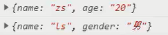
wx.request({
	url:'https://www.escook.cn/api/get',
	method:'GET',
	data:{
		name:'zs',
		age:'30'
	},
	success:(res)=>{
		console.log(res);
	}
})
post request
Use Wx Request() method
wx.request({
	url:'https://www.escook.cn/api/post',
	method:'POST',
	data:{
		name:'zs',
		age:'30'
	},
	success:(res)=>{
		console.log(res);
	}
})
Request data when page loads
The request can be made in onLoad of the page.
onLoad:function(options){
	this.getData();//Methods in pages
}
Skip request legal request
It can be temporarily opened in the developer tool (details) ➡ (local setting) the development environment does not verify the requested domain name, TLS version and https certificate, and skips the domain name verification.
It can only be used in development and debugging.
Cross domain and ajax
- There is no cross domain problem in the applet.
- ajax relies on the browser's XMLHttpRequest, but the applet is not a browser, so it can only be called initiating a network data request.
Page navigation
Jump page
- Declarative navigation: click < navigator > to realize bar navigation.
- Navigation during programming: call api,
Navigate to the tabBar page (declarative)
You need to specify the url and open type attributes, where
- url indicates the page address to jump to, which must start with /
- Open type indicates the jump mode, which must be switchTab
For example:
<navigator url="pages/message/message" open-type="switchTab">Navigate to the message page</navigator>
Navigate to a non tabBar page (declarative)
- url indicates the page address to jump to, which must start with /
- Open type indicates the jump mode, which must be navigate (this attribute can be omitted, and the effect is the same)
For example:
<navigator url="pages/message/message" open-type="navigate">Navigate to non tab noodles</navigator>
Back navigation (declarative)
- If you want to go back, the default value is 1. If you want to go back, you must go back.
- Open type is navigateBack, indicating backward navigation
Navigate to the tabBar page (programming)
Call Wx Switchtab (object object) method can jump to tabBar, where object attribute:
- url string, the tabBar path that needs to be jumped. The path cannot take parameters
- success function, successful callback
- fail function, failed callback
- complete function, completed callback
wx.switchTab({
	url:'/pages/message/message'
})
Navigate to a non tabBar page (programming)
Call Wx The navigateto (object object) method can jump to a non tabBar, where the object attribute:
- url string, a non tabBar path that needs to jump. The path cannot take parameters
- success function, successful callback
- fail function, failed callback
- complete function, completed callback
wx.navigateTo({
	url:'/pages/message/message'
})
Backward navigation (programming)
Call navigateBack to return to the previous page or multi-level page. The optional parameters are as follows:
- delta string, indicating the level to go back. If it is larger than the existing page, it will return to the home page
- success function, successful callback
- fail function, failed callback
- The complete function is called to complete the callback returned
wx. Does navigateback () return to the previous page by default.
Navigation parameters (declarative)
Parameters can be carried after the url path:
- Use between parameter and path? division
- The parameter key is connected with the parameter value with =
- Split with & without parameters
<navigator url="/pages/info/info?name=tom&age=30">Jump</navigator>
You can view the page parameters in the lower left corner of the simulator.
Navigation parameter transmission (programming)
Call Wx When navigateto (object object) jumps, it can carry parameters as follows
wx.navigateTo({
	url:"pages/info/info?name=ls&age=32"
})
Accept navigation parameters
Get it directly in onLoad (in options), assuming that the query stored in data:
onLoad:function(options){
	console.log(options)
	this.setData({
		query:options
	})
}
Pull down refresh and pull up to touch the bottom
Enable pull-down refresh
- Global open, app json ➡ window ➡ enablePullDownRefresh set to true
- Partial open, page json ➡ enablePullDownRefresh set true (recommended)
Drop down window style
Global or page json
- backgroundColor: background color in hexadecimal format
- backgroundTextStyle: the style of loading, dark or light
Listen for drop-down refresh events
On the page Listen in the onPullDownRefresh() function in js.
onPullDownRefresh:function(){
	//todo
	console.log("Pull down refresh")
}
Stop pull-down refresh effect
Through Wx Stoppulldownrefresh implementation:
onPullDownRefresh:function(){
	//todo
	console.log("Pull down refresh")
	wx.stopPullDownRefresh()
}
Monitor pull-up touch bottom
In the js file of the page, listen through the onReachBottom function:
onReachBottom:function(){
	//todo
	console.log("Pull up to touch the bottom")
}
example:
<view wx:for="{{colorList}}" wx:key="index" class="num-item" sytle="background-color:rgba({{item}})">{{item}}</view>
data:{
	colorList:[],//Random color
	isloading:false //Are you requesting
},
getColors(){
	this.setData({
		isloading:true
	})
	wx.showLoading({title:'Loading data...'})//Display prompt window
	wx.request({
		url:"https://www.essss.cn/api/getcolor",
		method:'GET',
		success:({data:res})=>{
			this.setData({
				colorList:[...this.data.colorList,...res.data]
			})
		},
		complete:()=>{
			wx.hideLoading()//Hide prompt window
			this.setData({
				isloading:false
			})
		}
	})
},
onLoad:function(options){
	this.getColors()
},
onReachBottom:function(){
//Throttling processing is required to prevent this request from being processed again before the last time
	if(this.data.isloading) return
	this.getColors()
}
.num-item{
	border:1rpx solid #efefef;
	border-radius:8rpx;
	line-height:200rpx;
	margin:15rpx;
	text-align:center;
	text-shadow:0rpx 0rpx 5rpx #fff;
	box-shadow:1rpx 1rpx 7rpx #aaa;
}
... The expansion operator is used for the operation of arrays or objects, and several arrays can also be connected, reference resources,
let arr=[1,2,3]
 // Expand an array
 console.log(...arr)

 console.log("-----------");
 // Copying an array is also called copying an array
 let arr2=[...arr]
 arr2.push(4);
 // And will not affect the arr
 console.log("arr",arr);
 console.log("arr2",arr2);

 console.log("-----------");

 // Join array
 let arr3=[...arr,...arr2]
 console.log(arr3);

//Object operation-------------------------------------------------
var obj1 = { foo: 'yuan', x: 42 };
var obj2 = { foo: 'li', y: 13 };

// Clone the object with {}
var clonedObj = { ...obj1 };
console.log("Cloned objects",clonedObj);
console.log("-----------");
// Similarly, modifying the copied object will not affect the original object
clonedObj.foo="ss"
console.log("clonedObj",clonedObj);
console.log("obj1",clonedObj);
console.log("-----------");

// Merged objects:
var mergedObj = { ...obj1, ...obj2}
console.log("Merged objects",mergedObj);

console.log("-----------");
// Of course, you can also add new attributes when merging
var mergedObj = { ...obj1, ...obj2,address:"Shanghai"}
console.log("Merged objects",mergedObj)

Original link: https://blog.csdn.net/qq_44259670/article/details/116397831
Custom compilation mode
After each recompilation, the simulator automatically jumps to the home page
Normal compilation drop-down ➡ Add compilation mode ➡ The value of the startup page can be modified, and the startup parameters can also be added automatically, such as name=zs.
When deleting, you can click the Modify button next to the custom compilation mode in the add compilation mode to delete.
life cycle
- Application lifecycle: applet starts from ➡ function ➡ Destruction process
- Page life cycle: loading of pages ➡ Render ➡ Destruction process
Applied lifecycle function
Need to app again JS.
App({
	//When the applet initialization is completed, execute this function, which is triggered only once globally and can be initialized
	onLaunch:function(options){ },
	//Triggered when the applet starts or enters the foreground display from the background.
	onShow:function(options){ },
	//The applet starts when it enters the background from the foreground.
	onHide:function(){ }
})
Page lifecycle function
The page needs to be updated again js.
Page({
	onLoad:function(options){ }, //Listen for page loading. A page can only be called once
	onReady:function(){ },//After the initial rendering of the listening page is completed, a page can only be called once
	onShow:function(){ },//Monitor page display
	onHide:function(){ },//Listening page hidden
	onUnload:function(){ },//Monitor page unloading. A page can only be called once
})
wxs script
wxs is a unique script language of wechat applet. Combined with wxml, the structure of the page can be constructed.
Can be applied as a filter.
- wxs has its own data type, the same as js
- wxs does not support syntax above es6, such as let arrow function expansion operator
- wxs follows the commonjs specification, such as module object, require() function, module exports
Using wxs scripts
wxs code can be written in the < wxs > tag in the wxml file.
Each < wxs > tag in the wxml file must provide the module attribute, which is used to specify the module name of the current wxs to facilitate access to module members in wxml.
<view>{{m1.toUpper(username)}}</view>
<wxs module="m1">
module.exports.toUpper = function(str){
	return str.toUpperCase()
}
</wxs>
Outreach wxs script
wxs code can also be written in In the file with wxs suffix, such as:
//tools.wxs
function toLower(str){
	return str.toLowerCase()
}
module.exports = {
	toLower:toLower
}
module and src attributes (relative path) need to be added when applying the external wxs script
<wxs module="m2" src="../../utils/tools.wxs"></wxs>
<view>{{m2.toLower(username)}}</view>
be careful:
- wxs is generally used as a filter in combination with mustache syntax, as shown in the above two examples.
The event callback function as a component cannot be performed. For example, the following method cannot be used:
<button bindtap="m2.toLower">Button</button>
- wxs cannot call functions in js and API s in applets.
Components and styles
establish
- Right click the project root directory to create a new folder, create the components folder, and create the test folder below
- Right click the test folder to create a new Component
- After the four component names are generated, wxson and WJS are returned automatically
It is recommended to create a separate folder for each component.
quote
- Local reference: a component can only be referenced by the current page
- Global reference: components can be referenced in each applet page
Local application:
Page Reference in json file
{
	"usingComponents":{
		"my-test1":"/component/test1/test1"
	}
}
Components used in pages
<my-test1></my-test1>
Global reference:
On app JSON file, import components
{
	"pages":[],
	"usingComponents":{
		"my-test1":"/component/test1/test1"
	}
}
Components used in pages
<my-test1></my-test1>
Component file
- The json file in the component needs to declare the "component": true attribute
- The js file in the component calls the Component() function.
- The event handling function of the component needs to be defined in the methods node
Component style isolation
The styles between components will not affect the styles of applets and other components, and the styles of applets and other components will not affect the styles in components.
That is, app can not be used in the component The style class defined in wxss.
Only class selectors will be affected, and id, tag and attribute selectors will not be affected. Therefore, it is recommended to use class selectors in components.
Modify component style isolation
The optional values can be modified through styleIsolation:
- isolated, default, enable style isolation
- The wxss style of the apply shared page will affect the component, but the style in the wxss component will not affect the page.
- The shared page wxss will affect the components, and the style in the component wxss will also affect the page and other components with shared and apply shared settings.
Add configuration in js file of component:
Component({
	options:{
		styleIsolation:'isolated'
	}
})
Or add configuration in the json file of the component:
{
	"styleIsolation":"isolated"
}
data
It needs to be defined in the data node
Component({
	data:{
		count:0
	}
})
method
The methods in the component need to be defined in the methods node
Component({
	methods:{
		addCount(){ //Event handler
			//todo
		},
		_showCount(){// Custom method suggestion underline_ start
			//todo
		}
	}
})
attribute
Properties are the external properties of the component, which are used to accept the data passed from the outside to the component. Examples are as follows:
Component({
	properties:{
		max:{	//This method is recommended when the default value of the attribute needs to be specified
			type:Number,	//Data type of attribute value
			value:10		// Default value
		},
		max:Number	//Simplify the method of defining attributes. You can use the simplified method when you do not need to specify the default value of attributes
	},
	methods:{
		getMax(){
			return this.properties.max
		}
	}
})
use:
<my-test max="10"></my-test>
Difference between data and properties
- They are readable and writable
- Data tends to store private data
- properties tend to store the passed data
Component({
	properties:{
		max:{	//This method is recommended when the default value of the attribute needs to be specified
			type:Number,	//Data type of attribute value
			value:9		// Default value
		},
		max:Number	//Simplify the method of defining attributes. You can use the simplified method when you do not need to specify the default value of attributes
	},
	methods:{
		printf(){
			console.log(this.data)
			console.log(this.properties)
			console.log(this.data === this.properties)
		}
	},
	data:{
		count:0
	}
})

Call printf and the result is true; Prove that data and properties are essentially the same, both readable and writable. Therefore, the value of the properties property can also be used for page rendering, or use setData to reassign the properties in the properties.
Modify the value of properties
Component({
	properties:{max:Number},
	methods:{
		addCount(){
			this.setData({max:this.properties.max + 1})
		}
	}
})
<view>properties{{max}}</view>
Data listener
The data listener is used to listen to and respond to any changes in attributes and data fields and perform specific operations. Similar to the watch in vue.
Component({
	data:{d1:0,d2:0},
	methods:{
		chg(){
			this.setData({
				d1:1
			})
		}
	},
	observers:{//Data listener
		'd1,d2':function(newd1,newd2){//Monitor the changes of d1 and d2
			//todo
		}
	}
})
You can also listen to a single or multiple attributes of an object. If one of the multiple attributes changes, the listener will be triggered.
Component({
	data:{
		o:{a:o,b:1}
	},
	methods:{
		chg(){
			this.setData({
				o:{a:11,b:22}
			})
		}
	},
	observers:{//Data listener
		'o.a,o.b':function(newd1,newd2){//Monitor the changes of a and b attributes of o
			//todo
		}
	}
})
Case:
Component({
	data:{
		rgb:{
			r:0,
			g:0,
			b:0
		},
		fullColor:'0,0,0'
	},
	properties:{

	},
	methods:{
		changeR(){
			this.setData({
				'rgb.r':this.data.rgb.r + 5 > 255 ? 255 :this.data.rgb.r + 5
			})
		},
		changeG(){
			this.setData({
				'rgb.g':this.data.rgb.g + 5 > 255 ? 255 :this.data.rgb.g + 5
			})
		},
		changeB(){
			this.setData({
				'rgb.b':this.data.rgb.b + 5 > 255 ? 255 :this.data.rgb.b + 5
			})
		},
	},
	observers:{
		'rgb.r, rgb.g, rgb.b':function(r,g,b){
			this.setData({
				fullColor: `${r},${g},${b}`
			})
		}
	}
})
<view style="background-color:rgb({{fullColor}});" class="colorBox">Color value:{{fullColor}}</view>
<button size="mini" bindtap="changeR" type="default">R</button>
<button size="mini" bindtap="changeG" type="primary">G</button>
<button size="mini" bindtap="changeB" type="warn">B</button>
.colorBox{
	line-height:200rpx;
	font-size:24rpx;
	color:white;
	text-shadow:0rpx 0rpx 2rpx black;
	text-align:center;
}
If there are too many attributes to monitor, you can use the wildcard * * to monitor the changes of all attributes, such as
observers:{
	'rgb.**':function(obj){
		this.setData({
			fullColor:`${obj.r},${obj.g},${obj.b}`
		})
	}
}
Pure data field
It refers to data that is not used for rendering, such as rgb in the above example. If the fields in data are neither displayed on the interface nor passed to other components, and are only used inside the current component, the fields of this feature are suitable to be set as pure data fields.
It helps to improve the performance of page update.
Usage rules:
In the options node of Component, specify pureDataPattern as a regular expression, and the field whose field name conforms to this regular expression will become a pure data field. as
Component({
	options:{
		//Specifies that the data beginning with an underscore is a pure data field
		pureDataPattern:/^_/
	},
	data:{
		a:true,//General data field
		_b:true//Pure data fields are only applied to data logic and are not rendered on the page
	}
})
Listening to pure data fields:
Component({
	options:{
		//Specifies that the data beginning with an underscore is a pure data field
		pureDataPattern:/^_/
	},
	data:{
		_rgb:{
			r:0,
			g:0,
			b:0
		}
	},
	observers:{
	'_rgb.**':function(obj){
		this.setData({
			fullColor:`${obj.r},${obj.g},${obj.b}`
		})
	}
}
})
Component lifecycle
The life cycle function is as follows:
| Life cycle function | parameter | Description |
|---|---|---|
| created | nothing | Called when the component instance has just been created |
| attached | nothing | Execute when the component instance enters the page node tree |
| ready | nothing | Execute after the component is laid out in the view layer |
| moved | nothing | Execute when the component instance is moved to another location in the page node tree |
| detached | nothing | Execute when the component instance is removed from the page node tree |
| error | Object Error | Execute whenever a component method throws an error |
The order is as shown in the table.
Focus on the following:
created:
When the component is created, the function is triggered; setData cannot be used at this time. At this stage, you can only add some custom attribute fields to this of the component.
attached:
At this stage, this Data has been initialized; Most initialization work can be carried out at this stage.
detached:
When exiting the page, the components in the page will trigger detached; The monitoring phase is generally cancelled, such as cleaning up.
Use of lifecycle functions:
Component({
	//Recommended use
	lifetimes:{
		attached(){},
		detached(){}
	},
	//Old way of definition
	attached(){},
	detached(){}
})
When the old and new methods exist at the same time, the life cycle function in lifetimes will overwrite the old ones.
The component can also monitor the life cycle of the page where the component is located,
| Life cycle function | parameter | describe |
|---|---|---|
| show | nothing | Execute when the page where the component is located is displayed |
| hide | nothing | Execute when the page of the component is hidden |
| resize | Object Size | Execute when the page size of the component changes |
use:
Component({
	pageLifetimes:{//Listen to the life cycle of the page
		show(){},
		hide(){},
		resize(){}
	}
})
slot
In the wxml structure, a * * < slot > * * node (slot) is provided to host the wxml structure provided by the component user.
It can be understood as a placeholder reserved in the component, and the component user provides specific content.
Single slot
In the applet, by default, only one slot is allowed to be used in each custom component. This limit on the number is called a single slot.
<!-- Component wxml -->
<view class="wrapper">
	<view>This is the internal node of the component</view>
	<slot></slot>
</view>

<!-- Component user's wxml -->
<component-tag-name>
	<view>Here is the insert component slot Content in</view>
</component-tag-name>
Multiple slots
Enable multiple slots and configure them in the js file of the component:
Component({
	options:{
		multipleSlot:true//Enable multiple slots
	}
})
Multiple slot tags are distinguished by name
<!-- Component wxml -->
<view class="wrapper">
	<slot name="before"></slot>
	<view>This is the internal node of the component</view>
	<slot name="after"></slot>
</view>

<!-- Component user's wxml -->
<component-tag-name>
	<view slot="before">Here is the insert component slot Content in 1</view>
	<view slot="after">Here is the insert component slot Content in 2</view>
</component-tag-name>
Parent child component communication
- Property binding
- It is used to set data from the parent component to the specified attribute of the child component. Only json compatible data can be set (methods cannot be passed)
- Event binding
- It is used to transfer data from child components to parent components, and any data can be transferred
- Get component instance
- The parent component can use this Selectcomponent() gets the object of the child component instance
- You can then directly access any data and methods of the subcomponent
Property binding
Parent component
<view> count value{{count}}</view>
<my-com count="{{count}}"></my-com>
data:{
	count:0
}
Subcomponents
properties:{
	count:Number
}
<view> Subcomponents count value{{count}}</view>
Event binding
- In the js of the parent component, a function is defined, which will be passed to the child component in the form of custom events.
- In the wxml of the parent component, the function reference defined in step 1 is passed to the child component in the form of custom events.
- In the js of the sub component, call this Trigger event ('custom event name ', {parameter object}) to send data to the parent component.
- In the js of the parent component, obtain the data passed from the child component through e.detail
Parent component
//The syncCount method is defined in the parent component
syncCount(e){
	console.log("syncCount")
	console.log(e.detail.value)
}
<!-- use bind:Custom event name (recommended: clear structure) -->
<my-com count="{{count}}" bind:sonf="syncCount"></my-com>
<!-- perhaps-->
<my-com count="{{count}}" bindsonf="syncCount"></my-com>
Subcomponents
methods:{
	addcount(){
		this.triggerEvent('sonf',{value:this.properties.count})
	}
}
Get component instance
Call this. in parent component Select component ("ID or css selector") to obtain the instance object of the sub component, so as to directly access any data and methods of the sub component. A selector needs to be passed in when calling.
<my-com class="comA" id="ca"></my-com>
<button bindtap="getchd">get</button>
getchd(){
//Label selectors are not supported
	const child = this.selectComponent('.comA')
	child.setData({//Call the setData method of the subcomponent
		count:child.properties.count + 1
	})
	child.addCount()//Method of calling subcomponent
}
behaviors
The feature used to realize code sharing between components is similar to mixins in vue.
Custom component A ← reference ← code sharing → reference → custom component B.
operation mode:
Each behavior can contain a set of properties, data, lifecycle functions, and methods. When a component references him, his properties, data, and methods are merged into the component.
Each component can refer to multiple behaviors, and behaviors can also refer to other behaviors.
Create behavior
Call the Behavior(Object object) method to create a shared behavior instance object for all components:
my-b.js
//Call the Behavior () method to create an instance
//Use module Exports shares the behavior instance object
module.exports = Behavior({
	//Attribute node
	properties:{},
	//Private data node
	data:{username:'zs'},
	//Event handler function and custom method node
	methods:{},
	//Other nodes
})
Import and use behavior
In the component, use the require() method to import the required behavior. After mounting, you can access the data or methods in the behavior, such as:
//1. Use require() to import the required custom behavior module
const myBehavior = require("../../behaviors/my-b")

Component({
	//2. Mount the imported behavior instance object into the behaviors array node to take effect
	behaviors:[myBehavior],
	//Other nodes of the component
})
<view>behavior:{{username}}</view>
Nodes available in behavior
Properties, data, methods and behaviors are widely used.
| Available nodes | type | Required | describe |
|---|---|---|---|
| properties | Object Map | no | Properties of the same component |
| data | Object | no | Data of the same component |
| methods | Object | no | Same as the method of custom component |
| behavior | String Array | no | Introduce other behavior s |
| created | Function | no | Life cycle function |
| attached | Function | no | Life cycle function |
| ready | Function | no | Life cycle function |
| moved | Function | no | Life cycle function |
| detached | Function | no | Life cycle function |
Overwrite and combination rules of fields with the same name in behavior
The group price and its referenced behavior can contain fields with the same name. The processing rules are as follows:
- Duplicate data name
- Object type data will be merged
- In other cases, data coverage is performed. Component > parent behavior > child behavior
- properties and methods
- Life cycle function
Using npm packages
Applets support npm packages, but there are three limitations:
- Dependency on node is not supported JS package with built-in library, such as fs and path
- Packages that depend on browser built-in objects, such as jquery, are not supported
- Packages that depend on c + + plug-ins, such as some encrypted packages, are not supported
Therefore, few packages are supported.
vant Weapp
Front end open source applet UI component library, using MIT open source license agreement.
website:https://youzan.github.io/vant-weapp/#/home
install
- Through npm installation, you can make version @ 1.3.3
- npm init -y, generate package json
- NPM I @ vant / Web - s -- production, install vant web, or specify the version number npm i @vant/weapp@1.3.3 -S --production
- Build npm package
- Tools → build npm, check use npm module
- For details in the upper right corner, check use npm module
- Modify app json
- Delete "style": "v2" to prevent style conflicts
How to open the terminal in the applet: right click in the blank space of the directory tree and open it in the external terminal window.
use
On app The usingComponents node of JSON introduces the required components.
"usingComponents":{
	"van-button":"@vant/weapp/button/index"
}
<van-button type="primary">Button</van-button>
Customize global theme styles
Use css variables to implement custom themes.
To declare a custom attribute, you need to add two minus signs before the attribute name --, and the attribute value can make any css value.
/*Defining variables under the root pseudo class can be referenced anywhere in the html document or defined in html {}*/
:root{
	--my-define-color:brown;
	--my-define-width:10px;
}
p{
	background-color:var(--my-define-color);
	width:var(--my-define-width,5px);
	/*,5px Indicates that you are not sure whether my define width exists. If it does not exist, set the width according to 5px*/
}
In the applet, app In the wxss file, write the css variable to take effect globally:
page{
	--button-danger-background-color:#efef00;
	--button-danger-border-color:#efef00;
}
The root node of the applet is page, so it is defined under page.
You can find the corresponding css variable name in the customized topic on the official website.
API Promise
Asynchronous API based on callback function is easy to cause callback hell.
API Promise is to transform the official API into promise asynchronous API through additional configuration.
realization
Rely on the third-party npm package, miniprogram API promise.
Installation: NPM install -- save miniprogram API- promise@1.0.4
After the applet installs the new npm package, it needs to be built to prevent errors. You can use miniprogram_npm folder deleted.
In the applet entry file app In JS, once you call promiseifyAll(), you can implement Promise.
import { promisifyAll } from 'miniprogram-api-promise'

const wxp = wx.p = {}
promisifyAll(wx, wxp)
Using Promise API
Page js
async getInfo(){
	const { data:res } = await wx.p.request({
		method:'GET',
		url:'https://www.escook.cn/api/get',
		data:{name:'zs',age:30}
	})
	console.log(res)
}
Global data sharing
Global data sharing (also known as state management) is to solve the problem of data sharing between components.
Common data sharing schemes include vuex, redux, MobX, etc.
Global sharing in applets
Use mobx miniprogram with mobx miniprogram bindings to realize global data sharing.
- Mobx miniprogram is used to create Store instance objects
- Mobx miniprogram bindings is used to bind the shared data or methods in the Store to components or pages for use
Install MobX
npm install --save mobx-miniprogram@4.13.2 mobx-miniprogram-bindings@1.21
After installation, you need to delete the miniprogram_ After npm, re tool → build npm
Create MobX
Create a store folder under the root directory and create a store JS, used to store data
import { observable, action } from 'mobx-miniprogram'

export const store = observable({
	//Store shared data
	//Data field
	numA:1,
	numB:2,
	//Calculate the property and add get before the method name
	get sum(){
		return this.numA + this.numB
	}
	//The actions method is used to modify the data in the store. It can only be modified through actions, not directly
	updateNum1:action(function(step){
		this.numA += step
	}),
	updateNum2:action(function(step){
		this.numB += step
	})
})
Page usage
Page js file
import { createStoreBindings } from 'mobx-miniprogram-bindings'
//Import the instance object, store in the store folder js
import { store } from '../../store/store'

Page({
	onload:function(){
		//Bind the current page to data
		this.storeBindings = createStoreBindings(this, {
			store,//Bound data source
			fields:['numA','numB','sum'],//Data and attribute fields
			actions:['updateNum1']//Import method
		})
	},
	onUnload:function(){
		this.storeBindings.destroyStoreBindings()
	},
	handle1(e){//Button handling function
		this.updateNum1(e.target.dataset.step)
	}
})
Page wxml
<view>{{numA}} + {{numB}} = {{sum}}</view>
<van-button type="primary" bindtap="handle" data-step="{{1}}">
	numA + 1
</van-button>
<van-button type="danger" bindtap="handle" data-step="{{-1}}">
	numA - 1
</van-button>
Used in components
Bind members in the store to components
Component js file
import { storeBindingsBehavior } from 'mobx-miniprogram-bindings'
//Import the instance object, store in the store folder js
import { store } from '../../store/store'

Component({
	behaviors:[ storeBindingsBehavior ],//Automatic binding through storeBindingsBehavior
	storeBindings:{
		store,//Specify the store to bind
		fields:{//Specify the field data to bind
			numA:()=>store.numA,//How to bind fields 1
			numB:(store)=>store.numB,//How to bind fields 2
			sum:'sum'//How to bind fields 3
		},
		actions:{//Binding method
			updateNum2:'updateNum2'
		}
	},
	methods:{
		handle(e){
			this.updateNum2(e.target.dataset.step)
		}
	}
})
<view>{{numA}} + {{numB}} = {{sum}}</view>
<van-button type="primary" bindtap="handle" data-step="{{1}}">
	numB + 1
</van-button>
<van-button type="danger" bindtap="handle" data-step="{{-1}}">
	numB - 1
</van-button>
to subcontract
Subcontracting refers to dividing a complete small program project into different sub packages according to requirements, packaging it into different sub packages during construction, and users load it as needed during use.
- Reduce download time on first boot
- Collaborative development
After subcontracting, the applet project consists of one main package + multiple subcontracts
- Main package: generally, it only includes the startup page or tabBar page of the project and some public resources required by all subcontracts
- Subcontracting: it only contains pages and private resources related to the current subcontracting
Subcontracting loading rules:
- When the applet starts, the main package will be downloaded by default and the page in the main package will be started:
The tabBar page needs to be placed in the main package - When the user enters a page in the subcontracting, the client will download the corresponding subcontracting and display it after downloading
Non tabBar pages can be divided into different subcontracts according to different functions, and then downloaded on demand.
Volume limit:
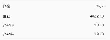
- The size of all subcontracts of the whole applet shall not exceed 16M
- The size of a single subcontract and main package shall not exceed 2M
Subcontracting needs to be used in app The subcontracting structure is declared in the subpackages node of JSON:
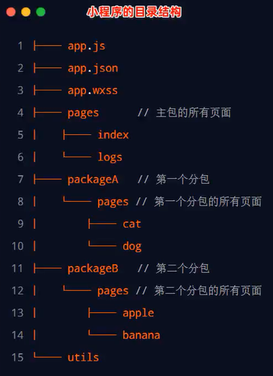
{
"pages":[//All pages of the main package
	"pages/index",
	"pages/logs"
]
"subpackages":[//Declare the subcontracting structure through the subpackages node
	{
		"root":"packageA",//First subcontract root
		"pages":[//Relative storage path of all pages under current subcontracting
			"pages/cat",
			"pages/dog"
		]
	},
	{
		"root":"packageB",//Root directory of the second subcontract
		"name":"pack",//Alias of subcontracting
		"pages":[//Relative storage path of all pages under current subcontracting
			"pages/apple",
			"pages/banana"
		]
	}
]
}
Create subcontracting:
It can be found in app JSON, directly improve the subpackages node. After saving, the developer tool will automatically generate the corresponding file.
View subcontracting size:
In the upper right corner of the development tool, expand the local code under the details and basic information to view
Packaging rules:
- The applet will be subcontracted according to the configuration of subpackages, and directories other than subpackages will be packaged into the main package
- The main package can also have its own pages, that is, the outermost pages field
- tabBar page must be in the main package
- Subcontracting cannot be nested with each other
Citation principle:
- The main package cannot reference private resources in the subcontract
- Private resources cannot be referred to each other
- Subcontracting can refer to public resources in the main package
Independent subcontracting
Independent subcontracting is also subcontracting in nature, but it can operate independently of the main package and other subcontracts.
Ordinary subcontracting must rely on the main package.
Independent subcontracting can run independently without downloading the main package. Independent subcontracting can improve the startup speed without downloading the main package. There can be multiple independent subcontracts in an applet.
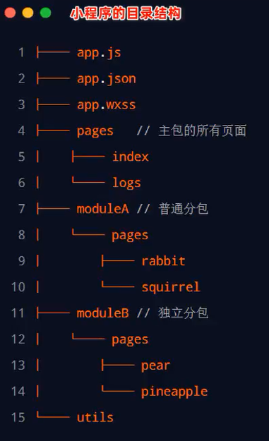
Declare the current subcontracting as independent subcontracting through the independent node.
{
"pages":[//All pages of the main package
	"pages/index",
	"pages/logs"
]
"subpackages":[//Declare the subcontracting structure through the subpackages node
	{
		"root":"moduleA",//Common subcontracting root directory
		"pages":[//Relative storage path of all pages under current subcontracting
			"pages/cat",
			"pages/dog"
		]
	},
	{
		"root":"moduleB",//Root directory of the second subcontract
		"pages":[//Relative storage path of all pages under current subcontracting
			"pages/apple",
			"pages/banana"
		],
		"independent":true//Declare that the current subcontract is an independent subcontract
	}
]
}
Reference principle of independent subcontracting:
Independent subcontracting, ordinary subcontracting and main subcontracting are isolated from each other and cannot reference each other's resources.
- The main package cannot reference private resources in independent subcontracting
- Private resources cannot be referenced between independent subcontractors
- Private resources cannot be referenced between independent subcontracting and ordinary subcontracting
- Public resources in the main package cannot be referenced in independent subcontracting
Subcontracting pre Download
When entering a page of the applet, the framework will automatically pre download the subcontracting that may be required, so as to improve the speed of entering the subsequent subcontracting pages.
Configure subcontracting preloadRule:
//app.json
{
	"preloadRule":{//Subcontracting pre download rules
		"pages/contact/contact":{//Page path triggering subcontracting pre Download
			// Network means pre download in the specified network mode
			//Optional values: all (unlimited network) and wifi (pre download in wifi mode)
			// Default: wifi
			"network":"all",
			// Packages indicates which packages are pre downloaded after entering the page
			// You can specify which subcontracts to download through root or name
			"packages":["pkgA"]
		}
	}
}
Pages in the same subcontract enjoy a common pre download size limit of 2M.
case
Custom tabBar
- app. Add custom:true to the JSON tabBar node; Indicates the use of a custom tabBar.
- Create a new folder named custom tab bar, which must be this name; The name of the new component is index, and the following key must be index.
- Based on vant component, improve index wxml. app.json introduces components.
- Use the custom tabbar icon and text to use data from the list in data
- Loop rendering tabbar's item item
- Modify the margin bottom value of the tabbar icon through the css variable
- Renders the logo number using the value of info in the list
- Synchronize num monitoring in global data to info in data
- Use the active control page in the global data to switch records
10. Modify the color of tabbar text
app.json
{
    "pages": [
        "pages/list/list",
        "pages/message/message",
        "pages/info/info"
    ],
    "window": {
        "backgroundTextStyle": "light",
        "navigationBarBackgroundColor": "#D8322E",
        "navigationBarTitleText": "Microenterprise blessing",
        "navigationBarTextStyle": "white"
    },
    "tabBar": {
        "custom": true,
        "list": [{
            "pagePath": "pages/list/list",
            "text": "list",
            "iconPath": "image/ln.png",
            "selectedIconPath": "image/la.png"
        },{
            "pagePath": "pages/message/message",
            "text": "news",
            "iconPath": "image/mn.png",
            "selectedIconPath": "image/ma.png"
        },{
            "pagePath": "pages/info/info",
            "text": "my",
            "iconPath": "image/in.png",
            "selectedIconPath": "image/ia.png"
        }]
    },
    "style": "v2",
    "sitemapLocation": "sitemap.json",
    "usingComponents":{
        "van-button":"@vant/weapp/button/index",
        "van-tabbar":"@vant/weapp/tabbar/index",
        "van-tabbar-item":"@vant/weapp/tabbar-item/index"
    }
}
store.js
import { observable, action } from 'mobx-miniprogram'

export const store = observable({
    num:7,
    active:0,
    setActive:action(function(newValue){
        this.active = newValue
    })
})
index.html
index.wxml
<van-tabbar active="{{ active }}" bind:change="onChange" active-color="#990101">
  <van-tabbar-item wx:for="{{list}}" wx:key="index" info="{{item.info ? item.info : ''}}" >
    <image slot="icon" src="{{item.iconPath}}" mode="aspectFit" style="width: 30px;height:18px;" />
    <image slot="icon-active" src="{{item.selectedIconPath}}" mode="aspectFit" style="width: 30px;height:18px;" />
    {{item.text}}
  </van-tabbar-item>
</van-tabbar>
index.js
// custom-tab-bar/index.js
import {storeBindingsBehavior} from 'mobx-miniprogram-bindings'
import {store} from '../store/store'
Component({
    options:{//Setting is required for style override
        styleIsolation:'shared'
    },
    observers:{
        'num':function(val){
            this.setData({
                'list[1].info':val
            })
        }
    },
    behaviors:[storeBindingsBehavior],
    storeBindings:{
        store,
        fields:{
            num:'num',
            active:'active'
        },
        actions:{
            setActive:'setActive'
        }
    },
    /**
     * Initial data of components
     */
    data: {
        "list": [{
            "pagePath": "/pages/list/list",
            "text": "list",
            "iconPath": "/image/ln.png",
            "selectedIconPath": "/image/la.png"
        },{
            "pagePath": "/pages/message/message",
            "text": "news",
            "iconPath": "/image/mn.png",
            "selectedIconPath": "/image/ma.png",
            info:2
        },{
            "pagePath": "/pages/info/info",
            "text": "my",
            "iconPath": "/image/in.png",
            "selectedIconPath": "/image/ia.png"
        }]
    },

    /**
     * Method list of components
     */
    methods: {
        onChange(event){
            this.setActive(event.detail)
            console.log(this.data.list[event.detail].pagePath)
            wx.switchTab({
              url: this.data.list[event.detail].pagePath,
            })
        }
    }
})
index.css
/* custom-tab-bar/index.wxss */
.van-tabbar-item{
    --tabbar-item-margin-bottom:0;
}
Common errors
Render layer error referenceerror:__ g is not defined
Delete app "Lazycode loading" in JSON: "requiredComponents"