This is my article Simple diet recommendation (I) Turntable meal selection module in function implementation.
Custom turntable assembly reference article: https://blog.csdn.net/qq_23375733/article/details/81274955
1. Introduction to random catering function of rotary table:
The module mainly uses the customization of simple components supported in the applet, and uses the concise component programming supported by the applet to realize the design of the turntable through this function. Then, through the turntable, you can realize random selection and choose your meal today. The meal is prepared for you through scientific diet. The result of the meal will be displayed. If you are not satisfied, you can also choose this meal again.
2. Module creativity
In this module, the creative points are as follows:
The creative point is realized through the form of turntable. It can not only realize the choice of food once, but also realize the choice again, and the final choice shall prevail.
Another creative point is to use the custom components of wechat applet. The custom module of wechat applet is a way to customize for developers. Developers can abstract the functional modules in the page into custom components for reuse in different pages; Complex pages can also be divided into multiple low coupling modules, which is helpful for code maintenance. Custom components are very similar to basic components when used.
3. Design ideas
In order to complete the module and realize the corresponding functions of dish recognition, the following problems must be solved:
- Implementation of custom components
- Using custom components
- Rotary table rotation through components
- Return to catering
- Display catering data
- Overall interface design
4. Implementation process
4.1 using custom components
After searching relevant materials, we learned that wechat applet can use customized components. Customized components are a customized way for wechat developers. Functional modules in the page can be abstracted into customized components for reuse in different pages; Complex pages can also be divided into multiple low coupling modules, which is helpful for code maintenance. Custom components are very similar to basic components when used.
4.2 how to use custom components
Create custom components( Official custom component development document ): similar to a page, a custom component consists of four files: json wxml wxss JS. To write a custom component, you first need to make a custom component declaration in the json file (set the component field to true to set this group of files as custom components):
{
  "component": true
}
At the same time, we should also write component templates in wxml files and add component styles in wxss files. Their writing method is similar to that of pages.
<!-- This is the internal of the custom component WXML structure -->
<view class="inner">
  {{innerText}}
</view>
<slot></slot>
/* The style here only applies to this custom component */
.inner {
  color: red;
}
In the js file of the custom component, you need to use Component() to register the component, and provide the attribute definition, internal data and custom methods of the component.
The attribute value and internal data of the component will be used for the rendering of the component wxml, where the attribute value can be passed in from outside the component.
Component({
  properties: {
    // The innerText attribute is defined here, and the attribute value can be specified when the component is used
    innerText: {
      type: String,
      value: 'default value',
    }
  },
  data: {
    // Here are some internal data of components
    someData: {}
  },
  methods: {
    // Here is a custom method
    customMethod: function(){}
  }
})
Before using a registered custom component, first make a reference declaration in the json file of the page. At this time, you need to provide the label name of each custom component and the corresponding custom component file path:
{
  "usingComponents": {
    "component-tag-name": "path/to/the/custom/component"
  }
}
In this way, custom components can be used in the wxml of the page just like the basic components. The node name is the label name of the custom component, and the node attribute is the attribute value passed to the component.
4.3 writing custom components of turntable
It is written through the development documents of wechat applet. The custom components of turntable are not familiar with the process because it is the first time to write custom components, so there are many problems in use, and the idea is wrong. Through the use of online tutorials, by reading other people's code and changing the code, the customization of components is successfully realized.
First, the color and appearance of the rotary table are processed, and the fan-shaped processing is used. The color is defined through the JS file.
<view animation="{{animationData}}" class="gb-wheel-content" style='width:{{size.w}}rpx;height:{{size.h}}rpx;'>
      <!-- The fan-shaped color background is specially processed when the option length is equal to 2 or 3 -->
      <view class="canvas-list">
         <view class="canvas-item2" wx:for="{{awardsConfig.awards}}" wx:key="key" style="transform: rotate({{item.item2Deg}});background-color:{{awardsConfig.awards.length==2?item.color:''}};opacity:{{awardsConfig.awards.length==2?item.opacity:awardsConfig.awards.length==3?item.opacity:''}};width:{{size.h}}rpx;height:{{size.h/2-2}}rpx;transform-origin:{{size.h/2}}rpx {{size.h/2}}rpx">
            <view class="canvas-item2-after" style="transform: rotate({{item.afterDeg}});background-color:{{item.color}};opacity:{{awardsConfig.awards.length==3?'':item.opacity}};width:{{size.h/2}}rpx;height:{{size.h/2}}rpx;transform-origin: {{size.h/2}}rpx {{size.h/2}}rpx"></view>
            <view wx:if='{{awardsConfig.awards.length==3}}' class="canvas-item2-after" style="background-color:{{item.color}};width:{{size.h/2}}rpx;height:{{size.h/2}}rpx;transform-origin: {{size.h/2}}rpx {{size.h/2}}rpx"></view>
         </view>
      </view>
Then process the options:
<!-- Option content -->
      <view class="gb-wheel-list">
         <view class="gb-wheel-item" data-index="{{index}}" wx:for="{{awardsConfig.awards}}" wx:key='key'>
            <view class="gb-wheel-icontent" style="height:262rpx;overflow:hidden;font-size:{{item.name.length>9?'20':'26'}}rpx;line-height:{{item.name.length>9?'20':'26'}}rpx;width:26rpx;padding-top:5rpx;transform: rotate({{index*turnNum}}turn);transform-origin: 50% {{size.h/2-2}}rpx">
               <text style='word-break:break-all;'>{{item.name}}</text>
            </view>
         </view>
      </view>
   </view>
After that, the style processing of the middle start key is carried out:
<!-- Button in the middle of the turntable -->
   <image bindtap="_zhuan" src='/images/canvas_button_go_unclick.png' style='width:{{size.h/4.4}}rpx;position:absolute;left:41%;top:38%;margin-top:-11rpx;z-index:9999;display:{{block1}}' mode='widthFix'></image>
   <image src='/images/canvas_button_go_click.png' style='width:{{size.h/4.4}}rpx;position:absolute;left:41%;top:38%;margin-top:-11rpx;z-index:9999;display:{{block2}}' mode='widthFix'></image>
   <image bindtap="reset" src='/images/canvas_button_reset_unclick.png' style='width:{{size.h/4.4}}rpx;left:41%;top:38%;position: absolute;margin-top:-11rpx;z-index:9999;display:{{block3}}' mode='widthFix'></image>
   <image src='/images/canvas_button_reset_click.png' style='width:{{size.h/4.4}}rpx;position:absolute;left:41%;top:38%;margin-top:-11rpx;z-index:9999;display:{{block4}}' mode='widthFix'></image>
Then implement the definition of component attributes in JS file. The attribute list of the component is used to customize and set the external attributes of the component, so that it can be realized when calling the component. The style changes, length, width, color, and even the turning probability of the turntable.
properties: {
      myProperty: {    // Property name myProperty2: String, simplified definition
         type: String, // Type (required). Currently accepted types include: String, Number, Boolean, Object, Array, null (indicating any type)
         value: '',    // Property default initial value (optional). If it is not specified, one will be selected according to the type
         observer: function (newVal, oldVal, changedPath) {
            // The function executed when the property is changed (optional) can also be written as the method name string defined in the methods section, such as: '_ propertyChange'
            // Usually, newVal is the newly set data and oldVal is the old data
         }
      },

      probability: {
         type: Boolean, // Probability switch, default random false
         value: false
      },

      musicflg: {
         type: Boolean, // Turntable sound switch, default true
         value: true
      },

      fastJuedin: {
         type: Boolean, // The switch for turning the turntable quickly. The default is false
         value: false
      },

      repeat: {
         type: Boolean, // Repeat the extraction switch. The default is false
         value: false
      },

      size: {
         type: Object, // Size of turntable, width and height unit: rpx
         value: {
            w: 659, // Note that width is smaller than height 1rpx
            h: 660
         }
      },

      zhuanpanArr: { // Turntable options that can be switched. Multiple turntables are supported
         type: Array,
         value: [
            {
               id: 0,
               option: 'Title name of turntable',
               awards: [
                  {
                     id: 0,
                     name: "Up to 17 options", // Option name
                     color: 'red',        // The background color of the option
                     probability: 0       // probability
                  },
                  {
                     id: 1,
                     name: "The maximum number of options is 13 words", // The font will become smaller when it exceeds 9 words
                     color: 'green',
                     probability: 0
                  }
               ],
            }
         ]
      },

      // Limit: 17 options at most, 10-13 words at most for a single option, and 21 words at most for the option name
      awardsConfig: { // Default current turntable options
         type: Object,
         value: {
            option: 'My little decision?',
            awards: [
               {
                  id: 0,
                  name: "Up to 17 options",
                  color: 'red',
                  probability: 0
               },
               {
                  id: 1,
                  name: "The maximum number of options is 13 words",
                  color: 'green',
                  probability: 0
               }
            ],
         }
      }

   },
Define the turntable Animation:
data: {
      id: '',
      animationData: {}, // Turntable animation
      zhuanflg: false,   // Whether the rotary table can be switched by clicking the flag bit
      fastTime: 7600,    // Time of rapid rotation of rotary table
      slowTime: 3900,    // Time of slow rotation of rotary table
      block1: 'block',   // The picture flag in the center of the turntable is used to show and hide
      block2: 'none',
      block3: 'none',
      block4: 'none',
   },
Then use the component life cycle. Pay attention to the setDate that cannot be used in the Create life cycle,
Then carry out various definitions and settings of the turntable. The middle button of the turntable starts to rotate. After the rotation is completed, return the data, reset the rotation, and then change the position of the turntable randomly.
4.4 use customized turntable assembly
The above is for customized components, which is for the following use. First, write the following in the json file of the page to reference the component:
{
  "usingComponents": {
    "zhuanpan":"/components/zhuanpan/zhuanpan" //Directory of your custom components
  }
}
Then reference these components in the WXML interface. The data to be used in the reference process are size, myData, myAwars, startzhu, zhuanpanArr, awardsConfig. With these, you can define the data on the turntable, the amount of turntable data, the re writing of events after the turntable is turned, and the events after the turntable is stopped.
<!--index.wxml-->
<view >
<view class="title">
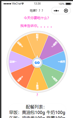
What are you going to eat today?
</view>
<view class="title">Let me tell you.....</view>
<!-- Reference component↓↓↓ -->
<zhuanpan id='zhuanpan'
bind:myData='getData'
bind:myAwards="getAwards"
bind:startZhuan="startZhuan"
size='{{size}}'
musicflg='{{musicflg}}'
fastJuedin='{{fastJuedin}}'
repeat='{{repeat}}'
zhuanpanArr='{{xiaojuedingArr}}'
awardsConfig='{{awardsConfig}}'></zhuanpan>
<!-- Reference component↑↑↑ -->
<view class="title">{{s_awards}}</view>
<view class="liebiao">Catering list:
<text>\n{{liebiao}}</text>
</view>
</view>
Write the data of the turntable,
data: {
      size:{ //Turntable size configurable
         w:599,
         h:600
      },//Turntable size,
      musicflg: true, //voice
      fastJuedin: false,//Quick decision
      repeat: false,//Non repeated extraction
      probability: false,// probability
      s_awards: '?',//result
      option: 'title',
      id:'?',
      liebiao:'',
      //The total data of the turntable. If you want to add multiple data, you can add a data with the same format to this array
      xiaojuedingArr: [
         {
            id: 0,
            option: '',//Title name of turntable
            awards: [
               {
                  id: 0,                // id increment
                  name: "Catering 1",           // When the option name exceeds 9 words, the font will become smaller, and when the number is greater than 13, the excess will be hidden
                  color: '#FFA827 ', / / background color of option
                  probability: 10       // Probability 0 means you can never switch to this option. The greater the number, the greater the probability. It takes effect only when the probability attribute in data is set to true. This attribute must also be filled in. If it is not filled in, there will be an error
               },
               {
                  id: 1,
                  name: "Catering 2",
                  color: '#AA47BC',
                  probability: 10
               },
               {
                  id: 2,
                  name: "Catering 3",
                  color: '#42A5F6',
                  probability: 10
               }
      ],
Then there is the writing and calling of events.
Receive the data from the turntable initialization,
getData(e) {
      this.setData({
         option: e.detail.option
      })
   },
Receive the answer options after the end of the current turntable. For a data transmission after the end of the turntable, show the list of catering tables and catering tables selected.
getAwards(e) {
      this.setData({
         liebiao:lie[e.detail.id],
         s_awards: e.detail.end ? "?" : e.detail.s_awards,
         // id:e.detail.id,

      })
   },
The occurrence of an event at the beginning or end of rotation. (there are some codes used in the experiment, which are commented out)
startZhuan(e) {

      // if(f == 0){
      //    a = Math.floor(Math.random()*7)
      //    console.log(a)
      //    f = 1
      // }else{
      //    f = 0
      // }
      this.setData({
         zhuanflg: e.detail ? true : false
      })
   },
The event of resetting the turntable, which is called when using the reset turntable, switches the turntable and resets the sequence of the turntable.
switchZhuanpan(e) {
      //When the turntable stops, the turntable switching is executed
      if (!this.data.zhuanflg) {
         var idx = e.currentTarget.dataset.idx, zhuanpanArr = this.data.zhuanpanArr, obj = {};
         for (let i in zhuanpanArr) {
            if (this.data.option != zhuanpanArr[i].option && zhuanpanArr[i].id == idx) {
               obj.option = zhuanpanArr[i].option;
               obj.awards = zhuanpanArr[i].awards;
               this.setData({
                  awardsConfig: obj //In fact, if you want to change the data of the current turntable by default, you need to transfer this object to have the effect
               })
               break;
            }
         }
      }
   },
Another important thing is that for the instantiation of component objects, the use of component objects cannot be realized without instantiation, so I write the instantiation of this component object directly into the OnLoad life cycle, so that the instantiation of component objects can be realized in the process of applet loading
onLoad: function () {
       //Instantiate the component object so that the methods in the component can be called when necessary
       this.zhuanpan = this.selectComponent("#zhuanpan");

   }
4.5 display method of randomly selected catering list
The method used is a relatively simple way to use the return of the id of the data written in the component. This function was not written at the beginning, but in the previous custom component, so later, the return of this id, the data transferred by the turntable and the id of the returned data were added. r in the following is the id returned. Previously, a random number was used to generate and return the result, but no id was returned. As a result, the id used later cannot be called, so the return of an id is added
 that.setData({
               animationData: {},
               s_awards: awardsConfig.awards[r].name,//Final selected result
               awardsConfig: awardsConfig,
               id:r,
               block1: 'none',
               block2: 'none',
               block3: 'block',
               zhuanflg: false,
            })
After that, the id is returned to call the food that is retrieved from the global data.
//Receive the answer options after the end of the current turntable
   getAwards(e) {
      this.setData({
         liebiao:lie[e.detail.id],//List of transferred catering
         s_awards: e.detail.end ? "?" : e.detail.s_awards,
         // id:e.detail.id,

      })
   },
5. Overall appearance design
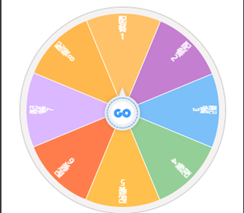
5.1 design of rotary table
The key code of wxml in this part is as follows
<view animation="{{animationData}}" class="gb-wheel-content" style='width:{{size.w}}rpx;height:{{size.h}}rpx;'>
      <!-- The fan-shaped color background is specially processed when the option length is equal to 2 or 3 -->
      <view class="canvas-list">
         <view class="canvas-item2" wx:for="{{awardsConfig.awards}}" wx:key="key" style="transform: rotate({{item.item2Deg}});background-color:{{awardsConfig.awards.length==2?item.color:''}};opacity:{{awardsConfig.awards.length==2?item.opacity:awardsConfig.awards.length==3?item.opacity:''}};width:{{size.h}}rpx;height:{{size.h/2-2}}rpx;transform-origin:{{size.h/2}}rpx {{size.h/2}}rpx">
            <view class="canvas-item2-after" style="transform: rotate({{item.afterDeg}});background-color:{{item.color}};opacity:{{awardsConfig.awards.length==3?'':item.opacity}};width:{{size.h/2}}rpx;height:{{size.h/2}}rpx;transform-origin: {{size.h/2}}rpx {{size.h/2}}rpx"></view>
            <view wx:if='{{awardsConfig.awards.length==3}}' class="canvas-item2-after" style="background-color:{{item.color}};width:{{size.h/2}}rpx;height:{{size.h/2}}rpx;transform-origin: {{size.h/2}}rpx {{size.h/2}}rpx"></view>
         </view>
      </view>
Here is the fan-shaped design of the turntable, which can be changed through JS files.
awards: [
            {
               id: 0,                // id increment
               name: "Catering 1",           // When the option name exceeds 9 words, the font will become smaller, and when the number is greater than 13, the excess will be hidden
               color: '#FFA827 ', / / background color of option
               probability: 10       ,
            },
In this way, the implementation effect of this part is shown in the following figure:
5.2 middle button design
The key code of wxml in this part is as follows
<!-- Button in the middle of the turntable -->
   <image bindtap="_zhuan" src='/images/canvas_button_go_unclick.png' style='width:{{size.h/4.4}}rpx;position:absolute;left:41%;top:38%;margin-top:-11rpx;z-index:9999;display:{{block1}}' mode='widthFix'></image>
   <image src='/images/canvas_button_go_click.png' style='width:{{size.h/4.4}}rpx;position:absolute;left:41%;top:38%;margin-top:-11rpx;z-index:9999;display:{{block2}}' mode='widthFix'></image>
   <image bindtap="reset" src='/images/canvas_button_reset_unclick.png' style='width:{{size.h/4.4}}rpx;left:41%;top:38%;position: absolute;margin-top:-11rpx;z-index:9999;display:{{block3}}' mode='widthFix'></image>
   <image src='/images/canvas_button_reset_click.png' style='width:{{size.h/4.4}}rpx;position:absolute;left:41%;top:38%;margin-top:-11rpx;z-index:9999;display:{{block4}}' mode='widthFix'></image>
The icons are obtained from Alibaba vector icon library.
The results are as follows.

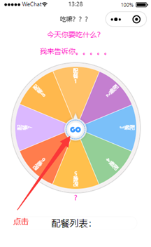
6. Verification effect
Click "GO" and the turntable starts to rotate.
After the rotation is completed, select the option,? It became a catering table, and the catering came out.
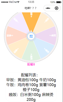
Click the reset button and the sequence will be reset.