Hello everyone, I always believe that good ideas are obtained through ideological exchange and collision. Recently, a wechat group netizen lamented that pandas data is too monotonous. As a result, another one gave such a beautiful solution. Let's enjoy it together. You can join our technical exchange group at the end of the article.
We know that Pandas is an efficient data processing library. It takes dataframe and series as the basic data types and presents two-dimensional data similar to excel.
In Jupyter, the output of Pandas will be beautified. Different from the text form displayed in the IDE, Jupyter can modify the style of the table through CSS.
When we make excel tables, we often highlight important data or use different colors to represent the size of data. This can also be achieved in Pandas, and it is very concise.
Pandas provides dataframe Style property, which returns the Styler object to beautify the data style.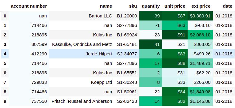
Generally, we need to pass the style function as a parameter to the following methods to beautify the chart.
-
Styler.applymap: act on element
-
Styler.apply: applies to rows, columns, or the entire table
Here are some examples to show the commonly used beautification forms.
1, Highlight
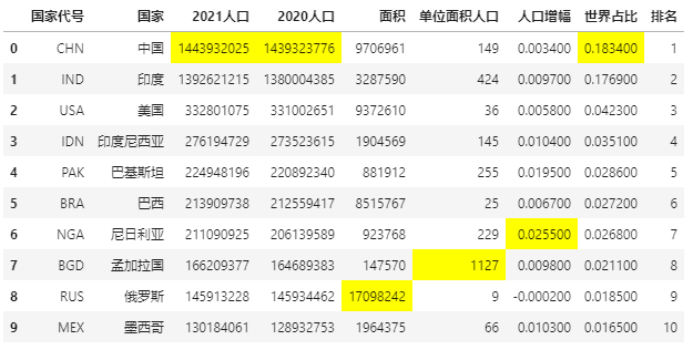
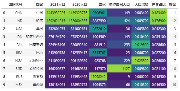
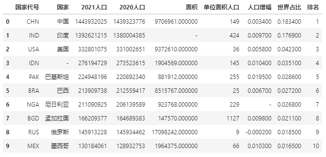
For ease of presentation, the data example is the data of the top ten countries with the world's population in 2021.
import pandas as pd
data = pd.read_excel(r"E:\\jupyter_notebook\\2021 World population data.xlsx")
data
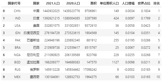
Let's first look at the information in this table:
data.info()
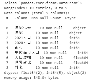
Except for the first two columns, all other columns are numeric.
Now highlight the maximum value of the specified column:
def highlight_max(s):
    '''
    Highlight (yellow) the maximum value of the column
    '''
    is_max = s == s.max()
    return ['background-color: yellow' if v else '' for v in is_max]

data.style.apply(highlight_max,subset=['2021 population', '2020 population', 'the measure of area','Population per unit area','Population growth','World share'])
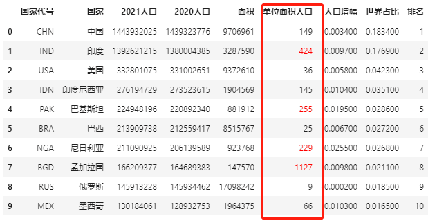
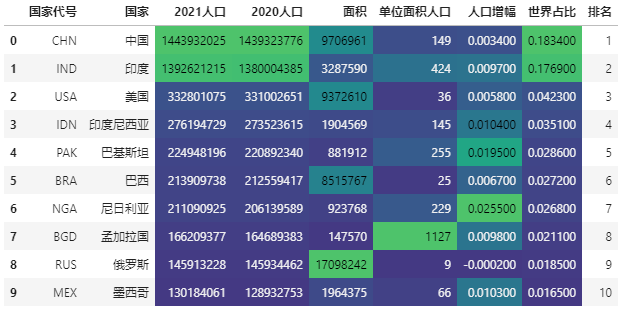
If you don't want to highlight the element background, you can also directly change the color of the specified element to highlight the key points.
Mark elements with a population column greater than 200 per unit area:
def color_red(s):
    is_max = s > 200
    return ['color : red' if v else '' for v in is_max]

data.style.apply(color_red,subset=['Population per unit area'])
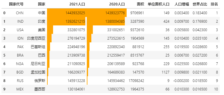
2, Data bar display
In Excel conditional format, there is a data bar display mode to visually express the data size.
The Pandas Style method also has the expression form of data bar, using DF style. Bar.
Using the previous example of population data, let's see how to operate the data bar.
import pandas as pd
data = pd.read_excel(r"E:\\jupyter_notebook\\2021 World population data.xlsx")
# The data bar displays the specified column data size
data.style.bar(subset=['2021 population', '2020 population'], color='#FFA500')
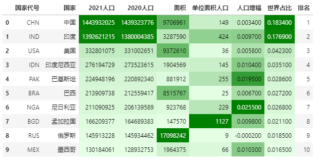
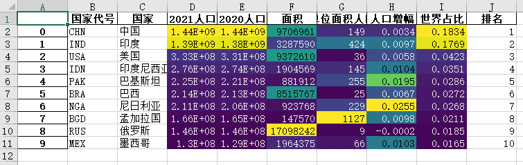
3, Color scale display
Color scale is also known as thermal diagram. Like data bar, it is used to express data size.
The use of color scale in Pandas Style is also very simple, using DF style. background_ Gradient implementation.
import seaborn as sns

# Get colors using seaborn
cm = sns.light_palette("green", as_cmap=True)
# Color scale realization
data.style.background_gradient(cmap=cm,subset=['2021 population', '2020 population', 'the measure of area','Population per unit area','Population growth','World share'])
You can adjust the color scale range by selecting the maximum and minimum color scale.
Before adjustment:
import seaborn as sns

# Color scale implementation. The built-in color scale type is used here, and the color range is not adjusted
data.style.background_gradient(cmap='viridis',high=0.2,low=0.1,subset=['2021 population', '2020 population', 'the measure of area','Population per unit area','Population growth','World share'])
After adjustment:
import seaborn as sns

# Color scale implementation. Here, the built-in color scale type is used to adjust the color range
data.style.background_gradient(cmap='viridis',high=0.5,low=0.3,subset=['2021 population', '2020 population', 'the measure of area','Population per unit area','Population growth','World share'])
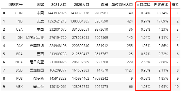
4, Percentage display
Some figures need percentage display to express accurately, such as population growth in population data and world share.
Pandas can display the percentage in the data frame through Styler Format.
data.style.format("{:.2%}",subset=['Population growth','World share'])
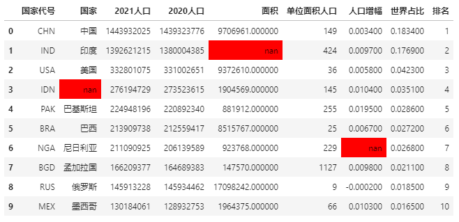
5, Tag missing value
There may be missing values in the dataset. What should I do if I want to highlight the missing values?
There are several common methods, one is to replace with - symbol, the other is to highlight
First create a table with missing values, or use population data.
import pandas as pd
import numpy as np
data = pd.read_excel(r"E:\\jupyter_notebook\\2021 World population data.xlsx")
data.iloc[1, 4] = np.nan
data.iloc[3, 1] = np.nan
data.iloc[6, 6] = np.nan
data
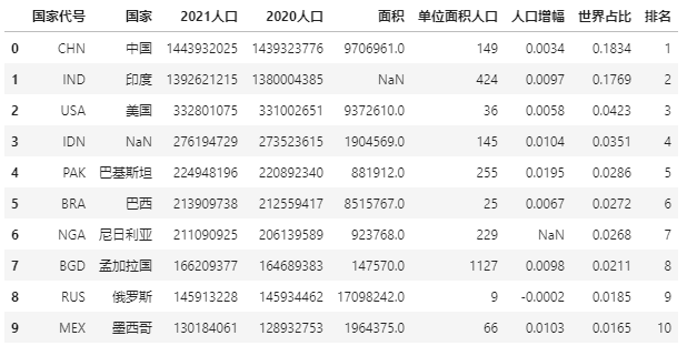
There are three missing values in the above data. We use the - symbol to replace the missing value:
data.style.format(None, na_rep="-")
Try highlighting the missing values again:
data.style.highlight_null(null_color='red')
Attachment: output style to excel
The data beautification style in Pandas can not only be displayed in notebook, but also be output to excel.
Use to here_ Excel method and openpyxl as the kernel
import pandas as pd
import numpy as np
data = pd.read_excel(r"E:\\jupyter_notebook\\2021 World population data.xlsx")
data.style.background_gradient(cmap='viridis',subset=['2021 population', '2020 population', 'the measure of area','Population per unit area','Population growth','World share']).\
                              to_excel('style.xlsx', engine='openpyxl')
Technical exchange
Welcome to reprint, collect, gain, praise and support!
At present, a technical exchange group has been opened, with more than 1000 group friends. The best way to add notes is: source + Interest direction, which is convenient to find like-minded friends
- Method ① send the following pictures to wechat, long press to identify, and the background replies: add group;
- Method ②. Add micro signal: dkl88191, remarks: CSDN + research direction
- WeChat search official account: Python learning and data mining, background reply: add group