Preface
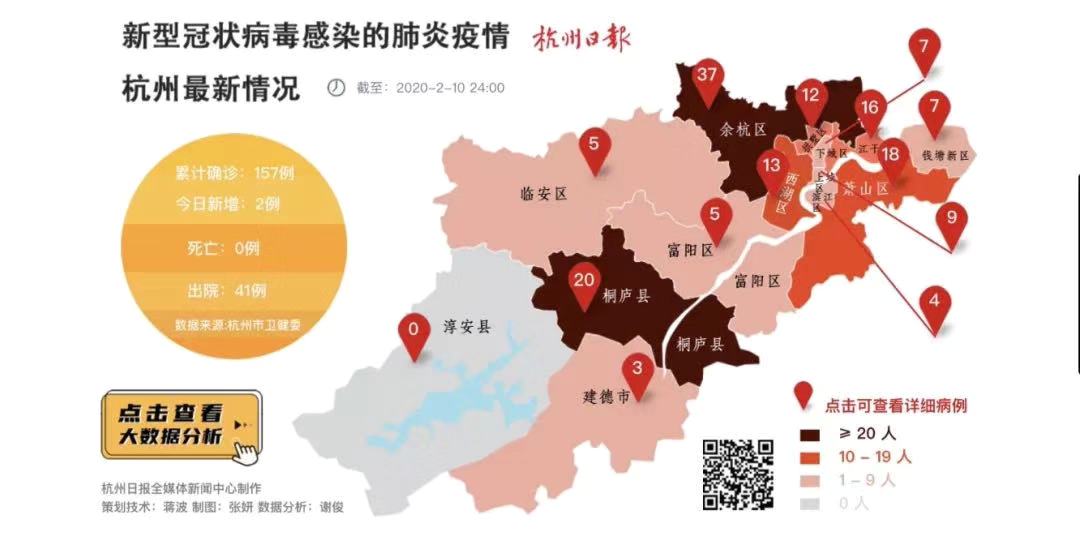
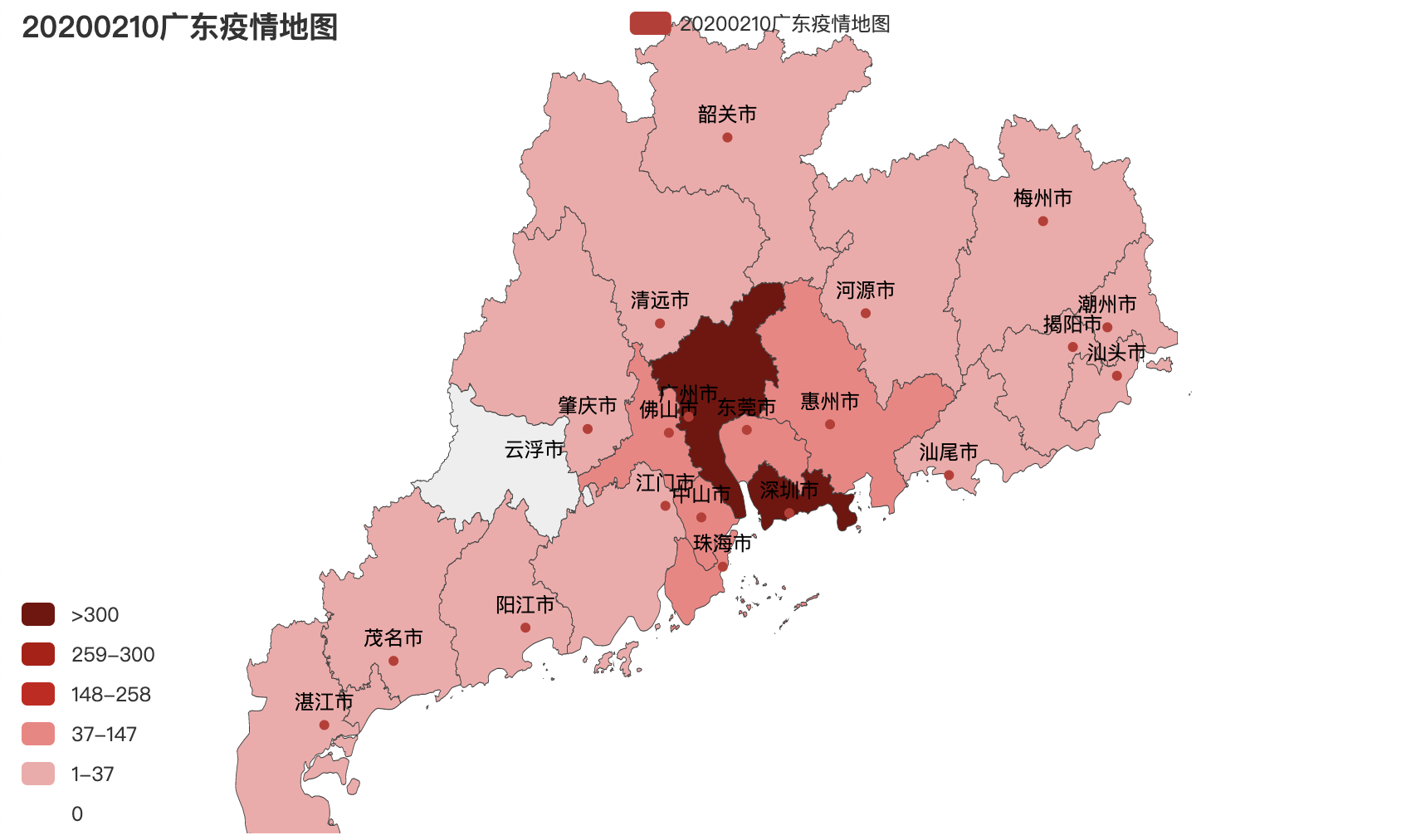
This Spring Festival, everyone is paying close attention to the progress of the epidemic.Many people wake up every day and turn on their mobile phones. The first thing they do is look at the epidemic map of their home town.What you might see is this:
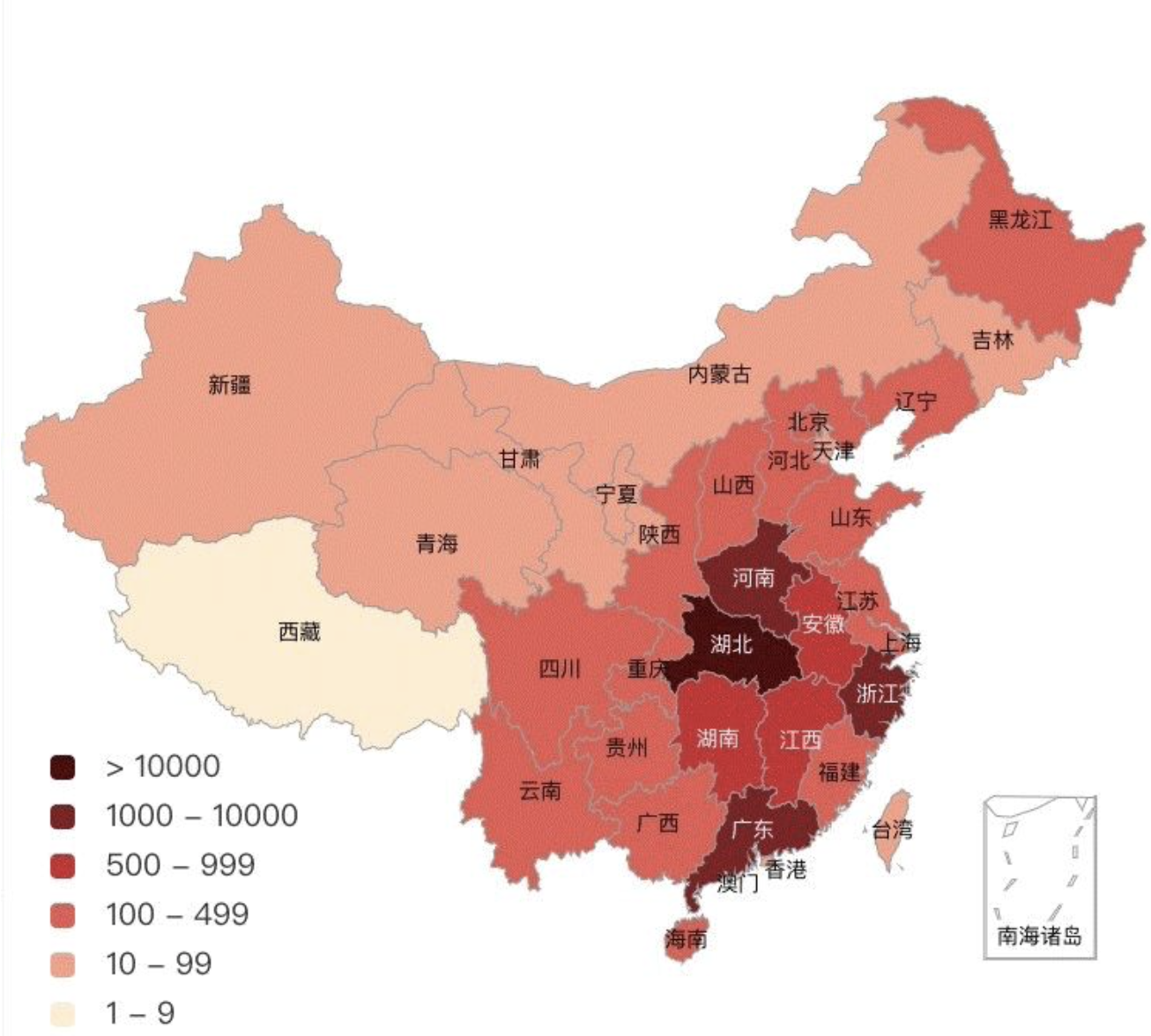
Or it could be:
The progress of the epidemic has touched our hearts.As a developer, we can continue to work hard on our technology while closing our doors to contribute to the fight against the epidemic.The purpose of this article is to introduce the principle of epidemic map visualization and to help you understand echart.
Core ideas
The core of epidemic map lies in the compilation of epidemic data and the visualization of epidemic data.
Epidemic data compilation
This epidemic data is compiled from the public data of NetEase News and is only used for demo display.The specific address of the data is explained in the code: This address is a Get request, you can copy the address to the browser to view the data format first.The data format for a successful request back-end response is as follows (only the data we need is listed here)
| parameter | type | Remarks |
|---|---|---|
| code | int | |
| msg | String | |
| data | Object |
Parameters inside data
| parameter | type | Remarks |
|---|---|---|
| list | List | Number of confirmed cases at various levels and municipalities |
Parameters inside Object
| parameter | type | Remarks |
|---|---|---|
| name | String | Prefectural City Name (for short) |
| province | String | Province |
| confirm | int | Number of confirmed cases |
Visualization of epidemic data
Maps are a common tool for data visualization, and we use them to show the specific distribution of epidemics.This article uses open source pyecharts Projects for developers to use in map presentations.Among them, pyecharts is a class library to help generate Echarts charts; while Echarts is an open source data visualization JS Library in Baidu, which supports 12 types of charts such as polyline charts, column charts, scatterplots, K-line charts, pie charts, radar charts, chord charts, force-oriented layout charts, maps, dashboards, funnel charts, event River charts, and can be used on a PC.It runs smoothly with mobile devices and is compatible with most current browsers.Pyecharts is an extension of Echarts based on Python.
Detailed Principle
Next, this article will explain in detail how to set up an environment, integrate data, visualize data using pyecharts, and debug projects.
Environment Setup
To quickly develop this functionality and minimize the amount of code possible, this demo chose to use Python for development.To do this, we should prepare the Python development environment and import the python base libraries.
Install Python environment
Mac comes with Python 2.7, other computers can refer to the related on the Internet Installation Tutorial
Install pip
Pip is a Python package management tool that allows you to quickly find, download, install, uninstall Python packages.If you are downloading the latest version of the installation package from python.org, the tool is already available on your system.In addition, both Python 2.7.9+ and Python 3.4+ have their own PIP tools.You can use the "pip-version" command line to view the current version of pip.
If the Python environment is not configured on this machine, we can install it online by simply entering the following 2 lines of commands at the terminal
$ curl https://bootstrap.pypa.io/get-pip.py -o get-pip.py
$ sudo python get-pip.py
Install plug-ins needed for the project
It's not difficult to see in the code that we imported some open source libraries:
import math
import time
from fake_useragent import UserAgent
from pyecharts.charts import Map
from pyecharts import options as opts
import requests
import json
import sys
Plug-ins needed to request network data:
pip install fake_useragent # Fake requests, randomly generate UserAgent s
pip install requests # HTTP request library.
Plug-ins needed for map display:
pip install echarts-countries-pypkg  # World Map
pip install echarts-china-provinces-pypkg  # Provincial Maps of China
pip install echarts-china-cities-pypkg  # China City Map
We copy the above command line to the terminal and execute it line by line.
Data Integration & Filtering
The code is still concise, so we can build a GET request directly using the requests library, and the data the server responds to is "Epidemics in all cities throughout the country".
ua = UserAgent(verify_ssl=False)
headers = {'User-Agent': ua.random}
url = "https://c.m.163.com/ug/api/wuhan/app/index/feiyan-data-list?t=1580469818264"


def getEpidemicInfo(url):
    try:
        response = requests.get(url, headers=headers)
        print(response.status_code)
        if response.status_code == 200:
            content_field = json.loads(response.text)
            epidemicInfo = content_field['data']['list']
            return epidemicInfo
        else:
            print('Request error code:' + response.status_code)
            return None
    except Exception as e:
        print('There is a problem with this page!', e)
        return None
The t in the request address represents the timestamp.When we enter the above code, the computer will output the data in the format mentioned above.Note: After getting the data, we need to filter. We only need to get the epidemic information of a province, autonomous prefecture or a municipality directly under the Central Government.
The data is filtered by the following code:
# Generate provincial epidemic list
def makedict(list):
    cityList = {}
    for item in list:
        for k, v in item.items():
        # 1
            if v == sys.argv[1]:
            #2
                if str(item["confirm"]).isdigit():
                # 3
                    if v == "Beijing" or v == "Shanghai" or v == "Tianjin":
                        cityList[item['name'] + 'area'] = int(item["confirm"])
                    elif "autonomous prefecture" in v:
                        continue
                    else:
                        cityList[item['name'] + 'city'] = int(item["confirm"])
    return cityList
- sys.argv[1] is a legend that represents provinces, autonomous regions, municipalities directly under the Central Government or special administrative regions that we have manually entered, such as Zhejiang, Xinjiang, Beijing, Hong Kong, etc.
- The "confirm" keyword is used to match the value of response results, as mentioned in the integration of epidemic data above, representing the number of epidemic cases in the current city.
- Pecharts are adapted according to the full name of the city, where you need to investigate the level cities or subordinate districts and counties in the data format. If there are cities with short names, you need to debug them. (If the name of the city returned by the interface is Enshi, we need to adapted to Enshi Tujia and Miao Autonomous Prefecture) to prevent abnormal map display.
For example, when we input Zhejiang Province, the last output data format of the computer is:
{'Huzhou City': 9, 'Lishui City': 16, 'Zhoushan City': 7, 'Quzhou City': 15, 'Jinhua City': 47, 'Jiaxing City': 30, 'Shaoxing City': 33, 'Ningbo City': 126, 'Taizhou City': 124, 'Hangzhou City': 151, 'Wenzhou City': 396}
Data Visualization
This is the most central step.dict in the makeEpidemicInfoMap method corresponds to the data we have filtered:
def makeEpidemicInfoMap(dict):

    # Provinces and municipalities directly under the Central Government
    province_distribution = dict
    value = province_distribution.values()
    print(province_distribution)
    title = str(int(time.strftime("%Y%m%d")) - 1) + sys.argv[1] + "Epidemic Map"
    epidemicCount = []
    for k, v in dict.items():
        epidemicCount.append(v)
    # 1
    epidemicCount.sort(reverse=True)
    maxEpidemic = handle(epidemicCount.pop(0))
    maxEpidemic = int(maxEpidemic)
    # 2
    map = Map()
    # 3
    map.set_global_opts(
        title_opts=opts.TitleOpts(title=title),
        visualmap_opts=opts.VisualMapOpts(max_=200, is_piecewise=True,
                                          pieces=[
                                              {"max": 9999999, "min": maxEpidemic, "label": ">" + str(maxEpidemic),
                                               "color": "#780707"},  # Data range segmented, color segmented, size-specific according to data size
                                              {"max": int(maxEpidemic), "min": int(maxEpidemic / 8) * 7,
                                               "label": str(int(maxEpidemic / 8) * 7) + "-" + str(int(maxEpidemic)),
                                               "color": "#B40404"},
                                              {"max": int(maxEpidemic / 8) * 7, "min": int(maxEpidemic / 8) * 4,
                                               "label": str(int(maxEpidemic / 8) * 4) + "-" + str(
                                                   int(maxEpidemic / 8) * 7 - 1), "color": "#CD1111"},
                                              {"max": int(maxEpidemic / 8) * 4, "min": int(maxEpidemic / 8),
                                               "label": str(int(maxEpidemic / 8)) + "-" + str(
                                                   int(maxEpidemic / 8) * 4 - 1), "color": "#F68181"},
                                              {"max": int(maxEpidemic / 8), "min": 1,
                                               "label": "1-" + str(int(maxEpidemic / 8)), "color": "#F5A9A9"},
                                              {"max": 0, "min": 0, "label": "0", "color": "#FFFFFF"},
                                          ], )  # Maximum data range, segment
    )
    # 4
    map.add(title, data_pair=province_distribution.items(), maptype=sys.argv[1], is_roam=True)
    map.render(sys.argv[1] + 'Epidemic Map.html')
- All cities were descended according to the number of confirmed cases in each city of the selected province and the name of the city with the largest number of confirmed cases in the current province was obtained.MaxEpidemic is the closest number of confirmed cases in the city. For example, if the number of confirmed cases in the city with the most severe epidemic in the province is "357", maxEpidemic=300. The purpose of introducing this parameter is to make the map more clear and intuitive.
- Mapping with PyEcharts requires initialization of Map objects for visualization of geographic area data.
- Maps are set in builder mode, where VisualMapOpts is the visual map ping configuration item for PyEcharts.
    # Specifies the maximum value of the visual MapPiecewise component.
    max =100
    # Is it segmented
    is_piecewise: bool = False,

    # Customize the scope of each paragraph, the text of each paragraph, and the specific style of each paragraph.For example:
    # pieces: [
    #   {"min": 1500}, //does not specify max, meaning that Max is infinite (Infinity).
    #   {"min": 900, "max": 1500},
    #   {"min": 310, "max": 1000},
    #   {"min": 200, "max": 300},
    #   {min': 10,'max': 200,'label':'10 to 200 (custom label)'},
    #   {value': 123,'label':'123 (custom special color)','color':'grey'}, //for the case where value equals 123
    #   {"max": 5} //No min specified, meaning min is infinite (-Infinity).
    # ]
Detailed configuration can be seen on the PyEcharts website.The range here is divided into six sections, each of which is dynamically adjusted to the maxEpidemic calculated above to ensure the visual effect of the epidemic map. Here I have just made a very simple range model for reference only
4. Use PyEcharts to generate a web page under the current directory
debugging
Execute python map.py [province], for example:
python /Users/xxx/map.py Zhejiang
You will get a file named Zhejiang Epidemic Map. html under the current directory, open it directly with the browser, and the result will be cool or not.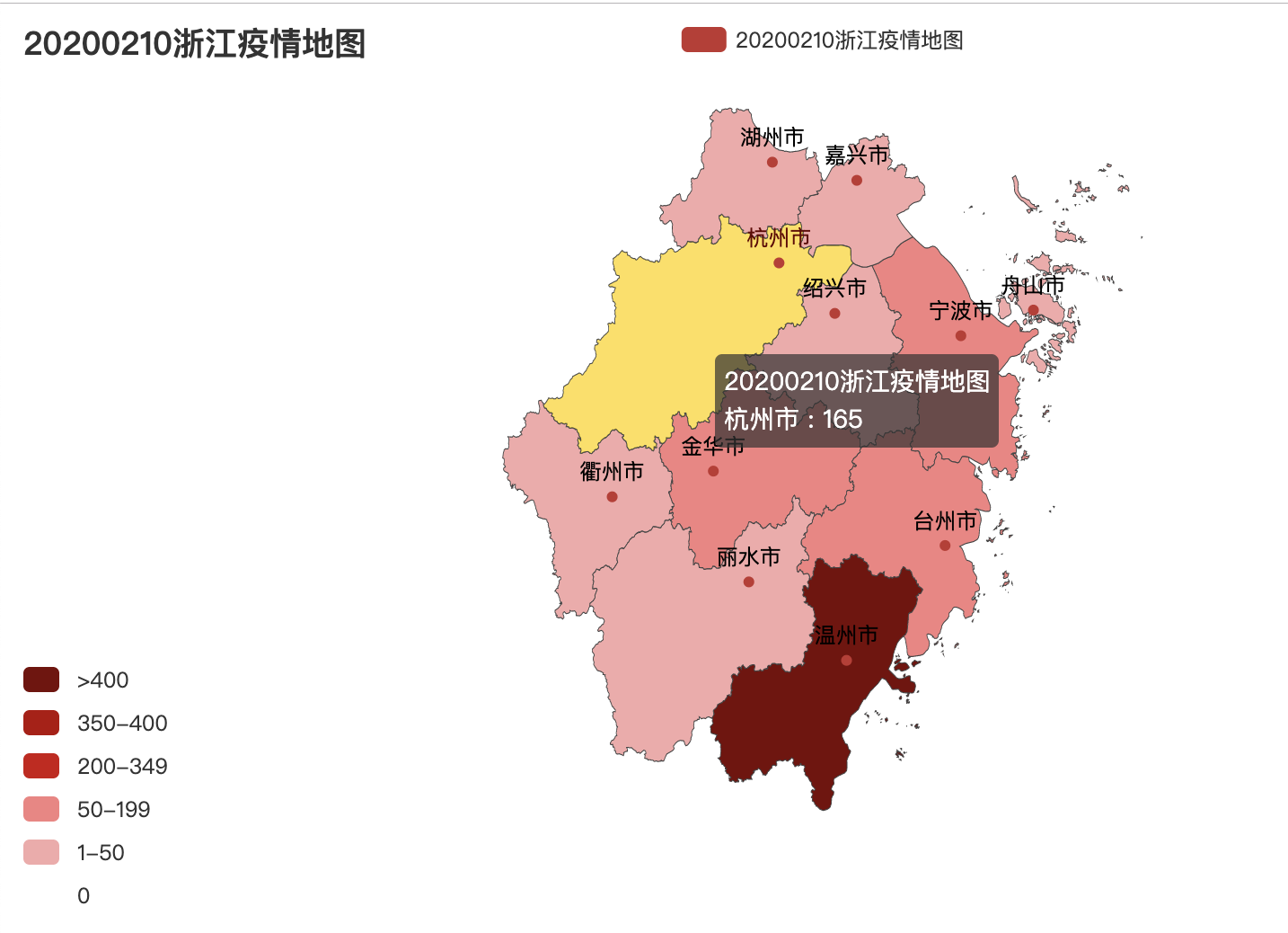
summary
After reading this article, I hope you can have a preliminary understanding of data visualization.During the "epidemic" of the National War, push services will not stop, and we will continue to provide technical support to developers.In addition, the "Disaster Prevention Quick Report" applet has been launched with the new function of "New Pneumonia Epidemic Real-time Dynamic", which provides reliable data support for epidemic prevention.

