Click the link to view the video of station b.
https://www.bilibili.com/video/BV1Pa4y1E7WS
reference material
- Document of pheatmap package
- pheatmap introduction: https://www.jianshu.com/p/42c643a43a1f#fn3
- Introduction to correlation coefficient matrix package: https://www.jianshu.com/p/b76f09aacd9c
- Color block control: https://www.jianshu.com/p/6b765e83d723
- Color matching: https://www.jianshu.com/p/e50babec45cb
R package tools
There are many packages that can draw heat maps. Here are some examples
- pheatmap::pheatmap (common heat map)
- stats::heatmap (basic heat map)
- gplots::heatmap.2 (basic enhanced heat map)
- ComplexHeatmap (complex heat map for genome analysis)
- ggplot2::ggplot (ggplot visualization)
- heatmaply::heatmaply (Interactive)
- ......
Why do heat maps?
- Heat map can intuitively show the relationship or difference between multiple variables through color depth
- The heat map can show multivariable clustering results
Basic elements
- Data preprocessing
- Main parameters of heat map
- Note content (significance; legend)
solve the problem
- Color block control (hot map, red and blue block problem, number size and positive and negative value problem)
- Show partial heat map
- Marked correlation coefficient Heatmap significance
- The numerical difference is too large, and the distinction between heat maps is not obvious
- Color matching
pheatmap package
1. Brief introduction
The pheatmap function in the pheatmap package can perform k-means clustering and hierarchical clustering on the input data, but the clustering cannot be performed when the number of rows of data exceeds 1000.
2. Function parameters
pheatmap(mat, color = colorRampPalette(rev(brewer.pal(n = 7, name =
  "RdYlBu")))(100), kmeans_k = NA, breaks = NA, border_color = "grey60",
  cellwidth = NA, cellheight = NA, scale = "none", cluster_rows = TRUE,
  cluster_cols = TRUE, clustering_distance_rows = "euclidean",
  clustering_distance_cols = "euclidean", clustering_method = "complete",
  clustering_callback = identity2, cutree_rows = NA, cutree_cols = NA,
  treeheight_row = ifelse((class(cluster_rows) == "hclust") || cluster_rows,
  50, 0), treeheight_col = ifelse((class(cluster_cols) == "hclust") ||
  cluster_cols, 50, 0), legend = TRUE, legend_breaks = NA,
  legend_labels = NA, annotation_row = NA, annotation_col = NA,
  annotation = NA, annotation_colors = NA, annotation_legend = TRUE,
  annotation_names_row = TRUE, annotation_names_col = TRUE,
  drop_levels = TRUE, show_rownames = T, show_colnames = T, main = NA,
  fontsize = 10, fontsize_row = fontsize, fontsize_col = fontsize,
  angle_col = c("270", "0", "45", "90", "315"), display_numbers = F,
  number_format = "%.2f", number_color = "grey30", fontsize_number = 0.8
  * fontsize, gaps_row = NULL, gaps_col = NULL, labels_row = NULL,
  labels_col = NULL, filename = NA, width = NA, height = NA,
  silent = FALSE, na_col = "#DDDDDD", ...)
3. Data processing (create a matrix here first)
> library(pheatmap)
> # Create test matrix
> test = matrix(rnorm(200), 20, 10)
> test[1:10, seq(1, 10, 2)] = test[1:10, seq(1, 10, 2)] + 3
> test[11:20, seq(2, 10, 2)] = test[11:20, seq(2, 10, 2)] + 2
> test[15:20, seq(2, 10, 2)] = test[15:20, seq(2, 10, 2)] + 4
> colnames(test) = paste("Test", 1:10, sep = "")
> rownames(test) = paste("Gene", 1:20, sep = "")
> head(test, 5)
          Test1       Test2    Test3      Test4    Test5      Test6    Test7      Test8
Gene1 2.9506296  0.04980323 3.385544  1.1669879 1.885813 -0.9771256 3.112077 -0.6027554
Gene2 2.0099044  0.51020937 4.011563  0.2758383 5.311161 -0.5104894 1.078437  1.2681561
Gene3 3.8667236 -1.00110670 1.763909 -0.4958210 2.814205  0.9438923 2.238253  2.6206316
Gene4 2.1241335 -0.17389532 3.381439  0.9546686 5.046722 -1.5613329 2.322061 -1.4255754
Gene5 0.2062854  0.45703810 3.471799 -1.2390113 2.333674 -1.0852306 3.996635 -0.8064933
         Test9       Test10
Gene1 3.365981 -1.257651534
Gene2 0.727328 -0.004095374
Gene3 5.569084  0.020165678
Gene4 2.413953 -0.644605108
Gene5 2.838279 -0.004935564
4. Draw heat map
- Default parameters
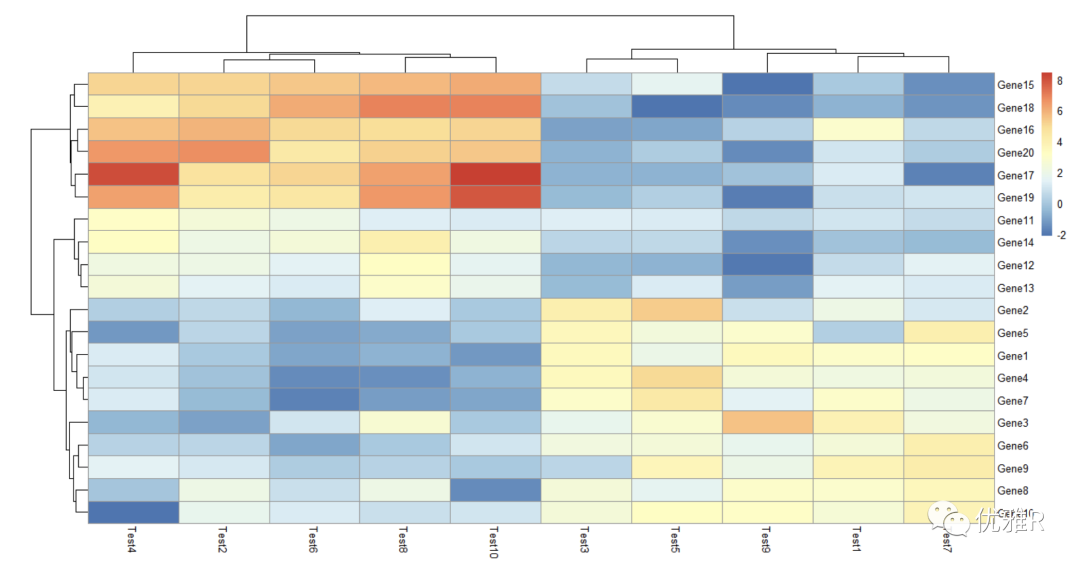
> pheatmap(test)
The parameters are not set. Clustering is the default. By default, it clusters both rows and columns of matrix data. You can set it separately to cluster only rows or columns.
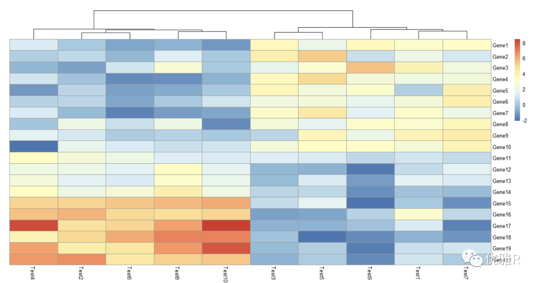
> pheatmap(test, cluster_row = FALSE)
The parameter needs to be set with Boolean value, cluster_row = FALSE, that is, the rows are not clustered
- K-means clustering
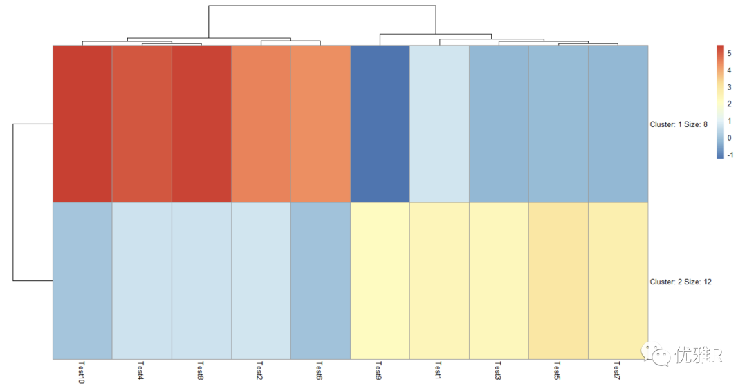
> pheatmap(test, kmeans_k = 2)
k means clustering can set the number of clusters by itself. After clustering, the number of variables contained in the cluster will be automatically displayed. The specific variables in the class are not directly displayed on the graph, but this information can be obtained by viewing the heat map list.
> test_k <- pheatmap(test, kmeans_k = 2)
> cluster <- test_k$kmeans$cluster
> cluster
 Gene1  Gene2  Gene3  Gene4  Gene5  Gene6  Gene7  Gene8  Gene9 Gene10 Gene11 Gene12 Gene13
     2      2      2      2      2      2      2      2      2      2      2      1      2
Gene14 Gene15 Gene16 Gene17 Gene18 Gene19 Gene20
     1      1      1      1      1      1      1
The variables contained in the cluster can be further extracted
> cluster_1 <- names(cluster[which(cluster == 1)])
> cluster_1
[1] "Gene12" "Gene14" "Gene15" "Gene16" "Gene17" "Gene18" "Gene19" "Gene20"
> cluster_2 <- names(cluster[which(cluster == 2)])
> cluster_2
 [1] "Gene1"  "Gene2"  "Gene3"  "Gene4"  "Gene5"  "Gene6"  "Gene7"  "Gene8"  "Gene9"  "Gene10"
[11] "Gene11" "Gene13"
- Normalization and clustering basis
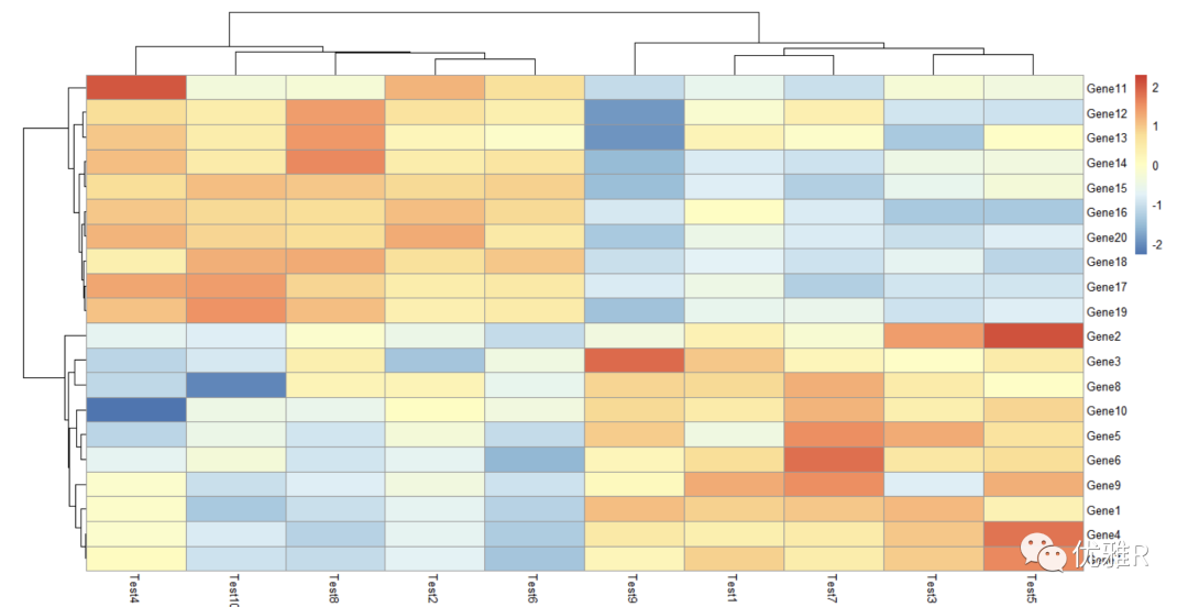
Set the clustering basis of rows or columns separately. The basis here is Pearson coefficient. You can select 'correlation', 'euclidean', 'maximum', 'manhattan', 'canberra', 'binary', 'minkowski' to change the parameters
Normalization processing is also done here. It can be seen that the content of color block reference also changes with the change of data range.
> pheatmap(test, scale = "row", clustering_distance_rows = "correlation")
- color setting
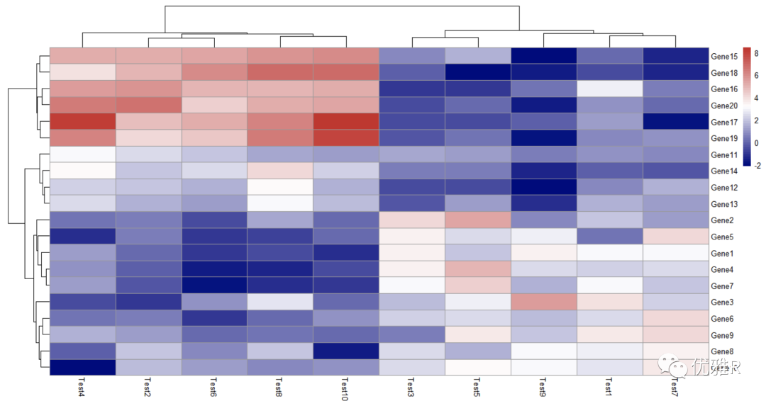
Take a look at this colorRampPalette. It takes 50 colors to mark the relationship and difference between data.
The larger the value of colorRampPalette is set, the more diverse the colors are, and the clearer the data gap can be reflected.
> pheatmap(test, color = colorRampPalette(c("navy", "white", "firebrick3"))(50))
> colorRampPalette(c("navy", "white", "firebrick3"))(50)
 [1] "#000080" "#0A0A85" "#14148A" "#1F1F8F" "#292994" "#343499" "#3E3E9F" "#4848A4" "#5353A9"
[10] "#5D5DAE" "#6868B3" "#7272B9" "#7C7CBE" "#8787C3" "#9191C8" "#9C9CCD" "#A6A6D2" "#B0B0D8"
[19] "#BBBBDD" "#C5C5E2" "#D0D0E7" "#DADAEC" "#E4E4F2" "#EFEFF7" "#F9F9FC" "#FDFAFA" "#FBF1F1"
[28] "#F9E8E8" "#F7E0E0" "#F5D7D7" "#F3CECE" "#F1C5C5" "#EFBCBC" "#EDB3B3" "#EBAAAA" "#E9A2A2"
[37] "#E79999" "#E59090" "#E38787" "#E17E7E" "#DF7575" "#DD6C6C" "#DB6464" "#D95B5B" "#D75252"
[46] "#D54949" "#D34040" "#D13737" "#CF2E2E" "#CD2626"
- Hierarchical clustering method
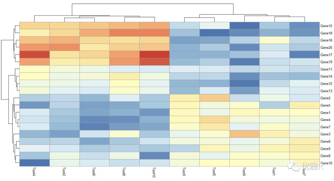
> pheatmap(test,clustering_method = "ward")
clustering_method optional parameters include 'ward', 'ward D', 'ward. D2 ',' single ',' complete ',' average ',' mcquitty ',' intermediate 'or' centroid ', these are the calculation methods of the distance between classes in hierarchical clustering.
- legend = FALSE
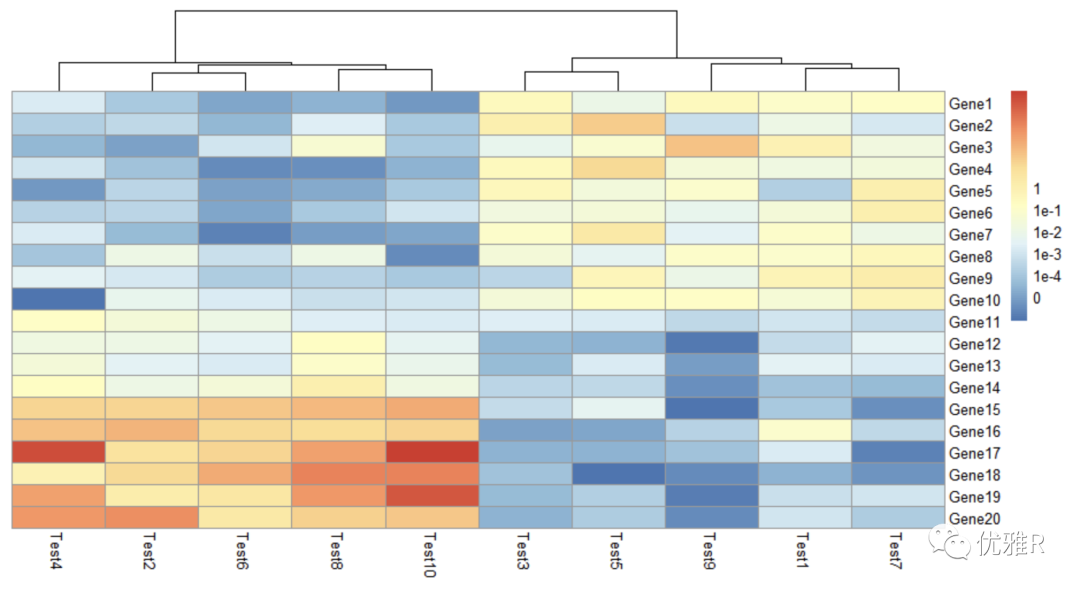
> pheatmap(test, cluster_row = FALSE, legend_breaks = -1:4, legend_labels = c("0",
                                                                            "1e-4", "1e-3", "1e-2", "1e-1", "1"))
Here, the custom setting range of legend is between - 1 and 4, and the label is set to these 6 numbers. You can set the range you want to see in a certain color range at a glance.
- Color block internal information
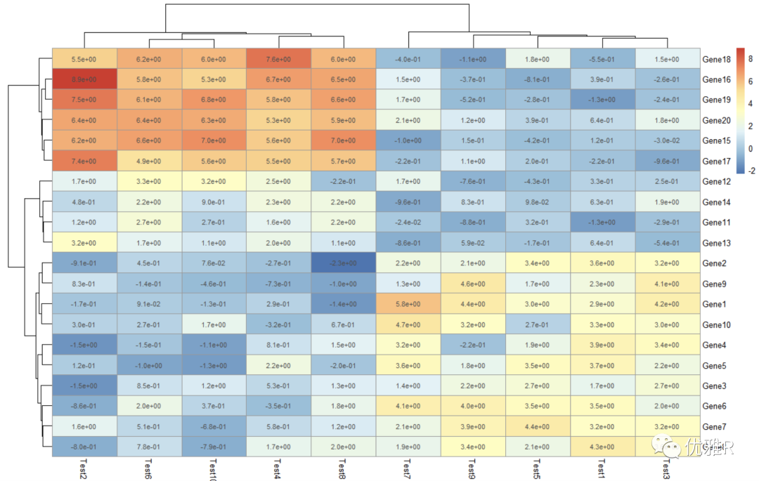
> pheatmap(test, display_numbers = TRUE)
> pheatmap(test, display_numbers = TRUE, number_format = "%.1e")
Display matrix information. When the value is large or small, you can add parameter setting number_ Format = '%. 1E', displays content in scientific counting.
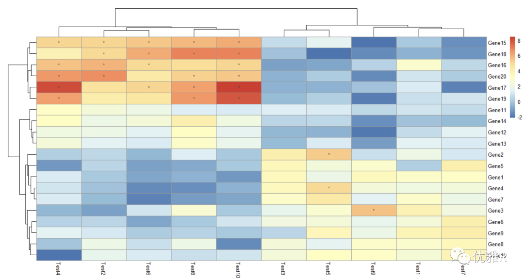
> pheatmap(test, display_numbers = matrix(ifelse(test > 5, "*", ""), nrow(test)))
Here, the original matrix is processed and a new matrix is constructed to store the marks. The marks greater than 5 are * * * * *. If it is a heat map made with correlation coefficient, the significance mark can be added in this way.
- Set the heat map and font size and title content
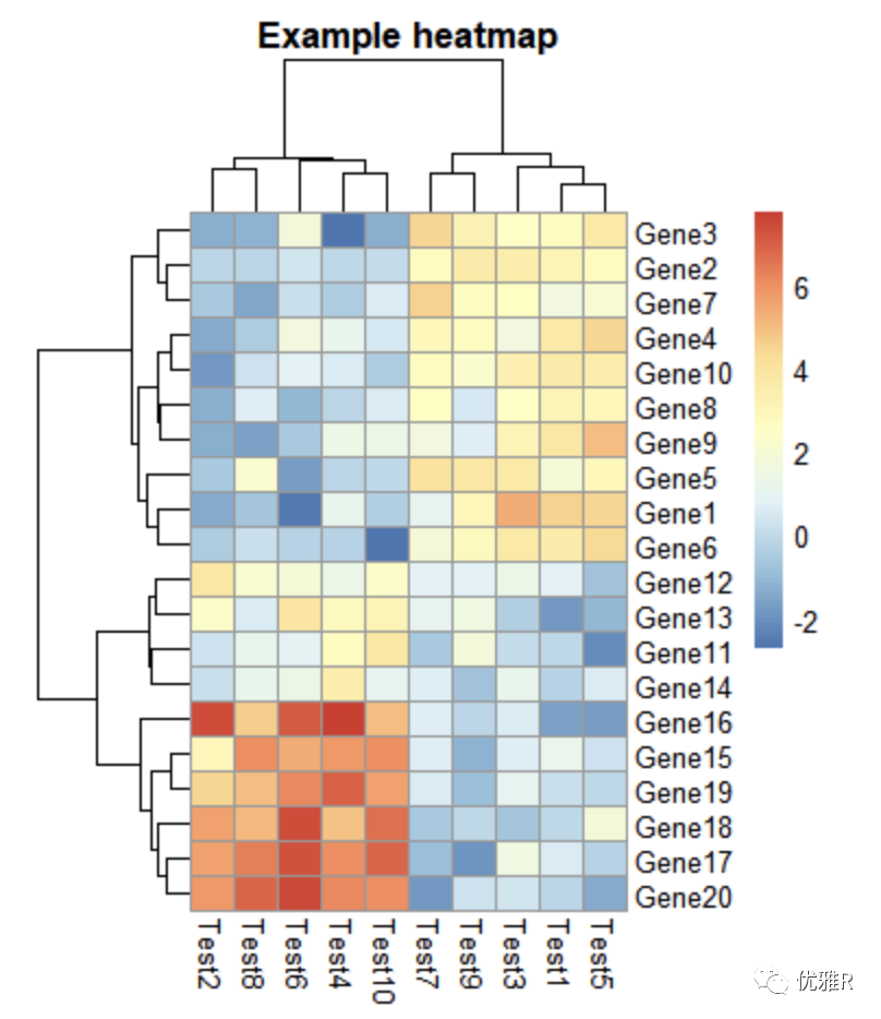
> pheatmap(test, cellwidth = 15, cellheight = 12, fontsize = 8, main = "Example heatmap", filename = "test.pdf")
cellwidth sets the heat map length, cellheight sets the heat map height, main sets the theme, fontsize sets all fonts, and filename sets the heat map.
5. Notes to heat map
- Create comment information for rows and columns
> # Generate annotations for rows and columns
> annotation_col = data.frame(
+   CellType = factor(rep(c("CT1", "CT2"), 5)),
+   Time = 1:5
+ )
> rownames(annotation_col) = paste("Test", 1:10, sep = "")
> annotation_row = data.frame(
+   GeneClass = factor(rep(c("Path1", "Path2", "Path3"), c(10, 4, 6)))
+ )
> rownames(annotation_row) = paste("Gene", 1:20, sep = "")
> annotation_col
       CellType Time
Test1       CT1    1
Test2       CT2    2
Test3       CT1    3
Test4       CT2    4
Test5       CT1    5
Test6       CT2    1
Test7       CT1    2
Test8       CT2    3
Test9       CT1    4
Test10      CT2    5
> annotation_row
       GeneClass
Gene1      Path1
Gene2      Path1
Gene3      Path1
Gene4      Path1
Gene5      Path1
Gene6      Path1
Gene7      Path1
Gene8      Path1
Gene9      Path1
Gene10     Path1
Gene11     Path2
Gene12     Path2
Gene13     Path2
Gene14     Path2
Gene15     Path3
Gene16     Path3
Gene17     Path3
Gene18     Path3
Gene19     Path3
Gene20     Path3
- Heat map for annotation information
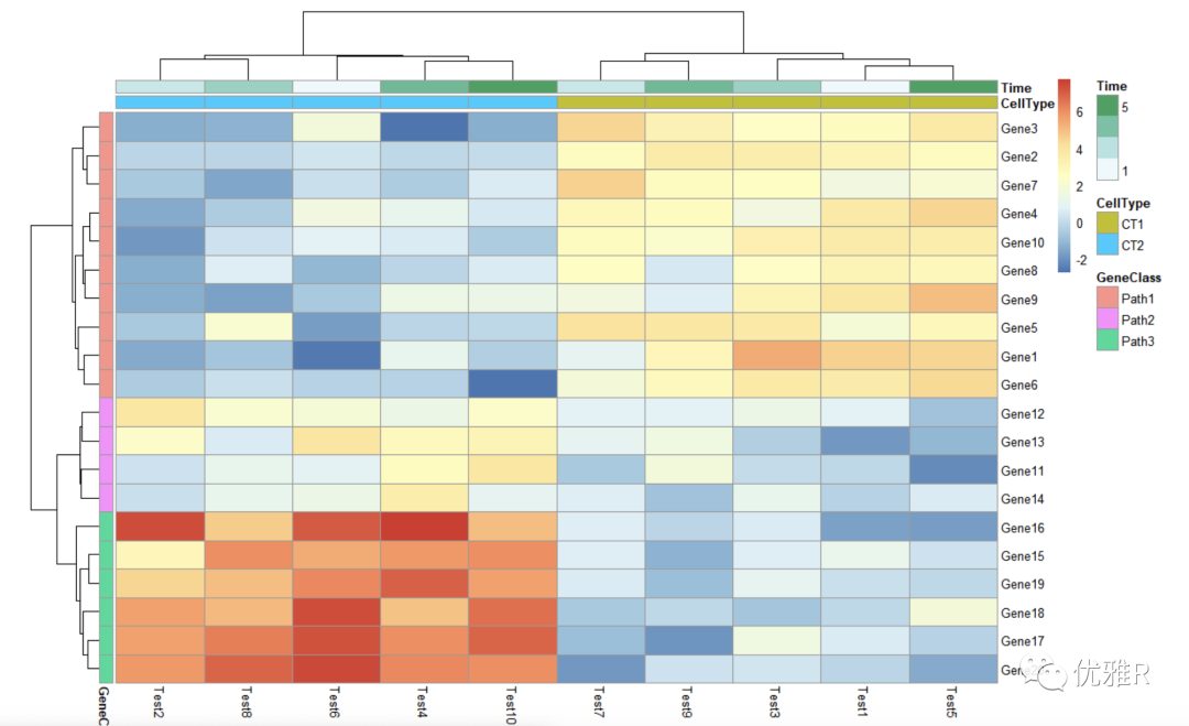
> # Display row and color annotations
> pheatmap(test, annotation_col = annotation_col, annotation_row = annotation_row)
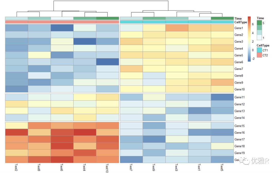
Additional information can be displayed through the added color block, and the rows and columns can be annotated respectively. In addition, the annotated color bar can cancel the annotation_legend = FALSE, but it is not clear what the color represents.
- Change color for annotation information color block
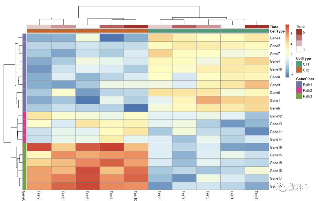
> pheatmap(test, annotation_col = annotation_col, annotation_row = annotation_row,
+          annotation_colors = ann_colors)
- Block the heat map
> pheatmap(test, annotation_col = annotation_col, cluster_rows = FALSE, gaps_row = c(10, 14),
+          cutree_col = 2)
gaps_row divides the row. c(10,14) divides the row into three parts with 10 and 14 as dividing lines.
cutree_col splits the column, 2 that is, it is divided into two blocks.
- Change heat map row and column names
You can create a new vector to store the row and column names you want to set and pass them to label_row this parameter.
> labels_row = c("", "", "", "", "", "", "", "", "", "", "", "", "", "", "",
+                "", "", "Il10", "Il15", "Il1b")
> pheatmap(test, annotation_col = annotation_col, labels_row = labels_row)

- Heat map sorting
> callback = function(hc, mat){
+   sv = svd(t(mat))$v[,1]
+   dend = reorder(as.dendrogram(hc), wts = sv)
+   as.hclust(dend)
+ }
> pheatmap(test, clustering_callback = callback)
Solution 1: color block control
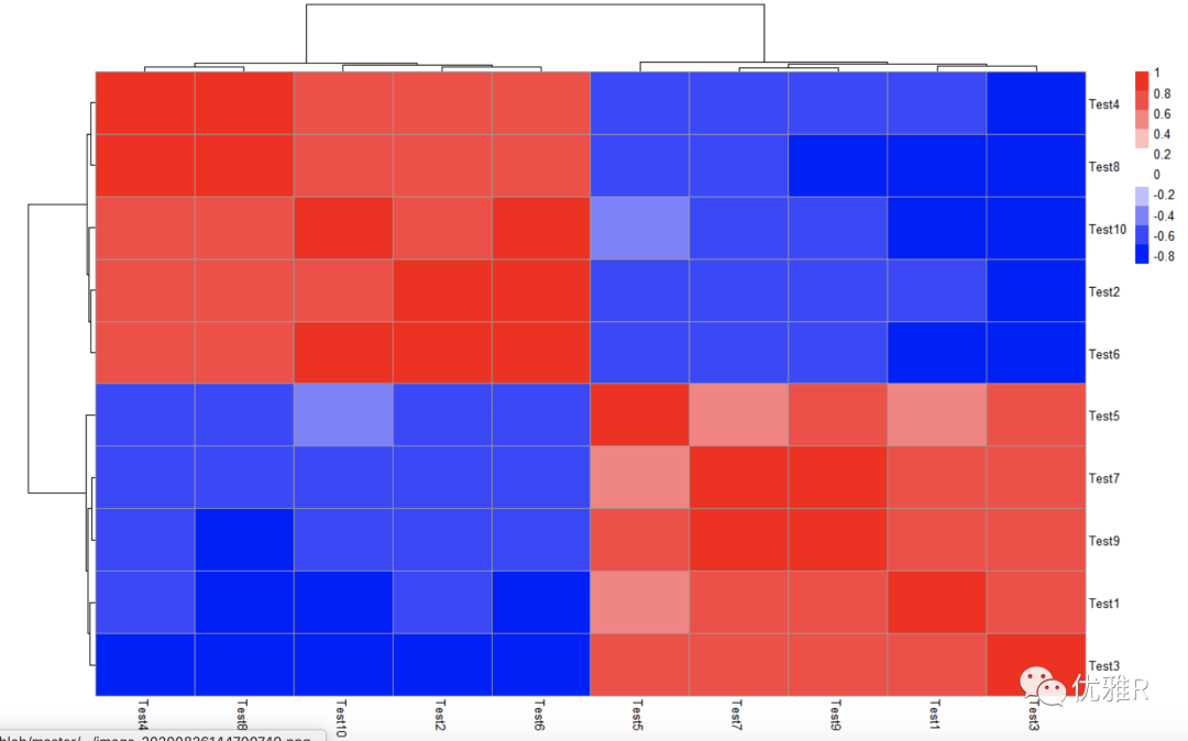
In many cases, we need to intuitively look through the color. When the data is within the range of positive and negative values, the ideal situation is to take 0 as white, and the other two color systems represent positive and negative values respectively, which is easy to read at a glance.
Take the correlation coefficient matrix between test s as an example to check the value range:
> library(Hmisc)
> cortest <- rcorr(as.matrix(test), type = "pearson")
> r_value <- cortest$r
> range(r_value)
[1] -0.8980495  1.0000000
Set color block (set 0 to white by symmetry)
> pheatmap(r_value,
+          color = c(colorRampPalette(c("blue","white"))(10),
+                    colorRampPalette(c("white","red"))(10)),
+          legend_breaks=seq(-1,1,0.2))
Problem solving 2: display part of the heat map
The data form used in the phatmap package is a matrix. When performing correlation analysis inside variables, there is half of the data redundancy, but the matrix form can only change the redundant information into 0 through test [upper.tri (test)] < - Na, which can not be removed directly. It seems that there are no parameters in the parameters that can directly draw the upper and lower triangle heat map, or the upper and lower triangle heat map can be drawn.
[if ggplot2 is used for heat map drawing, since its input data is long data, the data can be converted through melt() in reshape package for drawing]
> r_value[upper.tri(r_value)] <- 0
> pheatmap(r_value,
         c(colorRampPalette(c("blue","white"))(5),
          colorRampPalette(c("white","red"))(5)),
         legend_breaks=seq(-1,1,0.2),
         cluster_rows=F, cluster_cols=F, border_color=NA)
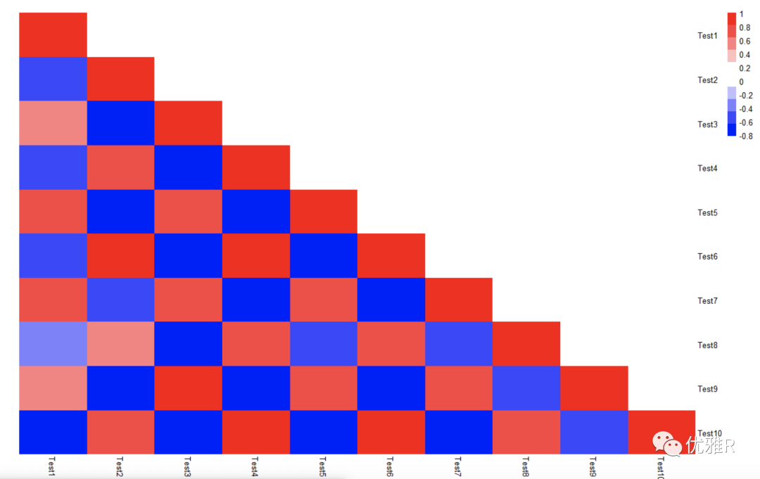
However, there is a big BUG, that is, the data itself still exists, and the removed triangular matrix part should be changed into the value corresponding to the white color block.
Solution 3: Mark correlation coefficient heat map significance
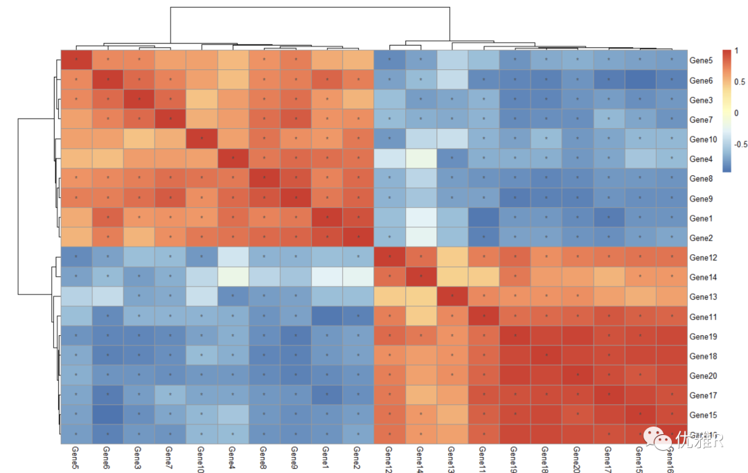
Here, a package Hmisc for calculating the correlation matrix is introduced, which can calculate the correlation matrix, and then directly use the correlation matrix to draw the heat map, and then according to the display_ The numbers parameter is used for significance labeling.
Suppose now I want to see the heat map of the correlation between these 10 test s:
> library(Hmisc)
> cortest <- rcorr(as.matrix(test), type = "pearson")
> p_value <- ifelse(is.na(cortest$P), "", cortest$P)
> pheatmap(cortest$r, display_numbers = matrix(ifelse(p_value < 0.05, "*", ""), nrow(p_value)))
spearman can be selected as the relevant type
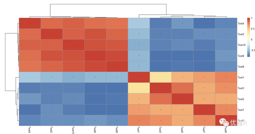
Similarly, if you want to see the heat map of the correlation relationship between these 20 genes, you can transpose the data frame t(), because the function for calculating the correlation matrix performs correlation analysis on the variables of the column by default.
Solution 4: take logarithm
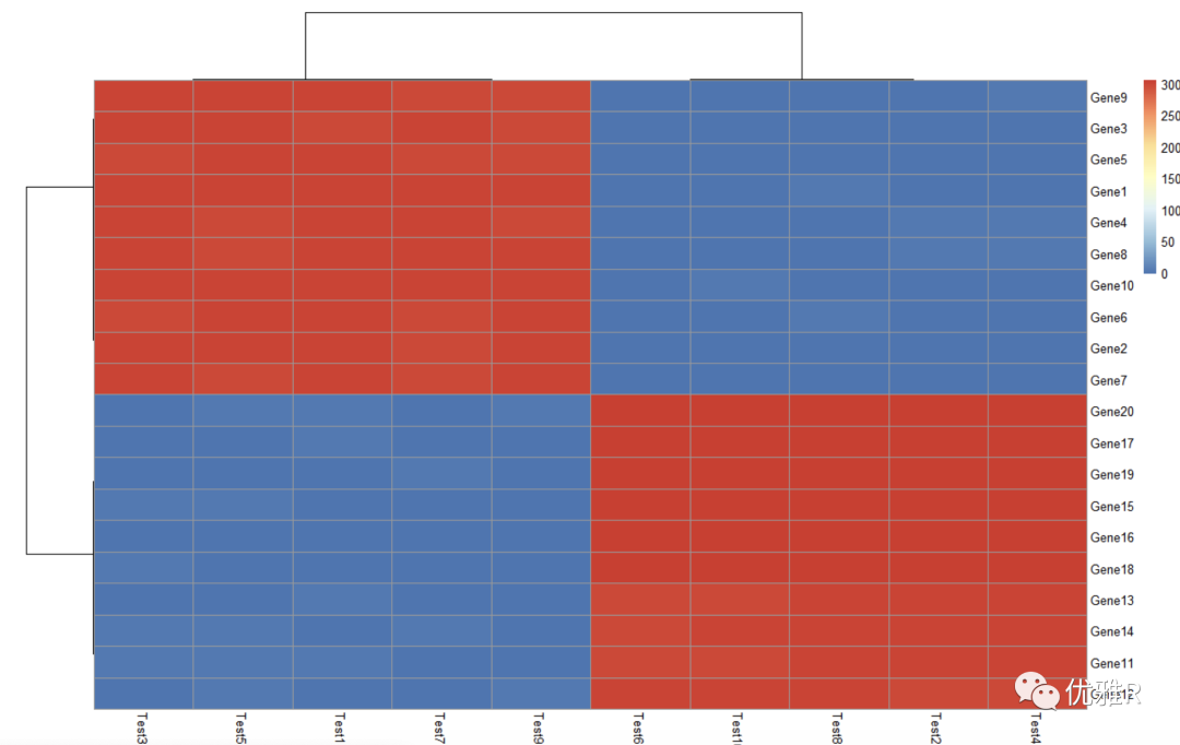
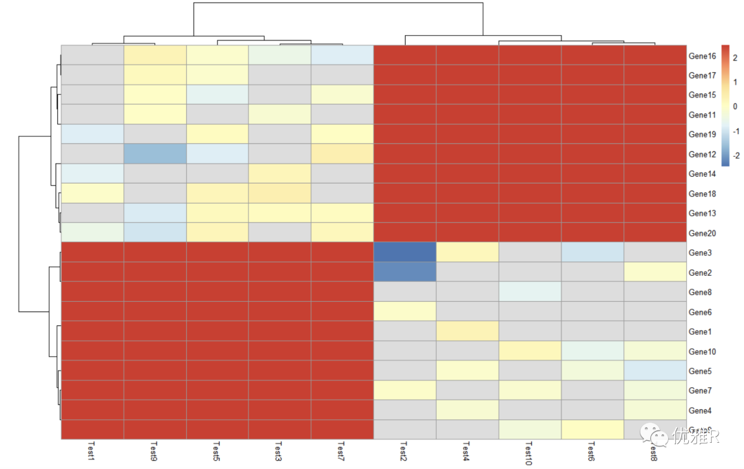
> pheatmap(log10(test))
Problem 5: color matching
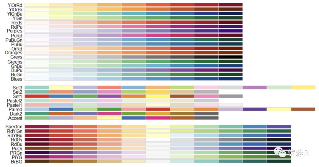
> library("RColorBrewer")
> display.brewer.all()
> brewer.pal.info
         maxcolors category colorblind
BrBG            11      div       TRUE
PiYG            11      div       TRUE
PRGn            11      div       TRUE
PuOr            11      div       TRUE
RdBu            11      div       TRUE
RdGy            11      div      FALSE
RdYlBu          11      div       TRUE
RdYlGn          11      div      FALSE
Spectral        11      div      FALSE
Accent           8     qual      FALSE
Dark2            8     qual       TRUE
Paired          12     qual       TRUE
Pastel1          9     qual      FALSE
Pastel2          8     qual      FALSE
Set1             9     qual      FALSE
Set2             8     qual       TRUE
Set3            12     qual      FALSE
Blues            9      seq       TRUE
BuGn             9      seq       TRUE
BuPu             9      seq       TRUE
GnBu             9      seq       TRUE
Greens           9      seq       TRUE
Greys            9      seq       TRUE
Oranges          9      seq       TRUE
OrRd             9      seq       TRUE
PuBu             9      seq       TRUE
PuBuGn           9      seq       TRUE
PuRd             9      seq       TRUE
Purples          9      seq       TRUE
RdPu             9      seq       TRUE
Reds             9      seq       TRUE
YlGn             9      seq       TRUE
YlGnBu           9      seq       TRUE
YlOrBr           9      seq       TRUE
YlOrRd           9      seq       TRUE
View specific colors
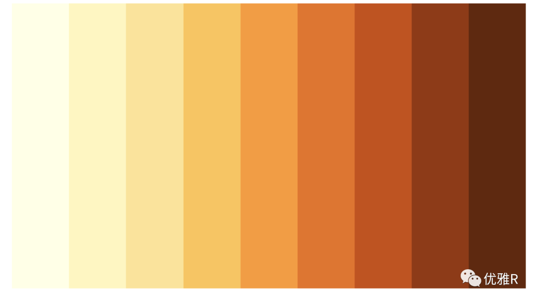
> display.brewer.pal(n = 9, name = 'YlOrBr')
supplement
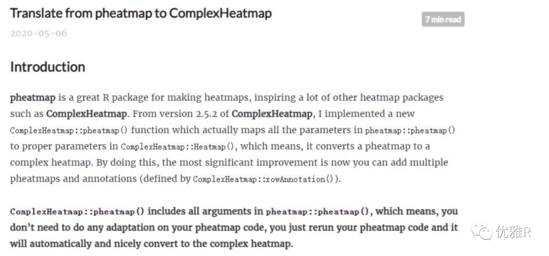
- ComplexHeatmap provides a new function to directly convert pheatmap into ComplexHeatmap
source: https://jokergoo.github.io/2020/05/06/translate-from-pheatmap-to-complexheatmap/
Using corrplot package to do correlation heat map is also a good choice
Editor: Wu Pancheng