catalogue
1, Overall layout of home page and login page
2, Page specific effect analysis
one Drop down list of front page head
QR code appears when downloading app
2. Implementation of mobile phone drop-down list in nav head part of home page
3. Switching between login and registration contents in the login interface
preface
This page is different from the previous one, because this page is composed of html+css+JavaScript It is a combination of the three. From the beginning of learning, I had a preliminary understanding of the role of Javascript. At that time, I thought it could make the page "move", which is very interesting. Now I contact it, and it is true. With Javascript, you can do the interaction effect of many pages and quickly improve the user experience! Take Xiaomi's official website, a project I just finished, to show you the advanced feeling brought by JS~
1, Overall layout of home page and login page
1. Homepage layout
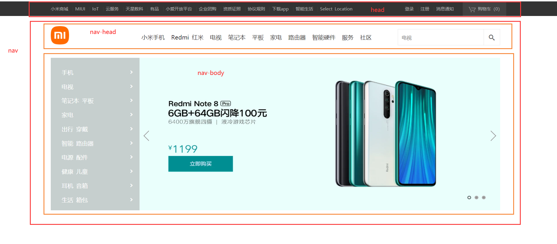
On this home page, I will first roughly divide it into two parts: head and nav, and then divide the nav into two parts: nav head and nav Body. In this way, it is completed according to the upper and lower arrangement of standard flow. The rest of the content in each part will be displayed in one line by using floating or positioning to divide it into left and right.
2. Login page layout
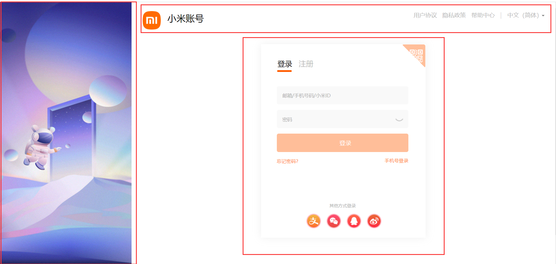
Compared with the home page, the layout of the login page is obviously left and right first and then up and down. As mentioned earlier, the left and right layout can be done by floating or positioning, because the picture on the left is fixed and does not scroll with the scrolling of the scroll bar, so we use the fixed positioning in the positioning to make it on the left. Obviously, the content on the right cannot be blocked by the picture on the left, so you can set a large box for the content on the right, and then set a margin left or padding left for the large box. My approach is to make the width of the large box as wide as the browser, and set a left inner margin for it, In this way, the contents of the box will not be blocked by the picture on the left. The rest is the up and down layout of the standard flow, which is the same as the home page.
2, Page specific effect analysis
one Drop down list of front page head
QR code appears when downloading app

Before learning JS, the way to achieve a certain effect through the mouse is to add: hover to the target through css, but this method has limited ability. It can only change the style of the target when the mouse passes, not the content. Here I use the JS method to achieve the effect of QR code after the mouse passes.
Case study:
- Get the download app and QR code in JS These two labels
- Add mouseenter mouse passing event to the downloaded app tag
- Write the effect to be achieved in the event function, that is, QR code label display
html part of code:
        <ul class="head-left">
            <li>Xiaomi mall <span>|</span></li>
            <li> MIUI <span>|</span></li>
            <li>IoT <span>|</span></li>
            <li>Cloud services <span>|</span></li>
            <li>Astronumerics <span>|</span></li>
            <li>You pin <span>|</span></li>
            <li>Xiaoai open platform <span>|</span></li>
            <li>Enterprise group purchase <span>|</span></li>
            <li>Qualification certificate <span>|</span></li>
            <li>Protocol rules <span>|</span></li>
            <li class="download">download app <span>|</span>
                 <div class="sjx"></div>
                    <div class="app">
                    <img src="images/xiaomi-android.png" alt="">
                    <p>Xiaomi mall APP</p>
                </div>
            </li>
            <li>Intelligent life <span>|</span></li>
            <li>Select Location </li>
        </ul>
css part of code:
header .head-left {
    float: left;
    width: 65%;
    height: 40px;
    line-height: 40px;
    padding-left: 140px;

}

header .head-left li,
header .head-right li {
    float: left;
    color: #b0b0b0;
    font-size: 12px;
    cursor: pointer;

}

header .head-left li:hover {
    color: white;
}

header .head-left li span,
header .head-right li span {
    margin: 0 5px;
    color: #3f423c;
}

.app {
    overflow: hidden;
    position: absolute;
    top: 42px;
    left: 703px;
    width: 145px;
    height: 0;
    text-align: center;
    background-color: white;
    box-shadow: 0 2px 4px rgba(0, 0, 0, 0.5);
    transition: height 0.3s;
    z-index: 1;
}

.app p {
    color: black;
    font-size: 16px;
    margin-top: -18px;
}

.appafter {
    height: 150px;
}

.sjx {
    display: none;
    position: absolute;
    top: 20px;
    left: 765px;
    width: 0;
    height: 0;
    border: 10px solid transparent;
    border-color: transparent transparent white transparent;
}

.download:hover .sjx {
    display: block;
}

.app img {
    width: 100px;
    height: 100px;
    margin-top: 15px;
}
Code js part:
    var download = document.querySelector('.download');
    var app = document.querySelector('.app');
    download.addEventListener('mouseenter', function () {
        app.classList.add('appafter');

    })
    download.addEventListener('mouseleave', function () {
        app.classList.remove('appafter');
    })
Summary: in fact, if you only display a QR code label, you only need to display the QR code label. style.display = 'block' after the mouse passes; But the visual effect is not very good. The QR code label suddenly appears and disappears. The method I use here is to first set the height of the QR code label to 0, and when the mouse passes, the height becomes 150px, and then add a transition: all 0.3s to the box with height change; In this way, when the mouse passes, the QR code label will have a drop-down process from scratch, just like putting down the curtain, and the user experience will rise instantly!
But you must pay attention to a pit here! If you set the height change, you don't need to set display:none and display:block, otherwise you won't see the drop-down effect. Because this attribute directly makes the element appear and disappear, which is an instantaneous thing. There is no time to see the animation effect. The blogger made this mistake when he was doing it, which led to the failure of the effect. He tossed for a long time. I never thought of it! It's actually a display problem! I'm so devastated to know the truth ~ I hope the students who read this blog won't make the same mistake again~
2. Implementation of mobile phone drop-down list in nav head part of home page

Case study:
The mobile phone dropdown as like as two peas of a mouse appear after each li. I believe you have heard the effect of the implementation described by me, and the method used here is exactly the same as the effect of the two-dimensional code just done. Therefore, we will not say what we have said, but what we have not said. For example, if you can't see it at the beginning, what is the content that appears only after the mouse passes? Is it positioning?? yes! you 're right! It's positioning! Then ask again, is it relative positioning? wrong! Absolute positioning, of course! Why? It's necessary to review the previous knowledge, because absolute positioning does not occupy position. Its movement or display and hiding will not affect other elements, just like an object that can't be seen or touched, so we all know the benefits of absolute positioning. Next, we'll buckle the details of this part. When you mouse past each li and leave, the mobile phone's drop-down list is pulled out and paid normally. However, when you want to move directly from the first li to the second li, we can see that only the content has changed without the drop-down effect, So in this case, we have to cancel the animation effect, um, yes, that's it, code display!
html part of code:
<div class="nav-head">
<img src="images/logo-mi2.png" alt="" class="mi">
<ul class="nav-ul">
<li class='nvl'> <a href="">Mi phones</a>
<div class="nav-item1">
<ul class='nav-phone'>
<li>
<img src="images/Mi_10pro.jpg" alt="">
<p>Xiaomi MIX 4</p>
<p>4999 Yuan Qi</p>
</li>
<li>
<img src="images/Mi_cc9e.png" alt="">
<p>millet MIX FOLD</p>
<p>9999 Yuan Qi</p>
</li>
<li>
<img src="images/Mi_cc9 customized.png" alt="">
<p>Xiaomi 11 UItra</p>
<p>5499 Yuan Qi</p>
</li>
<li>
<img src="images/Micc9.png" alt="">
<p>Xiaomi 11 Pro</p>
<p>4499 Yuan Qi</p>
</li>
<li>
<img src="images/RedMi_Note8.webp" alt="">
<p>Xiaomi 11 Youth Edition</p>
<p>2099 Yuan Qi</p>
</li>
<li>
<img src="images/RedMiK30.webp" alt="">
<p>Millet 10 S</p>
<p>2999 Yuan Qi</p>
</li>
</ul>
</div>
</li>
<li class='nvl'> <a href="">Redmi Red rice</a>
<div class="nav-item1">
<ul class='nav-phone'>
<li>
<img src="images/Micc9.png" alt="">
<p>Xiaomi MIX 4</p>
<p>4999 Yuan Qi</p>
</li>
<li>
<img src="images/Mi_cc9 customized.png" alt="">
<p>millet MIX FOLD</p>
<p>9999 Yuan Qi</p>
</li>
<li>
<img src="images/RedMi_K30.webp" alt="">
<p>Xiaomi 11 UItra</p>
<p>5499 Yuan Qi</p>
</li>
<li>
<img src="images/RedMi__8A.webp" alt="">
<p>Xiaomi 11 Pro</p>
<p>4499 Yuan Qi</p>
</li>
<li>
<img src="images/RedMi_Note8.webp" alt="">
<p>Xiaomi 11 Youth Edition</p>
<p>2099 Yuan Qi</p>
</li>
<li>
<img src="images/Mi_cc9e.png" alt="">
<p>Millet 10 S</p>
<p>2999 Yuan Qi</p>
</li>
</ul>
</div>
</li>
<li class='nvl'> <a href="">television</a>
<div class="nav-item1">
<ul class='nav-phone'>
<li>
<img src="images/RedMi__8A.webp" alt="">
<p>Xiaomi MIX 4</p>
<p>4999 Yuan Qi</p>
</li>
<li>
<img src="images/RedMi_K30.webp" alt="">
<p>millet MIX FOLD</p>
<p>9999 Yuan Qi</p>
</li>
<li>
<img src="images/RedMi_Note8.webp" alt="">
<p>Xiaomi 11 UItra</p>
<p>5499 Yuan Qi</p>
</li>
<li>
<img src="images/RedMiK30.webp" alt="">
<p>Xiaomi 11 Pro</p>
<p>4499 Yuan Qi</p>
</li>
<li>
<img src="images/RedMiK30_5G.webp" alt="">
<p>Xiaomi 11 Youth Edition</p>
<p>2099 Yuan Qi</p>
</li>
<li>
<img src="images/RedMiK30_Pro Focus version.webp" alt="">
<p>Millet 10 S</p>
<p>2999 Yuan Qi</p>
</li>
</ul>
</div>
</li>
<li class='nvl'> <a href="">notebook</a>
<div class="nav-item1">
<ul class='nav-phone'>
<li>
<img src="images/Mi_10pro.jpg" alt="">
<p>Xiaomi MIX 4</p>
<p>4999 Yuan Qi</p>
</li>
<li>
<img src="images/Mi_cc9e.png" alt="">
<p>millet MIX FOLD</p>
<p>9999 Yuan Qi</p>
</li>
<li>
<img src="images/Mi_cc9 customized.png" alt="">
<p>Xiaomi 11 UItra</p>
<p>5499 Yuan Qi</p>
</li>
<li>
<img src="images/Micc9.png" alt="">
<p>Xiaomi 11 Pro</p>
<p>4499 Yuan Qi</p>
</li>
<li>
<img src="images/RedMi_Note8.webp" alt="">
<p>Xiaomi 11 Youth Edition</p>
<p>2099 Yuan Qi</p>
</li>
<li>
<img src="images/RedMiK30.webp" alt="">
<p>Millet 10 S</p>
<p>2999 Yuan Qi</p>
</li>
</ul>
</div>
</li>
<li class='nvl'> <a href="">Flat</a>
<div class="nav-item1">
<ul class='nav-phone'>
<li>
<img src="images/RedMi__8A.webp" alt="">
<p>Xiaomi MIX 4</p>
<p>4999 Yuan Qi</p>
</li>
<li>
<img src="images/RedMi_K30.webp" alt="">
<p>millet MIX FOLD</p>
<p>9999 Yuan Qi</p>
</li>
<li>
<img src="images/RedMi_Note8.webp" alt="">
<p>Xiaomi 11 UItra</p>
<p>5499 Yuan Qi</p>
</li>
<li>
<img src="images/RedMiK30.webp" alt="">
<p>Xiaomi 11 Pro</p>
<p>4499 Yuan Qi</p>
</li>
<li>
<img src="images/RedMiK30_5G.webp" alt="">
<p>Xiaomi 11 Youth Edition</p>
<p>2099 Yuan Qi</p>
</li>
<li>
<img src="images/RedMiK30_Pro Focus version.webp" alt="">
<p>Millet 10 S</p>
<p>2999 Yuan Qi</p>
</li>
</ul>
</div>
</li>
<li class='nvl'> <a href="">household electrical appliances</a>
<div class="nav-item1">
<ul class='nav-phone'>
<li>
<img src="images/Mi_10pro.jpg" alt="">
<p>Xiaomi MIX 4</p>
<p>4999 Yuan Qi</p>
</li>
<li>
<img src="images/Mi_cc9e.png" alt="">
<p>millet MIX FOLD</p>
<p>9999 Yuan Qi</p>
</li>
<li>
<img src="images/Mi_cc9 customized.png" alt="">
<p>Xiaomi 11 UItra</p>
<p>5499 Yuan Qi</p>
</li>
<li>
<img src="images/Micc9.png" alt="">
<p>Xiaomi 11 Pro</p>
<p>4499 Yuan Qi</p>
</li>
<li>
<img src="images/RedMi_Note8.webp" alt="">
<p>Xiaomi 11 Youth Edition</p>
<p>2099 Yuan Qi</p>
</li>
<li>
<img src="images/RedMiK30.webp" alt="">
<p>Millet 10 S</p>
<p>2999 Yuan Qi</p>
</li>
</ul>
</div>
</li>
<li class='nvl'> <a href="">Router</a>
<div class="nav-item1">
<ul class='nav-phone'>
<li>
<img src="images/RedMi__8A.webp" alt="">
<p>Xiaomi MIX 4</p>
<p>4999 Yuan Qi</p>
</li>
<li>
<img src="images/RedMi_K30.webp" alt="">
<p>millet MIX FOLD</p>
<p>9999 Yuan Qi</p>
</li>
<li>
<img src="images/RedMi_Note8.webp" alt="">
<p>Xiaomi 11 UItra</p>
<p>5499 Yuan Qi</p>
</li>
<li>
<img src="images/RedMiK30.webp" alt="">
<p>Xiaomi 11 Pro</p>
<p>4499 Yuan Qi</p>
</li>
<li>
<img src="images/RedMiK30_5G.webp" alt="">
<p>Xiaomi 11 Youth Edition</p>
<p>2099 Yuan Qi</p>
</li>
<li>
<img src="images/RedMiK30_Pro Focus version.webp" alt="">
<p>Millet 10 S</p>
<p>2999 Yuan Qi</p>
</li>
</ul>
</div>
</li>
<li> <a href="">Intelligent hardware</a></li>
<li > <a href="">service</a></li>
<li> <a href="">community</a></li>
</ul>css part of code:
.nav-head {
    height: 115px;
    padding-top: 28px;
}

nav img {
    float: left;
    width: 50px;
    height: 50px;
}

nav ul {
    float: left;
    padding-top: 20px;
    margin-left: 200px;
}

nav ul li {
    float: left;
    padding-right: 18px;
    height: 67px;
}

nav ul li a {
    color: #373535;
}

nav ul li:hover a {
    color: #ff6700;
}
.nav-item1 {
    overflow: hidden;
    position: absolute;
    background-color: white;
    top: 115px;
    left: 0;
    width: 100%;
    height: 0;
    box-shadow: 0 2px 4px rgba(0, 0, 0, 0.5);
    transition: height 0.3s;
    z-index: 3;

}

.nav-item1-after {
    border-top: 1px solid #eaeaea;
    height: 200px;

}

nav .nav-phone li {
    position: relative;
    float: left;
    width: 150px;
    text-align: center;
    margin-left: 5px;
}

nav .nav-phone li:nth-child(-n+5)::after {
    content: '';
    position: absolute;
    top: 3px;
    right: -15px;
    width: 1px;
    height: 100px;
    border-right: 2px solid #e1e1e1;
    z-index: 4;
}

nav .nav-phone li img {
    width: 150px;
    height: 110px;
    margin-bottom: 15px;
}

nav .nav-phone li p {
    font-size: 12px;
    color: #767676;
}

nav .nav-phone li p:nth-of-type(2) {
    color: #ff8838;
}
Code js part:
var navItem1 = document.querySelectorAll('.nav-item1');
var navUl = document.querySelectorAll('.nvl');
var flag1 = true;
   for (var i = 0; i < navUl.length; i++) {
        navUl[i].setAttribute('data-index', i);
        navUl[i].addEventListener('mouseenter', function () {
            index = this.getAttribute('data-index');
            if (flag1) {
                navItem1[index].style.transition = 'height 0.3s';
                navItem1[index].classList.add('nav-item1-after');
            } else {
                navItem1[index].style.transition = 'none';
                navItem1[index].classList.add('nav-item1-after');
            }

        })
        navUl[i].addEventListener('mouseleave', function (e) {
            if (e.pageY < 93 || e.pageY > 108) {
                navItem1[index].style.transition = 'height 0.3s';
                navItem1[index].classList.remove('nav-item1-after');
                flag1 = true;
            } else {
                navItem1[index].style.transition = 'none';
                navItem1[index].classList.remove('nav-item1-after');
                flag1 = false;
            }

        })
    }
3. Switching between login and registration contents in the login interface
Case study:
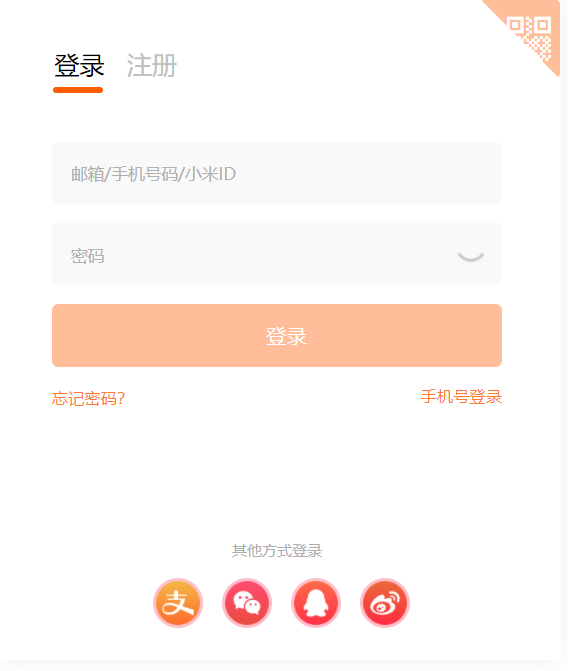
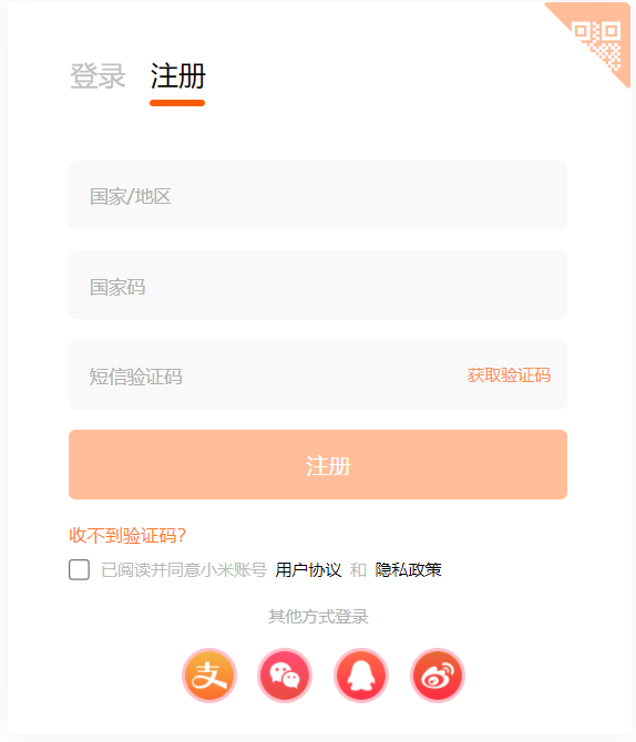
When we click login, the content switched below is the content of the login page. Similarly, when we click registration, the following content will be switched to the content of the registration page. At this time, someone asked, I can finish the content of the login page first, and then copy it to change the content into the registration page, When I click the corresponding option, I link to the corresponding content. Yes, this is indeed a way, but there is also a simple and animated way! Want to know? If you want to know, you should listen carefully! The implementation of this method requires our old friends to be absolutely positioned. First, we use a large box (to be absolutely positioned) with two sub boxes inside. Compared with the two sub boxes, we all know who they are, our eldest child (login interface) and the second child (registration interface), as shown in the following figure:
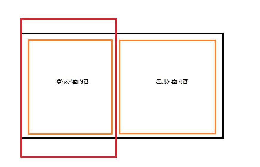
The black frame is the box we want to locate, Write the corresponding contents in the two sub boxes respectively, and the area in the red border represents our current visual area. By default, the login interface is displayed at the beginning. The most important step is coming! This is about to invite our hero JS today. It is realized through JS. When we click registration, let the large black box move the width of the red box to the left. Does this move the content of the registration interface to the red box?! If you click login, just move back (left='0 '). Someone asked, although the login interface has been moved out, you can still see it. It's harmful! It's not easy. Just add overflow:hidden to the red box! If you still want to achieve the sliding effect, add a transition to the black box: all, 0.3s; This method does not need to copy the code again. Is it very simple! Code!
html part of code:
<section>
<form action="#">
<div class="ewm">
<p>
/* The font icon is used here. If there is no corresponding folder, it cannot be displayed, so don't panic */
</p>
<div class="text">
Code scanning login
</div>
</div>
<div class="fhd">
<a href="#"> login < span > < / span ></a>
<a href="#"> register < span > < / span ></a>
</div>
<div class="center">
<div class="item1">
<input type="text" placeholder="mailbox/phone number/millet ID" id="uname">
<br>
<input type="password" placeholder="password" id="pass">
<img src="images/close.png" alt="" class="close">
<br>
<input type="submit" value="Sign in" class="sub">
<br>
<div class="fft">
<span>Forgot your password?</span>
<span>Mobile number login</span>
</div>
<div class="ffoot">
<p>Login in other ways</p>
<ul>
<li>
<img src="images/share3.png" alt="">
</li>
<li>
<img src="images/share2.png" alt="">
</li>
<li>
<img src="images/share4.png" alt="">
</li>
<li>
<img src="images/share1.png" alt="">
</li>
</ul>
</div>
</div>
<div class="item2">
<input type="text" placeholder="country/region">
<br>
<input type="text" placeholder="Country code" id="gjm">
<br>
<input type="text" placeholder="SMS verification code">
<p class="info">Get verification code</p>
<br>
<input type="submit" value="register" class="sub">
<br>
<div class="fft">
<span>No verification code received?</span>
</div>
<input type="checkbox" class='check'>
<span class="xy">Read and agree to Xiaomi account <a>User agreement</a> and <a>Privacy policy</a></span>
<br>
<div class="ffoot ffoot2">
<p>Login in other ways</p>
<ul>
<li>
<img src="images/share3.png" alt="">
</li>
<li>
<img src="images/share2.png" alt="">
</li>
<li>
<img src="images/share4.png" alt="">
</li>
<li>
<img src="images/share1.png" alt="">
</li>
</ul>
</div>
</div>
</div>
</form>
</section>css part of code:
.fhd {
    margin-bottom: 30px;
}

.fhd a {
    display: inline-block;
    position: relative;
    font-size: 20px;
    margin-right: 10px;
}

.fhd a:nth-child(1) {
    color: black;
}

.fhd a span {
    position: absolute;
    bottom: -10px;
    left: -1px;
    width: 40px;
    height: 5px;
    border-radius: 5px;
    background-color: #ff5c00;
}

.fhd  a:nth-child(2) span {
    display: none;
}

form input {
    width: 360px;
    height: 50px;
    border: none;
    background-color: #f9f9f9;
    margin-bottom: 15px;
    color: black;
    padding-left: 15px;
    border-radius: 5px;

}

#uname.change::placeholder {
    position: absolute;
    top: 6px;
    font-size: 12px;
    transition: all .3s;
}
form input::placeholder {
    color: #b0b0b0;
}
#uname.color::placeholder {
    color: #f04645;
}

section {
    padding-top: 70px;
}


.close {
    position: absolute;
    top: 75px;
    left: 320px;
    width: 30px;
    height: 30px;
    cursor: pointer;
}

.sub {
    background-color: #ffbe99;
    color: #ffffff;
    font-size: 16px;
    cursor: pointer;
}

.fft span {
    font-size: 13px;
    color: #ff792e;
    cursor: pointer;
}

.fft span:nth-child(2) {
    float: right;
}

.ffoot {
    margin-top: 105px;
   text-align: center;
}

.ffoot p {
    font-size: 12px;
    color: #afafaf;
    cursor: pointer;
}

.ffoot ul {
    margin-left: 66px;

}

.ffoot ul li {

    float: left;
    width: 40px;
    height: 40px;
    border-radius: 20px;
    overflow: hidden;
    background-color: pink;
    margin-left: 15px;
    margin-top: 15px;
}

.ffoot ul img {
    width: 100%;
    height: 100%;
}

.footer {
    position:absolute;
    bottom: 30px;
    left: 730px;
    font-size: 12px;
    color: #b5b5b5;
}

/* Registration section */

.center {
    position: absolute;
    top: 115px;
    left: 43px;
    width: 900px;
    transition: all .3s;
}

div[class^= "item" ] {
    float: left;
}

.center .item1 {
    margin-right: 50px;
}

.info {
    position: absolute;
    top: 147px;
    right: 142px;
    font-size: 12px;
    color: #fc9054;
    cursor: pointer;
}

.check {
    margin-top: 10px;
    width: 15px;
    height: 15px;
    vertical-align:bottom;
    margin-bottom: 0;
}


.xy {
    font-size: 12px;
    color: #bbbbbb;
}

.xy a {
    color: black;
    cursor: pointer;
}

.ffoot2 {
    margin-top: 18px;
}
Code js part:
var center = document.querySelector('.center');
    var fhd = document.querySelector('.fhd').querySelectorAll('a');
    var fhdSpan = document.querySelector('.fhd').querySelectorAll('span');

        fhd[0].addEventListener('click', function () {
            center.style.left = '43px';
            this.style.color = 'black';
            fhd[1].style.color = '#c0c0c0';
            fhdSpan[0].style.display = 'block';
            fhdSpan[1].style.display = 'none';
        })
        fhd[1].addEventListener('click', function () {
            center.style.left = '-366px';
            this.style.color = 'black';
            fhd[0].style.color = '#c0c0c0';
            fhdSpan[1].style.display = 'block';
            fhdSpan[0].style.display = 'none';
        })
summary
Through the production of this page, in fact, the methods used for most of the content are the same, such as the drop-down list effect. The only difference is that the details may be increased or decreased . I believe that after reading each part of the code I show, you can find that the content of JS is always the least. Therefore, you don't have to be afraid that JS is very difficult and complex. As long as you understand the logical concept, you only need to write a few simple codes to achieve interesting page interaction effects! Don't learn quickly~~