summary
For beginners of WPF, this article is mainly used to record several common WPF layout containers, including grid, dockpanel, wrappanel, StackPanel and uniformgrid;
1.Grid
You can define the number of rows and columns by defining the Row divisions and columndivisions of the Grid, and you can freely set the size of the rows and columns (fixed value, proportional, Auto). At the same time, the child elements can decide where to put them by defining Row and Column.
    <Grid>

            <Grid.RowDefinitions>
            <RowDefinition Height="40"/>
            <RowDefinition Height="Auto"/>
            <RowDefinition Height="2*"/>
            <RowDefinition Height="*"/>
        </Grid.RowDefinitions>

        <Grid.ColumnDefinitions>
            <ColumnDefinition/>
            <ColumnDefinition/>
            <ColumnDefinition/>
        </Grid.ColumnDefinitions>

        <Button Grid.Row="0" Content="Button" Background="Red"/>
        <Button Grid.Row="1" Grid.Column="1"  Content="Button" Background="Blue" />
        <Button Grid.Row="2" Grid.Column="1" Grid.ColumnSpan="2" Content="Button" Background="Green" />
        <Button Grid.Row="3" Content="Button" Grid.ColumnSpan="2"  Background="SkyBlue"/>

    </Grid>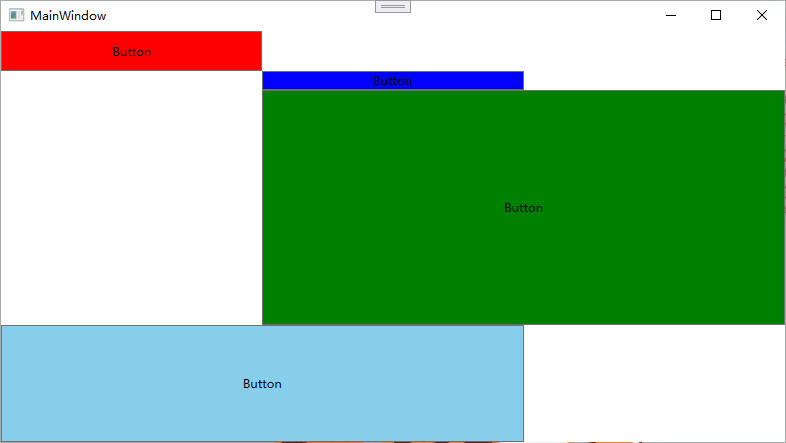
2.DockPanel
For the container with docking attribute, the child element controls the docking position with four values: Left, Top, Right and Bottom. The last child element will join a DockPanel and fill all the remaining space, unless the LastChildFill attribute of DockPanel is false
 <DockPanel LastChildFill="False">
            <Button Content="Button Left" DockPanel.Dock="Left" Background="Red"/>
            <Button Content="Button right" DockPanel.Dock="Right" Background="Yellow"/>
            <Button Content="Button upper" DockPanel.Dock="Top" Background="blue"/>
            <Button Content="Button lower" DockPanel.Dock="Bottom" Background="Green"/>
</DockPanel> 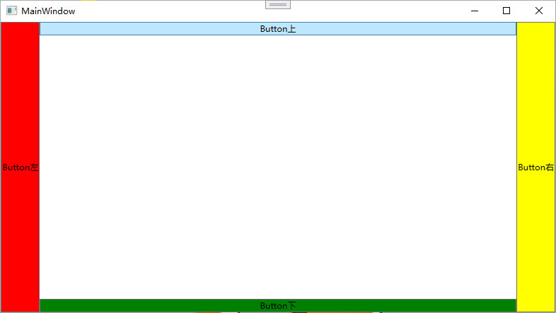
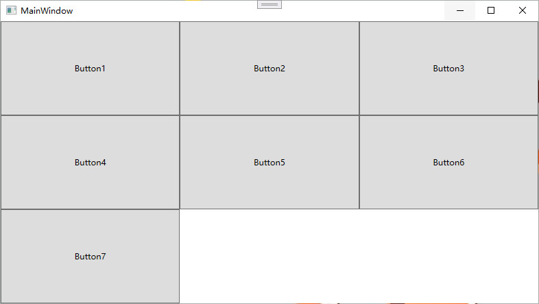
3.WarpPanel
WrapPanel layout panel lists all controls in a certain direction. When the length or height is not enough, it will be automatically adjusted to wrap lines and columns. When Orientation="Horizontal", the controls are listed from left to right. When the panel length is not enough, the child controls will wrap automatically and continue to be arranged from left to right. When orientation = "vertical", the controls are listed from top to bottom. When the panel height is not enough, the child controls will automatically change columns and continue to be arranged from top to bottom.
   <WrapPanel Orientation="Horizontal">
            <Button Content="Button1" Width="150"/>
            <Button Content="Button2" Width="200"/>
            <Button Content="Button3" Width="150"/>
            <Button Content="Button4" Width="200"/>
            <Button Content="Button5" Width="150"/>
            <Button Content="Button6" Width="200"/>
            <Button Content="Button7" Width="150"/>
        </WrapPanel>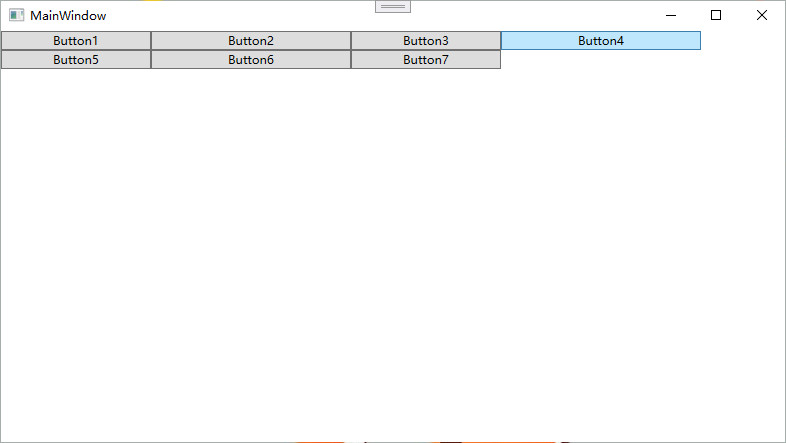
4.StackPanel
StackPanel arranges the controls in row or column order without wrapping. By setting the Orientation property of the panel, two arrangement modes are set: Horizontal (default) and Vertical (Vertical). The default is Vertical.
     <StackPanel Orientation="Horizontal">
            <Button Content="Button1"/>
            <Button Content="Button2"/>
            <Button Content="Button3"/>
        </StackPanel>

        <StackPanel Orientation="Vertical">
            <Button Content="Button4"/>
            <Button Content="Button5"/>
            <Button Content="Button6"/>
        </StackPanel>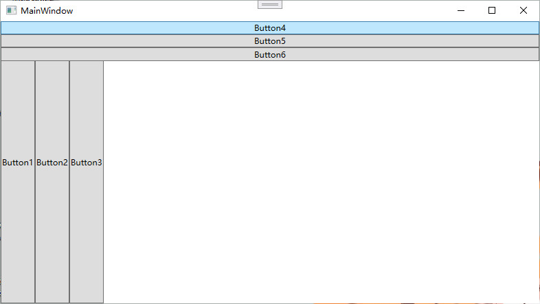
5.UniformGrid
UniformGrid is a simplified version of Grid. Each cell has the same size and does not need to define a Row and Column set. Each cell always has the same size, and each cell can hold only one control. If Rows colonies is not set, Rows and columns are automatically created according to the number of elements defined inside them, and the same number of Rows and columns is usually maintained. If only Rows is set, the number of Rows is fixed and the number of columns is automatically expanded. If only colors is set, the number of columns will be fixed and the number of Rows will be automatically expanded. There are no Row and Column additional properties and no blank cells in the UniformGrid.
 <UniformGrid>
            <Button Content="Button1"/>
            <Button Content="Button2"/>
            <Button Content="Button3"/>
            <Button Content="Button4"/>
            <Button Content="Button5"/>
            <Button Content="Button6"/>
            <Button Content="Button7"/>
        </UniformGrid>