After decades of busy, today finally have time to write blog.
The previous chapter introduces the content related to the working mode of the template, as well as the templates of all the controls under the FrameWorkElement. Next, I'll show you how to build a simple custom button and learn some details about the control template in the process.
From the previous chapter, the basic Button control uses the ButtonChrome class to draw its special background and border. One reason the Button class uses the ButtonChrome class instead of the WPF drawing entity is that the appearance of a standard Button depends on several obvious features (whether it is disabled, whether it has focus, and whether it is being clicked) and other more subtle factors (such as the Current Windows theme). It's unwieldy to use triggers only to implement this kind of logic.
However, when building custom controls, you don't have to worry about standardization and topic integration (in fact, WPF doesn't emphasize user interface standardization as much as previous user interface technologies). Instead, we need to focus more on how to create attractive new controls and mix them with other parts of the user interface. As a result, you may not need to create classes such as ButtonChrome, but you can use and learn elements to design self-sufficient control templates that do not use code.
1, Simple button
To apply a custom control Template, you only need to set the Template property of the control. Although inline templates can be defined (by embedding control Template tags inside the control tags), this approach makes little sense. This is because you almost always want to reuse templates for multiple skin instances of the same control. To adapt to this design, you need to define the control Template as a resource and use StaticResource to reference the resource, as follows:
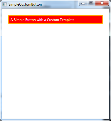
<Button  Margin="10" Padding="5" Template="{StaticResource ButtonTemplate}"  >
            A Simple Button with a Custom Template
</Button>
With this method, not only many custom buttons can be easily created, but also the control template can be modified flexibly in the future without disturbing the rest of the application user interface.
In this particular example, the ButtonTemplate Resource is placed in the Resource collection that contains the window. However, in a real application, you may prefer to use application resources for the reasons discussed in "organizing template resources" in the next chapter.
The following is the basic framework of the control template:
<Window.Resources>
        <ControlTemplate x:Key="ButtonTemplate" TargetType="{x:Type Button}">
            ...
        </ControlTemplate>
</Window.Resources>
The TargetType property is set in the control template above to explicitly indicate that the template is designed for buttons. Similar to styles, this is always a good convention to follow. You also need to use this Convention in content controls, such as buttons, or the ContentPresenter element won't work.
To create a template for a basic button, draw your own Border and background, and then place content in the button. Two possible candidates for drawing borders are the Rectangle class and the Border class. The following example uses the Border class to combine an orange outline with rounded corners with red background and white text that introduces attention:
<Window.Resources>
        <ControlTemplate x:Key="ButtonTemplate" TargetType="{x:Type Button}">
            <Border BorderBrush="Orange" BorderThickness="3" CornerRadius="2"
                    Background="Red" TextBlock.Foreground="White" Name="Border">
            ...
            </Border>
        </ControlTemplate>
</Window.Resources>
The main focus here is on the background, but there is still a way to display the Button content. In previous studies, you may remember that the Button class contains a ContentPresenter element in other control templates. All content controls require a ContentPresenter element - a marker that identifies "insert content here" and tells WPF where to save content:
<ControlTemplate x:Key="ButtonTemplate" TargetType="{x:Type Button}">
            <Border BorderBrush="Orange" BorderThickness="3" CornerRadius="2"
                    Background="Red" TextBlock.Foreground="White" Name="Border">
                  <ContentPresenter RecognizesAccessKey="True"></ContentPresenter>
            </Border>
</ControlTemplate>
Set the RecognizesAccessKey property to true in the ContentPresenter element. Although this is not required, make sure the button supports the access key - the underlined letter that can be used to quickly trigger the button. In this case, if the button has the text Click me, the button will be triggered when the user presses the Alt+M key combination (in the standard Windows settings, the underline is hidden, and as long as the Alt key is pressed, the access key (in this case, the M key) will be underlined). If the RecongnizesAccessKey property is set to true, the detail is ignored, and any underscores are treated as normal underscores and displayed as part of the button content.
2, Template binding
There is also a small problem with this example. Now label the button with a value of 10 for the Margin property and 5 for the Padding property. The StackPanel control focuses on the Margin property of the button, but ignores the Padding property, so that the content and side of the button are squeezed together. The problem here is that the Padding property doesn't work unless you pay special attention to it in the template. In other words, the template is responsible for retrieving the inner Margin value and using that value to insert extra white space around the content.
Fortunately, WPF has designed a tool specifically for this purpose: template binding. Instead of using a binding template, the header can extract a value from the control to which the template is applied. In this case, you can use the template binding to retrieve the value of the Padding attribute and use the attribute value to create an outer margin around the ContentPresenter element:
<ControlTemplate x:Key="ButtonTemplate" TargetType="{x:Type Button}">
            <Border BorderBrush="Orange" BorderThickness="3" CornerRadius="2"
                    Background="Red" TextBlock.Foreground="White" Name="Border">
                  <ContentPresenter RecognizesAccessKey="True"  Margin="{TemplateBinding Padding}"></ContentPresenter>
            </Border>
</ControlTemplate>
This gives you the desired effect, adding some white space between the border and the content. The new simple button is shown in the figure below.
Template bindings are similar to normal data bindings, but they are lighter because they are designed specifically for use in control templates. They only support one-way data banding (in other words, they pass information from the control to the template, but not from the template to the control), and they cannot be used to extract information from the properties of the derived class of the Freezable class. In case of ineffective template binding, you can use data binding with full functions instead.
The only way to predict which template bindings are required is to check the default control template. If you look at the control template of the Button class, you will find that the template binding method is exactly the same as the custom template -- get the inner margin specified for the Button, and convert it to the outer margin around the ContentPresenter element. It is also found that the standard Button template contains several other template bindings, such as horizontal alignment, vertical alignment and Background, which are not used in this simple custom template. This means that if you set these properties for the control, they have no effect on this simple custom template.
In many cases, template binding is not considered. In fact, you do not have to bind properties if you are not prepared to use them or if you do not want to modify the template. For example, the current simple button makes sense to set the Foreground property for text to white and ignore any values set for the Background property, because the Foreground and Background colors are inherent to the button's visual appearance.
Another reason you might choose to avoid template binding is that controls don't support them well. For example, if you set the Background property for a button, you might notice that the Background color is not processed coherently when the button is pressed (in fact, the Background color disappears and is replaced by the default appearance of the press). The custom template in this example is similar to this. Although there is no mouse over and mouse click behavior, once you add these details, you want to fully control the color of the buttons and their changes in different states.
3, Trigger to change property
If you test the button you created in the previous section, you'll find it very disappointing. Essentially, it's just a red, rounded rectangle - it doesn't look like anything when you move or click on it. The button just stayed there.
You can easily solve this problem by adding triggers to the control template. When one property changes, you can use triggers to change the other or more properties. At least you want to respond to the IsMouseOver and IsPressed properties in the button. The following markup is a modified version of the control template. When these properties change, the color of the control changes:
<Window.Resources>
        <ControlTemplate x:Key="ButtonTemplate" TargetType="{x:Type Button}">
            <Border BorderBrush="Orange" BorderThickness="3" CornerRadius="2"
                    Background="Red" TextBlock.Foreground="White" Name="Border">
                <ContentPresenter RecognizesAccessKey="True"
                                      Margin="{TemplateBinding Padding}"></ContentPresenter>
            </Border>
            <ControlTemplate.Triggers>
                <Trigger Property="IsMouseOver" Value="True">
                    <Setter TargetName="Border" Property="Background" Value="DarkRed"/>
                </Trigger>
                <Trigger Property="IsPressed" Value="True">
                    <Setter TargetName="Border" Property="Background" Value="IndianRed"/>
                    <Setter TargetName="Border" Property="BorderBrush" Value="DarkKhaki"/>
                </Trigger>
            </ControlTemplate.Triggers>
        </ControlTemplate>
    </Window.Resources>
Another change is needed to make the template work. A name has been specified for the Border element and is used to set the TargetName property for each of its settings. In this way, the setter can update the Background and BorderBrush attributes of the Border element specified in the template. Using names is the easiest way to ensure that specific parts of the template are updated. You can create an element type rule to affect all Border elements (because you already know that there is only one Border in the button template), but if you change the template later, this method is clearer and more flexible.
Another element is needed in all buttons (and most other controls) - the focus indicator. Although you cannot change the existing border to have a Tianjin focus effect, you can easily Tianjin another element to show whether it has focus, and you can simply use triggers to show or hide the element according to the Button.IsKeyboardFocused attribute. Although there are many ways to create a focus effect, the following example value only includes a transparent Rectangle element with a dotted border. The Rectangle element cannot contain child content, so you need to make sure that the Rectangle element and the rest overlap. The easiest way to do this is to encapsulate the Rectangle element and the ContentPresenter element in the same cell using the Grid nulls with only one cell.
Here is the modified template that supports focus:
<Window.Resources>
        <ControlTemplate x:Key="ButtonTemplate" TargetType="{x:Type Button}">
            <Border BorderBrush="Orange" BorderThickness="3" CornerRadius="2"
                    Background="Red" TextBlock.Foreground="White" Name="Border">
                <Grid>
                    <Rectangle Name="FocusCue" Visibility="Hidden" Stroke="Black"
                               StrokeThickness="1" StrokeDashArray="1 2"
                               SnapsToDevicePixels="True"></Rectangle>
                    <ContentPresenter RecognizesAccessKey="True"
                                      Margin="{TemplateBinding Padding}"></ContentPresenter>
                </Grid>
            </Border>
            <ControlTemplate.Triggers>
                <Trigger Property="IsMouseOver" Value="True">
                    <Setter TargetName="Border" Property="Background" Value="DarkRed"/>
                </Trigger>
                <Trigger Property="IsPressed" Value="True">
                    <Setter TargetName="Border" Property="Background" Value="IndianRed"/>
                    <Setter TargetName="Border" Property="BorderBrush" Value="DarkKhaki"/>
                </Trigger>
                <Trigger Property="IsKeyboardFocused" Value="True">
                    <Setter TargetName="FocusCue" Property="Visibility" Value="Visible"/>
                </Trigger>
            </ControlTemplate.Triggers>
        </ControlTemplate>
    </Window.Resources>
The setter uses the TargetName attribute tea cup here to change the elements.
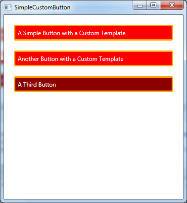
The following figure shows the three buttons for using the modified template. The second button currently has focus (represented by a dotted rectangle), while the mouse hovers over the third button.
Another trigger is needed to touch up the button. When the IsEnable property of the button changes to false, the trigger changes the background color of the button (or the foreground color of the text):
<Window.Resources>
        <ControlTemplate x:Key="ButtonTemplate" TargetType="{x:Type Button}">
            <Border BorderBrush="Orange" BorderThickness="3" CornerRadius="2"
                    Background="Red" TextBlock.Foreground="White" Name="Border">
                <Grid>
                    <Rectangle Name="FocusCue" Visibility="Hidden" Stroke="Black"
                               StrokeThickness="1" StrokeDashArray="1 2"
                               SnapsToDevicePixels="True"></Rectangle>
                    <ContentPresenter RecognizesAccessKey="True"
                                      Margin="{TemplateBinding Padding}"></ContentPresenter>
                </Grid>
            </Border>
            <ControlTemplate.Triggers>
                <Trigger Property="IsMouseOver" Value="True">
                    <Setter TargetName="Border" Property="Background" Value="DarkRed"/>
                </Trigger>
                <Trigger Property="IsPressed" Value="True">
                    <Setter TargetName="Border" Property="Background" Value="IndianRed"/>
                    <Setter TargetName="Border" Property="BorderBrush" Value="DarkKhaki"/>
                </Trigger>
                <Trigger Property="IsKeyboardFocused" Value="True">
                    <Setter TargetName="FocusCue" Property="Visibility" Value="Visible"/>
                </Trigger>
                <Trigger Property="IsEnabled" Value="False">
                    <Setter TargetName="Border" Property="TextBlock.Foreground" Value="Gray" />
                    <Setter TargetName="Border" Property="Background" Value="MistyRose" />
                </Trigger>
            </ControlTemplate.Triggers>
        </ControlTemplate>
    </Window.Resources>
To ensure that the rule takes precedence over other conflicting trigger settings, it should be defined at the end of the trigger list. In this way, whether the IsMouseOver property is true or not, the IsEnabled property trigger has priority, and the button remains inactive.
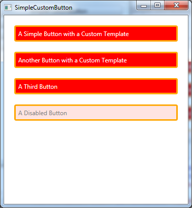
The picture shown below when the setup button is not available:
4, Use animated triggers
Triggers are not limited to setting properties. You can also use event triggers to run animations when specific properties change.
At first glance, this may seem a bit tortuous, but in addition to the simplest WPF controls, triggers are actually key elements of all other WPF controls. For example, consider a button that has been studied for its current location. Currently, when the mouse moves over a button, it immediately switches from one color to another. However, the more fashionable buttons can use a very short animation to faint from one color to another, creating subtle but elegant effects. Similarly, the button can use animation to change the transparency of the focus prompt rectangle, and when the button gets the focus, it will quickly fade into the attempt rather than display suddenly. In other words, event triggers allow the control to move more smoothly from one state to another, further refining its appearance.
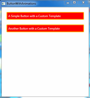
Here is the redesigned button template. When the mouse hovers over the button, the template uses the trigger to realize the button color pulse effect (constantly switching between red and blue). When the mouse leaves, use a separate animation lasting for 1 second to return the button background to its normal color:
<Window.Resources>
        <ControlTemplate x:Key="ButtonTemplate" TargetType="{x:Type Button}">
            <Border BorderBrush="Orange" BorderThickness="3" CornerRadius="2"
                    Background="Red" TextBlock.Foreground="White" Name="Border">
                <Grid>
                    <Rectangle Name="FocusCue" Visibility="Hidden" Stroke="Black"
                               StrokeThickness="1" StrokeDashArray="1 2"
                               SnapsToDevicePixels="True"></Rectangle>
                    <ContentPresenter RecognizesAccessKey="True"
                                      Margin="{TemplateBinding Padding}"></ContentPresenter>
                </Grid>
            </Border>
            <ControlTemplate.Triggers>
                <EventTrigger RoutedEvent="MouseEnter">
                    <BeginStoryboard>
                        <Storyboard>
                            <ColorAnimation Storyboard.TargetName="Border"
                                Storyboard.TargetProperty="Background.Color"
                                  To="Blue" AutoReverse="True" RepeatBehavior="Forever" Duration="0:0:1"></ColorAnimation>
                        </Storyboard>
                    </BeginStoryboard>
                </EventTrigger>
                <EventTrigger RoutedEvent="MouseLeave">
                    <BeginStoryboard>
                        <Storyboard>
                            <ColorAnimation Storyboard.TargetName="Border"
                                            Storyboard.TargetProperty="Background.Color"
                                            Duration="0:0:0.5"></ColorAnimation>
                        </Storyboard>
                    </BeginStoryboard>
                </EventTrigger>
                <Trigger Property="IsPressed" Value="True">
                    <Setter TargetName="Border" Property="Background" Value="IndianRed" />
                    <Setter TargetName="Border" Property="BorderBrush" Value="DarkKhaki" />
                </Trigger>
                <Trigger Property="IsKeyboardFocused" Value="True">
                    <Setter TargetName="FocusCue" Property="Visibility" Value="Visible" />
                </Trigger>
            </ControlTemplate.Triggers>
        </ControlTemplate>
    </Window.Resources>
There are two equivalent ways to add a mouse over animation -- to create an event trigger that responds to MouseEnter and MouseLeave events, or to add an entry and exit action when the IsMouseOver property changes. The final rendering is as follows:
This example uses two ColorAnimation objects to change the button. Here are some other tasks you might want to use event trigger driven animation for:
- Show or hide elements. To do this, you need to change the Opacity property of the element in the control template.
- Change shape or position. You can use the TranslateTransform object to adjust the position of the element (for example, slightly offset the element to make the button feel pressed). When you move the mouse over an element, you can use a ScaleTransform or RotateTransform object to slightly rotate the appearance of the element.
- Change the light or shade. To do this, you need to use animation that changes the paint background color brush. You can use the ColorAnimation animation to change the color in the SolidBrush brush, or you can dynamically display more complex brushes for more advanced effects. For example, using one of the colors in the LinearGradientBrush brush, which is the default button control template, you can also change the center point of the RadialGradientBrush brush brush.