Xuecheng online website knowledge sharing
Xuecheng online website is a relatively basic web page layout, which allows people who have just learned the front end to use tools to measure the size, cut pictures, use boxes to locate the layout, use floating to place floating boxes and other knowledge points. Major teaching websites will also use this case to teach the basic layout. Next, let's take a look at the page layout of Xuecheng online website
Tip: This article only provides ideas and some codes. Please use PS and other tools to sample the data
preface
We know that the layout of a web page is composed of a large number of boxes placed, nested and floating. The whole web page can be divided into three parts: the head, the distinction of content and the bottom. I can share some things I need to pay attention to these three modules and what codes can be used to achieve these effects
Tip: the following is the main content of this article. The following cases can be used for reference
1, View of overall layout
We should start to learn the online website layout planning. First, we should analyze how it should be laid out, which can meet our needs. We can analyze the layout of the web page to achieve the effect by observing the layout of the head, content, bottom and style in the content.
For example: how the web page of station B is laid out, let's first take a look at what its web page looks like
This is the top of the picture

Use borders to distinguish how their boxes are nested, such as heads
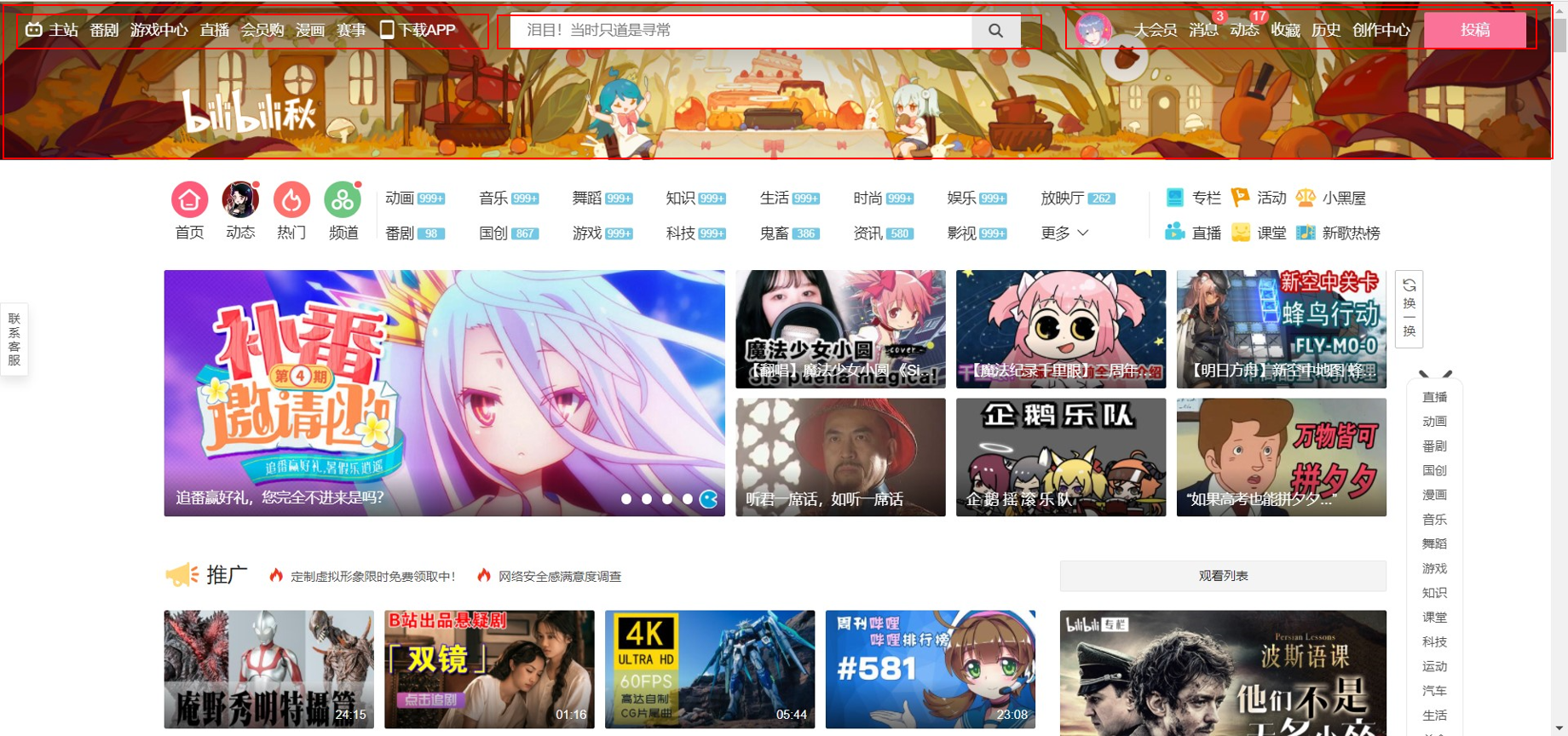
In this way, the layout of the web page is regarded as a nested division of boxes. From here, we can see that the head is written by a background board, a overhead navigation bar, search bar and user bar attributes. The navigation bar needs to float left, the search bar needs to float left, and the user bar can float left or right. We can also divide the following contents in the same way. For example, I can divide the contents in this way:

The plates that can see the content can also be divided into two large boxes through the standard flow, and the box can be adjusted to float left and right. Therefore, we can also divide the knowledge analysis of our Xuecheng online website in the same way. Next, let's take a look at the page of Xuecheng online website:

We can still use the same method to divide the web page layout. Here is a demonstration of the division of some, and the rest can be divided by ourselves:

2, Problems needing attention
1. Interception of logo
General websites will have special designers or outsourced designers to design logo s, which will be delivered to front-end staff for use and put into the website. Usually, the designed files are psd files. Therefore, we should learn to use PS to intercept pictures. We can use some excellent plug-ins in PS to achieve the effect of quickly intercepting and exporting pictures. It is recommended to use the Cutterman plug-in. You can query how to use it.
http://www.cutterman.cn/zh (this is the official website)
In the process of using, remember that the logo of the image needs to use png to keep the transparent background board, otherwise the left logo is a logo image that does not meet the requirements
2. Width, height and margin of the box
We know that the width and height required for the layout of our web pages are different. Some are the width and height of the whole web page, while others need some specific height and width. Note that the main content of some web pages will be put into a large number of boxes, so only the width will be set here, The rest of the boxes are directly supported by the content to achieve the desired effect.
When we need to center the box in a fixed position, in addition to using the center effect on the body, we can also adjust the outer margin to achieve this effect. For example, the contents of the banner can do this:
  .w {
      width: 1200px;
      margin: auto;
  }
  .banner {
      height: 421px;
      background-color: #1c036c;
  }

  .banner .w {
      height: 421px;
      background: url(images/banner2.png) no-repeat top center;
  }
You can first set a width for the whole, then let other sections directly use the width defined by the w-class selector, and use margin: auto to automatically align the layout of the web page. Then you only need to set the height to achieve the desired effect.
3. Width of boutique module
The observation boutique recommendation module is a module opened with a box. The internal ten small sections are basically made with an unordered list. However, when setting, the sorting of two rows and five is generally realized by squeezing the box down. However, if margin is set, the box will be squeezed down.
For example:
    <style>
        .box {
            width: 500px;
        }

        li {
            list-style: none;
        }

        .box ul li a {
            float: left;
            width: 100px;
            height: 200px;
            margin-right: 10px;
            margin-bottom: 10px;
            background-color: aqua;
        }
    </style>
    <div>
        <div class="box">
            <ul>
                <li><a href="#"></a></li>
                <li><a href="#"></a></li>
                <li><a href="#"></a></li>
                <li><a href="#"></a></li>
                <li><a href="#"></a></li>
                <li><a href="#"></a></li>
                <li><a href="#"></a></li>
                <li><a href="#"></a></li>
                <li><a href="#"></a></li>
                <li><a href="#"></a></li>
            </ul>
        </div>
    </div>

Generally, in this case, we can solve this problem by widening the actual width of the box. Generally, the overflow part will not affect the overall box, while the overflow margin in the actual page will not affect the appearance. Therefore, using this method will not bring all kinds of trouble caused by adjusting other values, and it can also easily achieve the required web page layout effect
    .box {
            width: 600px;
        }

    li {
            list-style: none;
        }

        .box ul li a {
            float: left;
            width: 100px;
            height: 200px;
            margin-right: 10px;
            background-color: aqua;
        }

3. Floating problem
As mentioned earlier, the parent box with a large number of boxes does not set the height, but supports the parent box through the sub box, and the sub box usually uses a lot of floating effects, which often leads to some problems of height collapse. For this kind of problems, please refer to my last blog: How to solve the problem of high collapse
In addition to the problem of high collapse, there are some small problems to pay attention to when floating. Generally, there are left float and right float when using float. If you need to use right float to achieve the effect of right alignment, the first li will sort back from the right when using unordered list. At this time, you need to reorganize the contents of the list to observe the situation, or adjust it to left float, And increase the inner / outer edge distance to change the position.
    <style>
        .box {
            width: 600px;
        }

        li {
            list-style: none;
        }

        .box ul li a {
            float: right;
            width: 100px;
            height: 200px;
            margin-right: 10px;
            margin-bottom: 10px;
            background-color: aqua;
        }
    </style>
    <div>
        <div class="box">
            <ul>
                <li><a href="#">1</a></li>
                <li><a href="#">2</a></li>
                <li><a href="#">3</a></li>
                <li><a href="#">4</a></li>
                <li><a href="#">5</a></li>
                <li><a href="#">6</a></li>
                <li><a href="#">7</a></li>
                <li><a href="#">8</a></li>
                <li><a href="#">9</a></li>
                <li><a href="#">10</a></li>
            </ul>
        </div>
    </div>

3, Summary
Here's the last tip. When making code, many codes can be copied and pasted directly, because the actual format difference is not large. At this time, you need to pay attention to the format of your own code. Remember to be optimistic about whether the double labels of the code are repeated, whether there are more spaces, etc. if the double labels are missing, remember to supplement and standardize the overall code orderly, so as to achieve the effect that you can easily modify the actual content. Learning to become the home page of an online website is not very difficult. You only need to carefully observe the web page layout and write appropriate code to achieve the desired effect. In more cases, you still need to make it yourself. Thank you for watching.