Draggable series components allow us to drag components.
Draggable
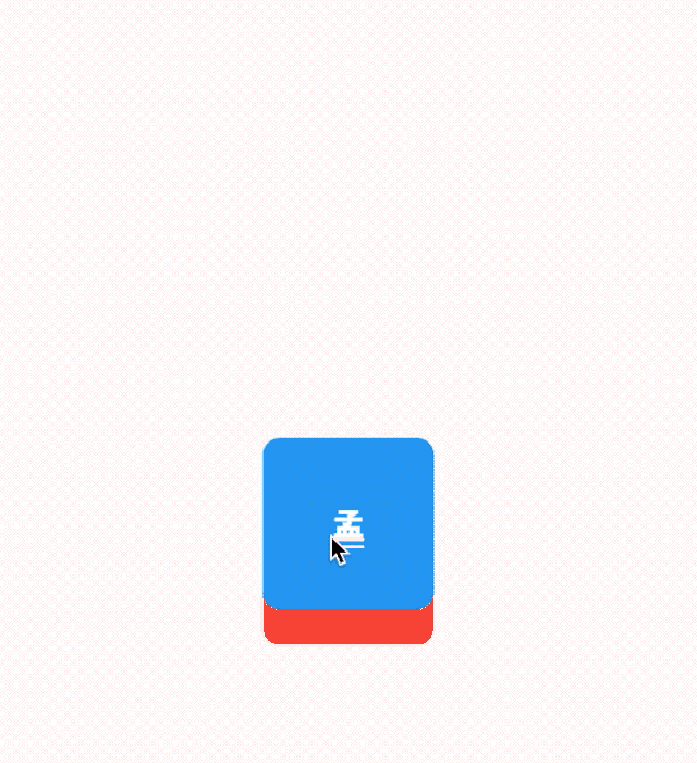
The Draggable component has two parameters that must be filled in. The child parameter is a child control and the feedback parameter is a component that moves with drag. The usage is as follows:
Draggable(
        child: Container(
          height: 100,
          width: 100,
          alignment: Alignment.center,
          decoration: BoxDecoration(
            color: Colors.red,
            borderRadius: BorderRadius.circular(10)
          ),
          child: Text('a jade tablet',style: TextStyle(color: Colors.white,fontSize: 20),),
        ),
        feedback: Container(
          height: 100,
          width: 100,
          alignment: Alignment.center,
          decoration: BoxDecoration(
              color: Colors.green,
              borderRadius: BorderRadius.circular(10)
          ),
          child: Text('three',style: TextStyle(color: Colors.white,fontSize: 20),),
        )
    )
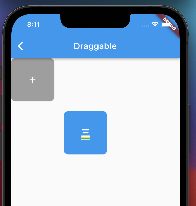
The blue component is feedback. If you want to display other styles of sub components when dragging, you can use the childWhenDragging parameter. The usage is as follows:
 childWhenDragging: Container(
        height: 100,
        width: 100,
        alignment: Alignment.center,
        decoration: BoxDecoration(
          color: Colors.grey,
          borderRadius: BorderRadius.circular(10),
        ),
        child: Text('king',
          style: TextStyle(
              color: Colors.white,
              fontSize: 18),
        ),
      ),
We can also control the drag direction. For example, only vertical movement is allowed. The code is as follows:
Draggable(
  axis: Axis.vertical,
  ...
)
Draggable component provides us with five kinds of callback events during dragging. The usage is as follows:
Draggable(
      // axis: Axis.vertical,
        child: Container(
          height: 100,
          width: 100,
          alignment: Alignment.center,
          decoration: BoxDecoration(
            color: Colors.red,
            borderRadius: BorderRadius.circular(10)
          ),
          child: Text('a jade tablet',style: TextStyle(color: Colors.white,fontSize: 20),),
        ),
        feedback: Container(
          height: 100,
          width: 100,
          alignment: Alignment.center,
          decoration: BoxDecoration(
              color: Colors.blue,
              borderRadius: BorderRadius.circular(10)
          ),
          child: Text('three',style: TextStyle(color: Colors.white,fontSize: 20),),
        ),
      childWhenDragging: Container(
        height: 100,
        width: 100,
        alignment: Alignment.center,
        decoration: BoxDecoration(
          color: Colors.grey,
          borderRadius: BorderRadius.circular(10),
        ),
        child: Text('king',
          style: TextStyle(
              color: Colors.white,
              fontSize: 18),
        ),
      ),
      onDragStarted: (){
        print('onDragStarted');
      },
      onDragEnd: (DraggableDetails details){
        print('onDragEnd:$details');
      },
      onDraggableCanceled: (Velocity velocity,Offset offset){
        print('onDraggableCancel velocity:$velocity,offset:$offset');
      },
      onDragCompleted: (){
        print('onDragCompleted');
      },
      onDragUpdate: (DragUpdateDetails details){
          print('onDragUpdate');
      },
    )
The description is as follows:
-
onDragStarted: callback when dragging starts.
-
onDragEnd: callback at the end of drag.
-
Ondraggablecancelled: callback when not dragged onto the DragTarget control.
-
onDragCompleted: callback when dragging onto a DragTarget control.
-
onDragUpdate: update callback during drag.
Draggable has a data parameter, which is used in conjunction with DragTarget. When the user drags the control to DragTarget, this data will be passed to DragTarget.
DragTarget
DragTarget, like its name, specifies a destination, and Draggable components can be dragged to this control,
Attribute description
builder
Called to build the content of the widget
Widget DragTargetBuilder (
BuildContext context,
List < T > candidatedata, / / the data collection passed
List rejectedData / / data collection that will not be received
)
onWillAccept whether to receive the data given by the drag target
onAccept is called when receiving data
onLeave = called when the dragged part leaves
The usage is as follows:
DragTarget(
  builder: (BuildContext context, List<dynamic> candidateData,
      List<dynamic> rejectedData) {
      ...
  }
)
When onWillAccept returns true, the data of the candidateData parameter is Draggable data.
When onWillAccept returns false, the data of the rejectedData parameter is Draggable data,
DragTarget has three callbacks, which are described as follows:
-
onWillAccept: called when dragging onto the control. You need to return true or false. Return true. Once you let go, you will call back onAccept. Otherwise, you will call back onLeave.
-
When onAccept:onWillAccept returns to true, the user calls after loosening.
-
When onLeave:onWillAccept returns to false, the user calls after loosening.
The usage is as follows:
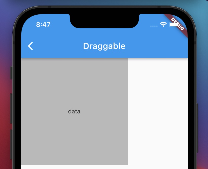
DragTarget(
      builder: (BuildContext context, List<Object?> candidateData,
          List<dynamic> rejectedData) {
        return Container(
          alignment: Alignment.center,
          height: 250,
          width: 250,
          color: Colors.black26,
          child: Text('data'),
        );
      },
      onAccept: (String data) {
        print(data);
      },
      onLeave:(String data){
        //The data came and left
        print('onLeave : $data');
      },

    )
LongPressDraggable
LongPressDraggable inherits from Draggable, so its usage is exactly the same as Draggable. The only difference is that LongPressDraggable triggers drag by long pressing, while Draggable triggers drag by pressing.