Preorder
Whether on the web or in native Native applications, pop-up window usage scenarios can be seen everywhere, and the quality of pop-up window UI design largely determines the user experience.Such as WeChat and Alipay, the pop-up window interaction is easy to operate and comfortable to use.
Explain
Mobile phone pop-ups have been developed long ago using the h5, and recently react-native technology has been pushed through many pits.Just think about using react-native technology as a custom Modal pop-up window to practice.
rnPop is a highly customized pop-up window component based on React/React-Native technology, which imitates the effect of android, ios and WeChat.Combines native Modal and react capabilities to make the pop-up window highly customized and elegant, concise and convenient to invoke.
Preview Effect Map
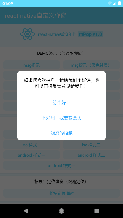
directory structure

Pop-up window introduction and invocation
Reference to many other people to customize react-native pop-up window invocation, nothing more than the following
// Introducing rnPop.js components
import RNPop from '../utils/rnPop/rnPop.js'

render() {
    return (
        <View style={styles.container}>
            ...

            {/* Introducing a pop-up window template */}
            <RNPop ref="rnPop" />
        </View>
    )
}

//Display: this.refs.rnPop.show({...options});
//Hide: this.refs.rnPop.hide();
This way of calling is to access component internal methods, such as show and hide methods, which always feel that the code is not elegant enough to be called globally.
Improvement
Define two static methods inside a pop-up window
/**************************
     *    Show pop-up events (handles arguments)
     */
    static show = (args) => {
        _this.setState({
            ..._this.props, ...args, isVisible: true
        }, _this.in)
    }

    /**************************
     *    Close Pop-up Event
     */
    static close = () => {
        _this.out()
    }
Provides the global calling interface rnPop to the outside via the react-native global variable Global
/**************************
 *    Instantiate pop-up window interface
 */
const Popup = (args) => {
    RNPop.show(args)
}
Popup.close = () => {
    RNPop.close()
}
global.rnPop = Popup
This makes it very elegant to make pop-up calls using rnPop({...options}), rnPop.close().
//msg prompt
    handlePress01 = ()=> {
        rnPop({
            content: 'msg Message prompt box (5) s Rear window closes)',
            shade: true,
            shadeClose: false,
            time: 5,
            xtime: true,
            anim: 'fadeIn',
        });
    }

    //msg prompt (black background)
    handlePress02 = ()=> {
        rnPop({
            content: 'Customize Pop-up Background',
            shade: false,
            style: {backgroundColor: 'rgba(17,17,17,.7)', borderRadius: 6},
            contentStyle: {color: '#fff', padding: 10},
            time: 2
        });
    }


RN Custom Toast
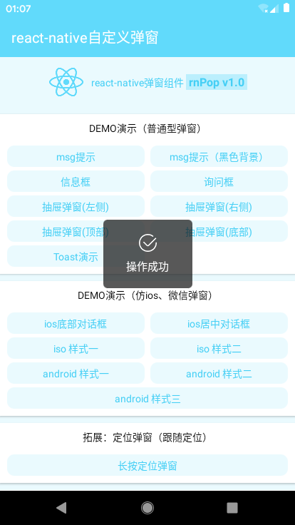
react-native custom toast supports four icons success/info/error/load
//Toast Demo
    handlePress15 = ()=> {
        rnPop({
            skin: 'toast',
            content: 'Operation Successful',
            icon: 'success', //success | info | error | loading
            shade: false,
            time: 3
        });
    }

ios pop-up effect
//ios dialog
    handlePress16 = ()=> {
        rnPop({
            skin: 'footer',
            content: 'Apple ID \n 282310962@qq.com',
            shadeClose: false,
            anim: 'bottom',

            btns: [
                {
                    text: 'Log off account',
                    style: {color: '#30a4fc'},
                    onPress() {
                        console.log('You clicked Restore!');
                    }
                },
                {
                    text: 'delete',
                    style: {color: '#e63d23'},
                    onPress() {
                        console.log('You clicked Delete!');

                        //Remove callback prompt
                        rnPop({
                            anim: 'fadeIn',
                            content: 'You clicked the Delete function',
                            shade: true,
                            time: 3
                        });
                    }
                },
                {
                    text: 'cancel',
                    style: {color: '#999'},
                    onPress() {
                        console.log('You clicked Cancel!');
                        rnPop.close();
                    }
                }
            ]
        });
    }


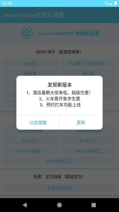
android and mimic effect
// android style
    handlePress20 = ()=>{
        rnPop({
            skin: 'android',
            title: 'Discover New Version',
            content: 'Programmer GG Emergency Fix a Flash bug,We apologize for the inconvenience.\n\n[Recent Updates]\n 1,New Information&Topic Entry \n 2,New Detail Page Long Press Sharing',

            shadeClose: false,

            btns: [
                {
                    text: 'Got it',
                    onPress() {
                        rnPop.close();
                        console.log("Got it");
                    }
                },
                {
                    text: 'To update',
                    style: {color: '#4eca33'},
                    onPress() {
                        console.log('You clicked Update!');
                    }
                }
            ]
        });
    }

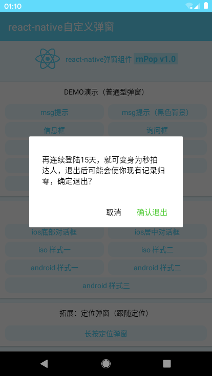
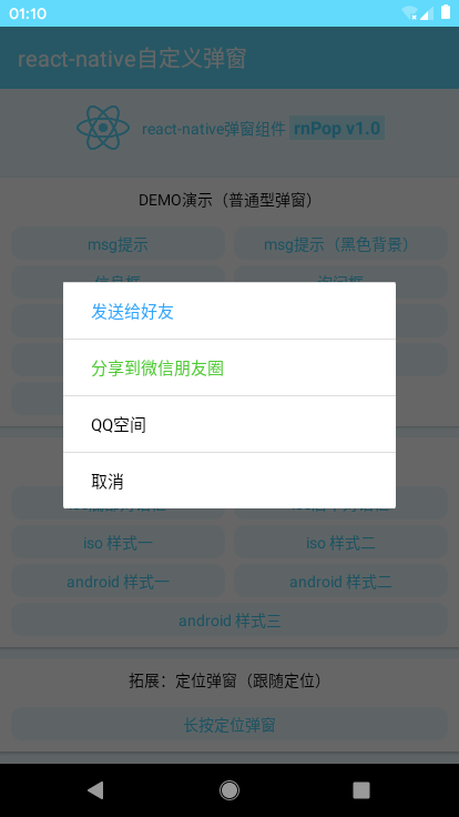
Custom Pop-up Template
Custom template content for incoming content parameters is also supported: string | object
// Custom Calls
    handlePressAA = () => {
        rnPop({
            content: (
                <DefineCp />

                // <View style={{alignItems: 'center', justifyContent: 'center'}}>
                //     <Image style={{height: 200, width: 200}} source={require('../assets/qrcode.jpg')} />
                //     <Text style={{color:'#999'}}>Long press or sweep QR code, plus my friend</Text>
                //     <View><Text onPress={rnPop.close} style={{backgroundColor:'#61dafb', borderRadius: 20, color:'#fff', marginTop: 15, marginBottom: 10, padding Vertical: 5, padding Horizontal: 50}>Save 2D code </Text></View>
                // </View>
            ),
            anim: 'bottom'
        });
    }
// Custom Template
const DefineCp = () => {
    return (
        <View style={{alignItems: 'center', justifyContent: 'center'}}>
            <Image style={{height: 200, width: 200}} source={require('../assets/qrcode.jpg')} />
            <Text style={{color: '#999'}>Long press or sweep QR code and add my friend</Text>
            <View><Text onPress={rnPop.close} style={{backgroundColor: '#61dafb', borderRadius: 20, color: '#Fff', marginTop: 15, marginBottom: 10, padding Vertical: 5, padding Horizontal: 50} > Save QR Code </Text></View>
        </View>
    )
}

Parameter Configuration
/**
 * @Title         react-native Pop-up plugin rnPop-v1.0 beta (UTF-8)
 * @Create        2019/08/01 10:00:50 GMT+0800 (China Standard Time)
 * @Author        andy  Q: 282310962  wx: xy19031
 */

'use strict'

import React, {Component} from 'react'
import {
    Animated, Easing, StyleSheet, Dimensions, PixelRatio, TouchableHighlight, Modal, View, Text, Image, ActivityIndicator
} from 'react-native'

const pixel = PixelRatio.get()
const {width, height} = Dimensions.get('window')

export default class RNPop extends Component{
    /**************************
     *    Pop-up window configuration parameters
     */
    static defaultProps = {
        isVisible: false,       //Pop-up window display

        title: '',              //Title
        content: '',            //content
        style: null,            //Custom pop-up style {object}
        contentStyle: null,     //Content Style
        skin: '',               //Customize Pop-up Style
        icon: '',               //Custom pop-up Icon

        shade: true,            //mask
        shadeClose: true,       //Click on the mask to close
        opacity: '',            //Mask layer transparency
        time: 0,                //Number of seconds for pop-up window to close automatically
        xtime: false,           //Show shutdown seconds

        anim: 'scaleIn',        //Pop-up animation (scaleIn / fadeIn / top / bottom / left / right)
        follow: null,            //Following Position (for locating a bullet window in a long position)
        position: '',           //Pop-up position

        btns: null,             //Pop-up button (no button is set, no button is displayed) [{...options}, {...options}]
    }

    constructor(props){
        super(props)

        this.state = {
            ...this.props,
            animatedValue: new Animated.Value(0),
        }
        this.timer = null
    }

    render(){
        let opt = this.state

        // _u Custom toast Icon
        let slotImg = {
            success: require('./skin/success.png'),
            error: require('./skin/error.png'),
            info: require('./skin/info.png'),
        }

        return (
            ...
        )

    }

    // Execute Animation
    in = () => {
        Animated.timing(
            this.state.animatedValue, {easing: Easing.linear, duration: 300, toValue: 1}
        ).start()
    }
    out = () => {
        Animated.timing(
            this.state.animatedValue, {easing: Easing.linear, duration: 100, toValue: 0}
        ).start(()=>{
            this.setState({
                ...this.props
            })
        })

        this.timer && clearTimeout(this.timer)
        delete this.timer
    }

    /**************************
     *    Show pop-up events (handles arguments)
     */
    static show = (args) => {
        _this.setState({
            ..._this.props, ...args, isVisible: true
        }, _this.in)
    }

    /**************************
     *    Close Pop-up Event
     */
    static close = () => {
        _this.out()
    }
}


More
Attach the previous h5 mobile terminal and WeChat applet pop-up window
h5 mobile terminal pop-up window: https://www.cnblogs.com/xiaoy...
h5 web version pop-up window: https://www.cnblogs.com/xiaoy...
wx applet pop-up window: https://www.cnblogs.com/xiaoy...