Data drawing point 6 - too many data groups
Comparing the distribution of several numerical variables is a common task in data presentation. The distribution of variables can be represented by histogram or density diagram. It is very attractive to represent groups of appropriate data on the same axis. However, too many data groups will seriously affect the performance of chart information.
Data distribution drawing example
The following is an example of how people perceive vocabulary. The phrase "highly likably" means the probability of what happens. The following are the results of probability score distribution given by people.
# Load Library
library(tidyverse)
library(hrbrthemes)
library(viridis)
library(patchwork)

# Load data
data <- read.table("https://raw.githubusercontent.com/zonination/perceptions/master/probly.csv", header=TRUE, sep=",")
# Processing data
data <- data %>%
  gather(key="text", value="value") %>%
  mutate(text = gsub("\\.", " ",text)) %>%
  mutate(value = round(as.numeric(value),0))
head(data)
nrow(data)
| text | value | |
|---|---|---|
| <chr> | <dbl> | |
| 1 | Almost Certainly | 95 |
| 2 | Almost Certainly | 95 |
| 3 | Almost Certainly | 95 |
| 4 | Almost Certainly | 95 |
| 5 | Almost Certainly | 98 |
| 6 | Almost Certainly | 95 |
782
# Create data callout box
annot <- data.frame(
  text = c("Almost No Chance", "About Even", "Probable", "Almost Certainly"),
  x = c(5, 53, 65, 79),
  y = c(0.15, 0.4, 0.06, 0.1)
)
# Extract some data for display
data1 <-filter(data,text %in% c("Almost No Chance", "About Even", "Probable", "Almost Certainly"))
data1 <-mutate(data1,text = fct_reorder(text, value))
head(data1)
nrow(data1)
| text | value | |
|---|---|---|
| <fct> | <dbl> | |
| 1 | Almost Certainly | 95 |
| 2 | Almost Certainly | 95 |
| 3 | Almost Certainly | 95 |
| 4 | Almost Certainly | 95 |
| 5 | Almost Certainly | 98 |
| 6 | Almost Certainly | 95 |
184
# mapping
ggplot(data1, aes(x=value, color=text, fill=text)) +
geom_density(alpha=0.6) +
scale_fill_viridis(discrete=TRUE) +
scale_color_viridis(discrete=TRUE) +
geom_text( data=annot, aes(x=x, y=y, label=text, color=text), hjust=0, size=4.5) +
theme(
  legend.position="none",
  panel.spacing = unit(0.1, "lines"),
  strip.text.x = element_text(size = 8)
) +
xlab("") +
ylab("Assigned Probability (%)")

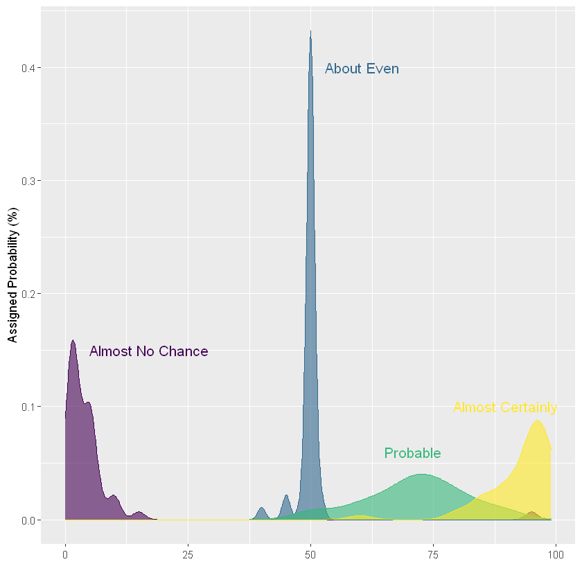
In this case, the graphics are very neat. People give "highly likably" the probability of saying "Almost No chance" is between 0% and 20%, while the probability of saying "Almost Certainly" is between 75% and 100%. But what happens when we look at representing more data groups.
# Plot
data2<-mutate(data,text = fct_reorder(text, value))
ggplot(data2,aes(x=value, color=text, fill=text)) +
# Draw density map
geom_density(alpha=0.6) +
scale_fill_viridis(discrete=TRUE) +
scale_color_viridis(discrete=TRUE) +
theme(
  panel.spacing = unit(0.1, "lines"),
  strip.text.x = element_text(size = 8)
) +
xlab("") +
ylab("Assigned Probability (%)")
Now you can see that the graph is too cluttered to distinguish groups: there are too many data groups represented on the same graph. How to avoid this situation? We will describe several solutions in the next section.
resolvent
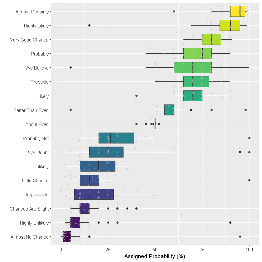
Box diagram
The most common way to represent such a dataset is boxplot. It summarizes the main characteristics of each group, so as to achieve efficient distribution. Please pay attention to some pitfalls. It is often meaningful to sort groups to make the chart easier to read. If the group label is long, consider a horizontal version that makes the label readable. However, the box chart box hides the basic distribution of sample size and other information, and inconspicuous points can be used to display each data point.
ggplot(data2, aes(x=text, y=value, fill=text)) +
# Draw box diagram
geom_boxplot() +
# Add data point
geom_jitter(color="grey", alpha=0.3, size=0.9) +
scale_fill_viridis(discrete=TRUE) +
theme(
  legend.position="none"
) +
# xy axis flip
coord_flip() +
xlab("") +
ylab("Assigned Probability (%)")
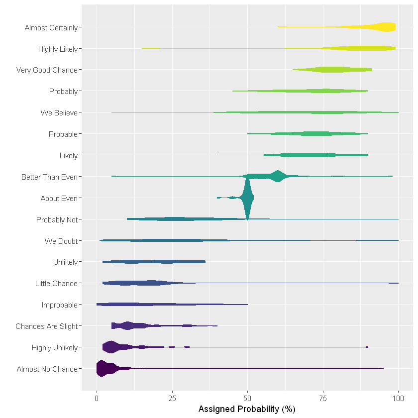
Violin picture
Violin charts are usually a good substitute for box charts as long as the sample size is large enough. It is very close to the box diagram, but it describes the group distribution more accurately by definition. If you have many groups, the violin diagram may not be the best choice, because the display results of each data group in the violin diagram are often very thin, which makes it difficult to imagine its distribution. In this case, a good alternative is the ridge map, which will be further described in this paper.
ggplot(data2,  aes(x=text, y=value, fill=text, color=text)) +
geom_violin(width=2.1, size=0.2) +
scale_fill_viridis(discrete=TRUE) +
scale_color_viridis(discrete=TRUE) +
theme(
  legend.position="none"
) +
coord_flip() +
xlab("") +
ylab("Assigned Probability (%)")
Warning message:
"position_dodge requires non-overlapping x intervals"
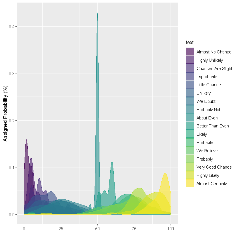
Density map
If there are only a few groups, they can be compared on the same density map. Only four groups were selected to illustrate this idea. If there are more groups, the graphics will become disorganized and difficult to read. This example has also been mentioned earlier, but it is only appropriate when there are few data groups.
# mapping
ggplot(data1, aes(x=value, color=text, fill=text)) +
geom_density(alpha=0.6) +
scale_fill_viridis(discrete=TRUE) +
scale_color_viridis(discrete=TRUE) +
geom_text( data=annot, aes(x=x, y=y, label=text, color=text), hjust=0, size=4.5) +
theme(
  legend.position="none",
  panel.spacing = unit(0.1, "lines"),
  strip.text.x = element_text(size = 8)
) +
xlab("") +
ylab("Assigned Probability (%)")
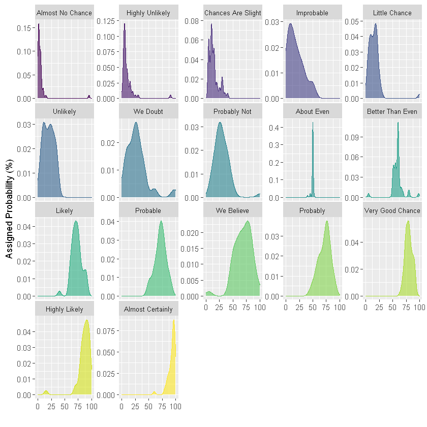
However, if you have more than 4 groups, the drawing becomes too chaotic. If you want to use density graph, it is more appropriate to use grouping subgraph. This is a good way to study the distribution of each group separately. However, because they do not share the same X axis, it is difficult to compare groups together. It all depends on the question you want to answer.
ggplot(data2,aes(x=value, color=text, fill=text)) +
geom_density(alpha=0.6) +
scale_fill_viridis(discrete=TRUE) +
scale_color_viridis(discrete=TRUE) +
theme(
  legend.position="none",
  panel.spacing = unit(0.1, "lines"),
  strip.text.x = element_text(size = 8)
) +
xlab("") +
ylab("Assigned Probability (%)") +
# Group drawing
facet_wrap(~text, scale="free_y")
histogram
The histogram is very close to the density map, and the representation processing method is also similar. Use subgraph. However, the Y scale of the histogram in this example is the same for each group, which is different from the previous example on the density map.
ggplot(data2, aes(x=value, color=text, fill=text)) +
geom_histogram(alpha=0.6, binwidth = 5) +
scale_fill_viridis(discrete=TRUE) +
scale_color_viridis(discrete=TRUE) +
theme(
  legend.position="none",
  panel.spacing = unit(0.1, "lines"),
  strip.text.x = element_text(size = 8)
) +
xlab("") +
ylab("Assigned Probability (%)") +
facet_wrap(~text)

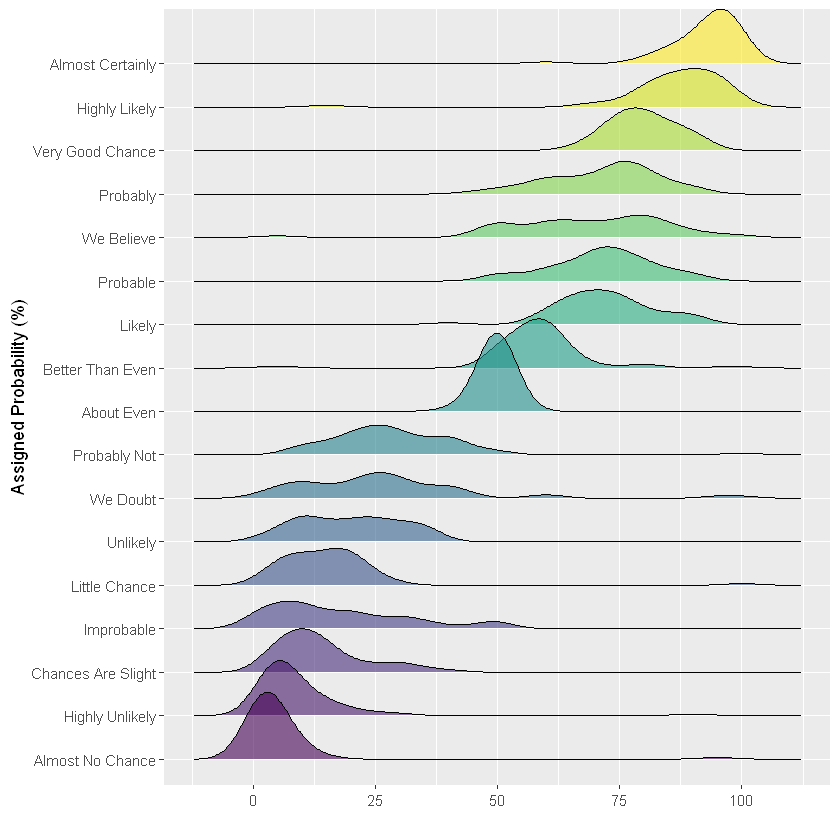
Ridge map
In this example, the best choice may be a ridge map. It has all the advantages of violin diagram, but avoids loose space because there is overlap between groups. It effectively describes the comparison between individual distribution and groups.
# Loading a dedicated drawing library
library(ggridges)

ggplot(data2, aes(y=text, x=value,  fill=text)) +
geom_density_ridges(alpha=0.6, bandwidth=4) +
scale_fill_viridis(discrete=TRUE) +
scale_color_viridis(discrete=TRUE) +
theme(
  legend.position="none",
  panel.spacing = unit(0.1, "lines"),
  strip.text.x = element_text(size = 8)
) +
xlab("") +
ylab("Assigned Probability (%)")