Original link: http://tecdat.cn/?p=24896
Original source: Tuo end data tribal official account
Beautiful circle chart. I'm not sure if there is any additional benefit to the data analyst itself, but if it can attract the attention of decision makers, it is additional value to me.
However, with coord_polar() or coord in ggplot2 found occasionally_ Radar () can be difficult to build. The two main problems I found are that the change of polar coordinates will bend your path into a circle, and the radar can't communicate with geom_bin is used in combination to fill the background.
That's why I usually use it in Cartesian coordinate system. More like a mathematical solution. Map your data and drawing requirements so that they eventually become a circle. As an added benefit, I also found it to build / load faster. It's important to me because I let them interact in Shiny Apps.
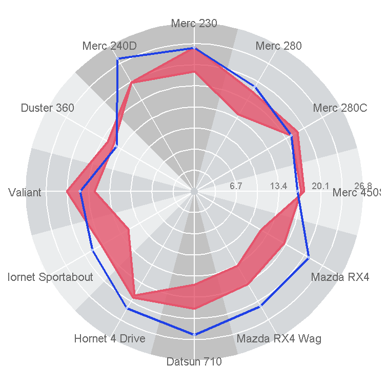
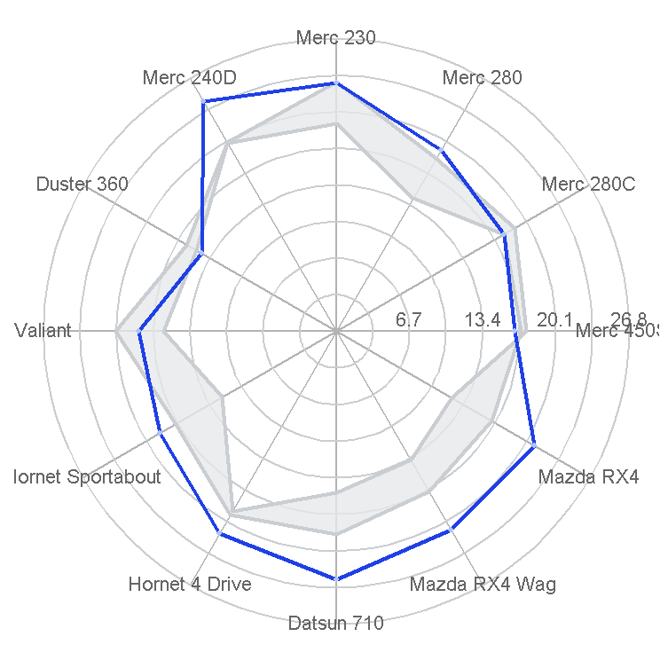
I used mtcars data in my example. The figure shows 12 cars in the collection:
- Cylinder in background. 4. Light, medium and dark colors for cylinders 6 and 8.
- Mark the miles per gallon of each car in blue.
This article is a step-by-step demonstration of how to add the required elements to the circular diagram. Many things may be improved. Please feel free to comment.
I use the first 12 cars and want a column containing row names.
add_rownames[1:12,]
Draw data mapping
To map the values of any column I want to draw, I create a function. It basically checks how many variables you want to plot and plots sinusoids for x and y values.
  lev <- levels
  num <- length

  dir <- rep
  dir_ <- map_dbl
  interp
  data <- mutate_
Store mapping data to map mpg variables for all tags.
# data point
rotate_data
I wanted to show the plot range data, so I forged a series of qsec data. Basically, you generate a data frame with multiple values (rows) for qsec on each vehicle (label).
#Make up some range data
bind_rows
rotate_data
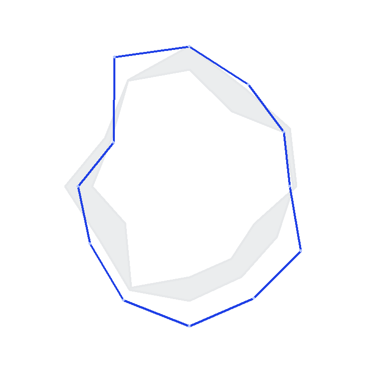
Use polygon to draw the range and path and point to draw the mpg value.
lim <- max
#  Use your own data and aesthetics to draw the pattern of each layer
ggplot() +
  geom_polygon+
  geom_point+
  theme+
  coord_equal
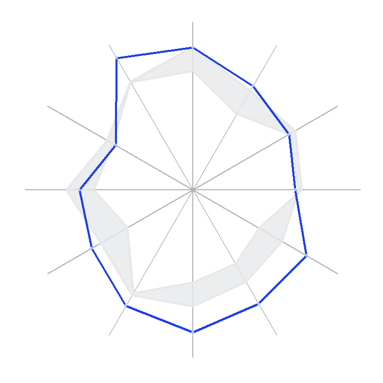
Radial line
I guess the desired grid is made up of circled radial outer lines. Create x, xend, y, and yend data points to draw segments between them.
r <- data_frame %>%
  mutate
r$xed <- 0
r$yed <- 0
#Use your own data and aesthetics to draw the pattern of each layer

ggplot() +
  geom_segment +
  geom_polygon+
  geom_point +
  ylim + xlim +
  theme+
  coord_equal
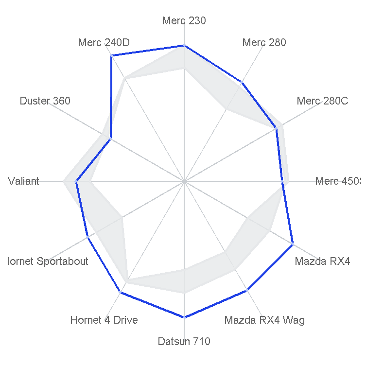
label
Add a text label to the variable you rotate.
label <- levels
ggplot() +
  geom_segment +
  geom_polygon +
  geom_path +
  geom_point +
  geom_text+
  theme +
  coord_equal
Draw a circle
To draw a circle, I'll use a circle with a fill option.
  t <- seq
  d <- data.frame
  if(fed==TRUE) { # #Add a point in the center so that the whole "cake" is filled
    d <- rbind
  }
  return(d)
Grid circles and labels
Circular gridlines are built by calling circle multiple times and storing all points in the data frame.
cregrd <- data_frame
crld <- cili %>%
  mutate

poties <- bind_rows
loics$lv <- as.factor
Circular labels can be added in a number of ways. But in order to simply set all axis text and axis labels to blank, I built a data box that can be drawn using text.
c <- data_frame
cl <- cl[x <= max,]
ggplot() +
  geom_segment +
  geom_path+
  geom_text+
  geom_polygon +
  geom_point +
  geom_text + xlim +
  theme+
  coord_equal
background
With circle, you can also easily build a circular part, which you can fill with the Filled = TRUE parameter. There is a slight - 1/num offset to align the section correctly. Here, you propose the factor variable you want to color. Of course, you can also change the code to change the "height" of each bar according to the variable.
num      <- length
levels   <- rev
tart    <- seq

bg  <- data_frame
  mutate

bgdta <- tdf
bgdta$lv <- as.factor
Center circle
Not much detail, but you may want to add some center circles.
lm <- max
ggplot() +
  geom_polygon+
  geom_segment +
  geom_path+
  geom_text +
  geom_polygon+
  geom_polygon+
  geom_path +
  geom_point +
  geom_text +
  ylim + xlim +
  theme +
  coord_equal

Most popular insights
1.R language dynamic graph visualization: how to create a graph with exquisite animation
2.Visual analysis of R language survival analysis
3.Python data visualization - seaborn Iris iris data
4.The experiment of Bufeng injection (Pufeng injection) is simulated and dynamic with r language
5.R language survival analysis data analysis visualization case
6.r language data visualization analysis case: exploring brfss data analysis