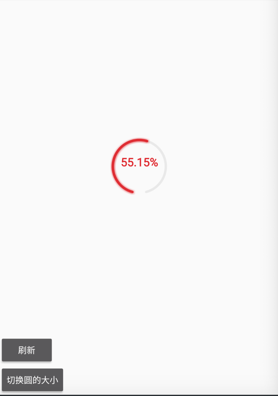
Today, let's implement a custom view progress bar with a gap, with a heartbeat animation effect
Take a look at the effect of the screenshot
When it comes to custom view s, we need to implement the onDraw() method to operate the Canvas parameters it carries, and draw the layout style we want through the drawXXX() series of methods.
How to realize a progress bar with gap down and heartbeat animation?
thinking
1. Draw two hollow fan circles by drawArc() method
The first is an unloaded style, and the second is a progress bar style
 RectF rect = new RectF(left, top, right, bottom);
        canvas.drawArc(rect, startPosition, endPosition, false, paint);
        canvas.save(); // Save it.
        //
        paint.setColor(Color.parseColor(progressColor));
        //paint.setDither(true);
        if(!TextUtils.isEmpty(shadowColor))
        paint.setShadowLayer(shadowSize,1,1,Color.parseColor(shadowColor));
        canvas.drawArc(rect, startPosition, progress, false, paint);
        canvas.save(); // Save it.
It should be noted that the two parameters startposition & endposition are calculated. First, understand canvas The drawarc parameters mean:
The first parameter rect is to determine the position. Several position information parameters of RectF represent:
left = distance from the leftmost view boundary to the leftmost side of the drawing canvas;
top = distance from the boundary of the topmost view view to the topmost edge of the drawing canvas;
right = distance from the boundary of the leftmost view to the rightmost side of the drawing canvas;
Bottom = distance from the boundary of the topmost view view to the bottom of the drawing canvas
The second parameter starts to draw the angle of the sector. This angle is 0 in the 3 o'clock direction, rotates 360 degrees clockwise, and then returns to the 3 o'clock direction.
The third parameter is the angle at which the sector ends.
The fourth parameter is whether to draw a line to connect with the center point, which is easy to understand.
The fifth parameter is brush paint, which is specially used to set some brush attributes.
Now let's calculate the position of the notch. The calculation method is also very simple. Assuming that our notch size is 30 degrees and the notch position is vertically downward, we need to determine that the vertical downward angle is 90 degrees, That is, in the 6 o'clock direction (3 o'clock is the starting position and 90 degrees to 6 o'clock). This line divides the gap we need to show into two, and the left and right sides account for 15 degrees respectively. Then the calculation method of the starting fan position is 90.0f + (30/2). After determining the position of starting to draw the sector, we can calculate the angular position of ending the sector. The size of the gap is 30 degrees. Drawing 360 degrees clockwise from 105 degrees is a complete circle. Of course, we don't need a complete circle, so we use 360 degrees to subtract the size of the gap, which is the end position of the gap.
Through calculation, the following methods can be provided to throw out the method of setting the notch size.
   /**
     *  Calculate notch position
     * @param gap
     */
    private void setGapPosition(float gap){
        startPosition = 90.0f + (gap/2);
        endPosition = 360 - gap;
    }
Idea: realize heartbeat animation by changing the radius of the circle
In the onDraw() method, first determine the radius of the circle. Here (l+levelOffset) represents the dynamic calculation of the radius of the circle. To realize the heartbeat animation, you must dynamically change the radius of the circle.
float r = getMeasuredWidth() / (l+levelOffset)-5; //
"l" in (l+levelOffset) is the level size of the circle, the lowest level is 2, and 2 is the largest circle. It is as large as the layout. The larger the level, the smaller the circle drawn:
    // The size of the circle is the minimum size by default
    private int level = XXXXXX;
    // XX = control / 2 = radius of circle
    public static final int XX = 2;
    // XXX = control / 3 = radius of circle
    public static final int XXX = 3;
    // XXXX = control / 4 = radius of circle
    public static final int XXXX = 4;
    // XXXXX = control / 5 = radius of circle
    public static final int XXXXX = 5;
    // XXXXXX = control / 6 = radius of circle
    public static final int XXXXXX = 6;
    // Modify the width of the brush and the thickness of the progress bar
Calculation method of levelOffset:
   /**
     *  Calculate offset / dynamically control the size of the circle
     */
    public void reconOffset(){
        if(isStarAnimation){
            if(levelOffset <= 0f || isAdd){
                // increase
                isAdd = true;
                levelOffset +=0.02f;
                if(levelOffset>=0.3)isAdd=false;
            }else if(levelOffset>=0f && !isAdd){
                //reduce
                isAdd = false;
                levelOffset -=0.02f;
            }
        }else{
            levelOffset = 0;
        }
    }
The above describes the implementation ideas and calculation methods. For the reconOffset() method, you can try to modify the value and run to see what the effect is.
The complete code is as follows:
package com.gongjiebin.drawtest;

import android.content.Context;
import android.graphics.Canvas;
import android.graphics.Color;
import android.graphics.Paint;
import android.graphics.RectF;
import android.os.Handler;
import android.os.Message;
import android.text.TextUtils;
import android.util.AttributeSet;
import android.util.TypedValue;
import android.view.View;

import java.text.DecimalFormat;

/**
 * @author gongjiebin
 */
public class JJumpProgress extends View {

    public JJumpProgress(Context context) {
        super(context);
        initView();
    }

    public JJumpProgress(Context context, AttributeSet attrs) {
        super(context, attrs);
        initView();
    }

    public JJumpProgress(Context context, AttributeSet attrs, int defStyleAttr) {
        super(context, attrs, defStyleAttr);
        initView();
    }


    @Override
    protected void onLayout(boolean changed, int left, int top, int right, int bottom) {
        super.onLayout(changed, left, top, right, bottom);

    }


    public void initView(){
        setGapPosition(this.gap);
    }

    @Override
    protected void onMeasure(int widthMeasureSpec, int heightMeasureSpec) {
        super.onMeasure(widthMeasureSpec, heightMeasureSpec);

        /**
         *  Get the width mode of the view
         *  Value - measurespec The size of unspecified view is unlimited and can be any size
         *  Value - measurespec The current size of exctly is the size of view, which is equivalent to match_ This is also true if parent is a specific value
         *  Value - measurespec AT_ The size that most view can take cannot exceed the current value, which is equivalent to wrap_content
         */
//        int widthSize = getSize(100, widthMeasureSpec);
        int heightSize = getSize(200, heightMeasureSpec);

        int widthSize = getDefaultSize(getSuggestedMinimumWidth(),widthMeasureSpec);
        int heightSize = getDefaultSize(getSuggestedMinimumHeight(),heightMeasureSpec);
//        int widthSize =  MeasureSpec.getSize(widthMeasureSpec);
//        int heightSize = MeasureSpec.getSize(heightMeasureSpec);
        // Log.i("GJB", "widthSize=" + widthSize + "  heightSize=" + heightSize);

        // Fill size
        setMeasuredDimension(widthSize, heightSize);

    }


    /**
     * Get the final width of the control through the default value and widthmeasurespec / hightmeasurespec
     *
     * @param defSize Default value
     */
    public int getSize(int defSize, int measureSpec) {
        /**
         *  Get the control size. Determine mode
         */
        int widthModel = MeasureSpec.getMode(measureSpec);

        int size = defSize;
        switch (widthModel) {
            case MeasureSpec.UNSPECIFIED: //Fill the layout.
                // No size specified. The default size is used
                size = defSize;
                break;
            case MeasureSpec.EXACTLY:
                size = MeasureSpec.getSize(measureSpec);
                break;
            case MeasureSpec.AT_MOST:// Content package
                // If the size is specified, return the specified size - fixed value, and also take the size of the current view
                size = MeasureSpec.getSize(measureSpec);

        }

        return size;
    }


    /**
     * progress bar
     */
    private float progress = 0f;
    // Notch end position
    private float endPosition;
    // Notch start position
    private float startPosition;
    // Progress text
    private String progressTxt = "";
    // Offset
    private float offset = 5f;
    // Gap. Set the size of the circular notch, 30 degrees by default
    private float gap = 30;
    // Color #000000 of progress bar - hexadecimal representation
    private String progressColor;
    // Color of progress bar #000000 - color of background circle
    private String bg_color;
    // The color of the shadow
    private String shadowColor;
    // The size of the shadow
    private float shadowSize = 5;
    // Font color -- the default is black.
    private String textColor = "#000000";
    // Default display percentage / false do not display
    private boolean isShowPercentage;
    // font size
    private float textSize;

    // The size of the circle is the minimum size by default
    private int level = XXXXXX;
    // Level animation offset
    private float levelOffset=0;
    // XX = control / 2 = radius of circle
    public static final int XX = 2;
    // XXX = control / 3 = radius of circle
    public static final int XXX = 3;
    // XXXX = control / 4 = radius of circle
    public static final int XXXX = 4;
    // XXXXX = control / 5 = radius of circle
    public static final int XXXXX = 5;
    // XXXXXX = control / 6 = radius of circle
    public static final int XXXXXX = 6;
    // Modify the width of the brush and the thickness of the progress bar
    private float strokeWidth=10;

    public void setStrokeWidth(float strokeWidth) {
        this.strokeWidth = strokeWidth;
    }

    private boolean isStarAnimation;

    public boolean isStarAnimation() {
        return isStarAnimation;
    }

    public void setStarAnimation(boolean starAnimation) {
        isStarAnimation = starAnimation;
    }

    public void setLevel(int level) {
        this.level = level;
    }


    public void setProgressTxt(String progressTxt) {
        this.progressTxt = progressTxt;
    }

    public int getLevel() {
        return level;
    }

    public void setTextSize(int textSize) {
        this.textSize = textSize;
    }

    public void setShowPercentage(boolean percentage) {
        this.isShowPercentage = percentage;
    }


    public void setTextColor(String textColor) {
        this.textColor = textColor;
    }

    public void setShadowSize(float shadowSize) {
        this.shadowSize = shadowSize;
    }

    public void setShadowColor(String shadowColor) {
        this.shadowColor = shadowColor;
    }

    public void setBg_color(String bg_color) {
        this.bg_color = bg_color;
    }

    public void setProgressColor(String progressColor) {
        // Turn off hardware acceleration
        setLayerType(LAYER_TYPE_SOFTWARE, null);
        this.progressColor = progressColor;
    }

    public void setGap(float gap) {
        this.gap = gap;
        setGapPosition(this.gap);
    }


    /**
     *  Toggles the size of the circle
     * @param level
     */
    public void changeLevel(int level){
        this.setLevel(level);
        // Do not animate when switching
        this.setStarAnimation(false);

        // Refresh Ui
        invalidate();
    }


    /**
     *  Calculate notch position
     * @param gap
     */
    private void setGapPosition(float gap){
        startPosition = 90.0f + (gap/2);
        endPosition = 360 - gap;
    }

    /**
     *  Set the offset for each.. The smaller the animation, the slower the execution, and the larger the animation, the faster the execution
     * @param offset
     */
    public void setOffset(float offset) {
        this.offset = offset;
    }


    /**
     * Set progress
     *
     * @param progress Value: 0-100
     */
    public void setProgress(final float progress) {
        // Calculate current value
        this.progress = endPosition / 100 * progress;
        //Refresh view
        invalidate();
    }


    /**
     * Animated execution
     *
     * @param progress Progress bar position to be reached
     */
    public void animationSetProgress(float progress) {
        // Convert to values that can be recognized by view
        float jd = progress * (endPosition / 100);
        if(jd == 0){
            setProgress(jd);
        }else{
            animationStart(jd, this.offset,progress);
        }
    }


    /**
     * @param progress Progress bar position to be reached
     */
    public void animationSetProgress(float progress,boolean isStarAnimation) {
        this.setStarAnimation(isStarAnimation);
        this.animationSetProgress(progress);
    }


    /**
     *  Change text
     * @param offset
     */
    public void setTextCenter(float progress,float offset,float thasProgress){
        if(!isShowPercentage)return;
        //Log.i("TAG",isShowPercentage+"");
        float b =  (offset / progress * thasProgress);
        DecimalFormat df = new DecimalFormat("#.00");
        String t = df.format(b);
        progressTxt = t+"%";
    }

    /**
     * @param progress Overall progress
     * @param offset   Offset the angle of each offset
     */
    private void animationStart(final float progress, float offset,float thasProgress) {
        // Get percentage
        float tPro =  (offset / progress * thasProgress);
        if(offset == progress){
            this.progress = offset;
            setTextCenter(progress,offset,thasProgress);
            invalidate();
            isStarAnimation = false;
            if(onChangeListener!=null)onChangeListener.onProgress(tPro);
            return;
        }

        // Conversion percentage.
        if(offset >= progress){
            // modify parameters
            offset = progress;
            this.progress = offset;
            setTextCenter(progress,offset,thasProgress);
        }else{
            this.progress = offset;
            setTextCenter(progress,offset,thasProgress);
           //("GJB","offset" + offset +"progress =" +progress);
            offset+=this.offset;
        }
        //
        if(onChangeListener!=null)onChangeListener.onProgress(tPro);
        invalidate();
        Message message = new Message();
        float[] sets = new float[]{progress,offset,thasProgress};
        message.obj = sets;
        handler.sendMessage(message);
    }

   Handler handler = new Handler(new Handler.Callback() {
       @Override
       public boolean handleMessage(Message msg) {
           float set[] = (float[]) msg.obj;
           animationStart(set[0],set[1],set[2]);
           return false;
       }
   });


    public boolean isAdd = true;

    /**
     *  Calculate offset / control circle size
     */
    public void reconOffset(){
        if(isStarAnimation){
            if(levelOffset <= 0f || isAdd){
                // increase
                isAdd = true;
                levelOffset +=0.02f;
                if(levelOffset>=0.3)isAdd=false;
            }else if(levelOffset>=0f && !isAdd){
                //reduce
                isAdd = false;
                levelOffset -=0.02f;
            }
        }else{
        //No animation required
            levelOffset = 0;
        }
    }


    @Override
    protected void onDraw(Canvas canvas) {
        super.onDraw(canvas);

        float l = Float.valueOf(level);
        // Calculate the offset size of the radius
        this.reconOffset();
        // Calculate the radius of the circle
        float r = getMeasuredWidth() / (l+levelOffset)-5; //
      //  Log.i("GJB","r = "+r + " levelOffset" + levelOffset);
        // Middle position of x coordinate
        int c_x = getLeft() + (getMeasuredWidth() / 2);
        // Middle position of y coordinate
        int c_y = getTop() + (getMeasuredHeight() / 2);

        // Create brush
        Paint paint = new Paint();
        // Brush color-
        paint.setColor(Color.parseColor(bg_color));
        // **When the drawing style is, setStrokeJoin is used to specify the line connection corner style: equivalent to fillet
        //paint.setStrokeJoin(Paint.Join.ROUND);
        // The shape of the brush paint Cap. Round, cap Square party
        paint.setStrokeCap(Paint.Cap.ROUND);
        //Brush style. Paint.Style.STROKE is a line. Paint.Style.FILL starts from the starting point. Until the end, a fan-shaped drawing area is formed. Paint.Style.FILL_AND_STROKE is the sector plus a circle
        paint.setStyle(Paint.Style.STROKE); // hollow
        paint.setStrokeWidth(strokeWidth);
        paint.setAntiAlias(true); // Set the value of sawtooth effect to true

        // Draw a red circle in the middle of the hollow
        float left = c_x - r;
        float top = c_y - r;
        float right = c_x + r;
        float bottom = c_y + r;
        // RectF - left is calculated from the left boundary to the leftmost position of the sector,
        // RectF -right is calculated from the left boundary to the rightmost position of the sector
        // RectF -top is calculated from the top boundary to the uppermost edge of the sector
        // RectF -bottom is calculated from the top boundary to the lowest edge of the sector
        RectF rect = new RectF(left, top, right, bottom);
        canvas.drawArc(rect, startPosition, endPosition, false, paint);
        canvas.save(); // Save it.
        //
        paint.setColor(Color.parseColor(progressColor));
        //paint.setDither(true);
        if(!TextUtils.isEmpty(shadowColor))
        paint.setShadowLayer(shadowSize,1,1,Color.parseColor(shadowColor));
        canvas.drawArc(rect, startPosition, progress, false, paint);
        canvas.save(); // Save it.


        if(!TextUtils.isEmpty(progressTxt)){
            // Draw a text at the center of the circle.
            Paint textPaint = new Paint();
            // Brush color

            textPaint.setColor(Color.parseColor(textColor));
            textPaint.setAntiAlias(true); // Set the value of sawtooth effect to true
            // The font size of the calculated textView changes with the layout
            float thasSize = 0;
            if(textSize == 0){
                thasSize = r / 6;
            }else{
                thasSize = textSize;
            }
           // Log.i("TAG",progressTxt+" progressTxt");
            textPaint.setTextSize(sp2px(thasSize));

            // Bold font
            textPaint.setFakeBoldText(true);
            // Measure the width of the text
            float textSize = textPaint.measureText(progressTxt); // Measure text size
            float center = c_x - (textSize/2);
            /**
             * Where y represents the coordinates of the baseline of the text. In other words, it is the kind of book with horizontal lines used for writing in our primary school (it is usually written according to a baseline, isn't it?),
             * It is used to standardize whether your words are in a straight line, otherwise many people will float upward. The x coordinate is the starting horizontal coordinate of text drawing, but there is a certain gap on both sides of each text itself,
             * Therefore, the position of the actual text will be more to the right than the position of x.
             */
            canvas.drawText(progressTxt,center,c_y,textPaint);
            canvas.save();
        }
    }


    private int sp2px(float spValue) {
        return (int) TypedValue.applyDimension(TypedValue.COMPLEX_UNIT_SP, spValue, getResources().getDisplayMetrics());
    }


    private OnChangeListener onChangeListener;

    public void setOnChangeListener(OnChangeListener onChangeListener) {
        this.onChangeListener = onChangeListener;
    }

    public interface OnChangeListener{
        /**
         *  Current progress callback
         * @param progress
         */
        void onProgress(float progress);
    }
}
The complete code of MainActivity is as follows (usage method)
package com.gongjiebin.drawtest;

import androidx.appcompat.app.AppCompatActivity;

import android.os.Bundle;
import android.view.LayoutInflater;
import android.view.View;
import android.view.ViewGroup;
import android.widget.Button;

public class MainActivity extends AppCompatActivity {

    private JJumpProgress jumpProgress;

    private Button btn_pull;

    private Button btn_level;


    @Override
    protected void onCreate(Bundle savedInstanceState) {
        super.onCreate(savedInstanceState);
        ViewGroup rootView = (ViewGroup) LayoutInflater.from(getBaseContext()).inflate(R.layout.activity_main, null);
        setContentView(rootView);

        btn_pull = rootView.findViewById(R.id.btn_pull);
        btn_level = rootView.findViewById(R.id.btn_level);


        jumpProgress = rootView.findViewById(R.id.dv_jd);
        jumpProgress.setGap(30f);// Set the size of the notch.
        jumpProgress.setOffset(5f); // The higher the value, the faster the animation effect
        jumpProgress.setBg_color("#E9E9E9");
        jumpProgress.setProgressColor("#FFDF2C32");
        jumpProgress.setShadowColor("#FFDF2C32");
        jumpProgress.setShadowSize(8);
        jumpProgress.setShowPercentage(true);
//        dv_jd.setTextSize(8);
        jumpProgress.setTextColor("#FFDF2C32");
//        dv_jd.setStrokeWidth(20);
        btn_pull.setOnClickListener(new View.OnClickListener() {
            @Override
            public void onClick(View v) {
                jumpProgress.animationSetProgress(100f, true);
            }
        });

        btn_level.setOnClickListener(new View.OnClickListener() {
            @Override
            public void onClick(View v) {
                int level = jumpProgress.getLevel();
                if (level == JJumpProgress.XX) {
                    level = JJumpProgress.XXX;
                } else if (jumpProgress.getLevel() == JJumpProgress.XXX) {
                    level = JJumpProgress.XXXX;
                } else if (jumpProgress.getLevel() == JJumpProgress.XXXX) {
                    level = JJumpProgress.XXXXX;
                } else if (jumpProgress.getLevel() == JJumpProgress.XXXXX) {
                    level = JJumpProgress.XXXXXX;
                } else if (jumpProgress.getLevel() == JJumpProgress.XXXXXX) {
                    level = 10;
                } else if (jumpProgress.getLevel() == 10) {
                    level = 15;
                } else if (jumpProgress.getLevel() == 15) {
                    level = JJumpProgress.XX;
                }

                // Toggles the size of the progress bar circle
                jumpProgress.changeLevel(level);
            }
        });

        initListener();
    }


    public void initListener() {
        jumpProgress.setOnChangeListener(new JJumpProgress.OnChangeListener() {
            @Override
            public void onProgress(float progress) {
                // The text you want to display can be displayed here. If you have enabled the default opening percentage, please close it first. setShowPercentage(false)
//                float price = progress / 100 * countPrice;
//                Log.i("TAG", "text=" + price + "progress =" + progress);
//                DecimalFormat df = new DecimalFormat("#.0");
//                String t = df.format(price);
//                dv_jd.setProgressTxt("¥" + t);
            }
        });
    }

    @Override
    protected void onResume() {
        super.onResume();
        // 90% complete.
        jumpProgress.animationSetProgress(90f, true);
    }


    @Override
    protected void onPause() {
        super.onPause();
    }
}
Use in XML:
  <com.gongjiebin.drawtest.JJumpProgress
        android:id="@+id/dv_jd"
        android:layout_width="wrap_content"
        android:layout_height="wrap_content"
/>
It should be noted that when using, you can look at the comments in the code and write them clearly. For example, for some parameter settings, just find the corresponding set method.
 //speed of progress
    private float progress = 0f;
    // Notch end position
    private float endPosition;
    // Notch start position
    private float startPosition;
    // Progress text
    private String progressTxt = "";
    // Offset
    private float offset = 5f;
    // Gap. Set the size of the circular notch, 30 degrees by default
    private float gap = 30;
    // Color #000000 of progress bar - hexadecimal representation
    private String progressColor;
    // Color #000000 of background circle - hexadecimal representation
    private String bg_color;
    // Shadow color #000000 - hexadecimal representation
    private String shadowColor;
    // The size of the shadow
    private float shadowSize = 5;
    // Font color -- the default is black.
    private String textColor = "#000000";
    // Default display percentage / false do not display
    private boolean isShowPercentage;
    // font size
    private float textSize;
    // The size of the circle is the minimum size by default
    private int level = XXXXXX;
    // Modify the width of the brush and the thickness of the progress bar
    private float strokeWidth=10;
The text in the middle is displayed as a percentage by default. If you want to display other text, you need to set it as follows.
jumpProgress.setShowPercentage(false);
Monitoring method for dynamically changing text
jumpProgress.setOnChangeListener(new JJumpProgress.OnChangeListener() {
            @Override
            public void onProgress(float progress) {
                // The text you want to display can be displayed here. If you have enabled the default opening percentage, please close it first. setShowPercentage(false)
                float price = progress / 100 * countPrice;
                Log.i("TAG", "text=" + price + "progress =" + progress);
                DecimalFormat df = new DecimalFormat("#.0");
                String t = df.format(price);
                jumpProgress.setProgressTxt("¥" + t);
            }
        });
explain
For the setting of textSize, if this parameter is set, the font animation effect will disappear. If not set, it will change according to the size of the progress bar. The animation effect of this view is suitable for the situation where the percentage is known (similar to viewing today's steps and displaying Statistics). When the progress bar that needs to update data in real time is not suitable for this animation, or the effect is not very good, but we can call setProgress to complete the update, but there will be no heartbeat animation.
   /**
     * Set progress
     *
     * @param progress Value: 0-100
     */
    public void setProgress(final float progress) {
        // Calculate current value
        this.progress = endPosition / 100 * progress;
        //Refresh view
        invalidate();
    }