Basic framework
<?xml version="1.0" encoding="utf-8"?>
<LinearLayout xmlns:android="http://schemas.android.com/apk/res/android"
    android:layout_width="match_parent"
    android:layout_height="match_parent"
    android:orientation="vertical">

    <Button
        android:layout_width="200dp"
        android:layout_height="100dp"/>

</LinearLayout>
Basic properties
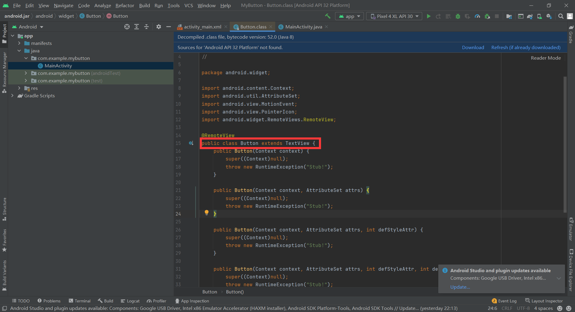
In the above xml file, Ctrl + left click Button. You can see that this class inherits from the TextView class, that is, everything mentioned in the TextView section can be used on the Button.
Text and background
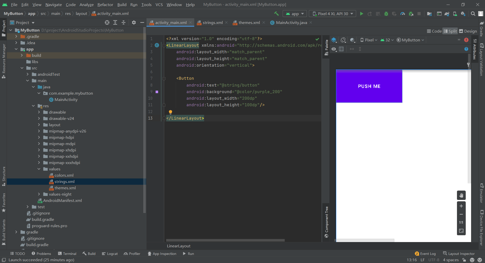
Here, we simply set the text on the button to "Push Me" and the background color to purple (these two resources are saved in three xml files in the values folder), but it is strange that the text is forcibly converted to uppercase, and setting the background is invalid.
Subject modification
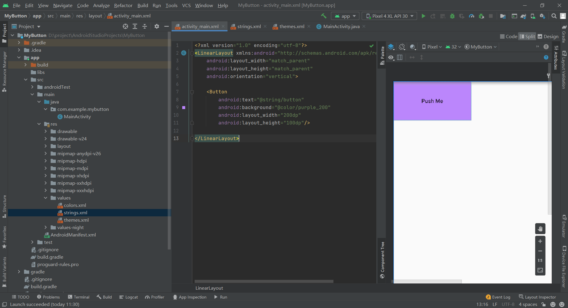
The problem lies in the theme file themes XML, we need to enter the file and set textAllCaps to false to cancel forced capitalization, that is, add the following code:
<item name="textAllCaps">true</item>
Then we also need to transfer the basic theme file from
<style name="Theme.MyButton" parent="Theme.MaterialComponents.DayNight.DarkActionBar">
Change to
<style name="Theme.MyButton" parent="Theme.MaterialComponents.DayNight.DarkActionBar.Bridge">
This allows our settings to take effect:
Although the basic properties of the button are set, now the button looks no different from TextView, and there is no response to clicking. Next, we will set the click effect.
Click effect
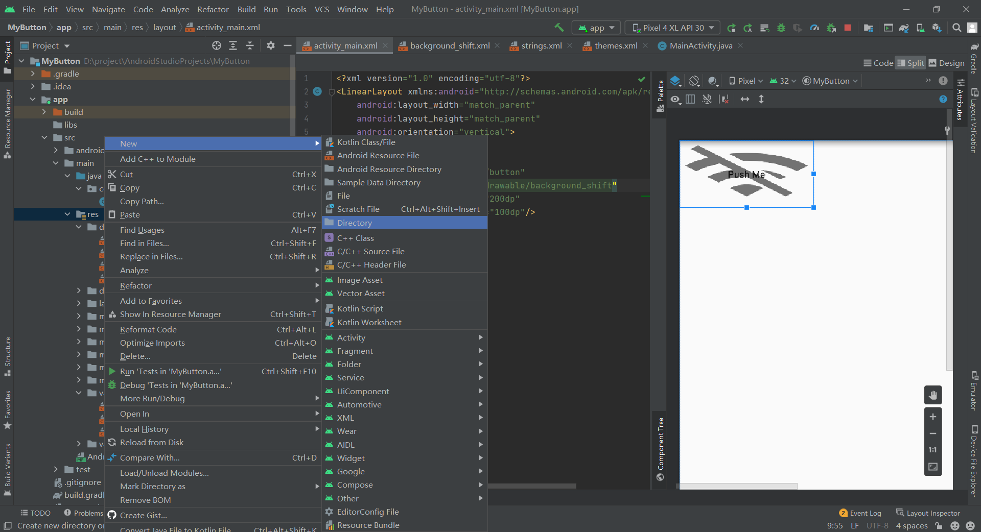
The main effect of this implementation is that the background of the button will be changed after clicking, so we create a new Drawable Resource file named background under res - > drawable folder_ shift. As you can see, the root node of the file is the image selector selector.
Picture transformation
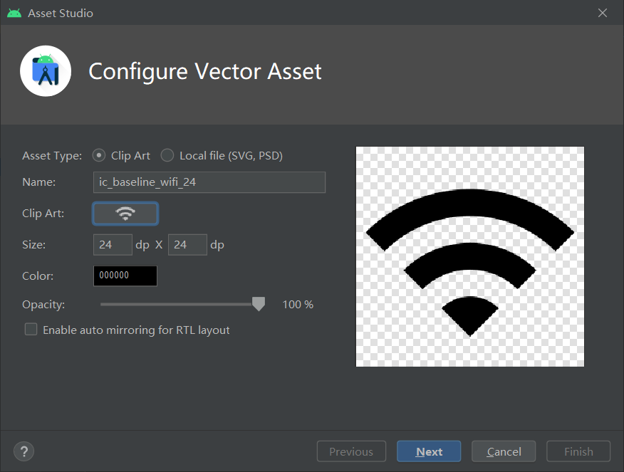
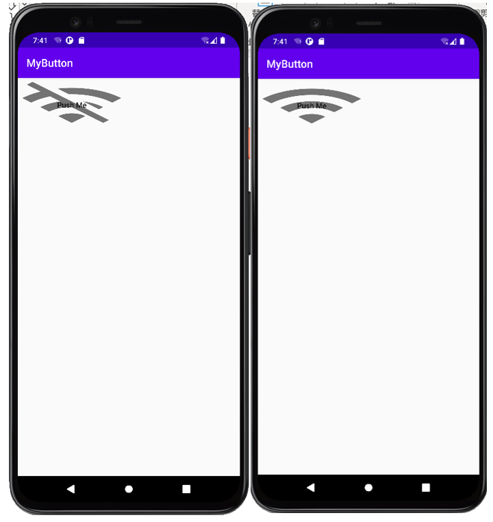
Then we add some image resources, click res, right-click new - > vector asset, enter the interface, click Clip Art and select a favorite Icon. For example, I chose WiFi:
At the same time, I imported another WiFi off icon.
After importing, you can use the background_ It is used in the shift file. Here I use state_ The pressed setting displays WiFi when pressed and WiFi off when not pressed. The code is as follows:
<?xml version="1.0" encoding="utf-8"?>
<selector xmlns:android="http://schemas.android.com/apk/res/android">

    <item android:drawable="@drawable/ic_baseline_wifi_24" android:state_pressed="true"/>
    <item android:drawable="@drawable/ic_baseline_wifi_off_24" android:state_pressed="false"/>

</selector>
Write the background_shift.xml, you can_ main. XML, setting the background attribute of the Button to this resource can realize the background transformation.
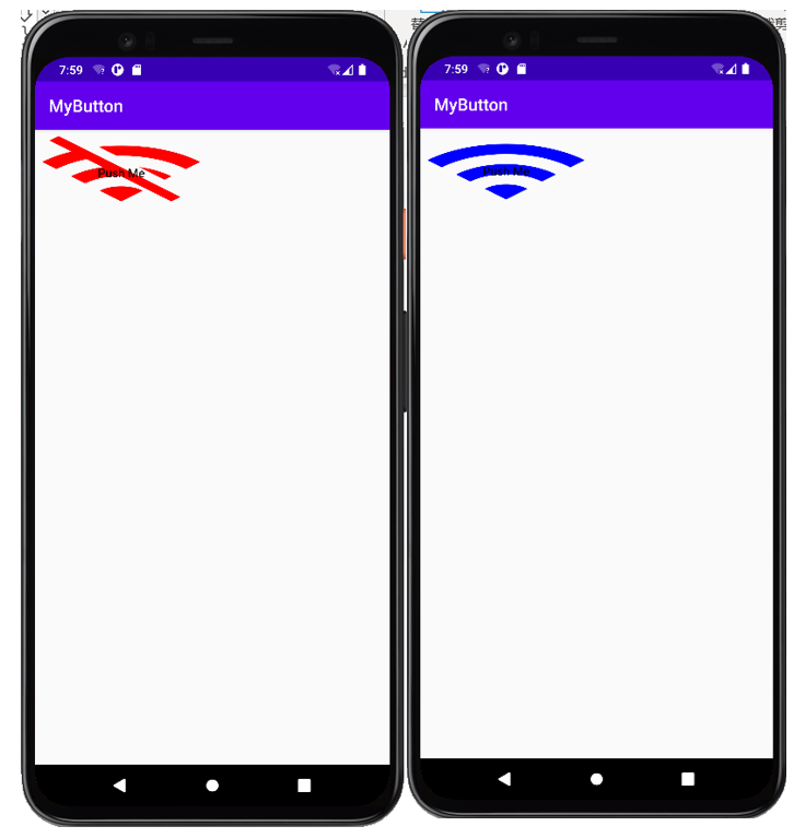
Color transformation
Color transformation is similar to image transformation, except that resources are stored in different locations. In the res folder, we create a new color folder, right-click rec, and create a new folder in New - > directory, named color
Then create a Drawable Resource file in color, and set it to blue when pressed, and the default is red:
<?xml version="1.0" encoding="utf-8"?>
<selector xmlns:android="http://schemas.android.com/apk/res/android">

    <item android:color="#ff0000ff" android:state_pressed="true"/>
    <item android:color="#ffff0000"/>

</selector>
With this color transformation file, we can_ main. Set the backgroundTint of the Button as the resource in XML to realize color transformation.
In addition to the background color, there is also the foreground foreground color. This is the top color, which will cover the whole layer. It is not commonly used.