"Brother, I heard you wrote a lot of pages. I have a page here. How much code do you think you need?"
"Let me see. It's OK. It's just a query form. Now everyone uses ProComponent. Write it quickly with that. I think it's about 200 lines."
"Well, I know, the official secondary packaging component library, 200 lines is OK? Well, yes. Wait, does the code you said include operation buttons?"
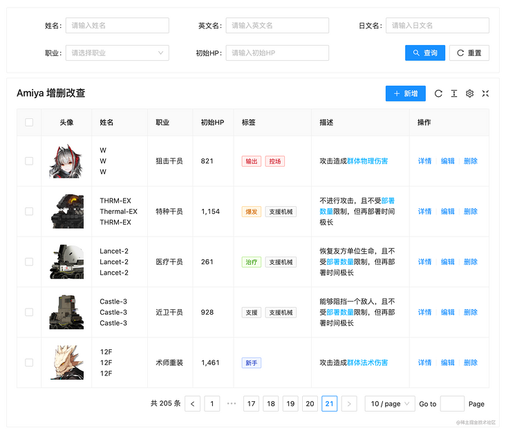
"Operation buttons" refer to the [add] and [details] buttons on your diagram? "
"Yes."
"What does it look like after ordering? You didn't show it to me!"
"Oh, almost like this."
"Oh, well, it's simple. It's just a pop-up form. If you hang up, add another 100."
"What about [delete]?"
"That's it. 10 lines will be done."
"Ha ha, don't worry, there are batch deletion!"
"Oh, it's not too difficult. Most of them are the APIs that come with the form. After deleting and refreshing the form request, it's done. It's just to record the options. I think it's almost enough to give another 10 lines. But I think there's a bar at the bottom of the page after you check it. Delete in batch" It's interesting to put the button there, but it's not too difficult. I think it's almost the same with another 20 lines. "
"Ha ha, yes, I calculate. It's almost 340."
"Yes, it's normal to write such a page."
"What if you still keep the option of the previous page after turning the page?"
"Well, who can do this now? These are ready-made components. You don't think it's troublesome. I think it's troublesome, and it's not necessary. Whoever you love will do it."
"Just say if you can!"
"You are deliberately finding fault, aren't you? Besides, it's not difficult. Doesn't the antd table have a preserveSelectedRowKeys attribute? I think you can use that to implement it, or listen to the selection events of the table and save a variable. It's really not good. Just click the page to delete it individually. It's not much trouble."
"It's really unnecessary to say so, but I think it's better. If you want to delete more than one, you always need to delete more times each time. Moreover, after deleting, the data is not gone. Then the data on the second page will run to the first page and worry about whether you will delete it wrong."
"It's OK. As long as you're not tired, you can write it. I don't think it's anything. If you really want to do it, just use that api. Add another 20 at most."
"Oh! By the way, I forgot to say that you can see the options when this number is suspended."
"... you're playing pretty well. You have all the data. Just make a Popover set."
"Yes, in that case, there are almost 400 lines of code."
"Well, you need more, almost."
"Haha, I spent a total of 134 lines of code on this page. Do you think it is feasible
"??? how did you do it? Show me“
"I looked at it. It's interesting. This component uses a large json to transfer the configuration. Isn't it? This kind of encapsulation is quite common."
"Yes, you see, this is one of the fragments. For the query at the top of the table, you only need to specify search: true."
{
  title: 'English name',
  key: 'en'
  search: true
}
"Well, I think there's a placeholder on it. Why didn't I see you pass it in?"
"Oh, that's automatically generated. Like here," please enter your English name "will be generated."
"What if you want to customize it?"
"Of course, you can. It needs to be written like this."
{
  title: 'English name',
  key: 'en'
  search: {
    placeholder: 'Please enter your English name'
  }
}
"Oh ~ this can also be an object, right? What if it's a selection box?"
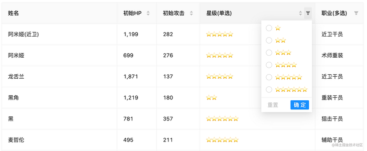
"It's also simple. Just add options and type: 'select'."
{
  title: 'occupation',
  key: 'class',
  type: 'select',
  options: [
    { label: 'Guard officer', value: '1' },
    { label: 'Sniper', value: '2' },
    { label: 'Surgeon reassembly', value: '3' },
    { label: 'Medical officer', value: '4' },
    { label: 'Reloading agent', value: '5' },
    { label: 'Assistant Officer', value: '6' },
    { label: 'Special agent', value: '7' },
    { label: 'Pioneer', value: '8' }
  ],
  search: true
}
"Why didn't you put your options and type s in the search object?"
"Ha ha, you don't know that, because if it is written like this, the table can also use this configuration. If it is written in the search object, it can only be used by the query area itself."
"This configuration can also be used for tables. What's the use of these two tables?"
"The column of the table can be translated through options. If the data is a 1, then this column will find the label according to options. At this time, the corresponding label is the guard, so the guard is displayed on the page. In addition, if the table has a filter, add filter: true, and the filter will appear."
"Yes, it's quite convenient. What about the type? You can't use this form."
"Yes, this is actually used for dialog pop-up editing. In this way, a selection box can be displayed in the pop-up window."
{
  title: 'occupation',
  key: 'class',
  type: 'select',
  options: [
    { label: 'Guard officer', value: '1' },
    { label: 'Sniper', value: '2' },
    { label: 'Surgeon reassembly', value: '3' },
    { label: 'Medical officer', value: '4' },
    { label: 'Reloading agent', value: '5' },
    { label: 'Assistant Officer', value: '6' },
    { label: 'Special agent', value: '7' },
    { label: 'Pioneer', value: '8' }
  ],
  search: true,
+ dialog: true
}
"Oh! I see. After specifying dialog: true, it will be displayed in the pop-up window, right?"
"Yes, what if it is only displayed in the pop-up window and the form is not displayed?"
"That's OK. Just specify table: false."
{
title: 'occupation',
key: 'class',
type: 'select',
options: [
{ label: 'Guard officer', value: '1' },
{ label: 'Sniper', value: '2' },
{ label: 'Surgeon reassembly', value: '3' },
{ label: 'Medical officer', value: '4' },
{ label: 'Reloading agent', value: '5' },
{ label: 'Assistant Officer', value: '6' },
{ label: 'Special agent', value: '7' },
{ label: 'Pioneer', value: '8' }
],
dialog: true,
+ table: false
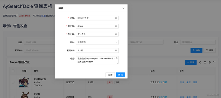
}"I see. This is a combination of pop-up window, table and query, right? By the way, why don't I see the new code to open pop-up window?"
"Well, you need to add some code. Just pass addApi as the request interface and specify action="add "
<AySearchTable
  title="Amiya Add, delete, modify and check"
  dialogFormExtend={{
    fields: fields,
    addApi
  }}
>
  <AyAction action="add">newly added</AyAction>
</AySearchTable>
"That's ok? Why? It's so difficult that you don't need to listen to the button click event, then control the pop-up display, then request the interface, and then close the pop-up window to refresh the page?"
"Yes, it is assumed that the pop-up window and the table share the same configuration by default, and most pop-up window additions are the same, so encapsulate all operations and there is only so much left. Of course, if it is too complex or there are no columns that can be shared with the table, define another 'fields: dialogFields', which is completely separated from the table and uses two fields, each with its own Yes. "
"Oh, yes, I understand. The same is true for modification."
"Yes, there will be default values when editing. At this time, we can transfer record as the default value of the form."
const ctrl: AyTableCtrlField = {
  render: (value: string, record: Record) => {
    return (
      <AyCtrl>
        <AyAction record={record} action="update">
          edit
        </AyAction>
      </AyCtrl>
    )
  }
}

<AySearchTable
  title="Amiya Add, delete, modify and check"
  dialogFormExtend={{
    fields: fields,
    addApi
  }}
/>
"Yes, yes! This component turns common operations into instructions."
"Yes, if your details need the request interface, you don't need to record. After deletion, it is changed to detailApi and detailParams, which are the requested interface and requested parameters respectively. The action="view "instruction will automatically take the data returned by the request as the default value of the form after opening the pop-up window."
<AyAction detailParams={record.sort_id} detailApi={detailApi} action="view">details</AyAction>"I see. It's great! By the way, you just mentioned paging deletion. Is it easy to use this component?"
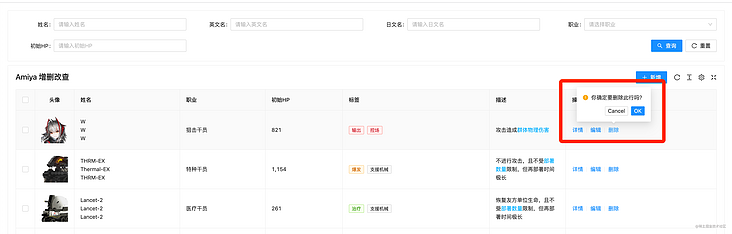
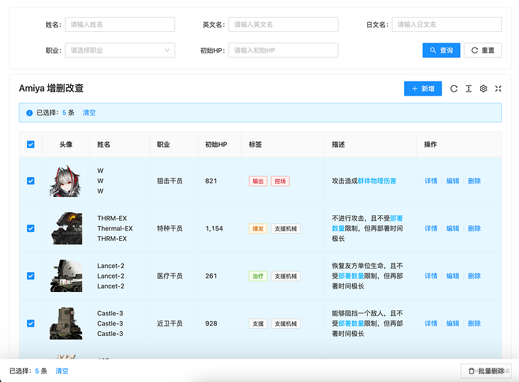
"Yes, let me show you. There are several steps. The first step is to add selectionType="checkbox "to check; the second step is to add selectShowKey="cn " , when the bubble is suspended, use it to decide to display the selected name and wrap it with the tag tag, because the tag tag can be deleted. In this way, you can also click the X above the tag tag to cancel the option after turning the page. You don't have to turn to the previous page to cancel the selection; Step 3: add the action="delete" attribute on the delete button, add the action = "batch delete" attribute on the batch deletion, and add the deleteApi={deleteApi} interface on the label to complete the actions of deletion and batch deletion. "
const ctrl: AyTableCtrlField = {
  render: (value: string, record: Record) => {
    return (
      <AyCtrl>
        <AyAction record={record} action="delete">
          delete
        </AyAction>
      </AyCtrl>
    )
  }
}

<AySearchTable
  title="Amiya Add, delete, modify and check"
  selectionType="checkbox"
  rowKey="sort_id"
  ctrl={ctrl}
  selectShowKey="cn"
  deleteApi={deleteApi}
>
  <AyAction action="batch-delete">Batch delete</AyAction>
</AySearchTable>
"Oh, is that ok? That's quite convenient. After all, you don't need to write a pile of code yourself. By the way, I just looked at the code and there was a renderType: 'html' on it. What's the function?"
{
  title: 'describe',
  key: 'feature',
  width: 200,
  renderType: 'html'
}
"Guess?"
"Render this column as html or something?"
"Yes, in addition, there are unit datetime state and other types. You can take a look at this."
"Yes, what if I don't have what I want?"
"Just waiting for you to ask. It seems that you have used other secondary encapsulation. This component provides two ways. The first one can specify the render method."
{
  title: 'full name',
  key: 'cn',
  search: true,
  dialog: {
    required: true
  },
  table: {
    // Render custom content
    render: (text: string, record: Record) => {
      return (
        <div>
          <div>{record.cn}</div>
          <div>{record.en}</div>
          <div>{record.jp}</div>
        </div>
      )
    }
  }
},
"Second, you can register globally. After registration, you can use it like renderType: 'star'."
import { registerTableRender, RenderProps } from 'amiya'

/**
 * @decs Register renderType
 * @param renderTypeName string Registration type name
 * @param text string Current col data
 * @param record object Data of current row
 * @param field Current configuration item
 *
 * @returns ReactNode
 */
registerTableRender('renderTypeName', ({ text, record, field }: RenderProps) => {
  return <span>{text}</span>
})

// Actual use
const fields = [
  {
    renderType: 'renderTypeName' // Registered name
  }
]"Good guy, it's no different from my direct render, but using the method of registration and writing render in other public places will really make the current page cleaner."
"Yes, the two methods are free to choose. You see, it saves a lot of code. If you use jsx syntax sugar, it will save more. In that case, it only needs 90 lines of code."
"Yes, the other secondary encapsulation I see is the lack of this. They all use json. When they use it, there is a large blank area on the right side of the editor, and the code is too long. It's very uncomfortable. I like your way of writing. I give them suggestions, but they don't listen. It's so easy to control."
 <AyFields>
   <AyField
     title="head portrait"
     key="icon"
     width={80}
     align="center"
     renderType="image"
   />
   <AyField title="full name" key="cn" search />
   <AyField title="English name" key="en" search dialog table={false} />
   {// ...}
 </AyFields>
"It's really economical. I haven't seen anything so economical. However, there are so many packages in this component. Will others use it? Do you understand?"
"Indeed, if you don't introduce it, no one can understand it. Therefore, this component supports complete TypeScript prompts, and documents are prepared to introduce the use of tables in detail. Look at the pile of menus on the left, which are all introducing the table api."
"Moreover, there are complete page level examples, which can also be used as a reference."
"I see. This is a secondary encapsulated component library. I think there are other components. I'll use them later and experience them."
"OK, wait for your news."