Common properties and methods in List:
/*
List Common attributes and methods:

   Common attributes:
       length          length
       reversed        Flip
       isEmpty         Is it empty
       isNotEmpty      Is it not empty
   Common methods:
       add         increase
       addAll      Splice array
       indexOf     Find the specific value passed in
       remove      Delete incoming specific value
       removeAt    Delete incoming index value
       fillRange   modify
       insert(index,value);            Insert at specified location
       insertAll(index,list)           Insert List at the specified location
       toList()    Convert other types to List
       join()      List Convert to string
       split()     Convert string to List
       forEach
       map
       where
       any
       every

*/


void main(){

 // List myList = ['Banana', 'Apple', 'watermelon'];
 // print(myList[1]);


 // var list=new List();
 // list.add('111');
 // list.add('222');
 // print(list);


//Properties in List:
   // List myList = ['Banana', 'Apple', 'watermelon'];
   // print(myList.length);
   // print(myList.isEmpty);
   // print(myList.isNotEmpty);
   // print(myList.reversed);  // Sort the list in reverse order
   // var newMyList=myList.reversed.toList();
   // print(newMyList);

//Methods in List:


   // List myList = ['Banana', 'Apple', 'watermelon'];
   //myList.add('peach ')// Add data add one

   // myList.addAll(['peach', 'grape'])// Splice array

   // print(myList);

   //print(myList.indexOf('apple x fruit ')// indexOf finds data, returns - 1 if not found, returns the index value


   // myList.remove('watermelon ');

   // myList.removeAt(1);

   // print(myList);


   // List myList = ['Banana', 'Apple', 'watermelon'];

   // myList.fillRange(1, 2,'aaa');  // modify

   //  myList.fillRange(1, 3,'aaa');


   // myList.insert(1,'aaa');      // Insert a

   // myList.insertAll(1, ['aaa','bbb']);  // Insert multiple

   // print(myList);


   // List myList = ['Banana', 'Apple', 'watermelon'];

   // var str=myList. join('-');   // Convert list to string

   // print(str);

   // print(str is String);  //true


   var str='Banana-Apple-watermelon';

   var list=str.split('-');

   print(list);

   print(list is List);

}
Set
//Set

//Its main function is to remove the duplicate contents of the array

//Set is a set that has no order and cannot be repeated, so it cannot get the value through the index

void main(){


  // var s=new Set();
  // s.add('banana ');
  // s.add('apple ');
  // s.add('apple ');

  // print(s);   // {banana, apple}

  // print(s.toList());


  List myList=['Banana','Apple','watermelon','Banana','Apple','Banana','Apple'];

  var s=new Set();

  s.addAll(myList);

  print(s);

  print(s.toList());


}
Map
/*
  Maps are unordered key value pairs:

    Common attributes:
        keys            Get all key values
        values          Get all value values
        isEmpty         Is it empty
        isNotEmpty      Is it not empty
    Common methods:
        remove(key)     Delete the data of the specified key
        addAll({...})   Merge mapping adds attributes to the map
        containsValue   View the value in the map and return true/false
        forEach
        map
        where
        any
        every


*/

void main(){


  // Map person={
  //   "name": "Zhang San",
  //   "age":20
  // };


  // var m=new Map();
  // m["name"] = "Li Si";

  // print(person);
  // print(m);

//Common attributes:

    // Map person={
    //   "name": "Zhang San",
    //   "age":20,
    //   "sex": "male"
    // };

    // print(person.keys.toList());
    // print(person.values.toList());
    // print(person.isEmpty);
    // print(person.isNotEmpty);


//Common methods:
    Map person={
      "name":"Zhang San",
      "age":20,
      "sex":"male"
    };

    // person.addAll({
    //   "work": ['code tapping', 'delivery'],
    //   "height":160
    // });

    // print(person);


    // person.remove("sex");
    // print(person);


    print(person.containsValue('Zhang San'));
}
forEach,map, where,any,every
/*
        forEach
        map
        where
        any
        every
*/
void main(){


      //  List myList = ['Banana', 'Apple', 'watermelon'];

      // for(var i=0;i<myList.length;i++){
      //   print(myList[i]);
      // }


      // for(var item in myList){
      //   print(item);
      // }


      // myList.forEach((value){
      //     print("$value");
      // });


      // List myList=[1,3,4];

      // List newList=new List();

      // for(var i=0;i<myList.length;i++){

      //   newList.add(myList[i]*2);
      // }
      // print(newList);


      // List myList=[1,3,4];
      // var newList=myList.map((value){
      //     return value*2;
      // });
      //  print(newList.toList());


      // List myList=[1,3,4,5,7,8,9];

      // var newList=myList.where((value){
      //     return value>5;
      // });
      // print(newList.toList());


      // List myList=[1,3,4,5,7,8,9];

      // var f=myList.any((value) {/ / returns true as long as there are qualified ones in the collection

      //     return value>5;
      // });
      // print(f);


      // List myList=[1,3,4,5,7,8,9];

      // var f=myList.every((value) {/ / returns true if each condition is met; otherwise, returns false

      //     return value>5;
      // });
      // print(f);


      // set

      // var s=new Set();

      // s.addAll([1,222,333]);

      // s.forEach((value)=>print(value));


      //map

       Map person={
          "name":"Zhang San",
          "age":20
        };

        person.forEach((key,value){
            print("$key---$value");
        });

}
Extensions abstract classes and implements
/*
Dart Abstract class in: Dart abstract class is mainly used to define standards. Subclasses can inherit abstract classes or implement abstract class interfaces.


  1,Abstract classes are defined by the abstract keyword

  2,Dart Abstract methods in cannot be declared with abstract. Methods without method body in Dart are called abstract methods.

  3,If a subclass inherits an abstract class, it must implement the abstract methods inside

  4,If you implement an abstract class as an interface, you must implement all the properties and methods defined in the abstract class.

  5,Abstract classes cannot be instantiated, only subclasses that inherit them can

extends Differences between abstract classes and implements:

  1,If we want to reuse the methods in the abstract class and use the abstract method to restrict our own class, we will inherit the abstract class with extensions

  2,If we only take abstract classes as the standard, we will use implements to implement abstract classes

*/
Flutter environment construction
Install the latest Xcode
Download Android studio
https://developer.android.google.cn/studio
Download the fluent SDK
https://flutter.dev/docs/development/tools/sdk/releases?tab=macos
Decompress the downloaded fluent Sdk to the directory where you want to install Sdk, such as
/Users/cc/flutter
Configure the bin directory of the Flutter installation directory to the environment variable, and then configure the Flutter domestic image to the environment variable
vim ~/.zshrc
export PATH=/Users/cc/flutter/bin:$PATH
export ANDROID_HOME="/Users/cc/Library/Android/sdk"
export PATH=${PATH}:${ANDROID_HOME}/tools
export PATH=${PATH}:${ANDROID_HOME}/platform-tools
export PUB_HOSTED_URL=https://pub.flutter-io.cn
export FLUTTER_STORAGE_BASE_URL=https://storage.flutter-io.cn
source ~/.zshrc
flutter -h if some commands can be issued, the flutter sdk configuration is successful.
Note that if you enter "flutter -h" to tell you that flutter is not a built-in command after configuration, the sdk may not be configured successfully, or the sdk may not be fully downloaded during download
Run the fluent doctor command to detect the environment
Entry file and entry method
There is a main in the lib directory of each fluent project Dart is the entry file of fluent
main. In dart
void main() {
  runApp(MyApp());
}
//It can also be abbreviated
void main() => runApp(MyApp());
The main method is the entry method of dart. The runApp method is the entry method of the shuttle. MyApp is a custom component
Use of the first Demo Center component
import 'package:flutter/material.dart';

void main() {
  runApp(Center(
    child: Text(
      "I am a text content",
      textDirection: TextDirection.ltr,
    ),
  ));
}
Separate the content into a component
The custom component in fluent is actually a class, which needs to inherit StatelessWidget/StatefulWidget
In the early stage, we all inherited StatelessWidget. Later, I'll tell you about the use of StatefulWidget.
Stateless widget is a stateless component with immutable state
Stateful widget is a stateful component, and the state held may change in the widget life cycle
import 'package:flutter/material.dart';

void main() {
  runApp(MyApp());
}

class MyApp extends StatelessWidget {
  @override
  Widget build(BuildContext context) {
    return Center(
      child: Text(
        "I am a text content",
        textDirection: TextDirection.ltr,
      ),
    );
  }
}
Add some decoration to the Text component
import 'package:flutter/material.dart';

void main() {
  runApp(MyApp());
}

class MyApp extends StatelessWidget {
  @override
  Widget build(BuildContext context) {
    return Center(
      child: Text(
        "I am a text content",
        textDirection: TextDirection.ltr,
        style: TextStyle(
            fontSize: 40.0,
            fontWeight: FontWeight.bold,
            // color: Colors.yellow
          color: Color.fromRGBO(255, 222, 222, 0.5)
        ),
      ),
    );
  }
}
Decorate the App with two components: MaterialApp and Scaffold
1,MaterialApp
MaterialApp is a convenient widget, which encapsulates some widgets required by the application to realize Material Design. General use of top-level widgets.
Common attributes:
Home (home)
Title
Color
Theme
Routes
...
2,Scaffold
Scaffold is the basic implementation of Material Design layout structure. This class provides API s for displaying drawer s, snapbars, and bottom sheet s.
Scaffold has the following main properties:
AppBar - an AppBar displayed at the top of the interface.
body - the main content displayed in the current interface Widget.
Drawer - drawer menu control.
...
import 'package:flutter/material.dart';

void main() {
  runApp(MyApp());
}

class MyApp extends StatelessWidget {
  @override
  Widget build(BuildContext context) {
    return MaterialApp(
      title: "I'm a title",
      home: Scaffold(
        appBar: AppBar(
          title: Text("Hello Flutter"),
          elevation: 30.0, Set the title shadow to 0 if not required.0
        ),
        body: HomeContent(),
      ),
      theme: ThemeData(
          //Set theme color
          primarySwatch: Colors.yellow),
    );
  }
}

class HomeContent extends StatelessWidget {
  @override
  Widget build(BuildContext context) {
    return Center(
      child: Text(
        "I am a text content",
        textDirection: TextDirection.ltr,
        style: TextStyle(
            fontSize: 40.0,
            fontWeight: FontWeight.bold,
            // color: Colors.yellow
            color: Color.fromRGBO(255, 222, 222, 0.5)
        ),
      ),
    );
  }
}
Text component
| name | function |
|---|---|
| textAlign | Text alignment (center, left, right, justfy) |
| textDirection | Text direction (ltr from left to right, rtl from right to left) |
| overflow | How to deal with the text after it exceeds the screen (clip clipping, fade fade, ellipsis) |
| textScaleFactor | Font display magnification |
| maxLines | Maximum lines of text display |
| style | Font style settings |
Here are the parameters of TextStyle:
| name | function |
|---|---|
| decoration | Text decorative line (none, lineThrough, strikeout, overline, underline) |
| decorationColor | Text decorative line color |
| decorationStyle | Text decorative line style ([dashed,dotted] dotted line, double two lines, solid one solid line, wavy wavy line) |
| wordSpacing | Word gaps (negative values make words more compact) |
| letterSpacing | Letter gap (negative values make letters more compact) |
| fontStyle | Text style (italic, normal, normal) |
| fontSize | Text size |
| color | Text color |
| fontWeight | Font thickness (bold bold, normal) |
More parameters: https://docs.flutter.io/flutter/painting/TextStyle-class.html
Container component
| name | function |
|---|---|
| alignment | topCenter: align top center Left: top left topRight: align top right Center: horizontal vertical center alignment centerLeft: vertically centered and horizontally aligned to the left centerRight: vertically centered and horizontally right aligned Align bottomCenter bottom center bottomLeft: align bottom to left bottomRight: align bottom right |
| decoration | decoration: BoxDecoration( color: Colors.blue, border: Border.all( color: Colors.red, width: 2.0, ), borderRadius: BorderRadius.all( Radius.circular(8.0) ) ) |
| margin | The margin property indicates the distance between the Container and other external components. EdgeInsets.all(20.0), |
| padding | padding is the inner margin of the Container, which refers to the distance between the edge of the Container and the Child padding: EdgeInsets.all(10.0) |
| transform | Make it easy for the Container to rotate and so on transform: Matrix4.rotationZ(0.2) |
| height | Container height |
| width | Container width |
| child | Container child element |
More parameters: https://api.flutter.dev/flutter/widgets/Container-class.html
Picture component
The Image component is a component that displays images. The Image component has many constructors. Here we will only tell you two
Image.asset local picture
Image.network remote picture
Common properties of Image component:
| name | type | explain |
|---|---|---|
| alignment | alignment | Picture alignment |
| color and colorBlendMode | Set the background color of the picture, which is usually used together with colorBlendMode, so that the picture color can be mixed with the background color. The above picture is a mixture of colors, green background and red | |
| fit | BoxFit | The fit attribute is used to control the stretching and squeezing of the picture, which is based on the parent container. BoxFit.fill: the full image is displayed. The image will be stretched and filled with the parent container. BoxFit.contain: full picture display, showing the original scale, there may be gaps. BoxFit.cover: the display may stretch, cut and fill (the picture should fill the whole container without deformation). BoxFit.fitWidth: width full (horizontal full), indicating possible stretching and cutting. BoxFit.fitHeight: height filling (vertical filling), indicating possible stretching and cutting. BoxFit.scaleDown: the effect is similar to that of contain, but this property does not allow the display to exceed the size of the source image. It can be small or large. |
| repeat | Tile | ImageRepeat.repeat: repeat horizontally and vertically until the whole canvas is covered. ImageRepeat.repeatX: horizontal repetition, vertical non repetition. ImageRepeat. Repeat: repeat vertically and not horizontally. |
| width | The width is generally combined with ClipOval to see the effect | |
| height | The effect can only be seen when the height is generally combined with ClipOval |
More attribute references: https://api.flutter.dev/flutter/widgets/Image-class.html
return Center(
      child: Container(
        child: Image.network(
          "http://pic.baike.soso.com/p/20130828/20130828161137-1346445960.jpg",
          alignment: Alignment.topLeft,
          color: Colors.red,
          colorBlendMode: BlendMode.colorDodge,
          // repeat: ImageRepeat.repeatX,
          fit: BoxFit.cover,
        ),
        width: 300.0,
        height: 400.0,
        decoration: BoxDecoration(
            color: Colors.yellow
        ),
      ),
    );
Import local pictures
emmm... Forget it
Clip rect, ClipRRect, ClipOval, ClipPath, CustomClipper
widget function
ClipRect cuts the child to the given rectangular size
Clipprrect cuts the child to a rounded rectangle
ClipOval if the child is a square, the clipping is followed by a circle; if the child is a rectangle, the clipping is followed by an ellipse
ClipPath cuts the child according to the given path
CustomClipper is not a widget, but we can draw any shape we want with CustomClipper
Rounded corners and circular pictures
Implement fillet image
return Center(
      child: Container(
        width: 300.0,
        height: 300.0,
        decoration: BoxDecoration(
            color: Colors.yellow,
            borderRadius: BorderRadius.circular(150),
            image: DecorationImage(
                image: NetworkImage(
                  "http://pic.baike.soso.com/p/20130828/20130828161137-1346445960.jpg",
                ),
                fit: BoxFit.cover
            )
        ),
      ),
    );
Realize circular picture
return Center(
      child: Container(
        child: ClipOval(
          child: Image.network(
            "https://www.itying.com/images/201905/thumb_img/1101_thumb_G_1557845381862.jpg",
            width: 150.0,
            height: 150.0,
          ),
        ),
      ),
    );
Round head
ClipOval
new ClipOval(
    child: new Image.asset(Utils.getImgPath('ali_connors')),
  )
② CircleAvatar
new CircleAvatar(
    radius: 36.0,
    backgroundImage: AssetImage(
      Utils.getImgPath('ali_connors'),
    ),
  )
③ BoxDecoration BoxShape.circle
 new Container(
    width: 72.0,
    height: 72.0,
    decoration: BoxDecoration(
      shape: BoxShape.circle,
      image: DecorationImage(
        image: AssetImage(
          Utils.getImgPath('ali_connors'),
        ),
      ),
    ),
  )
Rounded head
① ClipRRect
new ClipRRect(
    borderRadius: BorderRadius.circular(6.0),
    child: new Image.asset(Utils.getImgPath('ali_connors')),
  )
② BoxDecoration BoxShape.rectangle
new Container(
    width: 88.0,
    height: 88.0,
    decoration: BoxDecoration(
      shape: BoxShape.rectangle,
      borderRadius: BorderRadius.circular(6.0),
      image: DecorationImage(
        image: AssetImage(
          Utils.getImgPath('ali_connors'),
        ),
      ),
    ),
List component overview
List layout is the most commonly used layout method in our project development. In fluent, we can define list items through ListView, which supports vertical and horizontal display. You can control the display direction of the list through an attribute. The list has the following categories:
**1. Vertical list (the width is automatically expanded, and the setting width is invalid) * * it can be controlled in the outer package Container
2. Vertical text list
**3. Horizontal list (the height is automatically expanded, and the setting height is invalid) * * can be controlled in the outer package Container
4. Dynamic list
5. Matrix list (grid layout)
List parameters
| name | type | explain |
|---|---|---|
| scrollDirection | Axis | Axis.horizontal list Axis.vertical list |
| padding | EdgeInsetsGeometry | padding |
| resolve | bool | Reverse ordering of components |
| children | List | List element |
Basic list
class HomeContent extends StatelessWidget {
  @override
  Widget build(BuildContext context) {
    return Center(
      child: ListView(
        children: <Widget>[
          ListTile(
            leading: Icon(Icons.phone),
            title: Text("this is list", style: TextStyle(fontSize: 28.0)),
            subtitle: Text('this is list this is list'),
          ),
          ListTile(
            title: Text("this is list"),
            subtitle: Text('this is list this is list'),
            trailing: Icon(Icons.phone),
          ),
          ListTile(
            title: Text("this is list"),
            subtitle: Text('this is list this is list'),
          ),
          ListTile(
            title: Text("this is list"),
            subtitle: Text('this is list this is list'),
          ),
          ListTile(
            title: Text("this is list"),
            subtitle: Text('this is list this is list'),
          )
        ],
      ),
    );
  }
}
Horizontal list
class HomeContent extends StatelessWidget {
  @override
  Widget build(BuildContext context) {
    return Container(
      height: 200.0,
      margin: EdgeInsets.all(5),
      child: ListView(
        scrollDirection: Axis.horizontal,
        children: <Widget>[
          Container(
            width: 180.0,
            color: Colors.lightBlue,
          ),
          Container(
            width: 180,
            color: Colors.amber,
            child: ListView(
              children: <Widget>[
                Image.network(
                    "https://resources.ninghao.org/images/childhood-in-a-picture.jpg"),
                SizedBox(height: 16.0),
                Text("This is a text message",
                    textAlign: TextAlign.center,
                    style: TextStyle(fontSize: 16.0)),
              ],
            ),
          )
        ],
      ),
    );
  }
}
Dynamic list (dynamic cyclic data)
import 'package:flutter/material.dart';

void main() => runApp(MyApp());

class MyApp extends StatelessWidget {
  @override
  Widget build(BuildContext context) {
    return MaterialApp(
      home: Scaffold(
        appBar: AppBar(title: Text("Hello Flutter")),
        body: HomeContent(),
      ),
    );
  }
}

class HomeContent extends StatelessWidget {
  List list = List();

  HomeContent() {
    for (int i = 0; i < 20; i++) {
      list.add("This is the second $i Data bar");
    }
    print(list);
  }

  @override
  Widget build(BuildContext context) {
    return ListView.builder(
        itemCount: this.list.length,
        itemBuilder: (context, index) {
          // print(context);
          return ListTile(
            leading: Icon(Icons.phone),
            title: Text("${list[index]}"),
          );
        });
  }
}
Common parameters of GridView component
When the amount of data is large, it is clear to arrange it in a matrix. At this point, we can use the grid list component GridView to realize the layout.
There are many ways for GridView to create grid lists. We will mainly introduce two ways below.
1. You can use GridView Count to realize grid layout
2. Through GridView Implementation of grid layout with builder
Common attributes:
| name | type | explain |
|---|---|---|
| scrollDirection | Axis | Rolling method |
| padding | EdgeInsetsGeometry | padding |
| resolve | bool | Reverse ordering of components |
| crossAxisSpacing | double | Spacing between horizontal subwidgets |
| mainAxisSpacing | double | Spacing between vertical subwidgets |
| crossAxisCount | int | Number of widgets in a row |
| childAspectRatio | double | Width height ratio of child Widget |
| children | [ ] | |
| gridDelegate | SliverGridDelegateWithFix Edcrossaxiscount (common) SliverGridDelegateWithMax CrossAxisExtent | Control layout is mainly used in GridView Inside the builder |
GridView.count to realize grid layout
import 'package:cc/res/listData.dart';
import 'package:flutter/material.dart';

void main() => runApp(MyApp());

class MyApp extends StatelessWidget {
  @override
  Widget build(BuildContext context) {
    return MaterialApp(
      home: Scaffold(
        appBar: AppBar(title: Text("Hello Flutter")),
        body: LayoutContent(),
      ),
    );
  }
}

class LayoutContent extends StatelessWidget {
  List<Widget> _getListData() {
    var tempList = listData.map((value) {
      return Container(
        child: Column(
          children: <Widget>[
            Image.network(value["imageUrl"]),
            SizedBox(height: 12),
            Text(value["title"],
                textAlign: TextAlign.center, style: TextStyle(fontSize: 20))
          ],
        ),
        decoration: BoxDecoration(
            border: Border.all(
                color: Color.fromRGBO(230, 230, 230, 0.9), width: 1.0)),
      );
    });
    // ('124124','124214')
    return tempList.toList();
  }

  @override
  Widget build(BuildContext context) {
    return GridView.count(
      crossAxisCount: 2,
      crossAxisSpacing: 20,
      mainAxisSpacing: 20,
//       childAspectRatio:0.7,
      children: this._getListData(),
    );
  }
}
GridView. Implementation of grid layout with builder
import 'package:cc/res/listData.dart';
import 'package:flutter/material.dart';

void main() => runApp(MyApp());

class MyApp extends StatelessWidget {
  @override
  Widget build(BuildContext context) {
    return MaterialApp(
      home: Scaffold(
        appBar: AppBar(title: Text("Hello Flutter")),
        body: LayoutContent(),
      ),
    );
  }
}

class LayoutContent extends StatelessWidget {
  Widget _getListData(context, index) {
    return Container(
      child: Column(
        children: <Widget>[
          Image.network(listData[index]["imageUrl"]),
          SizedBox(height: 12),
          Text(listData[index]["title"],
              textAlign: TextAlign.center, style: TextStyle(fontSize: 20))
        ],
      ),
      decoration: BoxDecoration(
          border: Border.all(
              color: Color.fromRGBO(230, 230, 230, 0.9), width: 1.0)),
    );
  }

  @override
  Widget build(BuildContext context) {
    return GridView.builder(
      itemCount: listData.length,
      gridDelegate: SliverGridDelegateWithFixedCrossAxisCount(
          //Number of horizontal axis elements
          crossAxisCount: 2,
          //Longitudinal axis spacing
          mainAxisSpacing: 20.0,
          //Horizontal axis spacing
          crossAxisSpacing: 10.0,
          //Sub assembly width height length ratio
          childAspectRatio: 1.0),
      itemBuilder: this._getListData,
    );
  }
}
Padding component
Common layout tags in html have padding attribute, but many widgets in fluent do not have padding attribute. At this time, we can use the padding component to deal with the direct spacing between the container and the child elements.
| attribute | explain |
|---|---|
| padding | Padding value, EdgeInsetss sets the value of padding |
| child | Subcomponents |
class LayoutDemo extends StatelessWidget {
  @override
  Widget build(BuildContext context) {
    return Padding(
      padding: EdgeInsets.fromLTRB(0, 0, 10, 0),
      child: GridView.count(
        crossAxisCount: 2,
        childAspectRatio: 1.5,
        children: <Widget>[
          Padding(
            padding: EdgeInsets.fromLTRB(10, 10, 0, 0),
            child: Image.network("https://www.itying.com/images/flutter/1.png",
                fit: BoxFit.cover),
          ),
          Padding(
            padding: EdgeInsets.fromLTRB(10, 10, 0, 0),
            child: Image.network("https://www.itying.com/images/flutter/2.png",
                fit: BoxFit.cover),
          ),
          Padding(
            padding: EdgeInsets.fromLTRB(10, 10, 0, 0),
            child: Image.network("https://www.itying.com/images/flutter/3.png",
                fit: BoxFit.cover),
          ),
          Padding(
            padding: EdgeInsets.fromLTRB(10, 10, 0, 0),
            child: Image.network("https://www.itying.com/images/flutter/4.png",
                fit: BoxFit.cover),
          ),
          Padding(
            padding: EdgeInsets.fromLTRB(10, 10, 0, 0),
            child: Image.network("https://www.itying.com/images/flutter/5.png",
                fit: BoxFit.cover),
          ),
          Padding(
            padding: EdgeInsets.fromLTRB(10, 10, 0, 0),
            child: Image.network("https://www.itying.com/images/flutter/6.png",
                fit: BoxFit.cover),
          ),
        ],
      ),
    );
  }
}
Row horizontal layout component
| attribute | explain |
|---|---|
| mainAxisAlignment | Sorting method of spindle |
| crossAxisAlignment | Sorting method of secondary axis |
| children | Component child element |
import 'package:flutter/material.dart';

void main() => runApp(MyApp());

class MyApp extends StatelessWidget {
  @override
  Widget build(BuildContext context) {
    return MaterialApp(
      home: Scaffold(
        appBar: AppBar(title: Text("Hello Flutter")),
        body: LayoutDemo(),
      ),
    );
  }
}

class LayoutDemo extends StatelessWidget {
  @override
  Widget build(BuildContext context) {
    return Container(
      height: 700,
      width: 500,
      color: Colors.black26,
      child: Row(
        crossAxisAlignment: CrossAxisAlignment.center,
        mainAxisAlignment: MainAxisAlignment.spaceEvenly,
//        crossAxisAlignment: CrossAxisAlignment.center,
        children: <Widget>[
          IconContainer(Icons.home, color: Colors.red),
          IconContainer(Icons.home, color: Colors.blue),
          IconContainer(Icons.home, color: Colors.orange),
        ],
      ),
    );
  }
}

class IconContainer extends StatelessWidget {
  double size;
  IconData icon;
  Color color;

  IconContainer(this.icon, {this.size, this.color = Colors.blue}) {
    this.size = 32.0;
  }

  @override
  Widget build(BuildContext context) {
    return Container(
      width: this.size + 60,
      height: this.size + 60,
      color: this.color,
      child: Center(
          child: Icon(
        this.icon,
        color: Colors.white,
        size: this.size,
      )),
    );
  }
}
Column vertical layout component
| attribute | explain |
|---|---|
| mainAxisAlignment | Sorting method of spindle |
| crossAxisAlignment | Sorting method of secondary axis |
| children | Component child element |
import 'package:flutter/material.dart';

void main() => runApp(MyApp());

class MyApp extends StatelessWidget {
  @override
  Widget build(BuildContext context) {
    return MaterialApp(
      home: Scaffold(
        appBar: AppBar(title: Text("Hello Flutter")),
        body: LayoutDemo(),
      ),
    );
  }
}

class LayoutDemo extends StatelessWidget {
  @override
  Widget build(BuildContext context) {
    return Container(
      height: 700,
      width: 500,
      color: Colors.black26,
      child: Column(
        crossAxisAlignment: CrossAxisAlignment.center,
        mainAxisAlignment: MainAxisAlignment.spaceEvenly,
//        crossAxisAlignment: CrossAxisAlignment.center,
        children: <Widget>[
          IconContainer(Icons.home, color: Colors.red),
          IconContainer(Icons.home, color: Colors.blue),
          IconContainer(Icons.home, color: Colors.orange),
        ],
      ),
    );
  }
}

class IconContainer extends StatelessWidget {
  double size;
  IconData icon;
  Color color;

  IconContainer(this.icon, {this.size, this.color = Colors.blue}) {
    this.size = 32.0;
  }

  @override
  Widget build(BuildContext context) {
    return Container(
      width: this.size + 60,
      height: this.size + 60,
      color: this.color,
      child: Center(
          child: Icon(
        this.icon,
        color: Colors.white,
        size: this.size,
      )),
    );
  }
}
Expanded is similar to the Flex layout in the Web
Expanded can be used in Row and Column layouts
| attribute | explain |
|---|---|
| flex | The proportion of the entire parent Row /Column of the element station |
| child | Child element |
import 'package:flutter/material.dart';

void main() => runApp(MyApp());

class MyApp extends StatelessWidget {
  @override
  Widget build(BuildContext context) {
    return MaterialApp(
      home: Scaffold(
        appBar: AppBar(title: Text("Hello Flutter")),
        body: LayoutDemo(),
      ),
    );
  }
}

class LayoutDemo extends StatelessWidget {
  @override
  Widget build(BuildContext context) {
    return Padding(
      padding: EdgeInsets.all(10),
      child: Row(
        // crossAxisAlignment: CrossAxisAlignment.start,
        mainAxisAlignment: MainAxisAlignment.center,
        // crossAxisAlignment: CrossAxisAlignment.center,
        children: <Widget>[
          Expanded(flex: 2, child: IconContainer(Icons.home)),
          SizedBox(width: 10),
          Expanded(flex: 3, child: IconContainer(Icons.search)),
          // SizedBox(width: 10),
          // Expanded(child: IconContainer(Icons.send))
        ],
      ),
    );
  }
}

class IconContainer extends StatelessWidget {
  double size;
  IconData icon;

  IconContainer(this.icon, {this.size}) {
    this.size = 32.0;
  }

  @override
  Widget build(BuildContext context) {
    return Container(
      width: 100.0,
      height: 100.0,
      color: Colors.blue,
      child:
          Center(child: Icon(this.icon, color: Colors.white, size: this.size)),
    );
  }
}
Stack assembly
Stack means heap. We can use stack or stack combined with Align or stack combined with position d to realize the positioning and layout of the page
| attribute | explain |
|---|---|
| alignment | Configure the display position of all child elements |
| children | Subcomponents |
class LayoutDemo extends StatelessWidget {
  @override
  Widget build(BuildContext context) {
    // TODO: implement build
    return Center(
      child: Stack(
        alignment: Alignment.topLeft,
        children: <Widget>[
          Container(
            height: 400,
            width: 300,
            color: Colors.red,
          ),
          Text('I am a text',style: TextStyle(
            fontSize: 40,
            color: Colors.white
          ))
        ],
      ),
    );
  }
}
class LayoutDemo extends StatelessWidget {
  @override
  Widget build(BuildContext context) {
    // TODO: implement build
    return Center(
      child: Stack(
        alignment: Alignment(1,0.3),
        children: <Widget>[
          Container(
            height: 400,
            width: 300,
            color: Colors.red,
          ),
          Text('I am a text',style: TextStyle(
            fontSize: 20,
            color: Colors.white
          ))
        ],
      ),
    );
  }
}
Stack Align
Stack component combined with Align component can control the display position of each child element
| attribute | explain |
|---|---|
| alignment | Configure the display position of all child elements |
| child | Subcomponents |
class LayoutDemo extends StatelessWidget {
  @override
  Widget build(BuildContext context) {
    // TODO: implement build
    return Center(
      child:  Container(
            height: 400,
            width: 300,
            color: Colors.red,
            child: Stack(
              // alignment: Alignment.center,
              children: <Widget>[
                Align(
                  alignment: Alignment(1,-0.2),
                  child: Icon(Icons.home,size: 40,color: Colors.white),
                ),
                Align(
                  alignment: Alignment.center,
                  child: Icon(Icons.search,size: 30,color: Colors.white),
                ),
                Align(
                  alignment: Alignment.bottomRight,
                  child: Icon(Icons.settings_applications,size: 30,color: Colors.white),
                )
              ],
            ),
      ),
    );
  }
}
Stack Positioned
The Stack component combined with the Positioned component can also control the display position of each child element
| attribute | explain |
|---|---|
| top | Distance from child element to top |
| bottom | Distance of child element from bottom |
| left | Distance from child element to left |
| right | Distance from child element to right |
| child | Subcomponents |
class LayoutDemo extends StatelessWidget {
  @override
  Widget build(BuildContext context) {
    // TODO: implement build
    return Center(
      child:  Container(
            height: 400,
            width: 300,
            color: Colors.red,
            child: Stack(
              // alignment: Alignment.center,
              children: <Widget>[
                Positioned(
                //  left: 10,
                  child: Icon(Icons.home,size: 40,color: Colors.white),
                ),
                Positioned(
                 bottom: 0,
                 left: 100,
                  child: Icon(Icons.search,size: 30,color: Colors.white),
                ),
                Positioned(
                  right: 0,
                  child: Icon(Icons.settings_applications,size: 30,color: Colors.white),
                )
              ],
            ),
      ),
    );
  }
}
AspectRatio component
AspectRatio is used to adjust the aspect ratio of the child element according to the setting.
AspectRatio will first expand as much as possible within the scope allowed by the layout constraints. The height of the widget is determined by the width and ratio, similar to the contain in BoxFit. It will occupy the area as much as possible according to a fixed ratio.
If a feasible size cannot be found after all constraints are met, AspectRatio will eventually give priority to the layout constraints and ignore the set ratio.
| attribute | explain |
|---|---|
| aspectRatio | The aspect ratio may not be laid out according to this value in the end. It depends on the comprehensive factors. Whether the outer layer is allowed to be laid out according to this ratio is only a reference value |
| child | Subcomponents |
return Center(
      child: Container(
        width: 200,
        child: AspectRatio(
          aspectRatio: 2.0 / 1.0,
          child: Container(
            color: Colors.red,
          ),
        ),
      ),
    );
Card assembly
Card is a card component block. The content can be composed of most types of widgets. Card has rounded corners and shadows, which makes it look three-dimensional.
| attribute | explain |
|---|---|
| margin | Margin |
| child | Subcomponents |
| Shape | The shadow effect of Card. The default shadow effect is the rounded rectangular edge. |
class LayoutDemo extends StatelessWidget {
  @override
  Widget build(BuildContext context) {
    return ListView(
      children: <Widget>[
        Card(
          margin: EdgeInsets.all(10),
          child: Column(
            children: <Widget>[
              ListTile(
                title: Text(
                  "Zhang San",
                  style: TextStyle(fontSize: 28),
                ),
                subtitle: Text("Senior Software Engineer"),
              ),
              Divider(),
              ListTile(
                title: Text("Tel: 123123123"),
              ),
              ListTile(
                title: Text("Address: Haidian District, Beijing"),
              )
            ],
          ),
        ),
        Card(
          margin: EdgeInsets.all(10),
          child: Column(
            children: <Widget>[
              ListTile(
                title: Text(
                  "Li Si",
                  style: TextStyle(fontSize: 28),
                ),
                subtitle: Text("Senior Software Engineer"),
              ),
              Divider(),
              ListTile(
                title: Text("Tel: 123123123"),
              ),
              ListTile(
                title: Text("Address: Haidian District, Beijing"),
              )
            ],
          ),
        ),
      ],
    );
  }
}
Card component implements a graphic list layout
class LayoutDemo extends StatelessWidget {
  @override
  Widget build(BuildContext context) {
    return ListView(
        children: listData.map((value) {
      return Card(
        margin: EdgeInsets.all(10),
        child: Column(
          children: <Widget>[
            AspectRatio(
              aspectRatio: 16 / 9,
              child: Image.network(value["imageUrl"], fit: BoxFit.cover),
            ),
            ListTile(
              leading: CircleAvatar(
                backgroundImage: NetworkImage(value["imageUrl"]),
              ),
              title: Text(value["description"]),
              subtitle: Text(
                value["description"],
                overflow: TextOverflow.ellipsis,
              ),
            )
          ],
        ),
      );
    }).toList());
  }
}
class LayoutDemo extends StatelessWidget {
  @override
  Widget build(BuildContext context) {
    return ListView.builder(
      itemCount: listData.length,
      itemBuilder: (context,index){
        return Card(
          margin: EdgeInsets.all(10),
          child: Column(
            children: <Widget>[
              AspectRatio(
                aspectRatio: 16 / 9,
                child: Image.network(listData[index]["imageUrl"], fit: BoxFit.cover),
              ),
              ListTile(
                leading: CircleAvatar(
                  backgroundImage: NetworkImage(listData[index]["imageUrl"]),
                ),
                title: Text(listData[index]["description"]),
                subtitle: Text(
                  listData[index]["description"],
                  overflow: TextOverflow.ellipsis,
                ),
              )
            ],
          ),
        );
      },
    );
  }
}
RaisedButton defines a button
A button is defined in the shutter through RaisedButton. There are many parameters in RaisedButton. We just use them simply.
return RaisedButton(
        child: Text("Flutter"),
        textColor: Theme.of(context).accentColor,
    onPressed: (){

    });
Wrap component
Wrap can realize flow layout. The performance of single Row wrap is almost the same as that of Row, and that of single Column wrap is almost the same as that of Row. However, both Row and Column are single Row and single Column. Wrap breaks through this limitation. When there is insufficient space on mainAxis, it will expand the display to crossAxis.
| attribute | explain |
|---|---|
| direction | Spindle direction, default horizontal |
| alignment | Spindle alignment |
| spacing | Spacing in spindle direction |
| textDirection | Text direction |
| verticalDirection | The placement order of children is defined. The default is down. See the introduction to Flex related attributes. |
| runAlignment | Alignment of run. Run can be understood as a new row or column. If the layout is horizontal, run can be understood as a new row |
| runSpacing | run spacing |
import 'package:flutter/material.dart';

void main() => runApp(MyApp());

class MyApp extends StatelessWidget {
  @override
  Widget build(BuildContext context) {
    return MaterialApp(
      home: Scaffold(
        appBar: AppBar(title: Text("Hello Flutter")),
        body: LayoutDemo(),
      ),
    );
  }
}

class LayoutDemo extends StatelessWidget {
  @override
  Widget build(BuildContext context) {
    return Wrap(
      spacing: 10,
      runSpacing: 10,
      alignment: WrapAlignment.spaceEvenly,
      children: <Widget>[
        MyButton("Episode 1"),
        MyButton("Episode 2"),
        MyButton("Episode 3"),
        MyButton("Episode 4"),
        MyButton("Episode 5"),
        MyButton("Episode 6 Episode 6"),
        MyButton("Episode 7"),
        MyButton("Episode 8 Episode 6"),
        MyButton("Episode 9"),
        MyButton("Episode 10"),
        MyButton("Episode 11"),
      ],
    );
  }
}

class MyButton extends StatelessWidget {
  final String text;

  const MyButton(this.text, {Key key}) : super(key: key);

  @override
  Widget build(BuildContext context) {
    return RaisedButton(
        child: Text(this.text),
        textColor: Theme.of(context).accentColor,
        onPressed: () {});
  }
}
Custom stateful component
In fluent, a custom component is actually a class that needs to inherit StatelessWidget/StatefulWidget.
Stateless widget is a stateless component with immutable state
Stateful widget is a stateful component, and the state held may change in the widget life cycle. Generally speaking: if we want to change the data in the page, we need to use stateful widget at this time
import 'package:flutter/material.dart';

void main() => runApp(MyApp());

class MyApp extends StatelessWidget {
  @override
  Widget build(BuildContext context) {
    return MaterialApp(
      home: Scaffold(
        appBar: AppBar(title: Text("Hello Flutter")),
        body: HomePage(),
      ),
    );
  }
}

class HomePage extends StatefulWidget {
  @override
  _HomePageState createState() => _HomePageState();
}

class _HomePageState extends State<HomePage> {
  int count = 0;

  @override
  Widget build(BuildContext context) {
    return Container(
      child: Column(
        children: <Widget>[
          Chip(label: Text("${this.count}")),
          RaisedButton(
              child: Text("increase"),
              onPressed: () {
//                print(this.count);
                setState(() {
                  this.count++;
                });
              })
        ],
      ),
    );
  }
}
BottomNavigationBar component
bottomNavigationBar is the bottom navigation bar, which allows us to define the bottom Tab switch. bottomNavigationBar is the parameter of Scaffold component.
BottomNavigationBar common properties
| Attribute name | explain |
|---|---|
| items | List bottom navigation bar button collection |
| iconSize | icon |
| currentIndex | Which is selected by default |
| fixedColor | Selected color |
| type | BottomNavigationBarType.fixed BottomNavigationBarType.shifting |
| (four bottom navigation display errors solved above) |
class Tabs extends StatefulWidget {
  Tabs({Key key}) : super(key: key);

  _TabsState createState() => _TabsState();
}

class _TabsState extends State<Tabs> {

  int _currentIndex=0;
  List _pageList=[
    HomePage(),
    CategoryPage(),
    SettingPage(),
  ];
  @override
  Widget build(BuildContext context) {
    return Scaffold(
        appBar: AppBar(
          title: Text("Flutter Demo"),
        ),
        body: this._pageList[this._currentIndex],
        bottomNavigationBar: BottomNavigationBar(
          currentIndex: this._currentIndex,   //Select the index value corresponding to the configuration
          onTap: (int index){
              setState(() {  //Change state
                  this._currentIndex=index;
              });
          },
          iconSize:36.0,      //Size of icon
          fixedColor:Colors.red,  //Selected color
          type:BottomNavigationBarType.fixed,   //The tabs at the bottom of the configuration can have multiple buttons
          items: [
            BottomNavigationBarItem(
              icon: Icon(Icons.home),
              title: Text("home page")
            ),
             BottomNavigationBarItem(
              icon: Icon(Icons.category),
              title: Text("classification")
            ),

             BottomNavigationBarItem(
              icon: Icon(Icons.settings),
              title: Text("set up")
            )
          ],
        ),
      );
  }
}
route
Generally speaking, the route in fluent is page Jump. Manage route navigation through Navigator component in fluent.
It also provides a method to manage the stack. For example: navigator Push and navigator pop
Flutter provides us with two ways to configure route jump: 1. Basic route 2. Named route
Basic routing usage
For example, we now want to jump from the HomePage component to the SearchPage component.
1. Searchpage needs to be introduced into HomPage dart
import '../SearchPage.dart';
2. Jump through the following method in HomePage
RaisedButton(
      child: Text("Jump to search page"),
      onPressed: () {
        Navigator.of(context).push(
            MaterialPageRoute(
                builder: (context) => SerachPage()
            )
        );
      },
      color: Theme.of(context).accentColor,
      textTheme: ButtonTextTheme.primary,
    )
Basic route jump value
For example, we now want to jump from the HomePage component to the SearchPage component to pass values.
1. Searchpage needs to be introduced into HomPage dart
import '../SearchPage.dart';
2. Jump through the following method in HomePage
RaisedButton(
      child: Text("Jump to search page"),
      onPressed: () {
        Navigator.of(context).push(
            MaterialPageRoute(
            builder: (context) => SerachPage(title:"form ") //Pass value SerachPage plus constructor and pass parameters
            )
        );
      },
      color: Theme.of(context).accentColor,
      textTheme: ButtonTextTheme.primary,
    )
Named route
1. Configure routing
return MaterialApp(
      // home:Tabs(),
      initialRoute: '/', //Routes loaded during initialization
      routes: {
        '/':(contxt)=>Tabs(),
        '/search':(contxt) =>SearchPage(),
        '/form': (context) => FormPage(),
      },
    );
2. Route jump
RaisedButton(
            child: Text("Jump to search page"),
            onPressed: () {
              Navigator.pushNamed(context, '/search');
            },
            color: Theme.of(context).accentColor,
            textTheme: ButtonTextTheme.primary
        )d
Named route jump value
garish
Named routes are extracted separately into a file
Smoke a chicken
Return to the previous page
Navigator.of(context).pop();
Replace route
For example, we jump from the user center page to the registerFirst page, and then from the registerFirst page to the registerSecond page through pushReplacementNamed. At this time, when we click the return button of registerSecond, it will directly return to the user center.
Navigator.of(context).pushReplacementNamed('/registerSecond'); //Replace named route
// Normal route replacement
Navigator.of(context).pushReplacement(
            MaterialPageRoute(builder: (context)=>Second())
          );
Return to root route
For example, we jump from the user center to the registerFirst page, then jump from the registerFirst page to the registerSecond page, and then jump from registerSecond to the registerThird page. At this time, we want to return to the user center after registerThird is registered successfully. The method of returning to the root route is used at this time.
Navigator.of(context).pushAndRemoveUntil(
		new MaterialPageRoute(builder: (context) => new Tabs(index:1)),
		(route) => route == null
);
AppBar customize top button icon and color
| attribute | describe |
|---|---|
| leading | A control displayed in front of the title usually displays the logo of the application on the home page; In other interfaces, it is usually displayed as a return button |
| title | Title, usually displayed as the title text of the current interface, can be placed in components |
| actions | A control displayed after the title, usually represented by IconButton, can be placed in a button group |
| bottom | Usually put tabBar, and a Tab navigation bar is displayed under the title |
| backgroundColor | Navigation background color |
| iconTheme | Icon style |
| textTheme | Text style |
| centerTitle | Is the title centered |
class AppBardemoPage extends StatelessWidget {
  @override
  Widget build(BuildContext context) {
    return Scaffold(
      appBar: AppBar(
        backgroundColor: Colors.red,
        leading: IconButton(
            icon: Icon(Icons.menu),
            tooltip: "Search",
            onPressed: () {
              print('Menu Pressed');
            }),
        title: Text('FlutterDemo'),
        actions: <Widget>[
          IconButton(
              icon: Icon(Icons.search),
              tooltip: "Search",
              onPressed: () {
                print('Search Pressed');
              }),
          IconButton(
              icon: Icon(Icons.more_horiz),
              tooltip: "more_horiz",
              onPressed: () {
                print('more_horiz Pressed');
              })
        ],
      ),
      body: Text('This is Appbar'),
    );
  }
}
Customize TabBar in AppBar to realize top Tab switching
TabBar common properties:
| attribute | describe |
|---|---|
| tabs | The displayed label content generally uses Tab objects or other widgets |
| controller | TabController object |
| isScrollable | Whether it is scrollable (it refers to scrolling appbar when there are many appbars, and scrolling appbar left and right. It is not scrolling content) |
| indicatorColor | Indicator color |
| indicatorWeight | Indicator height |
| indicatorPadding | Padding of bottom indicator |
| indicator | Indicator decoration, such as border, etc |
| indicatorSize | Calculation method of indicator size, tabbarindicatorsize The label is the same width as the text, tabbarindicator size Tabs are the same width as each tab |
| labelColor | Select the label color |
| labelStyle | Select the Style of label |
| labelPadding | padding value of each label |
| unselectedLabelColor | label color is not selected |
| unselectedLabelStyle | label's Style is not selected |
import 'package:flutter/material.dart';

class AppBardemoPage extends StatelessWidget {
  @override
  Widget build(BuildContext context) {
    return MaterialApp(
      home: DefaultTabController( //DefaultTabController is after MaterialApp and before Scaffold
        length: 2,                //If the page is mounted via route, return DefaultTabController directly
        child: Scaffold(
          appBar: AppBar(
            title: TabBar(
              tabs: <Widget>[
                Tab(text: 'Hot'),
                Tab(text: "123"),
              ],
            ),
          ),
          body: TabBarView(
            children: <Widget>[
              ListView(
                children: <Widget>[
                  ListTile(title: Text("This is the first one tab")),
                  ListTile(title: Text("This is the first one tab")),
                  ListTile(title: Text("This is the first one tab"))
                ],
              ),
            ],
          ),
        ),
      ),
    );
  }
}
Put the TabBar at the top of the navigation
Put the TabBar in the titile
import 'package:flutter/material.dart';

class AppBardemoPage extends StatelessWidget {
  @override
  Widget build(BuildContext context) {
    return MaterialApp(
      home: DefaultTabController(
        length: 2,
        child: Scaffold(
          appBar: AppBar(
            isScrollable: true, //If there are multiple buttons, you can slide them
//            backgroundColor: Colors.red,
            leading: IconButton(
                icon: Icon(Icons.arrow_back),
                tooltip: "Search",
                onPressed: () {
                  Navigator.of(context).pop();
                }),
            title: Row(
              mainAxisAlignment: MainAxisAlignment.spaceEvenly,
              children: <Widget>[
                Expanded(
                    flex: 1,
                    child: TabBar(
                      tabs: <Widget>[Tab(text: "Hot"), Tab(text: "recommend")],
                    ))
              ],
            ),
          ),
          body: TabBarView(
            children: <Widget>[
              ListView(
                children: <Widget>[
                  ListTile(title: Text("This is the first one tab")),
                  ListTile(title: Text("This is the first one tab")),
                  ListTile(title: Text("This is the first one tab"))
                ],
              ),
              ListView(
                children: <Widget>[
                  ListTile(title: Text("This is the first one tab")),
                  ListTile(title: Text("This is the first one tab")),
                  ListTile(title: Text("This is the first one tab"))
                ],
              ),
            ],
          ),
        ),
      ),
    );
  }
}
Another way to customize TabBar in AppBar to implement Tabs.
TabController needs to inherit stateful components
import 'package:flutter/material.dart';

class AppBardemoPage extends StatefulWidget {
  @override
  _AppBardemoPageState createState() => _AppBardemoPageState();
}

class _AppBardemoPageState extends State<AppBardemoPage>
    with SingleTickerProviderStateMixin {
  TabController _tabController;

  @override
  void initState() {
    // TODO: implement initState
    super.initState();
    _tabController = new TabController(
        vsync: this,
        length: 2
    );
  }

  @override
  Widget build(BuildContext context) {
    return Scaffold(
      appBar: AppBar(
        title: Text("AppBardemoPage"),
        bottom: TabBar(
          controller: this._tabController, //be careful
          tabs: <Widget>[
            Tab(text: "Hot sale"), Tab(text: "recommend"),
          ],
        ),
      ),
      body: TabBarView(
        controller: this._tabController, //be careful
        children: <Widget>[
          Center(child: Text("Hot sale")),
          Center(child: Text("recommend"))
        ],
      ),
    );
  }
}
Shuttle drawer sidebar
In the Scaffold component, pass in the drawer parameter to define the left sidebar, and pass in endDrawer to define the right sidebar. The sidebar is hidden by default. We can slide the sidebar with our fingers or click the button to display the sidebar.
return Scaffold(
      appBar: AppBar(
        title: Text("Hello Flutter"),
      ),
      drawer: Drawer(
        child: Text("Left sidebar"),
      ),
      endDrawer: Drawer(
        child: Text("Right sidebar"),
      ),
    );
DrawerHeader
Common attributes:
| attribute | describe |
|---|---|
| decoration | Set top background color |
| child | Configure child elements |
| padding | padding |
| margin | Margin |
drawer: Drawer(
        child: Column(
          children: <Widget>[
            DrawerHeader(
              decoration: BoxDecoration(
                  color: Colors.yellow,
                  image: DecorationImage(
                      image: NetworkImage(
                          "https://www.itying.com/images/flutter/2.png"),
                      fit: BoxFit.cover)),
              child: ListView(
                children: <Widget>[Text("I am a head")],
              ),
            ),
            ListTile(
              title: Text("Personal Center"),
              leading: CircleAvatar(
                child: Icon(Icons.people),
              ),
            ),
            Divider(),
            ListTile(
              title: Text("System settings"),
              leading: CircleAvatar(
                child: Icon(Icons.settings),
              ),
            ),
            Divider(),
          ],
        ),
      ),
UserAccountsDrawerHeader
| attribute | describe |
|---|---|
| decoration | Top background color setting |
| accountName | title of account |
| accountEmail | Account mailbox |
| currentAccountPicture | User Avatar |
| otherAccountsPictures | Used to set the current account and other account avatars |
| margin |
drawer: Drawer(
        child: Column(
          children: <Widget>[
            UserAccountsDrawerHeader(
              accountName: Text("Meow meow?"),
              accountEmail: Text("xxx@xxx.com"),
              currentAccountPicture: CircleAvatar(// It is automatically processed into a circle, and there is no need to set the picture fit
                backgroundImage:
                    NetworkImage("https://www.itying.com/images/flutter/3.png"),
              ),
              decoration: BoxDecoration(
                  color: Colors.yellow,
                  image: DecorationImage(
                      image: NetworkImage(
                          "https://www.itying.com/images/flutter/2.png"),
                      fit: BoxFit.cover)),
              otherAccountsPictures: <Widget>[
                Image.network("https://www.itying.com/images/flutter/4.png"),
                Image.network("https://www.itying.com/images/flutter/5.png"),
                Image.network("https://www.itying.com/images/flutter/6.png"),
              ],
            ),
            ListTile(
              title: Text("Personal Center"),
              leading: CircleAvatar(
                child: Icon(Icons.people),
              ),
            ),
            Divider(),
            ListTile(
              title: Text("System settings"),
              leading: CircleAvatar(
                child: Icon(Icons.settings),
              ),
            ),
            Divider(),
          ],
        ),
      ),
Sidebar route jump
onTap: () {
                Navigator.of(context).pop();
                Navigator.pushNamed(context, "/tabBarController");
              },
Introduction to button components
There are many Button components in the shutter. The common Button components are: RaisedButton, FlatButton, IconButton, outlinbutton, ButtonBar, FloatingActionButton, etc.
RaisedButton: the raised Button is actually a Button in Material Design style
FlatButton: flattened button
OutlineButton: wireframe button
IconButton: icon button
ButtonBar: button group
FloatingActionButton: floating button
Some properties in the button component
| Attribute name | Value type | Attribute value |
|---|---|---|
| onPressed | VoidCallback, which generally receives a method | Required parameter, the callback triggered when the button is pressed, receives a method, passes null to indicate that the button is disabled, and the disabled related style will be displayed |
| child | Widget | Text control |
| textColor | Color | text color |
| color | Color | Button color |
| disabledColor | Color | Color when button is disabled |
| disabledTextColor | Color | Text color when button is disabled |
| splashColor | Color | The color of the water ripple when the button is clicked |
| highlightColor | Color | The color of the button after clicking (long press) the button |
| elevation | double | The range of shadows. The larger the value, the larger the shadow range |
| padding | padding | |
| shape | Sets the shape of the button shape: RoundedRectangleBorder( borderRadius: BorderRadius.circular(10), )/ / fillet button shape: CircleBorder( side: BorderSide( color: Colors.white, ) )/ / round button |
class ButtonDemoPage extends StatelessWidget {
  @override
  Widget build(BuildContext context) {
    return Scaffold(
      appBar: AppBar(
        title: Text("Button demo page"),
      ),
      body: Center(
        child: Column(
          mainAxisAlignment: MainAxisAlignment.center,
          children: <Widget>[
            Row(
              mainAxisAlignment: MainAxisAlignment.center,
              children: <Widget>[
                RaisedButton(
                  child: Text('Normal button'),
                  onPressed: () {
                    print('Click');
                  },
                ),
                SizedBox(width: 20),
                RaisedButton(
                  child: Text('Colored buttons'),
                  textColor: Colors.white,
                  color: Colors.blue,
                  onPressed: () {
                    print('Click');
                  },
                ),
                SizedBox(width: 20),
                RaisedButton(
                  child: Text('Shadow button'),
                  textColor: Colors.white,
                  color: Colors.blue,
                  elevation: 10,
                  onPressed: () {
                    print('Click');
                  },
                )
              ],
            ),
            SizedBox(height: 40),
            Row(
              mainAxisAlignment: MainAxisAlignment.center,
              children: <Widget>[
                Container(
                    height: 60,
                    width: 200,
                    child: RaisedButton(
                      child: Text('Button with width and height'),
                      textColor: Colors.white,
                      color: Colors.blue,
                      elevation: 10,
                      onPressed: () {
                        print('Click');
                      },
                    ))
              ],
            ),
            SizedBox(height: 40),
            Row(
              mainAxisAlignment: MainAxisAlignment.center,
              children: <Widget>[
                Expanded(
                    child: Container(
                  height: 60,
                  margin: EdgeInsets.all(20),
                  child: RaisedButton(
                    child: Text('Full screen button'),
                    textColor: Colors.white,
                    color: Colors.blue,
                    elevation: 10,
                    onPressed: () {
                      print('Click');
                    },
                  ),
                ))
              ],
            ),
            Row(
              mainAxisAlignment: MainAxisAlignment.center,
              children: <Widget>[
                Expanded(
                    child: Container(
                  height: 60,
                  margin: EdgeInsets.all(20),
                  child: RaisedButton(
                    child: Text('Button with rounded corners'),
                    textColor: Colors.white,
                    color: Colors.blue,
                    elevation: 10,
                    shape: RoundedRectangleBorder(
                      borderRadius: BorderRadius.circular(10),
                    ),
                    onPressed: () {
                      print('Click');
                    },
                  ),
                ))
              ],
            )
          ],
        ),
      ),
    );
  }
}
Introduction to FloatingActionButton
The FloatingActionButton, referred to as FAB for short, can realize the floating button and navigation similar to the free fish app
| Attribute name | Attribute value |
|---|---|
| child | The subview is generally Icon, and text is not recommended |
| tooltip | FAB is displayed on time, which is also a barrier free function |
| backgroundColor | background color |
| elevation | Shadow when not clicked |
| hignlightElevation | When clicked, the shadow value is 12.0 by default |
| onPressed | Click event callback |
| shape | The shape of FAB can be defined |
| mini | Is it a mini type? The default is false |
Introduction to common forms
Common forms in fluent include TextField single line text box, TextField multi line text box, CheckBox, Radio, SwitchCheckboxListTile, RadioListTile, SwitchListTile and Slide
TextField textbox component
TextField form common properties:
| attribute | describe |
|---|---|
| maxLines | Setting this parameter can change the text box into a multi line text box |
| onChanged | Event triggered when the text box changes |
| decoration | hintText is similar to placeholder in html Border configures the border of the text box. It is used with OutlineInputBorder LabelText label name labelStyle configure the style of label |
| obscureText | obscureText |
| controller | controller combined with TextEditingController() can configure the content displayed by default in the form |
TextField(
        maxLines: 10,
//      obscureText: true,
        decoration:
        InputDecoration(
            hintText: "Password box",
            border: OutlineInputBorder()
        ),
      )d
  var _username = TextEditingController();

  @override
  void initState() {
    // TODO: implement initState
    super.initState();
    _username.text = 'This is the initial value of the text box';
  }
TextField(
          controller: _username,
          onChanged: (value) {
//            print(value);
            setState(() {
              this._username.text = value;
            });
          },
          decoration: InputDecoration(
            hintText: "Please enter your content",
          ),
        )
Checkbox, CheckboxListTile multi box components
Common Checkbox properties:
| attribute | describe |
|---|---|
| value | true or false |
| onChanged | Event triggered when changing |
| activeColor | Selected color, background color |
| checkColor | The selected color and the check mark color in the Checkbox |
Common properties of CheckboxListTile:
| attribute | describe |
|---|---|
| value | true or false |
| onChanged | Event triggered when changing |
| activeColor | Selected color, background color |
| title | title |
| subtitle | Secondary title |
| secondary | Configure icons or pictures |
| selected | Does the text color change when selected |
Checkbox(
          value: _isSelected,
          onChanged: (v) {
            print(v);
            setState(() {
              this._isSelected = v;
            });
          },
          activeColor: Colors.red,
          checkColor: Colors.blue,
        )d
CheckboxListTile(
          value: _isSelected,
          title: Text("This is a title"),
          subtitle: Text("This is the secondary title"),
          onChanged: (v) {
            setState(() {
              this._isSelected = v;
            });
          },
          activeColor: Colors.red,
          secondary:
              Image.network("https://www.itying.com/images/flutter/1.png"),
          selected: _isSelected,
        )
Radio and RadioListTile radio button components
Radio common properties:
| attribute | describe |
|---|---|
| value | Single choice value |
| onChanged | Triggered on change |
| activeColor | Selected color, background color |
| groupValue | Select the value of the group |
RadioListTile common properties:
| attribute | describe |
|---|---|
| value | true or false |
| onChanged | Event triggered when changing |
| activeColor | Selected color, background color |
| title | title |
| subtitle | Secondary title |
| secondary | Configure icons or pictures |
| groupValue | Select the value of the group |
int _groupValue=1;
Radio(
              value: 0,
              onChanged: (v) {
                setState(() {
                  this._groupValue = v;
                });
              },
              activeColor: Colors.red,
              groupValue: _groupValue,
            ),
Radio(
              value: 1,
              onChanged: (v) {
                setState(() {
                  this._groupValue = v;
                });
              },
              activeColor: Colors.red,
              groupValue: _groupValue,
            )
int _groupValue = 1;

  _handelChange(v) {
    setState(() {
      _groupValue = v;
    });
  }

RadioListTile(
              value: 1,
              title: Text("nodejs Video tutorial"),
              subtitle: Text("egg.js Video tutorial"),
              secondary:
                  Image.network("https://www.itying.com/images/flutter/1.png"),
              groupValue: _groupValue,
              onChanged: _handelChange,
            ),
            Divider(),
            RadioListTile(
              value: 0,
              title: Container(
                height: 60,
                child: Text("This is the text"),
                color: Colors.red,
              ),
              subtitle: Text("egg.js Video tutorial"),
              secondary:
                  Image.network("https://www.itying.com/images/flutter/1.png"),
              groupValue: _groupValue,
              onChanged: _handelChange,
            )
Switch
| attribute | describe |
|---|---|
| value | Single choice value |
| onChanged | Triggered on change |
| activeColor | Selected color, background color |
Date and time stamp
Date to timestamp:
 var now = new DateTime.now();
 print(now.millisecondsSinceEpoch);//In milliseconds, 13 bit timestamp
Time stamp to date:
var now = new DateTime.now();
var a=now.millisecondsSinceEpoch; //time stamp

print(DateTime.fromMillisecondsSinceEpoch(a));
Third party library date_ Use of format
file: https://pub.dev/packages/date_format
Call the built-in date component and time component
Date component:
var _datetime = DateTime.now();

  _showDatePicker() async {
    var date = await showDatePicker(
        context: context,
        initialDate: _datetime,
        firstDate: DateTime(1900),
        lastDate: DateTime(2050));
    if (date == null) return;
    print(date);
    setState(() {
      _datetime = date;
    });
  }
Time component:
var _time = TimeOfDay(hour: 9, minute: 20);

  _showTimePicker() async {
    var time = await showTimePicker(context: context, initialTime: _time);
    if (time == null) return;
    print(time);
    setState(() {
      this._time = time;
    });
  }
Column(
        mainAxisAlignment: MainAxisAlignment.center,
        children: <Widget>[
          Row(
            mainAxisAlignment: MainAxisAlignment.center,
            children: <Widget>[
              InkWell(
                child: Row(
                  children: <Widget>[
                    Text("${formatDate(_datetime, [yyyy, '-', mm, '-', dd])}"),
                    Icon(Icons.arrow_drop_down)
                  ],
                ),
                onTap: _showDatePicker,
              ),
              InkWell(
                child: Row(
                  children: <Widget>[
                    Text("${this._time.format(context)}"),
                    Icon(Icons.arrow_drop_down)
                  ],
                ),
                onTap: _showTimePicker,
              )
            ],
          )
        ],
      )
Call the built-in date component and time component to change to Chinese
http://bbs.itying.com/topic/5cfb2a12f322340b2c90e764
Call the third-party time component
https://pub.dev/packages/flutter_cupertino_date_picker
Too lazy to remember...
Carousel chart component
Address: https://pub.dev/packages/flutter_swiper
import 'package:flutter/material.dart';
import 'package:flutter_swiper/flutter_swiper.dart';

class SwiperPage extends StatefulWidget {
  SwiperPage({Key key}) : super(key: key);

  _SwiperPageState createState() => _SwiperPageState();
}

class _SwiperPageState extends State<SwiperPage> {
  List<Map> list = [
    {"url": "https://www.itying.com/images/flutter/1.png"},
    {"url": "https://www.itying.com/images/flutter/2.png"},
    {"url": "https://www.itying.com/images/flutter/3.png"}
  ];

  @override
  Widget build(BuildContext context) {
    return Scaffold(
      appBar: AppBar(
        title: Text('Carousel diagram component demonstration'),
      ),
      body: Column(
        children: <Widget>[
          Container(
            width: double.infinity,
            child: AspectRatio(
              aspectRatio: 16 / 9,
              child: new Swiper(
                itemBuilder: (BuildContext context, int index) {
                  return new Image.network(
                    this.list[index]["url"],
                    fit: BoxFit.fill,
                  );
                },
                itemCount: list.length,
                pagination: new SwiperPagination(),
                autoplay: true,
								// control: new SwiperControl(),
              ),
            ),
          )
        ],
      ),
    );
  }
}
1, AlertDialog
var alertRel = await showDialog(
        context: context,
        builder: (context) {
          return AlertDialog(
            title: Text("Tips!"),
            content: Text("Are you sure you want to delete"),
            actions: <Widget>[
              FlatButton(
                child: Text("cancel"),
                onPressed: () {
                  Navigator.pop(context, 'Cancle');
                },
              ),
              FlatButton(
                child: Text("determine"),
                onPressed: () {
                  Navigator.pop(context, 'Ok');
                },
              )
            ],
          );
        });
2, SimpleDialog
var simpleRel = await showDialog(
        context: context,
        builder: (BuildContext context) {
          return SimpleDialog(
            title: Text("select Radio button box"),
            children: <Widget>[
              SimpleDialogOption(
                child: Text("Option A"),
                onPressed: () {
                  Navigator.pop(context, 'Option A');
                },
              ),
              Divider(),
              SimpleDialogOption(
                child: Text("Option B"),
                onPressed: () {
                  Navigator.pop(context, 'Option B');
                },
              ),
              Divider(),
              SimpleDialogOption(
                child: Text("Option C"),
                onPressed: () {
                  Navigator.pop(context, 'Option C');
                },
              )
            ],
          );
        });
3, showModalBottomSheet
var actionSheet = await showModalBottomSheet(
        context: context,
        builder: (builder) {
          return Container(
            height: 200, //The height is not set to display half
            child: Column(
              children: <Widget>[
                ListTile(
                  title: Text("share A"),
                  onTap: () {
                    Navigator.pop(context, 'A');
                  },
                ),
                ListTile(
                  title: Text("share B"),
                  onTap: () {
                    Navigator.pop(context, 'B');
                  },
                ),
                ListTile(
                  title: Text("share C"),
                  onTap: () {
                    Navigator.pop(context, 'C');
                  },
                )
              ],
            ),
          );
        });
4, showToast
https://pub.dev/packages/fluttertoast
Fluttertoast.showToast(
        msg: "This is Short Toast",
        toastLength: Toast.LENGTH_SHORT,
        timeInSecForIos: 1);
Custom Dialog
To customize the Dialog object, you need to inherit the Dialog class. Although Dialog provides the child parameter to write the view interface, it often fails to achieve the desired effect, because the default Dialog background box is full screen. If we want to fully define the interface, we need to rewrite the build function.
import 'package:flutter/material.dart';

class LoadingDialog extends Dialog {
  final String text;

  LoadingDialog(this.text);

  @override
  Widget build(BuildContext context) {
    // TODO: implement build
    return new Material(
//Create transparent layer
      type: MaterialType.transparency, //Transparent type child: new center(
      child: Container(
        width: 300,
        height: 200,
        color: Colors.white,
        child: Column(
          children: <Widget>[
            Padding(
              padding: EdgeInsets.all(10),
              child: Stack(
                children: <Widget>[
                  Align(
                    alignment: Alignment.center,
                    child: Text("About us"),
                  ),
                  Align(
                    alignment: Alignment.centerRight,
                    child: InkWell(
                      child: Icon(Icons.close),
                      onTap: () {
                        Navigator.pop(context);
                      },
                    ),
                  )
                ],
              ),
            ),
            Divider(),
            Column(
              children: <Widget>[
                Container(
                  height: 40,
                  child: Text(this.text),
                )
              ],
            )
          ],
        ),
      ),
    );
  }
}
timer
import 'dart:async';

_showTimer(context) {
    var timer;
    timer = Timer.periodic(Duration(milliseconds: 1500), (t) {
      print('implement');
      Navigator.pop(context);
      t.cancel();
    });
  }
Timer combined with Dialog
import 'dart:async';

import 'package:flutter/material.dart';

class LoadingDialog extends Dialog {
  final String text;

  LoadingDialog(this.text);

  _showTimer(context) {
    var timer;
    timer = Timer.periodic(Duration(milliseconds: 1500), (t) {
      print('implement');
      Navigator.pop(context);
      t.cancel();
    });
  }

  @override
  Widget build(BuildContext context) {
    _showTimer(context);
    return Material(
      //Create transparent layer
      type: MaterialType.transparency, //Transparent type
      child: Center(
        child: Container(
          width: 300,
          height: 200,
          color: Colors.white,
          child: Column(
            children: <Widget>[
              Padding(
                padding: EdgeInsets.all(10),
                child: Stack(
                  children: <Widget>[
                    Align(
                      alignment: Alignment.center,
                      child: Text("About us"),
                    ),
                    Align(
                      alignment: Alignment.centerRight,
                      child: InkWell(
                        child: Icon(Icons.close),
                        onTap: () {
                          Navigator.pop(context);
                        },
                      ),
                    )
                  ],
                ),
              ),
              Divider(),
              Column(
                children: <Widget>[
                  Container(
                    height: 40,
                    child: Text(this.text),
                  )
                ],
              )
            ],
          ),
        ),
      ),
    );
  }
}
Conversion of JSON string and Map type (small project)
(small projects are transferred directly, and large projects use model classes. The notes are below)
import 'dart:convert';

var mapData = {"name": "Zhang San", "age": "20"};
var strData = '{"name":"Zhang San","age":"20"}';
print(json.encode(mapData)); //Convert Map to Json string
print(json.decode(strData)); //Convert Json string to Map type
Network request using http Library
Please refer to the official documentation: https://pub.dev/packages/http
import 'package:flutter/material.dart';
import 'package:http/http.dart' as http;
import 'dart:convert';

class HomePage extends StatefulWidget {
  HomePage({Key key}) : super(key: key);

  _HomePageState createState() => _HomePageState();
}

class _HomePageState extends State<HomePage> {
  String _news = '';

  //Request data
  _getData() async {
    var apiUrl = "http://127.0.0.1:8080/";

    var result = await http.get(apiUrl);
    if (result.statusCode == 200) {
      // print(json.decode(result.body));
      setState(() {
        this._news = json.decode(result.body)["msg"];
      });
    } else {
      print(result.statusCode);
    }
  }

  //Submit data
  _postData() async {
    var apiUrl = "http://127.0.0.1:8080/x";

    var result = await http.post(apiUrl, body: {'username': 'Zhang San', 'age': '20'});
    if (result.statusCode == 200) {
      print(json.decode(result.body));
    } else {
      print(result.statusCode);
    }
  }

  @override
  Widget build(BuildContext context) {
    return Center(
      child: Column(
        mainAxisAlignment: MainAxisAlignment.center,
        children: [
          Text(this._news),
          RaisedButton(
            child: Text('Get Request data'),
            onPressed: _getData,
          ),
          SizedBox(height: 20),
          RaisedButton(
            child: Text('Post Submit data'),
            onPressed: _postData,
          ),
          SizedBox(height: 20),
          RaisedButton(
            child: Text('Get Request data, render data presentation demo'),
            onPressed: () {
              Navigator.pushNamed(context, '/http');
            },
          ),
          SizedBox(height: 20),
        ],
      ),
    );
  }
}
map traversal, outer set ListView component
import 'package:flutter/material.dart';
import 'package:http/http.dart' as http;
import 'dart:convert';

class HttpDemo extends StatefulWidget {
  HttpDemo({Key key}) : super(key: key);

  _HttpDemoState createState() => _HttpDemoState();
}

class _HttpDemoState extends State<HttpDemo> {
  List _list = [];

  @override
  void initState() {
    // TODO: implement initState
    super.initState();
    this._getData();
  }

  _getData() async {
    var apiUrl = "http://a.itying.com/api/productlist";
    var result = await http.get(apiUrl);
    if (result.statusCode == 200) {
      print(result.body);
      setState(() {
        this._list = json.decode(result.body)["result"];

        /*
      {
        "result": [{
            "_id": "5ac0896ca880f20358495508",
            "title": "Selected hot dishes ",
            "pid": "0",
          }, {
            "_id": "5ac089e4a880f20358495509",
            "title": "Specialties ",
            "pid": "0",

          }
        ]
      }

      */
      });
    } else {
      print("fail ${result.statusCode}");
    }
  }

  @override
  Widget build(BuildContext context) {
    return Scaffold(
        appBar: AppBar(
          title: Text("Request data Demo"),
        ),
        body: this._list.length > 0
            ? ListView(
                children: this._list.map((value) { //map traversal, outer set ListView component
                  return ListTile(
                    title: Text(value["title"]),
                  );
                }).toList(),
              )
            : Text("Loading..."));
  }
}
ListView.builder
import 'package:flutter/material.dart';
import 'package:http/http.dart' as http;
import 'dart:convert';

class HttpDemo extends StatefulWidget {
  HttpDemo({Key key}) : super(key: key);

  _HttpDemoState createState() => _HttpDemoState();
}

class _HttpDemoState extends State<HttpDemo> {
  List _list = [];

  @override
  void initState() {
    // TODO: implement initState
    super.initState();
    this._getData();
  }

  _getData() async {
    var apiUrl = "http://a.itying.com/api/productlist";
    var result = await http.get(apiUrl);
    if (result.statusCode == 200) {
      print(result.body);
      setState(() {
        this._list = json.decode(result.body)["result"];

        /*
      {
        "result": [{
            "_id": "5ac0896ca880f20358495508",
            "title": "Selected hot dishes ",
            "pid": "0",
          }, {
            "_id": "5ac089e4a880f20358495509",
            "title": "Specialties ",
            "pid": "0",

          }
        ]
      }

      */
      });
    } else {
      print("fail ${result.statusCode}");
    }
  }

  @override
  Widget build(BuildContext context) {
    return Scaffold(
        appBar: AppBar(
          title: Text("Request data Demo"),
        ),
        body: this._list.length > 0
            ? ListView.builder(
                itemCount: this._lidst.length,
                itemBuilder: (context, index) {
                  return ListTile(
                    title: Text("${this._list[index]["title"]}"),
                  );
                },
              )
            : Text("Loading..."));
  }
}
Dio Library
dio is a powerful Dart Http request library, which supports Restful API, FormData, interceptor, request cancellation, Cookie management, file upload / download, timeout, custom adapter, etc
https://pub.dev/packages/dio
https://github.com/flutterchina/dio/blob/master/README-ZH.md
Do not make chestnuts, according to the latest official document chestnuts
Pull down refresh and pull up paging
RefreshIndicator, a component for pull-down refresh, is provided in the official sdk of Flutter. However, there is no pull-up page to load more components. However, there is a ScrollController attribute in the shuttle ListView, which is specifically used to control the sliding event of the ListView. Here, we can judge whether it slides to the bottom according to the position of the ListView to load more processing.
Api interface: http://www.phonegap100.com/appapi.php?a=getPortalList&catid=20&page=1
Pull down refresh
@override
  Widget build(BuildContext context) {
    return Scaffold(
        appBar: AppBar(
          title: Text("Request data Dio Demo"),
        ),
        body: this._list.length > 0
            ? RefreshIndicator(
                onRefresh: _onRefresh,
                child: ListView.builder(
                    itemCount: this._list.length,
                    itemBuilder: (context, index) {
                      return ListTile(title: Text(this._list[index]["title"]));
                    }))
            : Text("Loading..."));
  }

  Future<void> _onRefresh() async {
    print('Perform refresh');
  }
Pull up page load more
_ scrollController.position.pixels scrolling distance
_ scrollController. position. Maxscrollextend total distance
Core code
ScrollController _scrollController = ScrollController(); //listview controller
  @override
  void initState() {
    // TODO: implement initState
    super.initState();
    this._getData();

    //Listen for scroll bar events
    _scrollController.addListener(() {
      if (_scrollController.position.pixels >
          _scrollController.position.maxScrollExtent - 20) {
        print("Scroll to the bottom");
        _getData();
      }
    });
  }

@override
  void dispose() {
    // TODO: implement dispose
    super.dispose();
    _scrollController.dispose(); //No, cut it off to improve the performance
  }

ListView.builder(
                  itemCount: this._list.length,
                  controller: _scrollController, //be careful
                  itemBuilder: (context, index) {

                  }
                )
Complete code
import 'package:dio/dio.dart';
import 'package:flutter/material.dart';
import 'dart:convert';

class NewsPage extends StatefulWidget {
  @override
  _NewsPageState createState() => _NewsPageState();
}

class _NewsPageState extends State<NewsPage> {
  ScrollController _scrollController = ScrollController(); //listview controller

  List _list = [];
  int _page = 1;
  bool isLoading = true; //Is data loading

  @override
  void initState() {
    // TODO: implement initState
    super.initState();
    this._getData();

    //Listen for scroll bar events
    _scrollController.addListener(() {
      if (_scrollController.position.pixels >
          _scrollController.position.maxScrollExtent - 20) {
        print("Slide to the bottom");
        _getData();
      }
    });
  }

  @override
  void dispose() {
    // TODO: implement dispose
    super.dispose();
    _scrollController.dispose(); //No, cut it off to improve the performance
  }

  _getData() async {
    String apiUrl =
        "http://www.phonegap100.com/appapi.php?a=getPortalList&catid=20&page=${this._page}";
    Response result = await Dio().get(apiUrl);
    var res = json.decode(result.data)["result"];

//    print(json.decode(result.data)["result"]);
    setState(() {
      this._list.addAll(res);
      this._page++;
    });
    //Determine whether it is the last page
    if (res.length < 20) {
      setState(() {
        this.isLoading = false;
      });
    }
  }

  Widget _getMoreWidget() {
    if (isLoading) {
      return Center(
        child: Padding(
          padding: EdgeInsets.all(10.0),
          child: Row(
            mainAxisAlignment: MainAxisAlignment.center,
            crossAxisAlignment: CrossAxisAlignment.center,
            children: <Widget>[
              Text(
                'Loading...',
                style: TextStyle(fontSize: 16.0),
              ),
              CircularProgressIndicator(
                strokeWidth: 1.0,
              )
            ],
          ),
        ),
      );
    } else {
      return Center(
        child: Text("--I have a bottom line--"),
      );
    }
  }

  //Pull down refresh
  Future<void> _onRefresh() async {
    print("Perform refresh");
    this._getData();
    await Future.delayed(Duration(seconds: 3), () {
      print("refresh");
    });
  }

  @override
  Widget build(BuildContext context) {
    return Scaffold(
      appBar: AppBar(
        title: Text("Request data Dio Demo"),
      ),
      body: this._list.length > 0
          ? RefreshIndicator(
              onRefresh: _onRefresh,
              child: ListView.builder(
                controller: _scrollController,
                itemCount: this._list.length,
                itemBuilder: (context, index) {
                  if (index == this._list.length - 1) {
                    return Column(
                      children: <Widget>[
                        ListTile(
                          title: Text(this._list[index]["title"], maxLines: 1),
                          onTap: () {
                            Navigator.pushNamed(context, '/newsContent');
                          },
                        ),
                        Divider(),
                        _getMoreWidget()
                      ],
                    );
                  } else {
                    return Column(
                      children: <Widget>[
                        ListTile(
                          title: Text(this._list[index]["title"], maxLines: 1),
                          onTap: () {
                            Navigator.pushNamed(context, '/newsContent');
                          },
                        ),
                        Divider()
                      ],
                    );
                  }
                },
              ),
            )
          : _getMoreWidget(),
    );
  }
}
Resolve duplicate requests
//Resolve duplicate requests
  bool flag=true;

  @override
  void initState() {
    super.initState();
    _getData();

    //Listen for scroll bar scrolling events
    _scrollController.addListener((){
        //_ scrollController.position.pixels / / get the scroll height of the scroll bar
        //_ scrollController. position. Maxscrollextend / / get the page height
        if(_scrollController.position.pixels>_scrollController.position.maxScrollExtent-20){
          if(this.flag && this._hasMore){ //If requested, no more data will be obtained
            _getData();
          }
        }
    });
  }


@override
  void dispose() {
    // TODO: implement dispose
    super.dispose();
    _scrollController.dispose(); //No, cut it off to improve the performance
  }

//get data
  _getData() async {
    // The request data is preceded by false
    setState(() {
     this.flag=false;
    });

    var api ='url';
    var result = await Dio().get(api);
    . . .
      // Set to true after the data request is completed
       setState(() {
        . . .
        this.flag=true;
      });
  }
Scroll bar back to top
//Back to the top
_scrollController.jumpTo(0);
Reference code
  //Triggered when the navigation changes
  _subHeaderChange(id) {
    if (id == 4) {
      _scaffoldKey.currentState.openEndDrawer();
      setState(() {
        this._selectHeaderId = id;
      });
    } else {
      setState(() {
        this._selectHeaderId = id;
        this._sort ="${this._subHeaderList[id - 1]["fileds"]}_${this._subHeaderList[id - 1]["sort"]}";

        //Reset paging
        this._page = 1;
        //Reset Data
        this._productList = [];
        //Change sort sort
        this._subHeaderList[id - 1]['sort'] =
            this._subHeaderList[id - 1]['sort'] * -1;
        //Back to the top
        _scrollController.jumpTo(0);
        //Reset_ hasMore
        this._hasMore = true;
        //Re request
        this._getProductListData();
      });
    }
  }
Implement a simple news APP
api interfaces involved:
News list: http://www.phonegap100.com/appapi.php?a=getPortalList&catid=20&page=1
News details: http://www.phonegap100.com/appapi.php?a=getPortalArticle&aid=20
List page
import 'package:cc/pages/NewsContent.dart';
import 'package:dio/dio.dart';
import 'package:flutter/material.dart';
import 'dart:convert';

class NewsPage extends StatefulWidget {
  @override
  _NewsPageState createState() => _NewsPageState();
}

class _NewsPageState extends State<NewsPage> {
  ScrollController _scrollController = ScrollController(); //listview controller

  List _list = [];
  int _page = 1;
  bool isLoading = true; //Is data loading

  @override
  void initState() {
    // TODO: implement initState
    super.initState();
    this._getData();

    //Listen for scroll bar events
    _scrollController.addListener(() {
      if (_scrollController.position.pixels >
          _scrollController.position.maxScrollExtent - 20) {
        print("Slide to the bottom");
        _getData();
      }
    });
  }

  _getData() async {
    String apiUrl =
        "http://www.phonegap100.com/appapi.php?a=getPortalList&catid=20&page=${this._page}";
    Response result = await Dio().get(apiUrl);
    var res = json.decode(result.data)["result"];

//    print(json.decode(result.data)["result"]);
    setState(() {
      this._list.addAll(res);
      this._page++;
    });
    //Determine whether it is the last page
    if (res.length < 20) {
      setState(() {
        this.isLoading = false;
      });
    }
  }

  Widget _getMoreWidget() {
    if (isLoading) {
      return Center(
        child: Padding(
          padding: EdgeInsets.all(10.0),
          child: Row(
            mainAxisAlignment: MainAxisAlignment.center,
            crossAxisAlignment: CrossAxisAlignment.center,
            children: <Widget>[
              Text(
                'Loading...',
                style: TextStyle(fontSize: 16.0),
              ),
              CircularProgressIndicator(
                strokeWidth: 1.0,
              )
            ],
          ),
        ),
      );
    } else {
      return Center(
        child: Text("--I have a bottom line--"),
      );
    }
  }

  //Pull down refresh
  Future<void> _onRefresh() async {
    print("Perform refresh");
    this._getData();
    await Future.delayed(Duration(seconds: 3), () {
      print("refresh");
    });
  }

  @override
  Widget build(BuildContext context) {
    return Scaffold(
      appBar: AppBar(
        title: Text("Request data Dio Demo"),
      ),
      body: this._list.length > 0
          ? RefreshIndicator(
              onRefresh: _onRefresh,
              child: ListView.builder(
                controller: _scrollController,
                itemCount: this._list.length,
                itemBuilder: (context, index) {
                  if (index == this._list.length - 1) {
                    return Column(
                      children: <Widget>[
                        ListTile(
                          title: Text(this._list[index]["title"], maxLines: 1),
                          onTap: () {
                            Navigator.pushNamed(context, '/newsContent');
                          },
                        ),
                        Divider(),
                        _getMoreWidget()
                      ],
                    );
                  } else {
                    return Column(
                      children: <Widget>[
                        ListTile(
                          title: Text(this._list[index]["title"], maxLines: 1),
                          onTap: () {
                            Navigator.of(context).push(MaterialPageRoute(
                                builder: (context) =>
                                    NewsContent(this._list[index]["aid"])));
                          },
                        ),
                        Divider()
                      ],
                    );
                  }
                },
              ),
            )
          : _getMoreWidget(),
    );
  }
}
Detail page
import 'package:flutter/material.dart';
import 'dart:convert';
import 'package:dio/dio.dart';

class NewsContent extends StatefulWidget {
  var aid;

  NewsContent(this.aid);

  createState() => _NewsContentState();
}

class _NewsContentState extends State<NewsContent> {
  List list = [];

  _getData() async {
    String apiUrl =
        "http://www.phonegap100.com/appapi.php?a=getPortalArticle&aid=${this.widget.aid}";
    Response response = await Dio().get(apiUrl);
    setState(() {
      this.list = json.decode(response.data)["result"];
    });
  }

  @override
  void initState() {
    // TODO: implement initState
    super.initState();
    this._getData();
  }

  @override
  Widget build(BuildContext context) {
    return Container(
      child: Scaffold(
        appBar: AppBar(
          title: Text(this.list.length > 0 ? this.list[0]["title"] : ""),
        ),
        body: ListView(
          children: <Widget>[
            Text(this.list.length > 0 ? this.list[0]["content"] : "")
          ],
        ),
      ),
    );
  }
}
Parsing html
https://pub.dev/packages/flutter_html
chicken ribs... Only partial HTML tags can be parsed
Use of WebView component inappbrowser
WebView is recommended_ The official library of flutter, inappbrowser, has become warped
https://pub.dev/packages/flutter_inappbrowser
ios simulator test failed...
Get device information
https://pub.dev/packages/device_info
Use Gaode positioning preparation to obtain key
1. Apply to become a developer
2. Create application configuration and get Key (refer to tutorial demonstration)
https://lbs.amap.com/api/android-sdk/guide/create-project/get-key
Realize positioning with Gaode
https://pub.dev/packages/amap_location
image_picker realizes camera photography and album selection
https://pub.dev/packages/image_picker
/*photograph*/
  _takePhoto() async {
    var image = await ImagePicker.pickImage(source: ImageSource.camera);
    setState(() {
      _imgPath = image;
    });
  }

/*album*/
  _openGallery() async {
    var image = await ImagePicker.pickImage(source: ImageSource.gallery);
    setState(() {
      _imgPath = image;
    });
  }
Upload pictures to the server
https://pub.dev/packages/dio
Dio2.x and 3 Different x codes shall be subject to DIO official documents
//Upload pictures
  _uploadImage(File _imageDir) async {
    //Note: DIO3 In order to be compatible with the web, version x has made some modifications. When uploading pictures, you need to convert the File type into String type. The specific code is as follows

    var fileDir = _imageDir.path;

    FormData formData = FormData.fromMap({
      "name": "zhangsna 6666666666",
      "age": 20,
      "sex": "male",
      "file": await MultipartFile.fromFile(fileDir, filename: "xxx.jpg")
    });
    var response =
        await Dio().post("http://jd.itying.com/imgupload", data: formData);
    print(response);
  }
Video playback
video_ The official library of player, which supports fluent Web
A video is officially provided in fluent_ The player plug-in can play videos. But video_player has some limitations. Can't control the bottom playback progress, etc. Therefore, we mainly explain a third-party video playback library chewie. chewie is an unofficial third-party video playback component, which looks like a component based on HTML5 playback. chewie relative video_ For player, it has the functions of control bar and full screen. Using chewie_ Player engine and wrap it in a friendly Material or Cupertino UI!
https://pub.dev/packages/video_player
https://pub.dev/packages/chewie
iOS warning
The video player plug-in used by chewie does not work on iOS simulator. iOS devices must be used during development / testing.
coffee 21:44:59
Amway flutter_ijkplayer video player has tried many in the past two days, but this has solved the current problem
coffee 22:31:46
flutter_ Tencent player Tencent cloud ios cannot play live streaming of rtmp protocol
coffee 22:33:13
Official Video_ The player has no ui and needs to be implemented by itself
coffee 22:34:47
chewie wrapped a layer of video_ The player provides a ui. I used this for video playback. It took a lot of effort to play it in the original video size. Today, I found the flutter_ijkplayer is easy to use, but the playback function is not going to be changed for the time being. It's not easy to adjust it
chewie video playback full demo
import 'package:flutter/material.dart';
import 'package:chewie/chewie.dart';
import 'package:video_player/video_player.dart';

class ChewieVideoDemo extends StatefulWidget {
  ChewieVideoDemo({Key key}) : super(key: key);

  _ChewieVideoDemoState createState() => _ChewieVideoDemoState();
}

class _ChewieVideoDemoState extends State<ChewieVideoDemo> {
  VideoPlayerController videoPlayerController;
  ChewieController chewieController;

  @override
  void initState() {
// TODO: implement initState super.initState();
    videoPlayerController = VideoPlayerController.network(
        'http://vfx.mtime.cn/Video/2019/02/04/mp4/190204084208765161.mp4');
    chewieController = ChewieController(
      videoPlayerController: videoPlayerController,
      aspectRatio: 3 / 2,
      autoPlay: true,
      looping: true,
    );
  }

  @override
  void dispose() {
// TODO: implement dispose super.dispose();
    videoPlayerController.dispose();
    chewieController.dispose();
    super.dispose();
  }

  @override
  Widget build(BuildContext context) {
    return Scaffold(
      appBar: AppBar(
        title: Text('title'),
      ),
      body: Center(
        child: Chewie(
          controller: chewieController,
        ),
      ),
    );
  }
}
Detection network
https://pub.dev/packages/connectivity
Detect network integrity demo
import 'package:flutter/material.dart';
import 'package:connectivity/connectivity.dart';

class NetworkPage extends StatefulWidget {
  NetworkPage({Key key}) : super(key: key);

  _NetworkPageState createState() => _NetworkPageState();
}

class _NetworkPageState extends State<NetworkPage> {
  String _state;
  var _subscription;

  @override
  initState() {
    super.initState();
    _subscription = Connectivity()
        .onConnectivityChanged
        .listen((ConnectivityResult result) {
      // Got a new connectivity status!
      if (result == ConnectivityResult.mobile) {
        setState(() {
          _state = "Mobile network";
        });
// I am connected to a mobile network. } else if (result == ConnectivityResult.wifi) {
        setState(() {
          _state = "Wifi network";
        });
// I am connected to a wifi network. }else{
        setState(() {
          _state = "No network";
        });
      }
    });
  }

  @override
  dispose() {
    super.dispose();
    _subscription.cancel();
  }

  @override
  Widget build(BuildContext context) {
    return Scaffold(
      appBar: AppBar(
        title: Text("Detect network changes"),
      ),
      body: Text("${_state}"),
    );
  }
}
Local storage
https://pub.dev/packages/shared_preferences
be careful:
If SharedPreferences prefs = await SharedPreferences getInstance(); Written in the outer layer of runapp(),
To add
Some methods commonly used in local storage
1. Set value
SharedPreferences prefs = await SharedPreferences.getInstance();
prefs.setString(key, value);
prefs.setBool(key, value)
prefs.setDouble(key, value)
prefs.setInt(key, value)
prefs.setStringList(key, value)
2. Get value
SharedPreferences prefs = await SharedPreferences.getInstance();
var data=prefs.getString("name");
3. Delete value
SharedPreferences prefs = await SharedPreferences.getInstance();
prefs.remove(key); //Delete key assignment
prefs.clear();//Clear key value pair
Store full demo locally
import 'package:flutter/material.dart';
import 'package:shared_preferences/shared_preferences.dart';

class StoragePage extends StatefulWidget {
  StoragePage({Key key}) : super(key: key);

  _StoragePageState createState() => _StoragePageState();
}

class _StoragePageState extends State<StoragePage> {
  _saveData() async {
    SharedPreferences prefs = await SharedPreferences.getInstance();
    prefs.setString("name", "Zhang San");
// prefs.setBool(key, value)
// prefs.setDouble(key, value)
    // prefs.setInt(key, value)
// prefs.setStringList(key, value)
  }

  _getData() async {
    SharedPreferences prefs = await SharedPreferences.getInstance();
    var data = prefs.getString("name");
    print(data);
  }

  @override
  Widget build(BuildContext context) {
    return Scaffold(
      appBar: AppBar(
        title: Text("Local storage"),
      ),
      body: Center(
        child: Column(mainAxisAlignment: MainAxisAlignment.center, children: [
          RaisedButton(
            child: Text('Save data'),
            onPressed: _saveData,
          ),
          SizedBox(height: 10),
          RaisedButton(
            child: Text('get data'),
            onPressed: _getData,
          )
        ]),
      ),
    );
  }
}
Scan QR code barcode plug-in
https://pub.dev/packages/barcode_scan
There are a lot of mistakes, great modifications, and no records... Use it again
Detect the application version number, download files from the server, and realize the automatic upgrade and installation of App
1. Android App upgrade execution process
1. Get local version number
2. Request the server to get the server version number
3. If the local version is inconsistent with the server version, you will be prompted to upgrade, and a pop-up window will prompt you whether to update
4. The user decides to upgrade and calls the file transfer method to download the apk file
5. Monitor download progress
6. After downloading, open Apk for installation
Note: you can't download and install directly in Ios. If the version is inconsistent, you can directly jump to the application market corresponding to Ios application.
Configuration version number: (the version number obtained by the fluent application is not here, but in the pubspec.yaml file)
<manifest android:hardwareAccelerated="true" android:versionCode="1" android:versionName="0.0.1" package="io.jdshop.demo" xmlns:android="http://schemas.android.com/apk/res/android">
2. Preparation before upgrading app configuration permissions
Configure androidmenifest XML file
<uses-permission android:name="android.permission.INTERNET"/>
<uses-permission android:name="android.permission.WRITE_EXTERNAL_STORAGE" />
<uses-permission android:name="android.permission.READ_EXTERNAL_STORAGE" />
<uses-permission android:name="android.permission.REQUEST_INSTALL_PACKAGES" />
3. API libraries involved in Android app upgrade
| Plug in name | describe | Plug in address |
|---|---|---|
| package_info | Test version number | https://pub.dev/packages/package_info |
| path_provider | Get file storage path | https://pub.dev/packages/path_provider |
| flutter_downloader | flutter_downloader | https://pub.dev/packages/flutter_downloader |
| open_file | Open file plug-in | https://pub.dev/packages/open_file |
4. Get version information
https://pub.dev/packages/package_info
PackageInfo packageInfo = await PackageInfo.fromPlatform();
String appName = packageInfo.appName;
String packageName = packageInfo.packageName;
String version = packageInfo.version;
String buildNumber = packageInfo.buildNumber;
print("appName:${appName}");
print("packageName:${packageName}");
print("version:${version}");
print("buildNumber:${buildNumber}");
5. Get file storage path
https://pub.dev/packages/path_provider
Directory tempDir = await getTemporaryDirectory();
String tempPath = tempDir.path;

Directory appDocDir = await getApplicationDocumentsDirectory();
String appDocPath = appDocDir.path;

var directory = await getExternalStorageDirectory();

String storageDirectory=directory.path;

print("tempPath:${tempPath}");

print("appDocDir:${appDocPath}");

print("StorageDirectory:${storageDirectory}");
6. Download File
https://pub.dev/packages/flutter_downloader
final directory = await getExternalStorageDirectory();
    String _localPath = directory.path;

    final taskId = await FlutterDownloader.enqueue(
      url: "http://www.ionic.wang/jdshop.apk",
      savedDir: _localPath,
      showNotification:
          true, // show download progress in status bar (for Android)
      openFileFromNotification:
          true, // click on notification to open downloaded file (for Android)
7. Open file
https://pub.dev/packages/open_file
OpenFile.open("${_localPath}/jdshop.apk");
8. Precautions
1. The App version of the server must be greater than the local App version
2. The package names and signatures of the local App and the server App must be consistent, so that the server package can replace the local package.
Complete code
import 'package:flutter/material.dart';

import 'package:package_info/package_info.dart';

import 'package:path_provider/path_provider.dart';
import 'dart:io';

import 'package:open_file/open_file.dart';

import 'package:flutter_downloader/flutter_downloader.dart';

class AppVersionPage extends StatefulWidget {
  AppVersionPage({Key key}) : super(key: key);

  _AppVersionPageState createState() => _AppVersionPageState();
}

class _AppVersionPageState extends State<AppVersionPage> {
  @override
  void initState() {
    // TODO: implement initState

    super.initState();

    this._getPackageInfo();

    this._getAppPath();
  }

  //Pop up Dialog
  _showDialog() async {
    var alertRel = await showDialog(
        context: context,
        builder: (context) {
          return AlertDialog(
            title: Text("to update APP Tips!"),
            content: Text("A new version was found. The new version fixes the following bug Update!"),
            actions: <Widget>[
              FlatButton(
                child: Text("no"),
                onPressed: () {
                  Navigator.pop(context, 'Cancle');
                },
              ),
              FlatButton(
                child: Text("yes"),
                onPressed: () {
                  Navigator.pop(context, 'Ok');
                },
              )
            ],
          );
        });
  }

  //Get version number
  _getPackageInfo() async {
    PackageInfo packageInfo = await PackageInfo.fromPlatform();
    String appName = packageInfo.appName;
    String packageName = packageInfo.packageName;
    String version = packageInfo.version;
    String buildNumber = packageInfo.buildNumber;

    print("appName:${appName}");

    print("packageName:${packageName}");

    print("version:${version}");

    print("buildNumber:${buildNumber}");
  }

//Get path
  _getAppPath() async {
    Directory tempDir = await getTemporaryDirectory();
    String tempPath = tempDir.path;

    Directory appDocDir = await getApplicationDocumentsDirectory();
    String appDocPath = appDocDir.path;

    var directory = await getExternalStorageDirectory();

    String storageDirectory = directory.path;

    print("tempPath:${tempPath}");

    print("appDocDir:${appDocPath}");

    print("StorageDirectory:${storageDirectory}");
  }

  //Download open file
  _downLoad() async {
    final directory = await getExternalStorageDirectory();
    String _localPath = directory.path;

    final taskId = await FlutterDownloader.enqueue(
      url: "http://www.ionic.wang/jdshop.apk",
      savedDir: _localPath,
      showNotification:
          true, // show download progress in status bar (for Android)
      openFileFromNotification:
          true, // click on notification to open downloaded file (for Android)
    );

    FlutterDownloader.registerCallback((id, status, progress) {
      print(status);
      // code to update your UI
      print('1111111');
      print(progress);
    });

    //Open file
    OpenFile.open("${_localPath}/jdshop.apk");
  }

  @override
  Widget build(BuildContext context) {
    return Scaffold(
      floatingActionButton: FloatingActionButton(
        child: Icon(Icons.arrow_downward),
        onPressed: _downLoad,
      ),
      appBar: AppBar(
        title: Text("app Upgrade demo"),
      ),
      body: Text("app Upgrade demo"),
    );
  }
}
Call URL_ The launcher module opens the external browser, opens the external application, dials the phone and sends text messages
1,Flutter url_launcher module
Flutter url_ The launcher module allows us to open external browsers, open external applications, send text messages, make calls and other functions.
https://pub.dev/packages/url_launcher
2,Flutter url_ Use of launcher module
import 'package:flutter/material.dart';
import 'package:url_launcher/url_launcher.dart';

class _UrlLauncherState extends State<UrlLauncher> {
  @override
  Widget build(BuildContext context) {
    return Scaffold(
      appBar: AppBar(
        title: Text('UrlLauncher'),
      ),
      body: Center(
        child: Padding(
          padding: EdgeInsets.all(20),
          child: ListView(
            children: <Widget>[
              RaisedButton(
                child: Text('Open external browser'),
                onPressed: () async {
                  const url = 'https://cflutter.com';
                  if (await canLaunch(url)) {
                    await launch(url);
                  } else {
                    throw 'Could not launch $url';
                  }
                },
              ),
              SizedBox(
                height: 10,
              ),
              RaisedButton(
                child: Text('Make a call'),
                onPressed: () async {
                  const tel = 'tel:10086';
                  if (await canLaunch(tel)) {
                    await launch(tel);
                  } else {
                    throw 'Could not launch $tel';
                  }
                },
              ),
              SizedBox(height: 10),
              RaisedButton(
                child: Text('Send SMS'),
                onPressed: () async {
                  const tel = 'sms:10086';
                  if (await canLaunch(tel)) {
                    await launch(tel);
                  } else {
                    throw 'Could not launch $tel';
                  }
                },
              ),
              SizedBox(height: 10),
              RaisedButton(
                child: Text('Open external application'),
                onPressed: () async {
                  // weixin://
                  const app = 'alipays://';
                  if (await canLaunch(app)) {
                    await launch(app);
                  } else {
                    throw 'Could not launch $app';
                  }
                },
              )
            ],
          ),
        ),
      ),
    );
  }
}
3. Please refer to this post for opening other app s
https://www.cflutter.com/topic/5d0853733b57e317a4d0af01
Android modifies the application name, application icon and application startup screen
1. Android modify app name
android is in android ▸ app ▸ src ▸ main ▸ androidmanifest Modify android:label = "XXX" in XML;
2. Android modify app Icon
android replaces the corresponding image in the corresponding folder under android ▸ app ▸ src ▸ res ▸ mipmap
3. Android modify application startup screen
Android add startup interface
Open the file android/app/src/main/res/drawable/launch_background.xml
Modify the content and open the annotated code launch_ That part.
<!-- <item>
        <bitmap
            android:gravity="center"
            android:src="@mipmap/launch_image" />
    </item> -->
IC inside_ launch. PNG is an icon, and launch is added to the startup screen_ image. Png, format requirements png
Note @ mipmap/launch_image is the name of the image resource of the startup interface you want to set. You need to put it in the corresponding folder
| density | Representative resolution |
|---|---|
| ldpi | 240 x 320 |
| mdpi | 320 x 480 |
| hdpi | 480 x 800 |
| xhdpi | 720 x 1280 |
| xxhdpi | 1080 x 1920 |
| xxxhdpi | 3840×2160 |
The vertical ListView is nested with the horizontal ListView, and the ListView is nested with the GridView
1. Vertical ListView nested horizontal ListView precautions:
When nesting the horizontal ListView in the vertical ListView, pay attention to add a Container to the outer layer of the horizontal ListView, and then set the height of the outer Container. The outer Container can be SizedBox or Container.
2. Precautions for nesting listgridview:
Since both GridView and ListView are scrollable components, when nesting, pay attention to changing the components inside into non scrollable components.
Important attributes:
shrinkWrap: true, / / solve the problem of infinite height
physics:NeverScrollableScrollPhysics(), / / disable sliding events
Adaptation of different terminal screens
The code I wrote still uses Adapter???
JSON serialization and deserialization (model class)
1. Manually serialize JSON using dart:convert
2. Serialize JSON in model class
Using dart:convert to manually serialize JSON in small projects is very good and fast. However, as the project grows, dart:convert manually serializes JSON and loses most of the static typing language features: type safety, automatic completion and the most important compile time exceptions. In this way, our code may become very error prone.
When we access the name or email field, we enter it quickly, resulting in the wrong field name. However, because the JSON is in the map structure, the compiler does not know the wrong field name.
In order to solve the above problems, we use more JSON serialization in model classes in large projects.
JSON string and Map type conversion dart:convert manually serialize JSON
import 'dart:convert';

    var mapData = {"name": "Zhang San", "age": "20"};
    var strData = '{"name":"Zhang San","age":"20"}';
    print(json.encode(mapData)); //Convert Map to Json string
    print(json.decode(strData)); //Convert Json string to Map type
Serialize JSON in model class
class FocusModel {
  String sId;
  String title;
  String status;
  String pic;
  String url;

  FocusModel({this.sId, this.title, this.status, this.pic, this.url});

  FocusModel.fromJson(Map<String, dynamic> json) {
    sId = json['_id'];
    title = json['title'];
    status = json['status'];
    pic = json['pic'];
    url = json['url'];
  }

  Map<String, dynamic> toJson() {
    final Map<String, dynamic> data = new Map<String, dynamic>();
    data['_id'] = this.sId;
    data['title'] = this.title;
    data['status'] = this.status;
    data['pic'] = this.pic;
    data['url'] = this.url;
    return data;
  }
}
var strData='{"_id":"59f6ef443ce1fb0fb02c7a43","title":"Notebook computer","status":"1","pic":"public\\upload\\UObZahqPYzFvx_C9CQjU8KiX.png","url":"12"}';

var data=FocusModel.fromJson(strData);
Refer to: https://flutterchina.club/json/
json_to_dart automatically generates model classes
https://javiercbk.github.io/json_to_dart/
IndexedStack keeps the page state
IndexedStack, like Stack, is a layer layout control. You can place another control on top of one control, but the only difference is that IndexedStack can only display one of the child controls at the same time, and the displayed controls can be set through the Index property.
The advantage of IndexedStack to keep the page state is simple configuration. The disadvantage of IndexedStack maintaining page state is that it is not convenient to control the state of each page separately.
body: IndexedStack(
        index: this._currentIndex,
        children: <Widget>[],
      ),
AutomaticKeepAliveClientMixin keep page state
garish...
Open sidebar by event
final GlobalKey<ScaffoldState> _scaffoldKey = new GlobalKey<ScaffoldState>();
return Scaffold( key:_scaffoldKey,
appBar: AppBar(
title: Text("Product list"),
) )
Expanded(
flex: 1,
child: InkWell( onTap: () {
_scaffoldKey.currentState.openEndDrawer(); },
child: Text("screen", textAlign: TextAlign.center), ),
)
Modify theme style
return MaterialApp(
debugShowCheckedModeBanner: false, // home: Tabs(),
initialRoute: '/', onGenerateRoute:onGenerateRoute, theme: ThemeData(
primaryColor: Colors.white ),
);
Drop down menu showMenu
IconButton(
              icon: Icon(Icons.more_horiz),
              onPressed: () {
                showMenu(
                    context: context,
                    position: RelativeRect.fromLTRB(500, 76, 10, 0),
                    items: [
                      PopupMenuItem(
                        child: Row(
                          children: <Widget>[
                            Icon(Icons.home),
                            Container(
                              padding: EdgeInsets.fromLTRB(20, 0, 20, 0),
                              child: Text("home page"),
                            )
                          ],
                        ),
                      ),
                      PopupMenuItem(
                        child: Row(
                          children: <Widget>[
                            Icon(Icons.search),
                            Container(
                              padding: EdgeInsets.fromLTRB(20, 0, 20, 0),
                              child: Text("search"),
                            )
                          ],
                        ),
                      )
                    ]);
              })
Pop up bottom menu
In fact, after clicking the event, the showmodal bottomsheet pops up. Refer to the diolog notes
StatefulBuilder updates the state in the shutter, ShowDialog, showModalBottomSheet
reference resources: https://www.cflutter.com/topic/5d202202403aa10564178c65
State management
Generally speaking: when we want to share state (data) between multiple pages (components / widgets), or between multiple sub components in a page (components / widgets), we can use the state management in fluent to manage the unified state (data) and realize the direct value transmission and data sharing of different components.
At present, Flutter has many state management schemes, such as redux, bloc, state, provide and provider.
At present, we recommend using provider, which is an official state management solution. Compared with other state management libraries, it is more convenient to use.
provider library and shutter provide library
provider is the state management mode launched by the Flutter team.
The official address is: https://pub.dev/packages/provider
Note: provider and provide are two libraries. The official recommendation of Flutter is to use the provider. Oh, the provider is the official recommendation of Flutter. Provide wasn't officially written by Flutter.
Use of provider
(the official document shall prevail, and the builder keyword changes to creat e)
1. Configuration dependency provider: ^4.3.3
2. Create a new folder called provider, and put our state management class in the provider folder
3. Create a counter in the provider dart
4,Counter. Create a new class in dart to inherit the ChangeNotifier code of minxins as follows
import 'package:flutter/material.dart';

class Counter with ChangeNotifier {
  int _count = 0;

  int get count => _count;

  void increment() {
    _count++;
    notifyListeners();
  }
}
5. Find main Dart modification code is as follows
import 'package:flutter/material.dart';
import 'routers/router.dart';
import 'package:provider/provider.dart';
import 'provider/Counter.dart';

void main() => runApp(MyApp());

// void main() => runApp(MyApp());
class MyApp extends StatefulWidget {
  MyApp({Key key}) : super(key: key);

  _MyAppState createState() => _MyAppState();
}

class _MyAppState extends State<MyApp> {
  @override
  Widget build(BuildContext context) {
    return MultiProvider(
        providers: [
          // Provider<Counter>.value(value: foo),
             ChangeNotifierProvider(create: (_) => Counter()), // provider4. Writing method of X global listening
          //ChangeNotifierProvider(builder: (_) => Counter()),
        ],
        child: MaterialApp(
          // home: Tabs(),
          debugShowCheckedModeBanner: false,
          initialRoute: '/productContent',
          onGenerateRoute: onGenerateRoute,
          theme: ThemeData(
              // primaryColor: Colors.yellow
              primaryColor: Colors.white),
        ));
  }
}
6. Get value, and set value
import 'package:provider/provider.dart';
import '../../provider/Counter.dart';

Widget build(BuildContext context) {
  final counter = Provider.of<Counter>(context); // counter.init();// In build
  return Scaffold(
      floatingActionButton: FloatingActionButton(
        child: Icon(Icons.add),
        onPressed: () {
          counter.increment();
        },
      ),
      body: Text("counter Value of:${counter.count}"));
}
Extended chestnut
import 'package:flutter/material.dart';

class Cart with ChangeNotifier {
  List _cartList = []; //state
  // int _cartNum=0; // The quantity is directly obtained from the array without defining a method to obtain the quantity

  int get cartNum => this._cartList.length; //The quantity is directly obtained from the array without defining a method to obtain the quantity

  List get cartList => this._cartList;

  addData(value) {
    this._cartList.add(value);
    notifyListeners();
  }

  deleteData(value) {
    this._cartList.remove(value);
    notifyListeners();
  }
}
event_bus event broadcast event listening
garish...
MediaQuery.removePadding removes the pandding of the element
Via mediaquery Removepadding can remove the padding of an element. Note that you need to specify which direction of padding to remove, such as removing the above padding
MediaQuery.removePadding(
            removeTop: true,
            context: context,
            child: ,
)
Waterfall flow layout
https://pub.dev/packages/flutter_staggered_grid_view
new StaggeredGridView.countBuilder(
  crossAxisCount: 4,
  itemCount: 8,
  itemBuilder: (BuildContext context, int index) => new Container(
      color: Colors.green,
      child: new Center(
        child: new CircleAvatar(
          backgroundColor: Colors.white,
          child: new Text('$index'),
        ),
      )),
  staggeredTileBuilder: (int index) =>
      new StaggeredTile.count(2, index.isEven ? 2 : 1), //Fixed number modify count() to fit(2)
  mainAxisSpacing: 4.0,
  crossAxisSpacing: 4.0,
)
Sliver awesome!!!
return Scaffold(
      body: CustomScrollView(
        slivers: <Widget>[
          SliverAppBar(
//            title: Text("SliverAppBar"),
//            pinned: true,
            floating: true,
            expandedHeight: 200,
            flexibleSpace: FlexibleSpaceBar(
              title: Text("Hello Flutter".toUpperCase()),
              background: Image.network(
                "https://images.unsplash.com/photo-1579964190836-13f5022f5c40?ixlib=rb-1.2.1&ixid=eyJhcHBfaWQiOjEyMDd9&auto=format&fit=crop&w=500&q=60",
                fit: BoxFit.cover,
              ),
            ),
          ),
          SliverGrid(
              delegate: SliverChildBuilderDelegate((context, index) {
                return Container(
                  child: Center(
                    child: Text("$index"),
                  ),
                );
              }, childCount: 1000),
              gridDelegate: SliverGridDelegateWithFixedCrossAxisCount(
                  crossAxisCount: 2,
                  crossAxisSpacing: 8.0,
                  mainAxisSpacing: 8.0))
        ],
      ),
    );
Adapt to night mode
Simple approach:
Direct setting mode
theme: ThemeData.dark(),
Automatic switching mode
darkTheme: ThemeData.dark()
positive:
Dark Mode, also known as Dark Mode or Dark Mode, is a display mode with high contrast or reverse color mode. After it is turned on, it can alleviate fatigue at night, make it easier to read, and save power to a certain extent.
Night mode following system
Using the darkTheme option of MaterialApp, you can easily adapt the DarkMode of the following system:
MaterialApp(
    theme: ThemeData(
        brightness: Brightness.light,
        primaryColor: Colors.blue,
    ),
    darkTheme: ThemeData(
        brightness: Brightness.dark,
    ),
);
It can also be written directly
darkTheme: ThemeData.dark()
- This method is automatically switched according to the system settings of iOS/Android, and there is no need for the user to set it separately
Manually turn on night mode
The experience of the above-mentioned follow-up system automatically switching to dark mode may not be very good. For example, the user does not like the night mode or the color matching of the app's night mode is not very good, which will lead to the user unable to manually control the app's night mode or can only turn off the system settings. Therefore, we can add the options of manual control and follow-up system, so that users can choose whether to turn it on and how to turn it on.
Save user configuration
Shared can be used in fluent_ Preferences to save the user's configuration data. See shared for details_ Preferences use
State management
The manual switching of topics affects the overall situation, which is difficult to achieve through the conventional data flow. Common status management:
- InheritedWidget
- Scoped model
- BLoC
- Redux
- Provider
Provider is the officially recommended state management method announced by Google I/O 2019 conference. We need to share the changed state with other widgets through user settings on the settings page. Here, provider is used to realize state sharing.
Universal night mode Provider Model class
import 'package:flutter/foundation.dart';
import 'package:shared_preferences/shared_preferences.dart';

class DarkModeModel with ChangeNotifier {
  ///Night mode 0: off 1: on 2: with the system
  int _darkMode;

  static const Map<int, String> darkModeMap = {
    0: "close",
    1: "open",
    2: "Follow system"
  };

  static const String STORE_KEY = 'darkMode';

  SharedPreferences _prefs;

  int get darkMode => _darkMode;

  DarkModeModel() {
    _init();
  }

  void _init() async {
    this._prefs = await SharedPreferences.getInstance();
    int localMode = this._prefs.getInt(STORE_KEY);
    changeMode(localMode ?? 0);
  }

  void changeMode(int darkMode) async {

    _darkMode = darkMode;

    notifyListeners();

    SharedPreferences prefs = this._prefs ?? SharedPreferences.getInstance();

    await prefs.setInt(STORE_KEY, darkMode);
  }
}
MaterialApp modification
If you manually control whether to turn on the night mode, you can set the theme option of MaterialApp to themedata dark()
theme: ThemeData.dark()
Because you need to keep both automatic switching and manual switching with the system at the same time, and there is a conflict between the darkTheme option and theme, you need to use the darkmodemodel The value of darkmode is used to render different materialapps. If it is in manual mode, it is based on darkmodemodel The value of darkmode is used to render different themes.
MultiProvider(
  providers: [
    ChangeNotifierProvider(builder: (_) => DarkModeModel())
  ],
  child: Consumer<DarkModeModel>(
    builder: (context, darkModeModel, _) {
      return darkModeModel.darkMode == 2
        ? MaterialApp(
            title: 'Special effect King',
            theme: ThemeData(
              primarySwatch: Colors.blue,
            ),
            darkTheme: ThemeData.dark(),
              home: MainPage(title: 'Special effect King'),
            )
        : MaterialApp(
            title: 'Special effect King',
            theme: darkModeModel.darkMode == 1
              ? ThemeData.dark()
              : ThemeData(
                  primarySwatch: Colors.blue,
                ),
            home: MainPage(title: 'Special effect King'),
          );
    },
  ),
)
In this way, we can provide users with the options of automatic follow-up system switching and manual control
Login registration case
login.dart
class Login extends StatefulWidget {
  @override
  _LoginState createState() => _LoginState();
}

class _LoginState extends State<Login> {
  String _nickname = "";
  String _password = "";
  final _formKey = GlobalKey<FormState>();
  bool _autoValidate = false;

  _toLogin() async {
    Response response = await Dio().post("http://127.0.0.1:8080/auth",
        data: {"nickname": _nickname, "password": _password});
    LoginModel signUp = LoginModel.fromJson(response.data);

    if (signUp.code == 2000) {
      Scaffold.of(context).showSnackBar(SnackBar(content: Text(signUp.msg)));
    } else {
      Scaffold.of(context).showSnackBar(SnackBar(content: Text(signUp.msg)));
    }
  }

  void _submitForm() {
    if (_formKey.currentState.validate()) {
      _formKey.currentState.save();
      _toLogin();
    } else {
      setState(() {
        _autoValidate = true;
      });
    }
  }

  String _validateNickname(String value) {
    if (value.isEmpty) {
      return "<nickname>Cannot be empty!";
    } else if (value.length > 20) {
      return "<nickname>Cannot be greater than 20 characters!";
    }
    return null;
  }

  String _validatePassword(String value) {
    if (value.isEmpty) {
      return "<password>Cannot be empty!";
    } else if (value.length < 6) {
      return "<password>Cannot be less than 6 digits!";
    }
    return null;
  }

  @override
  Widget build(BuildContext context) {
    return Scaffold(
      body: GestureDetector(
        behavior: HitTestBehavior.translucent,
        onTap: () {
          FocusScope.of(context).requestFocus(FocusNode());
        },
        // The outer package has a Container, which is convenient to set the inner and outer margins, background pictures, etc
        child: Container(
          padding: EdgeInsets.all(40.0),
          child: ListView(
            children: <Widget>[
              // Login LOGO
              Container(
                height: 100,
                decoration: BoxDecoration(
                  image: DecorationImage(
                    image: NetworkImage(
                      "https://c-ssl.duitang.com/uploads/item/201607/23/20160723143004_vyjTa.thumb.1000_0.jpeg",
                    ),
                  ),
                ),
              ),

              // form
              Form(
                key: _formKey,
                child: Column(
                  children: <Widget>[
                    // nickname
                    TextFormField(
                      decoration: InputDecoration(
                        labelText: "nickname",
                        hintText: "Please enter login nickname",
                        helperText: '',
                      ),
                      onSaved: (String value) {
                        _nickname = value;
                      },
                      autovalidate: _autoValidate,
                      validator: _validateNickname,
                    ),

                    // password
                    TextFormField(
                      decoration: InputDecoration(
                        labelText: "password",
                        hintText: "Please enter the login password",
                        helperText: '',
                      ),
                      obscureText: true,
                      onSaved: (String value) {
                        _password = value;
                      },
                      autovalidate: _autoValidate,
                      validator: _validatePassword,
                    ),

                    // Login button
                    Container(
                      child: RaisedButton(
                        child: Text("Sign in"),
                        onPressed: _submitForm,
                        color: Theme.of(context).accentColor,
                        elevation: 0.0,
                      ),
                    ),
                  ],
                ),
              ),

              // Register a new account
              Container(
                child: FlatButton(
                  onPressed: () {
                    Navigator.of(context).push(
                        MaterialPageRoute(builder: (context) => SignUp()));
                  },
                  child: Text("Register a new account"),
                ),
              ),
            ],
          ),
        ),
      ),
    );
  }
}
Shuttle sliderappbar hide / show navigation bar
class MyWidget extends StatelessWidget {
  @override
  Widget build(BuildContext context) {
    return Scaffold(
      body: NestedScrollView(
          headerSliverBuilder: _sliverBuilder,
          body: Center(
            child: Text('hahaha'),
          )),
    );
  }
}

List<Widget> _sliverBuilder(BuildContext context, bool innerBoxIsScrolled) {
  return <Widget>[
    SliverAppBar(
      centerTitle: true, //Title centered
      expandedHeight: 200.0, //Deployment height 200
      backgroundColor: Colors.tealAccent,
      floating: false, //Hide title without sliding
      pinned: false, //Not fixed on top
      flexibleSpace: FlexibleSpaceBar(
        centerTitle: true,
        background: Image.asset(
          "assets/pic.jpg",
          fit: BoxFit.cover,
        ),
      ),
    )
  ];
}
Skeleton screen
https://pub.dev/packages/pk_skeleton
Full screen background image of shutter (including appbar and status bar)
class _HomeState extends State<Home> {
  @override
  Widget build(BuildContext context) {
    SelfAdapt _adapt = SelfAdapt.init(context);
    return Container(
      width: _adapt.width,
      height: _adapt.height,
      decoration: BoxDecoration(
        image: DecorationImage(
          image: NetworkImage('https://img.zcool.cn/community/0372d195ac1cd55a8012062e3b16810.jpg'),
          fit: BoxFit.cover,
        ),
      ),
      child: Scaffold(
        backgroundColor: Colors.transparent,
        appBar: AppBar(
          elevation: 0,
          backgroundColor: Colors.transparent,
          // title: Text('home page '),
        ),
        drawer: MyDrawer(),
        body: Container(
          width: _adapt.width,
          padding: _adapt.setfromLTRB(100, 0, 100, 0),
          child: Text('hello'),
        ),
      ),
    );
  }
}
Aurora push:
Register an account ----- create an application ----- appkey ----- the application registration should be consistent
integrate
1. Download dependency
Android:
stay /android/app/build.gradle Add the following code to:

android: {
  ....
  defaultConfig {
    applicationId "Replace with your own application ID"
    ...
    ndk {
	//Select the corresponding cpu type to add so library.
	abiFilters 'armeabi', 'armeabi-v7a', 'x86', 'x86_64', 'mips', 'mips64', 'arm64-v8a',
    }

    manifestPlaceholders = [
        JPUSH_PKGNAME : applicationId,
        JPUSH_APPKEY : "appkey", // Note: Appkey corresponding to the package name registered on jpush
        JPUSH_CHANNEL : "developer-default", //Fill in the default value temporarily
    ]
  }
}
 void initState() {
    super.initState();
    this.initJpush();

    // ///Create JPush
    // JPush jpush = new JPush();

    // ///Configure application Key
    // jpush.setup(
    //   appKey: "3cc9670e26b5b3e83cabe979",
    //   channel: "theChannel",
    //   production: false,

    //   ///Set whether to print debug log
    //   debug: true,
    // );
  }
Or init:
 void initState() {
    // TODO: implement initState
    super.initState();
    this.initJpush();
  }

  //Monitor Aurora push (custom method)
  //https://github.com/jpush/jpush-flutter-plugin/blob/master/documents/APIs.md
  initJpush() async {
    JPush jpush = new JPush();
    //Get registered id
    jpush.getRegistrationID().then((rid) {
      print("Get registered id:$rid");
    });
    //initialization
    jpush.setup(
      appKey: "17d78ecf32c322db169a1d98",
      channel: "theChannel",
      production: false,
      debug: true, // Set whether to print debug log
    );

    //Set alias to push the specified user
    jpush.setAlias("jg123").then((map) {
      print("Successfully set alias");
    });

    try {
      //Monitor message notification
      jpush.addEventHandler(
        // Receive notification callback method.
        onReceiveNotification: (Map<String, dynamic> message) async {
          print("flutter onReceiveNotification: $message");
        },
        // Click the notification callback method.
        onOpenNotification: (Map<String, dynamic> message) async {
          print("flutter onOpenNotification: $message");
        },
        // Receive custom message callback method.
        onReceiveMessage: (Map<String, dynamic> message) async {
          print("flutter onReceiveMessage: $message");
        },
      );
    } catch (e) {
      print('aurora sdk Configuration exception');
    }
  }
Specify device push
sockio
var http=require('http');

var fs=require('fs');  /*fs Built in module*/

var app=http.createServer(function(req,res){
    //Load static page
    fs.readFile('app.html',function(err,data){

        res.writeHead(200,{"Content-Type":"text/html;charset='utf-8'"});
        res.end(data);
    })
})

//Introduce socket io
var io = require('socket.io')(app);

io.on('connection', function (socket) {

    console.log('The server has established a connection');

    //The server obtains the data broadcast by the client

    socket.on('addcart',function(data){

        console.log(data);

        //The server sends data to the client

        //socket.emit();   /* Who sends me a message? I broadcast the message to who*/

        //io.emit() ;   /* Broadcast data to all clients connected to the server*/


        //socket. Emit ('To client ',' I am the data of the server '+ data.client);

        io.emit('to-client','I am the data of the server'+data.client)

    })

});


app.listen(3000);


/*Use socket io
1.install

 npm install socket.io

 2,Import establish connection

 var io = require('socket.io')(app);


 io.on('connection', function (socket) {

    console.log('The server has established a connection ');
 });

3,Introduce js into client html

 http://localhost:3000/socket.io/socket.io.js


* */
fingerprint
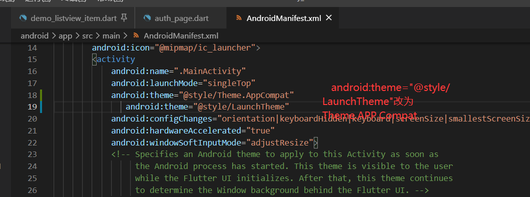
android:theme="@style/Theme.AppCompat"
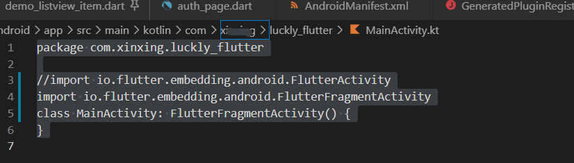
package com.xinxing.luckly_flutter

//import io.flutter.embedding.android.FlutterActivity
import io.flutter.embedding.android.FlutterFragmentActivity
class MainActivity: FlutterFragmentActivity() {
}
Some configurations using biometric authentication in FlutterIos
Info. Add the following configuration to plist
NSFaceIDUsageDescriptionfaceid for authentication?