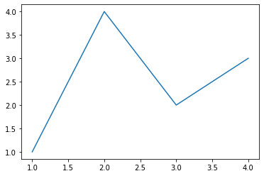
1, One of the simplest drawing examples
The image of Matplotlib is drawn on figure (such as windows, Jupiter form), and each figure contains one or more axes (a sub region that can specify the coordinate system). The easiest way to create figures and axes is through Pyplot Subplots command. After creating axes, you can use axes Plot draws the simplest line chart (Pyplot is a sub Library of Matplotlib, which provides a drawing API similar to MATLAB. It is a common drawing module and can facilitate users to draw 2D charts).
import matplotlib.pyplot as plt
import matplotlib as mpl
import numpy as np
fig, ax = plt.subplots()  # Create a figure containing an axis
ax.plot([1, 2, 3, 4], [1, 4, 2, 3]);  # Draw an image (a line chart with point coordinates of [1,1], [2,4], [3,2], [4,3])
The plot() function of Pyplot is the most basic function for drawing two-dimensional graphics.
plot(x, y)        # Create a 2D line diagram of the data in y and the corresponding value in x, using the default style
plot(x, y, 'bo')  # Create a two-dimensional line diagram of the data in y and the corresponding value in x, drawn with a blue solid circle
plot(y)           # The value of x is 0 N-1
plot(y, 'r+')     # Use red + sign
Trick:
(1) When using matplotlib in jupyter notebook, you will find that the code will automatically print similar information after running
<matplotlib. lines. Line2d at 0x23155916dc0 > this is because the drawing code of Matplotlib prints the last object by default. If you don't want to show this sentence, there are three methods. You can find the use of these three methods in the code examples in this chapter.
- Add a semicolon at the end of the code block;
- Add a sentence PLT. At the end of the code block show()
- When drawing, the drawing object is explicitly assigned to a variable, such as PLT Change plot ([1, 2, 3, 4]) to line = plot plot([1, 2,3, 4])
(2) You can draw images in a simpler way, matplotlib The pyplot method can draw an image directly on the current axes. If the user does not specify axes, matplotlib will help you create one automatically. So the above example can also be simplified to the following line of code.
line =plt.plot([1, 2, 3, 4], [1, 4, 2, 3])
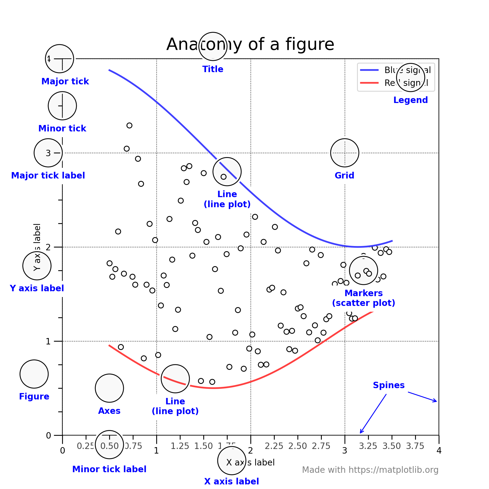
2, Figure composition
Through an anatomical figure, we can see that a complete matplotlib image usually includes the following four levels, which are also called container s, which will be described in detail in the next section. In the world of matplotlib, we will manipulate every part of the image through various command methods to achieve the final effect of data visualization. A complete image is actually a collection of various sub elements.
- Figure: top level, used to hold all drawing elements
- Axes: matplotlib is the core of the universe and contains a large number of elements to construct subgraphs. A figure can be composed of one or more subgraphs
- Axis: the subordinate level of axes, which is used to process all elements related to coordinate axes and grids
- Tick: the subordinate level of axis, which is used to handle all scale related elements
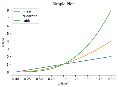
3, Two drawing interfaces
matplotlib provides two of the most commonly used drawing interfaces( Relationship between two drawing modes)
- Explicitly create figure and axes, and call the drawing method on them, also known as OO mode (object oriented style)
- Rely on pyplot to automatically create figure and axes and plot
(1) Use the first drawing interface:
x = np.linspace(0, 2, 100)	# numpy. The linspace function is used to create a one-dimensional array, which is composed of an arithmetic sequence

fig, ax = plt.subplots()
# Label sets the line label, and xlabel() and ylabel() methods set the labels of x-axis and y-axis
ax.plot(x, x, label='linear')
ax.plot(x, x**2, label='quadratic')
ax.plot(x, x**3, label='cubic')
ax.set_xlabel('x label')
ax.set_ylabel('y label')
ax.set_title("Simple Plot")
ax.legend()
plt.show()
(2) The second drawing interface is used to draw the same diagram. The code is as follows:
x = np.linspace(0, 2, 100)

plt.plot(x, x, label='linear')
plt.plot(x, x**2, label='quadratic')
plt.plot(x, x**3, label='cubic')
plt.xlabel('x label')
plt.ylabel('y label')
plt.title("Simple Plot")
plt.legend()
plt.show()
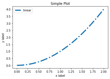
4, General drawing template
(1) OO mode
# step1 prepare data
x = np.linspace(0, 2, 100)
y = x**2

# step2 set up the first mock exam. The extension of this module is further learned in the fifth chapter. This step is not necessary. The style can also be set when drawing the image.
mpl.rc('lines', linewidth=4, linestyle='-.')

# step3 defines the layout the extension of the first mock exam is further learned in the third chapter.
fig, ax = plt.subplots()

# step4 the first mock exam is extended to the second chapter.
ax.plot(x, y, label='linear')

# step5 add labels, the text and legend, the extension of the first mock exam, the fourth chapter, further study.
ax.set_xlabel('x label')
ax.set_ylabel('y label')
ax.set_title("Simple Plot")
ax.legend() ;
(2) Second mode template
x = np.linspace(0,2,100)
y = x**2

mpl.rc('lines',linewidth=4, linestyle='-.')
plt.plot(x,y,label='linear')
plt.xlabel('x label')
plt.ylabel('y label')
plt.title('Simple Plot')
plt.legend();