Xiaobai, who wants to switch to data analysis in the Internet industry, has a certain understanding of python through Buddhist Study in winter vacation. Record the first gadget.
When I was brushing the cross forum, I suddenly saw a data analysis about the NBA. Because I also like playing very much, I immediately became interested.
Because I didn't know much about the url of python, I couldn't climb down the data from the Internet after looking for a pile of materials (almost persuaded). Later, I finally took the first step by looking for materials with ready-made csv.
First open the downloaded CSV data file
import matplotlib.pyplot as plt
import pandas as pd
from matplotlib.patches import Circle, Rectangle, Arc
from matplotlib.offsetbox import OffsetImage
data1 = pd.read_csv('shots-2019Aaron.csv',encoding='utf-8')
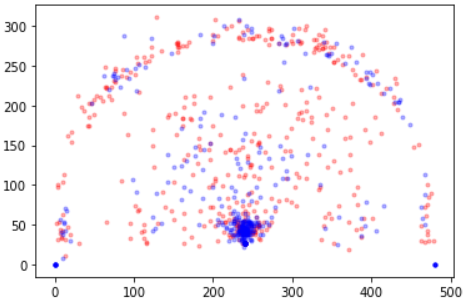
data1 Then, set the file in it as a scatter diagram through matplotlib, and draw it by determining four elements.
made = data1[data1['outcome']==1]
missed = data1[data1['outcome']==0]
plt.scatter(missed.y, missed.x,color='r', marker='.', alpha=0.3)
plt.scatter(made.y, made.x,color='b', marker='.', alpha=0.3)
#Delete the border and use it
#plt.tick_params(labelbottom=False, labelleft=False)
The first point is to determine the name of a player
The second point is the position of the player's X-axis.
The third point is the position of the player's Y-axis.
The fourth point is whether the ball has scored.
Finally, it looks like this.
 .
.
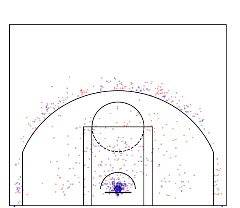
Draw the court again and you'll be finished.
Through the three tools Arc, Rectangle and Circle in matplotlib. Draw Arc, Rectangle and Circle respectively.
#First determine the canvas size
fig = plt.figure(figsize=(12, 10))
#Then determine the division area
ax = fig.subplots(1,1)
Next, you can start to draw the court in the canvas. Pay attention to the drawing coordinates here.
#The ball basket is 45cm and then scaled equally
circle = Circle((240,40), radius=7.5, linewidth=2, fill=False)
# The whole stadium
outer_box = Rectangle((-10, 0), 500,437 , linewidth=2,fill=False)
#Backboard frame
backboard = Rectangle((210, 32.5), 60, -2, linewidth=2,color ='k')
# Draw a small rectangle inside, widt=12ft, height=19ft
inner_box = Rectangle((160, 0), 160, 190, linewidth=2, color='k',fill=False)
inner_box2 = Rectangle((180, 0), 120, 190, linewidth=2, color='k',fill=False)
# three point line
three_point = Rectangle((19,0),0,130,linewidth=2,color='k')
three_point2 = Rectangle((460,0),0,130,linewidth=2,color='k')
three_arc = Arc((240, 40), 475, 475, theta1=22, theta2=158, linewidth=2,color='k')
# Draw the top arc of the free throw
top_free_throw = Arc((240, 190), 120, 120, theta1=0, theta2=180,linewidth=2, color='k', fill=False)
bottom_free_throw = Arc((240, 190), 120, 120, theta1=180, theta2=0,linewidth=2, color='k', linestyle='--')
# restricted area
restricted = Arc((240, 40), 80, 80, theta1=0, theta2=180, linewidth=2,color='k')

rectangle_list=[circle,outer_box,backboard,inner_box,top_free_throw,bottom_free_throw,restricted,inner_box2,three_point,three_point2,three_arc]
# roof filled color
for rect in rectangle_list:
    ax.add_patch(rect)
# Use the for loop to add an image to the canvas
plt.ylim(-10,500)
# The y-axis value decreases from bottom to top
# It is convenient to place the ball basket on the top of the figure
plt.xlim(-50, 550)
plt.show
The course comes out, and then the scatter diagram is combined with the course, which is the effect.
However, after this data analysis, I found that a lot of data were pieced together everywhere. In fact, I didn't knock down much. If I said that there was no harvest, it wasn't all no harvest. If I said that there was harvest, I felt that the possibility of harvest was that I had a thought about data analysis. The key point was to obtain data, and the next step of analysis was possible only with data, Visualization.
If there are mistakes, I hope you can give me more advice. Finally, I hope some big men can give some suggestions on reemployment or direction.