Fluent learning (3) picture component
Review the basic framework built before
import 'package:flutter/material.dart';
void main(){
runApp(MyApp());
}
class MyApp extends StatelessWidget{
@override
Widget build(BuildContext context){
return MaterialApp(
home:Scaffold(
appBar:AppBar (title: Text("flutter demo")),
body:HomeContent()
)
);
}
}
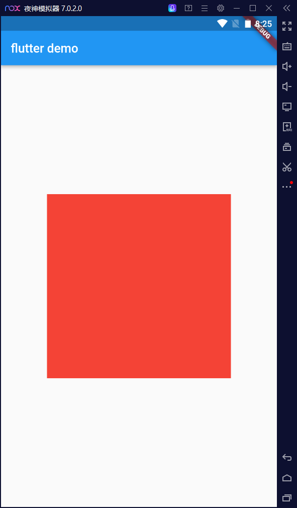
class HomeContent extends StatelessWidget{
Widget build(BuildContext context){
return Center(
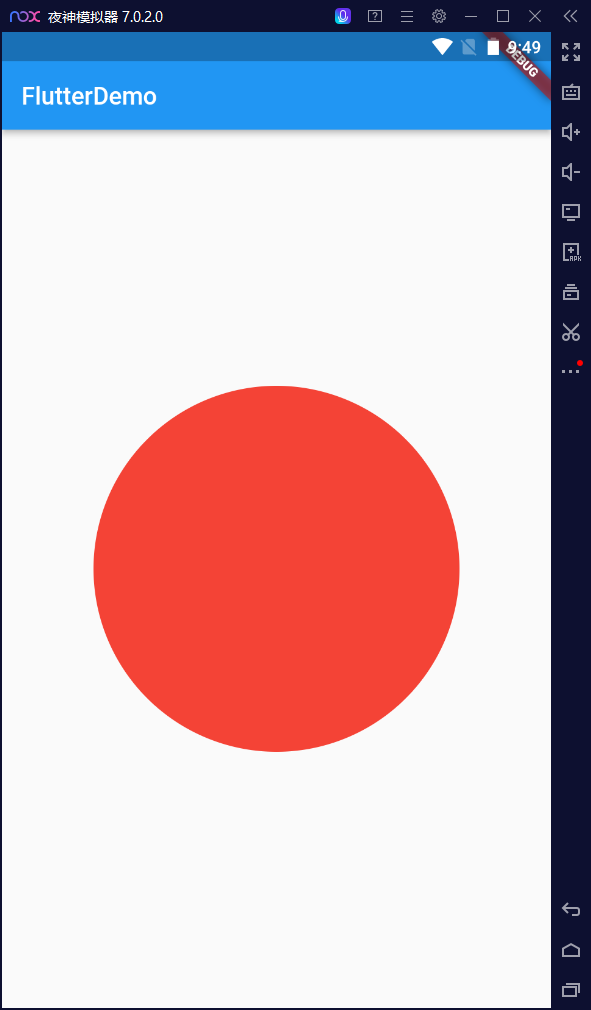
child: Container(
width:300,
height: 300,
decoration: BoxDecoration(
color:Colors.red
),
)
);
}
}
-
effect
Shutter picture component
Image component is a component that displays an image. There are many constructors in the image component
This time learn the local image Asset and remote image Network two components
-
Common properties of Image component
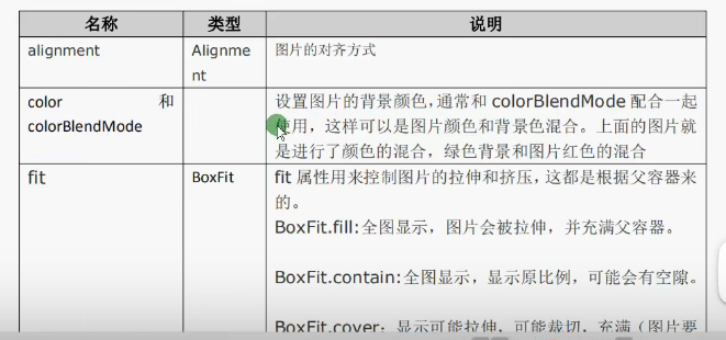
BoxFit.cover: display possible stretching, possible cutting and filling (the picture should fill the whole container without deformation)
I Remote picture
-
It's better to put the picture in a container
-
Picture as a sub component of Container
Based on the original framework
-
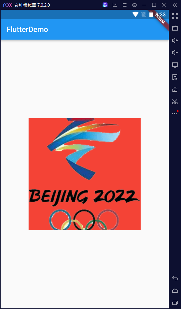
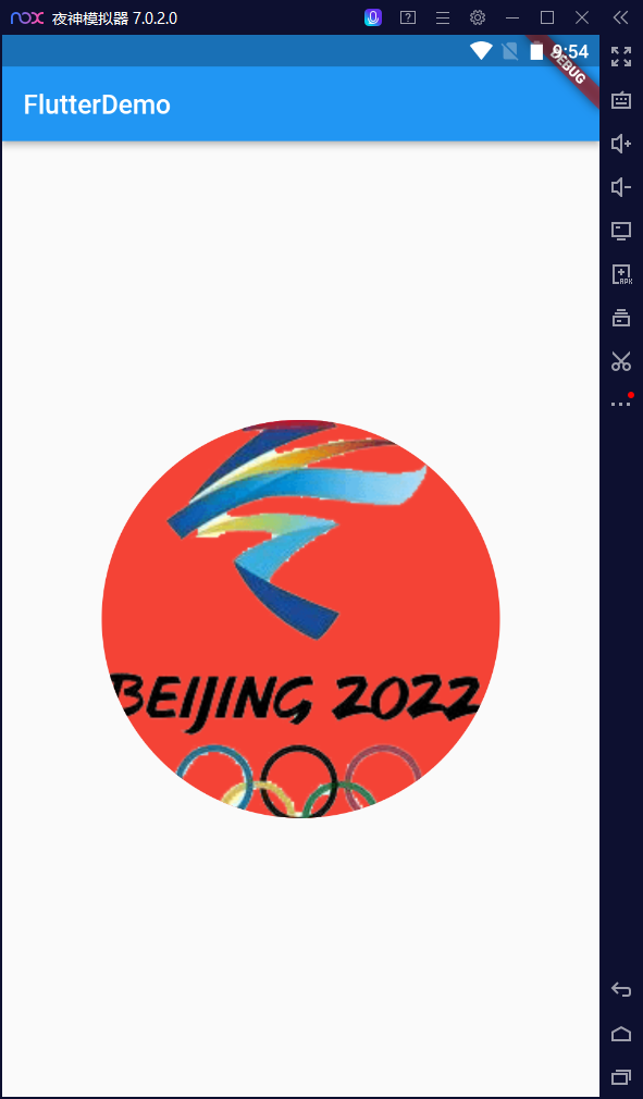
The Winter Olympics is coming. Find a picture of the ice pier on the Internet.
import 'package:flutter/material.dart'; import 'package:testforgramma/main_bk2.dart'; void main(){ runApp(MyApp()); } class MyApp extends StatelessWidget{ Widget build(BuildContext context){ return MaterialApp( home: Scaffold( appBar: AppBar(title: Text("FlutterDemo")), body: HomeContent(), ) ); } } class HomeContent extends StatelessWidget{ Widget build(BuildContext context){ return Center( child: Container( child: Image.network("https://img.fx361.cc/images/2022/01/22/qkimagesywsxywsx202201ywsx20220114-1-l.jpg"), width:300.0, height: 300.0, decoration: BoxDecoration( color:Colors.red ), ) ); } }-
effect

-
-
-
alignment attribute
Let the picture show in the upper left corner: alignment topLeft
Official document: the default is central alignment center
return Center(
	child: Container(
		child: Image.network(
			"https://img.fx361.cc/images/2022/01/22/qkimagesywsxywsx202201ywsx20220114-1-l.jpg",
		alignment: Alignment.topLeft,
		),
		width:500.0,
		height:500.0,
		decoration: BoxDecoration(
			color: Colors.red
		),
	)

);
-
effect
-
-
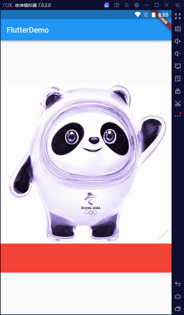
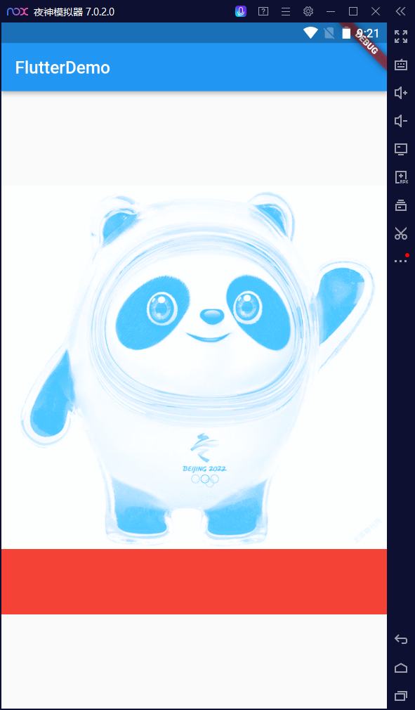
color property
color: Colors.lightBlueAccent,
            colorBlendMode: BlendMode.screen,
effect:
-
Important attribute fit
fit:BoxFit.cover
effect
-
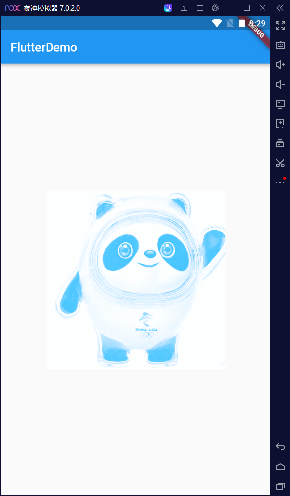
Affirmative picture of Bing dwen dwen square. Try a rectangle picture.
child: Image.network( "http://p6.itc.cn/q_70/images03/20201207/56b608773b7b478287921c1ae021ac0a.png", alignment: Alignment.center, fit:BoxFit.cover ),-
effect
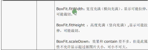
fit: Boxfit. The effect of fill is as follows

-
-
II Fletter implements rounded corners and circular images
FA Yi
-
Container BorderRadius is combined with the image attribute of boxdescription
-
Let's review the BorderRadius we learned before
class HomeContent extends StatelessWidget{
  Widget build(BuildContext context){
    return Center(
      child: Container(

        width:400.0,
        height: 300.0,
        decoration: BoxDecoration(
          color:Colors.red,
          borderRadius : BorderRadius.all(
            Radius.circular(150),
          )
        ),
      )
    );
  }
}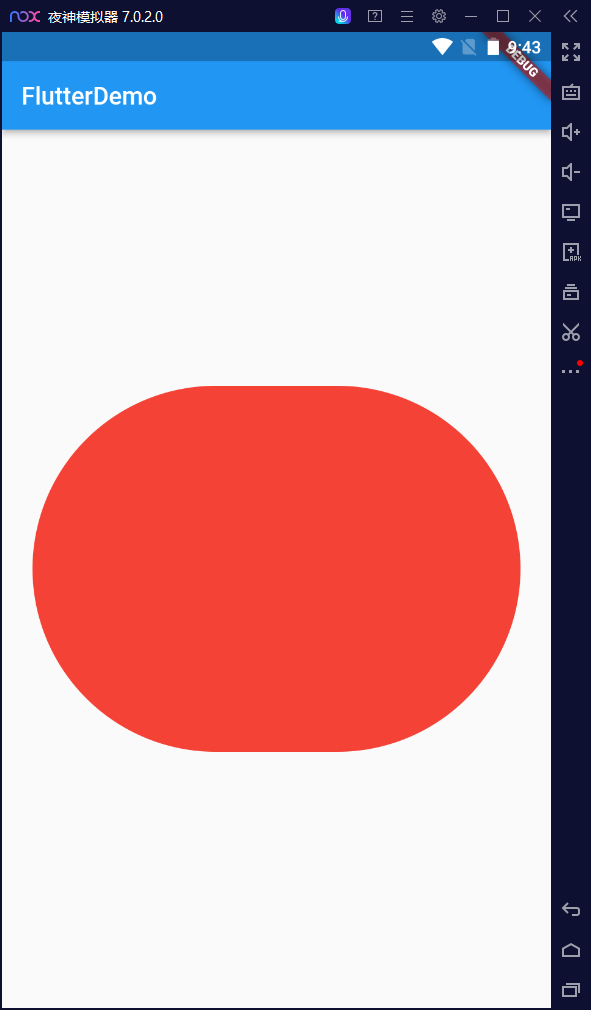
-
Realize circular
First set the Container as a square, and then the parameter size in the circular is half the side length of the square
class HomeContent extends StatelessWidget {
	Widget build(BuildContext context) {
		return Center(
			child : Container(
				width:300,
				height:300
				decoration: BoxDecration(
					color: Colors.red,
					borderRadius: BorderRaidus.circular(150)
				),
			)
		);
	}
}
effect
Method documentation
-
Insert the picture
class HomeContent extends StatelessWidget { Widget build(BuildContext context) { return Center( child: Container( width: 300.0, height: 300.0, decoration: BoxDecoration( color: Colors.red, borderRadius: BorderRadius.circular(150), image: DecorationImage( image:NetworkImage( "http://p6.itc.cn/q_70/images03/20201207/56b608773b7b478287921c1ae021ac0a.png", ), fit: BoxFit.cover ) ), ) ); } } -
effect
Method 2 (simpler)
-
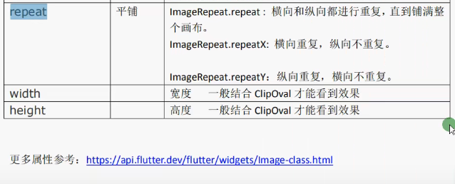
ClipOval component
The height and width of image should be combined with ClipOval to see the effect
-
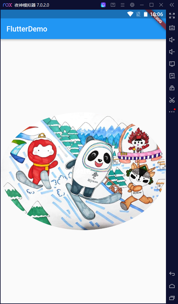
Try a picture
class HomeContent extends StatelessWidget { Widget build(BuildContext context) { return Center( child: Container( child: ClipOval( child: Image.network("https://gimg2.baidu.com/image_search/src=http%3A%2F%2Fci.xiaohongshu.com%2Feac64a49-e717-7e41-a592-5b7bee20297c%3FimageView2%2F2%2Fw%2F1080%2Fformat%2Fjpg&refer=http%3A%2F%2Fci.xiaohongshu.com&app=2002&size=f9999,10000&q=a80&n=0&g=0n&fmt=jpeg?sec=1646920654&t=40f05d8a75f0143d877f9d19ad886e43") ) ) ); } }-
effect
-
Add the height and width attributes
width:100,
height:100
At this time, it is still not round
Add fit attribute
class HomeContent extends StatelessWidget {
	Widget build(BuildContext context) {
		return Center(
			child: Container(

				child: ClipOval(
					child: Image.network("url ellipsis",
					height:100,
					width:100,
					fit:BoxFit.cover
					)

				)

			)

		);
	}
}
-
III Local picture
1. Create a new directory structure
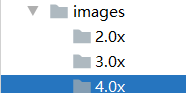
2. Modify pubspec Yaml file
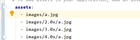
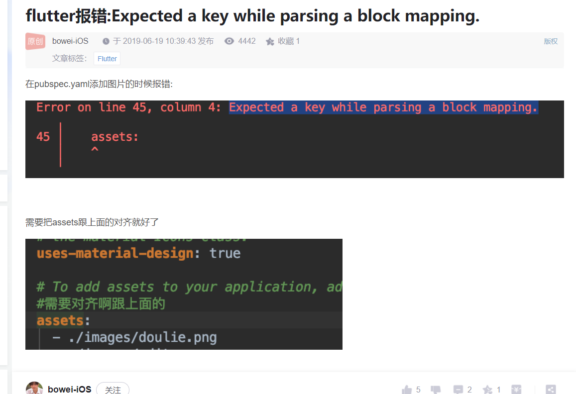
Pay attention to this error report
As for why 2.0x and 3.0x should be set, see the article of this big man: 👉 Explain the use of local resource pictures in fluent
3. Examples
-
Local images are prone to bug s. If they are not loaded, try to terminate the project first and re flip run
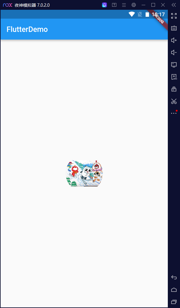
class HomeContent extends StatelessWidget {
  Widget build(BuildContext context) {
    return Center(
      child:Container(
          child: Image.asset(
              "images/a.jpg",
              fit:BoxFit.cover
          ),
          width:300.0,
          height: 300.0,
          decoration: const BoxDecoration(
              color:Colors.yellow
          )
      )

    );
  }
}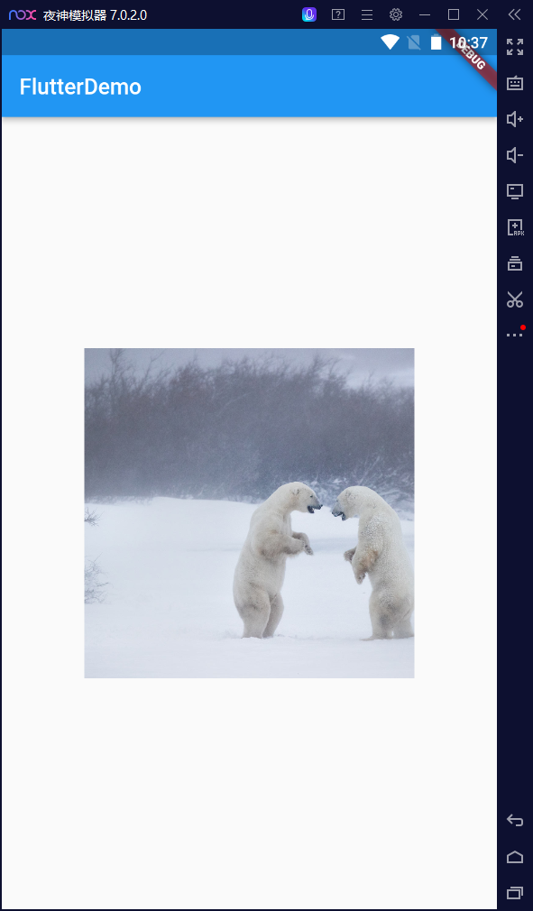
IV other
1.AS split screen
- vertically split screen horizontally
- horizontally vertical split screen
2.Git
- reference resources: Using gitee on Android Studio 3.6.1
3. Night God simulator
AS's own adb really consumes resources. I think of the fear that I have less than 10G left in drive C. I refer to this article written by the boss Installation tutorial of night God simulator
- horizontally vertical split screen