Official upgrade document https://ant.design/docs/react/migration-v4-cn
1, Upgrade preparation
Upgrade react to 16.14.0 0: yarn add react@16.14.0
Upgrade react DOM to 16.14.0 0: yarn add react-dom@16.14.0
New version antd4: yarn add antd@4.16.12
antd3 compatible Icon and Form transition package: yarn add @ Ant Design / compatible
2, Execute
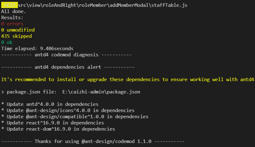
npx -p @ant-design/codemod-v4 antd4-codemod src
3, Icon automatically compatible with antd3
Usage of antd3
import { Icon } from 'antd';
antd4 uses a new writing method to load Icon on demand
import { MinusCircleOutlined, PlusCircleOutlined } from '@ant-design/icons';
4, Automatically compatible with antd3 Form
1. The difference between antd3 and antd4 is from high-order components to ordinary components
antd4 does not require form Create wrapper
The values after successful antd4 verification are obtained directly through onFinish
antd4 does not need a getFieldDecorator wrapper, and name rules initialValues are passed as component attributes
2. Usage of antd3
import React from "react";
import { Form, Input, Button } from "antd";
const Demo = ({ form }) => {
  const { getFieldDecorator, validateFields } = form;
  const handleSubmit = e => {
    e.preventDefault();
    validateFields((err, values) => {
      if (!err) {
        console.log(values);
      }
    });
  };
  return (
    <Form layout="inline" onSubmit={handleSubmit}>
      <Form.Item>
        {getFieldDecorator("username", {
          initialValue: '',
          rules: [{ required: true, message: "Please input your username!" }]
        })(<Input />)}
      </Form.Item>
      <Form.Item>
        <Button type="primary" htmlType="submit">
          Submit
        </Button>
      </Form.Item>
    </Form>
  );
};
export default Form.create()(Demo);
3. New usage of antd4
import React from "react";
import { Form, Input, Button } from "antd";
const Demo = () => {
  const onFinish = values => {
    console.log(values);
  };
  return (
    <Form
      name="basic"
      layout="inline"
      initialValues={{ username: '' }}
      onFinish={onFinish}
    >
      <Form.Item
        label="full name"
        name="username"
        rules={[{ required: true, message: "Please input your username!" }]}
      >
        <Input />
      </Form.Item>
      <Form.Item>
        <Button type="primary" htmlType="submit">
          Submit
        </Button>
      </Form.Item>
    </Form>
  );
};
export default Demo;
5, Table compatible with antd3 manually
1,scroll={{ x: 'max-content', y: document.body.clientHeight }}
If y is not defined in antd3, a header scroll bar will be formed when empty data is used. antd4 solves this bug
2. The default width of antd4 is 100%, which will cause table extrusion. It is recommended to use X: 'max content' or specify the width
3. After upgrading antd4, remove Y: document body. clientHeight,
4. At present, there are too few default 10 table s per page. After upgrading antd4, it is recommended to default 20
5. From 4.1 More than 50 pieces of data from 0 will display pageSize switcher by default. Some antd3 pages do not support paging. Add showSizeChanger: false
pagination: {
        current: 1,
        pageSize: 30,
        showSizeChanger: false, // Some antd3 pages do not support paging. Add showSizeChanger
}
6. The onChange method of antd4 will also be triggered when the pageSize value changes, resulting in two requests. The original two callbacks onChange and onShowSizeChange need to be changed to one onChange
7. For sorting problems, after antd4 upgrade, onChange calls back the columnKey of the third parameter sorter, which is undefined by default, while the field has a value and needs to be assigned
handleTableChange = (pagination, filters, sorter) => {
   sorter.columnKey = sorter.field; // antd4 upgrade columnKey is undefined by default, and the field has a value
   if (sorter.order === false) sorter = {}; // antd4 upgrade compatible with historical requirements
8. Whether the table row can be selected antd4 or not. The configuration of preserveSelectedRowKeys is added. The default is false. It is recommended to be false when deleting in batch. If the key needs to be reserved when switching pages, preserveSelectedRowKeys needs to be added: true
<Table
    columns={columns}
    dataSource={tableData}
    pagination={this.pagination}
    onChange={this.handleTableChange}
    rowSelection={{
    	selectedRowKeys,
    	onChange: this.tableSelectChange,
    	preserveSelectedRowKeys: true,
    }}
6, Manually compatible with antd3 Tree
1. Ant D3 supports Tree nested treeselect Treenode and antd4 are not supported. It needs to be changed to Tree TreeNode
2. The organization structure Tree and department width may be too long, and a scroll bar needs to be added
.staffListDeptTree {
    overflow-x: auto;  // Lateral roll
    white-space: nowrap; // nowrap
  }
7, Manually compatible with antd3 TreeSelect
1. The value of TreeSelect of antd3 supports matching number and string. antd4 must be of the same type
2. When the value of TreeSelect of antd3 is null, it can be assigned null. antd4 cannot be assigned null, and it can be assigned empty array []
3. antd4 uses virtual scrolling, so the width will not adapt automatically. Turn off virtual scrolling
<TreeSelect
     value={changeDept}
     placeholder="Search or select Department"
     dropdownMatchSelectWidth={false} // Turn off virtual scrolling
     onSearch={this.onSearch}
     onChange={this.onChangeDept}
 >
</TreeSelect>
8, Manual compatible Upload
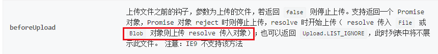
There is a bug in the official document of antd4. When the actual result is passed into the blob object, it will be converted into a new File object, resulting in the loss of some properties
You need to package it yourself
file = new File([file], file.name, { type: file.type });