Matplotlib data visualization related knowledge
1, Matplotlib Foundation
Python extension library Matplotlib relies on extension library numpy and standard library tkinter. It can draw various forms of graphics, such as line chart, scatter chart, pie chart, histogram, radar chart, etc., and the graphics quality can meet the publishing requirements.
Python extension library, matplotlib mainly includes drawing modules such as pylab and pyplot and a large number of modules for the management and control of graphic elements such as font, color and legend. It provides a drawing interface similar to MATLAB, supports the management and control of line style, font attribute, axis attribute and other attributes, and can draw beautiful patterns with very simple code.
The general process of drawing with pylab or pyplot is as follows:
-
Data is generated or read in first
-
Draw two-dimensional line chart, scatter chart, histogram, pie chart, radar chart or three-dimensional curve, surface, histogram, etc. according to actual needs
-
xlabel() and ylabel() functions of coordinate axis label (matplotlib.pyplot module) or * * set of axis field_ xlable(),set_ylable() * * method)
Xticks() and yticks() functions of coordinate axis scale (matplotlib.pyplot module) or * * set of axis field_ xticks(),set_yticks() * * method)
Legend (legend() function of matplotlib.pyplot module)
title (title Function of matplotlib.pyplot module)
4. Display or save drawing results
2, Drawing of five common graphics
1. Line chart (plot)
The line chart is drawn with Matplotlib The function plot() in pyplot specifies the position of the end point on the line chart, the shape, size and color of the marking symbol, as well as the color and linetype of the line through parameters.
format
plot( args, kwargs)
Common parameters of the plot() function
| Parameter name | meaning |
|---|---|
| args | (parameter 1, parameter 2, parameter 3) |
The first parameter is used to specify the X coordinate of one or more endpoints on the line chart
The second parameter is used to specify the Y coordinate of one or more endpoints on the line chart
The third parameter is used to specify the color, linetype and marker symbol shape of the line chart at the same time (which can also be specified through the key parameter Kwargs)
| colour | 'r' red, 'g' green, 'b' blue, 'c' cyan,'m 'magenta,' y 'yellow,' k 'black,' w 'white |
|---|---|
| linear | '-' solid line, '–' dash, '-.' Dotted line, ':' dotted line |
| Marker symbol | ‘.’ Dot, 'o' circle, 'v' downward triangle, '^' upward triangle, '<' leftward triangle, '>' rightward triangle, '*' pentagram, '+' plus sign, '-' minus sign, 'x' x sign,'D 'Diamond |
For example, plot(x,y, 'g-v') draws a green solid line with X, y elements as endpoint coordinates and uses a downward triangle as the marker endpoint
Kwargs
| It is used to set properties such as label, line width, anti aliasing, size, edge color, edge width and background color of marker symbols |
|---|
| **alpha: * * specifies the transparency, which is between 0 and 1. The default is 1, which means it is completely opaque |
| antialiased or aa: True indicates that antialiasing or antialiasing is enabled for graphics, False indicates that it is not enabled, and the default is True |
| Color or c: used to specify the line color. See the table above for the values |
| Label: used to specify the line label, which will be displayed in the legend after setting |
| linestytle or ls: Specifies the line shape |
| linewidth or lw: Specifies the line width |
| Marker: Specifies the shape of the marker symbol |
| Markredgecolor or mec: Specifies the color of the marker symbol edge |
| Marker edgewidth or mew: Specifies the width of the marker symbol edge |
| markerfacecolor or mfc: used to specify the background color of the marker symbol |
| Marker size or ms: used to specify the size of the marker symbol |
| Visible: Specifies whether lines and marker symbols are visible. The default value is True |
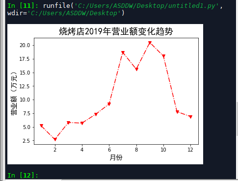
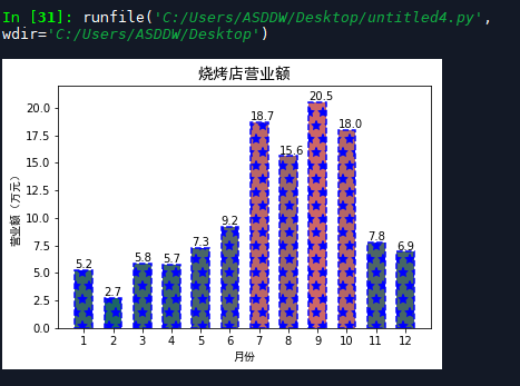
Example (barbecue stand)
It is known that the monthly turnover of a barbecue shop near the school in 2019 is shown in the table. Write a program to draw a broken line diagram to visualize the annual turnover of the barbecue shop. You can use red dotted lines to connect the data of each month, and use triangle marks in the data of each month
| Monthly turnover of a barbecue shop in 2019 |
|---|
| month | 1 | 2 | 3 | 4 | 5 | 6 | 7 | 8 | 9 | 10 | 11 | 12 |
|---|---|---|---|---|---|---|---|---|---|---|---|---|
| turnover | 5.2 | 2.7 | 5.8 | 5.7 | 7.3 | 9.2 | 18.7 | 15.6 | 20.5 | 18.0 | 7.8 | 6.9 |
import matplotlib.pyplot as plt

#Monthly and monthly turnover
month = list(range(1,13))
money = [5.2,2.7,5.8,5.7,7.3,9.2,18.7,15.6,20.5,18.0,7.8,6.9]
plt.plot(month,money,'r-.v')
plt.xlabel('month',fontproperties='simhei',fontsize=14)
plt.ylabel('Turnover (10000 yuan)',fontproperties='simhei',fontsize=14)
plt.title('Turnover trend of barbecue shop in 2019',fontproperties='simhei',fontsize=18)

#Shrink the surrounding white space and expand the available area of the drawing area
#plt.tight_layout()

plt.show()
The results are shown in the figure:
2. scatter chart
Scatter diagram is more suitable to describe the distribution of data in plane or space, and can be used to help analyze the association between data.
format
scatter(x,y,s=None,c=None,marker=None,cmap=None,norm=None,vmin=None,vmax=None,alpha=None,
linewidths=None,verts=None,edgecolors=None,hold=None,data=None, kwargs)
Common parameters of scatter() function
| Parameter name | meaning |
|---|---|
| x,y | Used to specify the x and y coordinates of scatter points respectively, which can be scalar or array data. |
| s | Specifies the size of the scatter symbol |
| marker | Specifies the shape of the scatter symbol |
| alpha | Specifies the transparency of the scatter symbol |
| linewidths | Specifies the lineweight, which can be a scalar or an array like object |
| edgecolors | Specifies the edge color of the scatter symbol, which can be a color value or a sequence of several colors |
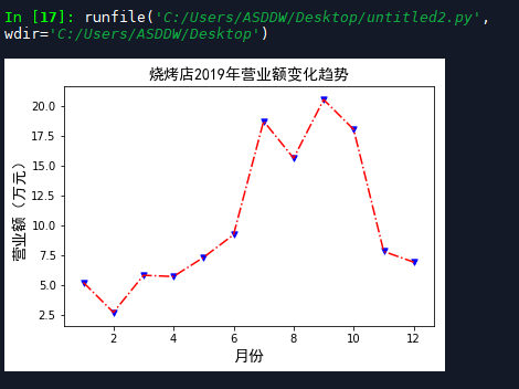
Example 1 (barbecue stand)
Combine the line chart and scatter chart to redraw the line chart of the barbecue stand. Use the plot() function to connect several endpoints in turn to draw a line chart, and use the scatter() function to draw a scatter chart at the specified endpoint. Combined with these two functions, the result chart of the line chart can be obtained again. However, in order to distinguish, the endpoint symbol is set to blue triangle this time.
| Monthly turnover of a barbecue shop in 2019 |
|---|
| month | 1 | 2 | 3 | 4 | 5 | 6 | 7 | 8 | 9 | 10 | 11 | 12 |
|---|---|---|---|---|---|---|---|---|---|---|---|---|
| turnover | 5.2 | 2.7 | 5.8 | 5.7 | 7.3 | 9.2 | 18.7 | 15.6 | 20.5 | 18.0 | 7.8 | 6.9 |
import matplotlib.pyplot as plt

#Monthly and monthly turnover
month = list(range(1,13))
money = [5.2,2.7,5.8,5.7,7.3,9.2,18.7,15.6,20.5,18.0,7.8,6.9]

#Draw a line chart and set the color and line type
plt.plot(month,money,'r-.')

#Draw a scatter chart and set the color, symbol, and size
plt.scatter(month,money,c='b',marker='v',s=28)
plt.xlabel('month',fontproperties='simhei',fontsize=14)
plt.ylabel('Turnover (10000 yuan)',fontproperties='simhei',fontsize=14)
plt.title('Turnover trend of barbecue shop in 2019',fontproperties='simhei',fontsize=14)

plt.show()
The results are shown in the figure:
Example 2 (mall signal strength)
A shopping mall arranges staff to test the mobile phone signal strength at different locations to further improve the shopping mall signal. The test data is saved in the file "D: \ service quality assurance \ mobile phone signal strength on the first floor of the shopping mall. txt". Each line of the file uses three numbers separated by commas to represent the x,y coordinates and signal strength of a location in the shopping mall, where x, The Y coordinate value takes the southwest corner of the shopping mall as the coordinate origin, and the East is the X positive axis (150m in total) and the north is the Y positive axis (30m in total). The signal strength is 0, indicating no signal and 100, indicating the strongest
Open file to read data:
with open(r'D:\Service quality assurance\Mobile phone signal strength on the first floor of shopping mall.txt') as fp:
3. Histogram (bar)
format
bar(left,height,width=0.8,bottom=None,hold=None,data=None, kwargs)
Common parameters of bar() function
| Parameter name | meaning |
|---|---|
| left | Specifies the x coordinate of the left border of each column |
| height | Specify the height of each column |
| bottom | Specify the y coordinate of the bottom border of each column |
| width | Specifies the width of each column, which defaults to 0.8 |
| color | Specifies the color of each column |
| edgecolor | Specifies the color of the border for each column |
| linewidth | Specifies the line weight of the border for each column |
| align | Alignment of each column |
| orientation | Specify the orientation of the column. When 'vertical', it is a vertical histogram, and when 'horizontal', it is a horizontal histogram |
| alpha | Specify transparency |
| hatch | Specifies the internal fill symbol. The optional values are '/', '\ \', '|' - ',' + ',' x ',' o ',' o ',' “*” |
| label | Specifies the text label displayed in the legend |
| fill | Set whether to fill |
Example 1 (performance of a shopping mall department)
The monthly performance of several departments of a shopping mall in 2019 is shown in the figure below. Write a program to draw a histogram to visualize the performance of each department. You can quickly draw graphics with the help of pandas's DataFrame structure, and require that the coordinate axis, title and legend can be displayed in Chinese.
| Performance of each department of a shopping mall |
|---|
| month | 1 | 2 | 3 | 4 | 5 | 6 | 7 | 8 | 9 | 10 | 11 | 12 |
|---|---|---|---|---|---|---|---|---|---|---|---|---|
| men's wear | 51 | 32 | 58 | 57 | 30 | 46 | 38 | 38 | 40 | 53 | 58 | 50 |
| Women's wear | 70 | 30 | 48 | 73 | 82 | 80 | 43 | 25 | 30 | 49 | 79 | 60 |
| Restaurant | 60 | 40 | 46 | 50 | 57 | 76 | 70 | 33 | 70 | 61 | 49 | 45 |
| Cosmetics | 110 | 75 | 130 | 80 | 83 | 95 | 87 | 89 | 96 | 88 | 86 | 89 |
| Gold and silver jewelry | 143 | 100 | 89 | 90 | 78 | 129 | 100 | 97 | 108 | 152 | 96 | 87 |
import pandas as pd
import matplotlib.pyplot as plt
import matplotlib.font_manager as fm

data = pd.DataFrame({'month':[1,2,3,4,5,6,7,8,9,10,11,12],
			'men's wear':[51,32,58,57,30,46,38,38,40,53,58,50],
			'Women's wear':[70,30,48,73,82,80,43,25,30,49,79,60],
			'Restaurant':[60,40,46,50,57,76,70,33,70,61,49,45],
			'Cosmetics':[110,75,130,80,83,95,87,89,96,88,86,89],
			'Gold and silver jewelry':[143,100,89,90,78,129,100,97,108,152,96,87]})

#Draw a histogram and specify the month data as the x-axis
data.plot(x='month',kind='bar')
#Set x and y axis labels and fonts
plt.xlabel('month',fontproperties='simhei')
plt.ylabel('Turnover (10000 yuan)',fontproperties='simhei')

#Set legend font
myfont = fm.FontProperties(fname=r'C:\Windows\Fonts\STKAITI.ttf')
plt.legend(prop=myfont)

plt.show()
The results are shown in the figure below:
Example 2 (barbecue stand)
It is required that the color, internal fill symbol, stroke effect and dimension text of each column can be set
import matplotlib.pyplot as plt

month = list(range(1,13))
money = [5.2,2.7,5.8,5.7,7.3,9.2,18.7,15.6,20.5,18.0,7.8,6.9]

#Draw monthly turnover
for x,y in zip(month,money):
	#The higher the turnover, the greater the red component in the color
	#0 in the format string indicates that if there are not enough 2 bits, it shall be preceded by 0
	color = '#%02x'%int(y*10)+'6666'
	plt.bar(x,y,
			color=color,hatch='*',width=0.6,
			edgecolor='b',linestyle='--',linewidth=1.5)
	plt.text(x-0.3,y+0.2,'%.1f'%y)

plt.xlabel('month',fontproperties='simhei')
plt.ylabel('Turnover (10000 yuan)',fontproperties='simhei')
plt.title('Barbecue shop turnover',fontproperties='simhei',fontsize=14)

#Set x-axis scale
plt.xticks(month)
#Set y-axis span
plt.ylim(0,22)
plt.show()
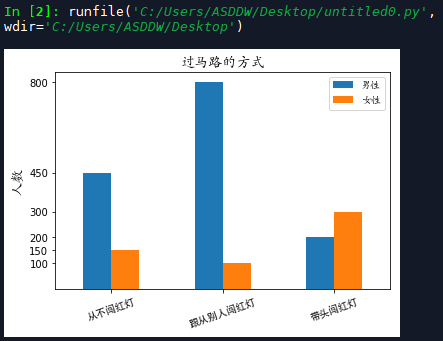
Example 3 (group crossing)
Compile a histogram for display and comparison
| Investigation of red light running |
|---|
| Never run a red light | Follow others through the red light | Take the lead in running the red light | |
|---|---|---|---|
| Male | 450 | 800 | 200 |
| female sex | 150 | 100 | 300 |
import pandas as pd
import matplotlib.pyplot as plt
import matplotlib.font_manager as fm

#Create DataFrame structure
df = pd.DataFrame({'Male':(450,800,200),
				'female sex':(150,100,300)})

df.plot(kind='bar')
plt.xticks([0,1,2],
			['Never run a red light','Follow others through the red light','Take the lead in running the red light'],
			fontproperties='simhei',
			rotation=20)

plt.yticks(list(df['Male'].values) + list(df['female sex'].values))
plt.ylabel('Number of people',fontproperties='stkaiti',fontsize=14)
plt.title('The way to cross the road',fontproperties='stkaiti',fontsize=14)

font = fm.FontProperties(fname=r'C:\Windows\Fonts\STKAITI.ttf')
plt.legend(prop=font)

plt.show()
The results are shown in the figure:
4. Pie chart
format
pie(x,explode=None,labels=None,colors=None,autopct=None,pctdistance=0.6,shadow=False,labeldistance=1.1,startangle=None,radius=None,counterclock=True,wedgeprops=None,textprops=None,center=(0,0),frame=False,hold=None,data=None)
Common parameters of pie() function
| Parameter name | meaning |
|---|---|
| x | Array data, automatically calculate the proportion of each data and determine the corresponding sector area |
| explode | The value can be none or an array with the same length as x, which is used to specify the offset of each sector relative to the circle along the radius direction. None means no offset, and a positive number means far away from the center of the circle |
| colors | It can be None or a sequence containing color values to specify the color of each sector. If the number of colors is less than the number of sectors, these colors will be recycled |
| labels | A sequence of strings as long as x, specifying the text label of each sector |
| autopct | Sets the format when numeric values are used as labels inside the sector |
| pctdistance | Set the distance between the center of each sector and the text specified by autopct. The default is 0.6 |
| labeldistance | The radial distance at which each pie label is drawn |
| shadow | True/False, used to set the drawing direction of each sector in the pie chart |
| startangle | Set the starting angle of the first sector of each pie chart and calculate it in a counterclockwise direction relative to the x-axis |
| radius | Set the radius of the cake, which is 1 by default |
| counterclock | True/False to set the drawing direction of each sector in the pie chart |
| center | Tuples in the form of (x,y) to set the center position of the cake |
| frame | True/False to set whether the border is displayed |
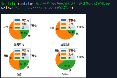
Examples (percentage of achievements)
Given the data structure, linear generation, English and Python course examination results of a class, it is required to draw a pie chart to show the proportion of excellent (above 85 points), pass (60 ~ 84 points) and fail (below 60 points) in each course
from itertools import groupby
import matplotlib.pyplot as plt

#Sets the font used in the drawing
plt.rcParams['font.sans-serif'] = ['simhei']
#Grade of each course
scores = {'data structure':[89,70,49,87,92,84,73,71,78,81,90,37,
                  77,82,81,79,80,82,75,90,54,80,70,68,61],
            'Linear generation':[70,74,80,60,50,87,68,77,95,80,79,74,
                    69,64,82,81,78,90,78,79,72,69,45,70,70],
            'English':[83,87,69,55,80,89,96,81,83,90,54,70,79,
                  66,85,82,88,76,60,80,75,83,75,70,20],
            'Python':[90,60,82,79,88,92,85,87,89,71,45,50,
                      80,81,87,93,80,70,68,65,85,89,80,72,75]}

#The user-defined grouping function is used in the groupby() function below
def splitScore(score):
    if score>=85:
        return 'excellent'
    elif score>=60:
        return 'pass'
    else:
        return 'fail,'

#Count the number of excellent, pass and fail in each course
ratios = dict()
for subject,subjectScore in scores.items():
    ratios[subject] = {}
    for category, num in groupby(sorted(subjectScore),splitScore):
        ratios[subject][category] = len(tuple(num))

#Create 4 subgraphs
fig, axs = plt.subplots(2,2)
axs.shape = 4,

#Draw the pie chart of each course in 4 subgraphs in turn
for index, subjectData in enumerate(ratios.items()):
    #Select subgraph
    plt.sca(axs[index])
    subjectName, subjectRatio = subjectData
    plt.pie(list(subjectRatio.values()),
            labels=list(subjectRatio.keys()),
            autopct='%1.1f%%')
    plt.xlabel(subjectName)
    plt.legend()
    plt.gca().set_aspect('equal')
plt.show()
The results are shown in the figure:
5. Radar chart (polar)
format
polar(args,kwargs)
The args and kwargs parameters in polar() function have similar meanings to plot() function
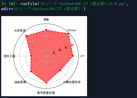
Example 1 (radar chart of score distribution)
Draw a radar chart according to some professional core and score list of a student
import numpy as np
import matplotlib.pyplot as plt

course = ['C++','Python','High number','College English','software engineering',
          'Composition principle','digital image processing','computer graphics']
scores = [80,95,78,85,45,65,80,60]
dataLength = len(scores)

angles = np.linspace(0,
                     2*np.pi,
                     dataLength,
                     endpoint=False)
scores.append(scores[0])
angles = np.append(angles,angles[0])

#Radar mapping
plt.polar(angles,
          scores,
          'rv--',
          linewidth=2)

#Set angle grid label
plt.thetagrids(angles*180/np.pi,
               courses,
               fontproperties='simhei')

#Fill the inside of the radar map
plt.fill(angles,
         scores,
         facecolor='r',
         alpha=0.6)
plt.show()
The results are shown in the figure
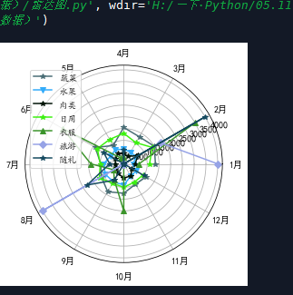
Example 2 (household expenses)
In order to analyze the details of family expenses and better conduct family financial management, Zhang San made detailed records of vegetables, fruits, meat, daily necessities, tourism, gifts and other points every month in 2018.
import random
import numpy as np
import matplotlib.pyplot as plt
import matplotlib.font_manager as fm

data = {
  'Vegetables':[1350,1500,1330,1550,900,1400,980,1100,1370,1250,1000,1100],
  'Fruits':[400,600,580,620,700,650,860,900,880,900,600,600],
  'meat':[480,700,370,440,500,400,360,380,480,600,600,400],
  'daily expenses':[1100,1400,1040,1300,1200,1300,1000,1200,950,1000,900,950],
  'clothes':[650,3500,0,300,300,3000,1400,500,800,2000,0,0],
  'Travel':[4000,1800,0,0,0,0,0,4000,0,0,0,0],
  'Accompanying ceremony':[0,4000,0,600,0,1000,600,1800,800,0,0,1000]
}

dataLength = len(data['Vegetables'])
angles = np.linspace(0,
                     2*np.pi,
                     dataLength,
                     endpoint=False)
markers = '*v^Do'

for col in data.keys():
    color = '#'+''.join(map('{0:02x}'.format,
                            np.random.randint(0,255,3)))
    plt.polar(angles,data[col],color=color,
              marker=random.choice(markers),label=col)

plt.thetagrids(angles*180/np.pi,
               list(map(lambda i:'%d month'%i,range(1,13))),
               fontproperties='simhei')
font = fm.FontProperties(fname=r'C:\Windows\Fonts\STKAITI.ttf')
plt.legend(prop=font)
plt.show()
The results are shown in the figure: