Charts are the basis of the data exploration process. They enable us to better understand our data - for example, help identify outliers or data processing to be done, or provide new ideas and ways to build machine learning models. Charting is an important part of any data science report.
Python has many visualization libraries for making static or dynamic diagrams. In this tutorial, I will try my best to help you understand the logic of matplotlib.
matplotlib is an important part of Python drawing library. It was created to enable MATLAB like drawing interface in Python. Without a MATLAB background, it may be difficult to understand how all parts of matplotlib work together to create the desired graphics. But don't worry, this tutorial will break it down into logical components to get started quickly.
Graphic object
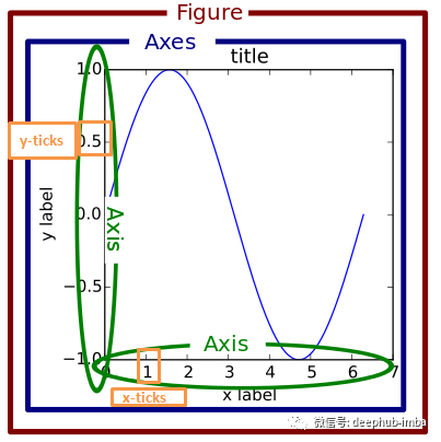
matplotlib is layered. Figure objects are composed of axes (or subgraphs); Each axis defines an object with a different graph (title, legend, scale, axis). The following figure illustrates the various components of the matplotlib diagram.
To create a graph, you can use the "pyplot.figure" function or use the "pyplot.add_subplot" function to add axes to the graph.
# import matplotlib and Numpy
import matplotlib.pyplot as plt
import numpy as np
# magic command to show figures in jupyter notebook
%matplotlib inline

# create a figure
fig = plt.figure()
# add axes
ax1 = fig.add_subplot(2, 2, 1)
ax2 = fig.add_subplot(2, 2, 2)
ax3 = fig.add_subplot(2, 2, 3)

In the above code snippet, we defined a graph that contains up to four graphs in total. We are selecting three of the four subgraphs.
A simple method is to create a graph with an axis using the "plt.subplots" function.
fig, axes = plt.subplots(2, 2)
# first subplot
axes[0, 0].scatter(np.arange(40), np.arange(40) + 4 * np.random.randn(40))
# second subplot
axes[0, 1].plot(np.random.randn(40).cumsum())
# third subplot
_ = axes[1, 0].hist(np.random.randn(100), bins=20)
# fourth subplot
axes[1, 1].bar(np.arange(40), np.arange(40) + 4 * np.random.randn(40))
plt.tight_layout()
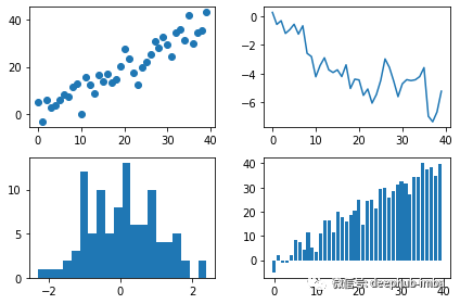
The above figure contains different subgraph types. The complete directory of drawing types can be found in the matplotlib document.
‘Plt. tight_ The layout() 'function is used to automatically interval subgraphs and avoid congestion. You can also use 'PLT subplots_ The adjust (left = none, bottom = none, top = none, wspace = none, hspace = none) 'function changes the default spacing of drawing objects.
fig, axes = plt.subplots(2, 2, sharex=True, sharey=True)
for i in range(2):
    for j in range(2):
        axes[i, j].plot(np.random.randn(40).cumsum())
plt.subplots_adjust(wspace=0, hspace=0)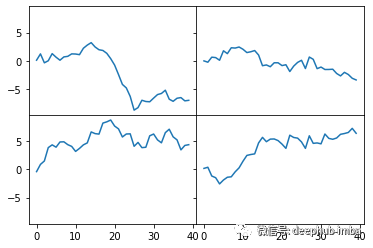
Linetype, color and marking
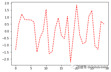
The "plot. Plot" function optionally accepts a string abbreviation representing color and line style. For example, we draw a red dotted line in the following code snippet.
fig, ax = plt.subplots()
ax.plot(np.random.randn(30), 'r--')
We can specify the linetype and color by using the linestyle and color attributes.
fig, ax = plt.subplots(1, 1)
ax.plot(np.random.randn(30), linestyle='--', color='r')
Available linetypes in matplotlib are:
 '-': Solid line style
 ' — ': Dashed line style
 '-.': Dash dot style
  ':' : Dashed line style
In addition to the color abbreviations provided by matplotlib, we can also use any color on the spectrum by specifying its hexadecimal code (for example, 'FFFF').
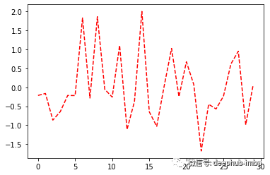
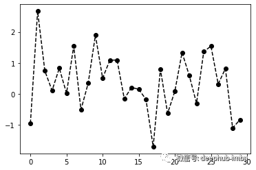
To draw a line graph, matplotlib interpolates between points. You can use the marker attribute to highlight the actual data points, as shown in the following figure.
fig, ax = plt.subplots(1, 1)
ax.plot(np.random.randn(30), linestyle='dashed', color='k', marker='o')
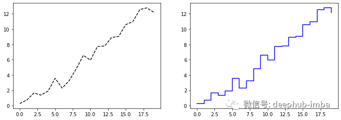
The default interpolation is linear; However, you can change it using the "drawstyle" attribute. The following examples illustrate linear interpolation and post step interpolation.
# data
data = np.random.randn(20).cumsum()
# figure
fig, (ax1, ax2) = plt.subplots(1, 2, figsize=(12, 4))
ax1.plot(data, 'k--')
ax2.plot(data, 'b-', drawstyle='steps-post')
Scales and labels
ax objects (subgraph objects) have different ways to define drawings:
- ‘Set_xticks' and set_xticklabels' change the x-axis scale;
- ‘Set_yticks' and set_yticklabels' change the y-axis scale;
- Set_title 'add a title to the drawing.
fig, ax = plt.subplots(1, 1)
ax.plot(np.random.randn(1000).cumsum())
ticks = ax.set_xticks([0, 200, 400, 600, 800, 1000])
labels = ax.set_xticklabels(['one', 'two', 'three', 'four', 'five', 'six'],
                           rotation=30, fontsize=12)
ax.set_title('Matplotlib plot')
ax.set_xlabel('Stages', fontsize=12)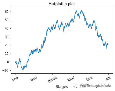
Another way to set drawing properties is to use the "set" method of the attribute dictionary.
fig, ax = plt.subplots(1, 1)
ax.plot(np.random.randn(1000).cumsum())
props = {
    'title': 'Matplotlib title',
    'xlabel': 'Stages'
}
ax.set(**props)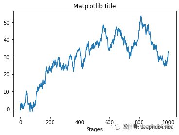
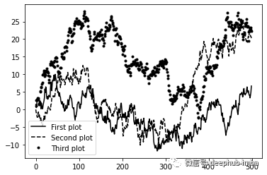
When drawing different data in the same diagram, the legend is very important to identify the diagram elements. Therefore, we use the label "label and legend" method to add the legend.
fig, ax = plt.subplots(1, 1)
ax.plot(np.random.randn(500).cumsum(), 'k', label='First plot')
ax.plot(np.random.randn(500).cumsum(), 'k--', label='Second plot')
ax.plot(np.random.randn(500).cumsum(), 'k.', label='Third plot')
ax.legend(loc='best')
notes
To add annotations to the subgraph, we can use the "text", "arrow" and annotation functions. Textdraws text at the given coordinates (x, y) on the drawing using an optional custom style.
fig, ax = plt.subplots()
ax.plot(np.arange(30), 'k')
ax.text(5, 15, 'Hello world!',
        family='monospace', fontsize=10)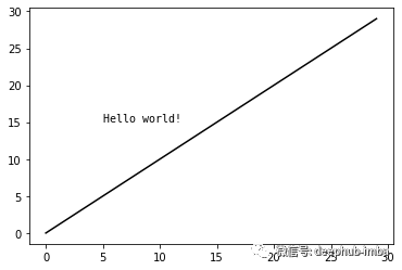
The "annotation" method arranges text and arrows appropriately.
fig, ax = plt.subplots()
ax.plot(np.linspace(0, 10, 200), np.sin(np.linspace(0, 10, 200)))
ax.annotate('Min', xy=(4.7, -1),
           xytext=(4.5, -0.5),
           arrowprops=dict(facecolor='black', headwidth=6, width=3,
                          headlength=4),
          horizontalalignment='left', verticalalignment='top')
ax.set_title('Annotation example')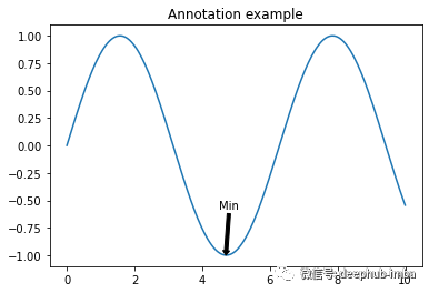
Matplotlib has objects that represent many standard shapes, called patches. Like Rectangle and Circle, some are in 'Matplotlib Pyplot ', but the whole collection is in' Matplotlib 'patches'.
fig, ax = plt.subplots()

rect = plt.Rectangle((0.2, 0.75), 0.4, 0.15, color='k', alpha=0.3)
circ = plt.Circle((0.7, 0.2), 0.15, color='b', alpha=0.3)
pgon = plt.Polygon([[0.15, 0.15], [0.35, 0.4], [0.2, 0.6]],
                    color='g', alpha=0.5)
ax.add_patch(rect)
ax.add_patch(circ)
ax.add_patch(pgon)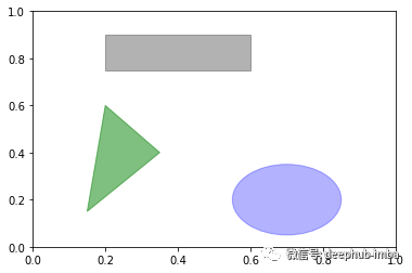
Save image
You can use "fig.savefig" to save the drawing in a file. Matplotlib infers the file type from the file extension. For example, we use the following code to save a PDF version of the drawing.
fig.savefig('figpath.pdf')summary
The goal of this tutorial is to familiarize you with the basics of data visualization using matplotlib. I hope this article can be helpful to your work.
Author: Jaouad Eddadsi