elaborate
The installation of the basic development environment and ant design has been completed.
This lesson uses Ant Design to make the interface of TodoList.
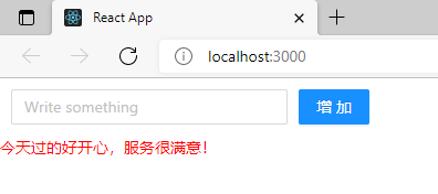
This article will not explain Ant Design in depth, just to make the course interface look better. If you have a strong learning need or desire for it, you can look at the official ant design documents, which are all in Chinese and have no difficulty. Let's take a look at the effect diagram of the implementation.

Introducing CSS Styles
When using Ant Design, the first thing is to introduce CSS styles. Only with styles can UI components display normally.
It can be directly in / SRC / todolist JS file is imported directly with import.
import 'antd/dist/antd.css'
Write Input box
After introducing CSS style, you can happily use the < Input > box in antd. When using, you need to introduce the Input component first.
All codes are as follows:
import React, { Component } from 'react';
import 'antd/dist/antd.css'
import { Input } from 'antd'

class TodoList extends Component {
    render() {
        return (
            <div>
                <div>
                    <Input placeholder='willem' style={{ width:'250px'}}/>
                </div>
            </div>
         );
    }
}
export default TodoList;
In the Input component, we set style. Note that this is set without single quotation marks or double quotation marks.
After writing, you can simply look at the effect.

Write Button button
Ant Design also provides rich and beautiful button components, directly using the simplest Primary button. The button component also needs to be introduced before using. In order to make the component look better, some Margin styles are added, and the code is as follows:
import React, { Component } from 'react';
import 'antd/dist/antd.css'
import { Input , Button } from 'antd'

class TodoList extends Component {
    render() {
        return (
            <div style={{margin:'10px'}}>
                <div>
                    <Input placeholder='Write something' style={{ width:'250px', marginRight:'10px'}}/>
                    <Button type="primary">increase</Button>
                </div>
            </div>
         );
    }
}
export default TodoList;
List component make list
Similarly, ant destination is used to make the todoList list. Before making it, we first declare a data array outside the class, and the contents of the array can be written freely.
const data=[
    'The morning meeting will be held at 8 a.m. to assign today's development work',
    '9:00 a.m. and project manager for development requirements discussion',
    'Late 5:30 Communication meeting on today's code'
]
Then introduce the List component, and the code is as follows:
import { Input , Button , List } from 'antd'
Finally, use the List component.
<div style={{margin:'10px',width:'300px'}}>
    <List
        bordered
        dataSource={data}
        renderItem={item=>(<List.Item>{item}</List.Item>)}
    />
</div>

In order to facilitate learning, I have given all the code. If you have difficulty in doing it, you can directly copy the following code.
TodoList.js
import React, { Component } from 'react';
import 'antd/dist/antd.css'
import { Input , Button , List } from 'antd'

const data=[
    'The morning meeting will be held at 8 a.m. to assign today's development work',
    '9:00 a.m. and project manager for development requirements discussion',
    'Late 5:30 Communication meeting on today's code'
]

class TodoList extends Component {
    render() {
        return (
            <div style={{margin:'10px',width:'300px'}}>
                <List
                    bordered
                    dataSource={data}
                    renderItem={item=>(<List.Item>{item}</List.Item>)}
                />
            </div>
         );
    }
}
export default TodoList;
summary
This lesson mainly uses Ant Design to make the todoList interface, using < input >, < button > and < list > components. Because this tutorial is about Redux, the use methods of these components are not discussed. It is mainly to make a UI interface to pave the way for future courses.
If you are very interested in Ant Design, you can go to the official website to read the documents.
demo

TodoList.js
import React, { Component } from 'react';
import 'antd/dist/antd.css'
import { Input , Button , List } from 'antd'

const data=[
    'The morning meeting will be held at 8 a.m. to assign today's development work',
    '9:00 a.m. and project manager for development requirements discussion',
    'Late 5:30 Communication meeting on today's code'
]

class TodoList extends Component {
    render() {
        return (
            <div style={{margin:'10px',width:'300px'}}>
                <div style={{margin:'10px'}}>
                    <div>
                        <Input placeholder='Write something' style={{ width:'150px', marginRight:'10px'}}/>
                        <Button type="primary">increase</Button>
                    </div>
                </div>
                <List
                    bordered
                    dataSource={data}
                    renderItem={item=>(<List.Item>{item}</List.Item>)}
                />
            </div>
         );
    }
}
export default TodoList;
index.js
import React from 'react';
import ReactDOM from 'react-dom'
import TodoList from './TodoList'

ReactDOM.render(<TodoList/>,document.getElementById('root'))
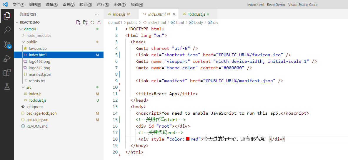
Red font part: