Recently, I was studying Turing textbook by myself< Python Basic course of machine learning ", take some notes in the form of blog on csdn.
We may have many purposes in using unsupervised learning for data transformation. The most common purpose is to visualize, compress data, and find a more informative data representation for further processing. Principal component analysis is the simplest and most commonly used method.
principal component analysis
principal component analysis (PCA) is a method of rotating data sets, and the rotated features are not statistically related. After this rotation, a subset of the new feature is usually selected according to its importance to interpreting the data.
The following will illustrate the application of principal component analysis in two-dimensional data sets.
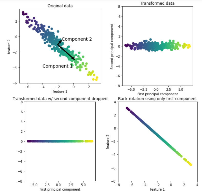
As shown in the above figure, the upper left corner is the original data. The principal component analysis algorithm will first find the direction with the largest variance in the data set and mark the direction as "Component 1". It is easy to understand that this direction is the direction containing the most information, that is, the features along this direction are the most relevant. Then the algorithm will find the direction orthogonal to the first direction and containing the most information (in the two-dimensional example above, there is only one orthogonal direction, but there are countless orthogonal directions in the multi-dimensional space). The direction found by the above process is called the principal component, that is, the main direction of data variance. The number of principal components is generally the same as the characteristic number of data.
For the second image (upper right corner), we rotate the original data so that the first principal component is parallel to the x-axis and the second principal component is parallel to the y-axis. Of course, before rotation, we subtract the average value from the original data to make the transformed data centered on 0. In the rotation representation found by PCA, the two coordinate axes are uncorrelated, that is, for this data representation, the correlation matrix is all zero except diagonal.
For the third picture (lower left corner), we use PCA to reduce the dimension of the data by retaining the first principal component. This reduces the data from a two-dimensional data set to a one-dimensional data set. However, it should be noted that instead of retaining one of the original features, we found the direction containing the most information (from top left to bottom right in the first picture) and retained this direction, that is, the first principal component.
Finally, we can reverse the rotation and add the average value back to the data. This will get the data in the last picture in the lower right corner. These data points are located in the original feature space, but we only retain the information contained in the first principal component. This transformation is sometimes used to remove the influence of noise in the data, or visualize the part of information retained in the principal component.
Visualization of high-dimensional data sets
One of the most common applications of PCA is to visualize high-dimensional data. For Iris (Iris) data set we are familiar with (less features), we can create a scatter matrix to show the local image of the data by showing all possible pairwise combinations of features. But if we want to look at the breast cancer dataset (the number of features), even if we use scatter plot matrix, it is also very difficult. This data set contains 30 features, which leads to the need to draw 30 * 14 = 420 scatter maps. We can never carefully observe all these images, let alone try to understand them. However, we can also use another visualization method: calculate the histograms of two categories (benign tumor and malignant tumor) for each feature.
import numpy as np
import matplotlib.pyplot as plt
from sklearn.datasets import load_breast_cancer
cancer= load_breast_cancer()
fig, axes = plt.subplots(15, 2, figsize=(10, 20))
malignant = cancer.data[cancer.target == 0]
benign = cancer.data[cancer.target == 1]
ax = axes.ravel()
for i in range(30):
 _, bins = np.histogram(cancer.data[:, i], bins=50)
 ax[i].hist(malignant[:, i], bins=bins, color=mglearn.cm3(0), alpha=.5)
 ax[i].hist(benign[:, i], bins=bins, color=mglearn.cm3(2), alpha=.5)
 ax[i].set_title(cancer.feature_names[i])
 ax[i].set_yticks(())
ax[0].set_xlabel("Feature magnitude")
ax[0].set_ylabel("Frequency")
ax[0].legend(["malignant", "benign"], loc="best")
fig.tight_layout()
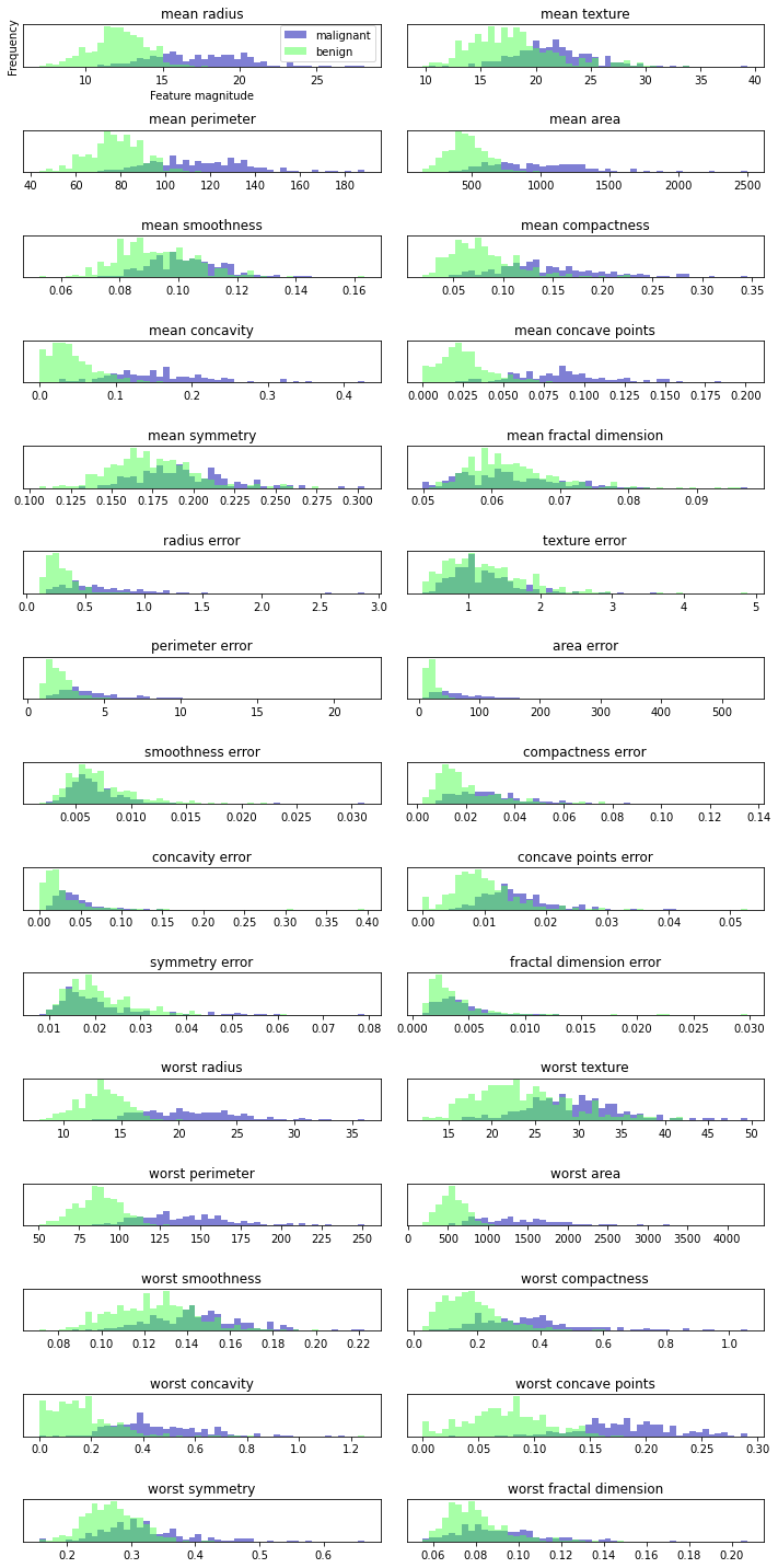 We create a histogram for each feature to calculate the frequency of data points with a certain feature in a specific range. Each graph contains two histograms, one is all points of benign category (blue), and the other is all points of malignant category (green). In this way, we can understand the distribution of each feature in the two categories, and guess which features can better distinguish benign samples from malignant samples. For example, the "smoothness error" feature seems to have little information, because most of the two histograms overlap together, while the "worst concove points" feature seems to have a large amount of information, because the intersection of the two histograms is very small.
But this kind of graph cannot show the interaction between variables. Using PCA, we can obtain the main interactions. The first two principal components will be used to visualize the data in this new two-dimensional space.
from sklearn.decomposition import PCA
from sklearn.datasets import load_breast_cancer
from sklearn.preprocessing import StandardScaler
cancer = load_breast_cancer()
#Before applying PCA, we use the StandardScaler to scale the data so that the variance of each feature is 1
scaler = StandardScaler()
scaler.fit(cancer.data)
X_scaled = scaler.transform(cancer.data)
# Retain the first two principal components of the data
pca = PCA(n_components=2)
# Fitting PCA model for breast cancer data
pca.fit(X_scaled)
# Transform the data to the direction of the first two principal components
X_pca = pca.transform(X_scaled)
# The first and second principal components are plotted and colored by category
plt.figure(figsize=(8, 8))
mglearn.discrete_scatter(X_pca[:, 0], X_pca[:, 1], cancer.target)
plt.legend(cancer.target_names, loc="best")
plt.gca().set_aspect("equal")
plt.xlabel("First principal component")
plt.ylabel("Second principal component")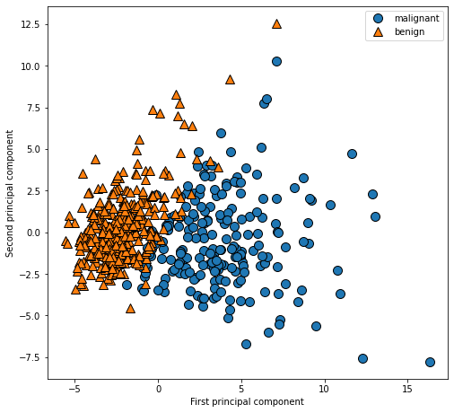
PCA is an unsupervised method, which does not use any category information when looking for the direction of rotation. It just observes the correlation in the data. For the scatter diagram shown here, we draw the relationship between the first principal component and the second principal component, and then use the category information to color the data points. It can be seen that the two categories are well separated in this two-dimensional space. Therefore, even a linear classifier (learning a straight line in this space) can perform quite well in distinguishing the two categories. We can also see that malignant points are more scattered than benign points, which can also be seen in the histogram above.
Face recognition -- feature extraction
Another application of PCA is feature extraction. The idea behind feature extraction is that a data representation can be found, which is more suitable for analysis than the given original representation. Feature extraction is very useful. A good application example is image.
Next, we will use PCA to process the face images in the Wild dataset Labeled Faces. This data set contains celebrity face images downloaded from the Internet. It contains the face images of politicians, singers, actors and athletes from the beginning of the 21st century.
from sklearn.datasets import fetch_lfw_people
people = fetch_lfw_people(min_faces_per_person=20, resize=0.7)
image_shape = people.images[0].shape
fix, axes = plt.subplots(2, 5, figsize=(15, 8),
 subplot_kw={'xticks': (), 'yticks': ()})
for target, image, ax in zip(people.target, people.images, axes.ravel()):
 ax.imshow(image)
 ax.set_title(people.target_names[target])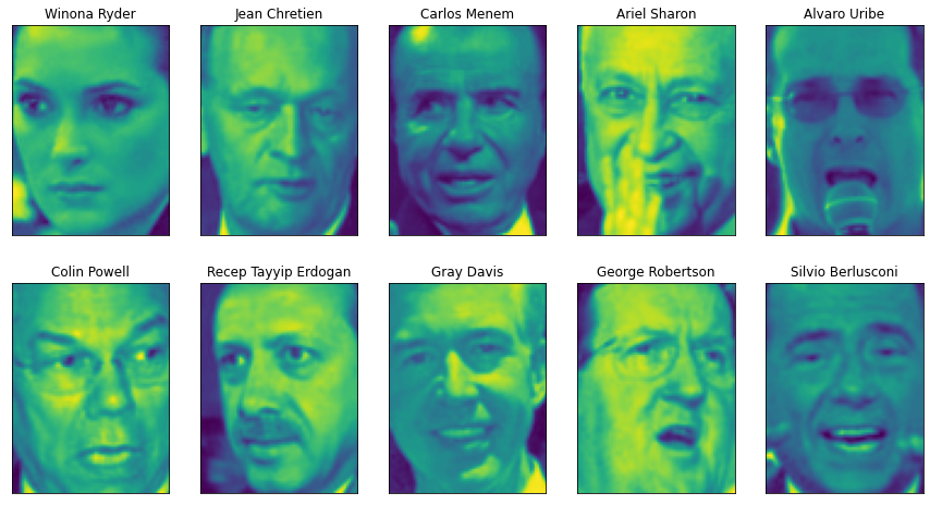
The above figure shows some images of Labeled Faces in Wild dataset; The data set contains 3023 images, each 87 pixels in size × 65 pixels, belonging to 62 different people. Let's take a look at the number of times each target appears in this data set.
# Count the number of occurrences of each target
counts = np.bincount(people.target)
# Print the number of times with the target name
for i, (count, name) in enumerate(zip(counts, people.target_names)):
 print("{0:25} {1:3}".format(name, count), end=' ')
 if (i + 1) % 3 == 0:
    print()
We can find that {it contains a large number of images of George W. Bush and Colin Powell, so the data set has a certain skew. In order to reduce data skew, we only take 50 images for each person at most (otherwise, feature extraction will be greatly affected by the possibility of George W. Bush)
mask = np.zeros(people.target.shape, dtype=np.bool)
for target in np.unique(people.target):
 mask[np.where(people.target == target)[0][:50]] = 1
X_people = people.data[mask]
y_people = people.target[mask]
# Scale the grayscale value to between 0 and 1 instead of between 0 and 255
# For better data stability
X_people = X_people / 255
Next, we build a simple KNN classifier (K=1) to find the face most similar to the face you want to classify.
from sklearn.neighbors import KNeighborsClassifier
# The data is divided into training set and test set
X_train, X_test, y_train, y_test = train_test_split(
 X_people, y_people, stratify=y_people, random_state=0)
# Building a kneigborsclassifier using a neighbor
knn = KNeighborsClassifier(n_neighbors=1)
knn.fit(X_train, y_train)
print("Test set score of 1-nn: {:.2f}".format(knn.score(X_test, y_test)))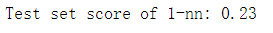
We get an accuracy of 0.23. In other words, it will succeed every four times. This is not bad for the classification problem with 62 categories (the accuracy of random guess is 1 / 62), but it is not very good. So we can use PCA to measure the similarity of human faces. It is a bad method to calculate the distance in the original pixel space. When comparing two images with pixel representation, we compare the gray value of each pixel with that of the corresponding position of the other image. This representation is very different from the way people interpret face images. It is difficult to obtain facial features using this original representation. For example, if the pixel distance is used, moving the face one pixel to the right will greatly change and get a completely different representation. We want to use along the main line
#We fit PCA objects to the training data and extract the first 100 principal components. Then the training data and test data are analyzed
#Transform
pca = PCA(n_components=100, whiten=True, random_state=0).fit(X_train)
X_train_pca = pca.transform(X_train)
X_test_pca = pca.transform(X_test)
#The new data has 100 features, namely the first 100 principal components. Now, you can use a single nearest neighbor classifier for the new representation
#Classify our images
knn = KNeighborsClassifier(n_neighbors=1)
knn.fit(X_train_pca, y_train)
print("Test set accuracy: {:.2f}".format(knn.score(X_test_pca, y_test)))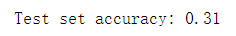
Our accuracy has improved significantly, from 23% to 31%, which confirms our intuition that principal components may provide a better data representation.
Next, we will look at the first few principal components
fix, axes = plt.subplots(3, 5, figsize=(15, 12),
 subplot_kw={'xticks': (), 'yticks': ()})
for i, (component, ax) in enumerate(zip(pca.components_, axes.ravel())):
 ax.imshow(component.reshape(image_shape),
 cmap='viridis')
 ax.set_title("{}. component".format((i + 1)))
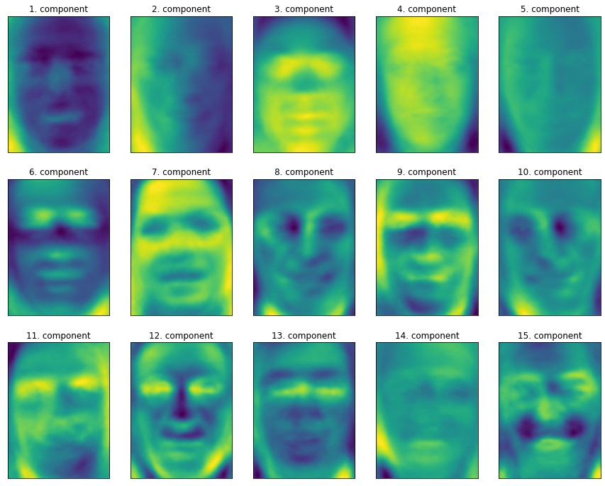
Although we certainly cannot understand all the contents of these components, we can guess what aspects of the face image are captured by some principal components. The first principal component seems to mainly encode the comparison between the face and the background, and the second principal component encodes the difference in the brightness of the left and right parts of the face, and so on. Although this representation is slightly more semantic than the original pixel value, it is still far from the way people perceive human faces. Because PCA model is based on pixels, the relative position of human face (the position of eyes, chin and nose) and the degree of light and shade have a great impact on the similarity of the two images in pixel representation. However, the relative position and brightness of the face may not be the first thing people perceive. When people are asked to evaluate the similarity of faces, they are more likely to use attributes such as age, gender, facial expression and hairstyle, which are difficult to infer from pixel intensity. Importantly, algorithms often interpret data (especially visual data, such as images that people are very familiar with) in a very different way from human interpretation.
Our introduction to PCA transformation is to rotate the data first, and then delete the components with small variance. Another useful explanation is to try to find some numbers (New eigenvalues after PCA rotation), so that we can represent the test points as the weighted sum of the main components.
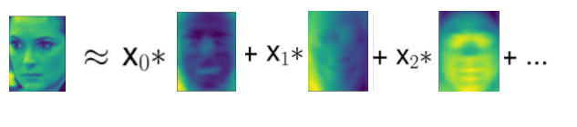
Here, x0, x1, etc. are the coefficients of the principal components of the data point, in other words, they are the representation of the image in the rotated space.
We can also use another way to understand PCA model, that is, only use some components to reconstruct the original data. In Figure 3-3, after removing the second component and coming to the third figure, we rotate reversely and add the average value again, so as to obtain new data points with the second component removed in the original space, as shown in the last figure. We can do a similar transformation on the face, reduce the dimension of the data to only contain some principal components, and then rotate it back to the original space. Back to the original feature space, you can use inverse_transform method. Here, we use 10, 50, 100 and 500 components to reconstruct and visualize some faces.
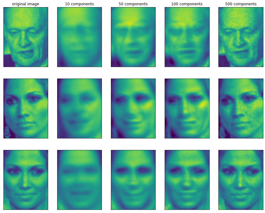
It can be seen that when only the first 10 principal components are used, only the basic features of the picture, such as face direction and brightness, are captured. As more and more principal components are used, more and more details are retained in the image. This corresponds to more and more items in the summation above. If the number of components used is equal to the number of pixels, it means that we will not discard any information after rotation and can reconstruct the image perfectly.